시작하기 전에 import 하기
import plotly.express as px
import plotly.graph_objects as go
import plotly.express as px
import numpy as np
Ploty 그래프 사이즈 설정하기
Plotly의 각각의 그래프 생성방법에(express, graph_object ) 따라 그래프 사이즈 및 Margin 설정 방법에 대해 알아봅니다.
Keyword : Plotly 그래프 사이즈, Plotly graph size ,Plotly 그래프 마진, Plotly graph margin , Plotly width, Plotly height
기본 사용
express 그래프
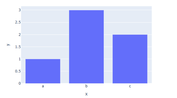
import plotly.express as px
fig = px.bar(x=["a", "b", "c"], y=[1, 3, 2],width=600, height=400)
fig.show()
px.그래프 함수 안에 width= , height= 를 통해 픽셀 단위의 크기를 지정합니다.
graph_object 그래프
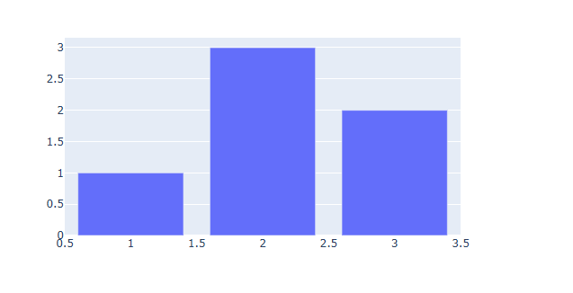
import plotly.graph_objects as go
fig = go.Figure(data=[go.Bar(x=[1, 2, 3], y=[1, 3, 2])])
fig.update_layout(width=600,height=400)
fig.show()
[사용 함수]
fig.update_layout ()
[함수 input 내용]
width : 가로 길이(픽셀 단위)
height : 세로 길이(픽셀 단위)
※ 이 방법은 express 그래프에도 적용됩니다.
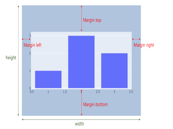
Margine 적용 방법
margin 이란 전체 크기(Figure) 와 그래프(Trace) 사이의 거리를 뜻합니다.
fig.update_layout(
        margin_l=left margine,
        margin_r=right margine,
        margin_b=right margine,
        margin_t=top margine)
[사용 함수]
fig.update_layout ()
[함수 input 내용]
margin_l = left margine
margin_r = right margine
margin_b = bottom margine
margin_t = top margine
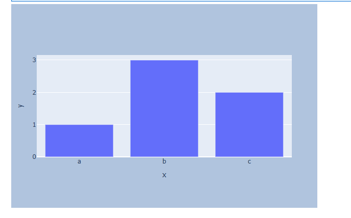
예제) 그래프 크기와 margin을 한번에 조절해보겠습니다.
import plotly.express as px
fig = px.bar(x=["a", "b", "c"], y=[1, 3, 2])
# 그래프 크기와 margin 설정하기
fig.update_layout(
    width=600,
    height=400,
    margin_l=50,
    margin_r=50,
    margin_b=100,
    margin_t=100,
    # 백그라운드 칼라 지정, margin 잘 보이게 하기위함
    paper_bgcolor="LightSteelBlue"
)
fig.show()
Plotly 타이틀 설정하기
Plotly의 각각의 그래프 생성방법에(express, graph_object ) 따라 타이틀 설정이 다릅니다. 각각의 타이틀 생성 방법에 대해 알아보고, 생성방법과 무관하게 모두에서 사용할수있는 title 생성 방법에 대해서도 알아봅니다.
또한 타이틀 위치지정, 폰트 스타일(크기, 색, 서체) 설정 방법에 대해 알아봅니다.
Keyword : Plotly Title, Plotly Title size, Plotly Title position, Plotly Title font, Plotly 타이틀, Plotly 타이틀 크기, Plotly 타이틀 위치, Plotly 타이틀 폰트
기본 사용
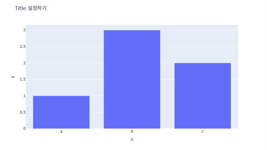
1) express 그래프
예제
fig = px.bar(x=["a", "b", "c"], y=[1, 3, 2], title="Title 설정하기")
fig.show()
px.그래프 함수 안에 title = "타이틀" 을 추가하여 생성합니다. 타이틀 설정이 쉽지만 타이틀 위치, 폰트 스타일등의 세세한 조정은 바로 설정이 불가능합니다.
2) graph_object 그래프
예제
fig = go.Figure(
    data=[go.Bar(x=[1, 2, 3], y=[1, 3, 2])],
    layout=go.Layout(title=go.layout.Title(text="Title 설정하기")))
fig.show()
go.Figure 함수의 layout에 go.Layout(title=go.layout.Title(text="타이틀")) 을 추가하여 생성합니다.
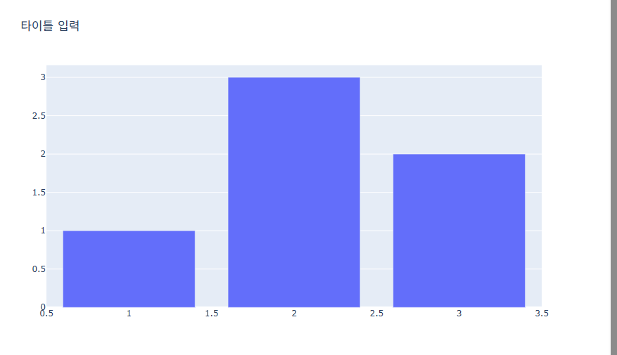
3) 두가지를 모두 커버하는 방법
예제
fig.update_layout(title_text="타이틀 입력")
[사용 함수]
fig.update_layout ()
fig.update_layout() 은 그래프 생성 완료 후 layout 정보를 업데이트 해주는 함수 입니다.
[함수 input 내용]
title_text = 타이틀 text 입력
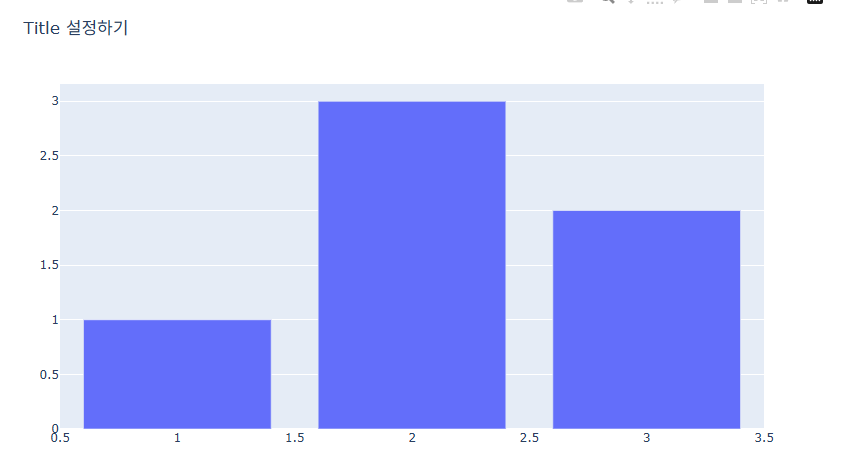
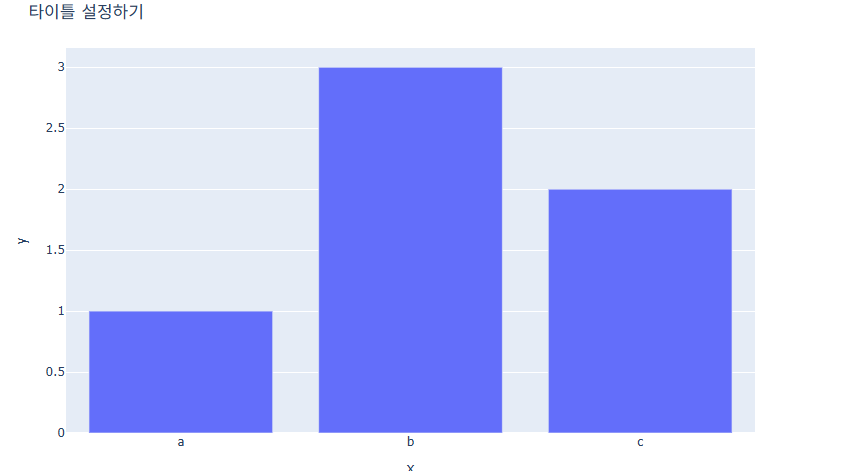
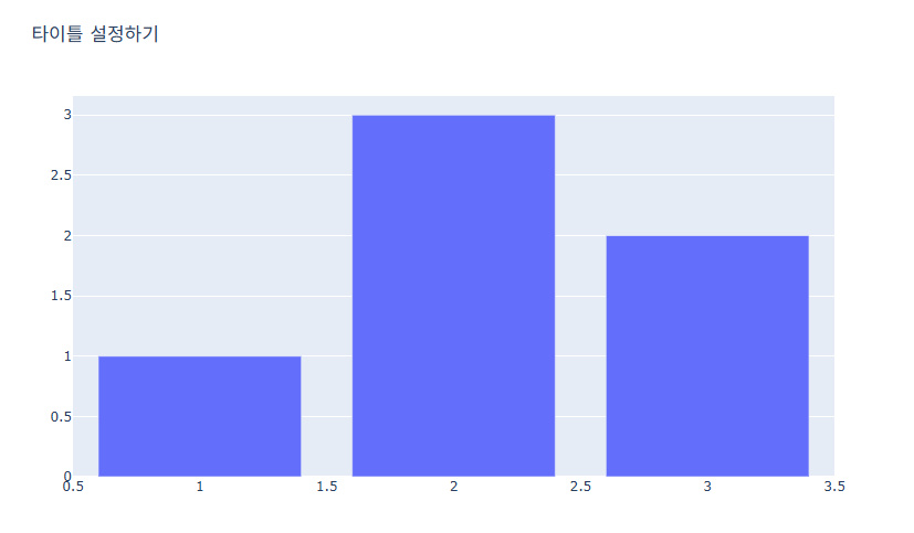
예제) express , graph_objects 방법에서 동일한 방법으로 작성합니다.
express 방법
import plotly.express as px
fig = px.bar(x=["a", "b", "c"], y=[1, 3, 2])
fig.update_layout(title_text="타이틀 설정하기")
fig.show()
graph_objects 방법
import plotly.graph_objects as go
fig = go.Figure(data=[go.Bar(x=[1, 2, 3], y=[1, 3, 2])])
fig.update_layout(title_text="타이틀 설정하기")
fig.show()
위치 지정
예제
fig.update_layout(
            title_x = (0~1) 사이값
            title_y = (0~1) 사이값
            title_xanchor = (`auto","left","center","right")
            title_yanchor = ("auto","top","middle","bottom")
            })
fig.update_layout ()
[함수 input 내용]
title_x = 가로 축의 좌표로 0은 맨 왼쪽 1은 맨 오른쪽을 뜻합니다.
title_y = 세로 축의 좌표로 0은 맨 아래 1은 맨 윗쪽을 뜻합니다.
title_xanchor = 좌표를 중심으로 타이틀을 왼쪽, 또는 가운데, 오른쪽에 놓을지 설정합니다.
title_yanchor = 좌표를 중심으로 타이틀을 위에, 또는 가운데, 아래에 놓을지 설정합니다.
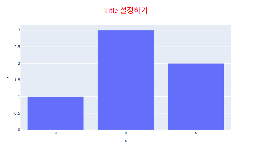
예제
fig = px.bar(x=["a", "b", "c"], y=[1, 3, 2], title="Title 설정하기")
# 타이틀 위치 설정부분
fig.update_layout(
                 title_x = 0.5,
                 title_y = 0.9,
                 title_xanchor = "center",
                 title_yanchor = "middle")
fig.show()

폰트 스타일 지정(크기, 색, 서체)
fig.update_layout(
        title_font_size = 폰트 사이즈
        title_font_color = "색 지정"
        title_font_family = "폰트 지정"
        )
[사용 함수]
fig.update_layout ()
[함수 input 내용]
title_font_size = 폰트 사이즈를 숫자로 입력합니다.
title_font_color = 원하는 색을 지정합니다.
title_font_family =HTML font family로 plotly를 구동하는 web browser에서 지원하는 폰트를 지원합니다. 몇가지 대표적인 폰트는 아래와 같습니다.
1) family-font: 우리가 일반적으로 알고 있는 특정 글꼴
ex) Georgia, arial, 나눔고딕, 궁서, 굴림, Times New Roman, Times, 등
2) generic-font: 비슷한 모양의 글꼴 집합
family-name으로 지정된 글꼴을 사용할 수 없는 경우 브라우저가 비슷한 스타일로 대체 할 수있도록 선언해주는 폰트입니다.
ex) serif, sans-serif, monospace, cursive, fantasy
serif : 삐침 있는 명조계열의 글꼴 모음
sans-serif : 삐침 없는 고딕계열의 글꼴 모음
cursive : 손 필기체 같은 느낌의 글꼴 모음
-monospace : 글자 폭과 간격이 일정한 글꼴 모음
fantasy : 위 폰트들을 제외한 나머지 화려한 글꼴 모음
예제
fig = px.bar(x=["a", "b", "c"], y=[1, 3, 2], title="Title 설정하기")
fig.update_layout(
        # 타이틀 위치 설정 부분
        title_y = 0.9,
        title_x = 0.5,
        title_xanchor = 'center',
        title_yanchor ='middle',
        # 폰트 스타일 추가 부분
        title_font_size = 25,
        title_font_color = "red",
        title_font_family = "Times")
fig.show()
Plotly 축 타이틀 설정하기(Axes Title)
Plotly의 각각의 그래프 생성방법에(express, graph_object ) 따라 그래프 X축, Y축의 타이틀 지정 방법과 위치, 스타일 지정 방법, 삭제 방법에 대해 알아봅니다.
Keyword : Plotly Aexs Title, Plotly Aexs Title size, Plotly Aexs Title position, Plotly Aexs Title font, Plotly 축 타이틀, Plotly 축 타이틀 크기, Plotly 축 타이틀 위치, Plotly 축 타이틀 폰트 [TOC]
기본 사용
1) express 그래프
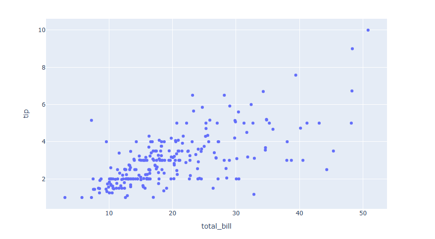
express 를 통해 시각화를 하는경우 아래와 같이 자동으로 데이터 컬럼명으로 축의 타이틀이 생성됩니다.
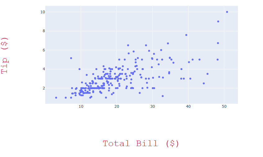
# 데이터 불러오기
df = px.data.tips()
#그래프 그리기
fig = px.scatter(df, x="total_bill", y="tip")
fig.show()
예제
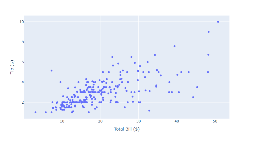
fig = px.scatter(df, x="total_bill", y="tip",
    labels=dict(total_bill="Total Bill ($)", tip="Tip ($)"))
labels=dict(X 축 컬럼명="변경할 컬럼명", Y 축 컬럼명="변경할 컬럼명") 을 통해서 변경이 가능합니다.
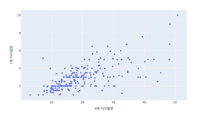
2) graph_object 그래프
graph_object를 통해 시각화를 하는경우 자동 생성이 되지 않습니다 . 별도의 코드를 통해 축 타이틀을 추가합니다.
fig.update_xaxes(title_text='X축 타이틀명')
fig.update_yaxes(title_text='Y축 타이틀명')
[사용 함수]
fig.update_xaxes() : x축 타이틀을 업데이트 할떄 사용
fig.update_yaxes() : y축 타이틀을 업데이트 할때 사용
[함수 input 내용]
title_text = "업데이트 할 타이틀명"
예제
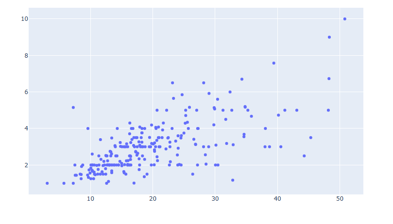
#데이터 생성
df = px.data.tips()
x = df["total_bill"]
y = df["tip"]
fig = go.Figure(data=go.Scatter(x=x, y=y, mode='markers'))
fig.update_xaxes(title_text='Total Bill ($)')
fig.update_yaxes(title_text='Tip ($)')
fig.show()
축 타이틀 스타일 설정방법
축 레이블은 글자크기, 색, 서체 변경이 가능합니다.
fig.update_xaxes(title_font_size =30,
                 title_font_color='crimson',
                 title_font_family='Courier')
fig.update_yaxes(title_font_size =30,
                 title_font_color='crimson',
                 title_font_family='Courier')
[사용 함수]
fig.update_xaxes() : x축 타이틀 스타일을 업데이트 할떄 사용
fig.update_yaxes() : y축 타이틀 스타일을 업데이트 할때 사용
[함수 input 내용]
title_font_size = 폰트 사이즈를 숫자로 입력합니다.
title_font_color= 원하는 색을 지정합니다.
title_font_family = HTML font family로 plotly를 구동하는 web browser에서 지원하는 폰트를 지원합니다.
예제
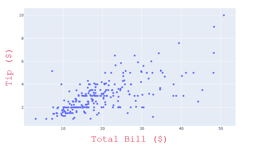
# 데이터 불러오기
df = px.data.tips()
#그래프 그리기
fig = px.scatter(df, x="total_bill", y="tip")
# 축 타이틀 스타일 지정부분
fig.update_xaxes(title_text='Total Bill ($)',
                 title_font_size =30,
                 title_font_color='crimson',
                 title_font_family='Courier')
fig.update_yaxes(title_text='Tip ($)',
                 title_font_size =30,
                 title_font_color='crimson',
                 title_font_family='Courier')
fig.show()
축 타이틀 위치 지정 방법
Trace 와 축 타이틀 사이 간격을 조절하며 위치 지정이 가능합니다.
fig.update_xaxes(title_standoff= 100)
fig.update_yaxes(title_standoff= 100)
[사용 함수]
fig.update_xaxes() : x축 타이틀 스타일을 업데이트 할떄 사용
fig.update_yaxes() : y축 타이틀 스타일을 업데이트 할때 사용
[함수 input 내용]
title_standoff : 축 타이틀과 Trace 사이의 거리, 거리를 키울수록 Trace의 크기가 줄어듭니다.(Figure 사이즈는 고정이기에..)
예제
# 데이터 불러오기
df = px.data.tips()
#그래프 그리기
fig = px.scatter(df, x="total_bill", y="tip")
# 축 타이틀 스타일 + 위치 지정 부분
fig.update_xaxes(title_text='Total Bill ($)',
                 title_font_size =30,
                 title_font_color='crimson',
                 title_font_family='Courier',
                 title_standoff= 100)
fig.update_yaxes(title_text='Tip ($)',
                 title_font_size =30,
                 title_font_color='crimson',
                 title_font_family='Courier',
                 title_standoff= 100)
fig.show()
축 타이틀삭제 방법
express 를 통해 시각화하여 자동 생성되는 축 타이틀 또한 삭제가 가능합니다.
# 데이터 불러오기
df = px.data.tips()
#그래프 그리기
fig = px.scatter(df, x="total_bill", y="tip")
# 축 레이블 삭제하기
fig.update_xaxes(title=None)
fig.update_yaxes(title=None)
fig.show()
[사용 함수]
fig.update_xaxes() : x축 타이틀 스타일을 업데이트 할떄 사용
fig.update_yaxes() : y축 타이틀 스타일을 업데이트 할때 사용
[함수 input 내용]
title =None
Plotly 축 범위 지정하기
Plotly의 축 범위를 조절하는 방법, 축의 범위를 역방향으로 전환하는 방법, Log 스케일로 변환하는 방법에 대해 학습합니다.
Keyword : Plotly axes range, Plotly 축 범위, Plotly axes reverse range, Plotly 역방향 축범위, Plotly Log scale, Plotly 로그 스케일
축 범위 지정 하기
예제
fig.update_xaxes(range=[min, max])
fig.update_yaxes(range=[min, mam])
[사용 함수]
fig.update_xaxes() : x축 범위를 업데이트 할떄 사용
fig.update_yaxes() : y축 범위를 업데이트 할때 사용
[input 내용]
range = ([min, max]) 범위의 최소값과 최대값을 차례로 리스트 형태로 넣습니다.
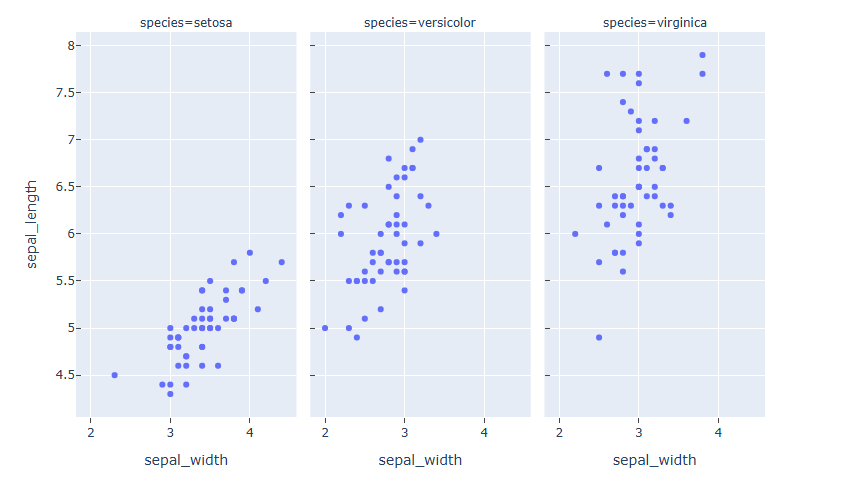
예제
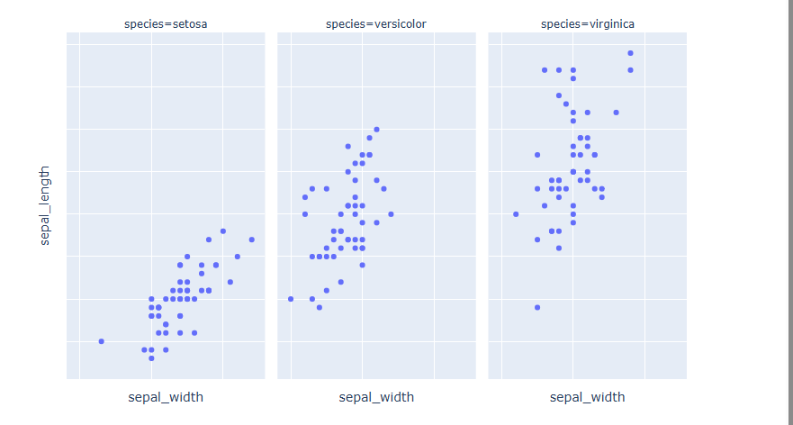
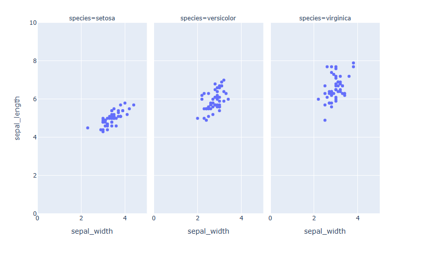
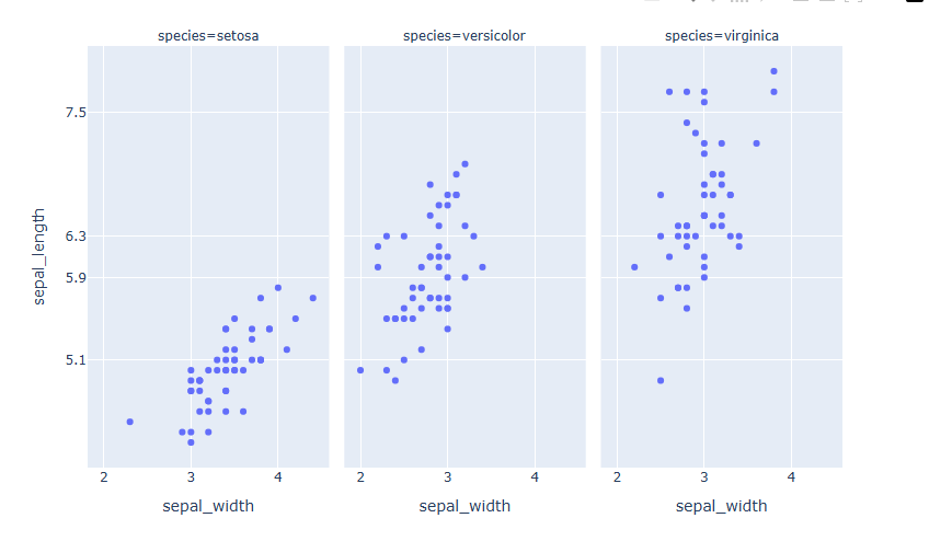
#데이터 불러오기
df = px.data.iris()
# Figure 생성
fig = px.scatter(df, x="sepal_width", y="sepal_length", facet_col="species")
# 축 범위 지정
fig.update_xaxes(range=[0, 5])
fig.update_yaxes(range=[0, 10])
fig.show()
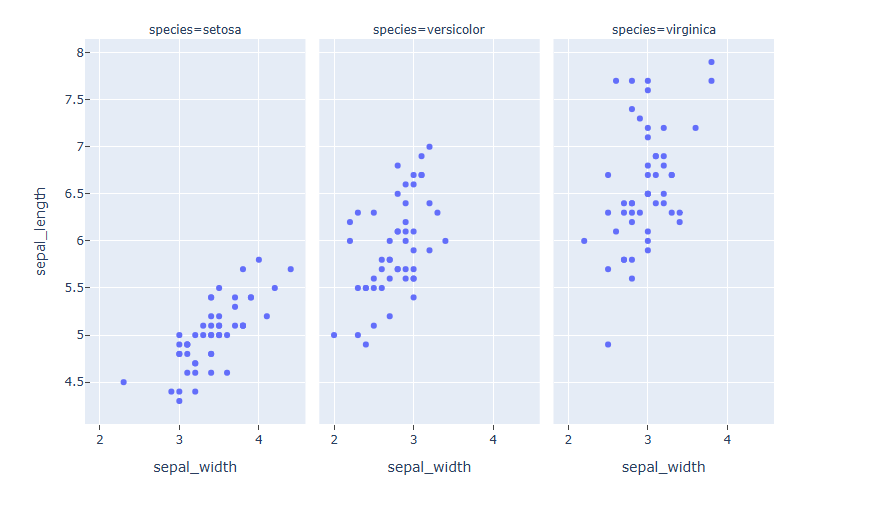
축 범위 역방향으로 지정하기
축의 범위를 역방향으로 시각화 하는 방법입니다.
fig.update_xaxes(autorange="reversed")
fig.update_yaxes(autorange="reversed")
[사용 함수]
fig.update_xaxes() : x축 업데이트 할떄 사용
fig.update_yaxes() : y축 업데이트 할때 사용
[input 내용]
autorange= "reversed",
예제
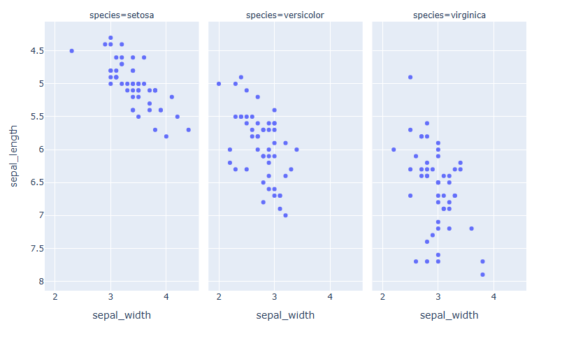
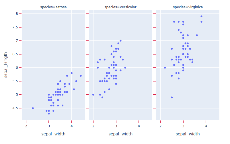
#데이터 불러오기
df = px.data.iris()
# Figure 생성
fig = px.scatter(df, x="sepal_width", y="sepal_length", facet_col="species")
# y 축 reverse
fig.update_yaxes(autorange="reversed")
fig.show()
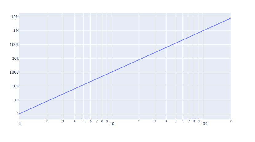
Log 스케일 지정하기
데이터의 범위가 너무 넓은경우 Log 스케일로 축을 변환합니다.
fig.update_xaxes(type="log")
fig.update_yaxes(type="log")
[사용 함수]
fig.update_xaxes() : x축 업데이트 할떄 사용
fig.update_yaxes() : y축 업데이트 할때 사용
[input 내용]
type= "log"
예제
#데이터 생성
x = np.linspace(1, 200, 30)
# Figure 생성
fig = go.Figure(go.Scatter(x=x, y=x**3))
# 축 Log 스케일로 변환
fig.update_xaxes(type="log")
fig.update_yaxes(type="log")
fig.show()
Plotly tick(눈금)/ tick 레이블 표시 설정하기
Plotly의 tick 표시방법, tick 스타일 지정 방법, tick레이블 스타일 지정 방법, tick레이블 삭제 방법에 대해 알아봅니다.
Keyword : Plotly tick, Plotly ticklabel, Plotly minortick, Plotly 눈금, Plotly 눈금 길이, tickwidth, ticklen, tickcolor, minor_tick, minor_tickwidth, minor_ticklen, minor_tickcolor
tick 기본 생성 및 위치 지정
plotly 에서는 눈금을 표시 하지 않는 것이 디폴트 값으로 지정되어 있습니다. 눈금을 추가하기 위해선 아래의 코드를 추가해야 합니다.
fig.update_xaxes(ticks="위치 입력")
fig.update_yaxes(ticks="위치 입력")
[사용 함수]
fig.update_xaxes() : x축 tick을 업데이트 할떄 사용
fig.update_yaxes() : y축 tick을 업데이트 할때 사용
[함수 input 내용]
ticks="inside" or "outside"
"inside" : 눈금을 그래프 안쪽으로 생성합니다.
"outside" : 눈금을 그래프 바깥쪽으로 생성합니다.
예제
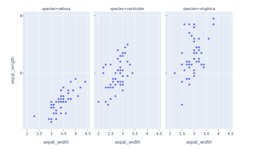
#데이터 불러오기
df = px.data.iris()
# Figure 생성
fig = px.scatter(df, x="sepal_width", y="sepal_length", facet_col="species")
# 눈금 생성
fig.update_xaxes(ticks="outside")
fig.update_yaxes(ticks="inside")
fig.show()
헌데 y 축 눈금이 3개의 Trace에 모두 생성되었습니다. 이럴경우 가시성을 높이기 위해 한가지 그래프만 선택해서 눈금 추가가 가능합니다.
#데이터 불러오기
df = px.data.iris()
# Figure 생성
fig = px.scatter(df, x="sepal_width", y="sepal_length", facet_col="species")
# 눈금 생성
fig.update_xaxes(ticks="outside")
fig.update_yaxes(ticks="inside", col=1)
fig.show()
눈금을 추가하고자 하는 Trace의 index를 col = 을 통해 지정하면 해당 Trace 만 눈금이 생성됩니다. 왼쪽부터 차례로 1,2,3 의 index를 갖게 됩니다.
tick 간격 지정
fig.update_xaxes(dtick=간격 입력)
fig.update_yaxes(dtick=간격 입력)
[사용 함수]
fig.update_xaxes() : x축 tick을 업데이트 할떄 사용
fig.update_yaxes() : y축 tick을 업데이트 할때 사용
[함수 input 내용]
dtick = 눈금 간격
예제
#데이터 불러오기
df = px.data.iris()
# Figure 생성
fig = px.scatter(df, x="sepal_width", y="sepal_length", facet_col="species")
# 눈금 생성 + 눈금 간격 지정
fig.update_xaxes(ticks="outside", dtick=0.5)
fig.update_yaxes(ticks="inside", dtick=2)
fig.show()
tick 위치 수동 입력
tick 위치를 자동 생성이 아닌 원하는 위치에만 지정해서 넣을 수 있습니다.
fig.update_xaxes(tickvals=[tick 좌료 리스트])
fig.update_yaxes(tickvals=[tick 좌료 리스트])
[사용 함수]
fig.update_xaxes() : x축 tick을 업데이트 할떄 사용
fig.update_yaxes() : y축 tick을 업데이트 할때 사용
[함수 input 내용]
tickvals = [...], tick 을 원하는 위치를 리스트 형태로 입력을 합니다.
예제
#데이터 불러오기
df = px.data.iris()
# Figure 생성
fig = px.scatter(df, x="sepal_width", y="sepal_length", facet_col="species")
# 눈금 생성 + 눈금 위치 수동 입력
fig.update_yaxes(tickvals=[5.1, 5.9, 6.3, 7.5])
fig.show()
tick 스타일 설정
fig.update_xaxes(tickwidth=두꺠, tickcolor=색, ticklen=길이)
fig.update_yaxes(tickwidth=두꺠, tickcolor=색, ticklen=길이)
[사용 함수]
fig.update_xaxes() : x축 tick을 업데이트 할떄 사용
fig.update_yaxes() : y축 tick을 업데이트 할때 사용
[함수 input 내용]
tick 스타일 은 아래의 3가지 항목에 의해 디자인 변경이 가능합니다. - tickwidth = 눈금의 두깨 - ticklen = 눈금의 길이 - tickcolor = 눈금 색
예제
#데이터 불러오기
df = px.data.iris()
# Figure 생성
fig = px.scatter(df, x="sepal_width", y="sepal_length", facet_col="species")
# 눈금 생성 + 눈금 스타일 설정
fig.update_xaxes(ticks="outside", tickwidth=2, tickcolor='crimson', ticklen=10)
fig.update_yaxes(ticks="outside", tickwidth=2, tickcolor='crimson', ticklen=10)
fig.show()
minor tick 추가
minor 눈금이란 기본 눈금 범위안의 범위의 더 작은 눈금을 뜻합니다. 자를 생각하시면 되는데요 cm 단위 사이에 mm 단위의 작은 눈금이 있습니다. 이것을 minor tick 또는 minor 눈금이라 합니다.
fig.update_xaxes(minor_ticks =위치,minor_tickwidth = 두깨, minor_ticklen = 길이, minor_tickcolor = 색)
fig.update_yaxes(minor_ticks =위치,minor_tickwidth = 두깨, minor_ticklen = 길이, minor_tickcolor = 색)
[사용 함수]
fig.update_xaxes() : x축 tick을 업데이트 할떄 사용
fig.update_yaxes() : y축 tick을 업데이트 할때 사용
[함수 input 내용]
minor_ticks = 눈금의 위치
minor_tickwidth = 눈금의 두깨
minor_ticklen = 눈금의 길이
minor_tickcolor = 눈금 색
예제
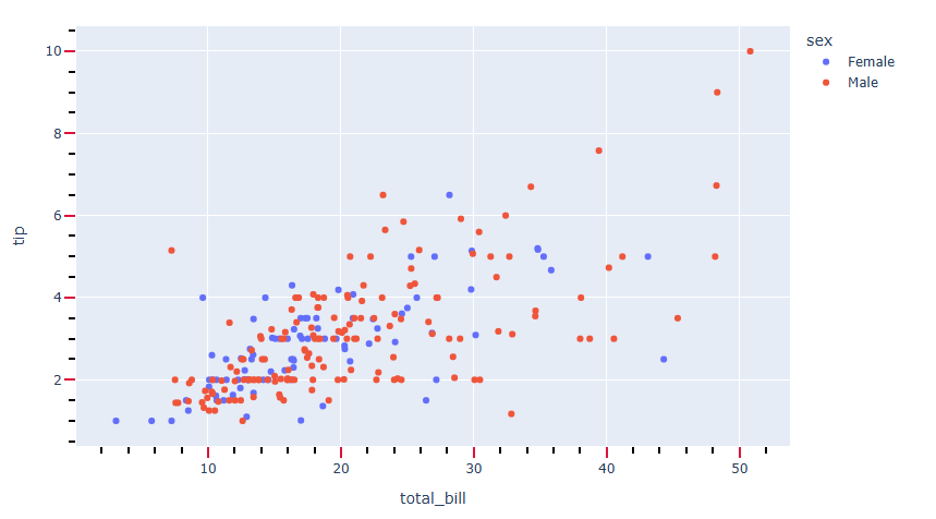
#데이터 불러오기
df = px.data.tips()
# Figure 생성
fig = px.scatter(df, x="total_bill", y="tip", color="sex")
# 눈금 생성 + 눈금 스타일 설정
fig.update_xaxes(ticks="outside", tickwidth=2, tickcolor='crimson', ticklen=10)
fig.update_yaxes(ticks="outside", tickwidth=2, tickcolor='crimson', ticklen=10)
# minor 눈금 생성 + minor  눈금 스타일 설정
fig.update_xaxes(minor_ticks="outside",minor_tickcolor = "black")
fig.update_yaxes(minor_ticks="outside",minor_tickcolor = "black")
fig.show()
tick 레이블 위치 설정
plotly에서는 tick 레이블은 자동 생성이 됩니다. tick 레이블 위치를 설정하려면 아래와 같이 작성합니다.
fig.update_yaxes(ticklabelposition="위치")
fig.update_xaxes(ticklabelposition="위치")
[사용 함수]
fig.update_xaxes() : x축 tick을 업데이트 할떄 사용
fig.update_yaxes() : y축 tick을 업데이트 할때 사용
[함수 input 내용]
ticklabelposition= tick 레이블위치
{"outside" | "inside" | "outside top" | "inside top" | "outside left" | "inside left" | "outside right" | "inside right" | "outside bottom" | "inside bottom"}
예제
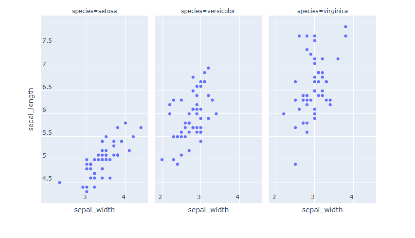
#데이터 불러오기
df = px.data.iris()
# Figure 생성
fig = px.scatter(df, x="sepal_width", y="sepal_length", facet_col="species")
# tick 레이블 위치 설정
fig.update_yaxes(ticklabelposition="inside top")
fig.update_xaxes(ticklabelposition="inside left")
fig.show()
tick 레이블 스타일 설정
fig.update_xaxes(tickangle=각도, tickfont_family=서체, tickfont_color=색, tickfont_size=사이즈)
fig.update_yaxes(tickangle=각도, tickfont_family=서체, tickfont_color=색, tickfont_size=사이즈)
fig.show()
[사용 함수]
fig.update_xaxes() : x축 tick을 업데이트 할떄 사용
fig.update_yaxes() : y축 tick을 업데이트 할때 사용
[함수 input 내용]
총 4가지 항목에 대해 스타일 지정이 가능합니다.
tickangle = tick 레이블의 각도를조절합니다.
tickfont_family =HTML font family로 plotly를 구동하는 web browser에서 지원하는 폰트를 지원합니다.
tickfont_color = 원하는 색을 지정합니다.
tickfont_size = 폰트 사이즈를 숫자로 입력합니다
예제
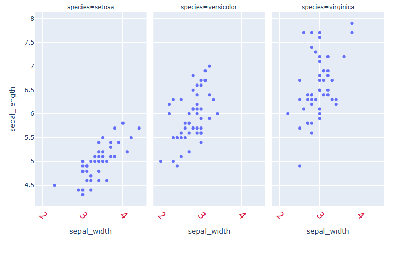
#데이터 불러오기
df = px.data.iris()
# Figure 생성
fig = px.scatter(df, x="sepal_width", y="sepal_length", facet_col="species")
# tick 레이블 스타일 설정
fig.update_xaxes(tickangle=45, tickfont_family='Rockwell', tickfont_color='crimson', tickfont_size=20)
fig.show()
tick 레이블 삭제
자동 생성된 tick 레이블 또한 아래 코드로 삭제 가능합니다.
fig.update_xaxes(showticklabels=False)
fig.update_yaxes(showticklabels=False)
[사용 함수]
fig.update_xaxes() : x축 tick을 업데이트 할떄 사용
fig.update_yaxes() : y축 tick을 업데이트 할때 사용
[함수 input 내용] - showticklabels = False
예제
#데이터 불러오기
df = px.data.iris()
# Figure 생성
fig = px.scatter(df, x="sepal_width", y="sepal_length", facet_col="species")
# tick 레이블 삭제
fig.update_xaxes(showticklabels=False)
fig.update_yaxes(showticklabels=False)
fig.show()