시작하기 전에 import 하기
import plotly.express as px
import plotly.graph_objects as go
import plotly.express as px
import numpy as np
Plotly 범례 지정하기 (Legend)
범례(Legend)는 서로다른 종류의 데이터를 색깔 또는 마커 모양으로 분류하고 표시하는 기능합니다.
Plotly에서 범례를 생성, 삭제, 위치지정, 범례타이틀 표시, 스타일 지정, 범례 그룹 지정하는 방법에 대해 알아보겠습니다.
범례 생성하기
실습 데이터
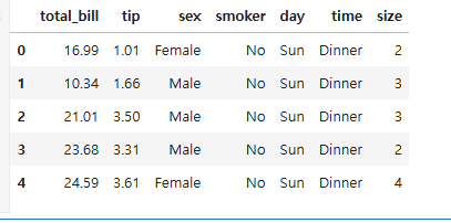
실습에 사용할 데이터는 plotly에서 제공하는 tips() 데이터를 사용합니다.
import plotly.express as px
# 실습 데이터 불러오기
df = px.data.tips()
# 실습 데이터 확인
df.head()
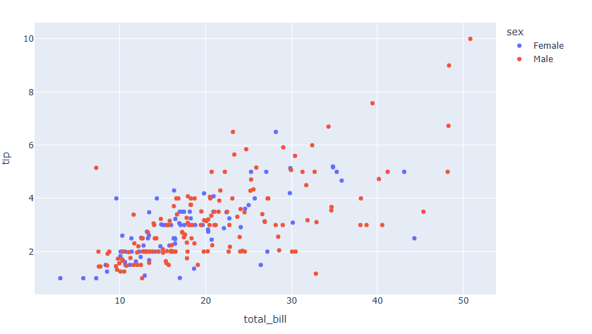
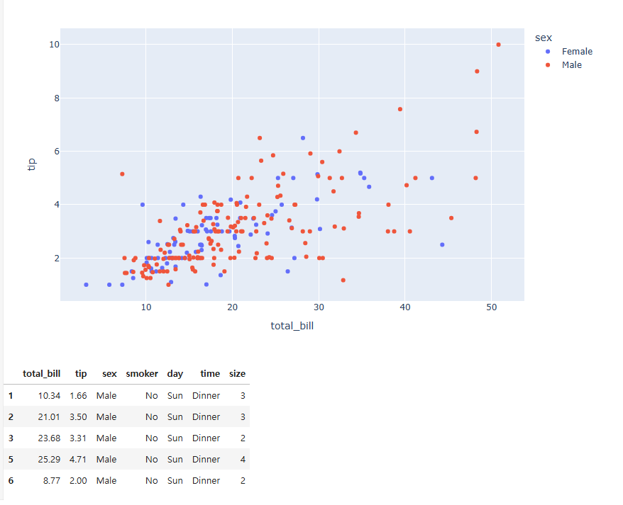
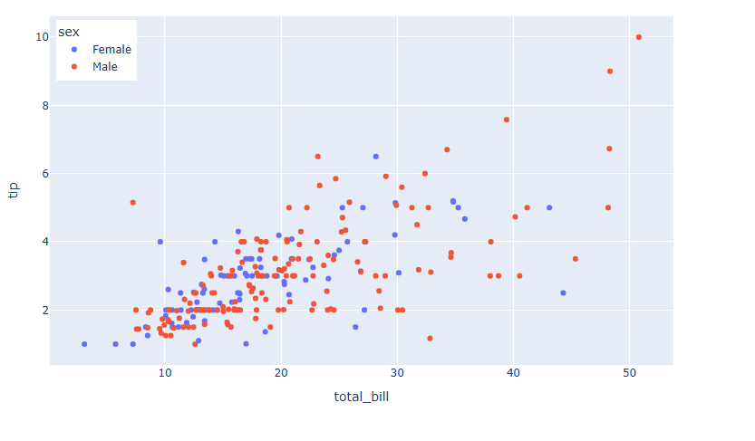
데이터는 식당에서의 소비 패턴 데이터 입니다. 실습에서는 total_bill 을 x축, tip 을 Y축으로 하여 둘의 경향성을 시각화 할 예정이고 각 성별에 따라서 색을 달리 해서 구분하고 범례를 표시 해보겠습니다.
express
express 를 통해 그래프를 생성하면 범례는 자동 생성됩니다. 다만 분류하고 하는 데이터의 컬럼명을 color = 에 넣어주면 됩니다.
import plotly.express as px
# 데이터 불러오기
df = px.data.tips()
# 그래프 그리기
fig = px.scatter(df, x="total_bill", y="tip", color="sex")
fig.show()
graph_objects
graph_objects를 통해 그래프를 생성하면 두단계의 과정이 필요합니다.
데이터 가공
graph_objects 는 직접 성별 데이터를 구분하고 따로따로 그래프를 그려줘야 합니다.
Female = df.loc[df["sex"]=="Female", :]
Female.head()
Male = df.loc[df["sex"]=="Male", :] Male.head()
그래프 그리기
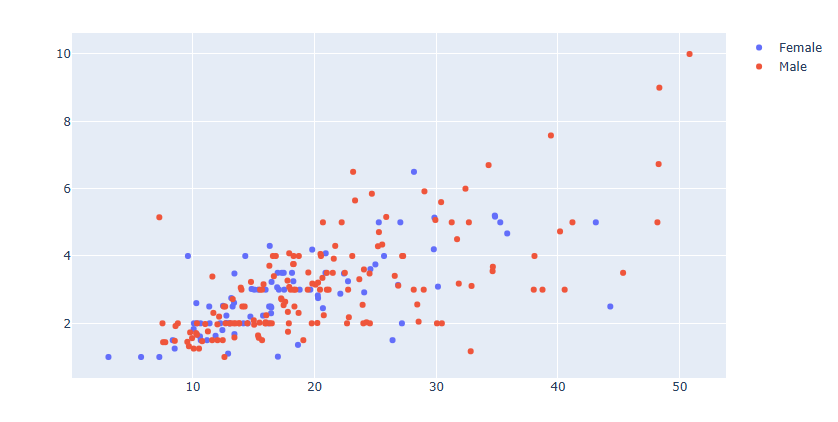
fig = go.Figure()
fig.add_trace(go.Scatter(
    x=Female.total_bill,
    y=Female.tip,
    mode='markers',
    name="Female"
))
fig.add_trace(go.Scatter(
    x=Male.total_bill,
    y=Male.tip,
    mode='markers',
    name="Male"
))
예제
# 데이터 불러오기
df = px.data.tips()
# 데이터 편집하기
Female = df.loc[df["sex"]=="Female", :]
Male = df.loc[df["sex"]=="Male", :]
# 그래프 그리기
fig = go.Figure()
fig.add_trace(go.Scatter(
    x=Female.total_bill,
    y=Female.tip,
    mode='markers',
    name="Female"
))
fig.add_trace(go.Scatter(
    x=Male.total_bill,
    y=Male.tip,
    mode='markers',
    name="Male"
))
fig.show()
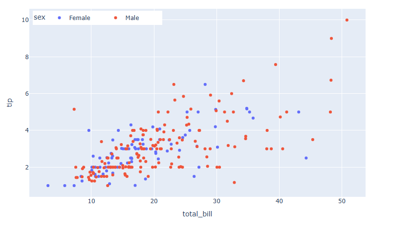
graph_objects 를 통해 그래프를 그릴때 각 Trace별로 name 만 넣어주면 범례가 자동 생성되지만 범례 타이틀은 생성이 되지 않습니다.
또한 express 는 자동으로 성별을 구분해서 시각화를 해준반면 graph_objects 데이터 전처리를 통해 직접 데이터를 구분하고 따로따로 그려줘야 하는 번거로움이 있습니다. 이것에 plotly에서 express 사용을 추천하는 가장 큰 이유입니다.
범례 삭제하기
express의 경우 범례가 자동 생성되기 때문에 범례를 삭제하려면 별도의 코드가 필요합니다.
fig.update_layout(showlegend=False)[사용 함수]
fig.update_layout ()
[함수 input 내용]
showlegend = False
예제
# 데이터 불러오기
df = px.data.tips()
# 그래프 그리기
fig = px.scatter(df, x="total_bill", y="tip", color="sex")
#범례 삭제하기
fig.update_layout(showlegend=False)
fig.show()
범례 위치 지정하기
fig.update_layout(
            legend__x = (0~1) 사이값
            legend__y = (0~1) 사이값
            legend_xanchor = (`auto","left","center","right")
            legend_yanchor = ("auto","top","middle","bottom")
            })
[사용 함수]
fig.update_layout ()
[함수 input 내용]
legend_x = 가로 축의 좌표로 0은 맨 왼쪽 1은 맨 오른쪽을 뜻합니다.
legend_y = 세로 축의 좌표로 0은 맨 아래 1은 맨 윗쪽을 뜻합니다.
legend_xanchor = 좌표를 중심으로 타이틀을 왼쪽, 또는 가운데, 오른쪽에 놓을지 설정합니다.
legend_yanchor = 좌표를 중심으로 타이틀을 위에, 또는 가운데, 아래에 놓을지 설정합니다.
예제
# 데이터 불러오기
df = px.data.tips()
# 그래프 그리기
fig = px.scatter(df, x="total_bill", y="tip", color="sex")
#범례 위치 지정하기
fig.update_layout(
    legend_yanchor="top",
    legend_y=0.99,
    legend_xanchor="left",
    legend_x=0.01
)
fig.show()
범례 가로로 길게 표시하기
fig.update_layout(
            legend_orientation = "h"
            legend_entrywidth = 가로 길이
            )
[사용 함수]
fig.update_layout ()
[함수 input 내용]
legend_orientation = "h" 가로배치, "v" 세로배치
legend_entrywidth = 가로 배치 시 총 너비 설정
예제
# 데이터 불러오기
df = px.data.tips()
# 그래프 그리기
fig = px.scatter(df, x="total_bill", y="tip", color="sex")
#범례 위치 지정하기
fig.update_layout(
    legend_orientation="h",
    legend_entrywidth=70,
    legend_yanchor="top",
    legend_y=0.99,
    legend_xanchor="left",
    legend_x=0.01
)
fig.show()
범례 스타일 지정
fig.update_layout(
                    legend_title_text= 타이틀명 text 입력,
                    legend_title_font_family = 범례 타이틀 서체,
                    legend_title_font_color= 범례 타이틀 색,
                    legend_title_font_size= 범례 타이틀 글자 크기,
                    legend_font_family= 범례 서체,
                    legend_font_size=범례 글자 크기,
                    legend_font_color=범례 색,
                    legend_bgcolor= 범례 배경색,
                    legend_bordercolor=범례 테두리 색,
                    legend_borderwidth=범례 테두리 두깨
                )
[사용 함수]
fig.update_layout ()
[함수 input 내용]
legend_title_text= 타이틀명 text 입력
legend_title_font_family = 범례 타이틀 서체 (HTML font family)
legend_title_font_color= 범례 타이틀 색
legend_title_font_size= 범례 타이틀 글자 크기
legend_font_family= 범례 서체 (HTML font family)
legend_font_size=범례 글자 크기
legend_font_color=범례 색
legend_bgcolor= 범례 배경색
legend_bordercolor=범례 테두리 색
legend_borderwidth=범례 테두리 두깨
예제
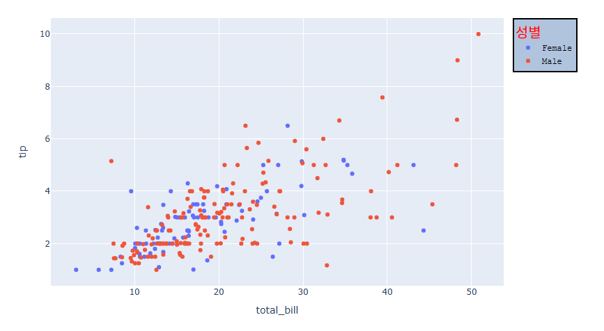
# 데이터 불러오기
df = px.data.tips()
# 그래프 그리기
fig = px.scatter(df, x="total_bill", y="tip", color="sex")
# 범례 스타일 지정하기
fig.update_layout(
                    legend_title_text='성별',
                    legend_title_font_family = "Times New Roman",
                    legend_title_font_color="red",
                    legend_title_font_size= 20,
                    legend_font_family="Courier",
                    legend_font_size=12,
                    legend_font_color="black",
                    legend_bgcolor="LightSteelBlue",
                    legend_bordercolor="Black",
                    legend_borderwidth=2
                )
fig.show()
Plotly 수직선/수평선/사각영역 그리기
수직선, 수평선은 그래프의 한쪽 끝에서 반대편 끝까지 이어지는 선을 의미합니다. 시계열 그래프에서 해당 시점을 강조할때, 산점도 그래프에서 영역을 나눌때 주로 사용하며 사각 영역은 그래프에서 일정 범위를 표시할때 유용하게 사용됩니다.
04-14 Ploty 다양한 도형 그리기 장에서 소개드린 방법은 일일이 시작 끝의 (x,y) 좌표를 모두 넣어줘야 하는 번거로움이 있지만 수직선/수평선/사각영역 그리는 것은 자주 쓰이는 그래프로 Plotly에서는 따로 함수를 구현하여 쉽게 사용할수 있도록 제공합니다.
그럼 지금부터 Plotly에서 수직선, 수평선, 사각 영역 그리는 방법에 대해 알아보겠습니다.
수직선 / 수평선 그리기
# 수평선 그리기
fig.add_hline(y= 선의 y 위치,
            line_width= 선 두깨,
            line_dash=선 스타일,
            line_color=선 색,
            annotation_text= 주석 입력,
            annotation_position= 주석 위치,
            annotation_font_size= 주석 폰트 사이즈,
            annotation_font_color=주석 폰트 색,
            annotation_font_family=주석 폰트 서체)
# 수직선 그리기
fig.add_vline(x= 선의 x 위치,
            line_width= 선 두깨,
            line_dash=선 스타일,
            line_color=선 색,
            annotation_text= 주석 입력,
            annotation_position= 주석 위치,
            annotation_font_size= 주석 폰트 사이즈,
            annotation_font_color=주석 폰트 색,
            annotation_font_family=주석 폰트 서체)
[사용 함수]
fig.add_hline() : 수평선 함수
fig.add_vline() : 수직선 함수
[함수 input 내용]
x or y = 선의 위치 좌표
line_width = 선 두깨
line_dash = 선 스타일
line_color = 선 색
annotation_text= 주석 입력
annotation_position={"top left", "top right"," bottom left", "bottom right"} 주석 위치
annotation_font_size= 주석 폰트 사이즈
annotation_font_color=주석 폰트 색
annotation_font_family=주석 폰트 서체
예제
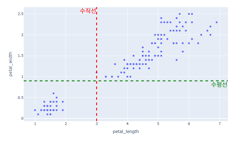
#데이터 불러오기
df = px.data.iris()
#그래프 그리기
fig = px.scatter(df, x="petal_length", y="petal_width")
# 수평선 추가하기
fig.add_hline(y=0.9,line_width=3, line_dash="dash",
              line_color="green",
              annotation_text="수평선",
              annotation_position="bottom right",
              annotation_font_size=20,
              annotation_font_color="green",
              annotation_font_family="Times New Roman")
# 수직선 추가하기
fig.add_vline(x=3,line_width=3, line_dash="dash",
              line_color="red",
              annotation_text="수직선",
              annotation_position="top left",
              annotation_font_size=20,
              annotation_font_color="red",
              annotation_font_family="Times New Roman")
fig.show()
사각 영역 그리기
# 수평 사각영역 그리기
fig.add_vrect(x0= 영역시작 x좌표, x1=영역끝 x좌표, ,line_width= 테두리 선 두깨, line_dash=테두리 선 스타일, line_color=테두리 선 색, fillcolor=영역 색, opacity=영역 투명도)
# 수직영역 그리기
fig.add_hrect(x0= 영역시작 x좌표, x1=영역끝 x좌표, ,line_width= 테두리 선 두깨, line_dash=테두리 선 스타일, line_color=테두리 선 색, fillcolor=영역 색, opacity=영역 투명도)
[사용 함수]
fig.add_vrect() : 수평 사각영역 함수
fig.add_hrect() : 수직 사각영역 함수
[함수 input 내용]
x0 or y0 = 영역 시작 좌표
x1 or y1 = 영역 끝 좌표
line_width = 테두리 선 두깨
line_dash = 테두리 선 스타일
line_color = 테두리 선 색
fillcolor = 영역 색
opacity = 영역 투명
annotation_text= 주석 입력
annotation_position={"top left", "top right"," bottom left", "bottom right"} 주석 위치
annotation_font_size= 주석 폰트 사이즈
annotation_font_color=주석 폰트 색
annotation_font_family=주석 폰트 서체
예제
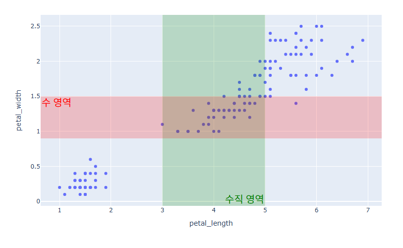
#데이터 불러오기
df = px.data.iris()
#그래프 그리기
fig = px.scatter(df, x="petal_length", y="petal_width")
# 수직 사각 영 추가하기
fig.add_vrect(x0=3, x1=5, line_width=0, fillcolor="green", opacity=0.2,
              annotation_text="수직 영역",
              annotation_position="bottom right",
              annotation_font_size=20,
              annotation_font_color="green",
              annotation_font_family="Times New Roman")
# 수평 사각 영역 추가하기
fig.add_hrect(y0=0.9, y1=1.5, line_width=0, fillcolor="red", opacity=0.2,
              annotation_text="수 영역",
              annotation_position="top left",
              annotation_font_size=20,
              annotation_font_color="red",
              annotation_font_family="Times New Roman")
fig.show()
시계열 데이터에서 수평선/사각영역 그리기
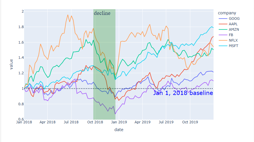
시계열 데이터에서는 일정 기간을 표기하기 위해 사각 영역을 표시하는 경우가 많습니다. 아래 예제는 주식 데이터를 활용한 Line 그래프 시각화 입니다.
시계열 데이터에서는 영역 좌표를 datetime 형태로 입력이 가능합니다.fig.add_vrect(x0="2018-09-24", x1="2018-12-18")
예제
# 주식 데이터 불러오기
df = px.data.stocks(indexed=True)
# 그래프 그리기
fig = px.line(df)
# 수평선 그리기
fig.add_hline(y=1, line_dash="dot",
              annotation_text="Jan 1, 2018 baseline",
              annotation_position="bottom right",
              annotation_font_size=20,
              annotation_font_color="blue"
             )
# 수직 영역 표시
fig.add_vrect(x0="2018-09-24", x1="2018-12-18",
              annotation_text="decline", annotation_position="top left",
              annotation=dict(font_size=20, font_family="Times New Roman"),
              fillcolor="green", opacity=0.25, line_width=0)
fig.show()
Plotly 다양한 도형 그리기
사각형 그리기
fig.add_shape(type="rect",
            x0= 왼쪽 아래 x좌표, y0= 왼쪽 아랫 y좌표,
            x1= 오늘쪽 위 x좌표, y1= 오른쪽 위 y좌표,
            line_width= 테두리선 두깨,
            line_dash= 테두리선 스타일,
            line_color= 테두리선 색,
            fillcolor= 안에 채우는 색,
            opacity = 투명도)
[사용 함수]
fig.add_shape()
[함수 input 내용]
type = "rect" 사각형 타입 선택
x0= 왼쪽 아래 x좌표
y0= 왼쪽 아랫 y좌표
x1= 오늘쪽 위 x좌표
y1= 오른쪽 위 y좌표
line_width = 테두리선 두깨
line_dash = 테두리선 스타일
line_color = 테두리선 색
fillcolor = 안에 채우는 색
opacity = (0~1) 투명도
예제
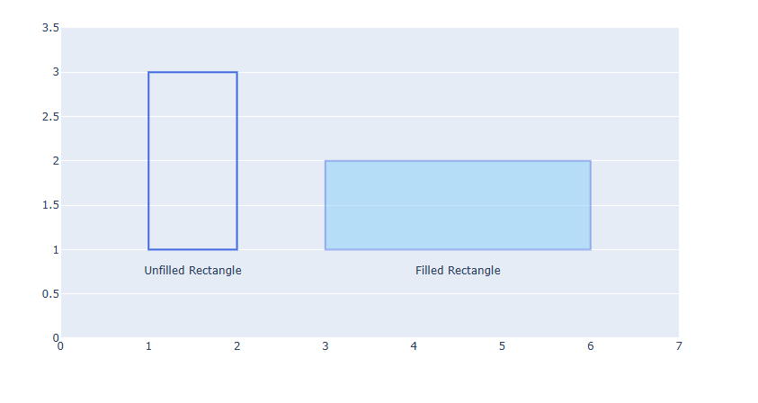
#그래프 생성
fig = go.Figure()
# 텍스트 추가
fig.add_trace(go.Scatter(
    x=[1.5, 4.5],
    y=[0.75, 0.75],
    text=["Unfilled Rectangle", "Filled Rectangle"],
    mode="text",
))
# 축 설정 변경
fig.update_xaxes(range=[0, 7], showgrid=False)
fig.update_yaxes(range=[0, 3.5])
# 사각형 그리기
fig.add_shape(type="rect",
    x0=1, y0=1, x1=2, y1=3,
    line_color="RoyalBlue")
fig.add_shape(type="rect",
    x0=3, y0=1, x1=6, y1=2,
    line_color="RoyalBlue",
    line_width=2,
    fillcolor="LightSkyBlue",
    opacity=0.5)
fig.show()
원 그리기
fig.add_shape(type="circle",
            x0= 원점 x좌표, y0= 원 y좌표,
            x1= 가로 반지름, y1= 세로 반지름,
            line_width= 테두리선 두깨,
            line_dash= 테두리선 스타일,
            line_color= 테두리선 색,
            fillcolor= 안에 채우는 색,
            opacity = 투명도)
[사용 함수]
fig.add_shape()
[함수 input 내용]
type = "circle" 원 타입 선택
x0= 원점 x좌표
y0= 원점 y좌표
x1= 가로 반지름
y1= 세로 반지름
line_width = 테두리선 두깨
line_dash = 테두리선 스타일
line_color = 테두리선 색
fillcolor = 안에 채우는 색
opacity = (0~1) 투명도
예제
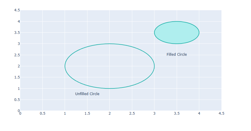
#그래프 생성
fig = go.Figure()
# 텍스트 추가
fig.add_trace(go.Scatter(
    x=[1.5, 3.5],
    y=[0.75, 2.5],
    text=["Unfilled Circle",
          "Filled Circle"],
    mode="text",
))
# 축 설정 변경
fig.update_xaxes(range=[0, 4.5], zeroline=False)
fig.update_yaxes(range=[0, 4.5])
# 원 그리기
fig.add_shape(type="circle",
    xref="x", yref="y",
    x0=1, y0=1, x1=3, y1=3,
    line_color="LightSeaGreen",)
fig.add_shape(type="circle",
    xref="x", yref="y",
    fillcolor="PaleTurquoise",
    x0=3, y0=3, x1=4, y1=4,
    line_color="LightSeaGreen",)
fig.show()
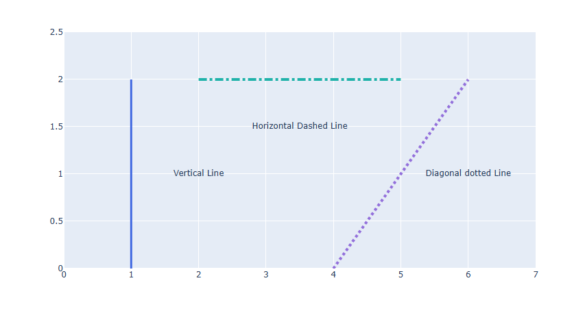
선 그리기
fig.add_shape(type="line",
            x0= 선 시작 x좌표, y0= 선 시작 y좌표,
            x1= 선 끝 x좌표, y1= 선 끝 y좌표,
            line_width= 선 두깨,
            line_dash= 선 스타일,
            line_color= 선 색,
            opacity = 투명도)
[사용 함수]
fig.add_shape()
[함수 input 내용]
type = "line" 선 타입 선택
x0= 선 시작 x좌표
y0= 선 시작 y좌표
x1= 선 끝 x좌표
y1= 선 끝 y좌표
line_width = 선 두깨
line_dash = 선 스타일
line_color = 선 색
opacity = (0~1) 투명도
예제
#그래프 생성
fig = go.Figure()
# 텍스트 추가
fig.add_trace(go.Scatter(
    x=[2, 3.5, 6],
    y=[1, 1.5, 1],
    text=["Vertical Line",
          "Horizontal Dashed Line",
          "Diagonal dotted Line"],mode="text",))
# 축 설정 변경
fig.update_xaxes(range=[0, 7])
fig.update_yaxes(range=[0, 2.5])
# 선 그리기
fig.add_shape(type="line",
    x0=1, y0=0, x1=1, y1=2,
    line_color="RoyalBlue",
    line_width=3)
fig.add_shape(type="line",
    x0=2, y0=2, x1=5, y1=2,
    line_color="LightSeaGreen",
    line_width=4,
    line_dash="dashdot")
fig.add_shape(type="line",
    x0=4, y0=0, x1=6, y1=2,
    line_color="MediumPurple",
    line_width=4,
    line_dash="dot")
fig.show()
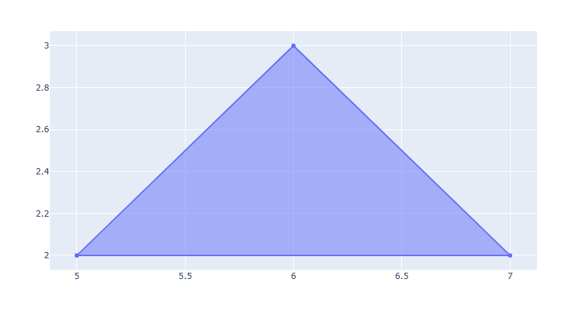
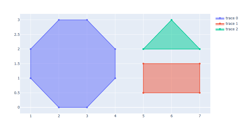
좌표를 활용해서 그리기 (다각형)
도형의 각 모서리 좌표를 활용해서 다각형을 그릴 수도 있습니다.
go.Scatter(x=[X좌표 리스트], y=[Y좌표 리스트], fill="toself")
[사용 함수]
go.Scatter()
Scatter 함수를 활용해서 삼각형부터 다각형까지 직접 모서리 좌표를 순서대로 입력해서 그릴 수 있습니다.
[함수 input 내용]
x = [...] 다각형 모서리 x좌표 리스트
y = [...] 다각형 모서리 y좌표 리스트
fill = "toself" 도형의 안을 채우려면 "toself", 채우지 않으려면 fill을 지정하기 않습니다.
예제 1
# 그래프 생성
fig = go.Figure()
# 삼각형 그리기
fig.add_trace(go.Scatter(x=[5,6,7,5], y=[2,3,2,2], fill="toself"))
fig.show()
예제 2
fig = go.Figure()
# 육각형
fig.add_trace(go.Scatter(x=[1,1,2,3,4,4,3,2,1], y=[1,2,3,3,2,1,0,0,1], fill="toself"))
# 사각형
fig.add_trace(go.Scatter(x=[5,5,7,7,5], y=[0.5,1.5,1.5,0.5,0.5], fill="toself"))
# 삼각형
fig.add_trace(go.Scatter(x=[5,6,7,5], y=[2,3,2,2], fill="toself"))
fig.show()
Plotly 텍스트/주석 넣기
Plotly를 활용해서 텍스트를 넣거나 Annotation(텍스트+화살표)을 넣는법에 대해 알아봅니다.
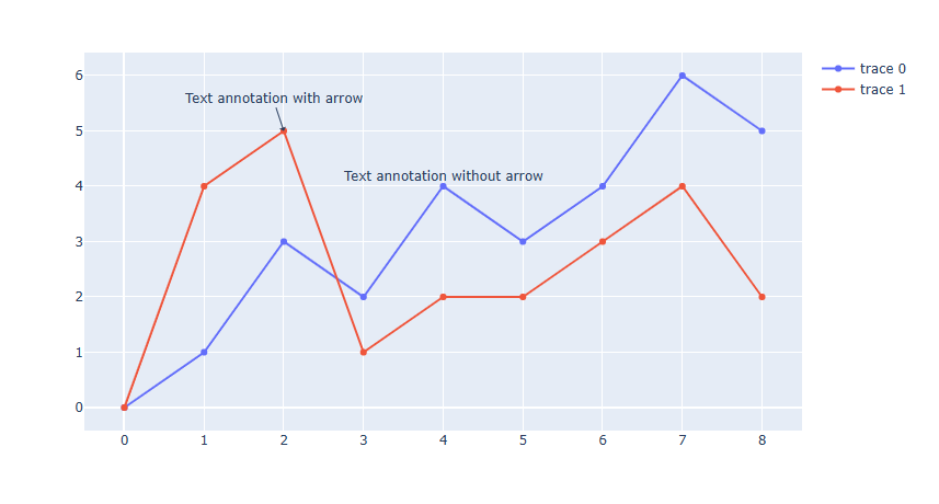
Annotation 넣기
fig.add_annotation(
            x= x 좌표, y= y 좌표,
            text= 주석 텍스트,
            textangle= 텍스트 각도,
            font_color = 텍스트 색,
            font_family = 텍스트 서체,
            font_size = 텍스트 사이즈,
            arrowhead = 화살표 스타일,
            arrowcolor= 화살표 색,
            arrowside= 화살표 방향,
            arrowsize= 화살표 크기,
            arrowwidth = 화살표 두깨,
            bgcolor=텍스트 백그라운드색,
            bordercolor= 테두리 색,
            borderwidth = 테두리 두깨,
            opacity = 투명도,
            xshift = x축 방향 평행이동,
            yshift = y축 방향 평행이동)
[사용 함수]
fig.add_annotation()
[함수 input 내용]
x = x 좌표
y = y 좌표
text = 주석 텍스트
textangle = 텍스트 각도
font_family = 텍스트 서체
font_size = 텍스트 사이즈
font_color = 텍스트 색
arrowhead = (0~8) 화살표 스타일
arrowcolor= 화살표 색
arrowside= {"end" , "start", "end+start"}화살표 방향
end : --->
start : <---
end+start : <--->
arrowsize= 화살표 크기
arrowwidth = 화살표 두깨
bgcolor=텍스트 백그라운드색
bordercolor= 테두리 색
borderwidth = 테두리 두깨
opacity = 투명도
xshift = x축 방향 평행이동
yshift = y축 방향 평행이동
예제
#그래프 생성
fig = go.Figure()
fig.add_trace(go.Scatter(
    x=[0, 1, 2, 3, 4, 5, 6, 7, 8],
    y=[0, 1, 3, 2, 4, 3, 4, 6, 5]
))
fig.add_trace(go.Scatter(
    x=[0, 1, 2, 3, 4, 5, 6, 7, 8],
    y=[0, 4, 5, 1, 2, 2, 3, 4, 2]
))
# annotation 추가
fig.add_annotation(x=2, y=5,
            text="Text annotation with arrow",
            showarrow=True,
            arrowhead=1)
fig.add_annotation(x=4, y=4,
            text="Text annotation without arrow",
            showarrow=False,
            yshift=10)
fig.show()
텍스트 넣기
go.Scatter(x=[X좌표 리스트], y=[Y좌표 리스트],text=[텍스트 리스트] mode="text", textposition= 텍스트 위치)
[사용 함수]
go.Scatter()
Scatter 함수를 활용해서 해당 좌표에 텍스트 삽입이 가능합니다..
[함수 input 내용]
x = [...] 텍스트 x좌표 리스트
y = [...] 텍스트 y좌표 리스트
text = [...] 텍스트 리스트
mode = "text" 모드를 text로 지정해야 삽입이 가능합니다..
textposition = {"top left" , "top center" , "top right" , "middle left" , "middle center", "middle right" , "bottom left" , "bottom center" , "bottom right"} 텍스트 위치 지정이 가능합니다.
※ 텍스트 스타일 은 fig.update_traces() 함수를 통해 따로 설정을 해줘야 합니다.
예제
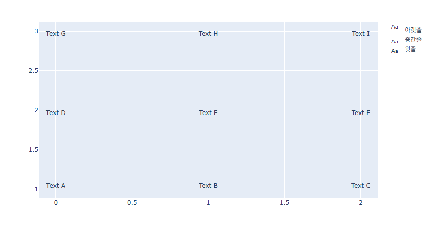
fig = go.Figure()
fig.add_trace(go.Scatter(
    x=[0, 1, 2],
    y=[1, 1, 1],
    mode="text",
    name="아랫줄",
    text=["Text A", "Text B", "Text C"],
    textposition="top center"))
fig.add_trace(go.Scatter(
    x=[0, 1, 2],
    y=[2, 2, 2],
    mode="text",
    name="중간줄",
    text=["Text D", "Text E", "Text F"],
    textposition="bottom center"))
fig.add_trace(go.Scatter(
    x=[0, 1, 2],
    y=[3, 3, 3],
    mode="text",
    name="윗줄",
    text=["Text G", "Text H", "Text I"],
    textposition="bottom center"))
fig.show()