교육 정보
- 교육 명: 경기미래기술학교 AI 교육
- 교육 기간: 2023.05.08 ~ 2023.10.31
- 오늘의 커리큘럼:
머신러닝
(7/17 ~ 7/28)- 강사: 이현주, 이애리 강사님
- 강의 계획:
1. 머신러닝
선형회귀
선형회귀의 개념
- 하나의 종속변수와 하나이상의 독립변수의 선형 관계를 모델링라는 기법
- feature가 하나면 단순선형 회귀(직선), 두개 이상이면 다중선형회귀(평면)
- 지도 학습으로, 기존 값의 관계를 나타내고 새로운 값을 예측하는 기법
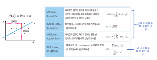
- 회귀분석의 평가지표
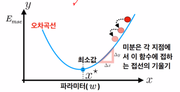
- 경사 하강법
기대수명 데이터셋으로 선형회귀 실습
데이터 분석 순서
- 데이터 분석
: target, feature, data type 등 파악- 문제 정의
: Data 기반으로 분석할수 있는, 분석하고자 하는 문제 정의- 데이터분석 방향
: target 상관도가 높은 속성을 기반으로 최적 모형을 찾기
- 오늘은 선형분석만 진행
- 세팅
# warning메시지 무시
import warnings
warnings.filterwarnings('ignore')

# 나눔바른고딕 폰트 설치 - [런타임 다시 시작]되면 폰트를 다시 설치해야 한글이 보입니다.
!apt-get install fonts-nanum

# 한글폰트 설정
import matplotlib.font_manager as fm
import matplotlib.pyplot as plt

fm.fontManager.addfont('/usr/share/fonts/truetype/nanum/NanumBarunGothic.ttf')
plt.rcParams['font.family'] = "NanumBarunGothic"

# 마이너스(음수)부호 설정
plt.rc("axes", unicode_minus = False)

# 한글, 마이너스 부호가 잘 보이는지 확인하기
plt.figure(figsize=(5,2))
plt.title('한글, 마이너스 부호 확인하기', fontsize=20)
plt.plot([-10,0,10], [-1,0,1])
plt.show()- 데이터셋 다운받기
기대수명 데이터
출처: Kaggle https://www.kaggle.com/kumarajarshi/life-expectancy-who/home
세계보건기구(World Health Organization, WHO)에서 수집한 193개국 기대수명, 건강요인과 관련된 데이터셋과 UN웹사이트에서 수집된 경제 데이터셋
2000년~2015년 사이의 나라별 기대수명, 보건 예산, 질병 통계, 비만도 등
✏️각 필드에 대한 설명
Country: 국가명
Year: 2000년부터 2015년까지의 연도
Status: Developed(선진국) or Developing(개발도상국) status
Life expectancy: 기대수명(나이)
Adult Mortality: 15세~60세사이의 성인 1000명당 사망자수
infant deaths: 유아 1000명당 사망자수
Alcohol: 1인당 알콜 소비량
percentage expenditure: GDP 대비 보건 예산 지출비율(%)
Hepatitis B: 1세 아동의 B형 간염 예방 접종률(%)
Measles: 인구 1000명당 홍역 예방 접종률(%)
BMI: 전인구 평균 체질량 지수
Under-five deaths: 5세이하 아동 1000명당 사망자수
Polio: 1세 아동의 소아마지 면역률(%)
Total expenditure: 정부 총예산 대비 보건 분야 예산(%)
Diphtheria: 1세 아동의 디프테리아 예방 접종률(%)
HIV/AIDS: HIV/AIDS 감염상태로 태어남 0-4세 인구 1000명당 사망자수
GDP: 1인당 GDP
Population: 국가 총인구
thinness 1-19 years: 1-19 세 청소년 중 저체중 비율
thinness 5-9 years:5-9세 사이의 아동의 저체중 비율
Income composition of resources: 소득에 따른 자기 투자 정도
Schooling: 학교 재학 연수
- 데이터 확인
# 필요한 라이브러리 import
import numpy as np
import matplotlib.pyplot as plt
import seaborn as sns
import pandas as pd

df = pd.read_csv('/content/drive/MyDrive/Colab Notebooks/경기미래기술학교AI과정/230717/data/Life Expectancy Data.csv')

df.shape
df.columns
df.info()

#
# 결과
(2938, 22)

Index(['Country', 'Year', 'Status', 'Life expectancy ', 'Adult Mortality',
       'infant deaths', 'Alcohol', 'percentage expenditure', 'Hepatitis B',
       'Measles ', ' BMI ', 'under-five deaths ', 'Polio', 'Total expenditure',
       'Diphtheria ', ' HIV/AIDS', 'GDP', 'Population',
       ' thinness  1-19 years', ' thinness 5-9 years',
       'Income composition of resources', 'Schooling'],
      dtype='object')

<class 'pandas.core.frame.DataFrame'>
RangeIndex: 2938 entries, 0 to 2937
Data columns (total 22 columns):
 #   Column                           Non-Null Count  Dtype
---  ------                           --------------  -----
 0   Country                          2938 non-null   object
 1   Year                             2938 non-null   int64
 2   Status                           2938 non-null   object
 3   Life expectancy                  2928 non-null   float64
 4   Adult Mortality                  2928 non-null   float64
 5   infant deaths                    2938 non-null   int64
 6   Alcohol                          2744 non-null   float64
 7   percentage expenditure           2938 non-null   float64
 8   Hepatitis B                      2385 non-null   float64
 9   Measles                          2938 non-null   int64
 10   BMI                             2904 non-null   float64
 11  under-five deaths                2938 non-null   int64
 12  Polio                            2919 non-null   float64
 13  Total expenditure                2712 non-null   float64
 14  Diphtheria                       2919 non-null   float64
 15   HIV/AIDS                        2938 non-null   float64
 16  GDP                              2490 non-null   float64
 17  Population                       2286 non-null   float64
 18   thinness  1-19 years            2904 non-null   float64
 19   thinness 5-9 years              2904 non-null   float64
 20  Income composition of resources  2771 non-null   float64
 21  Schooling                        2775 non-null   float64
dtypes: float64(16), int64(4), object(2)
memory usage: 505.1+ KB- 데이터 전처리 - 열이름 변경
# 열중에 필요없는 공백 있는거 수정
df.rename(columns={'Life expectancy ':'Life expectancy' ,
                   'Measles ':'Measles',
                   'under-five deaths ':'under-five deaths',
                   'Diphtheria ':'Diphtheria',
                   ' BMI':'BMI',
                   ' HIV/AIDS':'HIV/AIDS',
                   ' thinness  1-19 years':'thinness 1-19 years',
                   ' thinness 5-9 years':'thinness 5-9 years'
                   }, inplace = True)
df.columns

#
# 결과
Index(['Country', 'Year', 'Status', 'Life expectancy', 'Adult Mortality',
       'infant deaths', 'Alcohol', 'percentage expenditure', 'Hepatitis B',
       'Measles', ' BMI ', 'under-five deaths', 'Polio', 'Total expenditure',
       'Diphtheria', 'HIV/AIDS', 'GDP', 'Population', 'thinness 1-19 years',
       'thinness 5-9 years', 'Income composition of resources', 'Schooling'],
dtype='object')- 데이터 전처리 - 결측치 처리
df.isna().sum()
df.describe()
#
# 결과
Country                              0
Year                                 0
Status                               0
Life expectancy                     10
Adult Mortality                     10
infant deaths                        0
Alcohol                            194
percentage expenditure               0
Hepatitis B                        553
Measles                              0
 BMI                                34
under-five deaths                    0
Polio                               19
Total expenditure                  226
Diphtheria                          19
HIV/AIDS                             0
GDP                                448
Population                         652
thinness 1-19 years                 34
thinness 5-9 years                  34
Income composition of resources    167
Schooling                          163
dtype: int64
# 모든값이 수치형이므로 평균값으로 대체 (일반적인 경우)
# (범주형 데이터의 경우 보통 최빈값을 대체)
df.fillna(df.mean(), inplace=True)
df.isna().sum()
#
# 결과
Country                            0
Year                               0
Status                             0
Life expectancy                    0
Adult Mortality                    0
infant deaths                      0
Alcohol                            0
percentage expenditure             0
Hepatitis B                        0
Measles                            0
 BMI                               0
under-five deaths                  0
Polio                              0
Total expenditure                  0
Diphtheria                         0
HIV/AIDS                           0
GDP                                0
Population                         0
thinness 1-19 years                0
thinness 5-9 years                 0
Income composition of resources    0
Schooling                          0
dtype: int64- 시각화
import random

# hexadecimal 형식으로 랜덤 색 선택
def rand_color():
    return '#'+''.join([random.choice('0123456789ABCDEF') for _ in range(6)])

# 숫자 컬럼만 선택
numerical_columns = df.select_dtypes(include=[np.number]).columns.tolist()

# 서브블롯의 행을 계산
num_cols = len(numerical_columns)
num_rows = num_cols // 4
num_rows += num_cols % 4
position = range(1, num_cols+1)

# 서브블롯으로 히스토그램 그리기
fig = plt.figure(figsize = (16, num_rows * 4 ))
for k, col in zip(position, numerical_columns ):
  ax = fig.add_subplot(num_rows, 4, k)
  sns.distplot(df[col], color=rand_color(), ax = ax )
  ax.set_title(col)

#layout 조정
plt.tight_layout()
plt.show()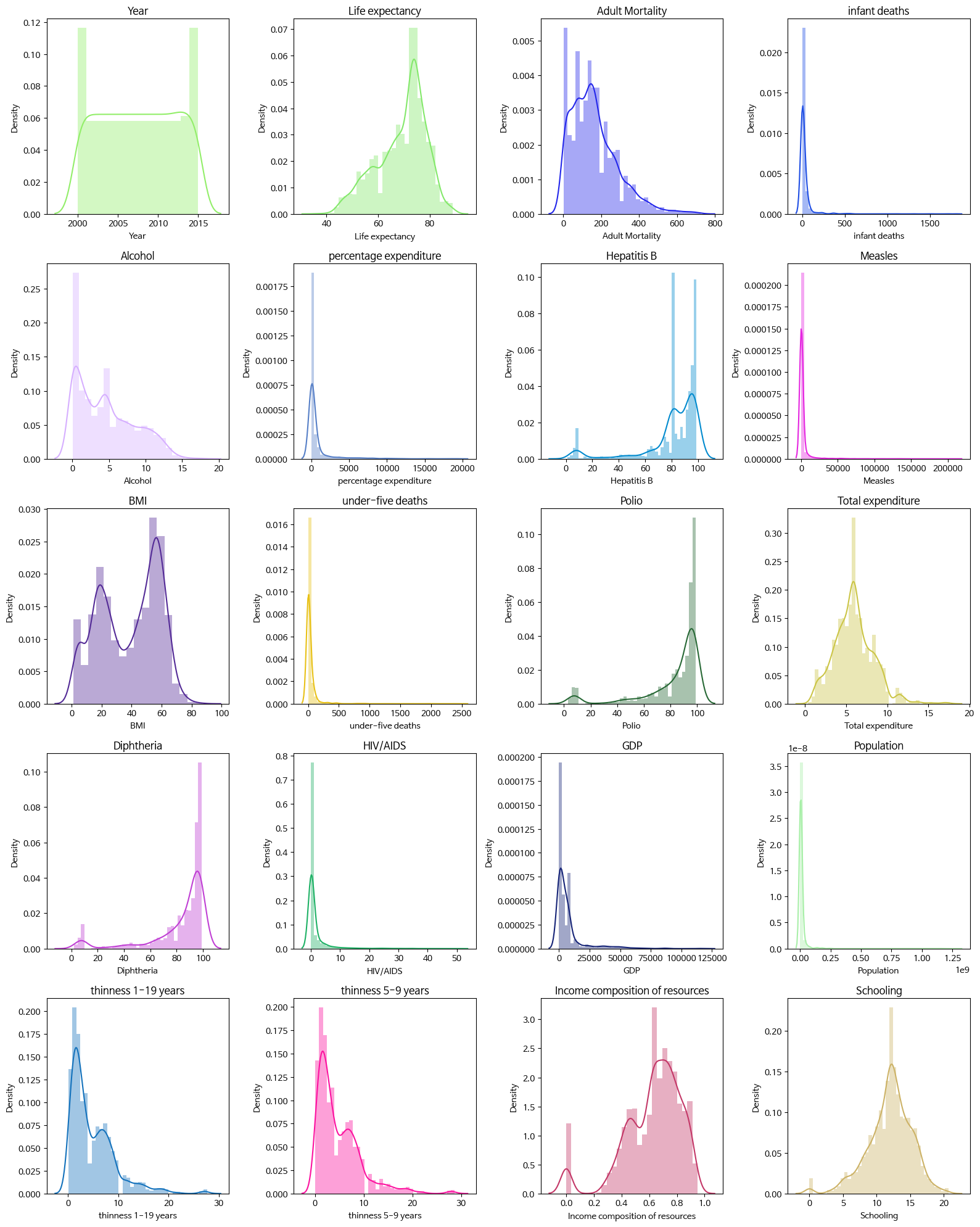
- 이상치 확인 및 처리 - Box Plot
fig = plt.figure(figsize=(16, num_rows * 4))

#서브플롯으로 boxplot 그리기
fig = plt.figure(figsize = (16, num_rows * 4 ))
for k, col in zip(position, numerical_columns ):
  ax = fig.add_subplot(num_rows, 5, k)
  sns.boxplot(df[col], color=rand_color(), ax = ax )
  ax.set_title(col)

plt.tight_layout()
plt.show()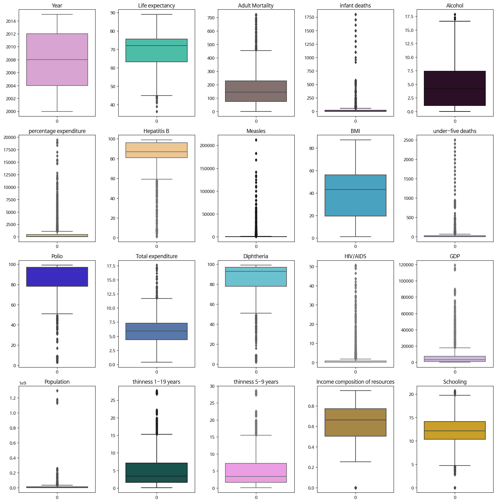
✏️ Target인 Life expectancy 데이터를 직접 봤을때 outlier로 생각되는 값은 없으나 연습삼아 해봄
# 중요한 값만 이상치 처리 - 우선 target값인 Life expectancy의 이상치를 처리
sns.boxplot(df['Life expectancy'])
plt.show()
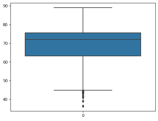
#q1, q3,irq 계산
def outliners_iqr(data):
q1, q3 = np.percentile(data, [25, 75])
iqr = q3 - q1
lower = q1 - (iqr * 1.5)
upper = q3 + (iqr * 1.5)
return data[(data>upper)|(data<lower)].index
# 이상치 추출
le_out_idx = outliners_iqr(df['Life expectancy'])
print(le_out_idx)
print(len(le_out_idx))
print(len(le_out_idx)/df.shape[0])
# 이상치 삭제
print(df.shape)
df = df.drop(le_out_idx, axis=0)
print(df.shape)
#
# 결과
Int64Index([1127, 1484, 1582, 1583, 1584, 1585, 2306, 2307, 2308, 2309, 2311,
2312, 2920, 2921, 2932, 2933, 2934],
dtype='int64')
17
0.005786249149081007
(2938, 22)
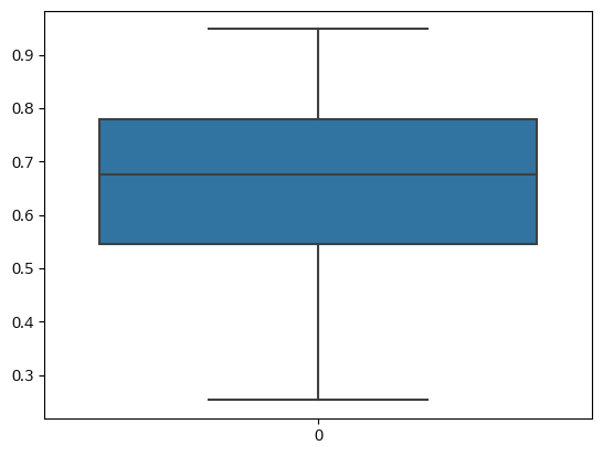
(2921, 22)# 이상치를 처리하였으므로 Box plot 다시 그려보기
sns.boxplot(df['Life expectancy'])
plt.show()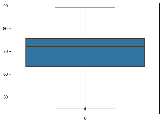
- 상관관계 분석
# 수치
df.corr().round(3)
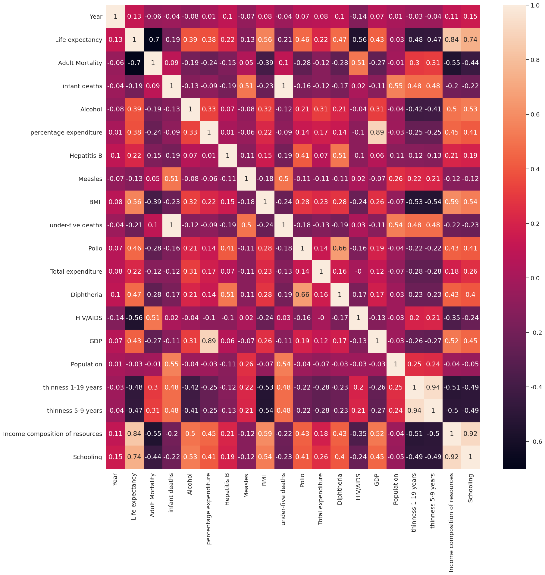
# 시각화
sns.heatmap(df.corr().round(3), annot = True)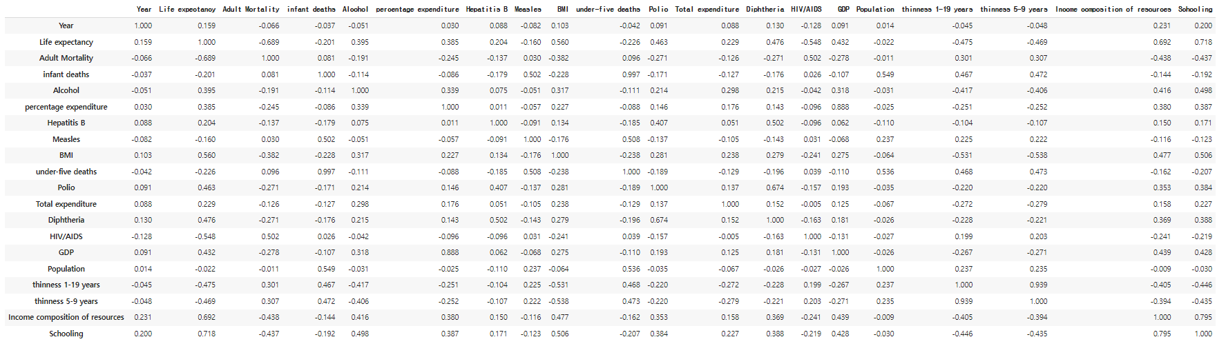
- Target(Life expectancy) 관련 상관도 분석
# 상관도 Top 5
df.corr()['Life expectancy'].abs().sort_values(ascending=False)[1:6]
#
# 결과
Schooling                          0.718292
Income composition of resources    0.691621
Adult Mortality                    0.689036
 BMI                               0.559576
HIV/AIDS                           0.548466
Name: Life expectancy, dtype: float64
abs_sorted = df.corr()['Life expectancy'].abs().sort_values(ascending=True)
abs_sorted = abs_sorted[:-1]
fig, ax = plt.subplots()
ax = plt.barh(abs_sorted.index, abs_sorted)
plt.title('correlation of life expectancy and features')
plt.xlabel('features')
plt.ylabel('corr')
plt.show()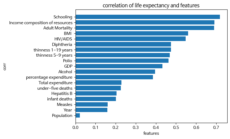
- 상관도가 높은 5개 feature의 pair plot
# 기대수명+상위5개, 총 6개
highcorr = df.corr()['Life expectancy'].abs().sort_values(ascending=False)[:6].index
print(highcorr)
sns.pairplot(df[highcorr])
plt.show()
#
# 결과
Index(['Life expectancy', 'Schooling', 'Income composition of resources',
       'Adult Mortality', ' BMI ', 'HIV/AIDS'],
      dtype='object')
- Pair plot에서 확인한 이상치 처리 - Income composition of resources
# 'Income composition of resources' 이상치 확인
sns.boxplot(df['Income composition of resources'])
# 'Income composition of resources' 이상치 처리
out_icr = outliners_iqr(df['Income composition of resources'])
print(out_icr)
print(len(out_icr))
print(len(out_icr)/df.shape[0])
print(df.shape)
df = df.drop(out_icr, axis=0)
print(df.shape)
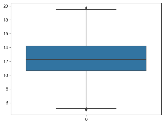
# 'Income composition of resources' 이상치 확인
sns.boxplot(df['Income composition of resources'])
#
# 결과
Int64Index([ 74, 75, 76, 77, 78, 79, 175, 293, 294, 295,
...
2710, 2711, 2712, 2841, 2852, 2853, 2854, 2855, 2856, 2857],
dtype='int64', length=130)
130
0.044505306401917154
(2921, 22)
(2791, 22)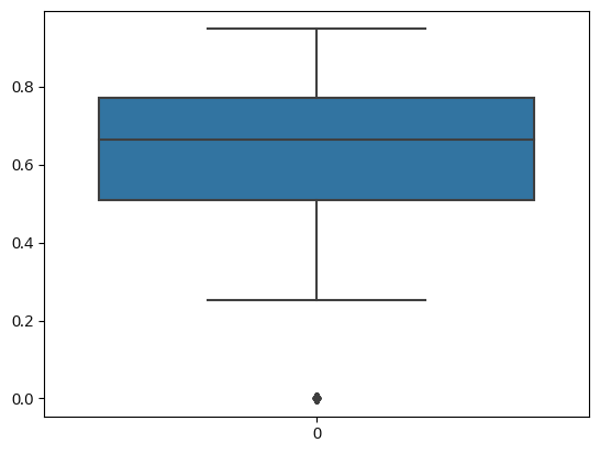
- Pair plot에서 확인한 이상치 처리 - Schooling
# 'Schooling' 이상치 확인
sns.boxplot(df['Schooling'])
# 'Schooling' 이상치 처리
out_sch = outliners_iqr(df['Schooling'])
print(out_sch)
print(len(out_sch))
print(len(out_sch)/df.shape[0])
print(df.shape)
df = df.drop(out_sch, axis=0)
print(df.shape)
sns.boxplot(df['Schooling'])
#
# 결과
Int64Index([  63,  112,  113,  114,  115,  116,  121,  122,  123,  124,  125,
             126,  127,  408,  409,  428,  429,  430,  431,  542,  761,  762,
             763,  764,  765,  766,  767,  768,  895,  896, 1089, 1631, 1632,
            1633, 1650, 1850, 1881, 1882, 1883, 1884, 1885, 1886, 1887, 1888,
            1889, 1890, 1891, 1892, 2409, 2410, 2411, 2412, 2413, 2713],
           dtype='int64')
54
0.01934790397706915
(2791, 22)
(2737, 22)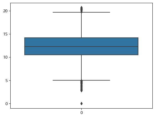
-
선형 회귀 모델 학습 및 평가
- 상관도 높은 5가지 feature로 학습 및 평가
-
feature target 분리
X = df[highcorr[1:]]
y = df['Life expectancy']- Train Test Split
from sklearn.model_selection import train_test_split

X_train, X_test, y_train, y_test = train_test_split(X, y, test_size = 0.2, random_state=0)

print(df.shape)
print(X_train.shape)
print(y_train.shape)
print(X_test.shape)
print(y_test.shape)
#
# 결과
(2737, 22)
(2189, 5)
(2189,)
(548, 5)
(548,)- 모델 생성 및 학습
# 선형회귀 모델 생성 및 초기화
from sklearn.linear_model import LinearRegression
regr = LinearRegression()

# 학습
regr.fit(X_train, y_train)

# 직선의 기울기(계수)
coef = regr.coef_

# 직선의 절편
intercept = regr.intercept_

print('선형회귀모델의 계수=',coef )
# 이 값은 계수 이므로 feature의 개수만큼 나와야 함
print('선형회귀모델의 절편=',intercept )
#
# 결과
선형회귀모델의 계수= [-1.08454427e-01  3.78661591e+01 -1.78416892e-02  2.88820373e-02
 -3.89970752e-01]
선형회귀모델의 절편= 48.45036587722861- 모델 평가
# score는 정확도 점수를 계산 (Score Default = R2, 1에 가까울수록 성능 우수 )
score = regr.score(X_train, y_train).round(3)
print(score)
score = regr.score(X_test, y_test).round(3)
print(score)
#
# 결과
0.829
0.82- 예측 및 평가
- mse, mas, r2의 차이의 값을 평가해서 성능이 우수하도록 모델을 학습시킴
from sklearn.metrics import mean_squared_error, mean_absolute_error, r2_score

#예측
y_pred = regr.predict(X_test)

#mse, mas r2
print(mean_squared_error(y_test, y_pred))
print(mean_absolute_error(y_test, y_pred))
print(r2_score(y_test, y_pred))
#
# 결과
16.059715873720297
2.772168666205379
0.8204280913014828- 개별 데이터 예측해보기
- ❗ 데이터의 shape도 맞춰야 함 (2차원 데이터를 받는다면 (3,)이 아니라 (3, 1) 형태라는 식)
# 데이터 형태 확인
X_train.mean()

# 데이터 생성
test_d = [16, 0.3, 30, 30, 1.61]
test_d = np.array (my).reshape(-1,5) # 2차원으로 바꿔야 모델에 넣을수 있음
test_d

# 예측
test_pred = regr.predict(test_d)
test_pred

#
# 결과
Schooling                           12.295128
Income composition of resources      0.663033
Adult Mortality                    158.290992
 BMI                                39.015175
HIV/AIDS                             1.619050
dtype: float64

array([[16.  ,  0.3 , 30.  , 30.  ,  1.61]])

array([57.7783003])
1차원 배열 2차원 배열로 만들기 newaxis, reshape
# newaxis
x = [162, 179, 166, 169, 171]
a = np.array(x)
print('a', a)
X = a[:, np.newaxis]
print('X', X)

# reshape
X2 = np.array(x).reshape(-1,1)
print('X2', X2)
#
# 결과
a [162 179 166 169 171]
X [[162]
 [179]
 [166]
 [169]
 [171]]
X2 [[162]
 [179]
 [166]
 [169]
 [171]]
-
사용가능한 다른 알고리즘
-
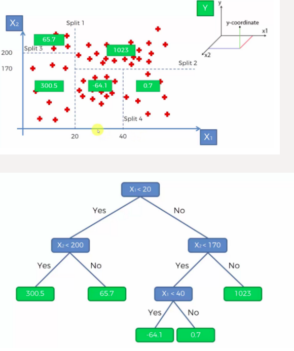
DecisionTreeRegressor
-
RandomForestRegressor
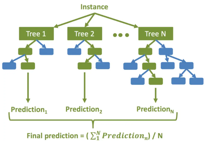
생성할 결정 트리 N의 수를 결정합니다.
부트스트래핑 방법을 사용하여 훈련 세트에서 K개의 데이터 샘플을 무작위로 가져옵니다.
위의 K 데이터 샘플을 사용하여 의사 결정 트리를 만듭니다.
N개의 의사 결정 트리가 생성될 때까지 2단계와 3단계를 반복합니다.
N개의 결정 트리 각각을 사용하여 회귀 결과를 예측합니다. 그런 다음 이러한 결과의 평균을 취하여 최종 회귀 출력에 도달합니다
-
-
RandomForestRegressor 장점
-
RandomForestRegressor는 앙상블 학습을 통해 다양한 특성과 데이터의 조합에 대해 좋은 예측 성능을 제공하는 모델을 만들어냅니다. 랜덤 포레스트는 과적합(Overfitting)에 강하고, 변수 중요도(Feature Importance)를 제공하여 어떤 특성이 예측에 중요한 역할을 하는지 확인할 수 있습니다.
-
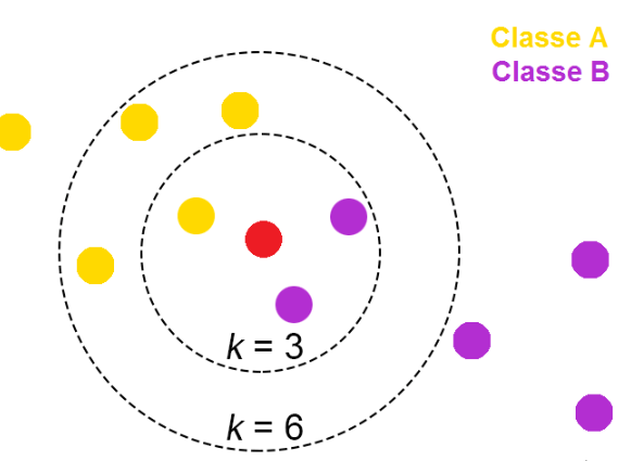
KNeighborsRegressor
-
KNeighborsRegressor는 K-최근접 이웃 회귀 알고리즘을 기반으로 하는 머신러닝 모델입니다. 이 알고리즘은 주어진 데이터 포인트의 주변에 있는 K개의 가장 가까운 이웃 데이터 포인트의 평균 값을 사용하여 예측을 수행합니다. 회귀 분석에 사용되며, 연속형 목표 변수를 예측하는 데에 주로 사용됩니다.
K 이웃 선택: 모델은 예측을 위해 주어진 데이터 포인트의 주변에 있는 K개의 가장 가까운 이웃을 선택합니다. 이웃은 일반적으로 유클리디안 거리(Euclidean distance)를 기준으로 측정됩니다.
이웃 값 평균 계산: 선택된 K개의 이웃 데이터 포인트의 목표 변수(y) 값을 평균하여 예측값을 계산합니다. 회귀 모델이므로 예측값은 연속형이며, 평균 값으로 계산됩니다.
예측: 새로운 데이터 포인트에 대해 K개의 이웃 데이터 포인트의 목표 변수 값의 평균을 예측값으로 사용합니다.
KNeighborsRegressor는 주로 이웃의 개수(K)와 거리 측정 방법을 선택하는 데에 의해 조정됩니다. K 값이 작을수록 모델은 데이터의 민감도가 높아지며, K 값이 커질수록 모델은 데이터의 민감도가 낮아집니다. 거리 측정 방법은 일반적으로 유클리디안 거리 외에도 다른 거리 측정 방법(예: 맨해튼 거리)을 선택할 수 있습니다.
KNeighborsRegressor는 간단하고 직관적인 모델이지만, 데이터의 크기가 커지면 계산 비용이 증가하고 예측 속도가 느려질 수 있습니다. 또한 이웃의 개수(K)와 거리 측정 방법에 따라 모델의 성능이 크게 달라질 수 있으므로, 적절한 K 값과 거리 측정 방법을 선택하는 것이 중요합니다.
-
Plotly
- Python으로 반응형 그래프(Interactive graph)로 시각화를 할 수 있는 무료 오픈소스 그래프 라이브러리
- plotly.express: 빠름
- plotly.graph_objects: 세세한 시각화
Plotly homepage
참조-한국어 위키
Plotly 기초
- 설치 및 불러오기
!pip install plotly==5.11.0

# graph_objects 패키지를  go 로 불러옴
import plotly.graph_objects as go- 기본 그래프 생성
# go.Figure() 함수를 활용하여 기본 그래프를 생성
fig = go.Figure(
    # Data
    data = [go.Bar(x=[1, 2, 3], y=[1, 3, 2])],

    #layout
    layout = go.Layout(
        title=go.layout.Title(text='bar chart by graphic module')
    )
)

# figure 랜더링
fig.show()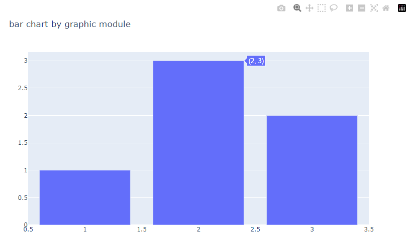
→ 이런식으로 인터랙티브 그래프가 생성됨
- express 모듈을 활용한 그래프
import plotly.express as px
fig = px.bar(x=[1, 2, 3], y=[1, 3, 2], title='bar chart')
fig.show()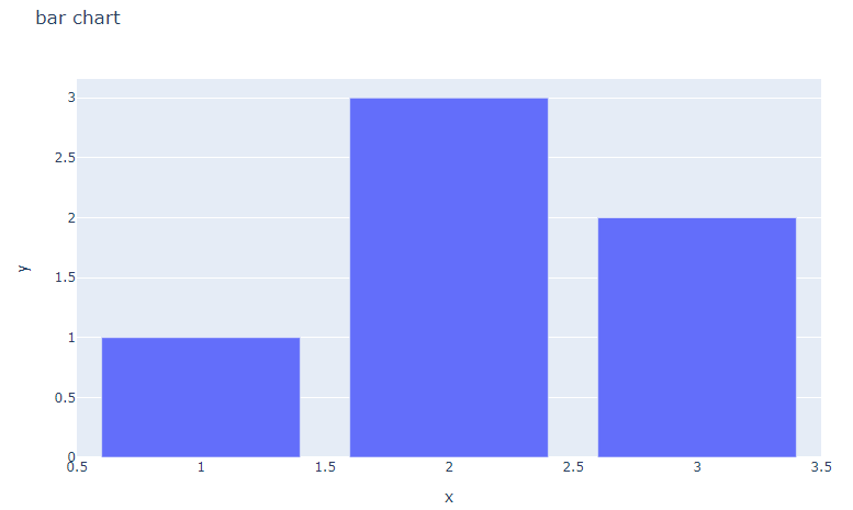
- add_trace()
import plotly.express as px

# 데이터 불러오기
df2 = px.data.iris()

# express를 활용한 scatter plot 생성
fig = px.scatter(df2, x="sepal_width", y="sepal_length", color="species",
                 title="add_trace() 활용")

#선을 추가하고싶을때
fig.add_trace(
    go.Scatter(
        # 아래 값은 아무값이나 준것
        x=[2,4],
        y=[4,8],
        mode='lines'
    )
)

fig.show()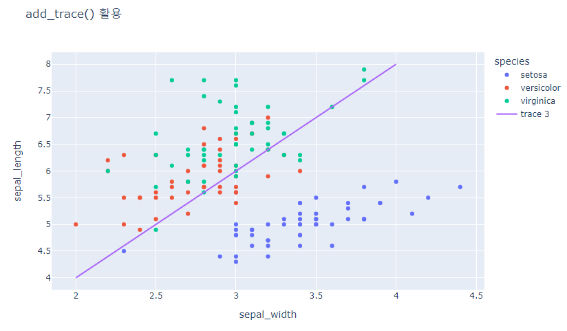
- update_trace()
from plotly.subplots import make_subplots

# subplot 생성
fig = make_subplots(rows=1, cols=2)

# Trace 추가하기
fig.add_scatter(y=[4, 2, 3.5], mode="markers",
                marker=dict(size=20, color="LightSeaGreen"),
                name="a", row=1, col=1)

fig.add_bar(y=[2, 1, 3],
            marker=dict(color="MediumPurple"),
            name="b", row=1, col=1)

fig.add_scatter(y=[2, 3.5, 4], mode="markers",
                marker=dict(size=20, color="MediumPurple"),
                name="c", row=1, col=2)

fig.add_bar(y=[1, 3, 2],
            marker=dict(color="LightSeaGreen"),
            name="d", row=1, col=2)

# 한번에 Bar plot 만 파란색으로 바꾸기
fig.update_traces(marker=dict(color='RoyalBlue'),
                  selector=dict(type='bar'))

fig.show()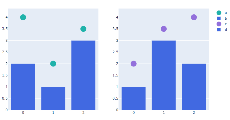
- update_layout()
import plotly.graph_objects as go

#그래프 생성
fig = go.Figure(data=go.Bar(x=[1, 2, 3], y=[1, 3, 2]))

# 타이틀 추가하기
fig.update_layout(title_text='update_layout')

fig.show()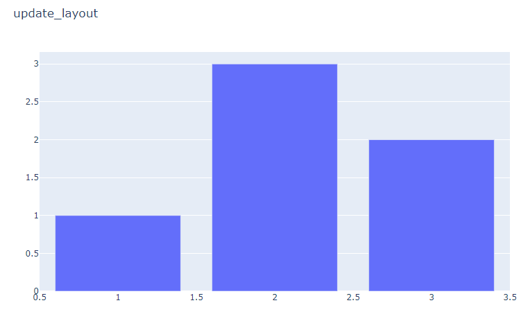
- update_xaxes() / update_yaxes
import plotly.graph_objects as go
import plotly.express as px

#데이터 생성
df3 = px.data.tips()
x = df3["total_bill"]
y = df3["tip"]

# 그래프 그리기
fig = go.Figure(data=go.Scatter(x=x, y=y, mode='markers'))

# 축 타이틀 추가하기
fig.update_xaxes(title_text='Total Bill')
fig.update_yaxes(title_text='Tip')

fig.show()
- histogram
import plotly.express as px #반응형 시각화 라이브러리
fig = px.histogram(df, x='Life expectancy')
fig.show()
- violin plot
- Box plot + 커널 밀도 곡선(Kernel Density Curvce) : 더 자세한 분포 표현
fig = px.violin(df, x='Status',
                y='Life expectancy',
                color = 'Status',
                box=True,
                title='Life expectancy by country status')
fig.show()
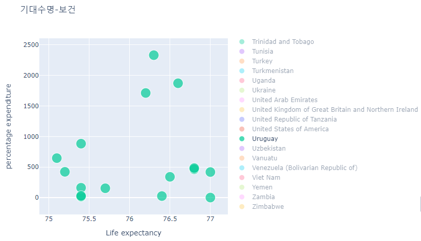
- 산점도 Scatter
fig = px.scatter(df, x='Life expectancy',
                 y='percentage expenditure',
                 color='Country',
                 size='Year',
                 title='기대수명-보건')
fig.show()
- 3차원 산점도 3D
# 3d 산점도
px.scatter_3d(df.sort_values(by='Year'),
              x='Life expectancy',
              y='Schooling',
              z='Total expenditure',
              color='Country',
              size='Total expenditure')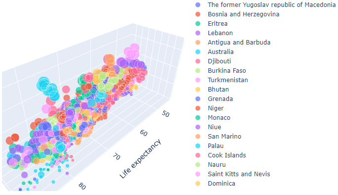
- line plot, 애니메이션
fig = px.line(df.sort_values(by='Year'),
              x='Year',
              y='Life expectancy',
              animation_frame='Country',
              animation_group='Year',
              color='Country',
              markers=True,
              title='Life expectancy by country')
fig.update_layout(width=1200, height=800)
fig.update_yaxes(range=[0, 100])
fig.show()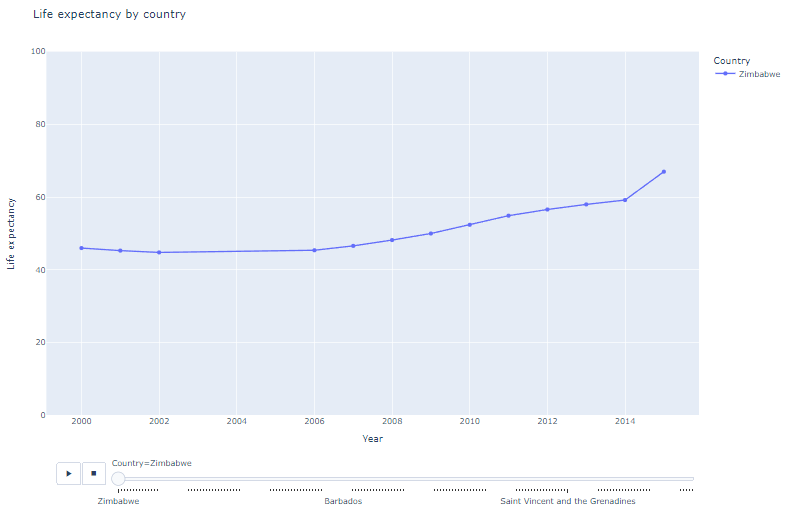
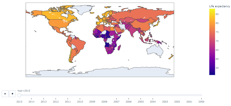
- choropleth 기법
- choropleth: 지리 영역별 데이터 수칫값을 지도 위에 색으로 표현하는 기법
- PyCountry 라이브러리 통해 국가 코드 검색
px.choropleth(
data_frame = 데이터프레임 객체,
locations = '열 이름',
locationmode = 'country names',
color = '열 이름'
)
- locations는 열 이름(국가명)에 따라 지도에 표시, color는 열 이름(행복 지수)에 따라 지도에 색상 표시, locationmode는 country names 중 locations의 열 이름 항목을 일치시킴
!pip install pycountry
import pycountry

def get_country_code(country_name):
    try:
      country_code = pycountry.countries.search_fuzzy(country_name)[0].alpha_3
    except LookupError:
      country_code = None
    return country_code

df['Country Code'] = df['Country'].apply(get_country_code)

import plotly.express as px

px.choropleth(df,
              locations='Country Code',
              color='Life expectancy',
              hover_name='Country',
              animation_frame='Year',
              height=600)