교육 정보
- 교육 명: 경기미래기술학교 AI 교육
- 교육 기간: 2023.05.08 ~ 2023.10.31
- 오늘의 커리큘럼:
머신러닝
(7/17 ~ 7/28)- 강사: 이현주, 이애리 강사님
- 강의 계획:
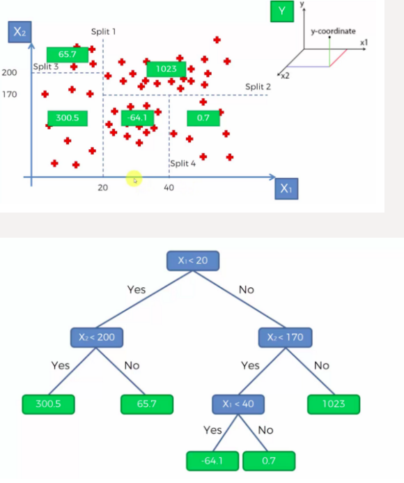
1. 머신러닝
회귀
사용가능한 다른 알고리즘
- 이런 알고리즘 사용할때는 하이퍼 파라미터를 바꿔서 최적의 학습 효과를 찾는게 중요
- DecisionTreeRegressor
from sklearn.tree import DecisionTreeRegressor
from sklearn.metrics import mean_squared_error, mean_absolute_error, r2_score
model =  DecisionTreeRegressor()
model.fit(X_train, y_train)
print(f'{model.score(X_train, y_train) = }')
print(f'{model.score(X_test, y_test) = }')

y_pred = model.predict(X_test)

print(f'{mean_squared_error(y_test, y_pred) = }')
print(f'{mean_absolute_error(y_test, y_pred) = }')
print(f'{r2_score(y_test, y_pred) = }')
#
#결과
model.score(X_train, y_train) = 1.0
model.score(X_test, y_test) = 0.932278983839146
mean_squared_error(y_test, y_pred) = 6.056516779853753
mean_absolute_error(y_test, y_pred) = 1.4536041392445451
r2_score(y_test, y_pred) = 0.932278983839146
📕 DecisionTreeRegressor 모델은 과적합에 취약 → RandomForestRegressor를 사용
- RandomForestRegressor
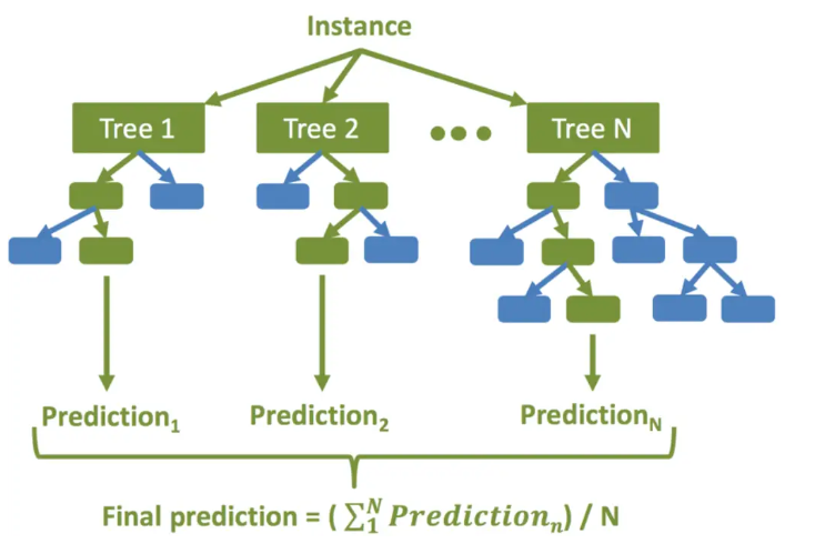
RandomForestRegressor 진행 순서
생성할 결정 트리 N의 수를 결정합니다.
부트스트래핑 방법을 사용하여 훈련 세트에서 K개의 데이터 샘플을 무작위로 가져옵니다.
위의 K 데이터 샘플을 사용하여 의사 결정 트리를 만듭니다.
N개의 의사 결정 트리가 생성될 때까지 2단계와 3단계를 반복합니다.
N개의 결정 트리 각각을 사용하여 회귀 결과를 예측합니다. 그런 다음 이러한 결과의 평균을 취하여 최종 회귀 출력에 도달합니다
from sklearn.ensemble import RandomForestRegressor
from sklearn.metrics import mean_squared_error, mean_absolute_error, r2_score

model =  RandomForestRegressor(n_estimators=100, random_state=0)
model.fit(X_train, y_train)
print(f'{model.score(X_train, y_train)=}')
print(f'{model.score(X_test, y_test)=}')

y_pred = model.predict(X_test)

print(f'{mean_squared_error(y_test, y_pred) = }')
print(f'{mean_absolute_error(y_test, y_pred) = }')
print(f'{r2_score(y_test, y_pred) = }')
#
#결과
model.score(X_train, y_train)=0.993691061878934
model.score(X_test, y_test)=0.961082900284296
mean_squared_error(y_test, y_pred) = 3.48048627757671
mean_absolute_error(y_test, y_pred) = 1.2145057436879245
r2_score(y_test, y_pred) = 0.961082900284296
RandomForestRegressor 장점
- 다양한 특성과 데이터의 조합에 대해 좋은 예측 성능을 제공하는 모델을 만들어냄
- 과적합(Overfitting)에 강함
- 변수 중요도(Feature Importance)를 제공하여 어떤 특성이 예측에 중요한 역할을 하는지 확인 가능
- KNeighborsRegressor
from sklearn.neighbors import KNeighborsRegressor
from sklearn.metrics import mean_squared_error, mean_absolute_error, r2_score

model =  KNeighborsRegressor(n_neighbors=5)
model.fit(X_train, y_train)
print(f'{model.score(X_train, y_train)=}')
print(f'{model.score(X_test, y_test)=}')

y_pred = model.predict(X_test)

print(f'{mean_squared_error(y_test, y_pred) = }')
print(f'{mean_absolute_error(y_test, y_pred) = }')
print(f'{r2_score(y_test, y_pred) = }')
#
#결과
model.score(X_train, y_train)=0.9527954129466426
model.score(X_test, y_test)=0.9267917781848946
mean_squared_error(y_test, y_pred) = 6.547255918211404
mean_absolute_error(y_test, y_pred) = 1.715712027840932
r2_score(y_test, y_pred) = 0.9267917781848946
📕 필드에서는 학습이 오래 걸리기 때문에 이렇게 다양한 모델을 사용해보고 평가할 수 없는 경우가 많음
→ 데이터를 분석해서 가장 적절할 것으로 보이는 모델을 선정해서 진행
전력 소모량 데이터셋 실습
-
출처: Kaggle https://www.kaggle.com/datasets/fedesoriano/electric-power-consumption
-
2017.1.1 ~ 2017.12.30일까지 10분 단위로 기상 데이터 및 전력 소비량, 52,416개의 관찰로 구성
-
Features
- Datetime: 날짜 시간
- Temperature: 온도
- Humidity: 습기
- WindSpeed: 풍속
- GeneralDiffuseFlows: 일반 확산 흐름
- “Diffuse flow” is a catchall term to describe low-temperature (< 0.2° to ~ 100°C) fluids that slowly discharge through sulfide mounds, fractured lava flows, and assemblages of bacterial mats and macrofauna.
- "확산 흐름"은 황화물 마운드, 균열된 용암 흐름, 박테리아 매트 및 거대동물군 집합체를 통해 천천히 배출되는 저온(< 0.2° ~ ~ 100°C) 유체를 설명하는 포괄적인 용어입니다.
- DiffuseFlows: 확산 흐름
- PowerConsumption_Zone1: 전력 소비_Zone1
- PowerConsumption_Zone2: 전력 소비_Zone2
- PowerConsumption_Zone3: 전력 소비_Zone3
-
세팅
# warning메시지 무시
import warnings
warnings.filterwarnings('ignore')

# 나눔바른고딕 폰트 설치 - [런타임 다시 시작]되면 폰트를 다시 설치해야 한글이 보입니다.
!apt-get install fonts-nanum
# 한글폰트 설정
import matplotlib.font_manager as fm
import matplotlib.pyplot as plt

fm.fontManager.addfont('/usr/share/fonts/truetype/nanum/NanumBarunGothic.ttf')
plt.rcParams['font.family'] = "NanumBarunGothic"

# 마이너스(음수)부호 설정
plt.rc("axes", unicode_minus = False)

#필요한 모듈 import
import numpy as np
import pandas as pd
import matplotlib.pyplot as plt
import seaborn as sns- 데이터 확인
# 데이터 가져와서 데이터프레임 만들기
df = pd.read_csv('/powerconsumption.csv')
df.columns
df.shape
df.info()

#
#결과

Index(['Datetime', 'Temperature', 'Humidity', 'WindSpeed',
       'GeneralDiffuseFlows', 'DiffuseFlows', 'PowerConsumption_Zone1',
       'PowerConsumption_Zone2', 'PowerConsumption_Zone3'],
      dtype='object')

(52416, 9)

<class 'pandas.core.frame.DataFrame'>
RangeIndex: 52416 entries, 0 to 52415
Data columns (total 9 columns):
 #   Column                  Non-Null Count  Dtype
---  ------                  --------------  -----
 0   Datetime                52416 non-null  object
 1   Temperature             52416 non-null  float64
 2   Humidity                52416 non-null  float64
 3   WindSpeed               52416 non-null  float64
 4   GeneralDiffuseFlows     52416 non-null  float64
 5   DiffuseFlows            52416 non-null  float64
 6   PowerConsumption_Zone1  52416 non-null  float64
 7   PowerConsumption_Zone2  52416 non-null  float64
 8   PowerConsumption_Zone3  52416 non-null  float64
dtypes: float64(8), object(1)
memory usage: 3.6+ MB- 컬럼 변경 (datetime, 컬럼명)
# 'Datetime' 컬럼을 datetime 형식으로 변경
df['Datetime'] = pd.to_datetime(df['Datetime'])

#긴 컬럼명을 짧게 줄임
df.columns = ['Datetime',
              'Temperature',
              'Humidity',
              'WindSpeed',
              'GeneralDiffuseFlows',
              'DiffuseFlows',
              'zone1',
              'zone2',
              'zone3']
df.info()

#
#결과
<class 'pandas.core.frame.DataFrame'>
RangeIndex: 52416 entries, 0 to 52415
Data columns (total 9 columns):
 #   Column               Non-Null Count  Dtype
---  ------               --------------  -----
 0   Datetime             52416 non-null  datetime64[ns]
 1   Temperature          52416 non-null  float64
 2   Humidity             52416 non-null  float64
 3   WindSpeed            52416 non-null  float64
 4   GeneralDiffuseFlows  52416 non-null  float64
 5   DiffuseFlows         52416 non-null  float64
 6   zone1                52416 non-null  float64
 7   zone2                52416 non-null  float64
 8   zone3                52416 non-null  float64
dtypes: datetime64[ns](1), float64(8)
memory usage: 3.6 MB- 결측치 확인
df.isna().sum()
#
#결과
Datetime               0
Temperature            0
Humidity               0
WindSpeed              0
GeneralDiffuseFlows    0
DiffuseFlows           0
zone1                  0
zone2                  0
zone3                  0
dtype: int64- 기술통계량 확인
- Outlier, 음수값 확인
df.describe()
# 음수가 나올 수 없는 값인데 음수가 있거나 한다면 그것도 Outlier임을 확인 할 수 있음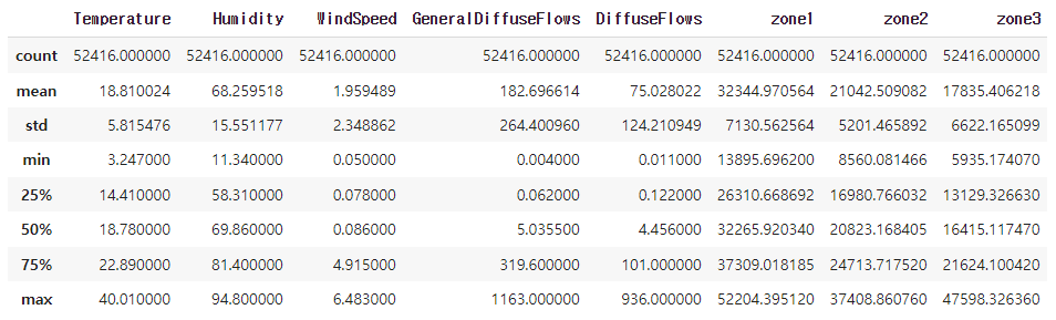
- Datetime 범위 확인 (시작, 끝)
df['Datetime'].min(), df['Datetime'].max()
#
#결과
(Timestamp('2017-01-01 00:00:00'), Timestamp('2017-12-30 23:50:00'))- Zone1, 2, 3의 전력 소모량 시각화
#plt.plot() 그래프
fig, ax = plt.subplots()
ax = plt.plot(df['Datetime'], df[['zone1', 'zone2', 'zone3']], alpha=0.5, lw=0.2)
plt.legend(['zone1', 'zone2', 'zone3'])
plt.show()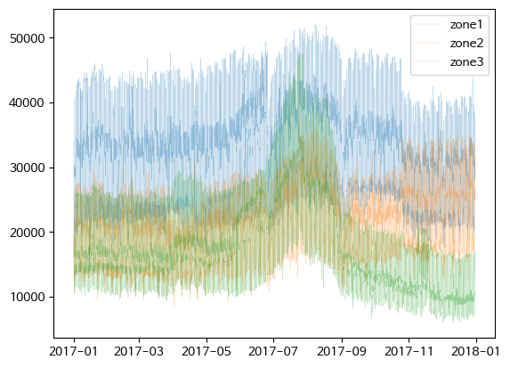
- Zone1 전력 소모량과 diffuse flows 비교
fig, ax = plt.subplots()
ax = plt.plot(df['Datetime'], df['zone1'], c='g', lw=0.2, label = 'zone1')
ax = plt.plot(df['Datetime'], df['DiffuseFlows'], c='pink', lw=0.2, label = 'DiffuseFlows')
plt.legend()
plt.show()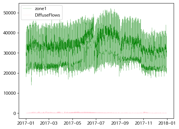
# twinx()사용하여 축 공유
fig, ax = plt.subplots()

ax = plt.plot(df['Datetime'], df['zone1'], c='g', lw=0.2, label = 'zone1')
ax2 = plt.twinx()
ax = plt.plot(df['Datetime'], df['DiffuseFlows'], c='pink', lw=0.2, label = 'DiffuseFlows')
fig.legend()
plt.show()
# 반비례 관계가 있어보임 (2017-09 부분)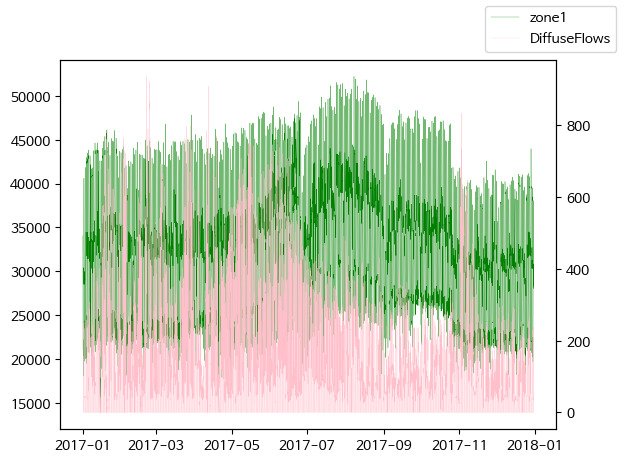
diffuse flows가 낮아질 때 전력 소모량이 증가하는 경향이 보임
- Zone1 전력 소모량과 general diffuse flows 비교
fig, ax = plt.subplots()

ax = plt.plot(df['Datetime'], df['zone1'], c='g', lw=0.2, label = 'zone1')
ax2 = plt.twinx()
ax = plt.plot(df['Datetime'], df['GeneralDiffuseFlows'], lw=0.2, label = 'DiffuseFlows')
fig.legend()
plt.show()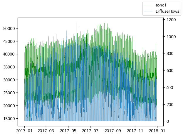
general diffuse flows과 전력 소모량은 큰 상관관계는 없어 보임
- Peak 시간대 탐색
- month hour 컬럼 생성
# datetime에서 month 추출하여 1열에 삽입
# df.insert(loc, column, value, allow_duplicates=False)
df.insert(1, 'month', df['Datetime'].dt.month)
df.head()

#datetime에서 시간을 추출하여 2컬럼에 삽입 한 후, 앞 5행 출력
df.insert(2, 'hour', df['Datetime'].dt.hour)
df.head()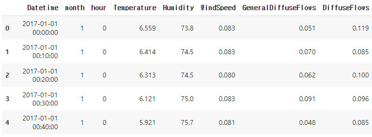
- 월별 평균 전력 소모량
df['zone1'].groupby(df['month']).mean().sort_values(ascending=False)[:5]
df['zone2'].groupby(df['month']).mean().sort_values(ascending=False)[:5]
df['zone3'].groupby(df['month']).mean().sort_values(ascending=False)[:5]
#
#결과
month
8     36435.189574
7     35831.553603
6     34605.540839
9     33396.681416
10    32827.660055
Name: zone1, dtype: float64

month
8     24656.216575
7     24147.886893
12    23681.852818
11    23240.464015
10    21468.993441
Name: zone2, dtype: float64

month
7    28194.111216
8    24648.894732
6    20430.941538
4    18593.167677
1    17746.095349
Name: zone3, dtype: float64- 시간대별 평균 전력 소모량
df['zone1'].groupby(df['hour']).mean().sort_values(ascending=False).head()
df['zone2'].groupby(df['hour']).mean().sort_values(ascending=False).head()
df['zone3'].groupby(df['hour']).mean().sort_values(ascending=False).head()
#
#결과
hour
20    43822.590575
19    42795.919144
21    42216.478542
22    39068.635850
18    38846.130578
Name: zone1, dtype: float64

hour
20    28186.910385
19    27723.744582
21    27228.712785
18    25443.902236
22    25284.942543
Name: zone2, dtype: float64

hour
20    26027.609150
21    25186.686692
19    25125.471392
22    23529.045275
18    21850.768343
Name: zone3, dtype: float64- 특정일 전력 소모량 살펴보기
df_8_1 = df[(df['month'] == 8) & (df['Datetime'].dt.day == 1)]
# 괄호 빼먹지 말기!!
df_8_1.info()

fig, ax = plt.subplots()
ax = plt.plot(df_8_1['Datetime'], df_8_1[['zone1', 'zone2', 'zone3']])
plt.show()

#
#결과
<class 'pandas.core.frame.DataFrame'>
Int64Index: 144 entries, 30528 to 30671
Data columns (total 11 columns):
 #   Column               Non-Null Count  Dtype
---  ------               --------------  -----
 0   Datetime             144 non-null    datetime64[ns]
 1   month                144 non-null    int64
 2   hour                 144 non-null    int64
 3   Temperature          144 non-null    float64
 4   Humidity             144 non-null    float64
 5   WindSpeed            144 non-null    float64
 6   GeneralDiffuseFlows  144 non-null    float64
 7   DiffuseFlows         144 non-null    float64
 8   zone1                144 non-null    float64
 9   zone2                144 non-null    float64
 10  zone3                144 non-null    float64
dtypes: datetime64[ns](1), float64(8), int64(2)
memory usage: 13.5 KB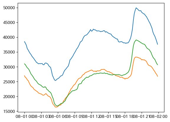
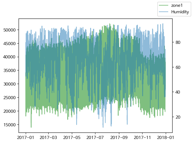
- zone1 전력 소모량과 온도/습도를 plot 그래프로 시각화
#twinx() 축을 공유하여 zone1 전력 소모량과 온도를 plot 그래프로 시각화
fig, ax1 = plt.subplots()
ax1.plot(df['Datetime'], df['zone1'], label='zone1', color='green', alpha=0.5)
ax2 = ax1.twinx()
ax2.plot(df['Datetime'], df['Temperature'], label='Temperature', alpha=0.5)
fig.legend()
plt.show()

fig, ax1 = plt.subplots()
ax1.plot(df['Datetime'], df['zone1'], label='zone1', color='green', alpha=0.5)
ax2 = ax1.twinx()
ax2.plot(df['Datetime'], df['Humidity'], label='Humidity', alpha=0.5)
fig.legend()
plt.show()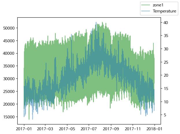
- scatter plot
#온도와 zone1 전력 소모량을 scatterplot 으로 시각화
fig, ax = plt.subplots()
ax = sns.scatterplot(data=df, x='Temperature', y='zone1')
plt.show()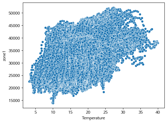
온도가 증가할 수록 전력 소모량도 증가하는 경향을 보인다.
상관계수 확인
stats.pearsonr():
- Python의 scipy.stats 모듈에서 제공하는 함수
- 두 변수 간의 피어슨 상관 계수(Pearson correlation coefficient)를 계산하는 데 사용
- 피어슨 상관 계수는 두 변수 간의 선형 상관 관계의 강도와 방향을 측정하는 통계적인 지표
|r| = 절대값
0.0 <= |r| < 0.2 : 상관관계가 없다. = 선형의 관계가 없다.
0.2 <= |r| < 0.4 : 약한 상관관계가 있다.
0.4 <= |r| < 0.6 : 보통의 상관관계가 있다.
0.6 <= |r| < 0.8 : 강한 (높은) 상관관계가 있다.
0.8 <= |r| <= 1.0 : 매우 강한 (매우 높은) 상관관계가 있다.
- 상관계수 확인
#stats.pearsonr()로 피어슨 상관계수 구하기
import scipy.stats as stats

stats.pearsonr(x=df['Temperature'], y=df['zone1'])
#
#결과
PearsonRResult(statistic=0.44022078902914086, pvalue=0.0)
보통의 상관 관계가 있다.
- Pair plot
# ['Temperature', 'Humidity', 'Wind Speed','general diffuse flows', 'diffuse flows', 'zone1'] 추출하여 df 생성
df2= df[['Temperature', 'Humidity', 'WindSpeed', 'GeneralDiffuseFlows', 'DiffuseFlows', 'zone1']]
# 이렇게 할수도 있음 !
df = df.loc[:,'Temperature': 'zone1']

sns.pairplot(df2)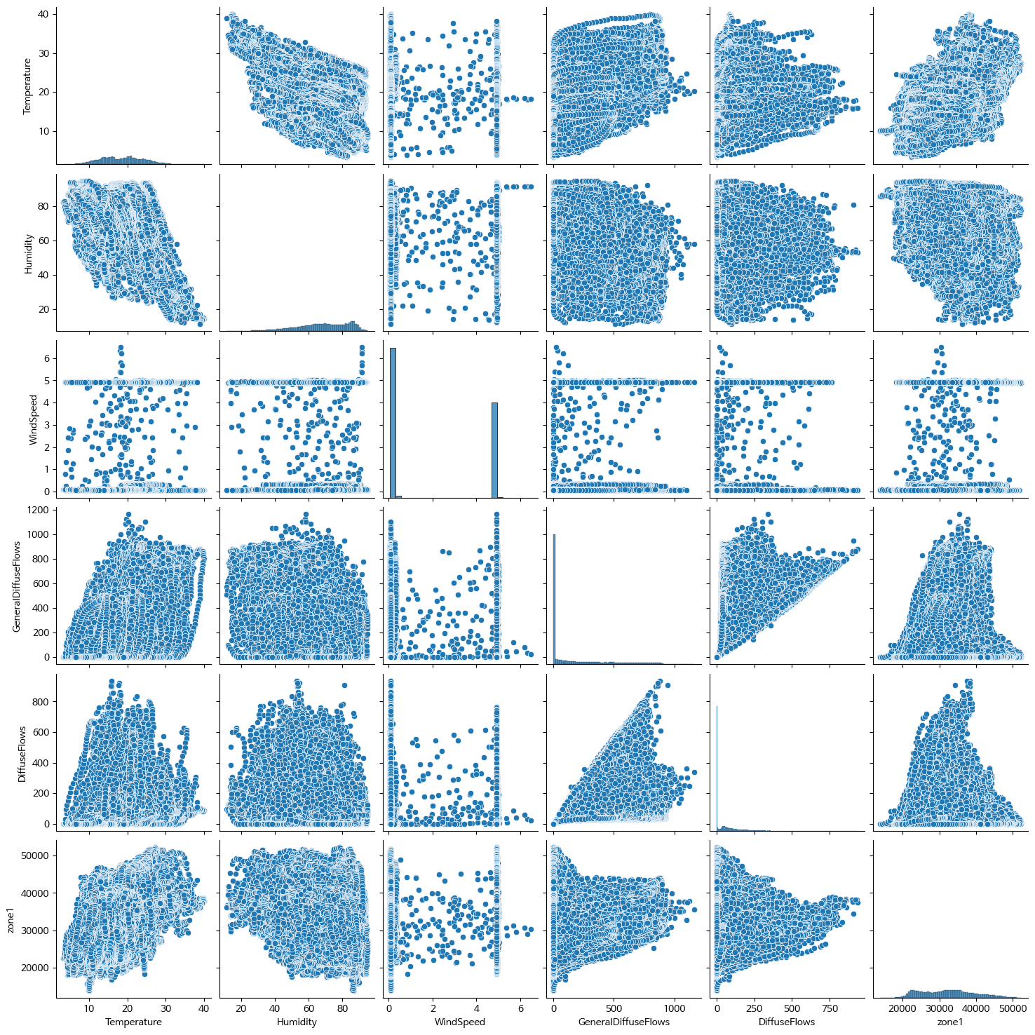
- 상관계수, heatmap
df2.corr()['zone1'].abs().sort_values(ascending=False)

corr = df2.corr()

fig, ax = plt.subplots()
ax = sns.heatmap(corr, annot=True, cmap='PRGn')
#
#결과
zone1                  1.000000
Temperature            0.440221
Humidity               0.287421
GeneralDiffuseFlows    0.187965
WindSpeed              0.167444
DiffuseFlows           0.080274
Name: zone1, dtype: float64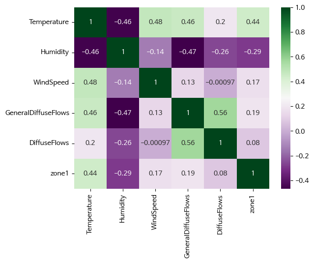
- 전력 소모량 예측 RandomForestRegressor
#필요한 모듈 import

from sklearn.ensemble import RandomForestRegressor
from sklearn.model_selection import train_test_split
from sklearn.metrics import mean_absolute_error, r2_score

X = df[['month', 'hour', 'Temperature', 'Humidity', 'WindSpeed', 'GeneralDiffuseFlows', 'DiffuseFlows']]
y = df['zone1']

X_train, X_test, y_train, y_test = train_test_split(X, y, test_size=0.3, random_state=0)
print(X_train.shape, y_train.shape)
print(X_test.shape, y_test.shape)

rfm = RandomForestRegressor()
rfm.fit(X_train, y_train)

y_pred = rfm.predict(X_test)

print(f'{mean_absolute_error(y_test, y_pred) = }')
print(f'{r2_score(y_test, y_pred) = }')

# 예측
y_pred_train = rfm.predict(X_train)
y_pred_test  = rfm.predict(X_test)

# 평가
print(f'{mean_absolute_error(y_train, y_pred_train) = }')
print(f'{r2_score(y_train, y_pred_train) = }')

print(f'{mean_absolute_error(y_test, y_pred_test) = }')
print(f'{r2_score(y_test, y_pred_test) = }')

#
#결과
mean_absolute_error(y_test, y_pred) = 913.2454203142386
r2_score(y_test, y_pred) = 0.9648194420550097

mean_absolute_error(y_train, y_pred_train) = 339.7218772617724
r2_score(y_train, y_pred_train) = 0.9951329665641457
# 이정도로 높으면 과대적합일 확률이 있음 - 확인 필요

mean_absolute_error(y_test, y_pred_test) = 913.2454203142386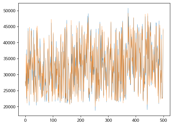
r2_score(y_test, y_pred_test) = 0.9648194420550097- 테스트 데이터의 실제 값과 예측 값 차이 확인
diff = pd.DataFrame({'y_test':y_test,
        'y_pred_test':y_pred_test,
        'diff':y_test-y_pred_test})
diff = pd.DataFrame(diff).reset_index(drop=True)
diff.head()

# 실제값과 예측값을 plot으로 시각화
fix, ax = plt.subplots()
ax = plt.plot(diff[['y_test','y_pred_test']][:500], lw=0.5)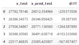
- 중요 변수 파악: featureimportances
rfm.feature_importances_
#
#결과
array([0.07087652, 0.74581235, 0.10148764, 0.02069298, 0.01578978,
       0.02592367, 0.01941705])
#feature_importances_ 를 시리즈로 출력 (인덱스는 칼럼명)
f_i = pd.Series(rfm.feature_importances_, index=X_train.columns)
# feature_importances_ 을 내림차순으로 정렬하여 barplot으로 시각화
s_f_i = f_i.sort_values(ascending=False)
# feature_importances_ 을 내림차순으로 정렬하여 상위 3개만 barplot으로 시각화
sns.barplot(x=s_f_i, y=s_f_i.index)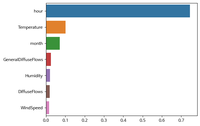
- feature importance가 높은 데이터와 전력 소모량과의 관계
#scatterplot으로 시각화
sns.scatterplot(x=df['hour'], y=df['zone1'])
plt.show()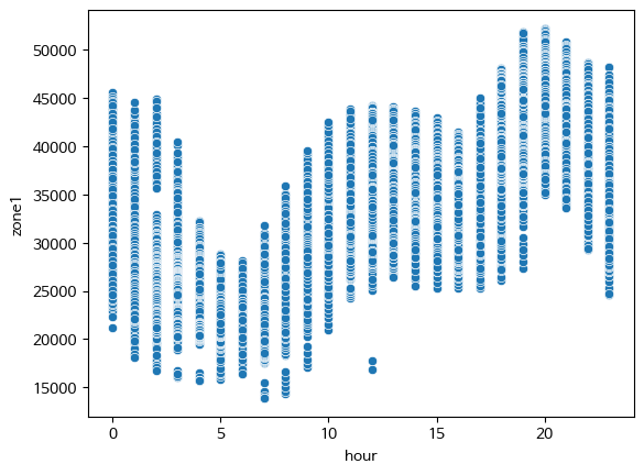
- 모델 저장

import pickle

saved_model = pickle.dumps(rfm)
sl_rfm = pickle.loads(saved_model)
#X_train 예측하기
sl_rfm.predict(X_train)
#
#결과
#X_train 예측하기
sl_rfm.predict(X_train)
++
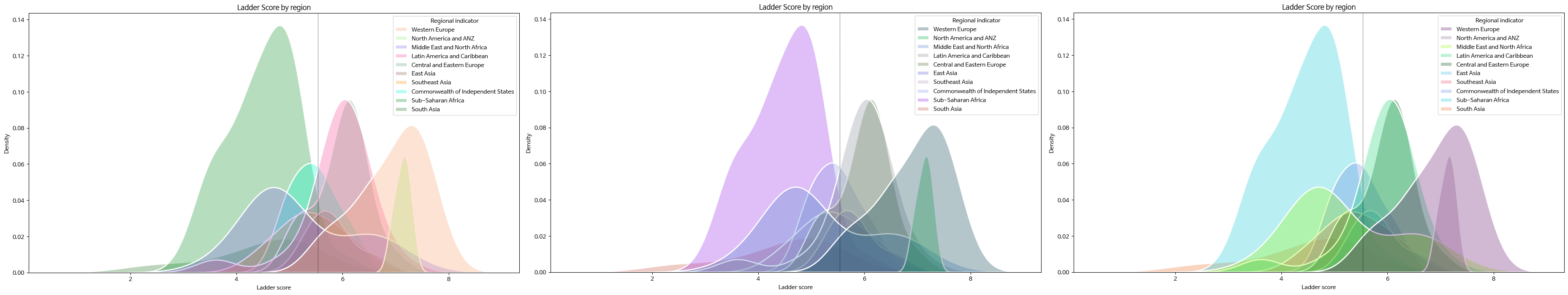
- kdeplot()으로 Ladder score 분포 확인
seaborn 다양한 옵션 (edge 색, shade 등)
fig, ax = plt.subplots(figsize=(15,8))
ax = sns.kdeplot(data=df,
                 x='Ladder score',
                 hue='Regional indicator',
                 alpha=0.3,
                 fill=True,
                 lw=2,
                 edgecolor='w',
                 shade=True)
plt.title('Ladder Score by Region'')
plt.axvline(df['Ladder score'].mean(), c='black', ls='--', lw=.5)
plt.show()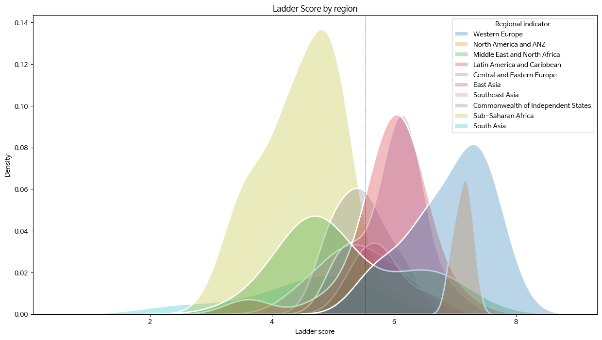
📕 위 그래프에 색상을 랜덤으로 주기
import random

#hexadecimal 형식으로 랜덤 색 선택
def rand_color(num=1):
  col = list()
  for _ in range(num):
    col.append("#" + "".join([random.choice('0123456789ABCDEF') for _ in range(6)]))
  return col

fig, ax = plt.subplots(figsize=(15,8))
ax = sns.kdeplot(data=df,
                 x='Ladder score',
                 hue='Regional indicator',
                 alpha=0.3,
                 fill=True,
                 palette=rand_color(len(df['Regional indicator'].unique())),
                 # 항목 수만큼의 색을 지정해야 함
                 lw=2,
                 edgecolor='w',
                 shade=True)
plt.title('Ladder Score by region')
plt.axvline(df['Ladder score'].mean(), c='black', ls='--', lw=.5)
plt.show()
- countplot()으로 지역(Regional indicator)별 나라 갯수 시각화
fig, ax = plt.subplots()
ax = sns.countplot(data=df, x=df['Regional indicator'])
plt.xticks(rotation=80)
plt.grid(axis='y', c='gray', ls='--')
plt.show()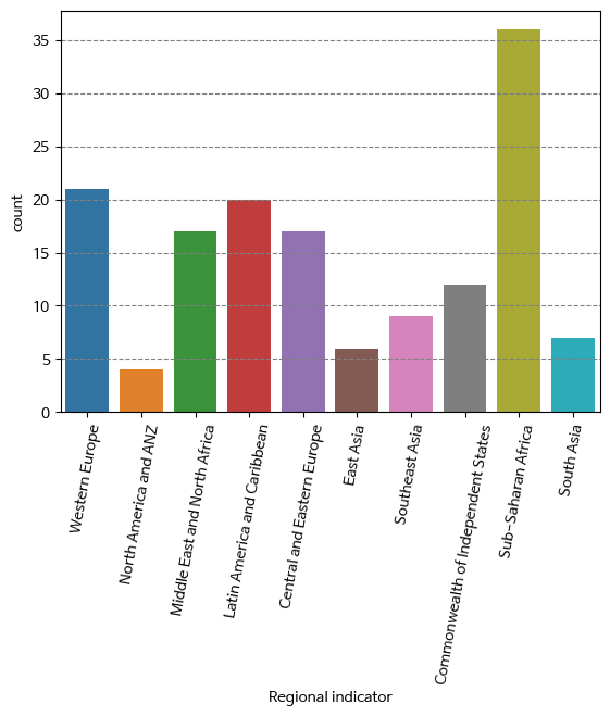


이 글이 정말 도움이 되었습니다.