교육 정보
- 교육 명: 경기미래기술학교 AI 교육
- 교육 기간: 2023.05.08 ~ 2023.10.31
- 오늘의 커리큘럼:
머신러닝
(7/17 ~ 7/28)- 강사: 이현주, 이애리 강사님
- 강의 계획:
1. 머신러닝
데이터 처리 및 시각화 기법
데이터 처리 및 시각화 기법
- px.treemap
===================format===================
px.treemap(data_frame = 데이터프레임 객체,
           path = [부모 열,자식 열],
           values = column(사각형 크기),
           color = columns(색상)
           )
============================================
fig = px.treemap(data_frame=df,
path=['Regional indicator', 'Country name'],
values='Ladder score',
color='Ladder score')
fig.update_layout(title='Ladder Score by country',
title_x=0.5,
width=900,
height=900)
fig.show()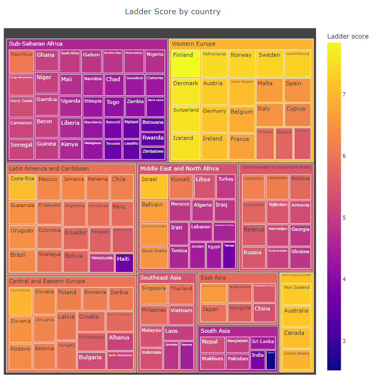
- px.sunburst
===================format===================
px.sunburst(data_frame = 데이터프레임 객체,
           path = [부모 열,자식 열],
           values = column(파이 크기),
           color = columns(색상)
           )
============================================
fig = px.sunburst(data_frame=df,
path=['Regional indicator', 'Country name'],
values='Ladder score',
color='Ladder score')
fig.update_layout(title='Ladder Score by country',
title_x=0.5,
width=1000,
height=600)
fig.show()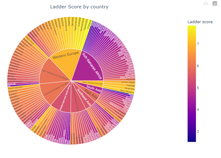
- px.choropleth 지도에 색으로 표현
===================format===================
px.choropleth(data_frame = 데이터프레임 객체,
              locations = 'columns(국가명)',
              locationmode = 'country names',
              color = 'columns(색상)'
              )
→ locations에 들어온 변수를 locationmode의 항목에 일치시켜 시각화 함
ex. 국가명이 들어있는 columns의 항목을 country names 항목에 일치시켜서 시각화
============================================
fig = px.choropleth(data_frame = df,
locations = 'Country name',
locationmode = 'country names',
color = 'Ladder score')
fig.show()- Heatmap 글자 크기 자동 조절 text auto
===================format===================
px.imshow(데이터프레임 객체.corr(),
          text_auto = True)
============================================
fig = px.imshow(df.corr(), text_auto=True)
fig.show()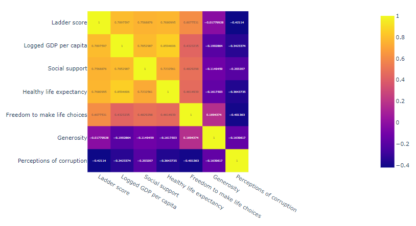
- 상관관계 Scatter Matrix
===================format===================
px.scatter_matrix(데이터프레임 객체,
                  dimensions = ['행렬로 표현할 속성명들'],
                  color = '색으로 표현할 색상명'
                  )
============================================
fig = px.scatter_matrix(df, dimensions = ['Ladder score',
'Logged GDP per capita', 'Social support', 'Healthy life expectancy',
'Freedom to make life choices', 'Generosity',
'Perceptions of corruption'], color = 'Ladder score')
fig.update_layout(title='Ladder Score Correlations',
title_x=0.5,
width=1000,
height=1000,
autosize=True)
fig.show()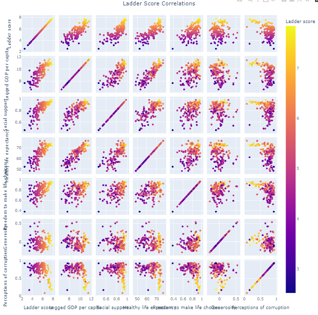
- px.scatter
===================format===================
px.scatter(데이터프레임 객체,
           x = 'x축 속성명',
           y = 'y축 속성명',
           size = '항목 크기를 결정할 속성명',
           trendline = '회귀선 종류',
           trendline_color_override = '회귀선 색상')

trendline = {"ols", "lowess", "rolling", "ewm", "expanding"}
- ols : ordinary least square의 약자로 최소자승법으로 회귀 모델
- lowess : locally weighted scatterplot smoothing
- rolling : 기본 이동 평균선
- expanding : Cumulative 이동 평균선
- ewm : exponentially weighted 이동 평균선
============================================
fig = px.scatter(df,
x = 'Logged GDP per capita',
y = 'Ladder score',
size = 'Ladder score',
trendline = 'ols',
trendline_color_override = 'red')
fig.show()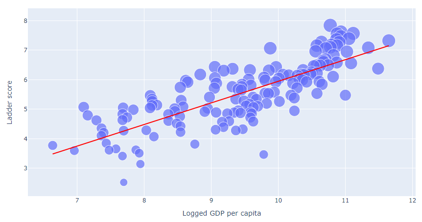
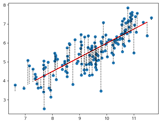
- 잔차 시각화 plt.vlines()
===================format===================

============================================plt.scatter(x, y)
plt.plot(x_test, y_pred, c='red')
plt.vlines(x=x,
ymin=lrm.predict(x),
ymax=y,
linestyles='dotted',
label='잔차',
color='black'
)
- 중복 데이터 처리
===================format===================
중복 여부 확인 함수
DataFrame.duplicated( [ 'column' ], keep='first | last | False' )

중복값 처리함수 (unique한 1개의 key만 남기고 나머지 중복은 제거)
DataFrame.drop_duplicates( [ 'column' ], keep='first | last | False' )
============================================df.shape
df.duplicated().sum()
df = df.drop_duplicates(keep='first')
df.shape
#
# 결과
(7385, 12)
1314
(6071, 9)
# 중복된 1314개의 항목을 제거 - 정규화 숫자 추출
===================format===================

============================================
import re
#숫자 추출
numbers = []
pattern = r'\d+'
for s in ['SD34', 'E12', 'VS45', 'DE1', 'HG4']:
match = re.search(pattern, s)
if match:
numbers.append(int(match.group()))
else:
numbers.append(0)
print(numbers)
# 리스트를 배열에 컬럼으로 추가
df['column_name'] = pd.Series(numbers)- 정규화 문자 추출
===================format===================

============================================
import re
#문자 추출
chars = []
pattern = r'[A-Za-z]+'
for s in df['Transmission']:
char = re.findall(pattern, s)
chars.extend(char)
print(chars)
# 리스트를 배열에 컬럼으로 추가
df['column_name'] = pd.Series(chars)- sns.swarmplot()
===================format===================

============================================
Swarmplot
범주형 변수와 연속형 변수 사이의 관계를 시각적으로 표현하는 데 사용
점들을 범주형 변수의 값을 기반으로 연속형 변수의 축을 따라 분산시켜 그림
데이터의 분포를 쉽게 파악할 수 있으며, 각 범주 수준에서의 값의 분산을 시각적으로 비교할 수 있음
sns.swarmplot(x=df['Engine Size(L)'], y= 'CO2 Emissions(g/km)', data=df)
plt.xticks(rotation= 70, fontsize=5)
plt.show()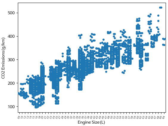

:D
아주 유용한 정보네요!