2021년 7월 7일 8일차
학습한 내용
html
<div class="transform"></div>

<div class="transition"></div>

<div class="animation"></div>

<div class="spin-lion"></div>
css
.transform {
margin-left: 300px;
margin-top: 500px;
/브라우저에서 왼쪽에서 300px, 위에서 500px 떨어뜨리겠다./
width: 100px;
height: 100px;
background-color: yellow;
/박스 너비 100px, 높이 100px, 배경색 노란색/
transform: rotate(45deg);
/*박스를 회전시키겠다.(양수는 오른쪽 음수는 왼쪽으로 회전함) -> 2차원 회전효과*/

transform: scale(2,3);
/*가로 세로 비율을 조정(2배, 3배), 소숫점 단위로 줄일 수 있다.*/

transform:  skew(10deg, 20deg);
/*회전 효과 (x축 회전, y축 회전) -> 3차원 회전효과*/

transform: translate(300px, 100px);
/*내가 선택한 영역의 객체를 위치를 변경할 때 사용 (x축 이동, y축 이동)*/

/*w3cschools.com -> 참조*/

-webkit-transform:  rotate(10deg);
/*크롬 사파리*/
-moz-transform:  rotate(10deg);
/*파이어폭스*/
-ms-transform:  rotate(10deg);
/*익스플로러*/
-o-transform:  rotate(10deg);
/*오페라*/
/*위의 방식 -> prefix : 크롬 인터넷익스플로러 파이어폭스 오페라 등 하위버전도 적용이 가능하게끔 설정해주는 것*/
}
.transition {
width: 300px;
height: 300px;
background-color: yellow;
transition-property: width;
/*박스의 너비효과를 주겠다.*/
transition-duration: 2s;
/*박스의 효과를 2초동안 주겠다.*/
transition-timing-function: linear;
/*박스의 효과가 일정하게 하겠다.*/
transition-delay: 1s;
/*마우스를 올리고 1초뒤에 효과를 주겠다.(마우스를 떼고 1초뒤 원래대로 효과가 돌아온다.)*/

transition: width 2s linear, height 2s linear;
/*위에 코드 4개를 1줄로 줄일 수 있다.
(duration이 먼저, delay가 제일 뒤, 숫자 1개만 입력하면 duration으로 인식함, 코드 순서는 duration delay 빼고는 상관없음)*/
}
.transition:hover {
width: 600px;
height: 600px;
}
/마우스를 올렸을 때 효과 : 너비가 600px, 높이가 600px로 바뀜/
.animation {
width: 300px;
height: 300px;
background-color: yellow;
animation-name: changeWidth;
animation-duration: 3s;
animation-timing-function: linear;
animation-delay: 1s;
/*애니메이션 너비바꾸고 3초동안 효과 나타내게 하고 일정하고 마우스를 올린 1초뒤 효과가 나타나게함*/

animation-iteration-count: infinite;
/*애니메이션 반복 횟수 숫자 입력하면
infinite : 무한으로 반복
alternate의 경우 from에서 to 1번 to에서 from을 1번 인식한다. -> 횟수 6을 입력한경우 3번 반복*/

animation-direction: alternate;
/*애니메이션의 진행방향이 from에서 to에서 from으로 돌아간다.
normal인 경우 from에서 to가 끝*/
}
@keyframes changeWidth {
from {
width: 300px;
height: 300px;
background-color: yellow;
}
to {
	width: 600px;
	height: 600px;
	background-color: red;
	border: solid 10px blue;
}
}
/@keyframes로 위에 changeWidth를 연동을 해주어야함
from 첫 시작에서 to 끝이 어떻게 애니메이션이 변화할지 값을 입력해주면 됨/
@keyframes changeWidth {
0% {
width: 300px;
height: 300px;
background-color: yellow;
}
50% {
	background-color: blue;
}
100% {
	width: 600px;
	height: 600px;
	background-color: red;
	border: solid 10px blue;
}
}
/from to 말고도 숫자로도 표현이 가능하다./
.spin-lion {
width: 150px;
height: 150px;
background-color: blue;
animation-name: spinLion;
/*애니메이션 이름 지정*/
animation-duration: 1500ms;
/*ms단위도 가능*/
animation-timing-function: linear;
/*애니메이션이 시간에 따라 일정하게 변화*/
animation-iteration-count: infinite;
/*반복횟수 무한*/
animation-direction: alternate;
/*반복할 때 from->to->from*/

-webkit-animation: spinLion 1.5s linear infinite alternate 0.5s;
/*prefix 설정*/
animation: spinLion 1.5s linear infinite alternate 0.5s;
/*위의 코드를 한줄로 작성 가능 (먼저 나오는 숫자 duration, 뒤에나오는 숫자 delay)*/
}
@-webkit-keyframes spinLion {
from {
-webkit-transform: rotate(-10deg);
/회전을 왼쪽방향에서 10도 돌아감/
}
to {
	-webkit-transform: rotate(10deg);
	/*회전이 오른쪽방향 10도에서 끝남*/
}
}
/-webkit-을 사용하려면 코드마다 적용시켜야한다 어휴 귀찮아;;;/
@keyframes spinLion {
from {
transform: rotate(-10deg);
/회전을 왼쪽방향에서 10도 돌아감/
}
to {
	transform: rotate(10deg);
	/*회전이 오른쪽방향 10도에서 끝남*/
}
}
.circle {
animation-name: circle-keyframes;
animation-duration: 2000ms;
animation-delay: 0ms;
animation-fill-mode: forwards;
animation-timing-function: linear;
animation-iteration-count: infinite;
transform-origin: 0 0;
}
@keyframes circle-keyframes {
0% {transform:translate(0px, 0px) scale(1) rotateX(0deg) rotateY(0deg) rotateZ(0deg) translate(-50%, -50%);}
50% {transform:translate(390px, -301px) scale(1) rotateX(0deg) rotateY(0deg) rotateZ(0deg) translate(-50%, -50%);}
100% {transform:translate(747px, 19px) scale(1) rotateX(0deg) rotateY(0deg) rotateZ(0deg) translate(-50%, -50%);}
}html::after { content: url(https://ga-beacon.appspot.com/UA-42910121-1/stylie?pixel); position: absolute; left: -999em; }
결과물
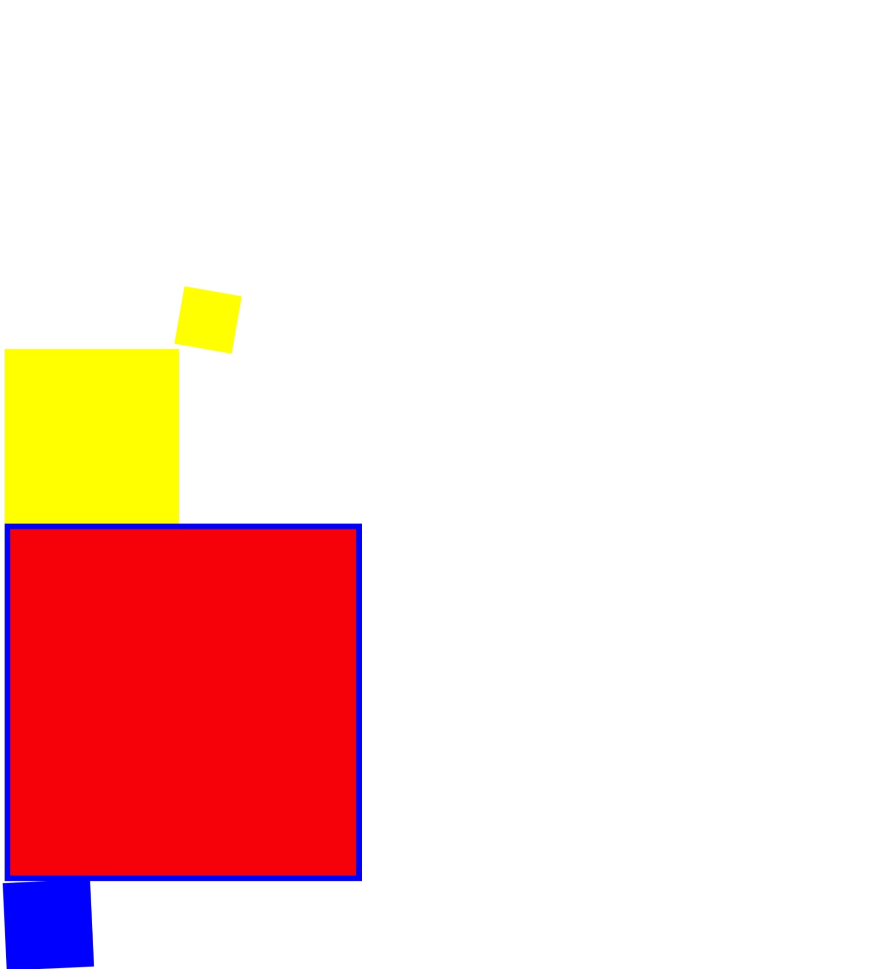
css에서 만들기 힘든 애니메이션 코딩 작성해주는 홈페이지
https://jeremyckahn.github.io/stylie/
애니메이션을 배웠다.
학습내용 중 어려웠던 점
내용이 어려운 것보다는 헷갈리는 내용이 조금 있었다.
해결방법
위의 내용에 있는 홈페이지 주소를 통해서 코드를 자동으로 작성할 수 있어서 코드의 구조를 어떻게만 구성할지만 생각하면 된다.
학습소감
오늘 내용은 재미있어서 어려워도 흥미롭게 배웠다.
어려운 내용도 흥미를 가지면 쉽게 공부 할 수 있다고 느꼈다.
