학습한 내용
html
<div class="move-box"></div>

<div class="outer-border">
	<div class="inner-border"></div>
</div>

<div class="mario-container">
	<div class="mario-coin"></div>
	<div class="mario-box"></div>
</div>

<div class="hover-image">
	<img src="https://img.animalplanet.co.kr/news/2019/07/10/700/6fa16l0p4qdt08l405h4.jpg">
	<div class="image-info">
		<h2>Title</h2>
		<p>Paragraph</p>
	</div>
</div>

<!-- https://animate.style/ -->
<div class="animate__animated animate__backInDown animate__slow color-red">Example</div>
<!-- 다양한 애니메이션 소스 효과를 가져올 수 있다.
https://codepen.io/ -->
css
html, body {
margin: 0;
padding: 0;
}
/초기화 작업/
ul {
list-style: none;
}
/li태그 앞에 동그라미 없애겠다./
a {
text-decoration: none;
color: #000000;
}
/색 검은색, 밑줄 없앰/
.mouse-animation li {
width: 250px;
/*background-color: #000000;*/
/*---------- 대체 ------------*/
background-color: rgba(0, 0, 0, 1.0);

padding: 20px;

border-top: solid 5px #dfdfdf;
transition: opacity 0.5s margin-left 0.5s;
}
/박스 너비 250px, 배경색 검정, 텍스트의 상하좌우 공백 20px, 박스테두리 실선 5px 회색
마우스를 올렸을시 투명도와 오른쪽으로 자연스럽게 움직임/
.mouse-animation li:hover {
/opacity: 0.5;/
/---------- 대체 ------------/
background-color: rgba(0, 0, 0, 0.5);
margin-left: 10px;}
/마우스를 올렸을 때 메뉴 버튼이 움직임 -> 투명도 0.5, 왼쪽으로 공백이 10px더 생김(오른쪽으로 10px 움직임)
opacity : 모든 영역을 투명하게 만듦(글자까지)
그래서 추가 대체 대신에 rgba로 넣어서 글자색상은 안바뀌게 만듦, rgba의 네번째 숫자는 투명도를 이야기함/
.mouse-animation li a {
color: #ffffff;
font-size: 20px;
}
/글자 색 흰색, 글자 폰트 크기 20px/
.move-box {
position: relative;
width: 200px;
height: 200px;
background-color: red;
animation-name: moveBox;
animation-duration: 4s;
animation-timing-function: linear;
animation-delay: 1s;

animation-iteration-count: infinite;
animation-direction: alternate;

animation-play-state: running;
/*running, paused 두가지 상태가 있는데 브라우저에서 실행, 중지 설정*/
animation-fill-mode: backwards;
/*원래 박스색은 빨간색인데 animation-fill-mode: backwards를 사용함으로써 애니메이션의 색을 적용*/
}
/박스 너비 높이 200px, 배경색 빨간색
애니메이션 이름 : moveBox, 애니메이션 효과 4초, 애니메이션 시간에 따라 일정하게 변함, 브라우저가 켜지고 효과 1초뒤에 시작,
애니메이션 무한반복, 애니메이션 왔다가 돌아왔다 진행/
@keyframes moveBox {
0% {
background-color: green;
left: 0;
top: 0;
}
25% {
	background-color: yellow;
	left: 500px;
	top: 0px;
}

50% {
background-color: gray;
left: 500px;
top: 500px;
border-radius: 50%;
}
75% {
	background-color: blue;
	left: 0px;
	top: 500px;
}

100% {
	background-color: red;
	left: 0;
	top: 0;
}
}
.outer-border {
display: flex;
justify-content: center;
align-items: center;
/브라우저 가운데에 위치/
width: 200px;
height: 200px;
border: solid 15px red;
border-radius: 50%;
/*박스 크기 너비 높이 200px, 실선 굵기15px 빨간색, 원형*/

margin: 0 auto;
/*박스가 x축으로 가운데*/
margin-top: 200px;
/*상하좌우 200px 이동*/

animation:  outerBorder 2s infinite;
/*애니메이션 이름 outerBorder 2초효과 무한*/
}
@keyframes outerBorder {
0%{ border-color: red; transform: scale(1); }
25% { border-color: yellow; transform: scale(1.2); }
50% { border-color: blue; transform: scale(1.3); }
75% { border-color: green; transform: scale(1.2); }
100% { border-color: pink; transform: scale(1); }
/transform :scale : 사이즈비율/
}
.inner-border {
box-sizing: border-box;
/박스 사이즈를 원형 사이즈 바깥에 넘어가지 않도록 제한을 해줌/
width: 75px;
height: 75px;
border: 5px solid purple;
animation: innerBorder 2s infinite alternate;
}
@keyframes innerBorder {
0%{ transform: rotate(0deg); }
25% { border-color: blue; border-width: 10px; }
50% { border-color: yellow; border-width: 20px; }
75% { border-color: green; border-width: 40px; }
100% { border-color: gray; border-width: 5px; transform: rotate(360deg); }
/border-width : 테두리 굵기/
}
.mario-container {
position: relative;
width: 500px;
height: 500px;
border: solid 10px black;
margin: 0 auto;
margin-top: 200px;
/*가운데 정렬, 브라우저 위에서 200px 떨어짐*/
}
.mario-container .mario-coin {
position: relative;
width: 70px;
height: 70px;
background-color: yellow;
border-radius: 50%;
margin: 0 auto;
margin-top: 100px;
/*가운데 정렬, 브라우저 위에서 100px 떨어짐*/

animation: jumpCoin 0.8s linear infinite;
}
@keyframes jumpCoin {
0% {transform: translateY(0px); opacity: 1;}
50% {transform: translateY(-100px) rotateY(180deg); opacity: 0; }
100% {transform: translateY(-100px) rotateY(360deg); opacity: 0;}
/rotateY : Y축 회전, opacity : 투명도/
}
.mario-container .mario-box {
width: 100px;
height: 100px;
background-color: blue;
margin: 0 auto;
animation: jumpBox 0.5s linear infinite alternate;
/*애니메이션 이름 jumpBox, 효과 0.5초, 일정하게 진행, 무한으로 반복, 왔다 돌아갔다*/
}
@keyframes jumpBox {
0% { transform: translateY(0px); }
50% { transform: translateY(-10px); }
100% { transform: translateY(0px); }
/translateY : Y축값만 이동시킬 수 있다./
}
.hover-image {
cursor: pointer;
/이미지에 커서를 올리면 마우스포인터가 바뀐다./
overflow: hidden;
/박스 영역밖으로 넘어가는 이미지들은 숨겨주겠다./
position: relative;
width: 400px;
border: solid 10px #000000;
}
.hover-image img {
width: 100%;
vertical-align: middle;
/이미지는 하단에 공백을 만들어줌 -> vertical-align :middle을 통해서 하단의 공백을 없애줌
img와 vertical-align -> inline-block요소를 가지고 있기 때문/
transition: transform 0.3s linear;
}
/img는 hover-image의 자식 그래서 width: 100% 라고 설정해주면 이미지가 부모박스의 100%로 설정이 된다./
.hover-image:hover img {
transform: scale(1.3);
}
.hover-image .image-info {
box-sizing: border-box;
/image-info 영역을 border-box영역 안으로 넣음/
position: absolute;
width: 100%;
background-color: rgba(0, 0, 0, 0.5);
padding: 20px;

left: 0;
bottom: -100px;
transition: bottom 0.3s linear;
}
.hover-image:hover .image-info {
bottom: 0;
/마우스를 올렸을 때 글자 텍스트가 보이게 해줌/
}
.hover-image .image-info h2
.hover-image .hover-info p {
margin: 0;
padding: 0;
color: #ffffff;
}
.hover-image .image-info h2 {
font-size: 20px;
}
.hover-image .image-info p {
font-size: 15px;
}
.color-red {
color: red;
}
.animate__animated {
margin-top: 200px;
margin-left: 200px;
}
/웹사이트에 있는 애니메이션을 가져다 쓰고 수정 할 수 있다./
결과 값
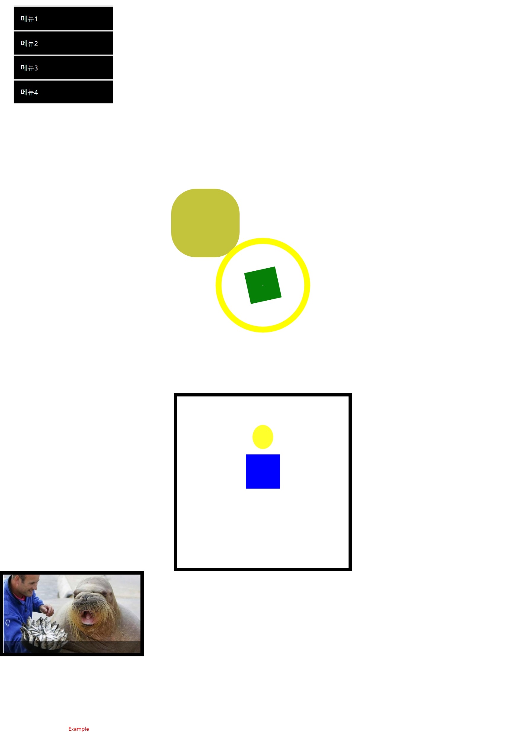
오늘은 애니메이션의 효과와 홈페이지 이용에 대해 배웠다.
학습내용 중 어려웠던 점
많은양의 애니메이션이 있어서 전부다 알기는 어려웠다. 그리고 그 세세한 부분까지 내가 일일이 조정을 할 수 없다는 것을 알았다.
해결방법
강사님께서 알려주신 애니메이션 홈페이지를 참조하면 쉽게 애니메이션 효과를 내맘대로 주무를 수 있다는 것을 알았다.
학습소감
이제 하나하나 세부적인 것들을 조정하고 만들어가는데 흥미가 있어진다.
