matplotlib 기초
import matplotlib.pyplot as plt
from matplotlib import rc
rc("font", family="Malgun Gothic")
%matplotlib inline #이 설정을 해줘야 그래프 나타남
# 그래프 기본 형태 설정
plt.figure(figsize=(10,6))
plt.plot()
plt.show()
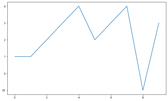
plt.figure(figsize=(10, 6))
plt.plot([0, 1, 2, 3, 4, 5, 6, 7, 8, 9], [1, 1, 2, 3, 4, 2, 3, 4, -1, 3])
plt.show()
예제1 : 그래프 기초
삼각함수 그리기
- np.arange(a,b,s) : a부터 b까지 s의 간격
- np.sin(value)
import numpy as np

t = np.arange(0, 12, 0.01)
y = np.sin(t)plt.figure(figsize=(10,6))
plt.plot(t, np.sin(t))
plt.plot(t, np.cos(t))
plt.show()
- 격자무늬 추가
- 그래프 제목 추가
- x축, y축 제목 추가
- 주황색, 파란색 선 데이터 의미 구분
# 격자무늬 추가
plt.figure(figsize=(10,6))
plt.plot(t, np.sin(t))
plt.plot(t, np.cos(t))
plt.grid(True)
plt.show()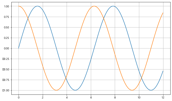
#그래프 제목, x,y축 제목 추가

plt.figure(figsize=(10,6))
plt.plot(t, np.sin(t))
plt.plot(t, np.cos(t))
plt.grid(True)
plt.legend(labels=["sin", "cos"])  #범례
plt.title("Example of sinewave")
plt.xlabel("time")
plt.ylabel("Amplitude") #진폭
plt.show()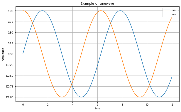
def drawgraph():
    plt.figure(figsize=(10,6))
    plt.plot(t, np.sin(t))
    plt.plot(t, np.cos(t))
    plt.grid(True)
    plt.legend(labels=["sin", "cos"])  #범례
    plt.title("Example of sinewave")
    plt.xlable("time")
    plt.ylable("Amplitude") #진폭
    plt.show()
예제2 : 그래프 커스텀
t = np.arange(0, 5, 0.5)
t
array([0. , 0.5, 1. , 1.5, 2. , 2.5, 3. , 3.5, 4. , 4.5])plt.figure(figsize=(10, 6))
plt.plot(t, t, "r--") #빨간 색으로 --점선 형태 선 그리기
plt.plot(t, t ** 2, "bs") #파란 박스형
plt.plot(t, t ** 3, "g^") #초록 화살표 형태
plt.show()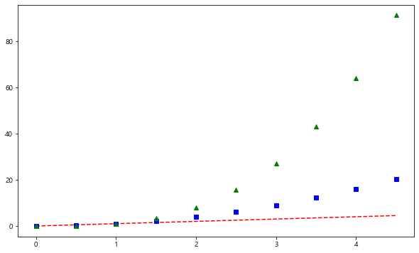
#t = [0, 1, 2, 3, 4, 5, 6]
t = list(range(0, 7))
y = [1, 4, 5, 8, 9, 5, 3]plt.figure(figsize=(10, 6))
plt.plot(
t,
y,
color = "green",
linestyle = "dashed", #dashed = "--"
marker="o",
markerfacecolor="blue",
markersize=15,
)
plt.xlim([-0.5, 6.5])
plt.ylim([0.5, 9.5])
plt.show()
def drawGraph():
    plt.figure(figsize=(10, 6))
    plt.plot(
        t,
        y,
        color = "red",
        linestyle = "-", #실선
        marker="*",
        markerfacecolor="yellow",
        markersize=20,
    )

    plt.xlim([-0.5, 6.5])
    plt.ylim([0.5, 9.5])
    plt.show()
drawGraph()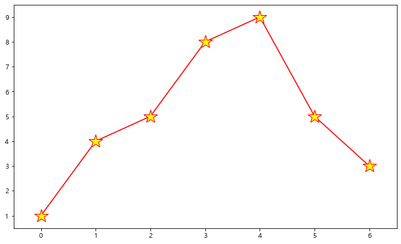
예제3. scatter plot
t = np.array(range(0,10))
y = np.array([9, 8, 7, 9, 8, 3, 2, 4, 3, 4])
def drawGraph():
plt.figure(figsize=(10,6))
plt.scatter(t,y)
plt.show()
drawGraph()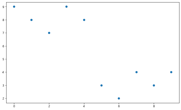
colormap = t

def drawGraph():
    plt.figure(figsize=(10,6))
    plt.scatter(t,y, s=50, c=colormap, marker=">")
    plt.colorbar()
    plt.show()
drawGraph()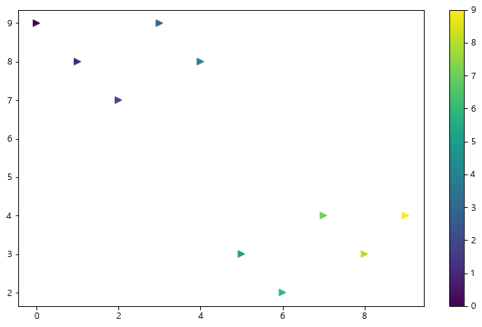
예시4. pandas에서 plot 그리기
- matplotlib 가져와서 사용
data_result.head()| 소계 | 최근 증가율 | 인구수 | 한국인 | 외국인 | 고령자 | 외국인 비율 | 고령자 비율 | CCTV비율 | |
|---|---|---|---|---|---|---|---|---|---|
| 구별 | |||||||||
| 강남구 | 3238 | 150.619195 | 561052 | 556164 | 4888 | 65060 | 0.871220 | 11.596073 | 0.577130 |
| 강동구 | 1010 | 166.490765 | 440359 | 436223 | 4136 | 56161 | 0.939234 | 12.753458 | 0.229358 |
| 강북구 | 831 | 125.203252 | 328002 | 324479 | 3523 | 56530 | 1.074079 | 17.234651 | 0.253352 |
| 강서구 | 911 | 134.793814 | 608255 | 601691 | 6564 | 76032 | 1.079153 | 12.500021 | 0.149773 |
| 관악구 | 2109 | 149.290780 | 520929 | 503297 | 17632 | 70046 | 3.384722 | 13.446362 | 0.404854 |
data_result["인구수"].plot(kind="bar", figsize=(10,10))
data_result["인구수"].plot(kind="barh", figsize=(10,10)) #barh : 가로 막대그래프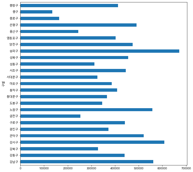
5. 데이터 시각화
import matplotlib.pyplot as plt
# import matplotlib as mpl  #matplotlib 전체 가져올 경우
plt.rcParams["axes.unicode_minus"]= False  #마이너스 부호 때문에 한글이 깨질 수 있어 주는 설정
rc("font", family="Malgun Gothic")
%matplotlib inline
"소계" 컬럼 시각화
data_result["소계"].plot(kind="barh", grid=True, figsize=(10, 10));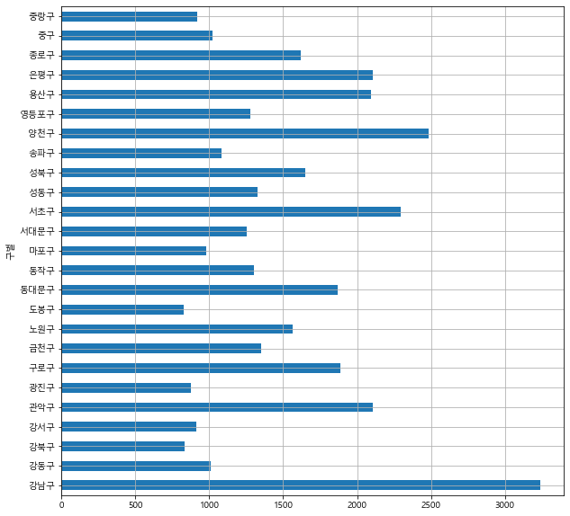
# 정렬 후 그래프 출력 시
# data_result["소계"].sort_values().plot(kind="barh", grid=True, figsize=(10, 10));
def drawGraph():
    data_result["소계"].sort_values().plot(
        kind="barh", grid=True, title="가장 CCTV가 많은 구", figsize=(10, 10));
drawGraph()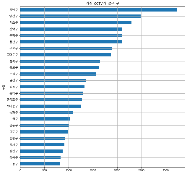
# CCTV 비율 기준 시각화
def drawGraph():
    data_result["CCTV비율"].sort_values().plot(
        kind="barh", grid=True, title="가장 CCTV가 많은 구", figsize=(10, 10));
drawGraph()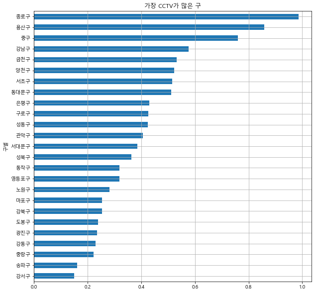
✍️그래프 종류
- The kind of plot to produce:
‘line’ : line plot (default)
‘bar’ : vertical bar plot
‘barh’ : horizontal bar plot
‘hist’ : histogram
‘box’ : boxplot
‘kde’ : Kernel Density Estimation plot
‘density’ : same as ‘kde’
‘area’ : area plot
‘pie’ : pie plot
‘scatter’ : scatter plot (DataFrame only)
‘hexbin’ : hexbin plot (DataFrame only)


데이터분석 스터디노트🧐✍️