Storybook이란
storybook 은 UI 컴포넌트를 보여주고 문서화하는 오픈소스 툴이다.
vite로 빌드된 React에 Storybook적용하기
npm create vite명령어로 react-typescript 패키지를 설치해준 뒤
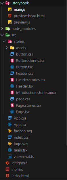
npx sb init --builder @storybook/builder-vite를 입력하면 아래 이미지처럼 루트 경로에 vite에 맞게 설정된 .storybook 폴더와 src/stories경로에 테스트 해볼 수 있는 몇개의 컴포넌트들이 생성된다.
stories폴더는 사용하지 않고 css도 emotion을 사용할 것이기 때문에 stories폴더와 css파일들을 삭제 해주고
npm i @emotion/styled @emotion/react emotion-reset로 emotion을 설정해준다.
Alias
프로젝트를 진행하다보면 import경로가 ../../../~이런 식으로 더러워지는 경우가 많다. 이를 해결하기 위해 루트 경로로 부터 접근할 수 있는 키워드를 설정하여 ../지옥을 벗어날 수 있다.
설정 방법
Step 1
vite.config.ts
import { defineConfig } from "vite";
import react from "@vitejs/plugin-react";
import * as path from "path";

export default defineConfig({
  plugins: [react()],
  resolve: {
    alias: [{ find: "@", replacement: path.resolve(__dirname, "src") }],
  },
});
Step 2
tsconfig.json
{
  "compilerOptions": {
    // ...rest of the template
    "types": ["node"],
    "paths": {
      "@/*": ["./src/*"]
    }
  },
  "include": ["src"],
  "references": [{ "path": "./tsconfig.node.json" }]
}
위와 같이 각각 파일을 설정해 주면 ../../styles/colors와 같은 경로를 @/styles/colors로 바꿔 사용할 수 있다.
참고 링크
그런데 storybook은 아직 @/~와 같은 경로를 읽어내지 못해 이 상태에선 오류를 뱉어낸다.
이를 해결하는 방법은 .storybook/main.cjs파일에 아래와 같이 설정해주면 된다.
const { loadConfigFromFile, mergeConfig } = require("vite");

module.exports = {
	...
  async viteFinal(config, { configType }) {
    const { config: userConfig } = await loadConfigFromFile(
      path.resolve(__dirname, "../vite.config.ts")
    );

    return mergeConfig(config, {
      ...userConfig,
      // manually specify plugins to avoid conflict
      plugins: [],
    });
  },
};
이 방식은 vite.config.ts에 작성된 설정을 재사용하는 방법이다.
참고 링크
src 폴더 구조
|-- components
|   `-- Button
|       |-- Button.stories.tsx
|       |-- Button.styles.ts
|       |-- Button.tsx
|       `-- Button.types.ts
|-- styles
|   |-- GlobalStyle.tsx
|   |-- colors.ts
|   `-- shared
|       `-- flex.ts
|-- App.tsx
|-- main.tsx
`-- vite-env.d.ts
button관련 파일
Button.tsx
import * as S from "./Button.styles";
import { ButtonProps } from "./Button.types";

/**
 * @param {Pick<ButtonProps,"size">} size - 버튼 크기
 * @param {Pick<ButtonProps,"color">} color - 버튼 색상
 * @todo 기능 더 만들기
 */

const Button = ({
  size = "md",
  color = "primary",
  children,
  ...rest
}: ButtonProps) => {
  return (
    <S.Container {...rest} size={size} color={color}>
      {children}
    </S.Container>
  );
};

export default Button;
Button.types.ts
import { ButtonHTMLAttributes, ReactNode } from "react";

export interface ButtonProps extends ButtonHTMLAttributes<HTMLButtonElement> {
  size?: "sm" | "md" | "lg";
  children: ReactNode;
  color?: "primary" | "secondary";
}
Button.styles.ts
import colors from "@/styles/colors";
import { flexCenter } from "@/styles/shared/flex";
import { css } from "@emotion/react";
import styled from "@emotion/styled";
import { ButtonProps } from "./Button.types";

export const Container = styled.button<Omit<ButtonProps, "children">>`
  transition: all 0.5s ease-in-out;
  cursor: pointer;
  border: none;
  ${flexCenter}
  border-radius: 0.2rem;
  background-color: ${({ color }) => color && colors[color]};
  color: ${colors.white};
  ${({ size }) =>
    size === "sm"
      ? css`
          padding: 0.5rem 1.5rem;
        `
      : size === "md"
      ? css`
          padding: 0.7rem 2rem;
        `
      : css`
          padding: 1rem 2.5rem;
        `}
`;
Button.stories.tsx
import Button from "./Button";
import { ComponentStory, ComponentMeta } from "@storybook/react";

export default {
  title: "Button",
  component: Button,
} as ComponentMeta<typeof Button>;

const Template: ComponentStory<typeof Button> = (args) => <Button {...args} />;

export const Default = Template.bind({});
Default.args = {
  children: "버튼",
};

export const Secondary = Template.bind({});
Secondary.args = {
  ...Default.args,
  color: "secondary",
};

export const Small = Template.bind({});
Small.args = {
  ...Default.args,
  size: "sm",
};

export const Large = Template.bind({});
Large.args = {
  ...Default.args,
  size: "lg",
};
App.tsx
import Button from "@/components/Button/Button";

function App() {
  return (
    <>
      <div style={{ padding: "1rem 2rem" }}>
        <Button size="sm" color="primary">
          sm primary
        </Button>
        <br />
        <Button>md primary</Button>
        <br />
        <Button color="secondary" size="lg">
          lg secondary
        </Button>
      </div>
    </>
  );
}

export default App;
실행 화면
npm run dev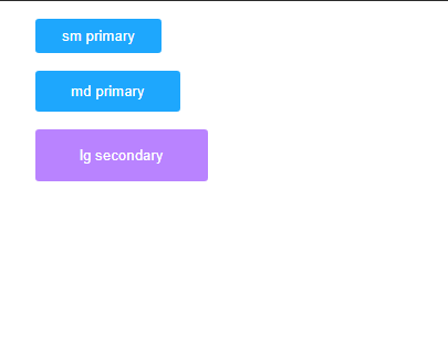
npm storybook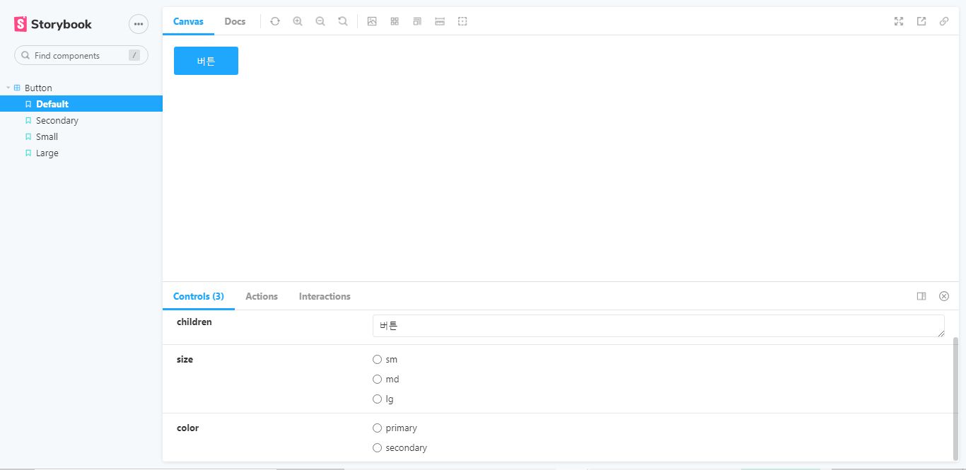
전체 코드(boilerplate)

기록해버리기