◾타이타닉 생존자 분석
1. 개요
- 생존자 예측
- 1910년대 당시 최대 여객선 타이타닉 : 영국에서 미국 뉴욕으로 가던 국제선
- 컬럼의 의미
컬럼명 속성 pclass 객실 등급 survived 생존 유무 sex 성별 age 나이 sibsp 형제 혹은 부부의 수 parch 부모 혹은 자녀의 수 fare 지불한 요금 boat 탈출을 했다면 탑승한 보트의 번호
- 컬럼의 의미
2. 데이터 탐색적 분석 EDA
import pandas as pd

titanic = pd.read_excel('titanic.xls')
titanic.head()
import matplotlib.pyplot as plt
import seaborn as sns
import set_matplotlib_korean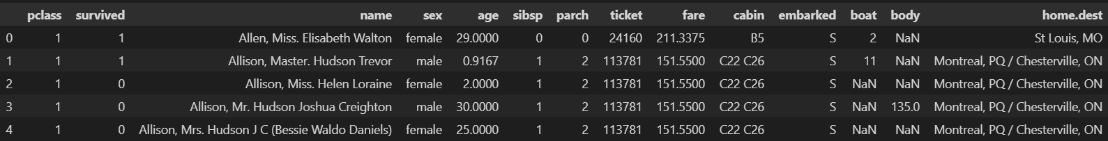
# 생존 상황
# 여러 개의 그래프를 한번에 표현 : subplots
f, ax = plt.subplots(1, 2, figsize=(18, 8))

titanic['survived'].value_counts().plot.pie(ax = ax[0], autopct='%1.1f%%', shadow=True, explode=[0, 0.1]);
ax[0].set_title('Pie plot - Survived')
ax[0].set_ylabel('')

sns.countplot(x='survived', data=titanic, ax=ax[1])
ax[1].set_title('Count plot - Survived')

plt.show()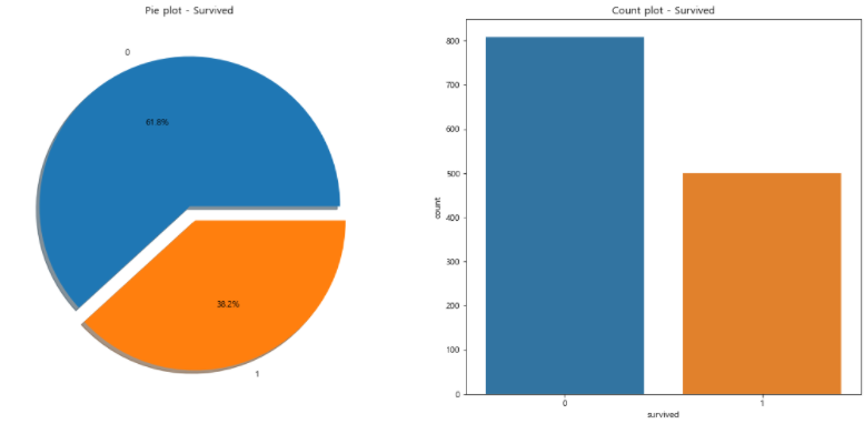
- 남성이 여성의 2배 정도이다.
- 여성은 350명 정도의 생존자가 있었고 남성은 150명 정도의 생존자가 있었다.
- 여성의 생존 인원의 2배의 남성이 사망하였다.
- 남성의 생존 가능성이 낮다.
# 성별에 따른 생존 현황
f, ax = plt.subplots(1, 2, figsize=(18, 8))

sns.countplot(x='sex', data=titanic, ax=ax[0])
ax[0].set_title('Count of passangers of sex')

sns.countplot(x='sex', data=titanic, hue='survived', ax=ax[1])
ax[1].set_title('Sex : Survived')

plt.show()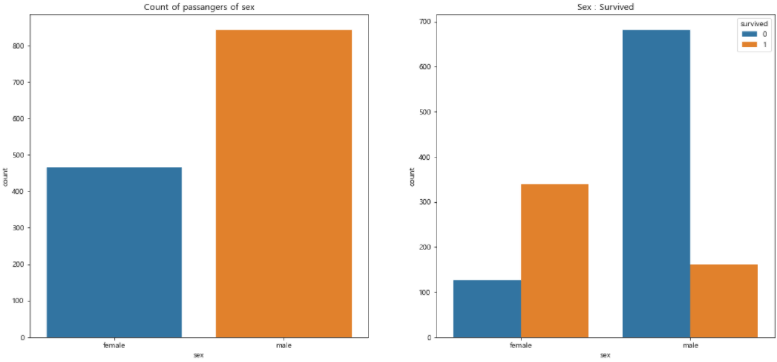
crosstab: 범주형 변수를 기준으로 개수 파악이나 수치형 데이터를 넣어 계산할 때 사용- 1등실의 생존 가능성이 높다.
- 앞서 여성의 생존률이 높은 것을 확인하였다.
- 1등실에는 여성이 많이 타고 있었는지 확인이 필요하다.
# 경제력 대비 생존률
# 0 사망, 1 생존
pd.crosstab(titanic['pclass'], titanic['survived'], margins=True)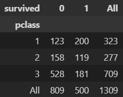
- 3등실에는 남성이 많았으며, 특히 20대 남성이 많다.
# 객실별 남성, 여성 분포
grid = sns.FacetGrid(titanic, row='pclass', col='sex', height=4, aspect=2)
grid.map(plt.hist, 'age', alpha=0.8, bins=20)
grid.add_legend()
plt.show()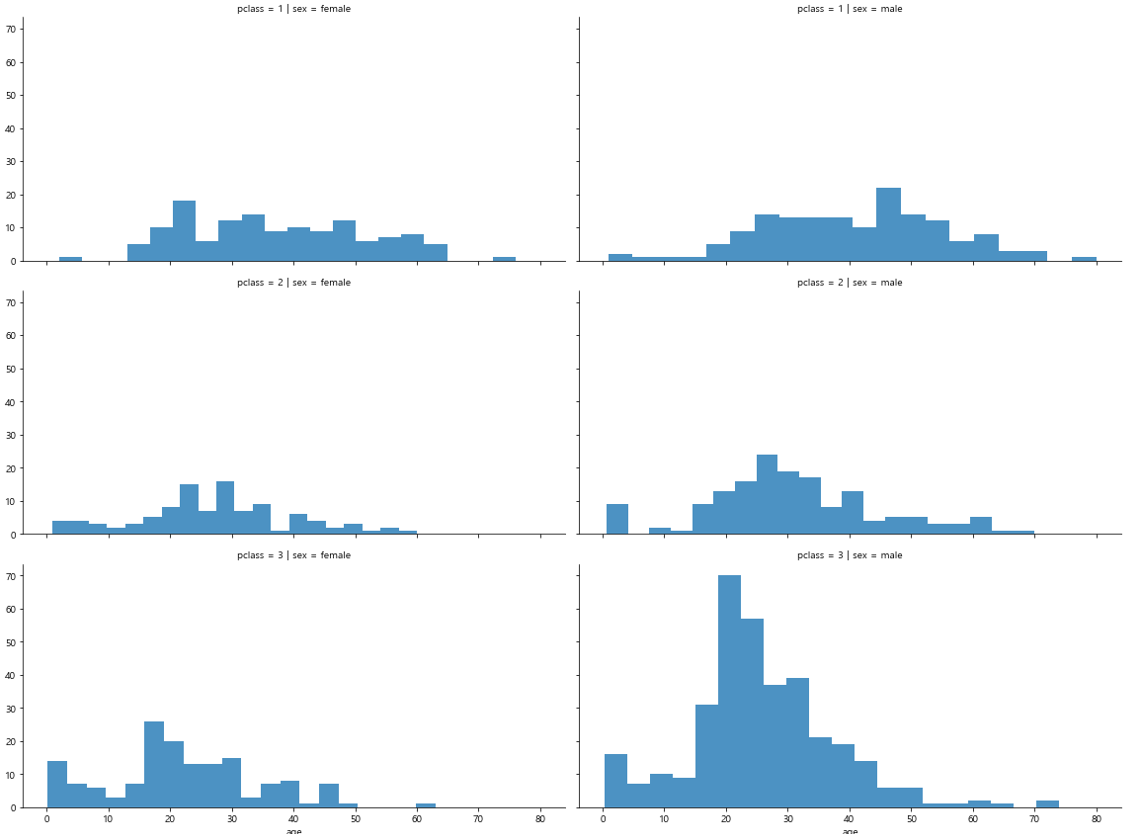
# 나이별 승객 현황
import plotly.express as px

fig = px.histogram(titanic, x='age')
fig.show()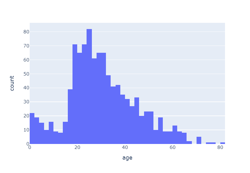
- 선실 등급이 높으면 생존률이 높은 것을 볼 수 있다.
- 3등실의 경우 20~40세 정도의 사람들이 크게 사망한 것을 볼 수 있다.
# 객실별 생존률을 연령별로 시각화
grid = sns.FacetGrid(titanic, col='survived', row = 'pclass', height=4, aspect=2)
grid.map(plt.hist, 'age', alpha=.5, bins=20)
grid.add_legend()
plt.show()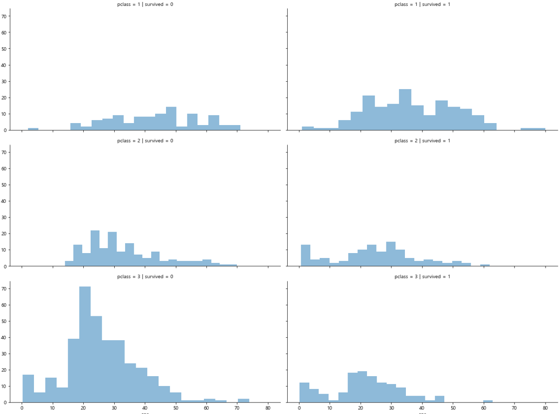
cut: 수치형 변수를 특정 구간으로 나눈 범주형 레이블을 생성할 수 있다. 위 함수들을 이용하여 특정 구간들에 대한 그룹별 통계량을 구하는 것이 가능해진다.
# 나이 5단계로 정리
titanic['age_cat'] = pd.cut(titanic['age'], bins=[0, 7, 15, 30, 60, 100],
                            include_lowest = True,
                            labels = ['baby', 'teen', 'young', 'adult', 'old'])
titanic.head()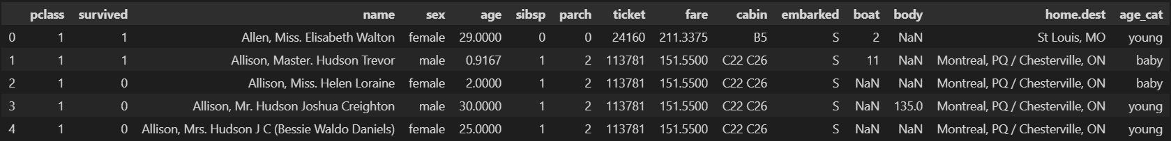
# 나이, 성별, 등급별 생존자 수 파악
plt.figure(figsize=(12, 4))
plt.subplot(131)
sns.barplot(x='pclass', y='survived', data=titanic)
plt.subplot(132)
sns.barplot(x='age_cat', y='survived', data=titanic)
plt.subplot(133)
sns.barplot(x='sex', y='survived', data=titanic)
plt.subplots_adjust(top=1, bottom=0.1, left=0.1, right=1, hspace=0.5, wspace=0.5)
plt.show()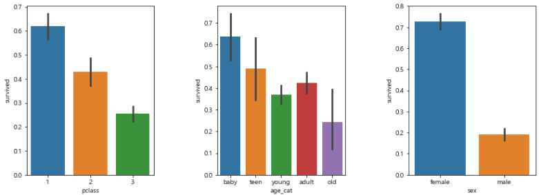
# 남/여 나이별 생존 상황
fig, axes = plt.subplots(nrows=1, ncols=2, figsize=(14, 6))

women = titanic[titanic['sex'] == 'female']
men = titanic[titanic['sex'] == 'male']

ax = sns.histplot(women[women['survived'] == 1]['age'], bins=20,
                 label = 'survived', ax = axes[0], kde=False)
ax = sns.histplot(women[women['survived'] == 0]['age'], bins=40,
                 label = 'not_survived', ax = axes[0], kde=False, color=['orange'])
ax.legend(); ax.set_title('Female')

ax = sns.histplot(men[men['survived'] == 1]['age'], bins=18,
                 label = 'survived', ax = axes[1], kde=False)
ax = sns.histplot(men[men['survived'] == 0]['age'], bins=40,
                 label = 'not_survived', ax = axes[1], kde=False, color=['orange'])
ax.legend(); ax.set_title('Male')
plt.show()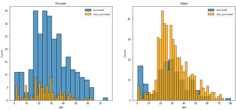
# 탑승객의 이름에서 신분을 알 수 있다.
import re

title = []
for idx, dataset in titanic.iterrows():
    tmp = dataset['name']
    title.append(re.search('\,\s\w+(\s\w+)?\.', tmp).group()[2:-1])

titanic['title'] = title
titanic.head()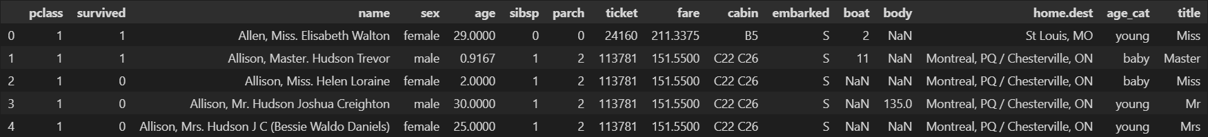
# 성별별로 본 귀족
pd.crosstab(titanic['title'], titanic['sex'])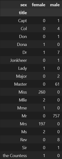
# 신분 구분
titanic['title'] = titanic['title'].replace('Mlle', 'Miss')
titanic['title'] = titanic['title'].replace('Mme', 'Miss')
titanic['title'] = titanic['title'].replace('Ms', 'Miss')

Rare_f = ['Dona', 'Lady', 'the Countess']
Rare_m = ['Capt', 'Col', 'Don', 'Major', 'Rev', 'Sir', 'Dr', 'Master', 'Jonkheer']
for each in Rare_f:
    titanic['title'] = titanic['title'].replace(each, 'Rare_f')

for each in Rare_m:
    titanic['title'] = titanic['title'].replace(each, 'Rare_m')
titanic['title'].unique()
- 평민 남성의 생존률이 가장 낮고, 귀족 남성이 다음으로 낮다.
- 귀족 여성, 평민 여성이 높은 생존률을 보인다.
# 결과 해석
titanic[['title', 'survived']].groupby(['title'], as_index = False).mean()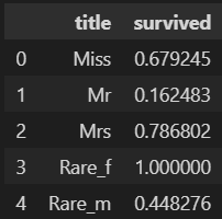
3. 머신 러닝을 이용한 생존자 예측
# 구조 확인
# pclass, sex, age, sibsp, parch, fare 등 사용
titanic.info()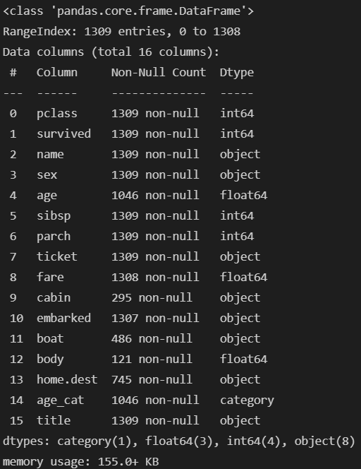
# 머신러닝을 위해 해당 컬럼 숫자로 변경
# Label Encode를 이용해 라벨 변경
from sklearn.preprocessing import LabelEncoder

le = LabelEncoder()
le.fit(titanic['sex'])
titanic['gender'] = le.transform(titanic['sex'])
titanic.head()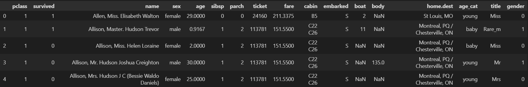
# 결측치는 포기하고 진행
titanic = titanic[titanic['age'].notnull()]
titanic = titanic[titanic['fare'].notnull()]
titanic.info()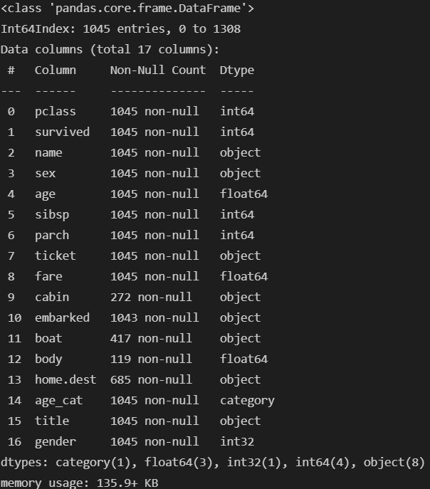
# 상관관계 확인
correlation_matrix = titanic.corr().round(1)
plt.figure(figsize=(10, 6))
sns.heatmap(data=correlation_matrix, annot=True, cmap='bwr')
plt.show()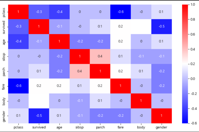
# 데이터 나누기
from sklearn.model_selection import train_test_split

X = titanic[['pclass', 'age', 'sibsp', 'parch', 'fare', 'gender']]
y = titanic['survived']

X_train, X_test, y_train, y_test = train_test_split(X, y, test_size=0.2, random_state=13)
# Decision Tree
from sklearn.tree import DecisionTreeClassifier
from sklearn.metrics import accuracy_score
dt = DecisionTreeClassifier(max_depth=4, random_state=13)
dt.fit(X_train.values, y_train)
pred = dt.predict(X_test.values)
print(accuracy_score(y_test, pred))
- 생존률 테스트
- pclass = 3, age = 18, sibsp = 0, parch = 0, fare = 5, gender = 1
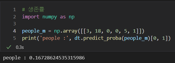
- pclass = 3, age = 18, sibsp = 0, parch = 0, fare = 5, gender = 1
- 생존률 테스트
- pclass = 1, age = 16, sibsp = 1, parch = 1, fare = 100, gender = 0
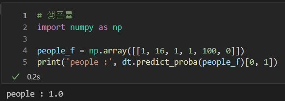
- pclass = 1, age = 16, sibsp = 1, parch = 1, fare = 100, gender = 0

후라이드 치킨