6-1. 처음 만나는 리액트 네이티브 애니메이션
📍 6장 프로젝트 준비
- src/copy/Person.tsx
useToggle : 커스텀 훅 사용 예정
deletePressed 속성 추가, Press Me 버튼 추가
IconText -> Icon 컴포넌트로 변경
import React, {useCallback, useState, useRef, useEffect, useMemo} from 'react'
import type {FC} from 'react'
import {View, Text, Image, Alert, Animated, Easing} from 'react-native'
import {Colors} from 'react-native-paper'
import Icon from 'react-native-vector-icons/MaterialCommunityIcons'
import moment from 'moment-with-locales-es6'
import * as D from '../data'
import {useToggle} from '../hooks' // 추가
import {Avatar} from '../components'
import {styles} from './Person.style'

moment.locale('ko')

export type PersonProps = {
  person: D.IPerson
  deletePressed: () => void // 추가
}

const Person: FC<PersonProps> = ({person, deletePressed}) => {
  // 변경 부분
  const avatarPressed = useCallback(() => Alert.alert('avatar pressed.'), [])

  return (
    <View style={[styles.view]}>
      <View style={[styles.leftView]}>
        <Avatar
          imageStyle={[styles.avatar]}
          uri={person.avatar}
          size={50}
          onPress={avatarPressed}
        />
        <Text style={[styles.text]}>Press Me</Text>
      </View>
      <View style={[styles.rightView]}>
        <Text style={[styles.name]}>{person.name}</Text>
        <Text style={[styles.email]}>{person.email}</Text>
        <View style={[styles.dateView]}>
          <Text style={[styles.text]}>
            {moment(person.createdDate).startOf('day').fromNow()}
          </Text>
          <Icon
            name="trash-can-outline"
            size={26}
            color={Colors.lightBlue500}
            onPress={deletePressed}
          />
        </View>
        <Text
          numberOfLines={3}
          ellipsizeMode="tail"
          style={[styles.text, styles.comments]}>
          {person.comments}
        </Text>
        <Image style={[styles.image]} source={{uri: person.image}} />
        <View style={[styles.countsView]}>
          <Icon name="comment" size={24} color={Colors.blue500} />
          <Icon name="twitter-retweet" size={24} color={Colors.purple500} />
          <Icon name="heart" size={24} color={Colors.red500} />
        </View>
      </View>
    </View>
  )
}
export default Person
- src/copy/People.tsx
addPerson : 새로운 아이템이 가장 처음에 위치하도록 변경
useEffect로 초기 아이템 하나 기본적으로 추가
deletePerson : people에서 특정 id를 가진 사람 제거
import React, {useState, useCallback, useEffect} from 'react'
import {StyleSheet, View, Text, Switch, FlatList} from 'react-native'
import {useTheme} from 'react-native-paper'
import {useToggleTheme} from '../contexts'
import * as D from '../data'
import Person from './Person'

export default function People() {
  const [people, setPeople] = useState<D.IPerson[]>([])
  const theme = useTheme()
  const toggleTheme = useToggleTheme()
  const addPerson = useCallback(() => {
    setPeople(people => [D.createRandomPerson(), ...people]) // 새로운 아이템이 가장 처음에 위치하도록 함
  }, [])
  const removeAllPersons = useCallback(() => {
    setPeople(notUsed => [])
  }, [])

  const deletePerson = useCallback(
    (id: string) => () =>
      setPeople(people => people.filter(person => person.id != id)),
    []
  )
  useEffect(addPerson, []) // 초기 아이템 하나 추가

  return (
    <View style={[styles.view, {backgroundColor: theme.colors.surface}]}>
      <View style={[styles.topBar, {backgroundColor: theme.colors.accent}]}>
        <Text onPress={addPerson} style={styles.text}>
          add
        </Text>
        <Text onPress={removeAllPersons} style={styles.text}>
          remove all
        </Text>
        <View style={{flex: 1}} />
        <Switch value={theme.dark} onValueChange={toggleTheme} />
      </View>
      <FlatList
        data={people}
        renderItem={({item}) => (
          <Person person={item} deletePressed={deletePerson(item.id)} />
        )}
        keyExtractor={item => item.id}
      />
    </View>
  )
}
const styles = StyleSheet.create({
  view: {flex: 1},
  topBar: {flexDirection: 'row', padding: 5},
  text: {marginRight: 10, fontSize: 20}
})- src/screens/MainNavigator.tsx
import React, {useState} from 'react'
import {BottomNavigation} from 'react-native-paper'
import Basic from './Basic'
import Monitor from './Monitor'
import Toggle from './Toggle'
import Interpolate from './Interpolate'

export default function MainNavigator() {
  const [index, setIndex] = useState<number>(0)
  const [routes] = useState([
    {key: 'basic', title: 'Basic', icon: 'alpha-b-box'},
    {key: 'monitor', title: 'Monitor', icon: 'eye-circle'},
    {key: 'toggle', title: 'Toggle', icon: 'file-eye'},
    {key: 'interpolate', title: 'Interpolate', icon: 'bullseye'},
  ])
  const renderScene = BottomNavigation.SceneMap({
    basic: Basic,
    monitor: Monitor,
    toggle: Toggle,
    interpolate: Interpolate
  })
  return (
    <BottomNavigation
      navigationState={{index, routes}}
      onIndexChange={setIndex}
      renderScene={renderScene}
    />
  )
}
📍 리액트 네이티브 애니메이션 특징
- 리액트 네이티브 애니메이션 모드
- 자바스크립트 엔진 애니메이션 : 자바스크립트 엔진이 기본으로 제공하는 requestAnimationFrame 함수를 사용한 애니메이션. 반복적으로 호출 시 다른 UI 컴포넌트의 동작이 일시적으로 정지하는 현상이 발생하여 지금은 잘 사용하지 않음.
- ⭐네이티브 모듈 애니메이션 : 자바나 Objective-C로 구현한 애니메이션.(useNativeDriver 값이 true일때 동작)
📍 Animated가 제공하는 애니메이션
import {Animated} from 'react-native'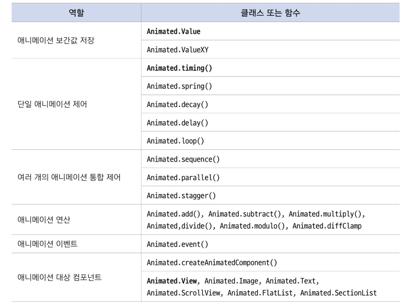
📍 리액트 네이티브 애니메이션 요약
- useRef훅을 사용하여 Animated.Value 클래스의 인스턴스 생성
리액트 네이티브 팀에서 useRef 훅 사용 권장
const PersonBasic: FC<PersonProps> = ({person}) => {
const animValue = useRef(new Animated.Value(0)).current- opacity 속성에 animValue 적용
Animated.Value 클래스의 인스턴스(animValue)는 항상 컴포넌트의 스타일 속성에 적용되어야 함!
const PersonBasic: FC<PersonProps> = ({person}) => {
  const animValue = useRef(new Animated.Value(0)).current
const rightViewAnimStyle = {opacity: animValue}- Animated.View 컴포넌트 사용
Animated.Value 타입을 View와 같은 컴포넌트에서 해석할 수 없으므로 View 대신 Animated.View 사용
const PersonBasic: FC<PersonProps> = ({person}) => {
  const animValue = useRef(new Animated.Value(0)).current
  const rightViewAnimStyle = {opacity: animValue}
<Animated.View style={[styles.rightView, rightViewAnimStyle]}>- 1초 동안 애니메이션 진행
animValue 값이 0(초깃값)부터 1(toValue)까지 1초(duration) 동안 보간하면서 애니메이션이 진행됨
- 보간 : 프레임을 일정 시간 동안 연속으로 보여주는 것
const PersonBasic: FC<PersonProps> = ({person}) => {
  const animValue = useRef(new Animated.Value(0)).current
  const rightViewAnimStyle = {opacity: animValue}
  const onPress = () => [
  	Animated.timing(animValue, {toValue: 1, useNativeDriver: true,
    	duration: 1000}).start()
  }
  <Avatar uri={person.avatar} size={50| onPress={onPress} />
<Animated.View style={[styles.rightView, rightViewAnimStyle]}>- 완성된 src/screens/PersonBasic.tsx
import React, {useCallback, useState, useRef} from 'react'
import type {FC} from 'react'
import {View, Text, Image, Alert, Animated} from 'react-native'
import {Colors} from 'react-native-paper'
import Icon from 'react-native-vector-icons/MaterialCommunityIcons'
import moment from 'moment-with-locales-es6'
import * as D from '../data'
import {Avatar} from '../components'
import {styles} from './Person.style'

moment.locale('ko')

export type PersonProps = {
  person: D.IPerson
  deletePressed: () => void
}

const PersonBasic: FC<PersonProps> = ({person, deletePressed}) => {
  // Animated.Value 인스턴스를 생성하여 opacity에 적용
  const animValue = useRef(new Animated.Value(0)).current
  const rightViewAnimStyle = {opacity: animValue}
  // Animated.timing : 시간의 경과에 따라 애니메이션이 일어남
  const avatarPressed = useCallback(
    () =>
      Animated.timing(animValue, {useNativeDriver: true, toValue: 1}).start(),
    []
  )
  return (
    <View style={[styles.view]}>
      <View style={[styles.leftView]}>
        <Avatar
          imageStyle={[styles.avatar]}
          uri={person.avatar}
          size={50}
          onPress={avatarPressed}
        />
        <Text style={[styles.text]}>Press Me</Text>
      </View>
      <Animated.View style={[styles.rightView, rightViewAnimStyle]}>
        <Text style={[styles.name]}>{person.name}</Text>
        <Text style={[styles.email]} onPress={avatarPressed}>
          {person.email}
        </Text>
        <View style={[styles.dateView]}>
          <Text style={[styles.text]}>
            {moment(person.createdDate).startOf('day').fromNow()}
          </Text>
          <Icon
            name="trash-can-outline"
            size={26}
            color={Colors.lightBlue500}
            onPress={deletePressed}
          />
        </View>
        <Text
          numberOfLines={3}
          ellipsizeMode="tail"
          style={[styles.text, styles.comments]}>
          {person.comments}
        </Text>
        <Image style={[styles.image]} source={{uri: person.image}} />
        <View style={[styles.countsView]}>
          <Icon name="comment" size={24} color={Colors.blue500} />
          <Icon name="twitter-retweet" size={24} color={Colors.purple500} />
          <Icon name="heart" size={24} color={Colors.red500} />
        </View>
      </Animated.View>
    </View>
  )
}
export default PersonBasic
📍 Animated.Value 클래스
해당 클래스는 애니메이션이 실행되면 값을 보간하는 number 타입 값을 value라는 속성에 저장하는 클래스. setValue를 통해 다른 값으로 변경 가능함.
const animValue = new Animated.Value(0)
animValue.setValue(100)
animValue에 useRef 훅을 사용할 경우 animValue를 사용하는 컴포넌트가 재랜더링할 때마다 animValue가 새로 생성되는 불필요한 일이 발생하지 않으므로, 리액트 네이티브에서는 아래와 같은 useRef 사용을 권장하고 있다.
const animValue = useRef(new Animated.Value(0)).current
animValue.setValue(100)
이처럼 useRef를 사용하면 컴포넌트 초기 렌더링 시에만 유일하게 animValue가 생성된다.
📍 useRef훅과 MutableRefObject 타입
- useRef 훅의 두가지 버전
RefObject< T> 타입 객체 반환
MutableRefObject< T> 타입 객체 반환
이때 MutableRefObject 제네릭 타입은 내부 속성인 current를 가지고 있고, 이 속성은 null이 허용되지 않는다.
interface MutableRefObject<T> {
  current: T;
}
따라서 아래의 예시 속 animValue는 null이 될 수 없고, 따라서 useMemo나 useCallback의 의존성 목록에 추가할 필요가 없다.
const animValue = useRef(new Animated.Value(0)).current📍 Animated.View와 Animated.createAnimatedComponent 함수
Animated.createAnimatedComponent 함수는 다른 컴포넌트를 매개변수로 입력받아 Animated.Value 타입 객체를 처리할 수 있는 기능을 가진 새로운 컴포넌트를 만든다.
type AnimatedComponent = Animated.createAnimatedComponent
export function createAnimatedComponent<T>(component: T): AnimatedComponent<T>;
이렇게 일일히 type을 새로 만들어주는 것은 번거로우므로 Animated에서는 앞서 사용했던 Animated.View 를 포함하여 Animated.Text, Animated.Image등의 컴포넌트를 제공한다. 애니메이션을 제공하는 기본 컴포넌트들이다.
📍 Animated.timing
시간에 따른 기본적인 애니메이션을 제공하는 함수다. 지속 시간(duration)과 지연 시간(delay)를 설정하고 목표값(value)을 설정하면,
1. 지연 시간이 지난 뒤
2. 지속시간 동안 초기값에서 목표값까지 서서히 변화한다(=애니메이션)
이 함수의 매개변수는 value와 config로, value에는 초기값이 들어있고 config(Animated.TimingAnimationConfig 타입)에 아래와 같은 속성이 들어있다.
interface AnimationConfig {
  // 자바스크립트 엔진(false) 또는 네이티브 애니메이션(true) 사용 여부
  useNativeDriver: boolean;
}
interface TimingAnimationConfig extends AnimationConfig {
  toValue: number | Animated.Value // 목표 값 설정
  duration?: number // 애니메이션 진행 시간
  delay?: number // 애니메이션 진행 전 대기 시간
  easing?: (value: number) => number; //Easing이 제공하는 보간 함수 설정
}
📍 Animated.CompositeAnimation 타입 객체
-> Animated.timing이 반환하는 객체, 애니메이션 시작 및 종료를 담당한다.
애니메이션을 실행하는 start 메서드가 있고, 애니메이션이 종료되면 콜백함수를 남길 수 있습니다.
Animated.timing(animValue, {toValue:1, duration: 1000, useNativeDriver: true}).start(
	() => console.log('animation end')
}
📍 Press Me 글자를 클릭하면 애니메이션 효과 보이기
- src/screens/PersonMonitor.tsx
import React, {useCallback, useState, useRef, useEffect, useMemo} from 'react'
import type {FC} from 'react'
import {View, Text, Image, Alert, Animated, Easing} from 'react-native'
import {Colors} from 'react-native-paper'
import Icon from 'react-native-vector-icons/MaterialCommunityIcons'
import moment from 'moment-with-locales-es6'
import * as D from '../data'
import {Avatar} from '../components'
import {Text as ThemeText, View as ThemeView} from '../theme/paper'
import {styles} from './Person.style'

moment.locale('ko')

export type PersonProps = {
  person: D.IPerson
  deletePressed: () => void
}

const PersonMonitor: FC<PersonProps> = ({person, deletePressed}) => {
  const animValue = useRef(new Animated.Value(0)).current
  const [realAnimValue, setRealAnimValue] = useState<number>(0)
  const [animationEnd, setAnimationEnd] = useState<boolean>(false)
  useEffect(() => {
    const id = animValue.addListener((state: {value: number}) => {
      setRealAnimValue(state.value)
    })
    return () => animValue.removeListener(id)
  }, [])
  const avatarPressed = useCallback(
    () =>
      Animated.timing(animValue, {
        toValue: 1,
        useNativeDriver: true,
        duration: 3000,
        easing: Easing.bounce
      }).start(() => setAnimationEnd(notUsed => true)),
    []
  )
  const rightViewAnimStyle = {opacity: animValue}
  return (
    <ThemeView>
      <ThemeText style={[{fontSize: 20}]}>
        realAnimValue: {realAnimValue}
      </ThemeText>
      <ThemeText style={[{fontSize: 20}]}>
        animationEnd: {animationEnd ? 'true' : 'false'}
      </ThemeText>
      <View style={[styles.view]}>
        <View style={[styles.leftView]}>
          <Avatar
            imageStyle={[styles.avatar]}
            uri={person.avatar}
            size={50}
            onPress={avatarPressed}
          />
          <Text style={[styles.text]}>Press Me</Text>
        </View>
        <Animated.View style={[styles.rightView, rightViewAnimStyle]}>
          <Text style={[styles.name]}>{person.name}</Text>
          <Text style={[styles.email]} onPress={avatarPressed}>
            {person.email}
          </Text>
          <View style={[styles.dateView]}>
            <Text style={[styles.text]}>
              {moment(person.createdDate).startOf('day').fromNow()}
            </Text>
            <Icon
              name="trash-can-outline"
              size={26}
              color={Colors.lightBlue500}
              onPress={deletePressed}
            />
          </View>
          <Text
            numberOfLines={3}
            ellipsizeMode="tail"
            style={[styles.text, styles.comments]}>
            {person.comments}
          </Text>
          <Image style={[styles.image]} source={{uri: person.image}} />
          <View style={[styles.countsView]}>
            <Icon name="comment" size={24} color={Colors.blue500} />
            <Icon name="twitter-retweet" size={24} color={Colors.purple500} />
            <Icon name="heart" size={24} color={Colors.red500} />
          </View>
        </Animated.View>
      </View>
    </ThemeView>
  )
}
export default PersonMonitor
📍 결과 화면
실행 도중의 사진

📍 토글 애니메이션 구현
초기 상태 -> 애니메이션 진행 -> 원래의 상태로 돌아감 : 애니메이션 순환 방식의 토글 애니메이션
- boolean타입의 started라는 변수를 생성
- started 값이 false면 Animated.timing(animValue, {toValue: 1}) <- 애니메이션을 진행
- 애니메이션이 끝나면 started값이 true로 바뀜
=> 애니메이션 순환
📍 Animated.Value 클래스의 interpolate 메서드

위 사례처럼 0~1 사이의 값으로 애니메이션 진행 척도를 조절하는데, 우리의 목표가 0과 1 사이에 없을 때가 더 많다.
이때는 입력 보간값을 새로운 보간값으로 변경하여야 한다.
export class Value {
  interpolate(config: InterpolationConfigType): AnimatedInterpolation;
}
class AnimatedInterpolation{
  interpolate(config: InterpolationConfigType): AnimatedInterpolation;
}
interpolation 메서드는 InterpolationConfigType을 받아 AnimatedInterpolation 객체를 반환한다.
이때 InterpolationConfigType에 보간값에 관한 속성이 포함되어 있다.
type ExtrapolateType = 'extend' | 'identity' | 'clamp';

type InterpolationConfigType = {
  inputRange: number[];
  outputRange: number[] | string[];
  easing?: (input: number) => number;
};
위의 세가지 사례를 InterpolationConfigType으로 표현해보자
animValue.interpolate({inputRange: [0, 1], outputRange: [0, 100]})
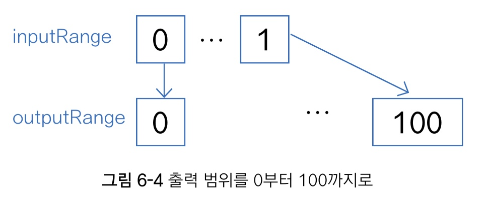
animValue.interpolate({inputRange: [0, 1], outputRange: ['red', 'blue']})
animValue.interpolate({inputRange: [0, 1], outputRange: ['0deg', '360deg']})6-2. transform 스타일 속성에 적용하는 애니메이션
📍 transform 스타일 속성 탐구
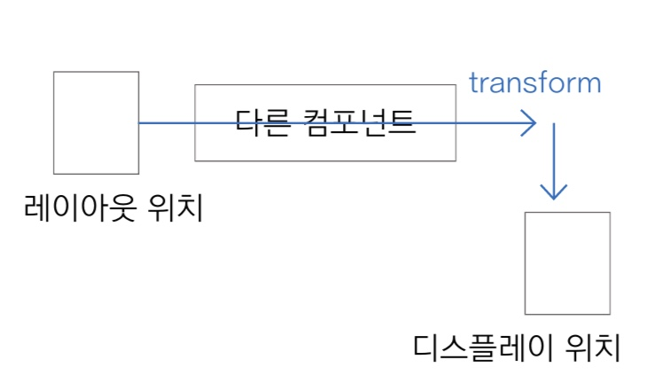
CSS의 transform과 같은 개념으로, 주의할 점은 속성을 적용한 컴포넌트의 레이아웃 위치(기존 위치)와 디스플레이 위치(transform하여 이동한 위치)가 다르다는 점이다.
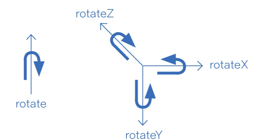
rotate와 관련된 방향은 다음과 같다. (실제로 그렇지 않지만 그렇게 보이는 것도 있다.)
- rotate : 시계 방향
- rotateX : 아래에서 위
- rotateY : 왼쪽에서 오른쪽
- rotateZ : 시계 방향
📍 transform 스타일 속성에 애니메이션 적용하기
이전에 만들어둔 useStyle 커스텀 훅은 다음과 같다.
import {useMemo} from 'react'

export const useStyle = (style: object, deps: any[] = []) => {
  return useMemo(() => style, deps)
}
useStyle 훅을 사용하여 transform 스타일 속성이 있는 nameAnimStyle 스타일 객체 생성하고
수평 방향(translateX)으로 500픽셀 이동(interpolate)하고, 45도 회전하며, 크기가 두 배로 커지는 애니메이션을 구현해보자
const nameAnimStyle = useStyle({
  transform: [
  	{
      translateX: animValue.interpolate({
        inputRange: [0,1],
        outputRange: [0, 500]
      })
    },
   {
      rotate: animValue.interpolate({
        inputRange: [0,1],
        outputRange: ['0deg', '45deg']
      })
    },
   {
      scale: animValue.interpolate({
        inputRange: [0,1],
        outputRange: [1, 2]
      })
    },
  ]
})
위의 코드를 커스텀 훅으로 구현해보자.
커스텀 훅 구현을 위해서는 아래와 같은 과정이 필요하다. 데이터를 다룰 때 흔히 사용하는 배열 속 딕셔너리로 만들어줘야 한다.
const transform = {translateX, rotate, scale}
Object.keys(transform) // ['translateX', 'rotate', 'scale']
	.map((key) => ({[key]: transform[key]})) // [{translateX: 0}, {rotate: '0deg'}, {scale: 1}
이걸 반영해서 useTransformStyle 커스텀 훅을 구현해본다.
import {useStyle} from './useStyle'

export const useTransformStyle = (
  transform: Record<string, any>,
  deps: any[] = []
) => {
  return useStyle(
    {
      transform: Object.keys(transform).map(key => ({[key]: transform[key]}))
    },
    deps
  )
}
📍 애니메이션 연산 관련 함수
Animated는 +, -, *, /, % 등의 연산 관련 내장 함수가 있다.
type Value = Animated.Value
export function add(a: Value, b: Value): Animated.AnimatedInterpolation // +
export function subtract(a: Value, b: Value): Animated.AnimatedInterpolation  // -
export function multiply(a: Value, b: Value): Animated.AnimatedInterpolation  // *
export function divide(a: Value, b: Value): Animated.AnimatedInterpolation  // /
export function modulo(a: Value, b: Value): Animated.AnimatedInterpolation  // %
이때 매개변수 a,b에는 number 타입이 들어가면 안 된다.
const [_10, set_10] = useState(new Animated.Value(10))
const [_20, set_20] = useState(new Animated.Value(20))
const textStyle = useStyle({
fontSize: Animated.add(_10, Animated.multiply(animValue, _20)),
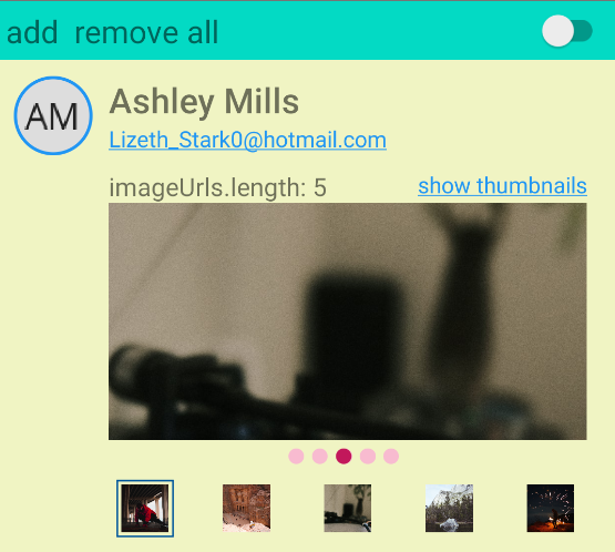
})📍 다시 사용할 수 있는 ImageSlider 컴포넌트 제작
- 이미지 슬라이더 또는 캐러셀(Carousel) 컴포넌트를 제작할 예정
<ImageSlider imageUrls={imageUrls} imageWidth={layout.width}
	showThumbnails={showThumbnails} />
▶ ImageSlider에 들어가야 할 매개변수
export type ImageSliderProps = {
  imageUrls: string[]  // 이미지의 URL이 있는 배경
  imageWidth: number  // 이미지 크기
  showThumbnails?: boolean  // 화면 아래에 썸네일 표시 여부
}
▶ FlatList 코어 컴포넌트 관련 설정
- contentContainerStyle 속성(너비)에 "이미지 개수 * 이미지 크기" 만큼의 width 값을 주어야 함
- 좌우 스크롤로 현재 보는 이미지를 바꾸려면 scrollEnabled 속성을 true로 주어야 함
- showHorizontal ScrollIndicator 속성값에 false를 설정하면 스크롤 바 숨김
- scrollToIndex 메서드를 통해 해당 컴포넌트의 순서를 알아낼 수 있다(index값)
▶ FlatList의 scrollToIndex 메서드를 호출하는 코드
export const ImageSlider: FC<ImageSliderProps> = ({
  imageUrls, imageWidth, showThumbNails}) => {
    const flatListRef = useRef<FlatList | null>(null)
    const selectImage = (index: number) => () => {
      flatListRef.current?.scrollToIndex({index})
    }
    return (<FlatList ref={flatListRef} />)
  }
▶ 슬라이드 애니메이션 구현
Animated의 사칙 연산 함수를 사용하여 이미지 개수 만큼 나열하고, index번째 아이템에만 다른 색상으로 표시하는 슬라이드 애니메이션을 구현하도록 하겠다.
export const ImageSlider: FC<ImageSliderProps> = ({images, imageWidth, showThumbNails})
=> {
  const circles = useMemo(() =>
  	images.map((uri, index) => <View key={index} style={styles.circle} />), [])
  <View style={{flexDirection: 'row''}}>{circles}</View>
}

const styles = StyleSheet.create({
	circle: {width: circleWidth, height: circleWidth, borderRadius: circleWidth/2,
    marginRight: circleMarginRight, backgroundColor: Color.pink100},
})
▶ 최종 ImageSlider
- src/components/ImageSlider.tsx
import React, {useRef, useMemo, useCallback} from 'react'
import type {FC} from 'react'
import {StyleSheet, FlatList, Image, View, Animated} from 'react-native'
import type {NativeSyntheticEvent, NativeScrollEvent} from 'react-native'
import {Colors} from 'react-native-paper'
import {TouchableView} from './TouchableView'
// prettier-ignore
import {useAnimatedValue, useMonitorAnimatedValue, useTransformStyle}
from '../hooks'

export type ImageSliderProps = {
  imageUrls: string[]
  imageWidth: number
  showThumbnails?: boolean
}
// prettier-ignore
const circleWidth = 10, circleMarginRight = 5, thumbnailSize = 30

export const ImageSlider: FC<ImageSliderProps> = ({
  imageUrls,
  imageWidth,
  showThumbnails
}) => {
  const flatListRef = useRef<FlatList | null>(null)
  const selectedIndexAnimValue = useAnimatedValue(0)
  const selectedIndex = useMonitorAnimatedValue(selectedIndexAnimValue)
  const circleWidthAnimValue = useAnimatedValue(circleWidth)
  const circleMarginRightAnimValue = useAnimatedValue(circleMarginRight)

  // contentOffset.x 값을 이미지로 나누어 현재 화면에 있는(스크롤된) 이미지의 index를 얻음
  const onScroll = useCallback(
    (event: NativeSyntheticEvent<NativeScrollEvent>) => {
      if (imageWidth == 0) return
      const {contentOffset} = event.nativeEvent
      const index = Math.round(contentOffset.x / imageWidth)
      selectedIndexAnimValue.setValue(index)
    },
    [imageWidth]
  )
  const selectImage = useCallback(
    (index: number) => () => {
      // 썸네일 이미지를 눌렀을 때 Animated.View가 움직이도록 하는 코드
      selectedIndexAnimValue.setValue(index)
      flatListRef.current?.scrollToIndex({index}) // 이 코드 없어도 됨
    },
    []
  )
  const circles = useMemo(
    () =>
      imageUrls.map((uri, index) => <View key={index} style={styles.circle} />),
    []
  )
  const thumbnails = useMemo(
    () =>
      imageUrls.map((uri, index) => (
        <TouchableView
          key={index}
          onPress={selectImage(index)}
          style={[
            styles.thumbnail,
            {
              borderColor:
                index == selectedIndex ? Colors.lightBlue900 : 'transparent'
            }
          ]}>
          <Image
            source={{uri}}
            style={{width: thumbnailSize, height: thumbnailSize}}
          />
        </TouchableView>
      )),
    []
  )

  // 선택된 index 원 위치 찾기
  const translateX = useTransformStyle({
    translateX: Animated.multiply(
      selectedIndexAnimValue,
      Animated.add(circleWidthAnimValue, circleMarginRightAnimValue)
    )
  })

  return (
    <>
      <FlatList
        ref={flatListRef}
        scrollEnabled={true}
        pagingEnabled={true}
        onScroll={onScroll}
        contentContainerStyle={{width: imageUrls.length * imageWidth}}
        showsHorizontalScrollIndicator={false}
        horizontal={true}
        data={imageUrls}
        renderItem={({item}) => (
          <Image
            style={[styles.image, {width: imageWidth}]}
            source={{uri: item}}
          />
        )}
        keyExtractor={(item, index) => index.toString()}
      />
      <View style={[styles.iconBar, {justifyContent: 'center'}]}>
        <View style={{flexDirection: 'row'}}>
          {circles}
          <Animated.View
            style={[styles.circle, styles.selectedCircle, translateX]}
          />
        </View>
      </View>
      {showThumbnails && (
        <View style={[styles.iconBar, {justifyContent: 'space-between'}]}>
          {thumbnails}
        </View>
      )}
    </>
  )
}

const styles = StyleSheet.create({
  image: {height: 150, resizeMode: 'cover'},
  iconBar: {flexDirection: 'row', padding: 5},
  thumbnail: {borderWidth: 1, padding: 2},
  circle: {
    width: circleWidth,
    height: circleWidth,
    borderRadius: circleWidth / 2,
    marginRight: circleMarginRight,
    backgroundColor: Colors.pink100
  },
  selectedCircle: {position: 'absolute', backgroundColor: Colors.pink700}
})
6-3. 여러 개의 애니메이션 한꺼번에 실행하기
📍 Animated.CompositeAnimation[] 타입 객체를 매개변수로 하는 함수
- parallel, sequence, stagger 함수
type CompositeAnimation = Animated.CompositeAnimation

export function sequence(
  animations: CompositeAnimation[]
): CompositeAnimation

export function parallel(
  animations: CompositeAnimation[],
  config?: {stopTogether?: boolean}
): CompositeAnimation

export function stagger(
  time: number,
  animations: CompositeAnimation[]
): COmpositeAnimation
CompositeAnimation 타입은 Animated.timing 함수의 반환값이므로 아래와 같이 나타내면 CompositeAnimation[] 타입 객체 배열을 얻을 수 있다. 그리고 start 메서드를 이용해 CompositeAnimation 타입을 실행할 수 있다.
// 객체 배열 얻기
const animations: CompositeAnimation[] = animValues.map(animValue =>
	Animated.timing(animValue, {useNativeDriver:true, toValue: 1})

// 배열 요소 각각을 애니메이션 실행
const animation: CompositeAnimation = Animated.sequence(animations)
animation.start()
이때 sequence 함수는 animations에 담긴 애니메이션을 순서대로 실행한다. 주의할 점은 animValue는 원하는 개수만큼 독립적으로 생성해야 한다는 점이다.
const animValues = useMemo(() => [1,2,3].map((notUsed) => new Animated.Value(0)), [])그리고 이렇게 각각 애니메이션을 주고 Animated.sequence로 실행시킨다.
const leftIconStyle = useTransformStyle({
  translateX: interpolate(animValues[0], !started ? [-1200, 0] : [0, -1200])
})
const centerIconStyle = useTransformStyle({
  translateY: interpolate(animValues[1], !started ? [1200, 0] : [0, 1200])
})
const rightIconStyle = useTransformStyle({
  translateX: interpolate(animValues[2], !started ? [1200, 0] : [0, 1200])
})


<View style={[styles.countsView]}>
  <AnimatedIcon name="comment" style={[leftIconStyle]} size={24} color={Colors.blue500} />
  <AnimatedIcon name="twitter-retweet" style={[centerIconStyle]} size={24} color={Colors.purple500} />
  <AnimatedIcon name="heart" size={24} style={[rightIconStyle]} color={Colors.red500} />
</View>
📍 Animated.spring 함수
용수철 같은 보간을 만들어내는 함수
export function spring(
  value: Animated.Value | Animated.ValueXY,
  config: SpringAnimationConfig
): Animated.CompositeAnimation
Animated.timing에 easing을 bounce로 넣어주면 비슷해진다. 하지만 Animated.spring에는 duration이 없다.
Animated.timing(animValue, {
  useNativeDriver: true,
  toValue: !started ? 1 : 0,
  duration: 1000 * 1,
  easing: Easing.bounce
})
최종구현은 아래와 같이 하면 된다. Animated.timing과 비슷하다.
const fadeInStyle = useCallback(() => {
  Animated.spring(animValue, {toValue: 1, useNativeDriver: true}).start()
}, [])
📍 Animated.parallel 함수
여러 개의 애니메이션을 동시에 실행하는 것이 특징이다.
export function parallel(animations: CompositeAnimation[],
  config?: {stopTogether?: boolean}): CompositeAnimation
실습에서는 아바타를 클릭했을 때 콜백함수에 parallel 함수를 달아 동시 애니메이션을 실행시킨다.
const avatarPressed = useCallback(() => {
  Animated.parallel(animations).start(toggleStarted)
}, [started])
📍 Animated.delay와 Animated.stagger 함수
Animated.delay는 애니메이션 지연 시간을 나타내는 시간으로, Animated.stagger 함수도 delay를 입력 매개변수로 받는다. Animated.stagger 또한 애니메이션이 순서대로 진행된다.
export namespace Animated {
  export const timing: (value: AnimatedValue, config: TimingAnimationConfig) =>
    CompositeAnimation
  interface TimingAnimationConfig {
    delay?: number;
  }
}
Animated.stagger 함수
export function stagger(delay: number, animations: CompositeAnimation[]): CompositeAnimationAnimated.sequence는 delay값이 있으면 애니메이션이 처음 시작하기 전에도 delay만큼 시간을 지연시킨 뒤 애니메이션을 실행시키지만, Animated.stagger는 첫 번째 애니메이션 실행 전에 지연 시간이 없다.
🌻 안드로이드에서는 현재 Animated.stagger 실행 시 애니메이션이 진행 중 멈추는 현상이 발생하므로 잘 사용하지 않는다.
Animated.loop 함수
애니메이션 반복을 실행하는 함수.
interface LoopAnimationConfig {
  iterations?: number		// 기본값 -1
  resetBeforeIteration?: Boolean	// 기본값 true
}

export function loop(animation: CompositeAnimation, config?: LoopAnimationConfig):
  CompositeAnimation
이 함수로 무한 반복하는 애니메이션을 구현해보자. 위의 config를 명시하지 않으면 애니메이션이 무한 반복된다.
const avatarPressed = useCallback(() => {
  if (Platform.OS === 'ios')
    Animated.loop(Animated.stagger(delay, [
      ...startAnimations,
      ...endAnimations
    ])).start()
  else Animated.loop(Animated.sequence([...startAnimations, ...endAnimations])).start()
}, [])
📍 Enter/Exit 애니메이션 구현
새로운 컴포넌트가 생성될 때 실행하는 Enter 애니메이션과 컴포넌트가 파괴될 때 실행하는 Exit 애니메이션을 구현해보자.
- enterAnimation 함수와 exitAnimation 함수
const PersonEnterExit: FC<PersonProps> = ({person, onDelete}) => {
  const [started, toggleStarted] = useToggle()

  const enterAnimation = useCallback(() => {
    Animated.sequence([
    ]).start(toggleStarted)}, [])
  const exitAnimation = useCallback(() => {
    Animated.sequence([
]).start(onDelete)}, [])- 반영된 코드
import React, {useCallback, useMemo, useEffect} from 'react'
import type {FC} from 'react'
import {View, Text, Animated, Easing} from 'react-native'
import {Colors} from 'react-native-paper'
import Icon from 'react-native-vector-icons/MaterialCommunityIcons'
import moment from 'moment-with-locales-es6'
import * as D from '../data'
// prettier-ignore
import {useToggle, useTransformStyle, useAnimatedValues, useAnimatedValue,
useStyle} from '../hooks'
import {interpolate} from '../utils'
import {Avatar} from '../components'
import {styles} from './Person.style'

const AnimatedIcon = Animated.createAnimatedComponent(Icon)

export type PersonProps = {
  person: D.IPerson
  deletePressed: () => void
}
const PersonEnterExit: FC<PersonProps> = ({person, deletePressed}) => {
  const [started, toggleStarted] = useToggle()
  const opacityAnimValue = useAnimatedValue()
  const leftToRightAnimValue = useAnimatedValue()
  const topBottomAnimValue = useAnimatedValue()
  const iconAnimValues = useAnimatedValues(3)
  const iconAnimations = useMemo(
    () =>
      iconAnimValues.map(animValue =>
        Animated.spring(animValue, {
          useNativeDriver: true,
          toValue: !started ? 1 : 0
        })
      ),
    [started]
  )

  // 보간된 값 반영(enterAnimation, exitAnimation)
  // sequence 내에 timing, spring 함수를 사용하여 애니메이션 추가)
  const enterAnimation = useCallback(() => {
    Animated.sequence([
      Animated.timing(leftToRightAnimValue, {
        useNativeDriver: true,
        toValue: 1,
        duration: 1 * 1000,
        easing: Easing.bounce
      }),
      Animated.spring(opacityAnimValue, {useNativeDriver: true, toValue: 1}),
      Animated.timing(topBottomAnimValue, {
        useNativeDriver: true,
        toValue: 1,
        duration: 1 * 1000,
        easing: Easing.circle
      }),
      ...iconAnimations
    ]).start(toggleStarted)
  }, [])
  const exitAnimation = useCallback(() => {
    Animated.sequence([
      ...iconAnimations,
      Animated.parallel([
        Animated.spring(topBottomAnimValue, {
          useNativeDriver: true,
          toValue: 0
        }),
        Animated.spring(opacityAnimValue, {useNativeDriver: true, toValue: 0})
      ]),
      Animated.timing(leftToRightAnimValue, {
        useNativeDriver: true,
        toValue: 0,
        duration: 0.3 * 1000
      })
    ]).start(deletePressed)
  }, [started])
  useEffect(enterAnimation, []) // 애니메이션 자동 시작

  // 화면 왼쪽에서 들어오는 애니메이션, 오른쪽으로 나가는 애니메이션 구현
  const enterLeaveTransformStyle = useTransformStyle(
    {
      translateX: interpolate(
        leftToRightAnimValue,
        started ? [400, 0] : [-400, 0]
      )
    },
    [started]
  )
  const fadeInOutStyle = useStyle({
    opacity: opacityAnimValue
  })
  const topOrBottomTransformStyle = useTransformStyle(
    {
      translateY: interpolate(
        topBottomAnimValue,
        started ? [400, 0] : [-400, 0]
      )
    },
    [started]
  )
  const leftIconStyle = useTransformStyle({
    translateX: interpolate(
      iconAnimValues[0],
      !started ? [-1200, 0] : [0, -1200]
    )
  })
  const centerIconStyle = useTransformStyle({
    translateY: interpolate(iconAnimValues[1], !started ? [1200, 0] : [0, 1200])
  })
  const rightIconStyle = useTransformStyle({
    translateX: interpolate(iconAnimValues[2], !started ? [1200, 0] : [0, 1200])
  })

  return (
    <Animated.View style={[styles.view, enterLeaveTransformStyle]}>
      <Animated.View style={[styles.leftView, fadeInOutStyle]}>
        <Avatar imageStyle={[styles.avatar]} uri={person.avatar} size={50} />
      </Animated.View>
      <View style={[styles.rightView]}>
        <Text style={[styles.name]}>{person.name}</Text>
        <Text style={[styles.email]}>{person.email}</Text>
        <View style={[styles.dateView]}>
          <Text style={[styles.text]}>
            {moment(person.createdDate).startOf('day').fromNow()}
          </Text>
          <Icon
            name="trash-can-outline"
            size={26}
            color={Colors.lightBlue500}
            onPress={exitAnimation}
          />
        </View>
        <Text
          numberOfLines={3}
          ellipsizeMode="tail"
          style={[styles.text, styles.comments]}>
          {person.comments}
        </Text>
        <Animated.Image
          style={[styles.image, fadeInOutStyle, topOrBottomTransformStyle]}
          source={{uri: person.image}}
        />
        <View style={[styles.countsView]}>
          <AnimatedIcon
            style={[leftIconStyle]}
            name="comment"
            size={24}
            color={Colors.blue500}
          />
          <AnimatedIcon
            style={[centerIconStyle]}
            name="twitter-retweet"
            size={24}
            color={Colors.purple500}
          />
          <AnimatedIcon
            style={[rightIconStyle]}
            name="heart"
            size={24}
            color={Colors.red500}
          />
        </View>
      </View>
    </Animated.View>
  )
}
export default PersonEnterExit
6-4. PanResponder API 이해하기
- Panning : 영화나 사진 촬영을 할 때 고정된 위치에서 수평으로 카메라를 회전하는 기술
- FlatList에서 수평 스크롤 제스처를 가리켜 패닝이라고 한다.
📍 ScrollEnabledProvider 컴포넌트
import React, {createContext, useContext, useState} from 'react'
import type {FC} from 'react'

export type ScrollEnabledContextType = {
  scrollEnabled: boolean
  setScrollEnabled: (enable: boolean) => void
}
const defaultScrollEnabledContext = {
  scrollEnabled: true,
  setScrollEnabled: (enable: boolean) => {}
}
const ScrollEnabledContext = createContext<ScrollEnabledContextType>(
  defaultScrollEnabledContext
)
type ScrollEnabledContextProps = {}
export const ScrollEnabledProvider: FC<ScrollEnabledContextProps> = ({
  children
}) => {
  const [scrollEnabled, setScrollEnabled] = useState<boolean>(true)
  const value = {
    scrollEnabled,
    setScrollEnabled
  }
  // context.Provider 를 통해 context 하위에 상위 속성 공유
  return (
    <ScrollEnabledContext.Provider value={value}>
      {children}
    </ScrollEnabledContext.Provider>
  )
}
export const useScrollEnabled = (): [boolean, (enabled: boolean) => void] => {
  const {scrollEnabled, setScrollEnabled} = useContext(ScrollEnabledContext)
  return [scrollEnabled, setScrollEnabled]
}
📍 PanResponder API
react-native 패키지에서 제공하는 API.
사용을 위해서는 PanResponder.create 함수를 호출하여 PanResponder Instance 타입 객체를 얻어야 함.
import type {PanResponderCallbacks, PanResponderInstance} from 'react-native'

PanResponderObject = PanResponder.create(
  config: PanResponderCallbacks
): PanResponderInstance
PanResponder.create 함수가 반환하는 PanResponder Instance 객체는 panHandlers라는 속성을 제공.
import type {GestureResponderHandlers} from 'react-native'

export interface PanResponderInstance {
  panHandlers: GestureResponderHandlers;
}
panHandlers 속성을 사용한 코드
const panResponder = PandResponder.create(...)
<View {...panResponder.panHandlers} />
📍PanResponderCallbacks 타입
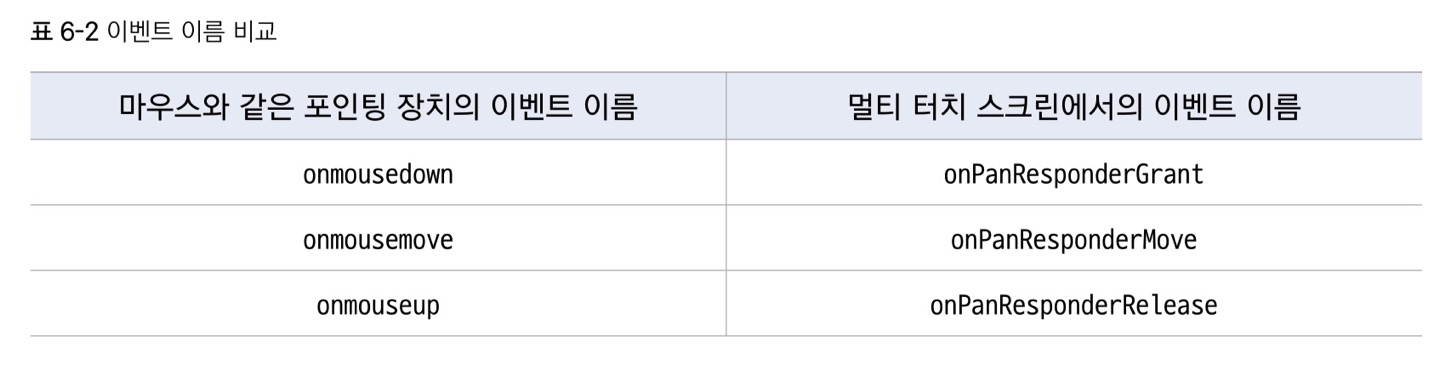
import type = {GestureResponderEvent, PanResponderGestureState) from 'react-native'
type Event = GestureResponderEvent
type State = PanResponderGuestureState

export interface PanResponderCallbacks {
  onPanResponderGrant?: (e:Event, gestureState: State) => void;
  onPanRespponderMove?: (e:Event, gestureState: State) => void;
  onPanRespponderRelease?: (e:Event, gestureState: State) => void;
}
해당 타입 중 onPanResponderGrant와 onPanResponderRelease가 실행되려면 아래의 메서드가 true를 반환해야 한다.
export interface PanResponderCallbacks {
  onStartShouldSetPanResponder: (e:Event, s: State) => boolean,
}
그리고 onPanResonderMove는 아래의 메서드가 true를 반환해야 이벤트 처리가 된다.
export interface PanResponderCallbacks {
  onMoveShouldSetPanResponder: (e:Event, s: State) => boolean,
}
📍 PanResponder API 를 활용한 코드
import React, {useState} from 'react'
import type {FC} from 'react'
import {Platform, PanResponder} from 'react-native'
// prettier-ignore
import type {GestureResponderEvent, PanResponderGestureState} from 'react-native'
import {View, Text} from '../theme/paper'
import * as D from '../data'
import {useScrollEnabled} from '../contexts'

const ios = Platform.OS == 'ios'

type Event = GestureResponderEvent
type State = PanResponderGestureState

export type PersonProps = {
  person: D.IPerson
  onDelete: () => void
}

const PersonPanRes: FC<PersonProps> = ({person, onDelete}) => {
  const [gestureState, setGestureState] = useState<State | null>(null)
  const [scrollEnabled, setScrollEnabled] = useScrollEnabled()
  const panResponder = PanResponder.create({
    // 여기가 true를 반환해야 onPanResponderGrant, onPanResponderRelease 메서드가 실행됨
    onStartShouldSetPanResponder() {
      return true
    },
    onPanResponderGrant(e: Event, s: State) {
      ios && setScrollEnabled(false)
      setGestureState(s)
    },
    onPanResponderRelease(e: Event, s: State) {
      setGestureState(s)
      ios && setScrollEnabled(true)
    },

    // 여기가 true를 반환해야 onPanResponderMove 메서드가 실행됨
    onMoveShouldSetPanResponder() {
      return true
    },
    onPanResponderMove(e: Event, s: State) {
      setGestureState(s)
    }
  })
  return (
    <View background style={[{width: '100%'}]}>
      <Text>scrollEnabled: {scrollEnabled ? 'true' : 'false'}</Text>
      <View accent {...panResponder.panHandlers} style={{height: 300, flex: 1}}>
        {gestureState && <Text>{JSON.stringify(gestureState, null, 2)}</Text>}
      </View>
    </View>
  )
}
export default PersonPanRes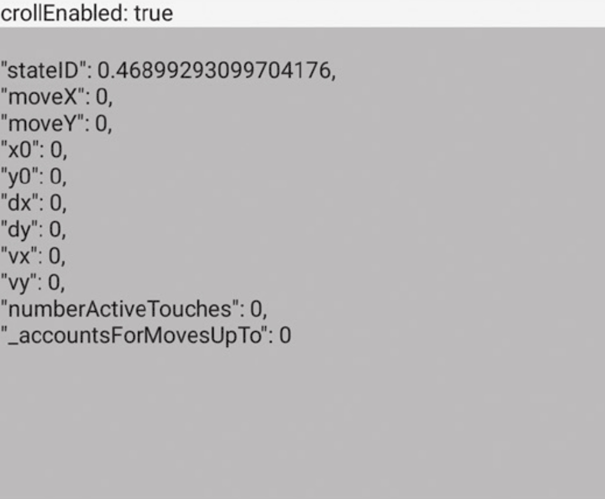
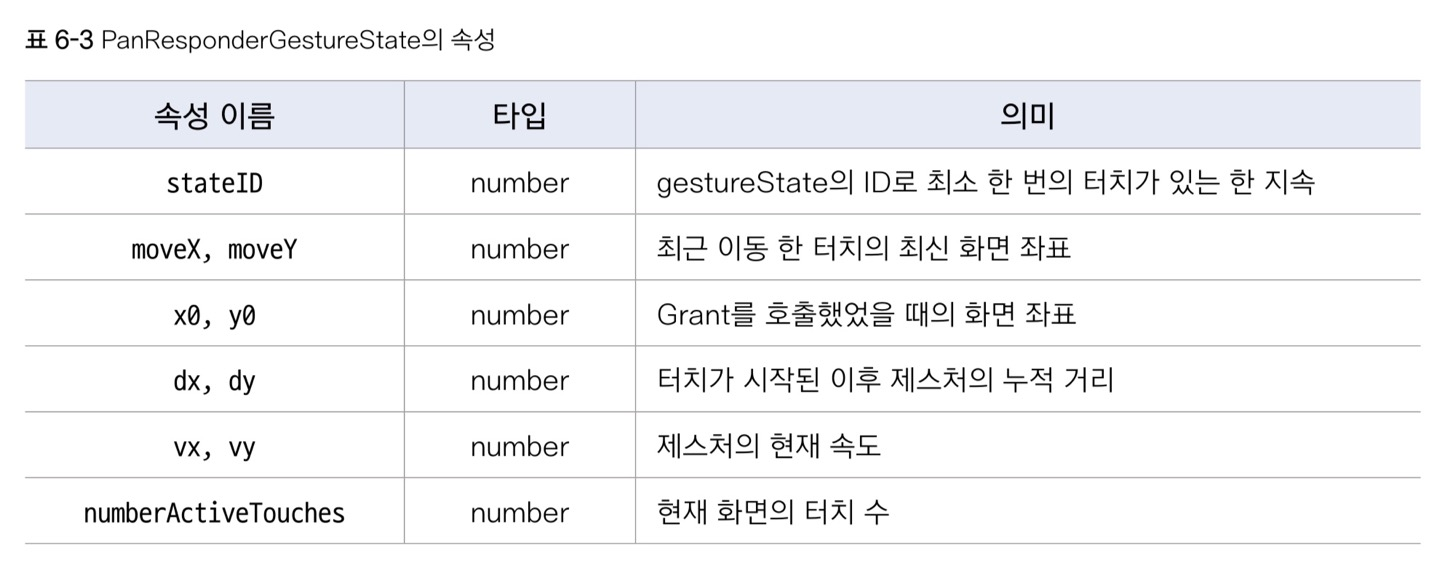
📍 PanResponderGestureState의 속성
주요 속성은 아래와 같다. 그 중에서도 dx, dy가 많이 사용된다고 한다.
📍 컴포넌트 드래깅 기능 구현
(사진..불가능..실행이안되는)
동그란 아바타 컴포넌트 4개를 만들고 걔네를 드래그할 수 있게 하고, 드래깅하면서 이동한 거리를 확인할 수 있도록 하고자 한다. 이때 필요한 컴포넌트를 DragAvatar라고 정의한다. 동그란 아바타 컴포넌트를 말한다.
이때 필요한 개념들을 먼저 학습해보자.
▶ Animated.ValueXY 클래스
Animated.Value 타입 x와 y값을 가지는 클래스.
보통 translateX와 translateY에 Animated.ValueXY의 x,y값을 집어넣어서 애니메이션을 구현한다.
export class ValueXY {
  x: Animated.Value
  y: Animated.Value
  constructor(valueIn?: {x: number | Animated.Value; y: number | Animated.Value})
  setValue(value: {x: number, y: number}): void
  extractOffset(): void
}
여러 번 드래깅을 할 때 누적된 값을 계산하기 위해 ValueXY에서는 extractOffset 메서드를 제공한다.
컴포넌트를 드래깅할 때는 Animated.View를 조정한다. Animated.View의 style 속성 내에 translateX, translateY를 조절하여 드래깅 기능을 수행하도록 한다.
const transformStyle = useTransformStyle({
	translateX: x값,
    translateY: y값
})

<Animated.View style={[style, transformStyle]}>
  <Avatar uri={avatarUrl} size={60} />
<Animated.View>
translateX와 translateY 값을 바꿀 수 있기는 하지만, Animated.ValueXY 타입 변수의 실제 값을 바꿀 수는 없다는 게 문제다. 그래서 그 방법으로 PanResponder가 고안되었다.
const animValueXY = useAnimatedValueXY() // 우리가 조정해야 하는 Animated.ValueXY 타입 객체
const transformStyle = useTransformStyle({
  translateX: animValueXY.x,
  translateY: animValueXY.y
})

const panResponder = usePanResponder({
  onPanResponderMove(e: Event, s:State) {
  	const {dx, dy} = s
    animValueXY.setValue({x: dx, y: dy})
  }
})

<Animated.View style={[style, transformStyle]} {...panResponder.panHandlers}>
  <Avatar uri={avatarUrl} size={60} />
<Animated.View>