3-1. style 속성과 StyleSheet API 이해하기
import React from 'react'
import { SafeAreaView, Text } from 'react-native'

export default function App() {
	return () {
    	<SafeAreaView>
        <Text>Hello world!</Text>
     	</SafeAreaView>
    )
}
📍 스타일 속성
- 스타일 속성을 지정하는 방법 : 컴포넌트 안에 style 속성을 주고 그 안에 스타일 객체를 작성
- 이름 표기법
ⓐ 소문자로 시작 - flex, color
ⓑ 카멜 표기법 - 예시 : justifyContent, marginTop
<SafeAreaView style={{flex: 1, backgroundColor: 'blue'}}>📍 스타일에 배열 설정 구문
<컴포넌트_이름 style={{스타일_객체1, 스타일_객체2, ...}} />📍 color vs backgroundColor
- color : Text 컴포넌트에서 글자 색상을 변경
- backgroundColor : 'View'가 붙은 컴포넌트들에서 배경색 변경
📍 StyleSheet API
import React from 'react'
import {StyleSheet, SafeAreaView, Text} from 'react-native'

export default function App() {
	return (
    <SafeAreaView style={{styles.safeAreaView, {backgroundColor: 'blue'}]}>
    	<Text style={[styles.text, {color: 'white'}]}>
        	Hello StyleSheet world!
        </Text>
    </SafeAreaView>
const styles = StyleSheet.create({
	safeAreaView: {flex:1, alignItems: 'center', justifyContent: 'center'},
    text: {fontSize: 20}
})
3-2. View 컴포넌트와 CSS 박스 모델
📍 Platform과 Dimensions API
- Platform : 빌드 타깃을 반환
- Dimensions : 화면의 width, height 반환
import {Platform, Dimensions} from 'react-native'
console.log(Platform.OS) // 'android' or 'ios'
const {width, height} = Dimensions.get('window') // 화면의 width, height 반환
실습 화면

import React from 'react';
// prettier-ignore
import {Platform, StyleSheet, SafeAreaView, Text, Dimensions} from 'react-native';
import {Colors} from 'react-native-paper';

const {width, height} = Dimensions.get('window');

export default function App() {

  return (
    <SafeAreaView style={[styles.safeAreaView]}>
      <Text style={[styles.text]}>os: {Platform.OS}</Text>
      <Text style={[styles.text]}>width: {width}px</Text>
      <Text style={[styles.text]}>height: {height}px</Text>
    </SafeAreaView>
  );
}
const styles = StyleSheet.create({
  safeAreaView: {backgroundColor: Colors.blue500, height:height},
  text: {fontSize: 20, color: Colors.blue200},
});
📍 width, height 설정법
1) 명시적으로 width, height를 설정하지 않고 리액트 네이티브의 기본 설정 방식을 따르는 방법
- width는 부모 컴포넌트를, height는 자식요소가 수평 정렬 시에는 가장 높은 값, 수직 정렬 시에는 다 더한 값을 따름
2) 픽셀(px) 단위의 숫자 직접 설정하는 방법
3) 부모 요소의 width, height를 기준으로 자식 컴포넌트의 크기를 퍼센트로 정하는 방법
4) flex 속성을 사용해 여러 자식 컴포넌트가 부모 컴포넌트의 크기를 나눠 가지는 방법
- flex 스타일 속성: 보통 0 ~ 1의 값을 가짐(0~ 100%로 치환) 1이 넘어가면 남은 여백을 비율대로 나눠 가짐
📍 margin, padding, border
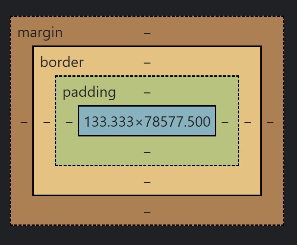
웹 개발자 도구 - 요소 - 스타일에서 이런 그림을 많이 봤을 것이다. margin은 컴포넌트 간의 간격, padding은 컴포넌트 내의 공백을 의미한다. border는 각 컴포넌트를 감싸는 테두리라고 생각하면 된다.
각 속성값
- margin : marginTop, marginRight, marginBottom, marginLeft
- padding : paddingTop, paddingRight, paddingBottom, paddingLeft
- border : borderWidth, borderColor, borderRadius, borderStyle
실습 화면

import React from 'react';
// prettier-ignore
import {Platform, StyleSheet, SafeAreaView, Text, Dimensions, View} from 'react-native';
import {Colors} from 'react-native-paper';

const {width, height} = Dimensions.get('window');

export default function App() {
  return (
    <SafeAreaView style={[styles.safeAreaView]}>
      <Text style={[styles.text]}>os: {Platform.OS}</Text>
      <Text style={[styles.text]}>width: {width}px</Text>
      <Text style={[styles.text]}>height: {height}px</Text>

      <View style={[styles.box, styles.border]} />
      <View style={[styles.box, styles.border, {borderRadius: 20}]} />
      <View
        style={[
          styles.box, styles.border,
          {borderTopLeftRadius: 40, borderBottomLeftRadius: 40}]} />
    </SafeAreaView>
  );
}
const styles = StyleSheet.create({
  safeAreaView: {backgroundColor: Colors.blue500, flex: 1, padding: 10},
  text: {marginBottom: 10, fontSize: 20, color: Colors.blue200},
  box: {height: 100, backgroundColor: Colors.lime500, marginBottom: 10},
  border: {borderWidth: 10, borderColor: Colors.blue900},
});
❓ 안드로이드와 iOS에서 동일하게 적용이 되지 않을 때
속성: Platform.select({
	ios: Platform.OS가 ios일 때의 값,
    android: Platform.OS가 android일 때의 값
})
3-3. 자원과 아이콘 사용하기
📍 Image, ImageBackground를 사용하여 이미지와 배경이미지 나타내기
실습 화면

import React from 'react';
import * as D from './src/data';
// prettier-ignore
import { StyleSheet, SafeAreaView, Image, ImageBackground, Text } from 'react-native';

const avatarUrl = D.randomAvatarUrl();
const avatarSize = 50;

export default function App() {
  return (
    <SafeAreaView style={[styles.flex]}>
      <ImageBackground
        style={[styles.flex, styles.imageBackground]}
        source={require('./src/assets/images/bg.jpg')}>
        <Image source={{uri: avatarUrl}} style={[styles.image]} />
      </ImageBackground>
    </SafeAreaView>
  );
}

const styles = StyleSheet.create({
  flex: {flex: 1},
  imageBackground: {padding: 10},
  image: {width: avatarSize, height: avatarSize, borderRadius: avatarSize / 2},
});- 로컬에 존재하는 이미지는 require 메서드로 불러옴
- Uri를 받아오고 싶을 땐 {{uri: 링크}}의 형식으로 받아 옴
- Url은 내가 찾고자 하는 파일의 고유한 위치를 나타내고 Uri는 인터넷 상에서 특정 자원(파일)을 나타내는 유일한 식별자 값을 나타낸다.
📍 폰트 사용하기
react-native.config.js
module.exports = {
  project: {
    ios: {},
    android: {},
  },
  assets: ['./src/assets/fonts'],
}
project키를 다음과 같이 설정해주고 react-native link 명령어를 입력하면 위에서 작성한 js파일이 프로젝트에 반영된다.
npx react-native link본 명령어를 실행하고 나면 src/assets/fonts 디렉터리의 파일이 android/app/src/main/assets/fonts 디렉터리에 복사됨을 알 수 있다.
실습 화면

import React from 'react';
import * as D from './src/data';
// prettier-ignore
import { StyleSheet, SafeAreaView, Image, ImageBackground, Text, Platform, View } from 'react-native';

const avatarUrl = D.randomAvatarUrl();
const avatarSize = 50;

const text = `Almost before we knew it, we had left the ground.`

export default function App() {
  return (
    <SafeAreaView style={[styles.flex]}>
      <ImageBackground
        style={[styles.flex, styles.imageBackground]}
        source={require('./src/assets/images/bg.jpg')}>
        <Image source={{uri: avatarUrl}} style={[styles.image]} />
        <View style={[styles.flex, styles.padding10]}>
          <Text style={[styles.text, styles.regular]}>{text} [regular]</Text>
          <Text style={[styles.text, styles.medium]}>{text} [medium]</Text>
          <Text style={[styles.text, styles.semiBold]}>{text} [semi bold]</Text>
          <Text style={[styles.text, styles.bold]}>{text} [bold]</Text>
        </View>
      </ImageBackground>
    </SafeAreaView>
  );
}

const styles = StyleSheet.create({
  flex: {flex: 1},
  imageBackground: {padding: 10},
  image: {width: avatarSize, height: avatarSize, borderRadius: avatarSize / 2},
  padding10: {padding: 10},
  text: {textAlign: 'center', fontSize: 25, color: 'white', marginBottom: 10},

  regular: {fontFamily: 'DancingScript-Regular', fontWeight: '400'},
  medium: {fontFamily: 'DancingScript-Medium', fontWeight: '500'},
  semiBold: {fontFamily: 'DancingScript-SemiBold', fontWeight: '600'},
  bold: {
    fontFamily: 'DancingScript-Bold',
    fontWeight: Platform.select({ios: '700', android: '600'})
  }
});
📍 아이콘 사용하기
react-native-vector-icons 패키지를 설치한 후 사용하기 위해서는 아래의 명령어 실행
npx react-native link react-native-vector-icons실습 화면

import React from 'react';
import * as D from './src/data';
// prettier-ignore
import { StyleSheet, SafeAreaView, Image, ImageBackground, Text, Platform, View, Alert } from 'react-native';
import {Colors} from 'react-native-paper';
import Icon from 'react-native-vector-icons/MaterialCommunityIcons';
const avatarUrl = D.randomAvatarUrl();
const avatarSize = 50;

const text = 'Almost before we knew it, we had left the ground.';
const onIconPressed = () => Alert.alert('icon pressed');

export default function App() {
  return (
    <SafeAreaView style={[styles.flex]}>
      <ImageBackground
        style={[styles.flex, styles.imageBackground]}
        source={require('./src/assets/images/bg.jpg')}>
        <Image source={{uri: avatarUrl}} style={[styles.image]} />
        <View style={[styles.flex, styles.padding10]}>
          <Text style={[styles.text, styles.regular]}>{text} [regular]</Text>
          <Text style={[styles.text, styles.medium]}>{text} [medium]</Text>
          <Text style={[styles.text, styles.semiBold]}>{text} [semi bold]</Text>
          <Text style={[styles.text, styles.bold]}>{text} [bold]</Text>
        </View>
        <Icon
          name="home"
          size={50}
          color={Colors.lightBlue500}
          onPress={onIconPressed}
        />
      </ImageBackground>
    </SafeAreaView>
  );
}

const styles = StyleSheet.create({
  flex: {flex: 1},
  imageBackground: {padding: 10},
  image: {width: avatarSize, height: avatarSize, borderRadius: avatarSize / 2},
  padding10: {padding: 10},
  text: {textAlign: 'center', fontSize: 25, color: 'white', marginBottom: 10},

  regular: {fontFamily: 'DancingScript-Regular', fontWeight: '400'},
  medium: {fontFamily: 'DancingScript-Medium', fontWeight: '500'},
  semiBold: {fontFamily: 'DancingScript-SemiBold', fontWeight: '600'},
  bold: {
    fontFamily: 'DancingScript-Bold',
    fontWeight: Platform.select({ios: '700', android: '600'}),
  },
});
3-4. 컴포넌트 배치 관련 스타일 속성 탐구하기
실습 화면

Content.tsx - TopBar, BottomBar도 title만 다름
import React from 'react';
import {StyleSheet, View, Text} from 'react-native';
import {Colors} from 'react-native-paper';
import * as D from '../data';

const title = 'Content';
export default function Content() {
  return  (
    <View style={[styles.view]}>
      <Text style={[styles.text]}>{title}</Text>
    </View>
  );;
}

const styles = StyleSheet.create({
  view: {padding: 5, backgroundColor: Colors.blue900},
  text: {fontSize: 20, color: 'white'},
});
App.tsx
import React from 'react';
import {SafeAreaView, StyleSheet} from 'react-native';
import {Colors} from 'react-native-paper';
import TopBar from './src/screens/TopBar';
import Content from './src/screens/Content';
import BottomBar from './src/screens/BottomBar';

export default function App() {
  return (
    <SafeAreaView style={styles.flex}>
      <TopBar />
      <Content />
      <BottomBar />
    </SafeAreaView>
  );
}

const styles = StyleSheet.create({
  flex: {flex: 1, backgroundColor: Colors.lightBlue100},
});
❓ BottomBar 아래에는 SafeAreaView만 있는 이유?
SafeAreaView 내의 컴포넌트들은 flex값이 설정되어있지 않다. 따라서 flex를 1로 주었던 SafeAreaView만 화면 전체에 깔리게 되었다.
- Content에 flex:1 을 부여하는 것과 height:100%를 부여하는 것의 차이
import React from 'react';
import {StyleSheet, View, Text} from 'react-native';
import {Colors} from 'react-native-paper';
import * as D from '../data';

const title = 'Content';
export default function TopBar() {
  return (
    <View style={([styles.view], {flex: 1})}>
      <Text style={[styles.text]}>{title}</Text>
    </View>
  );
}

const styles = StyleSheet.create({
  view: {padding: 5, backgroundColor: Colors.blue900},
  text: {fontSize: 20, color: 'white'},
});
위와 같이 flex: 1을 부여하게 된다면 왼쪽과 같은 그림이, height:100%를 부여하게 된다면 오른쪽과 같은 그림이 된다.


📍 flex 관련 스타일 속성
실습 화면

1. TopBar.tsx
화면 상단의 노란색 바.
flexDirection의 기본값이 수직으로 쌓는 column인데, TopBar에서는 row 적용.
✔ flexDirection 속성
➡ row, column
- row

- column

- flexDirection 속성 row로 적용
import React from 'react';
import {StyleSheet, View, Text, Image} from 'react-native';
import {Colors} from 'react-native-paper';
import Icon from 'react-native-vector-icons/MaterialCommunityIcons';
import * as D from '../data';

const avatarUrl = D.randomAvatarUrl()
const name = D.randomName()

export default function TopBar() {
  return (
    <View style={[styles.view]}>
      <Image style={styles.avatar} source={{uri: avatarUrl}} />
      <View style={styles.centerView}>
        <Text style={[styles.text]}>{name}</Text>
      </View>
      <Icon name="menu" size={24} color="white" />
    </View>
  );
}

const styles = StyleSheet.create({
  view: {
    flexDirection: 'row',
    alignItems: 'center',
    padding: 5,
    backgroundColor: Colors.amber500,
  },
  text: {fontSize: 20, textAlign: 'center'},
  avatar: {width: 40, height: 40, borderRadius: 20},
  centerView: {flex: 1}
});
2. BottomBar.tsx
하단 네비게이션 바.
네비게이션 버튼 아이콘의 이름을 icons에 저장한 후 map 함수로 꺼낸다. 그리고 Icon 컴포넌트의 name에 해당 이름을 넣어 매칭시켰다.
✔ alignItems 속성
➡ left, center, right, stretch
✔ justifyContent 속성
➡ flex-start, center, flex-end, space-around, space-between, space-evenly
import React from 'react';
import {StyleSheet, View} from 'react-native';
import {Colors} from 'react-native-paper';
import Icon from 'react-native-vector-icons/MaterialCommunityIcons';

const iconSize = 30, iconColor = 'white';
const icons = ['home', 'table-search', 'face-profile-woman', 'account-settings'];

export default function BottomBar() {
  const children = icons.map((name) => (
    <Icon key={name} name={name} size={iconSize} color={iconColor} />
  ))
  return <View style={styles.view}>{children}</View>
}

const styles = StyleSheet.create({
  view: {
    flexDirection: 'row',
    alignItems: 'center',
    justifyContent: 'space-evenly',
    padding: 10,
    backgroundColor: Colors.lightBlue500,
  }
})
3. Content.tsx
✔ flexWrap 속성
➡ nowrap, wrap, wrap-reverse
flexWrap 속성값에 따라 아래와 같은 차이가 있다.
- wrap
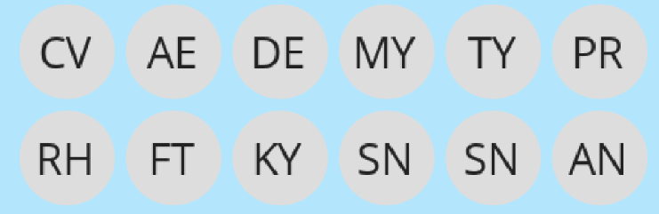
- nowrap
- wrap-reverse
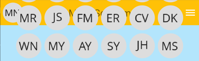
상단바까지 자리를 침입한다.
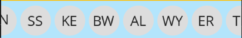
✔ overflow 속성
➡ visible, hidden, scroll
특이하게 overflow 속성 중 scroll은 작동하지 않는다. 리액트 네이티브에서 스크롤은 ScrollView나 FlatList 코어 컴포넌트에서만 가능하다.
import React from 'react';
import {StyleSheet, View, Image} from 'react-native';
import * as D from '../data';

const avatars = D.makeArray(200).map((notUsed) => D.randomAvatarUrl())
export default function Content() {
  const children = avatars.map((avatarUrl, index) => (
    <View key={index.toString()} style={styles.avatarView}>
      <Image style={styles.avatar} source={{uri: avatarUrl}} />
    </View>
  ))
  return <View style={[styles.view]}>{children}</View>
}

const styles = StyleSheet.create({
  view: {
    flexDirection: 'row',
    flexWrap: 'wrap',
    justifyContent: 'center',
    flex: 1,
    padding: 5,
  },
  text: {fontSize: 20},
  avatarView: {padding: 3},
  avatar: {width: 50, height: 50, borderRadius: 25},
})
4. App.tsx
import React from 'react';
import {SafeAreaView, StyleSheet} from 'react-native';
import {Colors} from 'react-native-paper';
import TopBar from './src/screens/TopBar';

export default function App() {
  return (
    <SafeAreaView style={[styles.flex]}>
      <TopBar />
      <Content />
      <BottomBar />
    </SafeAreaView>
  );
}

const styles = StyleSheet.create({
  flex: {flex: 1, backgroundColor: Colors.lightBlue100},
});
📍 ScrollView의 contentContainerStyle 속성
실습 화면

Content.tsx
import React from 'react';
import {StyleSheet, View, Image, ScrollView} from 'react-native';
import * as D from '../data';

const avatars = D.makeArray(200).map((notUsed) => D.randomAvatarUrl())
export default function Content() {
  const children = avatars.map((avatarUrl, index) => (
    <View key={index.toString()} style={styles.avatarView}>
      <Image style={styles.avatar} source={{uri: avatarUrl}} />
    </View>
  ));
  return (
    <ScrollView contentContainerStyle={[styles.view]}>{children}</ScrollView>
  )
}
const styles = StyleSheet.create({
  view: {
    flexDirection: 'row',
    flexWrap: 'wrap',
    justifyContent: 'center',
    padding: 5,
  },
  text: {fontSize: 20},
  avatarView: {padding: 3},
  avatar: {width: 50, height: 50, borderRadius: 25},
})
App.tsx
import React from 'react';
import {Alert, Platform, SafeAreaView, StyleSheet, View} from 'react-native';
import {Colors} from 'react-native-paper';
import Icon from 'react-native-vector-icons/MaterialCommunityIcons';
import TopBar from './src/screens/TopBar';
import Content from './src/screens/Content';
import BottomBar from './src/screens/BottomBar';

const iconPressed = () => Alert.alert('Icon pressed.')
export default function App() {
  return (
    <>
      <SafeAreaView style={[styles.flex]}>
        <TopBar />
        <Content />
        <BottomBar />
      </SafeAreaView>
      <View style={[styles.absoluteView]}>
        <Icon name="feature" size={50} color="white" onPress={iconPressed} />
      </View>
    </>
  );
}

const styles = StyleSheet.create({
  flex: {flex: 1, backgroundColor: Colors.lightBlue100},
  absoluteView: {
    backgroundColor: Colors.purple900,
    position: 'absolute',
    right: 30,
    bottom: Platform.select({ios: 100, android: 80}),
    padding: 10,
    borderRadius: 35
  }
});
3-5. 재사용할 수 있는 컴포넌트 만들기
FlatList 실습 화면

import React from "react";
import { FlatList, SafeAreaView, StyleSheet, View } from "react-native";
import { Colors } from "react-native-paper";
import Person from './src/copy/Person'
import * as D from './src/data';

const people: D.IPerson[] = D.makeArray(10).map(D.createRandomPerson)

export default function App() {
  return (
    <SafeAreaView style={styles.flex}>
      <FlatList data={people}
        renderItem={({item}) => <Person person={item} />}
        keyExtractor={(item, index) => item.id}
        ItemSeparatorComponent={() => <View style={styles.itemSeparator} />} />
    </SafeAreaView>
  )
}

const styles = StyleSheet.create({
  flex: {flex: 1},
  itemSeparator: {borderWidth: 1, borderColor: Colors.grey500}
})
📍 moment 패키지 기능 사용하기
- Date 클래스 : 날짜와 시간 관련 기능 처리
- new 키워드로 인스턴스를 생성하여 사용
✔ moment 패키지
- Date 클래스가 제공하지 않는 기능을 제공하는 날짜, 시간 처리 패키지
- 특정 포맷으로 날짜, 시간을 깔끔하게 출력
- 과거와 현재의 시간 차이를 알기 쉬운 형태로 출력
- moment-with-locales-es6 패키지를 사용하고 moment.locale('ko') 명령어를 입력하여 한글 출력 가능
📍 Person 컴포넌트 기본
Person 컴포넌트과 Person에 적용할 스타일 파일을 제작합니다.
src/copy/Person.tsx
- typescript을 이용해 변수에 React.FC형을 지정해주었다. 간단한 사용법은 여기를 참고하자.
import moment from 'moment'
import React, {FC} from 'react'
import {Text, View, Image} from 'react-native'
import * as D from '../data'
import {styles} from './Person.style'

export type PersonProps = {
  person: D.IPerson
}

const Person: FC<PersonProps> = ({person}) => {
  return (
    <View style={[styles.view]}>
      <Image source={{uri: person.avatar}} style={[styles.avatar]} />
      <View style={[styles.nameEmailView]}>
        <Text style={[styles.name]}>{person.name}</Text>
        <Text style={[styles.email]}>{person.email}</Text>
      </View>
      <View style={[styles.dateView]}>
        <Text style={[styles.createdDate]}>
          {moment(person.createdDate).startOf('day').fromNow()}
        </Text>
      </View>
      <Text style={[styles.text]}>{person.comments}</Text>
      <Image style={[styles.image]} source={{uri: person.image}} />
      <View style={[styles.countsView]}>
        <Text style={[styles.counts]}>{person.counts.comment}</Text>
        <Text style={[styles.counts]}>{person.counts.retweet}</Text>
        <Text style={[styles.counts]}>{person.counts.heart}</Text>
      </View>
    </View>
  );
}

export default Person
src/copy/Person.style.ts
import {StyleSheet} from 'react-native';
import {Colors} from 'react-native-paper';

export const styles = StyleSheet.create({
  view: {backgroundColor: Colors.lime100, padding: 5},
  avatar: {width: 50, height: 50, borderRadius: 25},
  nameEmailView: {flexDirection: 'row', alignItems: 'center'},
  name: {marginRight: 5, fontSize: 22, fontWeight: '500'},
  email: {},
  dateView: {},
  createdDate: {},
  text: {},
  image: {wdith: '100%', height: 150},
  countsView: {
    flexDirection: 'row',
    padding: 3,
    justifyContent: 'space-around',
  },
  counts: {},
})
📍 재사용할 수 있는 컴포넌트 만들기
- 사용자 컴포넌트 예시
<IconText viewStyle={styles.touchableIcon} onPress={onPress}
	name="comment" size={24} color='blue'
textStyle={styles.iconText} text={person.counts.comment} />`- React.FC를 활용한 재사용 컴포넌트
import type {FC, ReactNode} from 'react'

type SomeComponentProps = {
	children?: ReactNode
}

export const SomeComponent: FC<SomeComponentProps> = ({children}) => {
	return <View>{children}</View>
}
📍 TouchableView 컴포넌트 만들기
import React from 'react';
import type {FC, ReactNode, ComponentProps} from 'react';
import {TouchableOpacity, View} from 'react-native';

type TouchableOpacityProps = ComponentProps<typeof TouchableOpacity>

export type TouchableViewProps = TouchableOpacityProps & {
  children?: ReactNode;
};

export const TouchableView: FC<TouchableViewProps> = ({children, ...touchableProps}) => {
  return (
    <TouchableOpacity onPress={...touchableProps}>
      <View>{children}</View>
    </TouchableOpacity>
  )
}
아래의 코드에서 주목할 부분은
type TouchableOpacityProps = ComponentProps<typeof TouchableOpacity>이 부분이다. 이 부분은 TouchableOpacity의 props를 가져와 TouchableOpacityProps에 담고, 이를
export type TouchableViewProps = TouchableOpacityProps & {
  children?: ReactNode;
};
이렇게 교집합 타입을 이용해 children props에 더해준다. 그리고 이렇게 추가한 TouchableOpacityProps는
export const TouchableView: FC<TouchableViewProps> = ({children, ...touchableProps}) => {스프레드 연산자에 의해 사용되는 것을 볼 수 있다.
사실 이 코드는 조금 더 생략할 수 있다. TouchableViewProps는 FC 타입이므로 ReactNode 타입인 children 속성을 기본적으로 포함한다. 따라서 굳이 교집합 타입 연산자를 써주지 않고 아래와 같이 TouchableOpacityProps만 추가해도 된다.
export type TouchableViewProps = TouchableOpacityProps📍 StyleProp 타입
- StyleProp은 react-native 컴포넌트에서 제공하는 타입
- StyleProp은 ViewStyle과 의미상 같다. 그런데 StyleProp을 사용하는 이유는 여기를 참고하자.
실습 코드
import React from 'react';
import type {FC, ComponentProps} from 'react';
import {TouchableOpacity, View} from 'react-native';
import type {StyleProp, ViewStyle} from 'react-native';

type TouchableOpacityProps = ComponentProps<typeof TouchableOpacity>

export type TouchableViewProps = TouchableOpacityProps & {
  viewStyle?: StyleProp<ViewStyle>
};

export const TouchableView: FC<TouchableViewProps> = ({children, viewStyle, ...touchableProps}) => {
  return (
    <TouchableOpacity onPress={...touchableProps}>
      <View style={[viewStyle]}>{children}</View>
    </TouchableOpacity>
  )
}
📍 Avatar 컴포넌트 만들기
- Avatar 컴포넌트 속성 :
uri / size : Avatar의 고유 속성
viewStyle / onPress : Avatar를 구현하는 데 사용하는 TouchableView의 속성
src/components/Avatar.tsx
import React from "react";
import type {FC} from 'react';
import {Image} from 'react-native';
import type { StyleProp, ImageStyle } from "react-native";
import {TouchableView} from './TouchableView';
import type { TouchableViewProps } from "./TouchableView";

export type AvatarProps = TouchableViewProps & {
  uri: string
  size: number
  imageStyle?: StyleProp<ImageStyle>
}
//prettier-ignore
export const Avatar: FC<AvatarPorps> = ({uri, size, imageStyle, ...touchableViewProps}) => {
  return (
    <TouchableView {...touchableViewProps}>
      <Image source={{uri}}
        style={[imageStyle, {width: size, height: size, borderRadius: size/2}]} />
    </TouchableView>
  )
}
📍 IconText 컴포넌트 만들기
import React from "react";
import type {FC, ComponentProps} from 'react';
import {Text} from 'react-native';
import type { StyleProp, TextStyle } from "react-native";
import { TouchableView, TouchableViewProps } from "./TouchableView";
import Icon from "react-native-vector-icons/MaterialCommunityIcons";

export type IconTextProps = TouchableViewProps &
  ComponentProps<typeof Icon> & {
    text: number | string
    textStyle: StyleProp<TextStyle>
  }

export const IconText: FC<IconTextProps> = ({name, size, color, textStyle, text, ...touchableViewProps}) => {
    return (
      <TouchableView {...touchableViewProps}>
        <Icon name={name} size={size} color={color} />
        <Text style={textStyle}>{text}</Text>
      </TouchableView>
    )
}
▶ Text 코어 컴포넌트의 주요 속성
- numberOfLines={숫자}
렌더링하려는 텍스트 줄 수 제한 - ellipsize
head, middle, tail, clip - textDecorationLine
- textDecorationColor
📍 Person 컴포넌트 스타일 완료
실행 화면

Person.tsx
import React from 'react'
import type {FC} from 'react'
import {Text, View, Image, Alert} from 'react-native'
import * as D from '../data'
import {styles} from './Person.style'
import moment from 'moment-with-locales-es6'
import {Colors} from 'react-native-paper'
import Icon from 'react-native-vector-icons/MaterialCommunityIcons'
import {Avatar, IconText} from '../components'

moment.locale('ko')

export type PersonProps = {
  person: D.IPerson
}

const avatarPressed = () => Alert.alert('avatar pressed.')
const deletePressed = () => Alert.alert('delete pressed.')
const countIconPressed = (name: string) => () => Alert.alert(`${name} pressed.`)

//prettier-ignore
const Person: FC<PersonProps> = ({person}) => {
  return (
    <View style={[styles.view]}>
      <View style={[styles.leftView]}>
        <Avatar imageStyle={[styles.avatar]} uri={person.avatar} size={50}
          onPress={avatarPressed} />
      </View>
      <View style={[styles.rightView]}>
        <Text style={[styles.name]}>{person.name}</Text>
        <Text style={[styles.email]}>{person.email}</Text>
      <View style={[styles.dateView]}>
        <Text style={[styles.text]}>
          {moment(person.createdDate).startOf('day').fromNow()}
        </Text>
        <Icon name='trash-can-outline' size={26} color={Colors.lightBlue500}
          onPress={deletePressed} />
      </View>
      <Text numberOfLines={3} ellipsizeMode="tail" style={[styles.text, styles.comments]}>{person.comments}</Text>
      <Image style={[styles.image]} source={{uri: person.image}} />
      <View style={[styles.countsView]}>
        <IconText viewStyle={[styles.touchableIcon]}
          onPress={countIconPressed('comment')}
          name="comment" size={24} color={Colors.blue500}
          textStyle={[styles.iconText]} text={person.counts.comment} />
        <IconText viewStyle={[styles.touchableIcon]}
          onPress={countIconPressed('retweet')}
          name="comment" size={24} color={Colors.blue500}
          textStyle={[styles.iconText]} text={person.counts.retweet} />
        <IconText viewStyle={[styles.touchableIcon]}
          onPress={countIconPressed('heart')}
          name="comment" size={24} color={Colors.blue500}
          textStyle={[styles.iconText]} text={person.counts.heart} />
      </View>
    </View>
    </View>
  );
}

export default Person
Person.style.ts
import { StyleSheet } from "react-native"
import { Colors } from "react-native-paper"

//prettier-ignore
export const styles = StyleSheet.create({
  view: {flexDirection: 'row', backgroundColor: Colors.lime100, padding: 5},
  leftView: {padding: 5},
  avatar: {borderColor: Colors.blue500, borderWidth: 2},
  rightView: {flex: 1, padding: 5, marginRight: 10},
  name: {marginRight: 5, fontSize: 22, fontWeight: '500'},
  email: {textDecorationLine: 'underline',
      color: Colors.blue500, textDecorationColor: Colors.blue500},
  dateView: {flexDirection: 'row', justifyContent: 'space-between',
            padding: 3, marginTop: 5},
  text: {fontSize: 16},
  comments: {marginTop: 10, fontSize: 16},
  image: {height: 150, marginTop: 15},
  countsView: {flexDirection: 'row', padding: 3, justifyContent: 'space-around'},
  touchableIcon: {flexDirection: 'row', padding: 5, alignItems: 'center'},
  iconText: {color: Colors.deepPurple500, marginLeft: 3}
})