1. 모델 평가 개념
모델을 좋다, 나쁘다로 평가할 방법은 없다.
다양한 모델과 파라미터를 두고 상대적으로 비교하는 것이다.
1-1. 회귀 모델 평가 지표
- 실제 값과의 에러를 가지고 계산
- 회귀 모델의 예측 결과는 연속된 변수값이 된다.
1-2. 분류 모델 평가 지표
오차 행렬(Confusion Matrix)
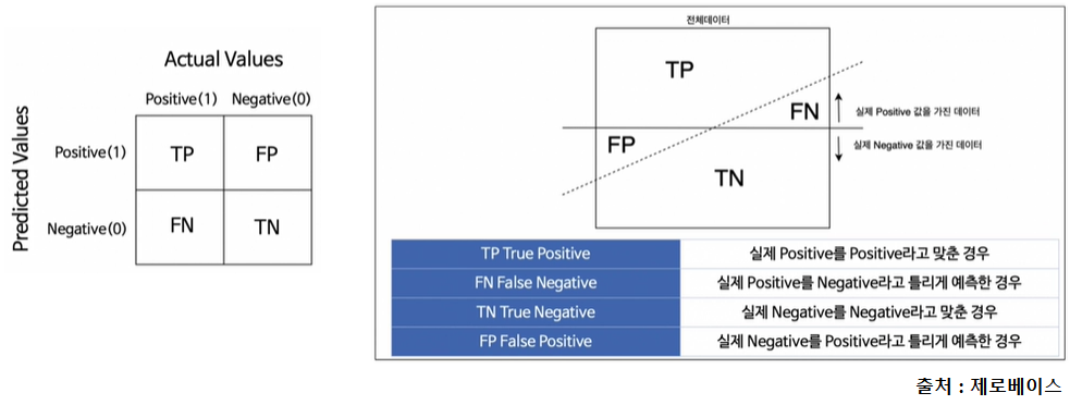
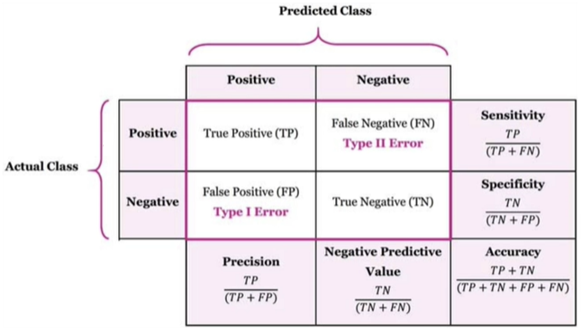
정확도(Accuracy)
- 전체 데이터 중 맞게 예측한 것의 비율
- (TP + TN) ÷ (TP + TN + FP + FN)
정밀도(Precision)
- 양성이라고 예측한 것 중에서 실제 양성의 비율
- TP ÷ (TP + FP)
TPR(True Positive Rate, Recall, 재현율)
- 실제 양성인 것 중에서 양성이라고 예측한 것의 비율
- TP ÷ (TP + FN)
- ✨중요한 예) 암 진단할 때 암 환자인 사람을 놓쳐서는 안 된다.
FPR(False Positive Rate, Fall-out)
- 실제 음성인 것 중에서 양성이라고 잘못 예측한 것의 비율
- FP ÷ (FP + TN)
- ✨중요한 예) 스팸 메일을 예측할 때 중요한 메일을 스팸으로 오해하면 안 된다.
1-3. 분류 모델 - threshold
분류 모델은 그 결과가 속할 비율(확률)을 반환한다.
predict 값은 predict_proba(0~1) 값이 0.5(threshold)보다 크면 1, 작으면 0이 된다. threshold를 변경해가면서 모델 평가 지표들을 관찰해보자.
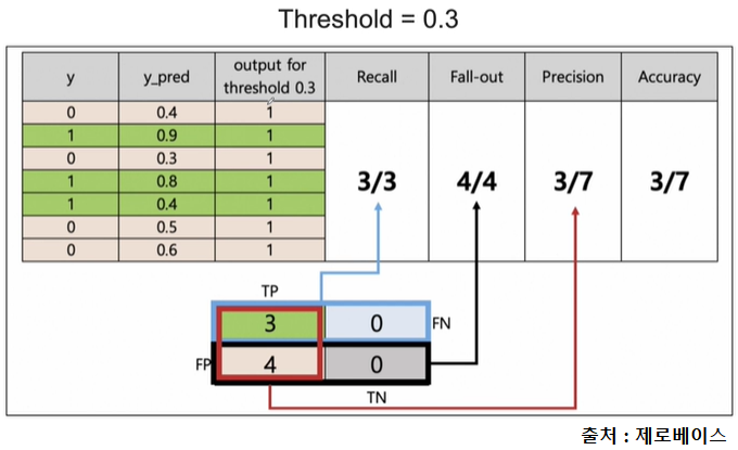
이때 y_pred = 0.4는 40% 확률로 1이라는 의미이다.
threshold = 0.3이면 y_pred >= 0.3일 때 1이라고 예측한다.
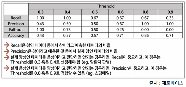
Recall과 Precision은 서로 영향을 주기 때문에 한쪽을 극단적으로 높게 설정해서는 안 된다.
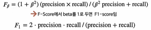
1-4. F1 score
- Recall과 Precision을 결합한 지표
- Recall과 Precision이 어느 한쪽으로 치우치지 않고 둘다 높은 값을 가질수록 F1 score가 높아진다.(조화평균)
1-5. ROC 곡선과 AUC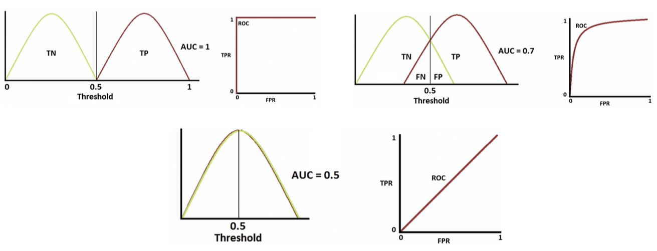
- FPR(x)이 변할 때 TPR(y)의 변화를 그린 그림
- 직선에 가까울수록 머신러닝 모델의 성능이 떨어지는 것으로 판단
- AUC = ROC 곡선 아래의 면적
- 일반적으로 1에 가까울수록 좋다.
1-6. ROC 곡선 그리기
from sklearn.metrics import (accuracy_score, precision_score, recall_score,
                             f1_score, roc_auc_score, roc_curve)

print('Accuracy :', accuracy_score(y_test, y_pred_test))
print('Precision :', precision_score(y_test, y_pred_test))
print('Recall :', recall_score(y_test, y_pred_test))
print('F1 score :', f1_score(y_test, y_pred_test))
print('AUC Score :', roc_auc_score(y_test, y_pred_test))
wine_tree.predict_proba(X_test) # [[0.61602594, 0.38397406], ... ]]
wine_tree.predict_proba(X_test)[:, 1] # [0.38397406, ... ]
# ROC curve
import matplotlib.pyplot as plt
%matplotlib inline
pred_proba = wine_tree.predict_proba(X_test)[:, 1] # 1일 확률만 가져옴
fpr, tpr, thresholds = roc_curve(y_test, pred_proba)
plt.figure(figsize=(10, 8))
plt.plot([0, 1], [0, 1], 'r', ls='dashed') # (0, 0) ~ (1, 1)
plt.plot(fpr, tpr)
plt.grid()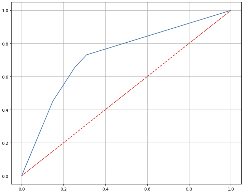
2. 함수 개념
2-1. 다항함수
x = np.linspace(-3, 2, 100)
y1 = 3 * x**2 + 2
y2 = 3 * (x+1)**2 + 2

plt.figure(figsize=(12, 8))
plt.plot(x, y1, lw=2, ls='dashed', label='$3x^2+2$')
plt.plot(x, y2, label='$3(x+1)^2+2$')
plt.legend(fontsize=15)
plt.grid()
plt.xlabel('$x$', fontsize=15)
plt.ylabel('$y$', fontsize=15)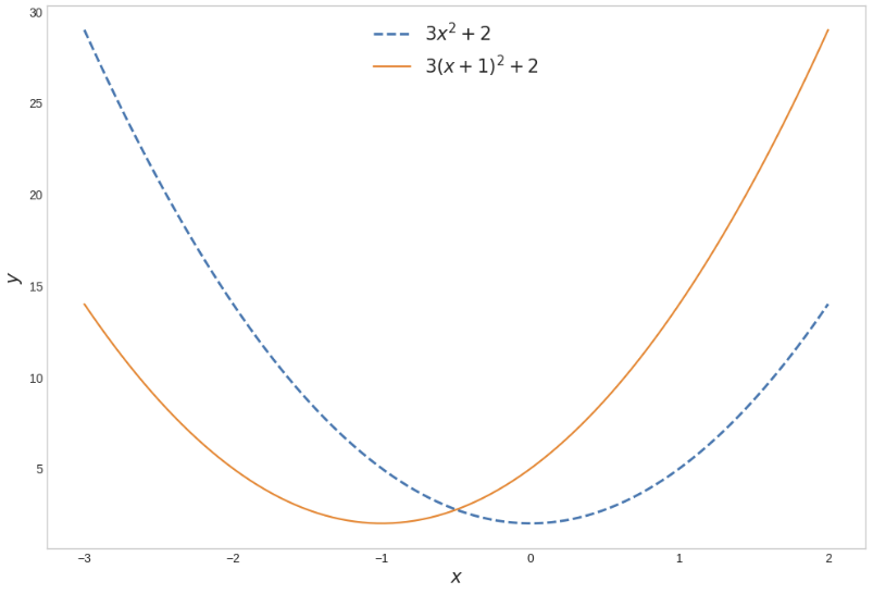
2-2. 지수함수
x = np.linspace(-3, 2, 100)
a11, a12, a13 = 2, 3, 4
y11, y12, y13 = a11**x, a12**x, a13**x

a21, a22, a23 = 1/2, 1/3, 1/4
y21, y22, y23 = a21**x, a22**x, a23**x

f, ax = plt.subplots(1, 2, figsize=(12, 6))
ax[0].plot(x, y11, color='k', label='$2^x$')
ax[0].plot(x, y12, '--', color='k', label='$3^x$')
ax[0].plot(x, y13, ':', color='k', label='$4^x$')
ax[0].legend(fontsize=15)

ax[1].plot(x, y21, color='k', label='$(1/2)^x$')
ax[1].plot(x, y22, '--', color='k', label='$(1/3)^x$')
ax[1].plot(x, y23, ':', color='k', label='$(1/4)^x$')
ax[1].legend(fontsize=15)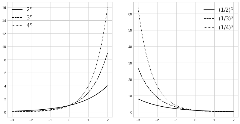
2-3. 자연상수 e
어떤 값을 넣어도 2.71828...에 수렴한다.
x = np.array([10, 100, 1000, 10000, 100000, 1000000, 10000000])
(1 + 1/x)**x

>>>
array([2.59374246, 2.70481383, 2.71692393, 2.71814593, 2.71826824,
       2.71828047, 2.71828169])
2-4. 로그함수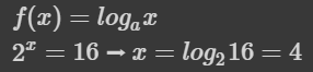
넘파이에서 지원하는 로그함수
print(np.log(np.e))	# 1.0
print(np.log2(2))	# 1.0
print(np.log10(10))	# 1.0

np.e, np.exp(1)		# (2.718281828459045, 2.718281828459045)
np.log(np.exp(1))	# 1.0
로그의 밑수(a)를 원하는 숫자로 변경하려면? 로그의 성질을 이용한다.
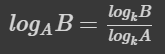
def log(x, base):
  return np.log(x) / np.log(base)

x1 = np.linspace(0.0001, 5, 1000)
x2 = np.linspace(0.01, 5, 100)

y11, y12 = log(x1, 10), log(x2, np.e) # np.log10(x1), np.log(x2)
y21, y22 = log(x1, 1/10), log(x2, 1/np.e)
f, ax = plt.subplots(1, 2, figsize=(12, 6))
# \ 넣으면 수학 기호로 인식
ax[0].plot(x1, y11, label='$\log_{10} x$', color='k')
ax[0].plot(x2, y12, '--', label='$\log_{e} x$', color='k')
ax[0].set_xlabel('$x$', fontsize=15)
ax[0].set_ylabel('$y$', fontsize=15)
ax[0].legend(fontsize=15, loc='lower right')
ax[1].plot(x1, y21, label='$\log_{1/10} x$', color='k')
ax[1].plot(x2, y22, '--', label='$\log_{1/e} x$', color='k')
ax[1].set_xlabel('$x$', fontsize=15)
ax[1].set_ylabel('$y$', fontsize=15)
ax[1].legend(fontsize=15, loc='upper right')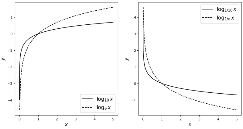
2-5. 시그모이드(Sigmoid)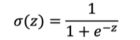
z = np.linspace(-10, 10, 100)
sigma = 1/(1+np.exp(-z))

plt.figure(figsize=(12, 8))
plt.plot(z, sigma)
plt.xlabel('$z$', fontsize=15)
plt.ylabel('$\sigma(z)$', fontsize=15)
plt.show()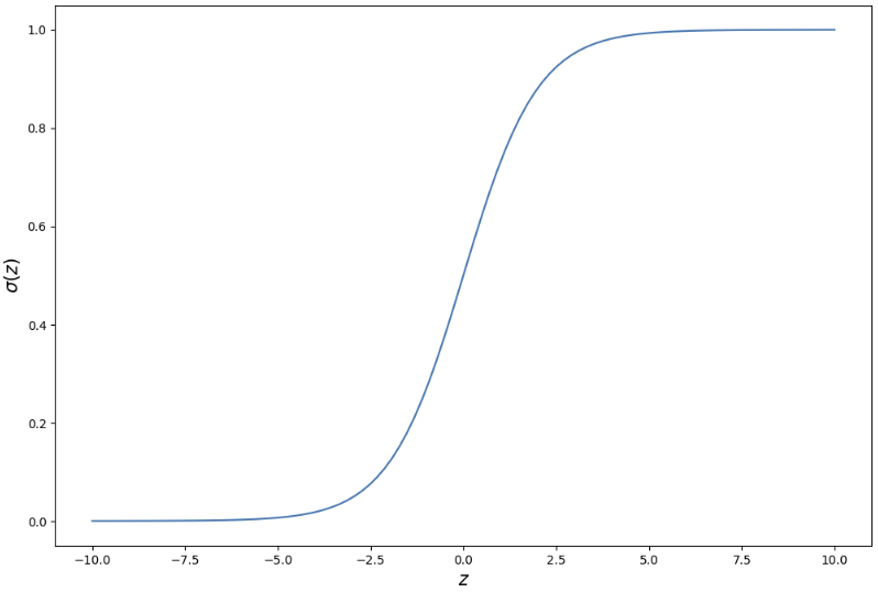
0과 1 사이의 값을 가진다.
2-6.벡터
# meshgrid
u = np.linspace(0, 5, 6)
v = np.linspace(10, 15, 6)
U, V = np.meshgrid(u, v)
# u를 v의 개수에 맞춰서 행 방향으로 나열
U
>>>
array([[0., 1., 2., 3., 4., 5.],
[0., 1., 2., 3., 4., 5.],
[0., 1., 2., 3., 4., 5.],
[0., 1., 2., 3., 4., 5.],
[0., 1., 2., 3., 4., 5.],
[0., 1., 2., 3., 4., 5.]])# v를 u의 개수에 맞춰서 열 방향으로 나열
V
>>>
array([[10., 10., 10., 10., 10., 10.],
[11., 11., 11., 11., 11., 11.],
[12., 12., 12., 12., 12., 12.],
[13., 13., 13., 13., 13., 13.],
[14., 14., 14., 14., 14., 14.],
[15., 15., 15., 15., 15., 15.]])U + V
>>>
array([[10., 11., 12., 13., 14., 15.],
[11., 12., 13., 14., 15., 16.],
[12., 13., 14., 15., 16., 17.],
[13., 14., 15., 16., 17., 18.],
[14., 15., 16., 17., 18., 19.],
[15., 16., 17., 18., 19., 20.]])u = np.linspace(0, 1, 30)
v = np.linspace(0, 1, 30)
U, V = np.meshgrid(u, v)
X = U
Y = V
Z = (1+U**2) + (V/(1+V**2))
fig = plt.figure(figsize=(7, 7))
# 3차원으로 그릴 때
ax = plt.axes(projection='3d')
ax.xaxis.set_tick_params(labelsize=15)
ax.yaxis.set_tick_params(labelsize=15)
ax.zaxis.set_tick_params(labelsize=15)
ax.set_xlabel('$x$', fontsize=10)
ax.set_ylabel('$y$', fontsize=10)
ax.set_zlabel('$z$', fontsize=10)
ax.scatter3D(X, Y, Z, marker='.', color='gray')
plt.show()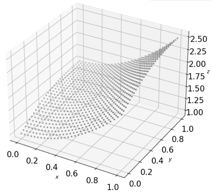
2-7. 함수의 합성
x = np.linspace(-4, 4, 100)
y = x**3 - 15*x + 30
z = np.log(y)

f, ax = plt.subplots(1, 2, figsize=(12, 6))

ax[0].plot(x, z, '--', label='$\log(f(x))$', color='k')
ax[0].legend(fontsize=15)

ax[1].plot(x, y, label='$x^3 - 15x + 30$', color='k')
ax[1].legend(fontsize=15)

# 2번째 그림에서 x축을 하나 더 만든다.
ax_tmp = ax[1].twinx()
ax_tmp.plot(x, z, '--', label='$\log(f(x))$', color='k')

plt.show()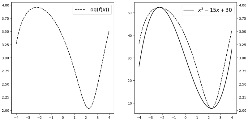
로그함수는 x축이 커질수록 증가폭이 둔화된다.
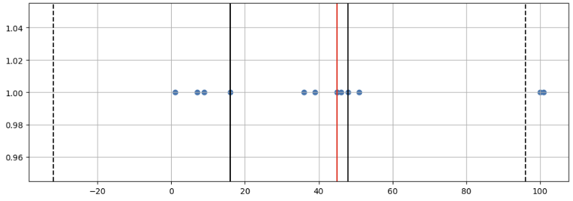
2-8. box plot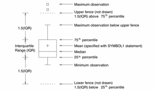
samples = [1, 7, 9, 16, 36, 39, 45, 45, 46, 48, 51, 100, 101]
tmp_y = [1] * len(samples)

q1 = np.percentile(samples, 25)
q2 = np.median(samples)
q3 = np.percentile(samples, 75)
iqr = np.percentile(samples, 75) - np.percentile(samples, 25)
upper_fence = q3 + iqr*1.5
lower_fence = q1 - iqr*1.5

plt.figure(figsize=(12, 4))
plt.scatter(samples, tmp_y)
plt.axvline(x=q1, color='black')
plt.axvline(x=q2, color='red')
plt.axvline(x=q3, color='black')
plt.axvline(x=upper_fence, color='black', ls='dashed')
plt.axvline(x=lower_fence, color='black', ls='dashed')
plt.grid()
plt.show()