본 글은 패스트캠퍼스 "올인원 패키지 : HTML/CSS, JavaScript" 를 바탕으로 작성되었습니다.
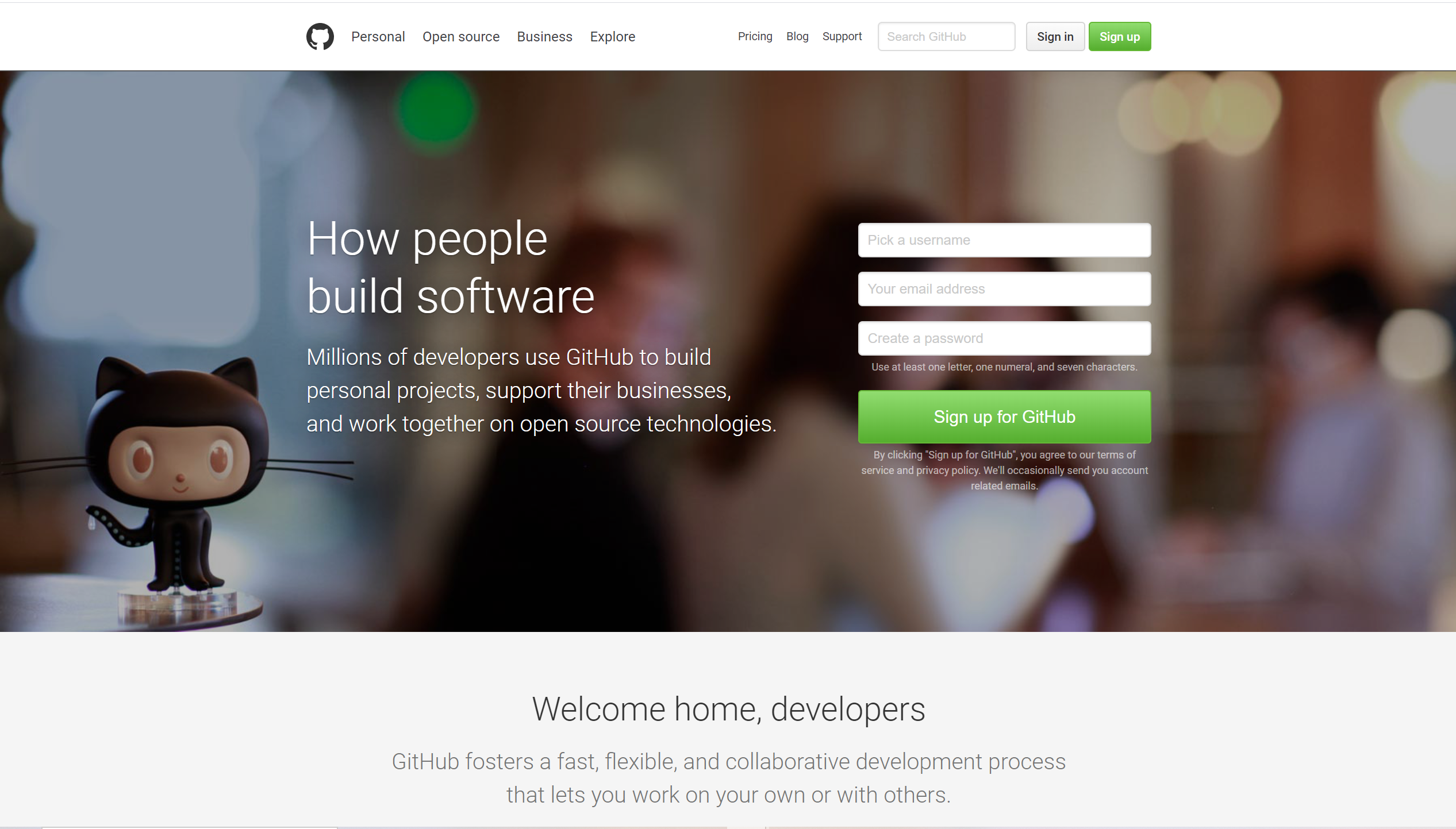
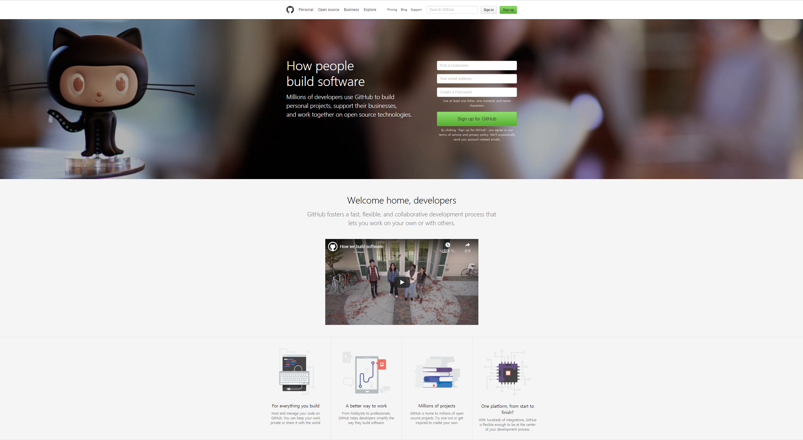
클론할 사이트는 강사님이 수업을 위해 만들어 놓으신 위 사진과 같은 깃헙사이트!
강의를 따라가면서, HTML CSS 부분만 만들어보자.
1. HEAD 설정
Visual Studio Code에서 느낌표(!)를 누르고 엔터를 누르면, HTML의 기본양식이 자동으로 작성된다.
<!DOCTYPE html>
<html lang="en">
<head>
    <meta charset="UTF-8">
    <meta name="viewport" content="width=device-width, initial-scale=1.0">
    <title>Document</title>
</head>
<body>
width,initial-scale,user-scalable
- width=device-width 는 내가 사용할 디바이스의 가로너비를 그대로 사용하겠다라는 뜻이다.
- initial-scale은 최초 화면의 배율을 의미한다. user-scalable은 화면 배율을 조정할 수 있는가의 여부를 설정한다.
<html lang="en">
<head>
    <meta charset="UTF-8">
    <meta name="viewport"
          content="width=device-width, initial-scale=1.0,
                   user-scalable=no, maximum-scale=1, minimum-scale=1">
    <title>Document</title>
</head>
<body>
- user-scalable 은 사용자가 확대,축소를 하는 것을 허용하는가에 대한 속성이다.
- maximum-scale,minimum-scale 을통해 확대,축소를 아예 못하게 할 수 있다. (주로 확대,축소를 했을 때 레이아웃의 문제가 생기는 것을 아예 방지해버리고 싶을 때 쓴다고 한다.)
Open Graph, twitter Card
<meta property="og:type" content="website">
<meta property="og:site_name" content="GitHub">
<meta property="og:title" content="Build software better,together">
<meta property="og:description"
        content="GitHub clone coding
  / GitHub is where people build software.
  More than 31 million people use GitHub to discover,
  fork, and contribute to over 100 million projects.">
<meta property="og:image" content="img/logo__github.png">
<meta property="og:url" content="https://github.com">
<meta property="twitter:card" content="summary">
<meta property="twitter:site" content="GitHub">
<meta property="twitter:title" content="Build software better,
  together">
<meta property="twitter:description" content="practicing">
<meta property="twitter:image" content="img/logo__github.png">
<meta property="twitter:url" content="https://github.com">
- 이를 바탕으로 검색엔진을 통해 검색되므로, 잘 설정 해놓아야 한다.
아이콘,폰트
<link rel="icon" href="/favicon.png">
<link rel="stylesheet" href="/favicon.png">
<link rel="stylesheet" href="/favicon.png">
<link rel="stylesheet" href="./css/styles.css">
<link href="https://fonts.googleapis.com/css2?family=Roboto:wght@300;400;500&display=swap" rel="stylesheet">
- rel="icon" 을 통해서 브라우저상에서 상단 바에 뜨는 아이콘을 설정할 수 있다.
- 구글 폰트를 이용하여 , body 태그에 폰트를 설정할 수 있다. 링크 태그로 구글 폰트를 호출할 수 있다. 본 강의에서는 Roboto 폰트를 이용했다.
body{font-family: 'Roboto',sans-serif}
- Roboto 폰트를 사용할 것이고, 폰트를 사용할 수 없는 환경에선 , sans-serif 폰트를 사용하게 설정한다.
reset
<link rel="stylesheet" href="https://cdnjs.cloudflare.com/ajax/libs/meyer-reset/2.0/reset.css">
- cdn 을 이용하여, 브라우저 스타일 초기화 CSS를 받을 수 있다.
2. 공통 요소 설정
BEM
- '--' : ~의 상태
- '__' : ~의 일부분
- '-' : 일반적인 작명
EX)
- body__container : body 의 일부로서의 컨테이너
- toggle-menu : 토글 메뉴
- btn--success : 버튼이 성공적으로 실행될때
- 완성본 사이트를 미리 살펴보면, 비슷한 스타일을 가지는 요소들을 확인 할 수있다.
버튼 같은경우도, 모두 비슷한 스타일이 사용된 것을 확인 할 수 있다. 버튼을 생성할 때마다 스타일을 매번 작성하는것은 비효율적이므로, 하나의 통합된 전역 스타일을 설정해야 한다.
버튼 스타일링
- 사용할 버튼의 스타일을 미리 정의해보자.
.btn{
    height: 34px;
    background: #eee linear-gradient(to bottom, #fcfcfc, #eee);
    border: 1px solid #d5d5d5;
    border-radius: 4px;
    display: inline-flex;
    align-items: center;
    padding: 0 12px;
    font-size: 14px;
    font-weight: 500;
    line-height: 1.5;
    cursor: pointer;
    box-sizing: border-box;
    position: relative;
}
.btn:hover::before {
    content: "";
    position: absolute;
    top: 0;
    left: 0;
    width: 100%;
    height: 100%;
    background: rgba(0,0,0,0.07);
}
.btn.btn--primary {
    border: 1px solid #65b836;
    color: fff;
    background: #55a532 linear-gradient(#91dd70, #55ae2e)
}
- inline-flex 와 align-items: center; 를 이용하여, 버튼의 내용물 만큼의 너비를 가지는 내용물이 수직정렬된 버튼 스타일을 만든다.
- box-sizing 속성은 패딩이나, border 속성으로 인해 요소가 커지는 것을 막는다.
- linear-gradient()는 그라데이션을 넣어준다.
- 다음과 같은 스타일의 버튼이 만들어진다.
입력양식 ( input )
사용할 입력양식을 먼저 스타일링 해보자.
.input--text {
    height: 34px;
    padding: 0 10px;
    border: 1px solid #ddd;
    border-radius: 5px;
    box-sizing: border-box;
    outline: none;
    box-shadow: inset 0 1px 2px rgba(0,0,0,0.075);
    font-size: 16px;
}
.input--text:focus {
    border-color: #51a7e8;
    box-shadow:  inset 0 1px 2px rgba(0,0,0,0.075),
                       0 0 5px rgba(81,167,232,0.5);
}
.input--text::-webkit-input-placeholder { color: #cacaca;}
- Vendor prefix를 통해, 크롬에서 input 태그의 placeholder 속성을 제어할 수 있다.
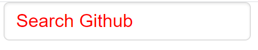
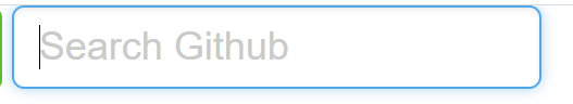
- 위와 같이, 포커스 됐을 때, 파란색의 테두리가 생기는 입력양식을 만들 수 있다.
3. Header
좌측 메뉴
형광펜으로 마크한 부분 부터 작업해보자.
<!--  HTML  -->
<!-- HEADER -->
<header class="section">
    <div class="inner clearfix">

        <div class="menu-group float--left">
            <div class="logo">
                <a href="#">GitHub</a>
            </div>
            <ul class="main-menu">
                <li><a href="#">Personal</a></li>
                <li><a href="#">Open source</a></li>
                <li><a href="#">Business</a></li>
                <li><a href="#">Explore</a></li>
            </ul>
        </div>
    </div>
</header>
// CSS
header {
border-bottom: 1px solid rgba(0,0,0,.75);
box-shadow: 0 0 5px rgba(0,0,0,.75);
background: #fff;
}
header .inner{
max-width: 980px;
height: 78px;
margin: 0 auto;
/* 가운데정렬 margin 0 auto를 사용하기위해선, 가로사이즈가무조건 정의되어있어야함 */
/* 왜 height를 헤더가아닌 inner에서작업하는가?
inner에 한번만 쓰면, header는 기본값으로 설정되고, inner에 넣은 높이만큼 설정됨. */
}
header .menu-group{
display: flex;
align-items: center;
height: 100%;
/* flex를 통해, 자식요소들이 수평의 구조를 가짐 */
/* align-items를 통해 수직가운데정렬 */
}
header .logo{
margin-right: 10px;
}
header .logo a {
background: url("../img/logo.svg");
width: 32px;
height: 32px;
display: block;
text-indent: -9999px;
/* text-indent 속성을 통해, a태그의 'GitHub'이라는 글자를 왼쪽으로
-9999px만큼 밀어내서, 로고 이미지만 보이게 함 */
}
header .logo a:hover{
background: url("../img/logo_on.svg");
}
header .main-menu{
display: flex;
}
header .main-menu li a{
display:block;
padding: 10px;
color: #3c4146;
}-
text-indent: -9999px; 를 통해 a태그의 문자를 화면밖으로 내보내면, 로고이미지만 보이게 할 수 있다.
-
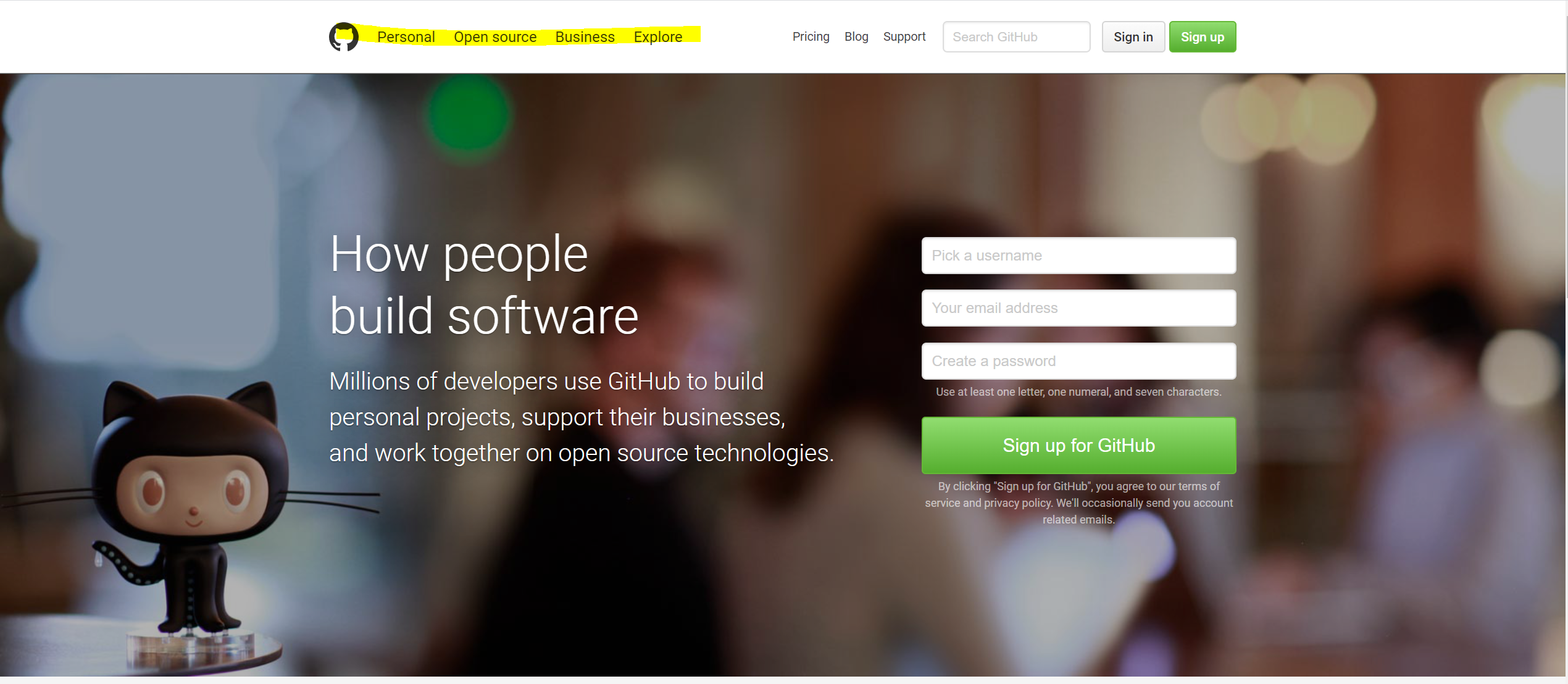
결과는 다음과 같다.

우측메뉴
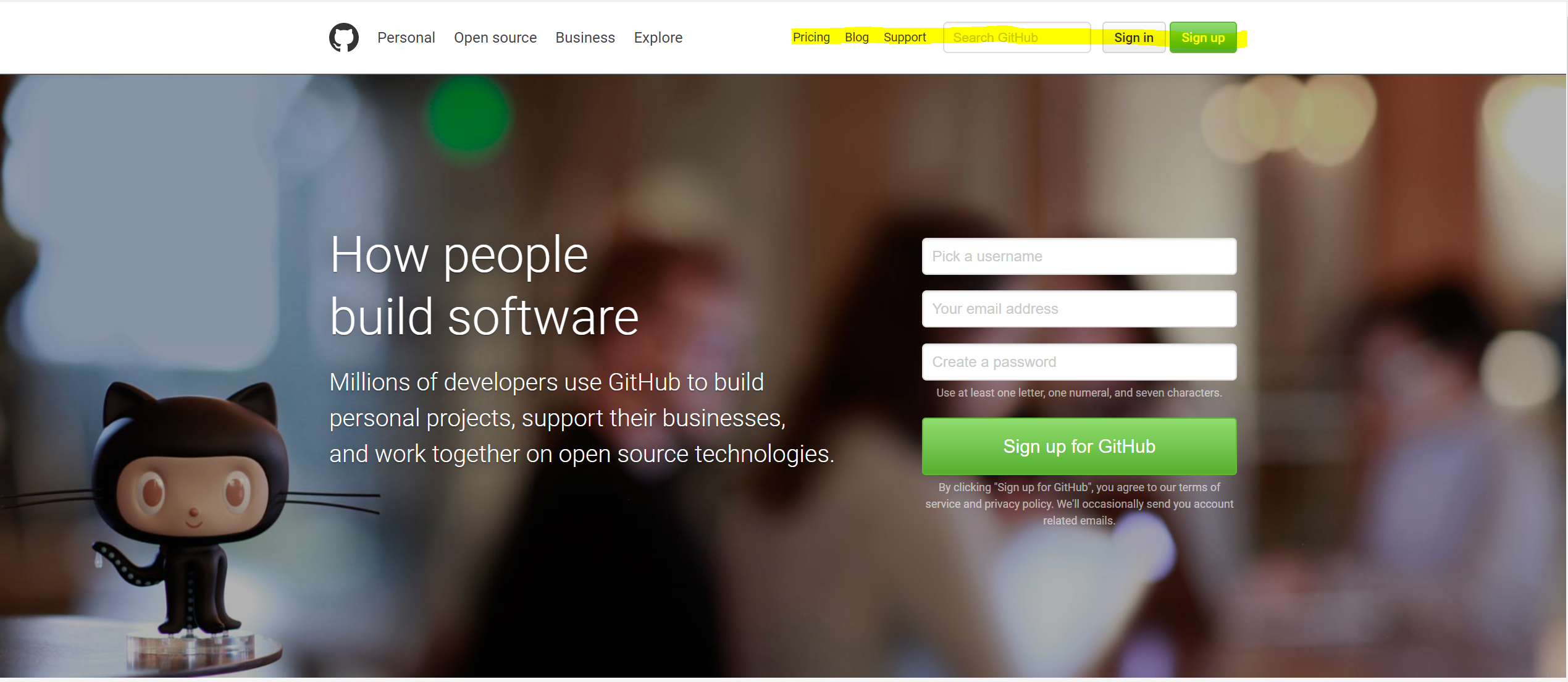
이번엔 우측 메뉴를 작업해보자.
<!-- HTML -->
<div class="sign-group float--right">
    <div class="btn-group">
        <a href="#" class="btn sign-in">Sign in</a>
        <a href="#" class="btn btn--primary sign-up">Sign up</a>
    </div>
    <form id="search-form" action="">
        <input type="text" id="search" class="input--text" placeholder="Search GitHub">
        <input type="submit" value="Submit" style="display:none;">
    </form>
    <ul class="sub-menu">
        <li><a href="#">Pricing</a></li>
        <li><a href="#">Blog</a></li>
        <li><a href="#">Support</a></li>
    </ul>
</div>
// css
header .sign-group {
    display:flex;
    align-items: center;
    height: 100%;
}
header .btn-group{
    order:2;
    display:flex;
}
header .btn-group .sign-in {
    margin-right: 12px;
}
#search-form {
    order:1;
    margin-right: 12px;
}
}
#search{
    width: 160px;
    font-size: 14px;
}
#search + [type="submit"] {
    display:none;
}
header .sub-menu{
    display : flex;
    margin-right: 12px;
}
header .sub-menu li a{
    padding: 8px;
    display:block;
    font-size : 13px;
    color: #3c4146;
}
header .sub-menu li a:hover{
    color: #4078c0;
}
- order 속성을 통해 버튼,검색,서브메뉴들의 순서를 바꾸었다.
- 결과는 다음과 같다.

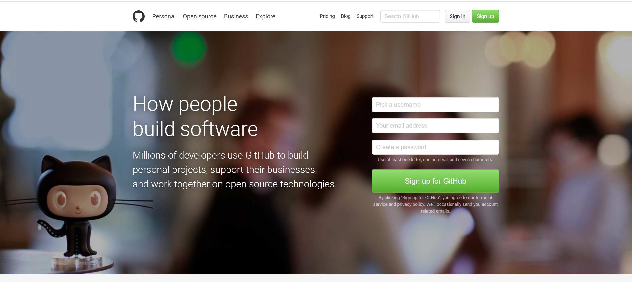
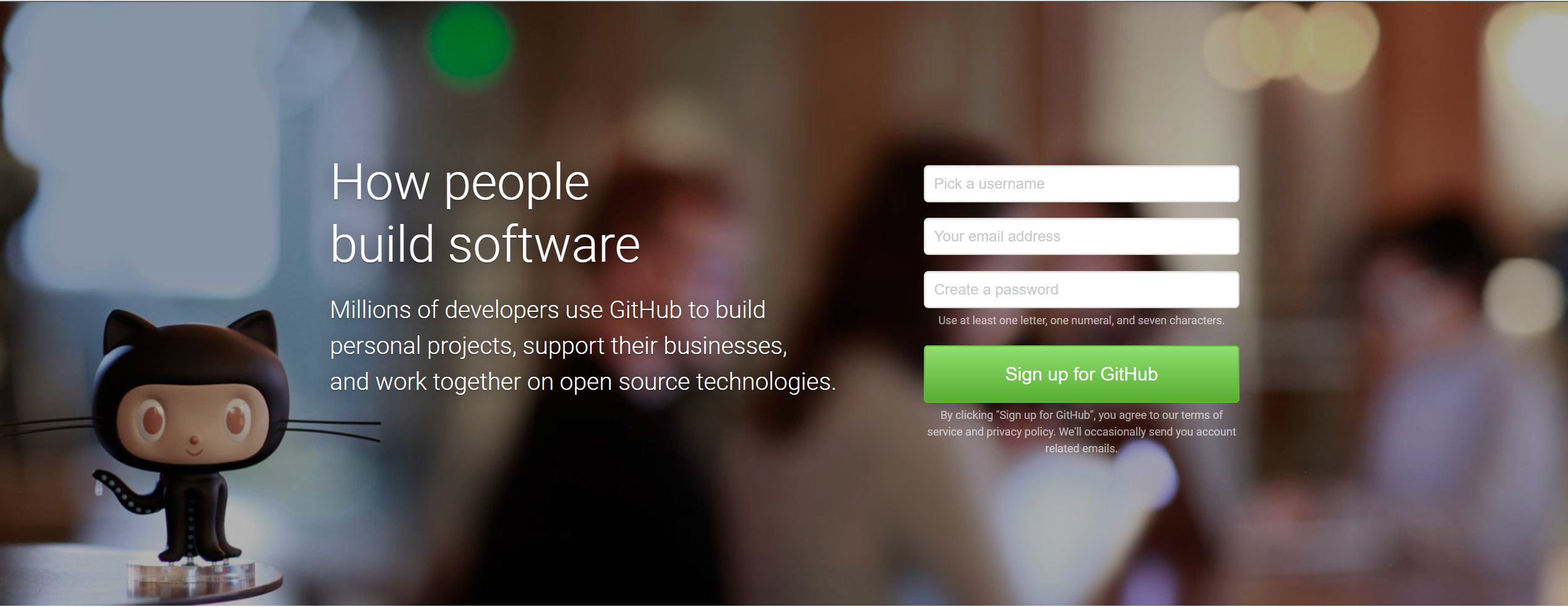
4. Visual section
회원가입 창 + 배경설정
header부분을 완성했으니, 바로 밑의 섹션(Visual Section)을 클론해보자.
<!-- VISUAL SECTION -->
<!-- HTML -->
<section class="section section--visual">
<div class="inner">
<div class="summary">
<div class="summary__title">
How people build software
</div>
<div class="summary__description">
Millions of developers use GitHub to build personal projects, support their businesses, and work together on open source technologies.
</div>
</div>
<form id="sign-form" action="" method="POST" >
<ul>
<li><input type="text" class="input--text" placeholder="Pick a Username"></li>
<li><input type="email" class="input--text" placeholder="Your email address"></li>
<li>
<input type="password" class="input--text" placeholder="Create a Password">
<p class="caption">Use at least one letter, one numeral, and seven characters.</p>
</li>
<li>
<button type="submit" class="btn btn--primary">Sign up for GitHub</button>
<p class="caption">By clicking "Sign up for GitHub", you agree to our terms of service and privacy policy. We'll occasionally send you account related emails.</p>
</li>
</ul>
</form>
</div>
</section>
// css
.section--visual{
    background-image: url("../img/bg.jpg");
    background-repeat: no-repeat;
    background-position: bottom left;
    background-size: cover;
    /* background-size:cover; 를 통해 축소해도 섹션전체를 커버하게만듬 */


}
/* 배경이미지앞, 텍스트 뒤에 어두운배경이미지를 삽입 */
.section--visual::before{
    content:"";
    position: absolute;
    /* position: absolute 를 쓸때, 부모요소에 항상 position이 있는지 확인해야함 */
    top:0;
    left:0;
    width: 100%;
    height: 100%;
    background : rgba(0,0,0,.3);
    /* 왼쪽끝 위쪽끝에 배치시키고, section의 100%크기를 갖게끔하여 다 덮음
       또는 bottom:0 ; right:0; 으로 똑같은효과 넣을수있음 */
}
.section--visual .inner{
    padding: 160px 0;
    display: flex;
}
.section--visual .summary{
    flex-grow: 1;
    flex-basis: 0;
    /* flex container 아이템 속성들
        flex: 1; 과 같음 */
    margin-right: 90px;
}
.section--visual .summary__title {
    color: #FFF;
    font-size: 54px;
    text-shadow: 0 1px 1px rgba(0,0,0,.25),
                 0 1px 25px rgba(0, 0, 0, .75);
}

.section--visual .summary__description{
    color: #FFF;
    text-shadow: 0 1px 1px rgba(0,0,0,.25),
                 0 1px 25px rgba(0, 0, 0, .75);

}

#sign-form{
    width: 340px;
    margin-top: 16px;
}
#sign-form li {
    margin-bottom: 17px;
}
#sign-form li:last-child {
    margin-bottom: 0;
}
#sign-form .input--text{
    width: 100%;
    height: 40px;
}
#sign-form .caption {
    font-size: 12px;
    margin-top: 5px;
    color: rgba(255,255,255,.6);
    line-height: 1.5;
    text-align: center;

}
#sign-form [type="submit"] {
    width: 100%;
    height: 62px;
    padding: 0 25px;
    font-size: 20px;
    justify-content: center;
    /* inline-flex 에서 자식요소 수평정렬을 하기위해선, justify-content 를 이용 */
}- 결과는 다음과 같다.

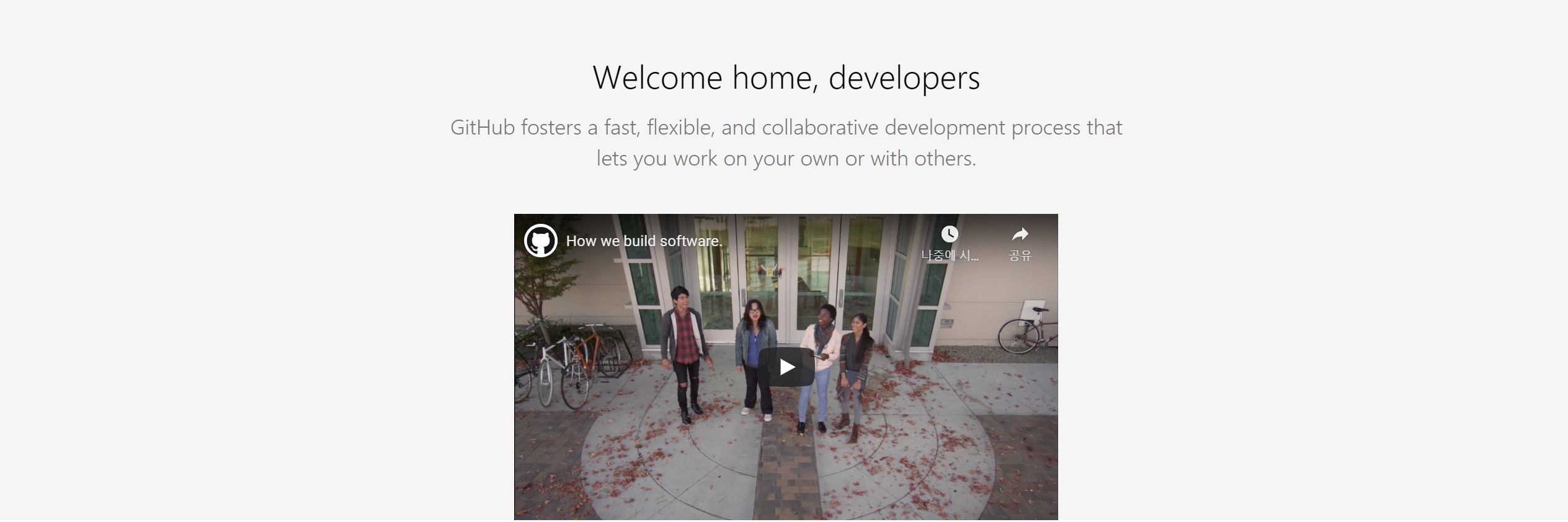
안내문 + 동영상
<!--html-->
<section class="section section--feature">
    <div class="summary">
        <div class="summary__title">
            Welcome home, developers
        </div>
        <div class="summary__description">
            GitHub fosters a fast, flexible, and collaborative development process that lets you work on your own or
            with others.
        </div>
    </div>
    <div class="video">
        <div class="video-ratio">
            <iframe width="1078" height="606" src="https://www.youtube.com/embed/afvT1c1ii0c" frameborder="0"
                allow="accelerometer; autoplay; encrypted-media; gyroscope; picture-in-picture"
                allowfullscreen></iframe>
        </div>
    </div>
    <div class="tiles">
    </div>
</section>
//css
.section--feature{
    background: #f5f5f5;
    padding-top: 66px;

}
.section--feature .summary{
    max-width:820px;
    /* 가변하는 너비를 정의할때는 , max-width를 정의한다 */
    margin: 0 auto;
    text-align: center;
}
.section--feature .video{
    /* 영상의 비율을 유지하면서 , 반응형으로 만듬 */
    /* padding-top 은 부모요소의 가로너비에 영향을 받는다 */
    max-width: 650px;
    margin: 50px auto;

}
.section--feature .video .video-ratio{
    height:0;
    padding-top: 56.25%;
    position: relative;
}
.section--feature .video .video-ratio iframe{
    position: absolute;
    top:0;
    left:0;
    width:100%;
    height: 100%;
}- 넣고자 하는 영상이 반응형으로 비율(16:9)을 유지하기 위해, padding-top을 이용하여 비디오의 높이를 설정함.
- 결과는 다음과 같다.
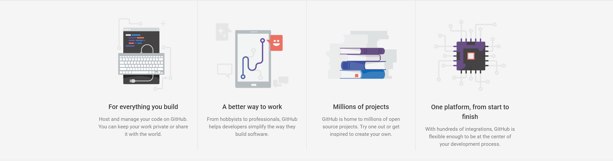
반응형 타일(그리드)
아래와 같은 반응형의 타일을 구현해보자.
<div class="tiles">
    <div class="inner">
        <ul class="clearfix">
            <li>
                <img src="./img/feature-tile__build.png" alt="">
                <h3>For everything you build</h3>
                <p>Host and manage your code on GitHub. You can keep your work private or share it with the world.</p>
            </li>
            <li>
                <img src="./img/feature-tile__work.png" alt="">
                <h3>A better way to work</h3>
                <p>From hobbyists to professionals, GitHub helps developers simplify the way they build software.</p>
            </li>
            <li>
                <img src="./img/feature-tile__projects.png" alt="">
                <h3>Millions of projects</h3>
                <p>GitHub is home to millions of open source projects. Try one out or get inspired to create your own.</p>
            </li>
            <li>
                <img src="./img/feature-tile__platform.png" alt="">
                <h3>One platform, from start to finish?</h3>
                <p>With hundreds of integrations, GitHub is flexible enough to be at the center of your development process.</p>
            </li>
        </ul>
    </div>
</div>
.section--feature .tiles{
border-top: 1px solid #e5e5e5;
border-bottom: 1px solid #e5e5e5;
}
.section--feature .tiles .inner{
max-width: 1200px;
}
.section--feature .tiles ul{
/* grid container */
display:grid;
grid-template-columns: repeat(4,1fr);
}
.section--feature .tiles ul li{
list-style : none;
padding: 34px 24px;
text-align:center;
line-height: 1.5;
border-right: 1px solid #e5e5e5;
box-sizing: border-box;
}
.section--feature .tiles ul li:last-child{
border-right: none;
}
.section--feature .tiles ul li img{
/* 반응형 이미지 만들기 */
max-width: 100%;
padding : 14px 10% 24px;
box-sizing: border-box;
}
.section--feature .tiles ul li h3{
font-size : 18px;
font-weight: 500;
margin-bottom: 10px;
}
.section--feature .tiles ul li p{
font-size : 14px;
color:#767676;
}결과물

연세대학교 산업공학과 웹개발 JavaScript