목표
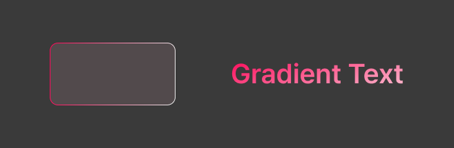
위 이미지와 같이 border와 text 색을 그래디언트로 구현하기.
리액트 네이티브에서는 css의 linear-gradient 속성을 지원하지 않기 때문에 네이티브 api를 사용해야한다. 나는 react-native-linear-gradient 라이브러리를 사용해서 구현했다.
구현
border
아래는 공식문서의 사용 예시 이다.
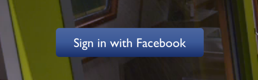
import LinearGradient from 'react-native-linear-gradient';

// Within your render function
<LinearGradient colors={['#4c669f', '#3b5998', '#192f6a']} style={styles.linearGradient}>
  <Text style={styles.buttonText}>
    Sign in with Facebook
  </Text>
</LinearGradient>

// Later on in your styles..
var styles = StyleSheet.create({
  linearGradient: {
    flex: 1,
    paddingLeft: 15,
    paddingRight: 15,
    borderRadius: 5
  },
  buttonText: {
    fontSize: 18,
    fontFamily: 'Gill Sans',
    textAlign: 'center',
    margin: 10,
    color: '#ffffff',
    backgroundColor: 'transparent',
  },
});
LinearGradient 에서 colors 필수 속성만 지정해주면 선형 그래디언트가 수직방향으로 적용된다.
그 외에도 locations와 start, end 속성으로 색상의 스톱 위치와 그래디언트 방향을 설정할 수 있다.
내 앱에서는 background 말고 border로 사용해야하는데 따로 border에 사용할 수 있는 api를 제공하지는 않았다.
그래서 LinearGradient 컴포넌트 내부에 View를 배치해서 구현했다.
View에 borderWidth만큼 margin 속성을 적용하면 부모 컴포넌트인 LinearGradient에서 margin을 제외한 부분만 View에 가려지기 때문에 마치 border 속성이 적용된 것처럼 보인다.
// GradientBorderView.tsx
import React from 'react'
import { StyleSheet, View } from 'react-native'
import LinearGradient, {
	LinearGradientProps
} from 'react-native-linear-gradient'

import { useCustomTheme } from '@/hooks/useCustomTheme'

interface GradientBorderViewProps extends LinearGradientProps {
	borderRadius: number
	borderWidth: number
}

export default function GradientBorderView({
	borderRadius,
	borderWidth,
	style,
	children,
	...props
}: GradientBorderViewProps) {
	const { colors } = useCustomTheme()
	const { backgroundColor, ...restStyle } = StyleSheet.flatten(style) || {}

	return (
		<LinearGradient {...props} style={[{ borderRadius }, restStyle]}>
			<View
				style={[
					styles.view,
					{
						borderRadius: borderRadius - borderWidth,
						margin: borderWidth,
						backgroundColor: backgroundColor || colors.background
					}
				]}
			>
				{children}
			</View>
		</LinearGradient>
	)
}

const styles = StyleSheet.create({
	view: {
		overflow: 'hidden'
	}
})
text
TextGradient는 iOS에서만 지원하기 때문에 안드로이드까지 사용가능한 @react-native-masked-view/masked-view 라이브러리를 사용해서 마스킹했다.
<MaskedView
  style={{ flex: 1, flexDirection: 'row', height: '100%' }}
  maskElement={
    <View
      style={{
        // Transparent background because mask is based off alpha channel.
        backgroundColor: 'transparent',
          flex: 1,
            justifyContent: 'center',
              alignItems: 'center',
      }}
      >
      <Text
        style={{
          fontSize: 60,
            color: 'black',
              fontWeight: 'bold',
        }}
        >
        Basic Mask
      </Text>
    </View>
  }
  >
  {/* Shows behind the mask, you can put anything here, such as an image */}
  <View style={{ flex: 1, height: '100%', backgroundColor: '#324376' }} />
  <View style={{ flex: 1, height: '100%', backgroundColor: '#F5DD90' }} />
  <View style={{ flex: 1, height: '100%', backgroundColor: '#F76C5E' }} />
  <View style={{ flex: 1, height: '100%', backgroundColor: '#e1e1e1' }} />
</MaskedView>
MaskedView 구조
- maskElement
마스크로 사용할 요소이다. 여기에서는 텍스트에 해당한다. 알파값을 사용해서 배경 컨텐츠를 어느정도 보여줄지 지정할 수 있다. - childeren
배경 컨텐츠이다. 여기에서는 LinearGradient에 해당한다. children의 요소를 maskElement의 형태에 따라 보여주게된다.
문제점
예시처럼 MaskedView에 flex-1, children에 LinearGradient만 넣고 flex-1 속성을 줬더니 예상처럼 렌더링되지 않았다. 텍스트의 크기보다 그라데이션의 크기가 더 넓게 잡혀 그라데이션의 일부분만 텍스트에 적용되었다.
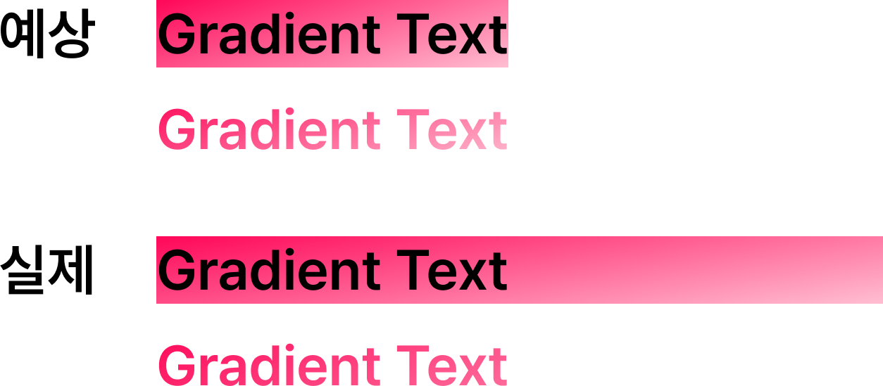
// MaskedView.js
<RNCMaskedView {...otherViewProps}>
  <View pointerEvents="none" style={StyleSheet.absoluteFill}>
    {maskElement}
  </View>
  {children}
</RNCMaskedView>
MaskedView의 컴포넌트 구조를 보면 RNCMaskedView 하위에 View > maskElement와 children이 형제 요소로 들어있다.
maskElement의 상위 View는 StyleSheet.absoluteFill 스타일을 갖는데 이는 부모의 전체공간을 차지하는 속성이다.
따라서 maskElement의 크기에 맞추려면 children의 크기를 maskElement와 동일하게 해주는 방법으로 구현해야한다. 가장 쉬운 방법은 maskElement의 텍스트를 똑같이 children으로 넣어주는 것이다.
// GradientText.tsx
import MaskedView from '@react-native-masked-view/masked-view'
import { styled } from 'nativewind'
import React from 'react'
import { ViewStyle } from 'react-native'
import LinearGradient, {
	LinearGradientProps
} from 'react-native-linear-gradient'

import { typography } from '@/theme/fonts'

import { CustomText } from './CustomText'

interface GradientTextProps extends LinearGradientProps {
	variant?: keyof typeof typography
	containerStyle?: ViewStyle
	numberOfLines?: number
	adjustsFontSizeToFit?: boolean
}

function GradientText({
	variant,
	containerStyle,
	children,
	style,
	numberOfLines,
	adjustsFontSizeToFit,
	...props
}: GradientTextProps) {
	return (
		<MaskedView
			style={containerStyle}
			maskElement={
				<CustomText
					variant={variant}
					className="bg-transparent"
					style={style}
					numberOfLines={numberOfLines}
					adjustsFontSizeToFit={adjustsFontSizeToFit}
				>
					{children}
				</CustomText>
			}
		>
			<LinearGradient {...props}>
				<CustomText
					variant={variant}
					className="opacity-0"
					style={style}
					numberOfLines={numberOfLines}
					adjustsFontSizeToFit={adjustsFontSizeToFit}
				>
					{children}
				</CustomText>
			</LinearGradient>
		</MaskedView>
	)
}

export default styled(GradientText)
완성된 코드는 이렇다.
중요한 점은 maskElement에서 배경은 transparent를 적용해 알파값을 0으로 만들어줘야 텍스트에만 컨텐츠를 적용할 수 있다. 또한 children에서 Text의 역할은 단순히 마스킹 요소의 크기와 맞추는 용도이기때문에 알파값을 0으로 만들어 LinearGradient만 사용하도록 해야한다.
