Importance of predominant color - moods
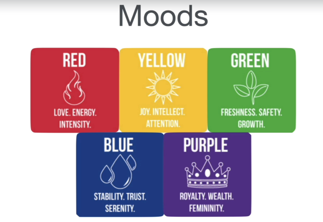
the predominant color that is going to be in your design really tells a story and it conveys a message
combines of colors
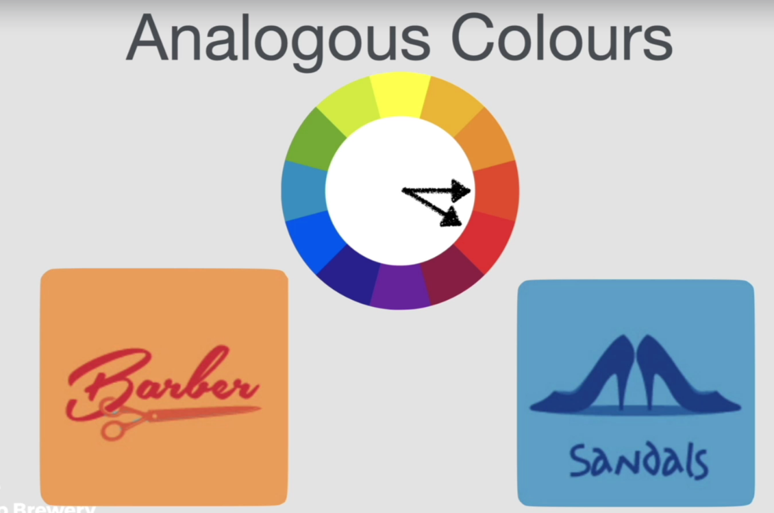
1. analogous color palette
look incredibly harmonious and they really work well together.
this color palette can be really good for things like navigation bars and the body of your website or things like a logo and it's background.
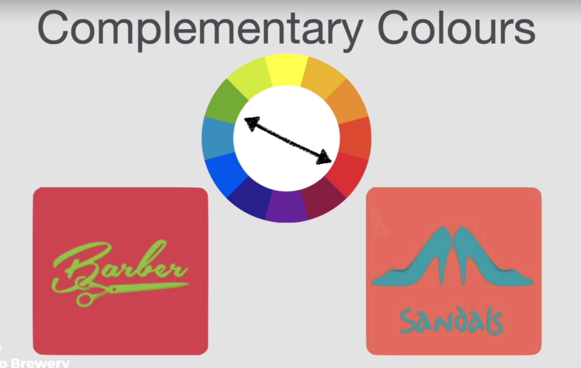
2. complementary color
creats a pop and it really brings out each of the colors.
used this complementary color palette to make things pop.

eg. supermarket
grass or fake bushes and they'll put it in between the meat. And because the green and the red are complementary colors it makes the red meat pop out a lot more and gives you this idea of freshness

Don't do it for text
But what you shouldn't do with clashing colors or complementary style text and text background with it because it actually looks very very jarring
So don't do this when it concerns text. keep it to things like logos or icons or things that you really really want to stand out from
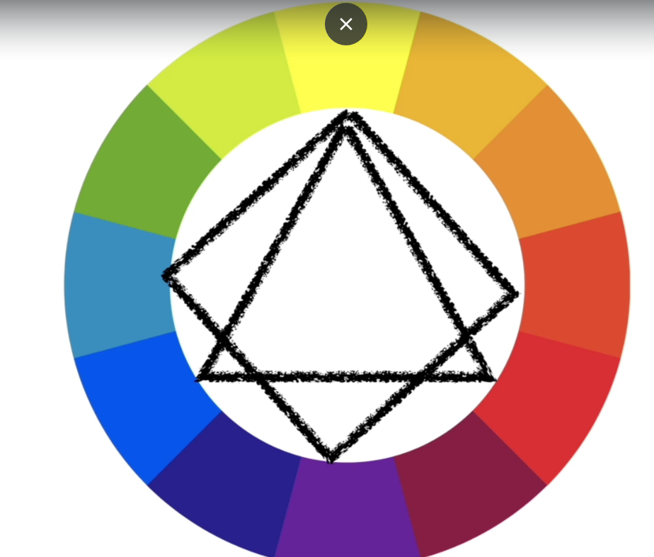
equilateral triangle
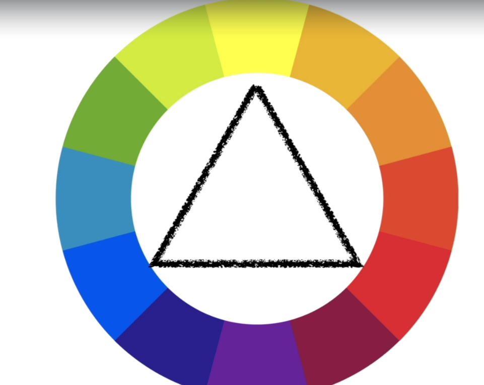
combine colors like drawing an equilateral triangle
perfect square.
using color paltte websites
drawing a perfect square.
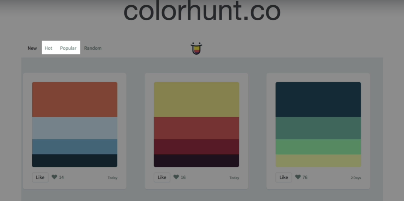
colorhunt.co.
This is a website where professional designers have curated some of their favorite color palettes and you can nab the hex codes straight off the website.
