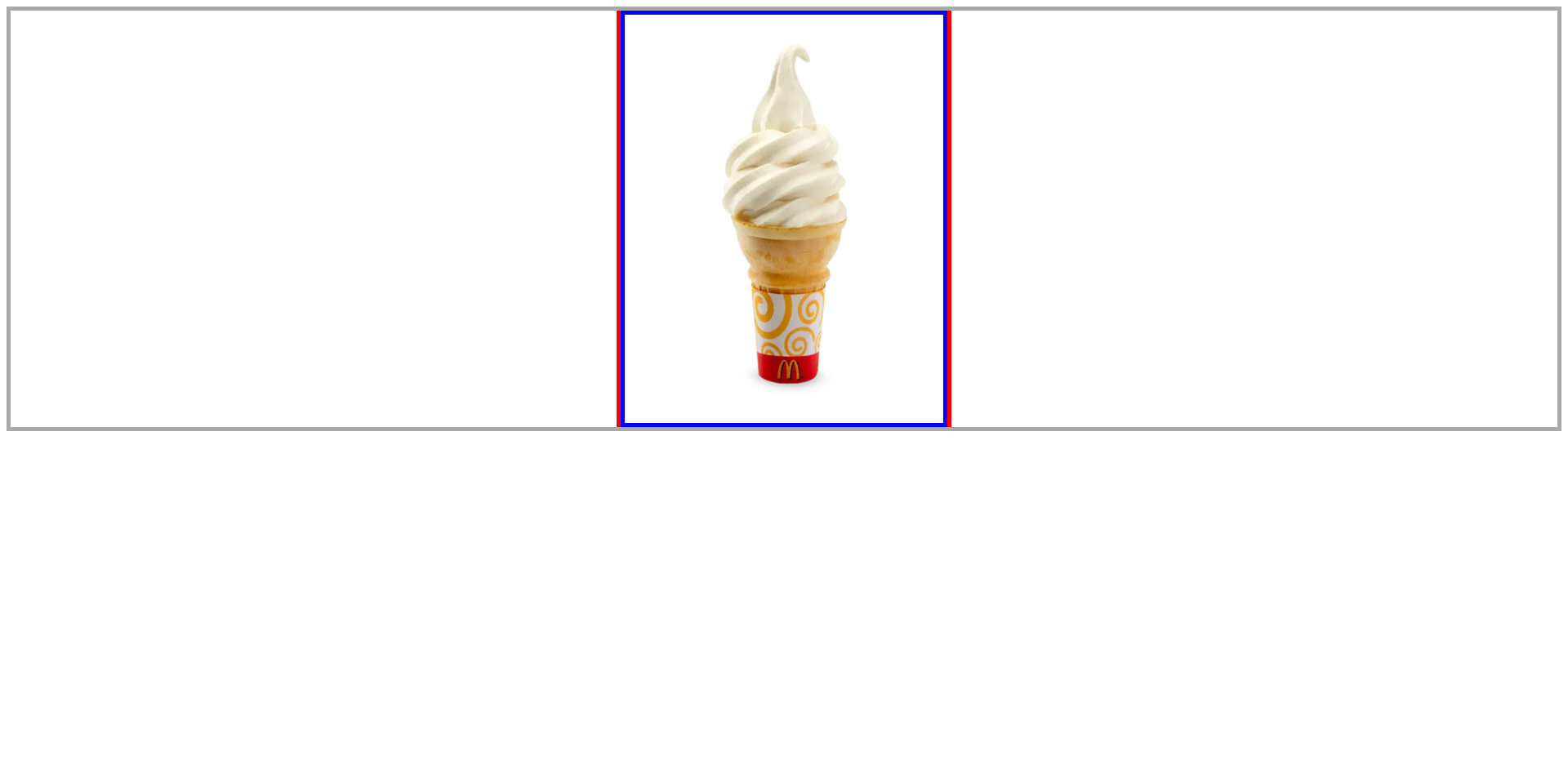
아이스크림을 빨간색 선 안에 위치 시키려면?
회색 테두리
box_container
빨간색 선box
아이스크림ice_img<!-- html --> <div class="box_container"> <div> <div class="box"></div> <img src="./assets/ice.jpg" alt="" class="ice_img" width="390" height="500"> </div> </div>/* css */ .box_container { border: 5px solid #aaa; position: relative; } .box { width: 400px; height: 510px; border-left: 5px solid red; border-right: 5px solid red; margin: auto; } .ice_img { position: absolute; top: 0; left: 0; border: 5px solid blue; }
기존 방법
left: 50%;주면 사진 크기만큼 계산해서margin-left: -계산값px;해준다..ice_img { position: absolute; top: 0; left: 50%; margin-left: -200px; border: 5px solid blue;
하지만, 매번 값을 계산하기는 어렵다.
그래서
transform: translateX(-50%)을 사용
쉬운 방법
transform: translateX(-50%)을 사용
그냥left: 50%는 요소 크기를 고려하지 않지만transfomr: translateX()는 요소 크기를 고려하기 때문에 가능.ice_img { position: absolute; top: 0; left: 50%; transform: translateX(-50%); border: 5px solid blue;
기존 방법과 동일하게 결과가 나온다.
하지만, IE는 9부터 지원한다.
https://caniuse.com/?search=transform

