
📌 cra로 프로젝트 생성
하나하나 설정하면 번거로우니 cra를 사용해 프로젝트를 생성한다.
방법은 간단하다.
npx가 없다면 npx를 설치하고 생성을 원하는 폴더로 가서 다음 명령어를 치면된다.
npx create-react-app todolist --template=typescript만약 프로젝트 생성이 성공하면 아래와 같은 문구가 나온다.
Created git commit.

Success! Created todolist at /Users/songminhyeong/Git/preCrew/todolist
Inside that directory, you can run several commands:

  npm start
    Starts the development server.

  npm run build
    Bundles the app into static files for production.

  npm test
    Starts the test runner.

  npm run eject
    Removes this tool and copies build dependencies, configuration files
    and scripts into the app directory. If you do this, you can’t go back!

We suggest that you begin by typing:

  cd todolist
  npm start

Happy hacking!
📌 프로젝트 구성
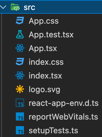
src 폴더를 열어보면 아래처럼 돼있는데 todoList 프로젝트에는
index.tsx, index.css를 제외하고는 필요없으므로 지워버린다.
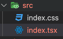
지워버리니까 index.tsx파일이 에러를 뱉어낸다.
이유는 아래의 줄에 해당하는 파일을 지워서 그렇다.
아래 두개의 줄도 지워준다.
import reportWebVitals from './reportWebVitals';
reportWebVitals();
그리고 이제 App.tsx 파일을 만들어 작성을 시작할건데
정말 아무런 기능 없이 추가, 삭제, 완료 기능만 있는 투두리스트를 만들 예정이다.
그 후 기능을 하나씩 추가해보자.
그 전에 투두리스트의 큰 틀부터 먼저 정하고 작성하는게 편하다고 생각한다.
투두리스트는 아래와 같이 구성할 예정이다.
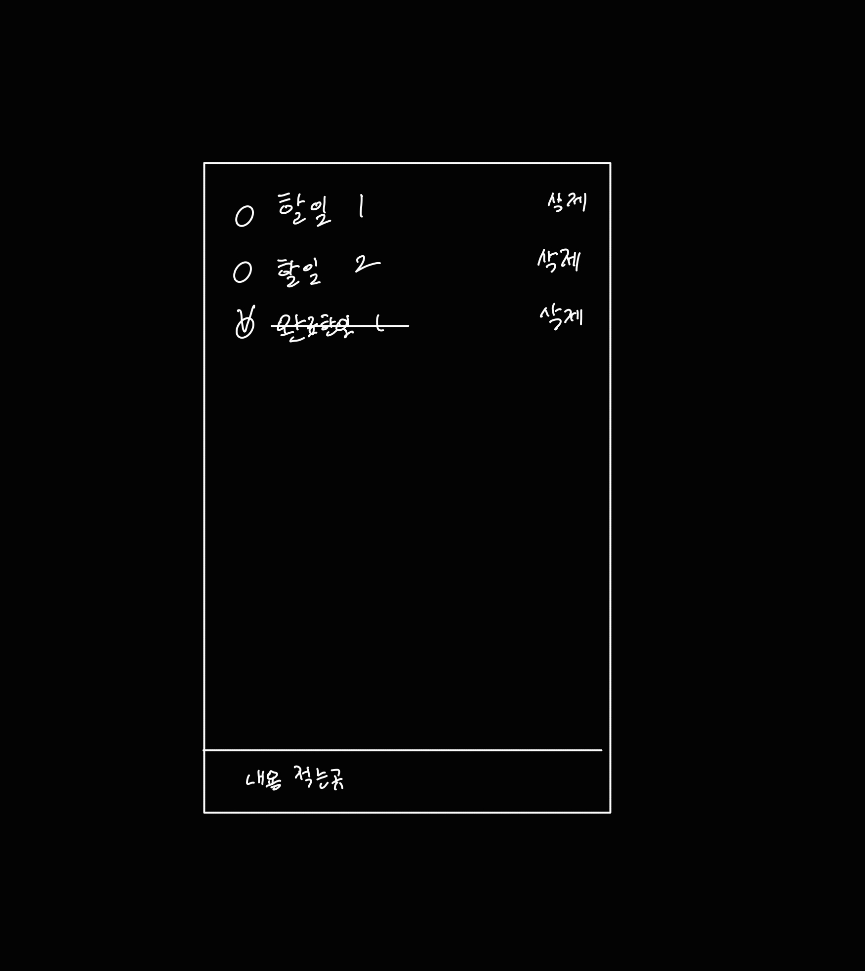
기능은 아래와 같은 기능이 있을것이다.
- 내용을 적고 엔터를 누르면 리스트에 추가된다.
- 체크버튼을 누르면 취소선이 그어진다.
- 삭제버튼을 누르면 리스트에서 제거된다.
이제 코드작성을 시작해보자.
📌 목업만들기
본격적으로 코드를 작성하기 앞서 목업을 만들어볼 예정이다.
실제로 데이터가 추가되고, 제거되지는 않지만 상호작용은 가능한 목업을 만들거다.
이렇게 목업을 먼저 만들면 나중에 상태관리만 해주면 되기때문에 편하다.
// index.css

#root, html, body {
  box-sizing: border-box;
  width: 100%;
  height: 100%;
  margin: 0;
  padding: 0;
}
body { ... }
code { ... }- width, height을 상속받아 사용할거기 떄문에 root, html, body의 width, height를 100%로 해준다.
👀 텍스트 입력창
일단 텍스트 입력창부터 추가하자
// App.tsx

import React from 'react';
import './app.css';
const App = () => {
    return (
        <>
            <div className="mainContainer">
                <div className="appContainer">
                    <input type="text"
                        className="inputText"
                        placeholder='내용을 입력후 엔터'
                    />
                </div>
            </div>
        </>
    );
}
export default App;
// App.css
.mainContainer {
width: 100%;
height: 100%;
display: flex;
justify-content: center;
align-items: center;
}
.appContainer {
width: 500px;
height: 800px;
background-color: rgb(255, 241, 253);
position: relative;
}
.inputText {
width: 100%;
height: 50px;
border: 0.1px solid black;
font-size: 18px;
text-align: center;
box-sizing: border-box;
position: absolute;
bottom: 0;
}
.inputText:focus {
outline: none;
border: 1px solid black;
}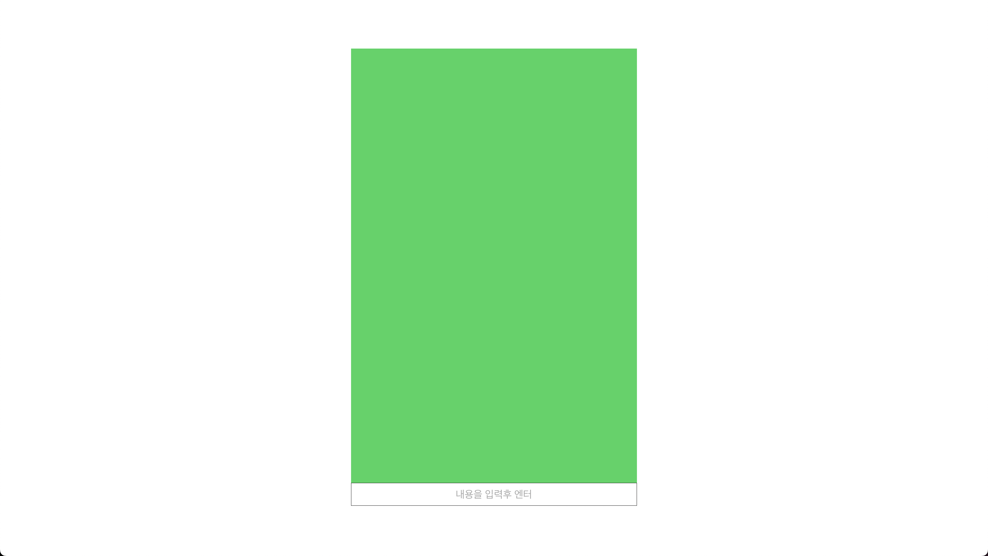
아무것도 없는 입력창이 생겼다.
이제 할일 리스트만 추가하면 된다.
👀 할일 리스트
투두리스트는 여러개의 아이템으로 이뤄져있다.
그 아이템 안에는 체크박스, 텍스트, 삭제버튼이 있다.
그러므로 체크박스, 텍스트, 삭제 컴포넌트를 따로 만든 후
아이템 컴포넌트로 합쳐줄것이다.
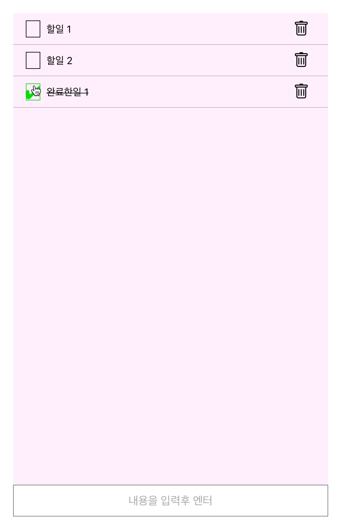
CheckBox 컴포넌트
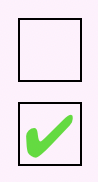
체크박스는 눌렸는지, 안눌렸는지에 대한 한가지 state를 가지고 있다.
그리고 만약 눌리면 색이 바뀌고 ✅ 모양이 생길것이다.
눌렸을 때 할 행동은 props를 받아서 처리하도록 하겠다.
// CheckBox.tsx

import React from 'react';
import './styles/checkBox.css';

interface CheckBoxProps {
    checked?: boolean;
    onClick?(): void;
}

const CheckBox = ({
    checked,
    onClick
}: CheckBoxProps) => {
    return (
        <>
            <div className="container" onClick={onClick}>
                <div className="checkIcon">
                    {checked && "✔︎"}
                </div>
            </div>
        </>
    );
}

export default CheckBox;
// checkBox.css
.container {
width: 25px;
height: 25px;
display: flex;
position: relative;
justify-content: center;
align-items: center;
border: 1px solid black;
cursor: pointer;
}
.container:hover {
border: 2px solid rgb(0, 221, 0);
}
.checkIcon {
position: absolute;
font-size: 30px;
color: rgb(0, 221, 0);
}
Text 컴포넌트
Text 컴포넌트가 수행하는 일은 더 간단하다.
그냥 props로 넘어온 값을 화면에 보여주기만 하면 된다.
그리고 만약 범위를 초과한 글자가 보여진다면 뒷쪽은 ...로 보이게 할것이다.
// Text.tsx

import React from 'react';
import './styles/text.css';

interface TextProps {
    completed?: boolean;
    children: React.ReactNode;
}

const Text = ({
    completed,
    children
}: TextProps) => {
    return (
        <>
            <div className={`text ${completed ? 'completedText' : ''}`}>
                {children}
            </div>
        </>
    );
}

export default Text;
// text.css
.text {
width: 100%;
box-sizing: border-box;
overflow: hidden;
text-overflow: ellipsis;
white-space: nowrap;
padding: 10px;
}
.completedText {
text-decoration: line-through;
}
- props로 긴 문자를 넣어주면 잘려나온다.
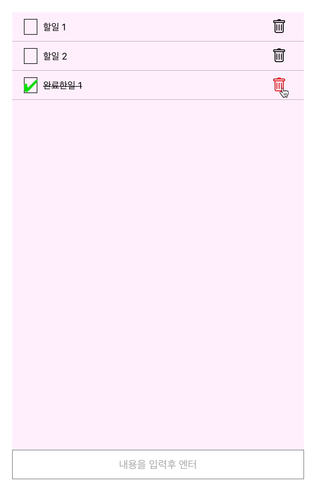
DeleteButton 컴포넌트
DeleteButton 컴포넌트도 CheckBox 컴포넌트와 비슷하다.
눌렸는지 확인하는 상태는 없지만, 눌렸을 때 동작하는 함수를 props로 받아온다.
그리고 아이콘 모양은 react-icons라이브러리를 사용했다.
// DeleteButton.tsx

import React from 'react';
import{BsTrash} from 'react-icons/bs/';
import './styles/deleteButton.css'

interface DeleteButtonProps {
    onClick? (): void;
}

const DeleteButton = ({
    onClick
}:DeleteButtonProps) => {
    return (
        <>
            <div className="deleteButtonContainer" onClick={onClick}>
                <BsTrash />
            </div>
        </>
    );
}

export default DeleteButton;
// deleteButton.css
.deleteButtonContainer {
width: 25px;
height: 25px;
font-size: 25px;
cursor: pointer;
}
.deleteButtonContainer:hover {
color: red;
}
- hover됐을 때 정상적으로 빨간색이 된다.
Item 컴포넌트
이제 위에서 만든 CheckBox, Text, DeleteButton을 합쳐서 Item 컴포넌트를 만들 차례다.
Item 컴포넌트는 CheckBox, DeleteButton을 눌렀을 때 컨트롤 하는 함수를 가지고 있을것이다.
그리고 완료된 일인지 확인하는 completed 상태도 받아올 것이다.
이제 이를 구현만 하면 된다.
import React, {useState} from 'react';
import './styles/item.css';
import CheckBox from './CheckBox';
import DeleteButton from './DeleteButton';
import Text from './Text';

interface ItemProps {
    completed?: boolean;
    text: string;
}

const Item = ({
    completed,
    text,

}:ItemProps) => {

    return (
        <>
            <div className="itemContainer">
                <CheckBox checked={completed}/>
                <Text completed={completed}>
                    {text}
                </Text>
                <DeleteButton/>
            </div>
        </>
    );
}

export default Item;
.itemContainer {
width: 100%;
height: 50px;
padding: 20px;
box-sizing: border-box;
display: flex;
justify-content: space-between;
align-items: center;
border-bottom: 0.1px solid rgb(134, 134, 134);
}
TodoList 컴포넌트
위의 투두리스트를 그려주기위해 App.tsx파일을 아래처럼 써줬다.
// App.tsx
import React from 'react';
import './app.css';
import Item from './components/Item';
const App = () => {
return (
<>
<div className="mainContainer">
<div className="appContainer">
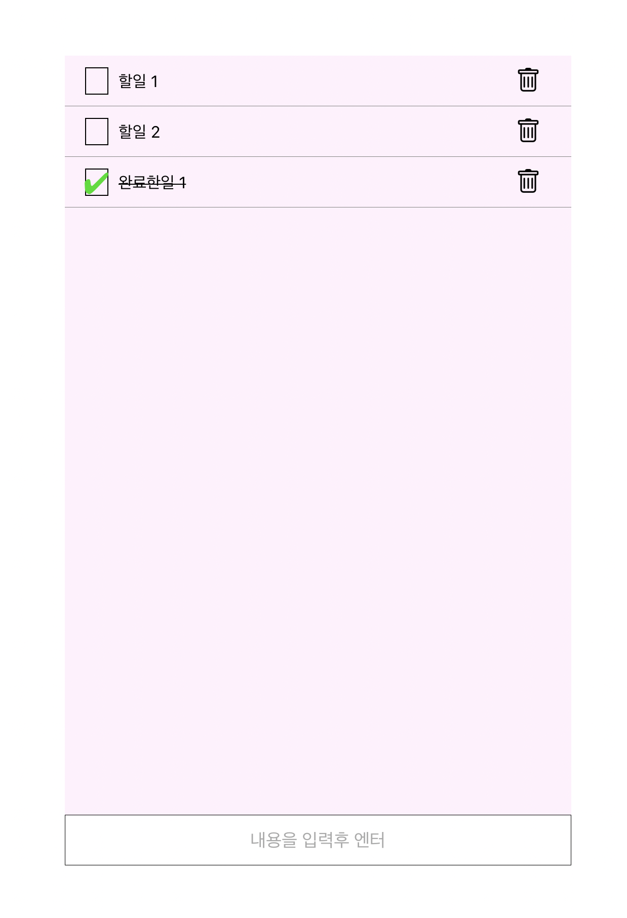
<Item text="할일 1"/>
<Item text="할일 2"/>
<Item text="완료한일 1" completed/>
<input type="text"
className="inputText"
placeholder='내용을 입력후 엔터'
/>
</div>
</div>
</>
);
}
export default App;코드를 보면 알겠지만 목업이기때문에 list가 따로 존재하지 않는다.
그래서 데이터의 추가, 제거가 불가능하다.
이를위해 TodoList 컴포넌트를 생성해주도록 하겠다.
이 컴포넌트는 모든 투두리스트 상태를 관리한다.
그리고 체크박스와 삭제버튼을 컨트롤 해준다.
우선 TodoList의 상태부터 구현해본다.
// TodoList.tsx

import React, {useRef, useState} from 'react';
import Item from './Item';

interface TodoListProps {

}

const TodoList = () => {
    const [tasks, setTasks] = useState([
        {
            id: 1,
            text: '할일 1',
            completed: false,
        },
        {
            id: 2,
            text: '할일 2',
            completed: false,
        },
        {
            id: 3,
            text: '완료한일 1',
            completed: true,
        }
    ]);
    const nextId = useRef(4);

    return (
        <div>
            {tasks.map( task =>
                <Item
                    text = {task.text}
                    completed={task.completed}
                />
            )}
        </div>
    );
}

export default TodoList;
이렇게하고 App.tsx에서 TodoList를 그려주면 방금전과 같은 화면이 나온다.
📌 구현
CheckBox 클릭 구현
여러개의 checkbox를 구분하려면 무언가가 필요하다.
그래서 Item 컴포넌트에id를 추가해주고, checkBox가 눌렸을때 실행할 함수를 받아오겠다.
// Item.tsx

...

interface ItemProps {
    onClickCheckBox(id: number): void;
    completed?: boolean;
    text: string;
    id: number;
}

const Item = ({
    onClickCheckBox,
    completed,
    text,
    id,

}:ItemProps) => {

    return (
        <>
            <div className="itemContainer">
                <CheckBox checked={completed} onClick={()=>onClickCheckBox(id)}/>
                <Text completed={completed}>
                    {text}
                </Text>
                <DeleteButton/>
            </div>
        </>
    );
}

...
// TodoList.tsx

...

    const handleClickCheckBox = (id: number) => {
        // 해당 id를 가진 컴포넌트의 completed 상태 변경
        setTasks(tasks.map(task =>
            task.id === id ? {...task, completed: !task.completed} : task
        ));
    }
    return (
        <div>
            {tasks.map( task =>
                <Item
                    id = {task.id}
                    text = {task.text}
                    completed={task.completed}
                    onClickCheckBox={handleClickCheckBox}
                />
            )}
        </div>
    );
}

...
DeleteButton 클릭 구현
이것도 CheckBox와 비슷하게 구현하면 된다.
// TodoList.tsx

...

    const handleClickDeleteButton = (id: number) => {
        // 해당 id를 가진 컴포넌트 삭제
        setTasks(tasks.filter( task => task.id !== id));
    }
    return (
        <div>
            {tasks.map( task =>
                <Item
                    id = {task.id}
                    text = {task.text}
                    completed={task.completed}
                    onClickCheckBox={handleClickCheckBox}
                    onClickDeleteButton={handleClickDeleteButton}
                />
            )}
        </div>
    );
}

...
// Item.tsx

...

interface ItemProps {
    onClickCheckBox(id: number): void;
    onClickDeleteButton(id: number): void;
    completed?: boolean;
    text: string;
    id: number;
}

const Item = ({
    onClickCheckBox,
    onClickDeleteButton,
    completed,
    text,
    id,

}:ItemProps) => {

    return (
        <>
            <div className="itemContainer">
                <CheckBox
                    checked={completed}
                    onClick={() => onClickCheckBox(id)}
                />
                <Text completed={completed}>
                    {text}
                </Text>
                <DeleteButton
                    onClick={() => onClickDeleteButton(id)}
                />
            </div>
        </>
    );
}

...
- 삭제 기능도 정상적으로 작동한다.
이제 끝난줄 알았는데 생각해보니 입력했을 때 리스트에 추가하는 기능을 구현하지 않았다.
바로 추가해보자
리스트에 추가기능 구현
기능을 구현하기전에 App.tsx에서 <input>태그로만 작성해놨던 부분을 컴포넌트로 만들어주겠다.
그 후 엔터를 누르면 tasks에 추가하는 함수도 구현해주도록 하겠다.
// InputText.tsx

import React from 'react';
import './styles/inputText.css';

interface InputTextProps {
    onChange(e: React.ChangeEvent<HTMLInputElement>): void;
    onKeyDown(e: React.KeyboardEvent<HTMLInputElement>): void;
    inputText: string;
}

const InputText = ({
    onChange,
    onKeyDown,
    inputText
}:InputTextProps) => {
    return (
        <>
            <input type="text"
                className="inputText"
                placeholder='내용을 입력후 엔터'
                onChange={e=> onChange(e)}
                onKeyDown={e => onKeyDown(e)}
                value={inputText}
            />
        </>
    );
}

export default InputText;
// inputText.css
.inputText {
width: 100%;
height: 50px;
border: 0.1px solid black;
font-size: 18px;
text-align: center;
box-sizing: border-box;
position: absolute;
bottom: 0;
}
.inputText:focus {
outline: none;
border: 1px solid black;
}// TodoList.tsx
import React, {useRef, useState} from 'react';
import InputText from './InputText';
import Item from './Item';
interface TList {
id: number;
text: string;
completed: boolean;
}
const TodoList = () => {
const [inputText, setInputText] = useState('');
const [tasks, setTasks] = useState<TList[]>([
{
id: 1,
text: '할일 1',
completed: false,
},
{
id: 2,
text: '할일 2',
completed: false,
},
{
id: 3,
text: '완료한일 1',
completed: true,
}
]);
const nextId = useRef(4);
// 체크박스 핸들러
const handleClickCheckBox = (id: number) => {
setTasks(tasks.map(task =>
task.id === id ? {...task, completed: !task.completed} : task
));
}
// 삭제버튼 핸들러
const handleClickDeleteButton = (id: number) => {
setTasks(tasks.filter( task => task.id !== id));
}
// 입력값 변경 핸들러
const handleInputTextChange = (e: React.ChangeEvent<HTMLInputElement>) => {
setInputText(e.target.value);
}
// 입력값 엔터 핸들러
const handleInputTextKeyDown = (e: React.KeyboardEvent<HTMLInputElement>) => {
if (e.key === 'Enter'){
const newList: TList = {
id: nextId.current,
text: inputText,
completed: false,
}
setTasks(tasks.concat(newList));
setInputText('');
nextId.current += 1;
}
}
return (
<>
{tasks.map( task =>
<Item
key={`${task.id}task`}
id = {task.id}
text = {task.text}
completed={task.completed}
onClickCheckBox={handleClickCheckBox}
onClickDeleteButton={handleClickDeleteButton}
/>
)}
<InputText
onChange={handleInputTextChange}
onKeyDown={handleInputTextKeyDown}
inputText={inputText}
/>
</>
);
}
export default TodoList;

이제 모든 기능이 작동한다.
📍 끝
위에서 디자인 관련해서 조금 바뀐 코드가 있는데 만약 보는사람이 있다면 아래에서 확인하세요!
전체 코드 👉 https://github.com/preCrew/MinHyung/tree/master/Projects/SoloProjects/todolist
실행 👉 https://doosies.github.io/todoList-page/