Seaborn
seaborn을 사용하기 위해선 설치하는 작업이 선행되어야 한다.
!pip install seaborn- cf) 주피터 노트북 내에서 !를 앞에 붙이면
명령 프롬프트에서 실행하는 것과 동일한 효과가 발생한다.
Seaborn Import
- seaborn의 별칭은 sns로 쓰는 게 국룰이다.
- sns 외에도 필요한 라이브러리들을 import한다.
import pandas as pd
import numpy as np
import matplotlib.pyplot as plt
import seaborn as sns
CSV파일 읽어오기
- pd.read_csv('path')
- 캐글에서 제공하는 타이타닉 데이터와 sns를 통해 시각화해보자.
titanic = pd.read_csv('titanic_train.csv')

# 확인
titanic.tail(2)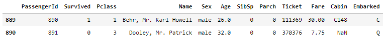
데이터 출처:https://www.kaggle.com/c/titanic
scatterplot
- sns.scatterplot(titanic['Age'], titanic['Fare']) 이렇게 코드를 짜면 산점도가 그려지긴 하지만 경고문구가 뜬다.
- cf)
https://seaborn.pydata.org/generated/seaborn.scatterplot.html
sns.scatterplot(x='Age', y='Fare', data=titanic)
plt.show()
- hue속성을 쓸 경우
sns.scatterplot(x='Age', y='Fare', data=titanic, hue='Survived')
plt.show()
histogram
- 자주 쓰는 파라미터들: x, y, hue, bins
- cf) https://seaborn.pydata.org/generated/seaborn.histplot.html
- hue속성을 안 쓸 경우
sns.histplot(data=titanic, x='Age', bins=16)
plt.show()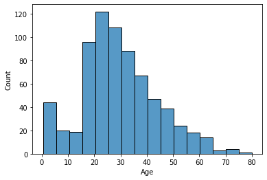
- hue속성을 쓸 경우
sns.histplot(data=titanic, x='Age', bins=16, hue='Survived')
plt.show()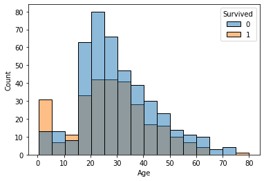
densityplot
- 자주 쓰는 파라미터들: data, x, hue
확률밀도함수그래프로kdeplot이라고도 한다.- cf) https://seaborn.pydata.org/generated/seaborn.kdeplot.html
- hue속성을 안 쓸 경우
sns.kdeplot(data=titanic, x='Age')
plt.show()
- hue속성을 쓸 경우
sns.kdeplot(data=titanic, x='Age', hue='Survived')
plt.show()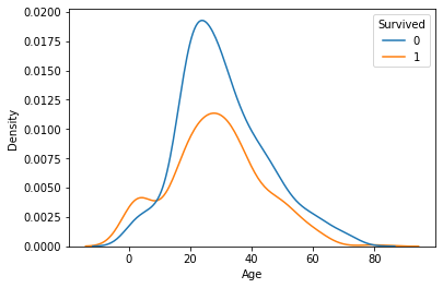
boxplot
- 자주 쓰는 파라미터들: data, x, y
- 이상치 파악 시 자주 사용된다.
- cf) https://seaborn.pydata.org/generated/seaborn.boxplot.html
sns.boxplot(data=titanic, y='Age')
plt.show()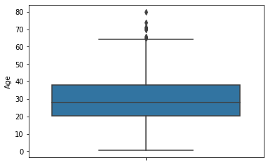
- x와 y를 모두 쓸 경우
sns.boxplot(data=titanic, x='Survived', y='Age')
# 또는
# sns.boxplot(x=titanic['Survived'], y=titanic['Age'])
plt.show()
distplot: histogram + densityplot
- cf) sns.distplot()으로 그릴 수 있지만, 이 경우
<다음 버전에서 사라질 코드>라는 경고문을 볼 수 있다. - 따라서 sns.histplot(kde=True)를 사용하도록 하자.
- cf) https://seaborn.pydata.org/generated/seaborn.histplot.html
- hue 안 쓸 경우
sns.histplot(data=titanic, x='Age', bins=16, kde=True)
plt.show()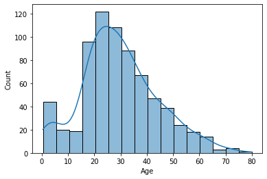
- hue 쓸 경우
sns.histplot(data=titanic, x='Age', bins=16, hue='Survived', kde=True)
plt.show()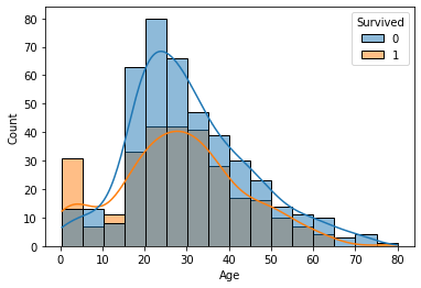
jointplot: scatter + histogram / density plot
- 숫자형 featrue들 간 분포를 확인할 수 있다.
- cf) https://seaborn.pydata.org/generated/seaborn.jointplot.html
- hue 안 쓸 경우: scatter + histogram
sns.jointplot(x='Age', y='Fare', data=titanic)
plt.show()
- hue 쓸 경우: scatter + density plot
sns.jointplot(x='Age', y='Fare', data=titanic, hue='Survived')
plt.show()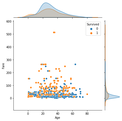
pairplot: scatter + histogram / density plot
- 모든 숫자형 feature들 간 산점도를 보여준다.
- 각각의 feature에 대해서는 histogram / density plot을 보여준다.
- 숫자형 모든 feature들에 대해서 보여주기 때문에 시간이 오래 걸린다.
- cf) pairplot은 titanic데이터보다 iris데이터로 그리는 게 더 적합해보인다.
- cf) https://seaborn.pydata.org/generated/seaborn.pairplot.html
- hue 안 쓸 경우: scatter + histogram
sns.pairplot(titanic)
plt.show()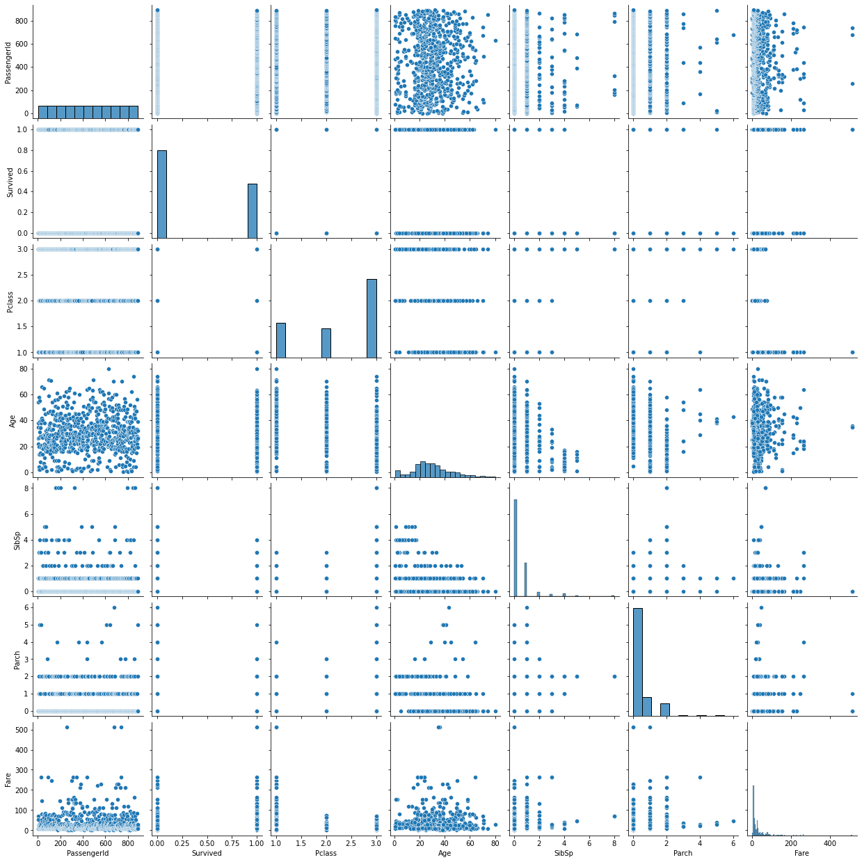
- hue 쓸 경우: scatter + density plot
sns.pairplot(titanic, hue = 'Survived')
plt.show()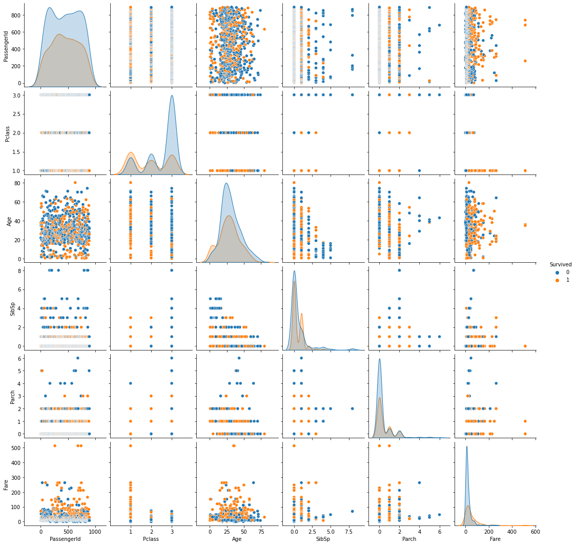
countplot: 집계 + barplot
- Seaborn의 countplot은
집계를 알아서해주고 barplot을 그려준다. - cf) Matplotlib에서는
반드시 집계 후barplot을 그려야한다. - cf) https://seaborn.pydata.org/generated/seaborn.countplot.html
Matplotlib을 활용한 barplot
embarked = titanic['Embarked'].value_counts()  # 반드시 집계 먼저
plt.bar(embarked.index, embarked.values)
plt.show()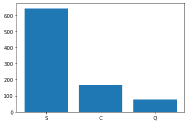
- plt.barh()는 barplot을 옆으로 눕혀준다.
embarked = titanic['Embarked'].value_counts()  # 반드시 집계 먼저
plt.barh(embarked.index, embarked.values)
plt.show()
sns.countplot을 할 경우 집계를 할 필요가 없다.
hue 안 쓸 경우
sns.countplot(x='Embarked', data=titanic)
plt.show()
hue 쓸 경우
sns.countplot(x='Embarked', data=titanic, hue = 'Survived')
plt.show()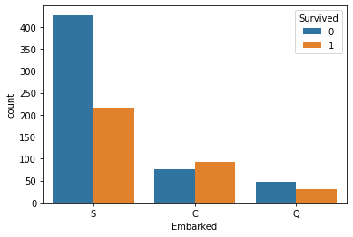
추가: 색 변경, 내림차순정렬
sns.countplot(x='Pclass', data=titanic, palette = sns.color_palette("pastel"),
              order = titanic['Pclass'].value_counts().index)
plt.show()
추가2: 수치표시
ax = sns.countplot(x='Pclass', data=titanic, palette = sns.color_palette("pastel"),
                   order = titanic['Pclass'].value_counts().index)

# countplot에 값 표시
for p in ax.patches:
    height = p.get_height()
    ax.text(p.get_x() + p.get_width() / 2., height + 30, height, ha = 'center', size = 12)
ax.set_ylim(0, 600)
plt.show()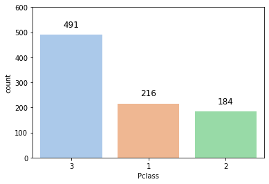
barplot: 평균비교 barplot + error bar
- sns에서의 barplot은 평균을 비교해주는 그래프이다.
- 가운데 직선은
error bar라고 하며, 신뢰구간을 의미한다.
- error bar의 길이는 해당 값의 평균이 존재할 수 있는 구간으로, 길이가 길수록 신뢰도는 떨어진다.- cf) 신뢰구간이 좁다 = 믿을만하다.
- cf) https://seaborn.pydata.org/generated/seaborn.barplot.html
sns.barplot(x='Embarked', y='Fare', data = titanic)
plt.show()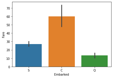
heatmap - 2. 두 범주를 집계한 결과를 그릴 수 있다.
-
corr()을 통한 숫자형 feature들 간의상관관계를 그릴 수 있다.
-
- 두 범주를 집계한 결과를 그릴 수 있다.
-
- ML파트로 가면,
confusion matrix시각화에도 쓰인다.
- ML파트로 가면,
-
cf) https://seaborn.pydata.org/generated/seaborn.heatmap.html
-
여기서는 두 범주를 집계한 결과를 그려본다.
- cf) 여태까지의 경험상, 거의 대부분 heatmap은 1번과 3번을 위해 사용되었다.
-
집계(groupby)와 피봇(pivot)을 먼저 만든다.
-
여러 범주를 갖는 변수 비교 시 유용하다.
temp1 = titanic.groupby(['Embarked','Pclass'], as_index = False)['PassengerId'].count()
temp1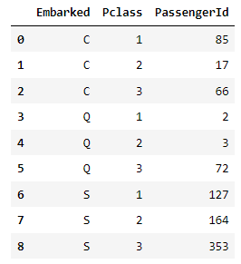
temp1 = titanic.groupby(['Embarked','Pclass'], as_index = False)['PassengerId'].count()
temp2 = temp1.pivot('Embarked','Pclass', 'PassengerId')  # Embarked별(행) Pclass별(열) PassengerId
print(temp2)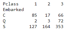
- cf) cbar=False 속성을 넣어주면 옆에 bar를 제거할 수 있다.
sns.heatmap(temp2, annot = True)  # annot = False할 경우 숫자가 안 뜸
plt.show()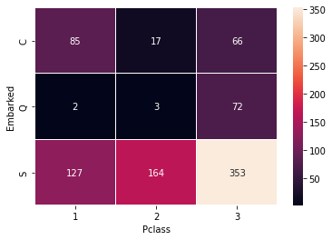
lmplot
-
fit_reg 속성은 True가 디폴트이다.
-
이를 False로 하고 hue 속성을 안 써줄 경우, plt.scatter()로 그리는 산점도와 동일하다.
-fit_reg는선형회귀 적합선을 보여주는 속성이다. -
cf) https://seaborn.pydata.org/generated/seaborn.lmplot.html
-
fit_reg=False일 경우
sns.lmplot(x='Age', y='Fare', data=titanic, fit_reg=False, hue='Survived')
plt.show()
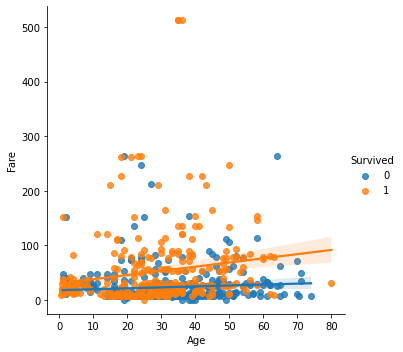
- fit_reg=True(디폴트)일 경우
sns.lmplot(x='Age', y='Fare', data=titanic, hue='Survived')
plt.show()