[CSS] Grid
CSSTILalign contentcolunm-gapfrontendgapgrid auto columnsgrid auto flowgrid auto rowsgrid columngrid rowgrid template areasgrid template rowsgrid-shorthandjustify contentjustify itemsrow-gapweb
CSS
목록 보기
11/14

🏠 Grid
- 주축과 교자축 전부(2차원)에 item들을 배치할 수 있다.
- sementic web의 header, footer, content를 나누어 css를 적용할 때도 사용 가능하다.
- column, row로 이루어져 있다.
- col과 row 사이에 gap이 존재할 수 있다.
- flex와 마찬가지로 container에 display: gird값을 준다.
inline-grid: 바깥 container끼리는 inline으로 설정하고, 내부 요소들은 grid를 적용하겠다는 의미

🏠 Grid container
🧱 grid-template-rows
- 몇개의 행/열을 가질 것인지 설정.
- 지정된 행/열보다 item이 넘칠 경우에는 자동으로 맞춰주지 않는다.
  grid-template-rows: 100px 100px
  grid-template-columns: 100px 50px 100px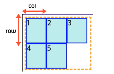

- fr을 사용하면 지정한 비율로 간격을 나눌 수 있다.
grid-template-rows: 1fr 2fr-> 1대 2비율로 나눌 수 있음.
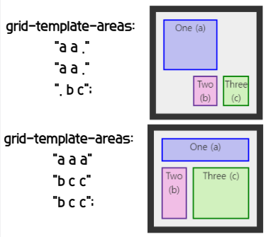
🧱 grid-template-areas
- 행렬 형태로 입력하여 grid 형태를 지정할 수 있다.
- name으로 구분하여 지정해준다.
grid-area: name
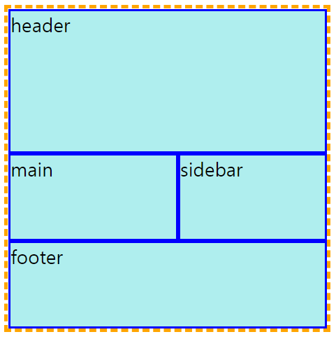
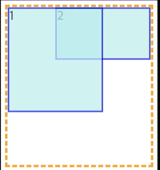
-hmtl-
<body>
    <div class="parent">Parent
        <div class="child1">child1</div>
        <div class="child2">child2</div>
    </div>
    <div class="container">
        <div class="item header">
            header
        </div>
        <div class="item main">
            main
        </div>
        <div class="item sidebar">
            sidebar
        </div>
        <div class="item footer">
            footer
        </div>
    </div>
</body>
-css-
.container {
border: 5px dashed orange;
width: 400px;
height: 400px;
display: grid;
/* grid-template-columns: 5fr 3fr 2fr 5fr;
grid-template-rows: repeat(4, 1fr); */
grid-template-areas:
"hd hd hd hd hd"
"hd hd hd hd hd"
"ma ma ma sb sb"
"ft ft ft ft ft"
}
.item {
background-color: paleturquoise;
border: 3px solid blue;
font-size: 24px;
}
.header {
grid-area: hd; -> hd라는 이름으로 area를 차지하자.
}
.main {
grid-area: ma;
}
.sidebar {
grid-area: sb;
}
.footer {
grid-area: ft;
}
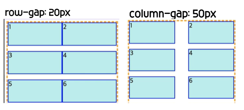
🧱 row-gap/colunm-gap
- 각각의 행/열의 갭을 지정한다.
row-gap: 20px / column-gap: 50px - gap으로 한번에 작성 가능하다. 순서는(row-col)이다.
gap: 20px 50px;
🧱 grid-auto-rows / grid-auto-columns
- 추가된 행/열에 대하여 암시적으로 높이/너비를 지정할 수 있다.
- templete에서 넘치는 item이 없으면 눈으로 볼 수 없다.
grid-auto-rows: 100px
🧱 grid-auto-flow
- item들이 정렬되는 방향을 설정할 수 있다.
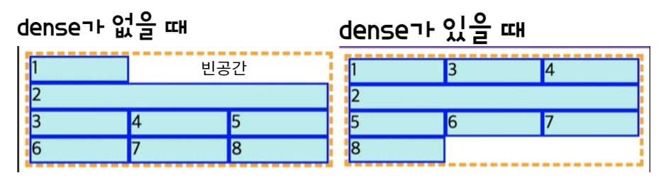
grid-auto-flow: column;/row; - dense: 남는 공간을 채우도록 한다.
grid-auto-flow: row dense/column dense
✅ grid-shorthand
- 초기값
- '/'를 기준으로 앞쪽은 row에 대한 정의, 뒤쪽은 column에 대한 정의이다.
- auto-flow값을 주고 싶다면 row part, column part 앞쪽에 auto-flow라고 적어주면 된다.
  * <'grid-template'> values */
  grid: "a" 100px "b" 1fr;
  grid: "a" 200px "b" min-content;
  grid: "a" minmax(100px, max-content) "b" 20%;
  grid: 100px / 200px;
  grid: minmax(400px, min-content) / repeat(auto-fill, 50px);

  /* <'grid-template-rows'> /
     [ auto-flow && dense? ] <'grid-auto-columns'>? values */
  grid: 200px / auto-flow;
  grid: 30% / auto-flow dense;
  grid: repeat(3, [line1 line2 line3] 200px) / auto-flow 300px;
  grid: [line1] minmax(20em, max-content) / auto-flow dense 40%;

  /* [ auto-flow && dense? ] <'grid-auto-rows'>? /
     <'grid-template-columns'> values */
  grid: auto-flow 300px / repeat(3, [line1 line2 line3] 200px);(20em, max-content);
✅ content vs items
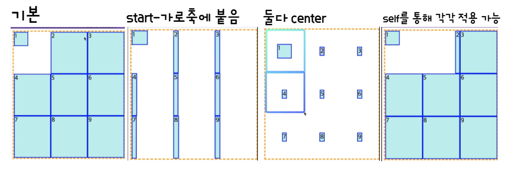
- items는 하나의 틀 안에서 하나의 item에 대한 정렬을 의미한다.
- content : 여러 개의 items들의 정렬을 의미한다.
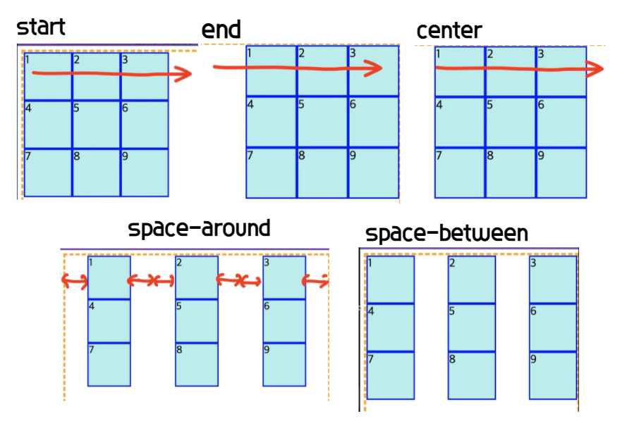
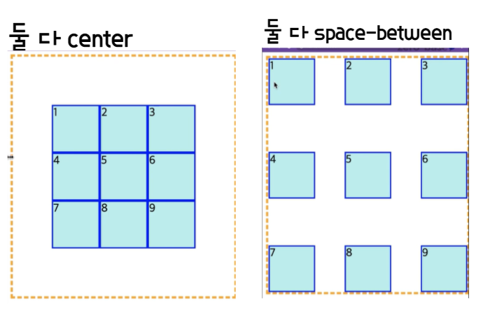
🧱 justify-content
- 바깥 container의 크기가 items들 보다 커서, 남는 공간이 남은 상태여야 한다.
- main-axis을 기준으로 items를 어떻게 정렬할지 정한다.
🧱 align-content
- corss-axis을 기준으로 items를 어떻게 정렬할지 정한다.
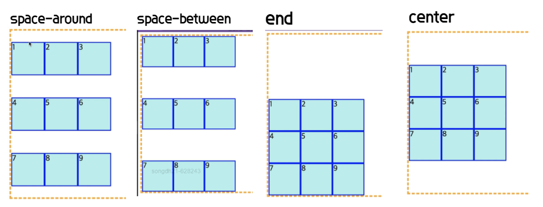
- justify + align 둘 다 center로 주면 정가운데에 위치한다.
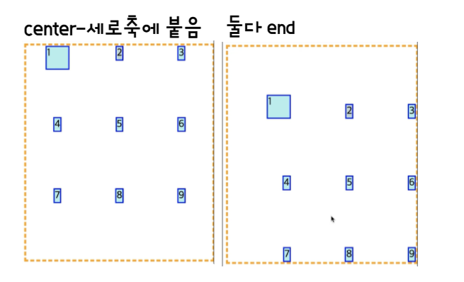
🧱 justify-items
- width를 지정하지 않는 경우, 기본값은 stretch이지만, width나 justify-items를 지정하는 경우 요소는 그 width만큼/해당 content의 가로 길이만큼만 차지하게 된다.
🧱 align-items
- height를 지정하지 않는 경우, 기본값은 stretch이지만, height나 align-items를 지정하는 경우 요소는 그 height만큼/해당 content의 가로 길이만큼만 차지하게 된다.
🏠 Grid items
🧱 grid-row
- grid-row-start/grid-row-end의 shorthand.
- '/'로 start와 end를 구분한다.
- grid-row-start: 해당 item이 시작될 grid line number.
- grid-row-end: 해당 item이 끝날 grid line number.
- span n은 어디서 시작하든 n만큼의 영역을 차지하도록 한다.
grid-row-start: 1;
grid-row-end:4/-1모두 4칸인 경우 전부 다 차지함.
grid-row: 1/3;
🧱 grid-column
- grid-row와 동일하다. 단지 선의 기준이 세로이다.
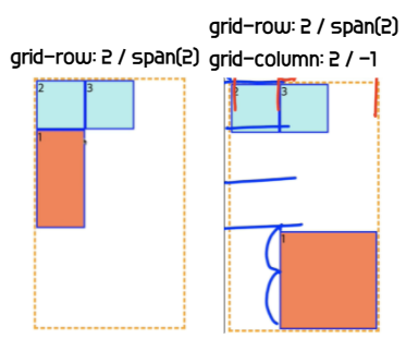
✅ 음수는 명시적으로 지정했을 때만 사용 가능
🧱 grid-area
- grid-templete-areas에서 이름을 구분해주기 위해 사용하는 속성
grid-area: a; - 동시에 grid-row-start, grid-column-start, grid-row-end, grid-column-end의 shorthand이기도 함.
-grid-area: 2 / 1 / 2 / 4; row-start / col-start / row-end /col-end
🧱 order
- flex처럼 grid내에서도 요소의 배치 순서를 정해줄 수 있다.
- order의 값이 동일한 경우 코드 순서가 앞에 있는 요소가 앞에 온다.
🧱 z-index
- grid container내에서도 z-index 사용이 가능하다.
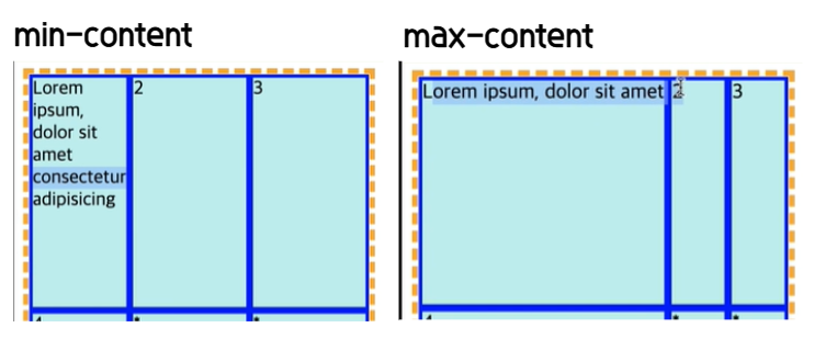
🧱 fr, min-content, max-content
- fr: 비율을 사용해서 나눌 때 사용하는 단위(1fr 2fr)
- min-content: content중에 가장 긴 단위에 기준을 맞춘다.
- max-content: content를 한 줄로 볼 수 있을 정도로 늘린다.
-min-content나 max-content로 길이를 지정하고 나면 남은 부분을 비율에 따라 나눠갖는다.
🧱 auto-fill
- 남는 공간에 자동으로 content가 채워지게 된다.
grid-template-columns: repeat(auto-fill, 100px);
grid-auto-rows: 50px;
✅ minmax(min, max)
-> 아무리 작아도 min의 값은 유지하도록 하고, min보다 커지면 max의 값을 가져라.
🧱 auto-fit
- content가 없어서 빈 공간이 생길 때, 빈 공간이 생기지 않도록 전부 다 꽉 채운다.

wanna be bright person✨ Front-End developer