[CSS] Flexbox
CSSFlexboxTILalign contentalign itemsalign selfdisplayfelxfelx-itemflex directionflex growflex wrapflex-basisflex-flowflex-shrinkfrontendjustify contentorder
CSS
목록 보기
10/14
📚 Flexbox
- 가로 혹은 세로, 직선의 형태로 요소들을 1차원 정렬해줄 수 있다.
- 부모 container내부에 item 들을 정렬할 수 있다.
- 요소가 flex가 되는 순간 block요소가 된다.
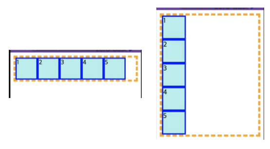
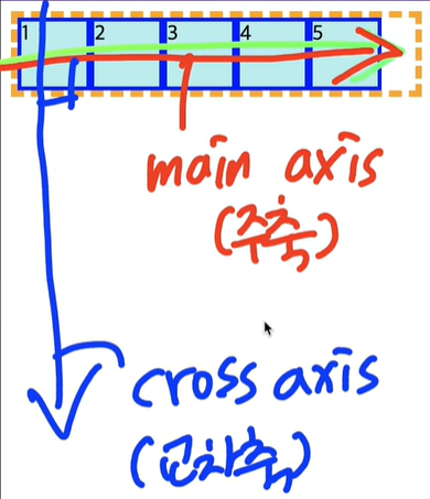
- main axis : 정렬의 주축 / cross axis : 교차축(기본은 가로/세로, 왼쪽->오른쪽/ 위->아래이다.)
-해당 요소가 부모인지, 자식인지 정확한 이해가 필요하다. - item과 container이 함께 있어야 한다.
- display 속성을 사용한다.
✅ display
- display-outside : inline요소와 block요소 자신의 바깥 요소들과의 관계를 의미한다.
- display-inside : flex, grid같이 inline요소와 block요소 안쪽의 items 관계를 의미한다.
📚 Flex container
- items을 감싸고 있는 부모 영역
📕 display
display: flexdisplay: inline-flex- 바깥 관계는 inline으로 하고, 내부를 flex로 정렬할 수 있다. 부모 container에 정의한다.
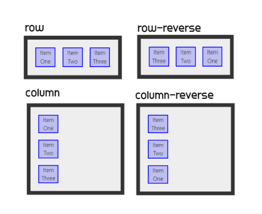
📙 flex-direction
- container 내의 item을 배치할 때 사용할 주축(main,cross) 및 방향(정방향, 역방향)을 지정한다.
- 정렬하고자 하는 items들의 부모 요소 container에 작성해야 한다.
  /* 한 줄의 글을 작성하는 방향대로 */
  flex-direction: row;
  /* <row>처럼, 대신 역방향 */
  flex-direction: row-reverse;
  /* 글 여러 줄이 쌓이는 방향대로 */
  flex-direction: column;
  /* <column>처럼, 대신 역방향 */
  flex-direction: column-reverse;
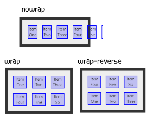
📒 flex-wrap
- flex-item 요소들이 강제로 한줄에 배치되게 할 것인지, 또는 가능한 영역 내에서 벗어나지 않고 여러행으로 나누어 표현 할 것인지 결정하는 속성. 만약 영역 내에서 벗어나지 못하게 설정한다면, 동시에 요소의 방향 축을 결정할 수 있다.
/* 부모 container를 영역을 벗어나도 flex-item 요소들을 한 줄에 배치 */
flex-wrap: nowrap; /* Default value */
/* continer안에서 여러 행에 걸쳐서 배치 */
/* 시작점은 flex-direction 에 의해 결정. 기본:위->아래 */
flex-wrap: wrap;
/* warp과 동일. 시작점과 끝점이 반대 */
flex-wrap: wrap-reverse;
📗 flex-flow
- flex-direction+flex-wrap의 shortcut
- 초기값
 /* flex-flow: <'flex-direction'>과 <'flex-wrap'> */
 flex-flow: row nowrap;
 flex-flow: column wrap;
 flex-flow: column-reverse wrap-reverse;
📘 justify-content
- main-axis을 기준으로 items를 어떻게 정렬할지 정한다.
- main-axis가 뭔지 알아야 한다.
/* Positional alignment */
 justify-content: center;     /* Pack items around the center */
 justify-content: flex-start; /* Pack flex items from the start */
 justify-content: flex-end;   /* Pack flex items from the end */
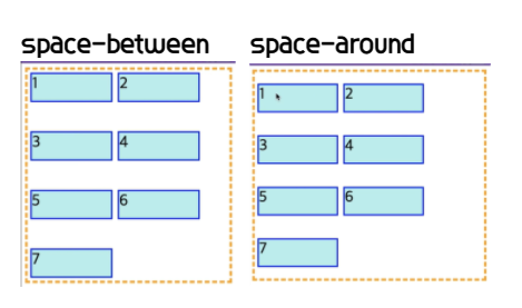
 /* Distributed alignment */
 justify-content: space-between; /* items의 간격을 자동으로 맞춰준다. */
 justify-content: space-around;  /* items의 앞 뒤로 간격을 나눠서 자동으로 맞춰준다.
 justify-content: space-evenly;  /* items의 앞 뒤 간격을 모두 동일하게 자동으로 맞춰준다.
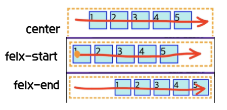
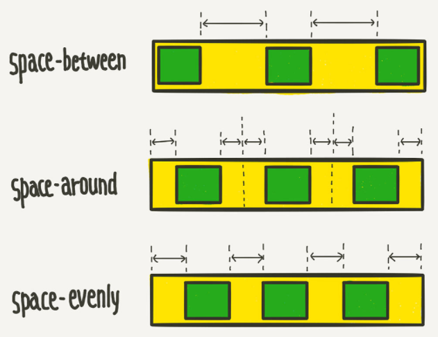 사진 출처 -
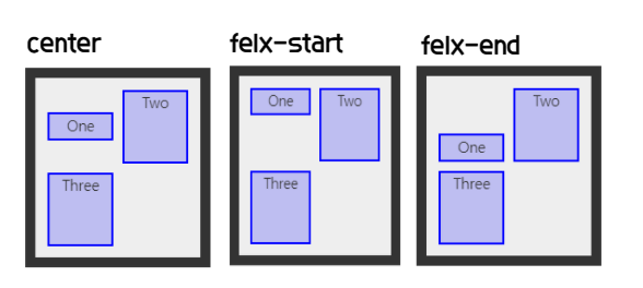
 📕 align-items
cross-axis을 기준으로 items를 어떻게 정렬할지 정한다.
BUT flex는 1차원이므로 한 줄 자체에 대한 정렬을 의미한다.
기본:
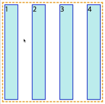
align-items: stretch;cross-axis의 시작부터 끝까지 stretch한다.
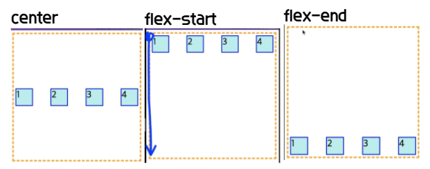
 /* Positional alignment */
 /* align-items does not take left and right values */
 align-items: center; /* Pack items around the center */
 align-items: flex-start; /* Pack flex items from the start */
 align-items: flex-end; /* Pack flex items from the end */
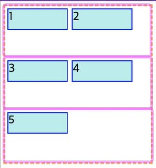
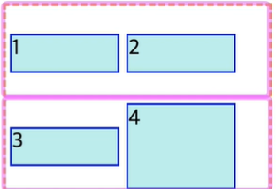
- 여러 줄일 경우, items는 1줄을 기준으로 하기 때문에 구역을 나눠서 적용된다.
- 아래 사진은 flex-wrap일 때 align-items: flex-start로 한 경우이다.
📙 align-content
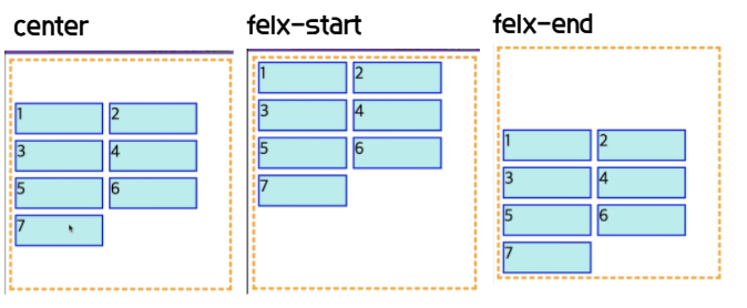
- 여러 줄에 대한 정렬 위치를 결정한다.
/* Positional alignment */
 align-content: center;     /* Pack items around the center */
 align-content: flex-start; /* Pack flex items from the start */
 align-content: flex-end;   /* Pack flex items from the end */
 /* Distributed alignment */
 align-content: space-between; /* items의 간격을 자동으로 맞춰준다. */
 align-content: space-around;  /* items의 앞 뒤로 간격을 자동으로 맞춰준다.
📚 Flex item
- 정렬을 할 item
📕 order
- item의 정렬 순서를 지정할 수 있다. 기본은 오름차순이고, 같은 값일 경우 소스코드의 순서대로 정렬된다.
- 음수를 사용할 수 있다.
  .container {
  	display: flex;
  }
  .item {
	width: 50px;
  	height: 50px;
  }
  .item:nth-child(3) {
  	order: 1; ->item이 5개가 있는 경우 3번째item은 제일 앞에 배치된다.
  }
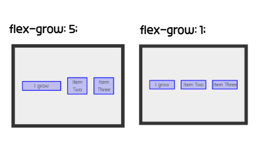
📙 flex-grow
- container내에 남는 공간이 있을 때, flex-item 요소가 flex-container 요소 내부에서 할당 가능한 공간을 설정할 수 있다.
기본값은 1이다. 음수값 사용 불가. 값이 0이면 늘어나지 않는다.
- 만약 형제 flex-item 요소들이 동일한 flex-grow 값을 갖는다면, flex-container 내부에서 동일한 공간을 할당받는다.
- 행이 바뀌는 경우에도, flex-grow값이 모두 같다면 요소들이 공간을 동일하게 나누어 갖는다.
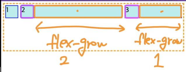
<div class="container">
	<div class="item">1</div>
	<div class="item">2</div>
	<div class="item">3</div>
</div>

  .container {
  	display: flex;
  }
  .item {
	width: 50px;
  	height: 50px;
  }
  .item:nth-child(2) {
  	flex-grow: 2;
  }
  .item:nth-child(3) {
  	flex-grow: 1;
  }
- glow를 1씩 하더라도 초기 크기가 다르면 다르게 glow할 수도 있다.
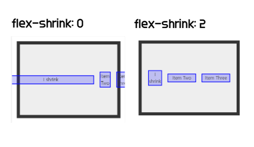
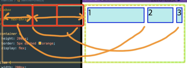
📒 flex-shrink
- flex-container 요소의 크기보다 flex-item 요소의 크기가 클 때 flex-shrink 속성을 사용하는데, 설정된 숫자값에 따라 flex-container 요소 내부에서줄어든 크기를 flex-item 요소들이 나누어서 줄어든다.
기본값은 1이다. 음수값 사용 불가. 값이 0이면 줄어들지 않는다.
📗 flex-basis
- flex item의 초기 크기를 지정한다.
- auto 값을 가지지 않은 flex-basis와 width(flex-direction: column인 경우 height) 값을 동시에 적용한 경우 flex-basis가 우선된다.
basis가 0이면 초기 item영역의 가로가 없다는 의미이다.- grow가 1이고 basis가 0이면 늘어난 정도 만큼이 item의 크기가 된다.
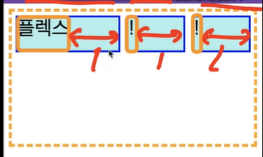
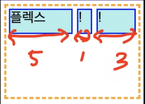
<div class="container">
	<div class="item">플렉스</div>
	<div class="item">!</div>
	<div class="item">!</div>
</div>

  .container {
  	display: flex;
  }
  .item {
  	height: 50px
	background-color: blue;
	flex-basis: 0;
  }
  .item:nth-child(1) {
  	flex-grow: 2;
  }
  .item:nth-child(2) {
  	flex-grow: 1;
  }
  .item:nth-child(3) {
  	flex-grow: 3;
  }
📘 flex
-flex는 flex-grow + flex-shrink + flex-basis의 shortcut
- 초기값
- 값이 한 개일 때, 그 값은 다음 중 하나여야 합니다.
<number>를 지정하면 <flex-grow>입니다.
<length> 또는 <percentage>를 지정하면 <flex-basis>입니다.- 값이 두 개일때, 첫 번째 값은 <number>여야 하며 <flex-grow>가 됩니다. 두 번째 값은 다음 중 하나여야 합니다.
<number>를 지정하면 <flex-shrink>입니다.
<length>, <percentage>, 또는 auto를 지정하면 <flex-basis>입니다.- 값이 세 개일 때는 다음 순서를 따라야 합니다.
<flex-grow>에 사용할 <number>
<flex-shrink>에 사용할 <number>
<flex-basis>에 사용할 <length>, <percentage>, 또는 auto- 한 개 또는 두 개의 단위 없는 숫자 값을 사용할 때, <flex-basis>의 값은 auto가 아니라 0이 됩니다.
/* Three values: flex-grow | flex-shrink | flex-basis */
	flex: 1 -> 완벽하게 1:1으로 셋팅할 수 있다.
	flex: 2 2 10%;
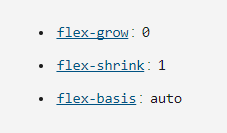
- initial
- flex: 0 1 auto와 동일.
- auto
- flex: 1 1 auto와 동일.
- none
- flex: 0 0 auto와 동일.
📕 align-self
- 나 자신에 대해 위치를 지정할 수 있다.
align-self: stretch;
/* Positional alignment */
/* align-self does not take left and right values */
align-self: center; /* Put the item around the center */
align-self: flex-start; /* Put the flex item at the start */
align-self: flex-end; /* Put the flex item at the end */
참고하기 좋은 사이트 : CSS-Flexbox-trick

wanna be bright person✨ Front-End developer