✏️ Matplotlib
- 2D 그래프를 그릴때 가장 많이 사용되는 Python 라이브러리중 하나
- 공식 홈페이지에서 다양한 그래프 예시 참고하기
💡 기본 공식
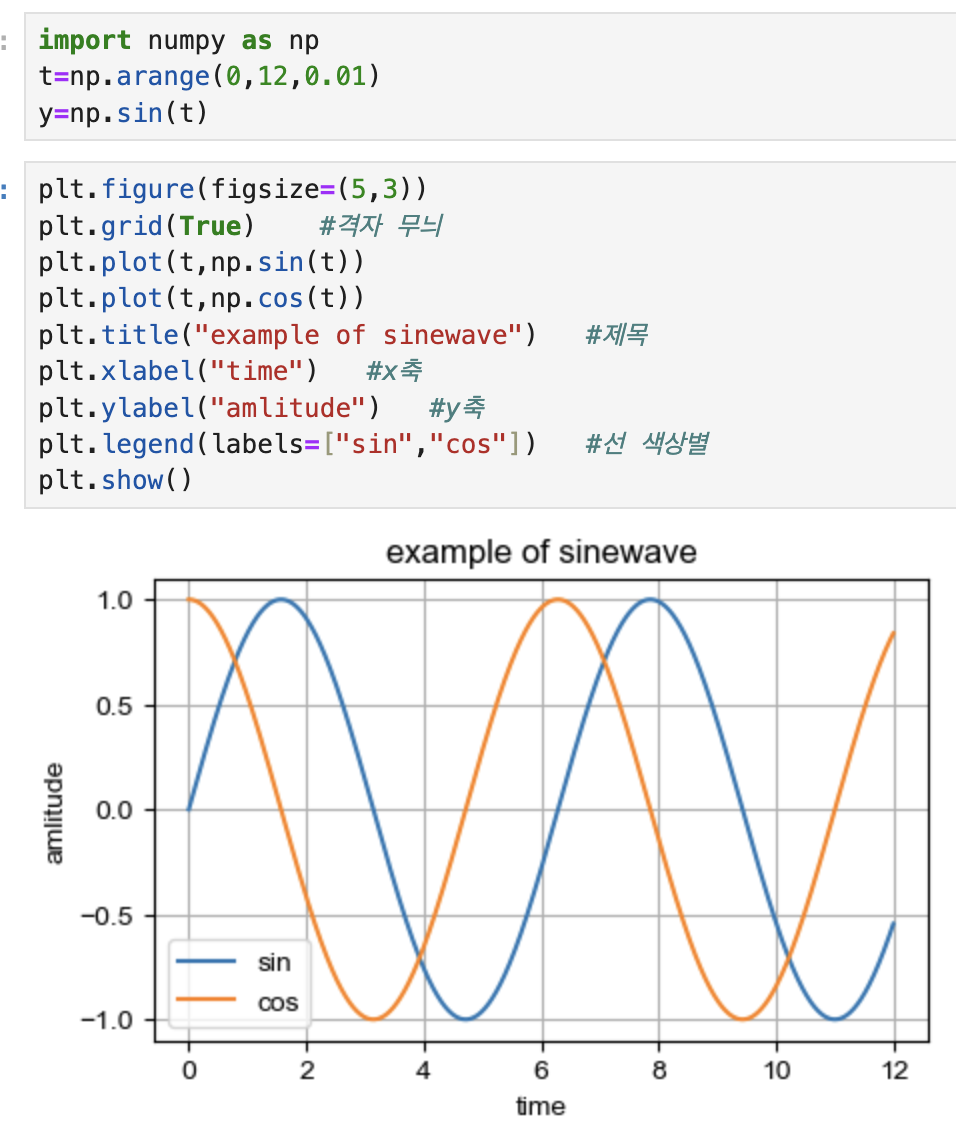
import matplotlib.pyplot as plt
from matplotlib import rc  #폰트 설정
rc("font",family="Arial Unicode MS")

%matplotlib inline
#혹은 get_[python().run_line_magic("matplotlib","inline"]

plt.figure(figsize=(10,6))
plt.plot(X축, Y축)  #x축,y축
plt.show()
이건 몰까
- plot_components()
💡 그래프 : 그리기
np.arange(a,b,s) #a~b까지 s간격
np.sin(value)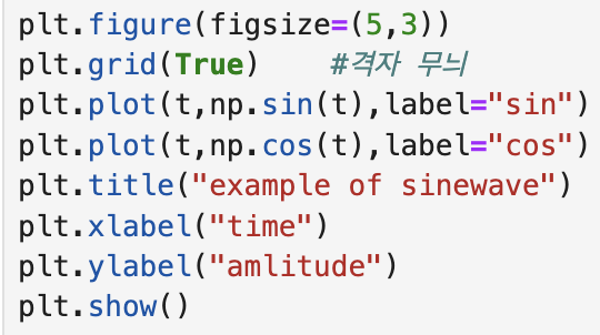
# + 기본 공식 붙이기- 격자 무늬 추가 : .grid( )
- 그래프 제목 : .title(" ")
- x축, y축 제목 : .xlabel(" ") / .ylabel(" ")
- 선 색상별 의미 구분 : .legend(labels="line 1", "line 2"])
- .legend(loc="upper right")과 같이 범례 위치 지정 가능
- x선, y선 범위 : .xlim([n,m]) / .ylim([n,m])
혹은 legend(범례) 부분을 아래와 같이 표현 가능
💡 그래프 : 커스텀
t=list(range(0,7))
y=[1,4,5,8,9,5,3]

plt.figure(figsize=(5,2))
plt.plot(
	t,
    y,
    color="green",
    linestyle="dashed",  #혹은 "--"으로 표시해도 됨 , "-"만 하면 실선
    marker="o",
    markerfacecolor="blue",
    markersize=7
)

plt.xlim([-0.5,6.5])   #x선 범위
plt.ylim([0.5,9.5])    #y선 범위
plt.show()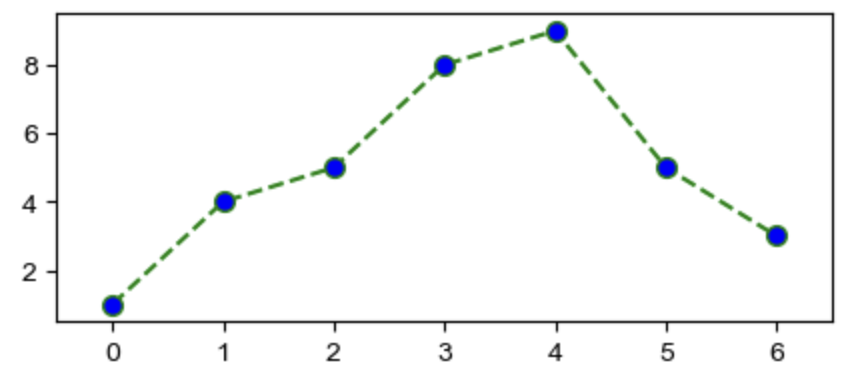
💡 Scatter Plot
t=np.array(range(0,10))
y=np.array([9,8,7,9,8,3,2,4,3,4])
colormap = t

def drawGraph() :

	plt.figure(figsize=(10,2))
	plt.scatter(t,y,s=50, c=colormap, marker=">")   #s : marker의 사이즈
    plt.colorbar()
	plt.show()

drawGraph() 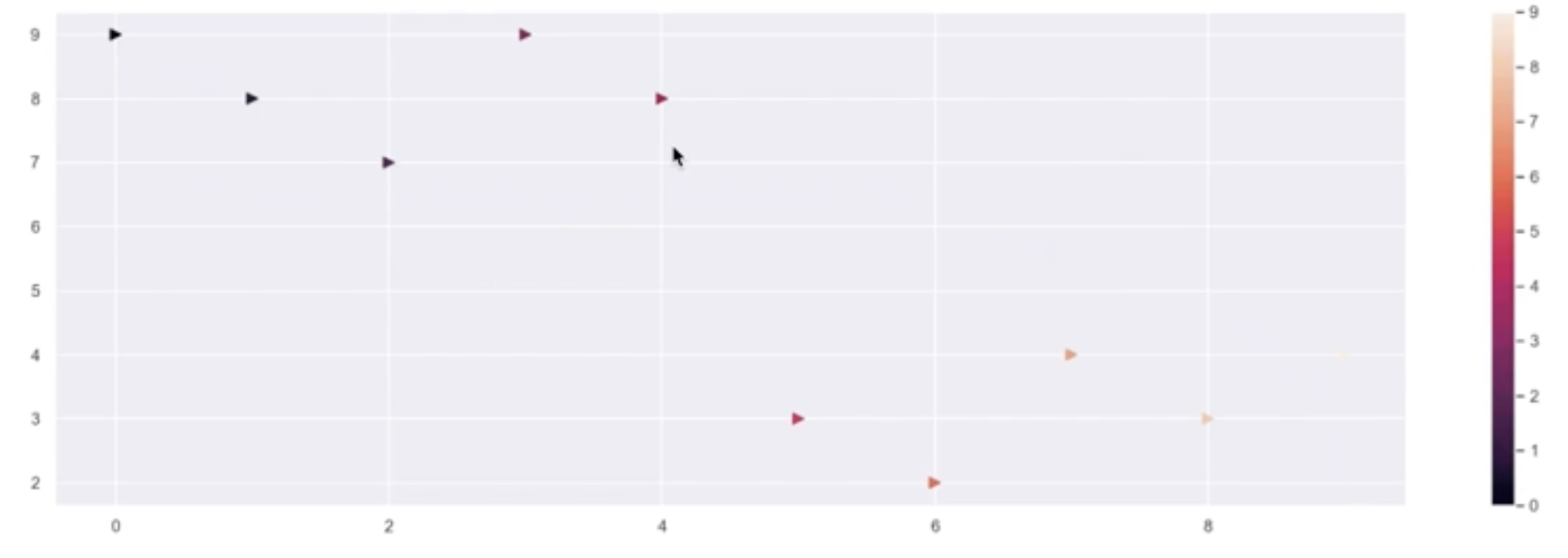
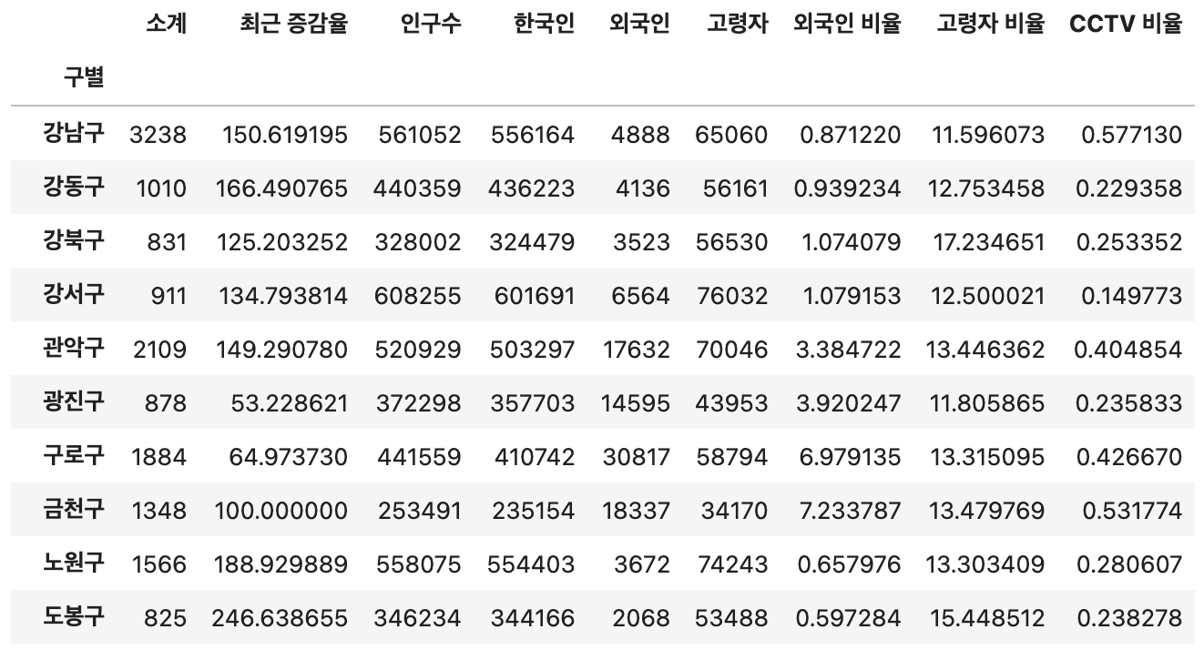
💡 실습 (서울시 CCTV)
-
기존 데이터
-
"인구수"를 기준으로 bar 데이터 출력
dataResult["인구수"].plot(kind="bar",figsize=(5,5))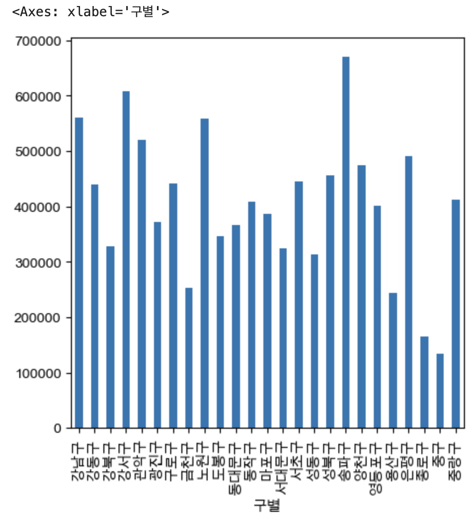
-
"인구수"를 기준으로 bar 데이터 가로 출력
- bar + h (horizontal)
dataResult["인구수"].plot(kind="barh",figsize=(5,5))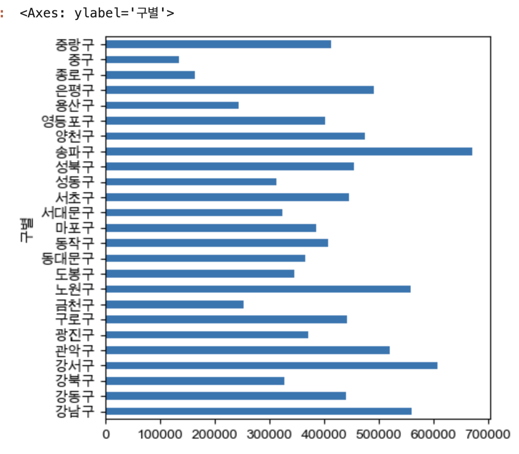
- bar + h (horizontal)
-
끝에 세미 콜론(;)을 쓸 경우, <Axes : ~ > 은 출력 안됨
dataResult["소계"].plot(kind="barh", grid=True, figsize=(5,5)) ;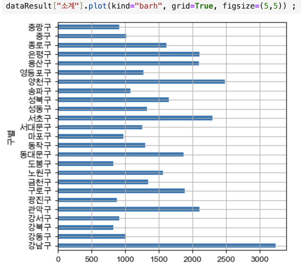
-
sort_value()로 그래프 정렬하기 / title
dataResult["소계"].sort_values().plot(kind="barh", grid=True, figsize=(5,5));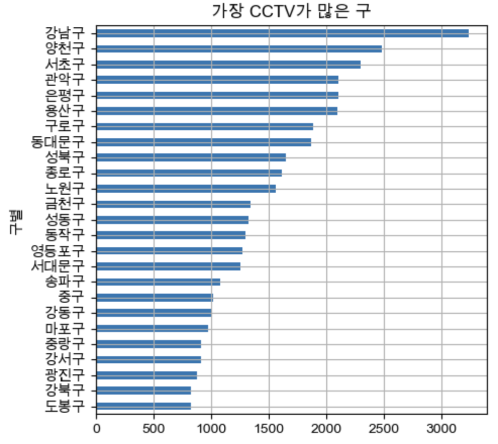

데린이인데요 ໒꒰ྀ ˶ • ༝ •˶ ꒱ྀིა (잘못 된 부분은 너그러이 알려주세요.)