Plotly란
인터렉티브한 시각화가 가능한 파이썬 그래픽 라이브러리
설치 - pip install plotly==5.11.0
graph_objects 모듈을 활용한 Figure 생성
Trace - data (Trace)를 Python List 형태로 받음, Trace는 그래프의 타입과 그래프에 시각화 하고자 하는 Raw 데이터를 품고 있는 단위
Layout - data와 무관하고 그 외 모든 부분을 편집 및 가공하는 부분
graph_objects vs express
graph_objects
장점: 그래프를 세세하게 구성 가능
단점: 코드가 길고 문법이 복잡하여 시간이 오래 걸리고 학습하기 어려움
express
장점: 간단한 코드로 쉽게 스래프 표현 가능
단점: 정해진 템플릿 외의 세세한 조정이 어려워 세세한 조정 필요시 graph_pbjects 도움이 필요함
- Plotly의 그래프를 그리는 보편 적인 방법은 2가지 - Express, graph_objects.
- 그 후 그래프 업데이트 - add_trace(), update_traces(), update_layout(), upadate_xaxes(), update_yaxes()
기초 그래프 그리기
- graph_objects를 import 한 후에 Figure() -> add_trace() 이용해서 그림
go.Figure() 만 할 경우에는 빈 그래프 표시
import plotly.graph_objects as go

fig = go.Figure()

fig.add_trace(go.Bar(x=[1, 2, 3], y=[1, 3, 2]))

fig.show()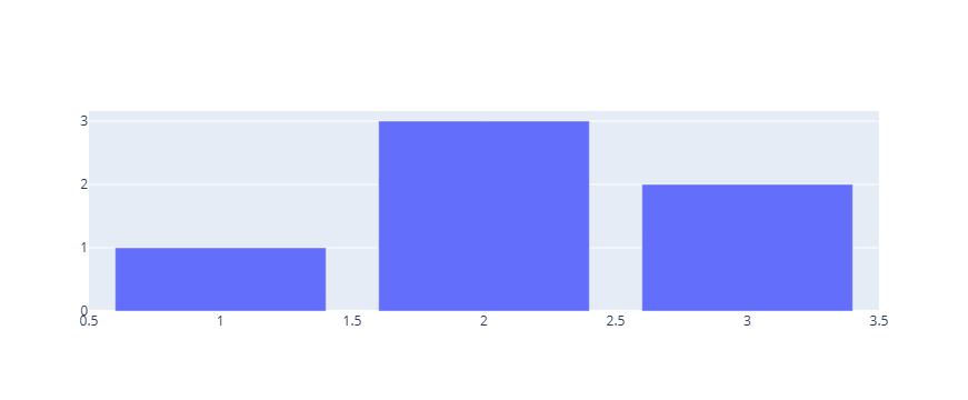
이미 Trace가 있는 Figure에 Trace 추가
기본으로 제공하는 예제용 데이터뎃을 iris()를 이용하여 불러온 다음, express를 이용하여 그래프를 그리고, 그 위에 graph_objects 를 이용하여 Trace 추가 (go를 import 하지 않아도 되는 이유는 위쪽 셀에서 이미 했기 때문, 원칙적으로는 import 해야함)
import plotly.express as px

# 데이터 불러오기
df = px.data.iris()

# express를 활용한 scatter plot 생성
fig = px.scatter(df, x="sepal_width", y="sepal_length", color="species",
                 title="Using The add_trace() method With A Plotly Express Figure")

fig.add_trace(
    go.Scatter(
        x=[2, 4],
        y=[4, 8],
        mode="lines",
        line=go.scatter.Line(color="gray"),
        showlegend=False)
)

fig.show()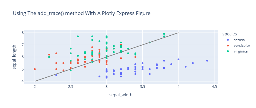
update_trace()를 이용하여 업데이트
subplots - 하나의 Figure 안에 여러 개의 독립적인 그래프 영역(axes 쌍)을 배치하는 기능
from plotly.subplots import make_subplots

# subplot 생성
fig = make_subplots(rows=1, cols=2)

# Trace 추가하기
fig.add_scatter(y=[4, 2, 3.5], mode="markers",
                marker=dict(size=20, color="LightSeaGreen"),
                name="a", row=1, col=1)

fig.add_bar(y=[2, 1, 3],
            marker=dict(color="MediumPurple"),
            name="b", row=1, col=1)

fig.add_scatter(y=[2, 3.5, 4], mode="markers",
                marker=dict(size=20, color="MediumPurple"),
                name="c", row=1, col=2)

fig.add_bar(y=[1, 3, 2],
            marker=dict(color="LightSeaGreen"),
            name="d", row=1, col=2)

# 한번에 Bar plot 만 파란색으로 바꾸기
fig.update_traces(marker=dict(color="RoyalBlue"),
                  selector=dict(type="bar"))
fig.show()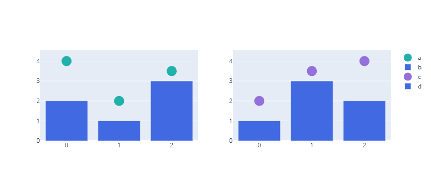
update_layout()을 이용하여 외적인 요소 업데이트
한번에 모든 같은 Trace 스타일의 업데이트를 할 때 update_layout()이 유용
import plotly.graph_objects as go

#그래프 생성
fig = go.Figure(data=go.Bar(x=[1, 2, 3], y=[1, 3, 2]))

# 타이틀 추가하기
fig.update_layout(title_text="Using update_layout() With Graph Object Figures",title_font_size=30)

fig.show()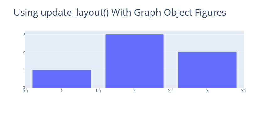
update_xaxes(), update_yaxes() 함수를 사용하여 각각 X축, Y축에 관한 다양한 편집
import plotly.graph_objects as go
import plotly.express as px

#데이터 생성
df = px.data.tips()
x = df["total_bill"]
y = df["tip"]

# 그래프 그리기
fig = go.Figure(data=go.Scatter(x=x, y=y, mode='markers'))

# 축 타이틀 추가하기
fig.update_xaxes(title_text='Total Bill ($)')
fig.update_yaxes(title_text='Tip ($)')

fig.show()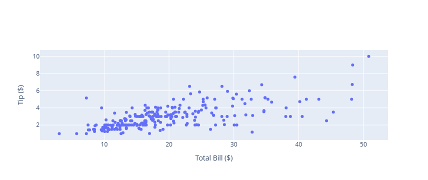

오랜시간 망설였던 코딩을 다시 해보려고 노력하고 있는 사람