축 스타일 편집
px.data.tips() - iris와 비슷하게 express의 예제 데이터 셋
import plotly.express as px
#데이터 불러오기
df = px.data.tips()

# Figure 생성
fig = px.histogram(df, x="sex", y="tip", histfunc='sum', facet_col='smoker')

# 축 스타일 편집
fig.update_xaxes(showline=True, linewidth=3, linecolor='black')
fig.update_yaxes(showline=True, linewidth=3, linecolor='red')

fig.show() 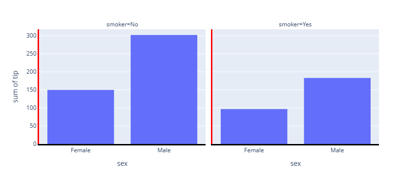
지정된 부분만 스타일 변화
기본적으로는 모든 Trace에 적용되므로 지정해주어야 함
import plotly.express as px
#데이터 불러오기
df = px.data.tips()

# Figure 생성
fig = px.histogram(df, x="sex", y="tip", histfunc='sum', facet_col='smoker')

# 축 스타일 편집
fig.update_xaxes(showline=True, linewidth=3, linecolor='black', col=1)
fig.update_yaxes(showline=True, linewidth=3, linecolor='red', col=1)

fig.show()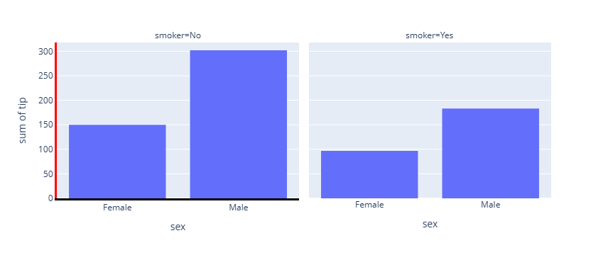
반대편에도 지정
import plotly.express as px
#데이터 불러오기
df = px.data.tips()

# Figure 생성
fig = px.histogram(df, x="sex", y="tip", histfunc='sum', facet_col='smoker')

# 축 스타일 편집
fig.update_xaxes(showline=True, linewidth=3, linecolor='black',mirror=  True)
fig.update_yaxes(showline=True, linewidth=3, linecolor='red',mirror=  True)

fig.show()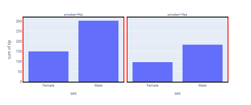
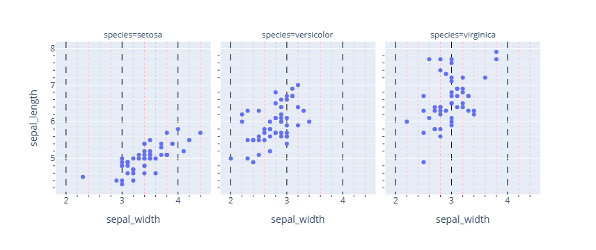
그리드
그리드가 육안으로 보이지 않아서 굉장히 헷깔림. 그래서 나중에 나오는 대로 색과 스타일 등에 변화를 줘 봄.
- 선의 종류
| 종류 | 속성 | 설명 |
|---|---|---|
| Grid line | showgrid | 눈금 간격마다 반복되는 격자 |
| Zero line | zeroline | 값 0 위치의 기준선 |
| Axis line | showline | 축 자체의 테두리 |
| Domain / subplot boundary | facet / subplot | subplot 경계선 |
import plotly.express as px
#데이터 불러오기
df = px.data.iris()

# Figure 생성
fig = px.scatter(df, x="sepal_width", y="sepal_length", facet_col="species")

# 그리드/ minor 그리드 시각화
fig.update_xaxes(showgrid=True, griddash='dash', gridcolor='black', minor_showgrid=True, minor_griddash="dot", minor_gridcolor='LightPink',)
fig.update_yaxes(showgrid=True, minor_showgrid=True)

fig.show()

#마이너 그리드 켜기
fig.update_xaxes(
    showgrid=True,
    minor_ticks="outside",
    minor_showgrid=True
)

fig.update_yaxes(
    showgrid=True,
    minor_ticks="outside",
    minor_showgrid=True
)

fig.show()
import plotly.express as px
#데이터 불러오기
df = px.data.iris()

# Figure 생성
fig = px.scatter(df, x="sepal_width", y="sepal_length", facet_col="species")

# 그리드/ minor 그리드 시각화
fig.update_xaxes(showgrid=True, minor_showgrid=True, minor_griddash="dot", minor_gridcolor='LightPink', col =1)
fig.update_yaxes(showgrid=True, minor_showgrid=True, col =1)
fig.show()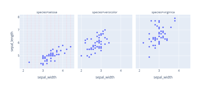
import plotly.express as px
#데이터 불러오기
df = px.data.iris()

# Figure 생성
fig = px.scatter(df, x="sepal_width", y="sepal_length", facet_col="species")

# 그리드/ minor 그리드 시각화
fig.update_xaxes(minor_showgrid=True, griddash='dash',gridcolor='black',minor_griddash="dot",minor_gridcolor='LightPink')
fig.update_yaxes(minor_showgrid=True,griddash='dash',gridcolor='black', minor_griddash="dot",minor_gridcolor='LightPink')
fig.show()

오랜시간 망설였던 코딩을 다시 해보려고 노력하고 있는 사람