범례(Legend)
범례는 서로 다른 종류의 데이터를 색깔 또는 마커 모양으로 분류하고 표시하는 기능
import plotly.express as px

# 실습 데이터 불러오기
df = px.data.tips()

# 실습 데이터 확인
df.head()| total_bill | tip | sex | smoker | day | time | size | |
|---|---|---|---|---|---|---|---|
| 0 | 16.99 | 1.01 | Female | No | Sun | Dinner | 2 |
| 1 | 10.34 | 1.66 | Male | No | Sun | Dinner | 3 |
| 2 | 21.01 | 3.50 | Male | No | Sun | Dinner | 3 |
| 3 | 23.68 | 3.31 | Male | No | Sun | Dinner | 2 |
| 4 | 24.59 | 3.61 | Female | No | Sun | Dinner | 4 |
# express 를 이용하여 범례와 함께 그래프 그리기 - 알아서 그룹해서 보여주기에 한 줄로 끝
import plotly.express as px

# 데이터 불러오기
df = px.data.tips()

# 그래프 그리기
fig = px.scatter(df, x="total_bill", y="tip", color="sex")

fig.show()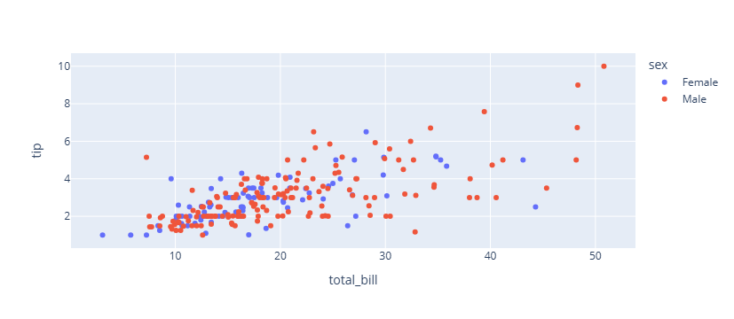
# express 에서 범례 삭제하기

import plotly.express as px

# 데이터 불러오기
df = px.data.tips()

# 그래프 그리기
fig = px.scatter(df, x="total_bill", y="tip", color="sex")

#범례 삭제하기
fig.update_layout(showlegend=False)

fig.show()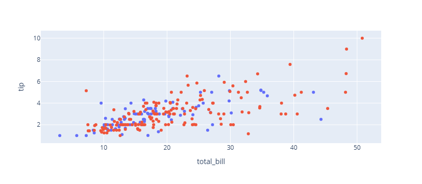
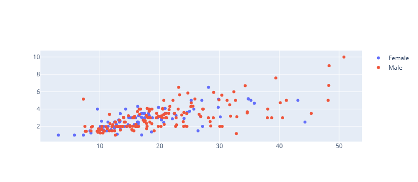
# graph_objects 를 이용하여 범례와 함께 그래프 그리기

Female = df.loc[df["sex"]=="Female", :]
Female.head()

Male = df.loc[df["sex"]=="Male", :]
Male.head()| total_bill | tip | sex | smoker | day | time | size | |
|---|---|---|---|---|---|---|---|
| 1 | 10.34 | 1.66 | Male | No | Sun | Dinner | 3 |
| 2 | 21.01 | 3.50 | Male | No | Sun | Dinner | 3 |
| 3 | 23.68 | 3.31 | Male | No | Sun | Dinner | 2 |
| 5 | 25.29 | 4.71 | Male | No | Sun | Dinner | 4 |
| 6 | 8.77 | 2.00 | Male | No | Sun | Dinner | 2 |
import plotly.graph_objects as go

fig = go.Figure()

fig.add_trace(go.Scatter(
    x=Female.total_bill,
    y=Female.tip,
    mode='markers',
    name="Female"

))

fig.add_trace(go.Scatter(
    x=Male.total_bill,
    y=Male.tip,
    mode='markers',
    name="Male"
))
# 범례 위치 조정

import plotly.express as px

# 데이터 불러오기
df = px.data.tips()

# 그래프 그리기
fig = px.scatter(df, x="total_bill", y="tip", color="sex")

#범례 위치 지정하기
fig.update_layout(
    legend_yanchor="top",
    legend_y=0.99,
    legend_xanchor="left",
    legend_x=0.01
)

fig.show()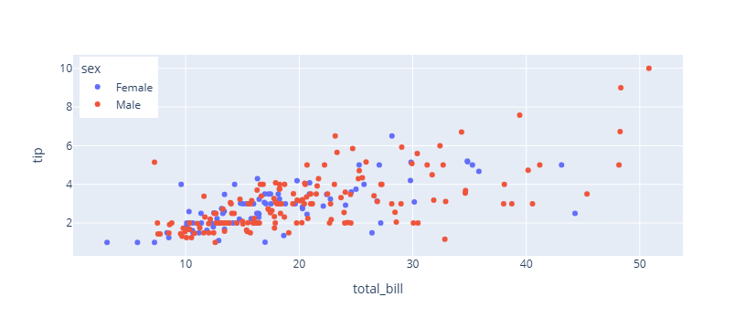
# 범례 가로로 보여주기
import plotly.express as px

# 데이터 불러오기
df = px.data.tips()

# 그래프 그리기
fig = px.scatter(df, x="total_bill", y="tip", color="sex")

#범례 위치 지정하기
fig.update_layout(
    legend_orientation="h",
    legend_entrywidth=70,
    legend_yanchor="top",
    legend_y=0.99,
    legend_xanchor="left",
    legend_x=0.01
)

fig.show()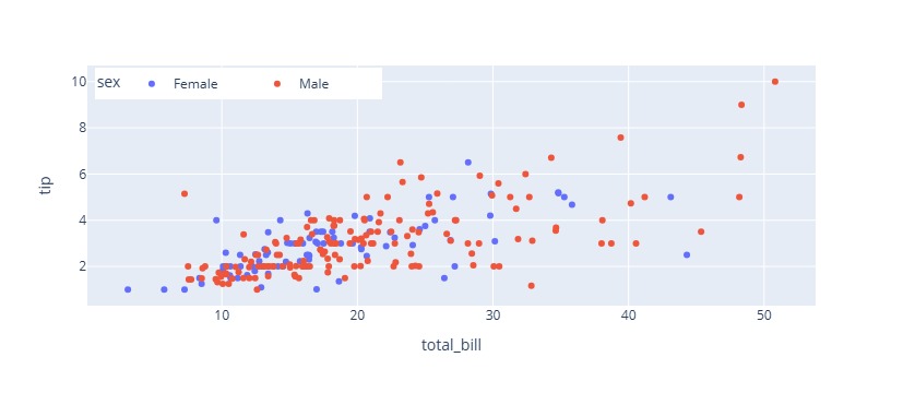
fig.update_layout(
                    legend_title_text= 타이틀명 text 입력
                    legend_title_font_family = 범례 타이틀 서체 (HTML font family)
                    legend_title_font_color= 범례 타이틀 색
                    legend_title_font_size= 범례 타이틀 글자 크기
                    legend_font_family= 범례 서체 (HTML font family)
                    legend_font_size=범례 글자 크기
                    legend_font_color=범례 색
                    legend_bgcolor= 범례 배경색
                    legend_bordercolor=범례 테두리 색
                    legend_borderwidth=범례 테두리 두깨
                )
# 데이터 불러오기
df = px.data.tips()
# 그래프 그리기
fig = px.scatter(df, x="total_bill", y="tip", color="sex")
# 범례 스타일 지정하기
fig.update_layout(
legend_title_text='성별',
legend_title_font_family = "Times New Roman",
legend_title_font_color="purple",
legend_title_font_size= 20,
legend_font_family="Courier",
legend_font_size=12,
legend_font_color="black",
legend_bgcolor="LightSteelBlue",
legend_bordercolor="Black",
legend_borderwidth=2
)
fig.show()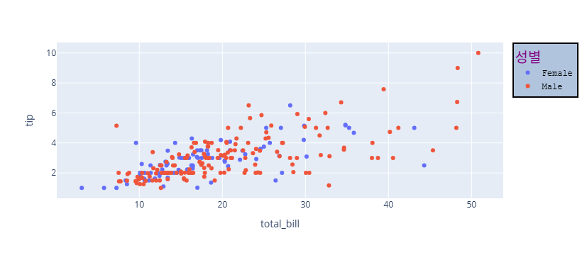

오랜시간 망설였던 코딩을 다시 해보려고 노력하고 있는 사람