💅styled-component
설치하기
npm i styled-components
import styled from "styled-components";
사용방법
const 변수명 = styled.html요소`display:flex;`;
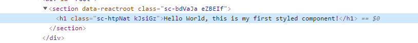
render(
<변수명 />
//컴포넌트처럼 쓰면 된다!
)❗ 클래스명은 랜덤으로 만들어진다.
💅Adapting & Extending
props를 이용해서 스타일을 살짝 바꾸기
- 컴포넌트에 props
bgColor를 설정합니다.
const App = () => (
  <Wrapper>
    <Box bgColor="red" />
    <Box bgColor="green" />
  </Wrapper>
);- 스타일드 컴포넌트에 props를 가져와서 적용시킵니다.
${(props) => props.bgColor};처럼 사용하면 됩니다.
const Box = styled.div`
  width: 100px;
  height: 100px;
  background-color: ${(props) => props.bgColor};
`;
<결과>

style 상속하기(확장)
sass의 상속과 같은 의미입니다^^
styled(Box)- Box 컴포넌트의 스타일을 가져옵니다.
const Circle = styled(Box)`
  border-radius: 50%;
`;
<결과>

💅'as' 와 'attrs'
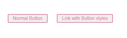
as - 스타일드 컴포넌트의 html 요소를 바꾸고 싶을 때
styled.button의button부분만 바꿔서 적용하고 싶을 때 as를 사용합니다.
const Button = styled.button`
	(...)
`;
<컴포넌트명 as="html태그" />
    <Button>Normal Button</Button>
    <Button as="a" href="#">
      Link with Button styles
    </Button>
<결과>

attrs - 컴포넌트에 일괄적으로 attribute를 넣고 싶을 때
styled.html태그.attrs()
<Input required />
<Input required />
<Input required />
👇👇👇
const Input = styled.input.attrs({required:true})//JS스타일로!
`
	(...)
`
💅애니메이션 & 가상선택자
animation CSS 사용하기
{keyframes}import
import styled,{keyframes} from "styled-components";- 애니메이션 css 작성
const animation = keyframes`
	일반 css처럼 쓰면 됨
`;- 스타일드 컴포넌트에 적용
const Box = styled.div`
  width: 100px;
  height: 100px;
  background-color: red;
  animation: ${animation} 5s linear infinite;
`;
가상선택자(Pseudo Selector) 선택하기 (CSS 중첩)
&를 사용하여 중첩
- Box 안의 컴포넌트 혹은 태그를 중첩(SASS랑 같음)
const Thing = styled.div`
  color: blue;
  //컴포넌트 중첩
  ${Emoji} {
		&:hover {
			font-size: 100px;
		}
  }
//태그 중첩
  & > span {
    color: red;
  }
📎참고

📚 배운 것을 정리하는 프론트엔드 개발자