pdp, lime, shap
출처 :
https://github.com/csinva/imodels/blob/master/notebooks/posthoc_analysis.ipynb
import matplotlib.pyplot as plt
import numpy as np
import pandas as pd

np.random.seed(13)
N = 300
p = 10
X0 = np.random.rand(N, p)
y0 = X0[:, 0] + X0[:, 1]
X0[:, 0] -= 1
X1 = np.random.rand(N, p)
y1 = np.logical_xor(X1[:, 0] > 0.5, X1[:, 1] > 0.5) * 1.0
X = np.concatenate((X0, X1))
y = np.concatenate((y0, y1))

plt.scatter(X[:, 0], X[:, 1], c=y)
plt.xlabel('$X_0$')
plt.ylabel('$X_1$')
plt.colorbar(label='y')
plt.show()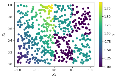
0~1 크기의 uniform distribution 의 샘플 데이터를 생성한다 (np.random.rand)
y 값은 XOR
from sklearn.neural_network import MLPRegressor

m = MLPRegressor(random_state=13)
m.fit(X, y)

plt.scatter(X[:, 0], X[:, 1], c=m.predict(X))
plt.xlabel('$X_0$')
plt.ylabel('$X_1$')
plt.colorbar(label='prediction')
plt.show()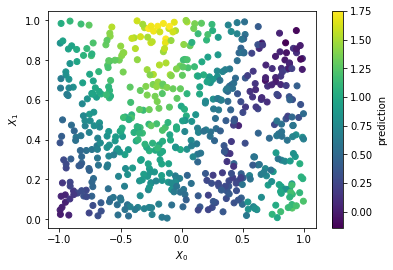
위 데이터에 핏하는 샘플 모델 생성
일차적으로 PDP로 확인
from pdpbox import pdp

feature_names = ["x" + str(i) for i in range(X.shape[1])]

feature_num = 0
curve0 = pdp.pdp_isolate(model=m, dataset=pd.DataFrame(X, columns=feature_names), model_features=feature_names,
                         feature=feature_names[feature_num], num_grid_points=50)
pdp.pdp_plot(curve0, feature_name=feature_names[feature_num], plot_lines=True)
plt.show()

feature_num = 1
curve1 = pdp.pdp_isolate(model=m, dataset=pd.DataFrame(X, columns=feature_names), model_features=feature_names,
                         feature=feature_names[feature_num], num_grid_points=50)
pdp.pdp_plot(curve1, feature_name=feature_names[feature_num], plot_lines=True)
plt.show()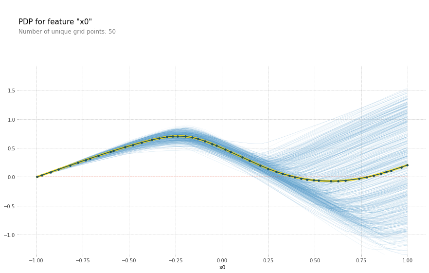
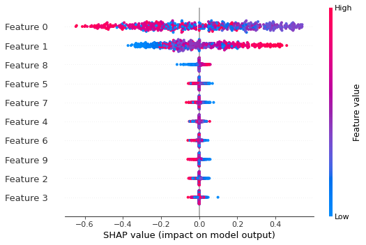
SHAP 으로 확인
shap_values = shap_explainer.shap_values(X, link="deep", nsamples=100)
shap.summary_plot(shap_values, X)
nsmaple 의 수에 따라 비교하는 샘플의 갯수가 정해지고 연산 시간이 변한다. 늘면 늘수록 기하급수적으로 증가
Lime 으로 확인
from lime.lime_tabular import LimeTabularExplainer
explainer = lime.lime_tabular.LimeTabularExplainer(X, feature_names=feature_names, mode='regression')
lime_explanation = explainer.explain_instance(X[0], m.predict, num_features=x.size) # X[0] 에 대한

pd.DataFrame(lime_explanation.as_list())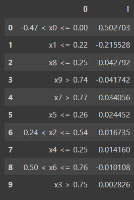

공부용 혹은 정리용 혹은 개인저장용