라이브러리 & 데이터 불러오기
import matplotlib.pyplot as plt
import seaborn as sns
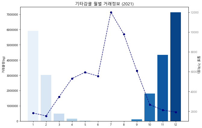
price = test.가격.tolist()
month = test.월.tolist()
kg = 기타감귤물량['물량(kg)'].tolist()
그래프 표기
fig = plt.figure(figsize=(10,6))
fig.set_facecolor('white')
ax1 = fig.add_subplot()
colors = sns.color_palette('Blues', len(month))
xtick_label_position = list(range(len(month)))
ax1.set_xticks(xtick_label_position)
ax1.set_xticklabels(month)
ax1.set_ylabel('거래물량(kg)',rotation=90)
plt.ticklabel_format(style='plain', axis='y',useOffset = False)
ax1.bar(xtick_label_position, kg, color=colors)
color = 'navy'
ax2 = ax1.twinx()
ax2.plot(xtick_label_position, price, color=color, linestyle='--', marker='o')
ax2.tick_params(axis='y', labelcolor='gray')
ax2.set_ylabel('월별 가격(원)',rotation=270)
plt.title('기타감귤 월별 거래정보 (2021)', fontsize=14)
plt.show()
함수
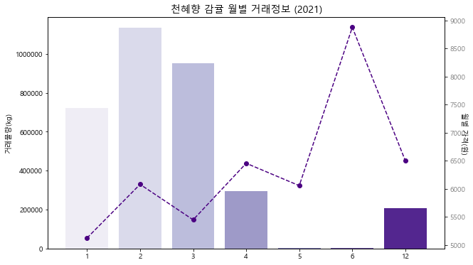
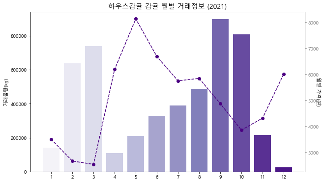
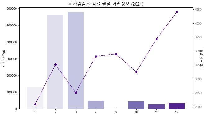
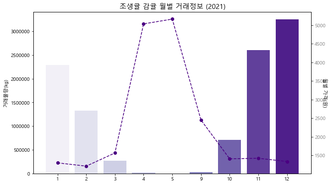
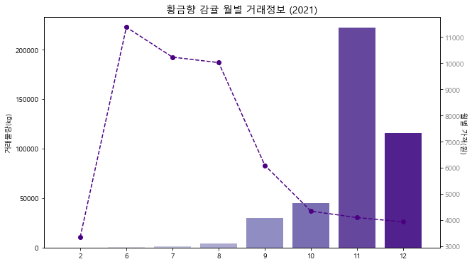
def bar_line_graph(kind):
감귤물량 = df2021[df2021['품종']==kind].groupby('월')[['물량(kg)']].sum().reset_index()
감귤가격 = df2021[df2021['품종']==kind].groupby('월')[['가격']].mean().reset_index()
price = 감귤가격.가격.tolist()
month = 감귤가격.월.tolist()
kg = 감귤물량['물량(kg)'].tolist()
fig = plt.figure(figsize=(10,6))
fig.set_facecolor('white')
ax1 = fig.add_subplot()
colors = sns.color_palette('Purples', len(month))
xtick_label_position = list(range(len(month)))
ax1.set_xticks(xtick_label_position)
ax1.set_xticklabels(month)
ax1.set_ylabel('거래물량(kg)',rotation=90)
plt.ticklabel_format(style='plain', axis='y',useOffset = False)
ax1.bar(xtick_label_position, kg, color=colors)
color = 'indigo'
ax2 = ax1.twinx()
ax2.plot(xtick_label_position, price, color=color, linestyle='--', marker='o')
ax2.tick_params(axis='y', labelcolor='gray')
ax2.set_ylabel('월별 가격(원)',rotation=270)
plt.title(f'{kind} 감귤 월별 거래정보 (2021)', fontsize=14)
plt.show()
감귤 종류 리스트
kind_list = df2021['품종'].unique().tolist()
감귤 품종별 그래프 출력
line 그래프 : 변동 가격(원)
bar 그래프 : 거래 물량(kg)
for k in kind_list:
    bar_line_graph(k)