[어제 복습-복지패널데이트]
Q. 1. 마우스에 반응하는 언터랙티브 그래프 만들 때 보편적으로 사용하는 패키지는
:plotly
Q. 2. 이때 사용하는 함수는?
:ggplotly()
Q. 3. position="dodge" 입력하면?
:데이터를 옆에 나누어서 보여줌
Q. 4. welfare $ income 안에 na값을 0으로 바꾸시오.
:welfare $ income <- ifelse(is.na(welfare $ income), 0, welfare $ income)
Q. 5.
:3번 색 비꿔 꾸미는게 아니라 라벨...
Q. 6. x=drv y=mean
내가쓴 답: ggplot(mpg,aes(x=drv,y=mean(cty),fill=drv)+geom_col()
:mpg %>% group_by(drv) %>% summarise(mean=mean(cty)) %>%
ggplot(aes(x=drv,y=mean,fill=drv)) + geom_col()
Q. 7.welfare 데이터 안에 gender 열 값이 1,2 나타날때 (male, female)변경하시오. ifelse(,,)사용하여.
내 답:??
:welfaregender == 1, 'male', 'female')
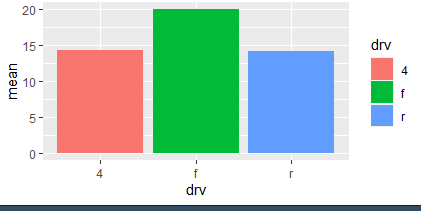
Q. 8.ggplot(gapminder,aes(x=continent,y=lifeExp,fill=continent)) + geom_boxplot() 범례를 지우시오
:theme(legend.position = 'none')
#범례의 포지션을 없앤다.
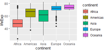
Q. 9. mtcars의 gear별 개수를 막대 그래프로 그리시오
:mtcars$gear <- as.factor(mtcars $ gear)
mtcars %>% ggplot(aes(x= gear, fill= gear)) + geom_bar()
:ggplot(data=mtcars, aes (x = factor(gear), fill = factor(gear))) + geom_bar() + scale_fill_manual(values = c('red', 'blue', 'green'))
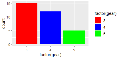
-> scale_fill_manual :함수를 통해 각각의 그래프에 원하는 색상을 지정해 준다. geom_bar()
- ggplot(data=mtcars, aes (x = factor(gear), fill = factor(gear))) + geom_bar() + scale_color_manual(values = c('red', 'blue', 'green'))
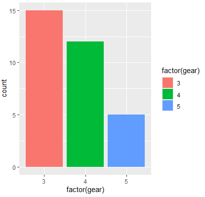
->scale_color_manual: color의 속성을 직접 바꾸고 싶을때, geom_line()
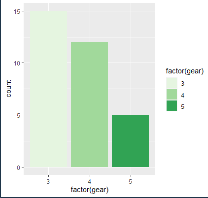
- ggplot(data=mtcars, aes (x = factor(gear), fill = factor(gear))) + geom_bar() + scale_fill_brewer(palette ="Greens" )
시각적 맵핑(AESTHETIC MAPPING)의 구체적 방법: 스케일(SCALES)
스케일은 한 변수의 값을 특정한 시각적 특성과 대응시키는 구체적인 맵핑(mapping) 방법을 결정한다.
예를 들어 mpg의 fl은 연료의 종류를 의미하며 c, d, e, p, r 중의 하나이다. 이를 어떤 채움색(fill=)에 대응시키느냐를 스케일이 결정한다.
scale_fill_manual는 변수가 채움색깔(fill)에 대응시키는 방법을 손수(manual) 결정하겠다는 의미이다.구체적으로 value는 색깔, break는 범례에 나타나는 변수값, name은 범례의 제목, labels는 범례에서 설명을 나타낸다. 마지막으로 limits은 실제 시각화되는 범주의 값을 제한한다.
단,
scale_fill_manual함수는 기존의 색상 위에 다른 색상을 입혀주는 함수이기 때문에scale_fill_manual을 적용하기 전 fill, 혹은 color함수를 적용해준 뒤 사용해야 합니다.
마찬가지로,그래프의 종류에 따라 fill과 color를 다르게 적용해줍니다. line 그래프라면 scale_color_manual을 입력합니다.
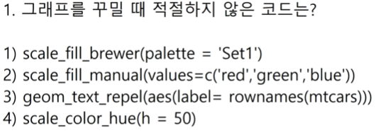
Q. 10.
:4
Q. 11.
:3
Q. 12.
:2
Q. 13. plot() 함수와 pair() 함수 차이는?
:plot()은 전체 데이터, pair()은 원하는 데이터 선택
Q. 14. dataset의 열의 갯수 확인하는 방법 3가지 이상 제시해라.
내 답: names(),glimpse(),dim()
:ncol(), dim(), colnames(), str()
[수업시작 - 복지패널데이트 이어서...]
- 이상치 있는지 없는지 살펴볼때 :boxplot() ##
- 밀도는 변수 한개짜리 그림이임.(x=)
- 이름 붙이기
이름 붙이기 확인함수 summary(), table() - dplyr 그룹별 평균내기 - 우리 목표.
- 변수가 2개면 x,y-> col
변수가 1개면 x -> bar - geom_density():분리해서 색 나와라.
ppt정리 !!중요함!!
- class(welfare$birth)
#데이터 타입 보여줌 - summary(welfare$birth)
#중요함 - qplot(welfare$birth)
#가급적 쓰지말아 - boxplot(welfare$birth)
#루틴, 이상치 확인 방법 - sum(is.na(welfare$birth))
#결측치 확인 방법
<age의 컬럼 추가하기>
2014-1살 #2013-2살
:welfare %>% welfare |> mutate(age=(2014-birth-1)) |> head(6)
<나이별 소득의 평균을 두개의 칼럼을 가지게 만들어라.>
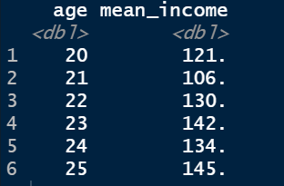
- age_income <- welfare |> filter(!is.na(income)) |> group_by(age) |> summarise(mean_income=mean(income))
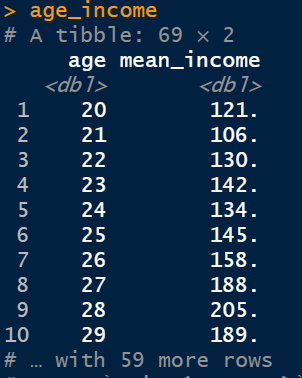
- head(age_income)
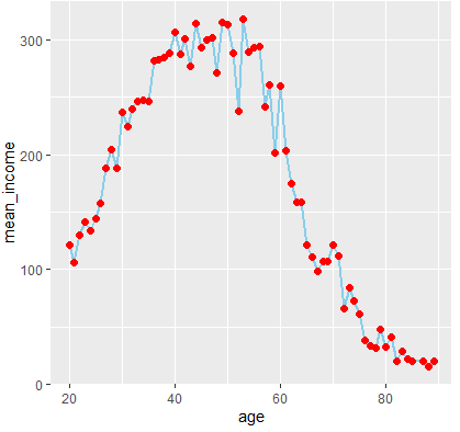
<그래프를 만들어라.>
- age_income |> ggplot(aes(x=age,y=mean_income,color=age))+geom_line()
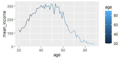
- ggplot(data=age_income,aes(x=age,y=mean_income,color=age))+geom_line(color="skyblue",size=1)+ geom_point(color="red",size=2)+theme(legend.position = 'none')
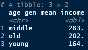
<연령대별로 쪼개기>
- welfare <- welfare |> mutate(age_gen=ifelse(age < 30, "young",ifelse(age <=50,"middle","old" )))
- head(welfare)
<세대별 소득>
- welfare %>% group_by(age_gen) %>% filter(!is.na(income)) %>%
summarise(mean_income=mean(income))
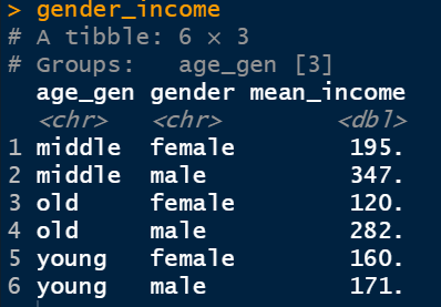
<나이와 성별 평균소득 만들기>
- gender_income <- welfare |> group_by(age_gen, gender) |>
summarise(mean_income = mean(income, na.rm = T))
- gender_income
<그래프 그리기>
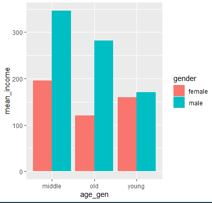
- ggplot(data=gender_income, aes(x=age_gen,y=mean_income, fill=gender))+ geom_col(position="dodge")
<그래프 그리기2>
-
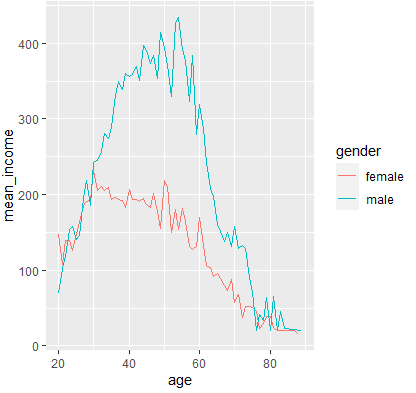
welfare %>% filter(!is.na (welfare$income)) %>%
group_by(age, gender) %>% summarise(mean_income= mean(income)) %>%
ggplot(aes(x= age, y= mean_income, color= gender)) + geom_line()
<오후수업>
-
library(KoNLP)
:f12(개발자도구)-편집-복사 -
readLines("ahn.txt", encoding =
'cp949') -
text <- read.csv('ahn.txt', fileEncoding =
'cp949')
:윈도우에서 파일 저장하면 한글있으면 무조건cp949에서 저장됨 -
KONLP
-
NaturalLanguage Processing
-
자연어:
-
형식어: 1+1=2, Co2
"multilinguer"
- install.packages("multilinguer") :
multilinguer설치 - library(multilinguer) :
multilinguer 실행 - install_jdk() :
multilinguer_jdk실행 - install.packages(c("hash", "tau", "Sejong", "RSQLite", "devtools", "bit", "rex", "lazyeval", "htmlwidgets", "crosstalk", "promises", "later", "sessioninfo", "xopen", "bit64", "blob", "DBI", "memoise", "plogr", "covr", "DT", "rcmdcheck", "rversions"), type = "binary") :
의존성 패키지 설치
"remotes"
- install.packages("remotes") :
remotes 설치 - remotes::install_github('haven-jeon/KoNLP',upgrade="never",INSTALL_opts=c("--no-multiarch")) :
remotes::install 실행 - library(remotes)
- remotes::install_github('haven-jeon/KoNLP', upgrade = "never", INSTALL_opts=c("--no-multiarch"))
- extractNoun('인하대학교 공학대학원 블록체인 전공입니다.')
"KoNLP"
- library(KoNLP) :
KoNLP 최종 적으로 실행 - extractNoun('이 문장에 명사만')
- text <- read.csv('ahn.txt', fileEncoding = 'cp949')
- readLines("ahn.txt")
- extractNoun(text) :
테스트해줌 - text <- ""
noums 지정하기
-
nouns<- extractNoun(text)
-
readline("ahn.txt")
-
nouns
-
useNIADic()
-
useSejongDic()
-
nchar(nouns)
-
nouns <- nouns[nchar(nouns)>1]
: -
table(nouns)
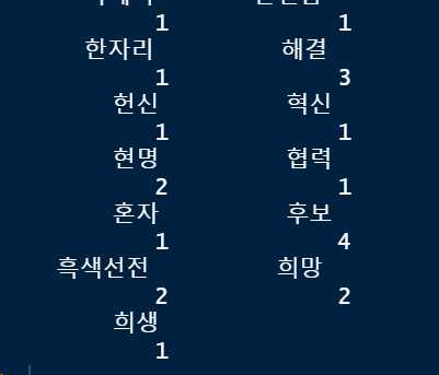
- as.data.frame(table(nouns))
: 데이터 프라임으로 바꿔줌
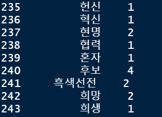
- df <- as.data.frame(table(nouns)) |> arrange(desc(Freq))
:정열함(글자순으로)
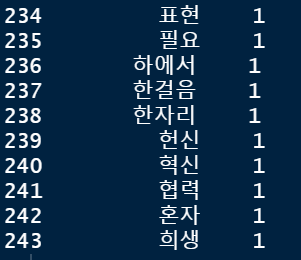
- df
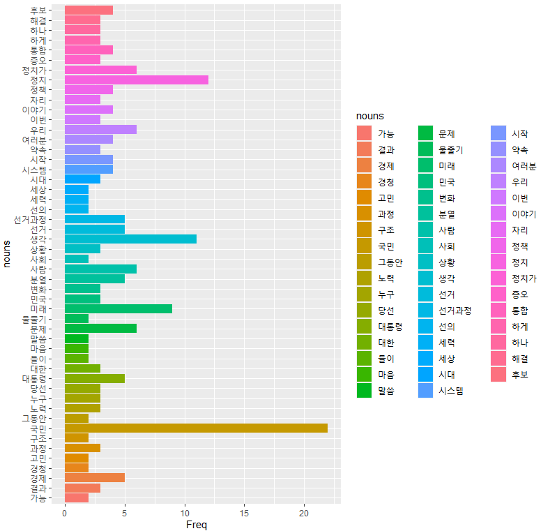
ggplot사용
- ggplot(data=df,aes(x=nouns, y=Freq,fill=nouns))+geom_col()
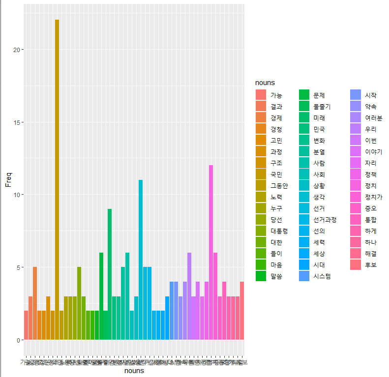
coord_flip()
- ggplot(data=df,aes(x=nouns, y=Freq,fill=nouns))+geom_col()+
coord_flip()
: 방향바꿔줌
값 지정
- df <- as.data.frame(table(nouns)) |>
arrange(desc(Freq)) |> head(50)
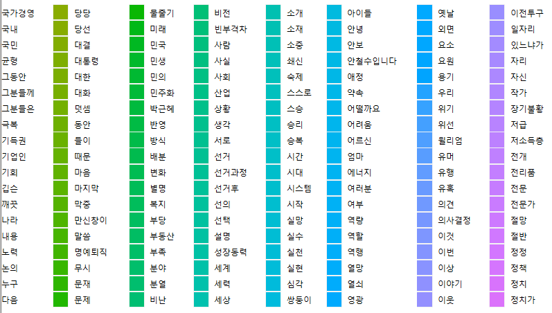
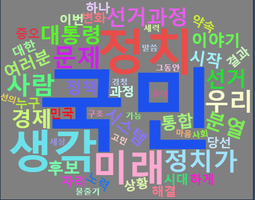
wordcloud2 불러오기
- install.packages(
"wordcloud2") - library(wordcloud2)
- wordcloud2(df)

- wordcloud2 패키지에서는 다양한 형태로 텍스트 마이닝을 할 수 있도록 Parameters를 지원하고 있습니다.
- data : word와 freq를 각 열로 갖고 있는 데이터 프레임을 사용합니다.
- size : font size, default는 1입니다.
- fontFamily : 설치되어 있는 font로 글자모양을 변경할 수 있습니다.
- color : random-dark, random-light를 사용할 수 있고 특정 색으로 선택할 수 있습니다.
- backgroundColor : 배경 색상을 변경할 수 있습니다.
- minSize : 자막의 문자열 크기를 나타냅니다.
- figPath : wordcloud2에서 사용할 이미지를 지정할 수 있습니다.
-
ex) wordcloud2(df, backgroundColor= "Pink",size=0.5)

-
wordcloud2(df, color = "random-light", backgroundColor = "grey")
- wordcloud2(df, minRotation = -pi/6, maxRotation = -pi/6, minSize = 10,
rotateRatio = 1)

-
letterCloud(df, word = "R", size = 2)
-
wordcloud2(df, figPath = figPath, size = 1.5,color = "skyblue")
-
letterCloud(df, word = "WORDCLOUD2", wordSize = 1)
이밖에도 다양한 Parameters를 지원하고 있는데 자세한 내용은 cran.r-project.org에서 참조하실 수 있습니다.
워드 클라우드
값 지정
-
df <- as.data.frame(table(nouns)) |> arrange(desc(Freq))
-
df
ggplot사용
ggplot(data=df,aes(x=nouns, y=Freq,fill=nouns))+geom_col()
coord_flip(): 방향바꿔줌
ggplot(data=df,aes(x=nouns, y=Freq,fill=nouns))+geom_col()+coord_flip()
값 지정
df <- as.data.frame(table(nouns)) |> arrange(desc(Freq)) |> head(50)
#wordcloud2: 불러오기
install.packages("wordcloud2")
library(wordcloud2)
wordcloud2(df)
unlist()
- 목록 병합
- 리스트를 벡터로 바꾸는 방법.
KoNLP
- 한국어 형태소 분석기(텍스트 마이닝)
딕셔너리들
- 딕셔너리들을 설치해줄 필요가 있습니다.
- useNIADic()
- useSejongDic()
extractNoun()
- 한글에서 명사를 추출해주는 함수.
출처:
https://rstatistics.tistory.com/69 <-한글 형태소 분석
https://lsjsj92.tistory.com/216 <-텍스트 마이닝
https://youngwoos.github.io/Doit_textmining/02-morphologicalAnalysis.html#13 <-텍스트 마이닝
https://minimax95.tistory.com/entry/R-프로그래밍4-wordcloud2-패키지-사용하기 [IT 정보기술 따라잡기!:티스토리]
https://ark1st.tistory.com/25 <-KoNLP설치
https://coinco.tistory.com/152
http://www.datamarket.kr/xe/index.php mid=board_ecko11&document_srl=516&listStyle=viewer <-문자열 길이 nchar 함수
https://gomguard.tistory.com/215 <-length 와 nchar의 차이점
https://minimax95.tistory.com/entry/R <-wordcloud2 다양한 모양변화
