오전 문제 html
- 오디오 태그
<!DOCTYPE html>
<html>
<head>
    <title>question 1</title>
</head>
<body>
    <audio src="Kalimba.mp3" controls="controls"></audio>
</body>
</html>
- 비디오 태그를 이용해 영상을 재생하고 controls기능도 추가하자, 크기도 설정하자
CSS를 사용해 비디오 요소에 스타일 적용
<!DOCTYPE html>
<html>
<head>
    <title>question 1</title>
    <style>
        video{
            width: 400px;
            height: 500px;
        }
    </style>
</head>
<body>
   <video controls="controls">
    <source src="exampleVideo.MP4" type="video/MP4">
    <source src="exampleVideo.MP4" type="video/webm">
   </video>
</body>
</html>
- Style태그는 head요소 안에서만 선언할 필요는 없다. CSS를 직접 HTML문서 안에 선언할 수 있는데, 이를 인라인 스타일링 이라고 한다.
인라인 스타일링 사용해 비디오 크기 설정
<!DOCTYPE html>
<html>
<head>
    <title>question 2</title>
</head>
<body>
   <video controls="controls" style="width: 500px; height: 300px;">
    <source src="exampleVideo.MP4" type="video/MP4">
    <source src="exampleVideo.MP4" type="video/webm">
   </video>
</body>
</html>- 파일 제출 양식 만들기
<!DOCTYPE html>
<html>
<head>
    <title>question 3</title>

</head>
<body>
   <form>
    <input type="text" name="search" />
   </form>
   <form>
    <input type="password" name="pw" />
   </form>
   <form>
    <input type="file" name="file" />
   </form>
   <form>
    <input type="submit" />
   </form>
</body>
</html>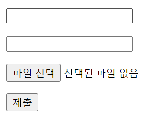
- 여러 줄을 작성할 수 있는 칸 만들기
<!DOCTYPE html>
<html>
<head>
    <title>question 4</title>
</head>
<body>
   <form>
   <textarea>Write Text</textarea>
   </form>
</body>
</html>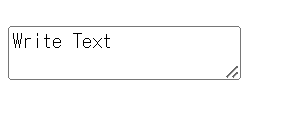
- 목록 만들기 - 국밥, 햄버거, 돈가스, 피자, 치킨
<!DOCTYPE html>
<html>
<head>
    <title>question 5</title>
</head>
<body>
   <select>
    <option>국밥</option>
    <option>햄버거</option>
    <option>돈가스</option>
    <option>피자</option>
    <option>치킨</option>
   </select>
</body>
</html>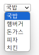
- 여러개 선택 가능하게 만들기
<!DOCTYPE html>
<html>
<head>
    <title>question 5-1</title>
</head>
<body>
   <select multiple = "multiple">
    <option>국밥</option>
    <option>햄버거</option>
    <option>돈가스</option>
    <option>피자</option>
    <option>치킨</option>
   </select>
</body>
</html>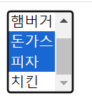
- 목록 안에서 그룹화 하기
<!DOCTYPE html>
<html>
<head>
    <title>question 6</title>
</head>
<body>
   <select>
   <optgroup label="음식">
    <option>밥</option>
    <option>면</option>
    <option>빵</option>
   </optgroup>
   <optgroup label="음료수">
    <option>탄산</option>
    <option>유기농</option>
    <option>이온 음료</option>
   </optgroup>
   </select>
</body>
</html>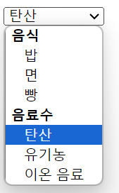
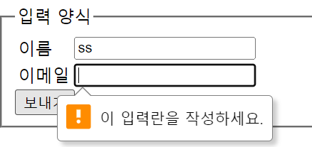
- 이름과 이메일을 입력하는 양식을 만들고 제출하는 칸의 이름을 다르게 변경해서 만들기 - 입력하지 않은 칸이 있다면 보낼 수 없게끔 설정하기
<!DOCTYPE html>
<html>
<head>
    <title>question 7</title>
</head>
<body>
   <fieldset>
    <legend>입력 양식</legend>
    <table>
        <tr>
            <td><label for="name">이름</label></td>
            <td><input id="name" type="text" required></td>
        </tr>
        <tr>
            <td><lable for="email" >이메일</lable></td>
            <td><input id="email" type="email" required></td>
        </tr>
    </table>
    <input type="submit" value="보내기">
   </fieldset>
</body>
</html>- required 속성은 사용자가 입력필드를 비울수 없도록 강제하는 것인데, form요소를 반드시 사용해야한다.
- 라디오버튼과, 체크박스 버튼을 이용한 예시를 만들어 보자
<!DOCTYPE html>
<html>
<head>
    <title>question 5</title>
</head>
<body>
    <h2>좋아하는 운동을 선택하세요.</h2>
    <form>
   <input type="checkbox" name="exercise" id="health" value="health">
   <label for="health">헬스</label><!--<br>하면 개행되서 세로로 나열됌-->

   <input type="checkbox" name="exercise" id="swimming" value="swimming">
   <label for="swimming">수영</label><!--<br>하면 개행되서 세로로 나열됌-->

   <input type="checkbox" name="exercise" id="boxing" value="boxing">
   <label for="boxing">복싱</label><!--<br>하면 개행되서 세로로 나열됌-->
    </form>

    <h2>현재 키와 몸무게를 선택하세요.</h2>
    <h4>키</h4>
    <input type="radio" name="height" id="small" value="small">
    <label for="small">140~150cm</label>

    <input type="radio" name="height" id="regular" value="regular">
    <label for="regular">150~160cm</label>

    <input type="radio" name="height" id="tall" value="tall">
    <label for="tall">160~170cm</label>

    <h4>몸무게</h4>
    <input type="radio" name="weight" id="underweight" value="underweight">
    <label for="underweight">30~40kg</label>

    <input type="radio" name="weight" id="moderate" value="moderate">
    <label for="moderate">40~50kg</label>

    <input type="radio" name="weight" id="overweight" value="overweight">
    <label for="overweight">50~60kg</label>
</body>
</html>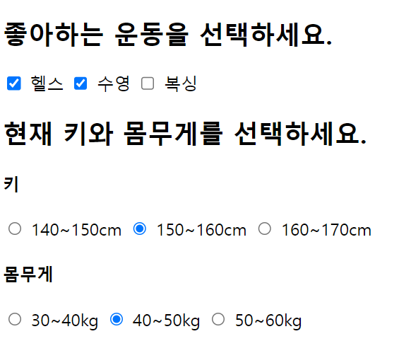
- radio, checkbox는 form문 안에 안넣고 단독으로 사용할 수 있지만, 가독성이 쉽게 form안에 넣어주는게 좋다.(변화는 없음 )
오전 문제 2 - 폼 만들기
<!DOCTYPE html>
<html lang="ko">
<head>
    <meta charset="UTF-8">
    <meta name="viewport" content="width=device-width, initial-scale=1.0">
    <title>회원가입</title>
    <!-- <style>
        tr, td{
            border: 1px solid black;
        } 이렇게 안해도 되고 간단하게 할때는 table에 border="1" 주는게 더 간편
    </style> -->
</head>
<body>
    <form id="registrationForm" onsubmit="submitForm(event)">
    <table border = "1">
        <caption>회원가입</caption>
        <tr>
            <td><label for="name">이름</label></td>
            <td><input type="text" name="name" id="name" required></td>
            <!-- required 속성은 폼 요소가 비어있을 경우 사용자에게 입력을 요구하는 역할이다. 그러므로 form요소가 있어야한다. -->
        </tr>
        <tr>
            <td><label for="id">아이디</label></td>
            <td><input type="text" name="id" id="id" required></td>
        </tr>
        <tr>
            <td><label for="password">비밀번호</label></td>
            <td><input type="text" name="password" id="password" required></td>
        </tr>
        <tr>
            <td><label for="checkpw">비밀번호 확인</label></td>
            <td><input type="text" name="checkpw" id="checkpw" required></td>
        </tr>
        <tr>
            <td><label for="email">이메일</label></td>
            <td><input type="text" name="email" id="email" required></td>
        </tr>
        <tr>
            <td>독서</td>
            <td>
                <label for="reading">독서</label>
                <input type="checkbox" name="hobby" id="reading" value="reading">
                <label for="cooking">요리</label>
                <input type="checkbox" name="hobby" id="cooking" value="cooling">
                <label for="ruuning">조깅</label>
                <input type="checkbox" name="hobby" id="running" value="running">
                <label for="swimming">수영</label>
                <input type="checkbox" name="hobby" id="swimming" value="swimming">
                <label for="sleep">취침</label>
                <input type="checkbox" name="hobby" id="sleep" value="sleep">
            </td>
        </tr>
        <tr>
            <td>전공</td>
                <td>
                    <!-- radio는 name을 하나의 그룹으로 줘야 하나의 옵션만 선택 가능하게끔 된다 -->
                    <label for="kor">국어</label>
                    <input type="radio" name="mojor" id="kor" value="kor" required>
                    <label for="eng">영어</label>
                    <input type="radio" name="mojor" id="eng" value="eng" required>
                    <label for="math">수학</label>
                    <input type="radio" name="mojor" id="math" value="math" required>
                    <label for="design">디자인</label>
                    <input type="radio" name="mojor" id="design" value="design" required>
                </td>
        </tr>
        <tr>
           <td><label for="mobile">전환번호</label></td>
           <td>
            <select name="mobile" id="mobile">
                <option value="SKT">STK</option>
                <option value="KT">KT</option>
                <option value="LG">LG</option>
            </select>
           </td>
        </tr>
        <tr>
            <!-- colspan은 하나의 셀이 두 개의 열을 차지하도록 지정 >> 해당 셀이 표에서 두 개의 열을 가로지름 -->
            <td colspan="2" id="submit">
                <input type="submit" value="전송">
                <input type="reset" value="초기화">
            </td>
        </tr>
    </table>
</form>
<script>
    // 사용자가 입력한 데이터를 수집해 서버로 전송하는 등의 제출 관련 동작이 들어간다.
    function submitForm(event){
        event.preventDefault();
         // 사용자가 입력한 데이터 수집
        const name = document.getElementById('name').value;
        const id = document.getElementById('id').value;
        const password = document.getElementById('password').value;
        const checkpw = document.getElementById('checkpw').value;
        const email = document.getElementById('email').value;
        const hobby = document.querySelectorAll('input[name="hobby"]:checked');
        const major = document.querySelector('input[name="major"]:checked');
        const mobile = document.getElementById('mobile').value;
        }
</script>
</body>
</html>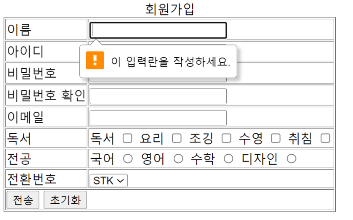
오전문제 css
- h1태그에 두 개 이상의 클래스 선택자를 사용해 보자.
<!DOCTYPE html>
<html>
<head>
    <title>CSS3 Selector Basic Page</title>
    <style>
        .item{
            color: red;
        }
        .header{
            background-color: blue;
        }
    </style>
</head>
<body>
    <!-- 아래처럼 입력하면 단축키emmet -->
    h1.item.header{동해물과 백두산이}
    <h1 class="item header">동해물과 백두산이</h1>
</body>
</html>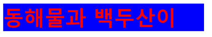
- 속성 선택자
input 속성을 이용하여 input type이 text이면 배경색을 빨간색 input type이 password이면 배경색상을 파란색으로 하시오.
<!DOCTYPE html>
<html>
<head>
    <title>CSS3 Selector Basic Page</title>
    <style>
       input[type="text"]{
        background-color: red;
       }
       input[type="password"]{
        background-color: blue;
       }
    </style>
</head>
<body>
    <input type="text" name="text" id="text">
    <input type="password" name="pw" id="pw">

</body>
</html>
글씨체 변환시키는 법
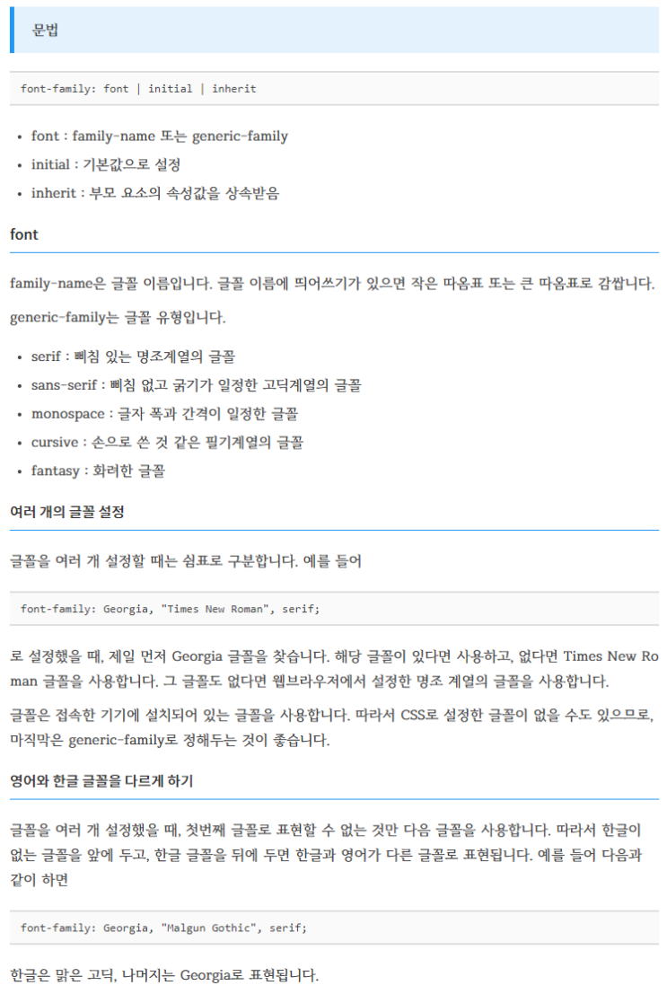
표 사이 간격
문제
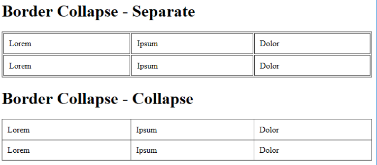
1번 글씨체, 표 색상 , 줄 문제
- 아래와 같이 만드시오.
선생님 풀이
<!DOCTYPE html>
<html>
<head>
<style>
#customers {<!--id가 customers인-->
<!--아래는 글씨 폰트인데, 쌍따옴표로 첫번째 폰트를 지정해줘야 한다. 사용하는 데스크탑에 폰트가 없을 수 있으니, 여러개의 폰트를 연달아 놔서 없으면 다음 폰트를 쓸 수 있게끔 명시-->
font-family: "Trebuchet MS", Arial, Helvetica, sans-serif;
border-collapse: collapse;
width: 100%;
}
#customers td, #customers th {<!--id가 customer의 후손인td-->
border: 1px solid #ddd;
padding: 8px; <!--padding을 8px하나만 주면 상하좌우가 모두 8px이 들어간다.-->
}
#customers tr:nth-child(even){background-color: #f2f2f2;}
#customers tr:hover {background-color: #ddd;}<!--hover: 커서가 위로 올라가면 색깔이 달라짐-->
#customers th {<!--customer의 후손 th-->
<!--위에서 8px하나만 줘서 상하좌우가 다 8 이였는데 이제는 위가 12, 아래가 12, 좌우가 8 이될것이다-->
padding-top: 12px;
padding-bottom: 12px;
text-align: left; <!--왼쪽 정렬-->
background-color: #4CAF50;
color: white; <!--글자 색상 흰색-->
}
</style>
</head>
<body>
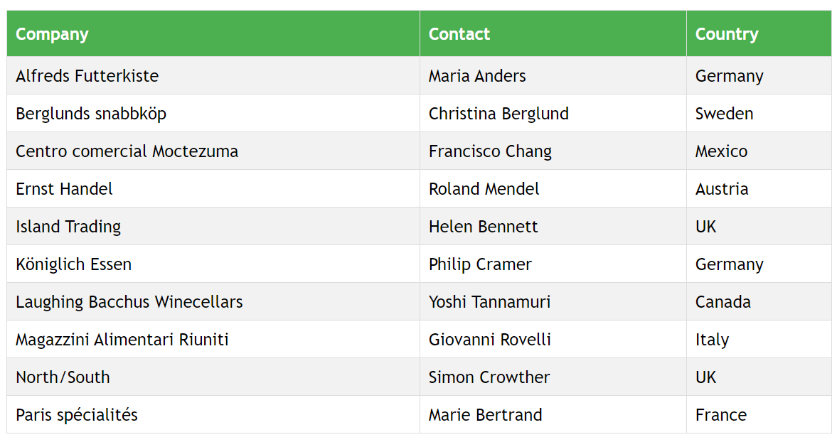
<table id="customers"> <!--위에서 #은 아이디를 주는것-->
<tr>
<th>Company</th>
<th>Contact</th>
<th>Country</th>
</tr>
<tr>
<td>Alfreds Futterkiste</td>
<td>Maria Anders</td>
<td>Germany</td>
</tr>
<tr>
<td>Berglunds snabbköp</td>
<td>Christina Berglund</td>
<td>Sweden</td>
</tr>
<tr>
<td>Centro comercial Moctezuma</td>
<td>Francisco Chang</td>
<td>Mexico</td>
</tr>
<tr>
<td>Ernst Handel</td>
<td>Roland Mendel</td>
<td>Austria</td>
</tr>
<tr>
<td>Island Trading</td>
<td>Helen Bennett</td>
<td>UK</td>
</tr>
<tr>
<td>Königlich Essen</td>
<td>Philip Cramer</td>
<td>Germany</td>
</tr>
<tr>
<td>Laughing Bacchus Winecellars</td>
<td>Yoshi Tannamuri</td>
<td>Canada</td>
</tr>
<tr>
<td>Magazzini Alimentari Riuniti</td>
<td>Giovanni Rovelli</td>
<td>Italy</td>
</tr>
<tr>
<td>North/South</td>
<td>Simon Crowther</td>
<td>UK</td>
</tr>
<tr>
<td>Paris spécialités</td>
<td>Marie Bertrand</td>
<td>France</td>
</tr>
</table>
</body>
</html>내가 하다 만거
<!DOCTYPE html>
<html>
<head>
    <title>question 5</title>
   <style>
    table{
        width: 100%;
        border: 1px solid #333333;
    }
    td{
        padding: 10px;
        border: 1px solid #333333;
    }
    .b{
        border-collapse: collapse;
    }
    .b thead {
        background: green;
    }
    .b thead td {
        color: white;
    }
   </style>
</head>
<body>
    <table class="b">
        <thead>
        <tr>
        <td>Company</td>
        <td>Contact</td>
        <td>Country</td>
       </tr>
    </thead>
    <tr>
        <td>Alfreds Futterkiste</td>
        <td>maria Abders</td>
        <td>Germany</td>
    </tr>
    <tr>
        <td>Berglunds snbbkop</td>
        <td>Christina berglund</td>
        <td>Sweden</td>
    </tr>

    </table>
</body>
</html>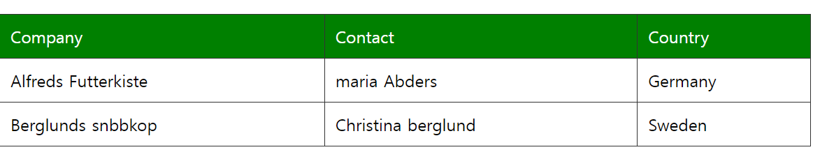
2번 레이아웃 문제
-
아래의 그림과 같이 만들어 보자
- 공간 분할 태그에 아이디 선택자를 사용하여 id 속성을 적용하고 레이아웃을 구성한다.
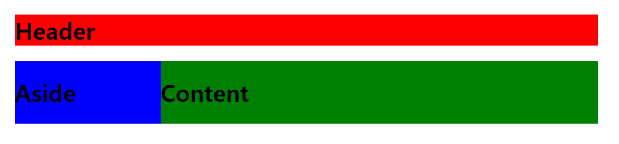
선생님 풀이
-
width속성을 사용하여 요소의 너비를 설정할 때, 값으로800px을 지정하면 해당 요소의 최대 너비가 800픽셀로 제한된다.- 해당 요소가 화면 너비가 800픽셀 이상이 되어도 더 이상 너비가 늘어나지 않음을 의미한다.
<!DOCTYPE html>
<html>
<head>
    <title>CSS3 Selector Basic Page</title>
    <style>
        /* #:id 속성으로 header를 가지고 있는 태그의 스타일을 지정합니다. */
        #header {
            width: 800px; margin: 0 auto;
              /*상하 margin이0 좌우는 auto로 주면 가운데 정렬이 됌(처음 0은 상하, 뒤 auto는 좌우*/
            background: red;
        }

        /* id 속성으로 wrap을 가지고 있는 태그의 스타일을 지정합니다. */
        #wrap {
            width: 800px; margin: 0 auto;
            overflow: hidden; /*부모가 hidden으로 주는게 공식*/
        }

        /* id 속성으로 aside를 가지고 있는 태그의 스타일을 지정합니다. */
        #aside {
            width: 200px; float: left;
            background: blue;
        }

        /* id 속성으로 content를 가지고 있는 태그의 스타일을 지정합니다. */
        #content {
            width: 600px; float: left;
            background: green;
        }
    </style>
</head>
<body>
    <div id="header">
        <h1>Header</h1>
    </div>
    <div id="wrap"> /*wrap이 aside와 content를 둘러싸고 있어서  wrap은 hidden으로 속성을 주는게 좋다.*/
        <div id="aside">
            <h1>Aside</h1>
        </div>
        <div id="content">
            <h1>Content</h1>
        </div>
    </div>/*div는 블록 속성을 가지고 있어 창의 끝까지 본인 영역으로 가지고 있다.*/
</body>
</html>
CSS 예제
폰트 크기
<!DOCTYPE html>
<html>
<head>
    <title>CSS3 Style Property Basic</title>
    <style>
        p:nth-child(1) { }
        p:nth-child(2) { font-size: 100%; }
        p:nth-child(3) { font-size: 150%; }
        p:nth-child(4) { font-size: 200%; }
    </style>
</head>
<body>
    <p>Lorem ipsum dolor sit amet, consectetur adipiscing elit.</p>
    <p>Lorem ipsum dolor sit amet, consectetur adipiscing elit.</p>
    <p>Lorem ipsum dolor sit amet, consectetur adipiscing elit.</p>
    <p>Lorem ipsum dolor sit amet, consectetur adipiscing elit.</p>
</body>
</html>- % 백분율 단위
- em 배수 단위
- px 픽셀 : 웹 브라우저 p태그 크기가 16px이다.
em예제
<!DOCTYPE html>
<html>
<head>
    <title>CSS3 Style Property Basic</title>
    <style>
        p:nth-child(1) { }
        p:nth-child(2) { font-size: 1.0em; }
        p:nth-child(3) { font-size: 1.5em; }
        p:nth-child(4) { font-size: 2.0em; }
    </style>
</head>
<body>
    <p>Lorem ipsum dolor sit amet, consectetur adipiscing elit.</p>
    <p>Lorem ipsum dolor sit amet, consectetur adipiscing elit.</p>
    <p>Lorem ipsum dolor sit amet, consectetur adipiscing elit.</p>
    <p>Lorem ipsum dolor sit amet, consectetur adipiscing elit.</p>
</body>
</html>
px예제
<!DOCTYPE html>
<html>
<head>
    <title>CSS3 Style Property Basic</title>
    <style>
        p:nth-child(1) { }
        p:nth-child(2) { font-size: 16px; }
        p:nth-child(3) { font-size: 24px; }
        p:nth-child(4) { font-size: 32px; }
    </style>
</head>
<body>
    <p>Lorem ipsum dolor sit amet, consectetur adipiscing elit.</p>
    <p>Lorem ipsum dolor sit amet, consectetur adipiscing elit.</p>
    <p>Lorem ipsum dolor sit amet, consectetur adipiscing elit.</p>
    <p>Lorem ipsum dolor sit amet, consectetur adipiscing elit.</p>
</body>
</html>
응용
<!DOCTYPE html>
<html>
<head>
    <title>CSS3 Style Property Basic</title>
    <style>
        * { font-size: 12px;}

        h1 { font-size: 3.0em; }/*12px의 3배 크기*/
        h2 { font-size: 1.5em; }/*12px의 1.5배 크기*/
    </style>
</head>
<body>
    <h1>Lorem ipsum dolor sit amet</h1>
    <h2>consectetur adipiscing elit. Sed nec purus elit, nec cursus dolor.</h2>
    <p>Lorem ipsum dolor sit amet, consectetur adipiscing elit.</p>
</body>
</html>-
* : 전체 선택자
-
h1 : 태그 선택자
태그를 이용한 폰트 크기 설정
<!DOCTYPE html>
<html>
<head>
    <title>CSS3 Style Property Basic</title>
    <style>
        * { font-size: 12px;}

        h1 { font-size: 3.0em; }
        h2 { font-size: 1.5em; }
    </style>
</head>
<body>
    <h1>Lorem ipsum dolor sit amet</h1>
    <h2>consectetur adipiscing elit. Sed nec purus elit, nec cursus dolor.</h2>
    <p>Lorem ipsum dolor sit amet, consectetur adipiscing elit.</p>
</body>
</html>- *를 이용해 모든 요소를 선택해 font-size로 글꼴의 크기를 설정
폰트 및 배경에 색상 주기
<!DOCTYPE html>
<html>
<head>
    <title>CSS Property Basic</title>
    <style>
        div {
            width: 100px; height: 100px;
            background-color: red;
        }
        body
        {
            background-image: url('Desert.jpg');
        }
    </style>
</head>
<body>
    <div></div>
</body>
</html>
<!--예시-->
<style>
    h1{background-color: red;}
    h2{background-color: orange;}
    h3{background-color: blue; }
</style>
색상 단위
-
rgb(red, green, blue) : RGB 색상 단위
- R(붉은색)과 G(초록색)과 B(파란색)를 조합하여 색상을 표현하며 다음과 같이 0부터 255사이의 숫자를 입력한다.
-
rgba(red, green, blue, alpha) : RGBA 색상 단위
-
RGBA 색상 단위는 RGB 색상 단위에 알파 값을 추가한 형태. 알파 값은 투명도를 나타내며 0.0부터 1.0사이의 숫자를 입력. 0.0은 완전 투명 상태고, 1.0은 완전 불투명 상태
-
opacity를 주면서 투명도 설정도 가능하다. : 똑같이 0.0~1.0 형태
-
-
#000000 : HEX 코드 단위
-
색상을 16진수로 표현할 때는 각 색상 요소에 00에서 FF사이의 값을 입력한다. RGB 색상 단위와 같으므로 쉽게 사용할 수 있다.
-
색상 확인이 힘들다면 ColorPicker와 같은 색상 선택 도구를 사용.
색상 선택 프로그램 (http://www.colorpicker.com/)
-
background-image
-
배경 이미지를 지정할 수 있다.
-
background-image 속성에는 'url(경로)' 형태로 url단위를 입력한다.
영역의 크기 지정
width, height : 글자를 감싸는 영역의 크기를 지정
border : 테두리의 두께를 지정
margin : 테두리와 다른 태그와의 간격 지정
padding : 테두리와 글자 사이의 간격을 지정
<!DOCTYPE html>
<html>
<head>
    <title>CSS Property Basic</title>
    <style>
        div {
            width: 100px; height: 100px;
            background-color: red;

            border: 20px solid black;
            margin: 10px; padding: 30px;
        }
    </style>
</head>
<body>
    <div></div>
</body>
</html>
태그 전체의 크기 공식
-
전체 너비 = width + 2 * (margin + border + padding)
- 100px(width) + 2 *(30px(padding) + 20px(border) + 10px(margin)) : 260px
-
전체 높이 = height + 2 * (margin + border + padding)
- 100px(height) + 2 * (30px(pdding) + 20px(border) + 10px(margin)) : 260px
margin과 padding 속성 값 부분 지정
왼쪽, 오른쪽, 위쪽, 아래쪽을 각각 지정 가능
-
margin-left : 왼쪽 마진
-
margin-right : 오른쪽 마진
...
-
padding-left : 왼쪽 패딩
-
padding-top : 위쪽 패딩
-
padding-bottom : 아래쪽 패딩
다 넣지는 않았지만 left, right, top, bottom형태로 구성
<!-- 7 box_marginPaddingEachFour.html -->

<!DOCTYPE html>
<html>
<head>
    <title>CSS Property Basic</title>
    <style>
        div {
            width: 100px; height: 100px;
            background-color: red;

            /* margin: 상 우 하 좌 */
            /* padding: 위 오른쪽 아래 왼쪽 */
            margin: 0 30px 0 30px;
            padding: 0 30px 0 30px;

               /* margin: 상하 좌우 */
            /* padding: 상하 좌우 */
            margin: 0 30px; padding: 0 30px;
        }
    </style>
</head>
<body>
    <div></div>
</body>
</html>
테두리 속성
-
border-width : 테두리의 두께를 지정하는 속성
-
border-style : 테두리의 형태를 지정하는 속성
-
border-color : 테두리의 색깔 지정
<!DOCTYPE html>
<html>
<head>
    <title>CSS3 Property Basic</title>
    <style>
        .box {
            border-width: thick;
            border-style: dashed;
            border-color: black;
        }
    </style>
</head>
<body>
    <div class="box">
        <h1>Lorem ipsum dolor amet</h1>
    </div>
</body>
</html>
border-style
none: 테두리 없음hidden: 테두리를 숨김dotted: 점선dashed: 대시solid: 실선double: 이중 실선groove: 홈이 파여있는 테두리ridge: 볼록한 테두리inset: 안쪽 테두리outset: 바깥쪽 테두리
border-width
border-style과 border-width는 CSS에서 사용할 수 있는 속성들입니다.
border-style:
none: 테두리 없음hidden: 테두리를 숨김dotted: 점선dashed: 대시solid: 실선double: 이중 실선groove: 홈이 파여있는 테두리ridge: 볼록한 테두리inset: 안쪽 테두리outset: 바깥쪽 테두리
border-width:
thin: 얇은 테두리medium: 중간 두께 테두리thick: 두꺼운 테두리- 단위를 사용하여 픽셀 값으로 지정할 수도 있다. (예:
1px,2px, 등)
border-radius : 테두리를 둥글게
<!DOCTYPE html>
<html>
<head>
    <title>CSS3 Property Basic</title>
    <style>
        .box {
            border-width: thick;
            border-style: dashed;
            border-color: black;

            border-radius: 20px;

          /* border-radius: 왼쪽위 오른쪽위 오른쪽아래 왼쪽아래 >> 시계방향 */
            border-radius: 50px 40px 20px 10px;
        }
    </style>
</head>
<body>
    <div class="box">
        <h1>Lorem ipsum dolor amet</h1>
    </div>
</body>
</html>
display 속성
css 요소의 레이아웃 동작을 제어하는데 사용된다. >> 화면에 어떻게 배치되고 표시되는지
-
block : 요소를 새로운 줄에서 시작하고, 가능한 최대 가로 너비를 차지한다. (수직으로 쌓이는 박스 모델 사용 >> div, p, h1등의 블록 요소)
-
inline : 요소를 인라인 요소로 지정하여, 줄의 어느 곳에서나 다른 인라인 요소와 함께 나타날 수 있다.(span, a 등의 인라인 요소)
-
inline-block : 인라인 레벨의 특성을 지니지만,내부의 크기와 패딩, 여백 등을 조절할 수 있는 블록 요소처럼 동작한다.
-
flex : 유연한 박스 모델을 사용해, 요소를 수평 또는 수직으로 정렬하는데 사용된다.
- 부모요소가 display: flex일 때 자식 요소들은 플렉스 아이템이 된다.
-
grid : 요소를 2차원 그리드로 배치할 수 있다. 부모가 grid요소면, 자식들도 그리트 아이템이 된다.
-
none : 요소를 화면에 숨긴다. 해당 요소와 그 자식 요소들은 렌더링 되지 않는다.
- display속성에 none키워드를 적용하면 태그가 화면에서 보이지 않는다.
인라인 형식
<!DOCTYPE html>
<html>
<head>
    <title>Display</title>
    <style>
        #box {
            display: inline;

            background-color: red;
            width: 100px;
            height: 50px;
            margin: 10px;
        }
    </style>
</head>
<body>
    <p>의미 없는 더미 객체</p>
    <span>더미 객체</span>
    <div id="box">대상 객체</div>
    <span>더미 객체</span>
    <p>의미 없는 더미 객체</p>
</body>
</html></body>
</html>-
inline 키워드를 적용한 코드는 width와 height 속성이 지정되지 않는다
-
margin 속성이 div 태그의 좌우로만 적용된다.
-
inline-block 키워드를 적용하면 width와 height 속성이 적용되고 margin 속성도 상하좌우로 적용된다.
<!-- display_inline-block-1.html -->

<!DOCTYPE html>
<html>
<head>
    <title>Display</title>
    <style>
        #box {
            display: inline-block;

            background-color: red;
            width: 100px;
            height: 50px;
            margin: 10px;
        }
    </style>
</head>
<body>
    <p> 의미 없는 객체</p>
    <span>더미 객체</span>
    <div id="box">대상 객체</div>
    <span>더미 객체</span>
    <p> 의미 없는 객체</p>
</body>
</html>
float and overflow문제
- 사진을 왼쪽에 두고 그 옆에 글 정렬
<!DOCTYPE html>
<html>
<head>
    <title>Float practice</title>
   <style>
    img{
        margin-right: 20px;
        float: left;
    }
   </style>
</head>
    <body>
    <h1>베트남 여행</h1>
    <p><img src="trip.png" alt="trip" width="250" height="180">
        Lorem ipsum dolor sit amet, consectetur adipiscing elit. Nam ornare sapien suscipit tincidunt ullamcorper. Cras ac sem sed mauris maximus rhoncus vel in metus. Nam pharetra arcu sit amet dolor interdum, eget scelerisque libero finibus. Phasellus quis vulputate ante. Fusce sit amet viverra justo. Donec id elementum mauris. Nam id porttitor nisl, et suscipit nunc. Vestibulum sit amet volutpat quam. Cum sociis natoque penatibus et magnis dis parturient montes, nascetur ridiculus mus. Duis placerat sem eu facilisis ultricies.
        Nulla et elit placerat, malesuada massa sit amet, dictum quam. Duis eu turpis non sapien molestie luctus nec a tortor. Nunc non est eget elit suscipit interdum. Maecenas iaculis lobortis lorem et dignissim. Nullam dapibus, arcu vel malesuada egestas, nisi mi accumsan tellus, at rhoncus dolor nisi in tortor. Donec at aliquam lectus, ac egestas odio. Proin convallis sapien id consectetur egestas. Sed at varius libero, ut ultricies eros. Suspendisse potenti. Vivamus non posuere mauris. Maecenas luctus elementum justo, non tempor nisl blandit id. Lorem ipsum dolor sit amet, consectetur adipiscing elit.</p>
</body>
</html>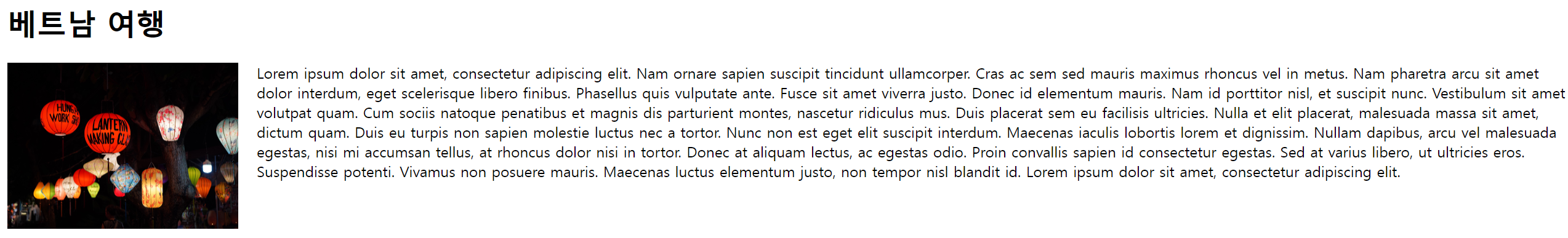
- 사진을 오른쪽에 두기
<!DOCTYPE html>
<html>
<head>
    <title>Float practice</title>
   <style>
    img{
        margin-right: 20px;
        float: right;
    }
   </style>
</head>
    <body>
    <h1>베트남 여행</h1>
    <p><img src="trip.png" alt="trip" width="250" height="180">
        Lorem ipsum dolor sit amet, consectetur adipiscing elit. Nam ornare sapien suscipit tincidunt ullamcorper. Cras ac sem sed mauris maximus rhoncus vel in metus. Nam pharetra arcu sit amet dolor interdum, eget scelerisque libero finibus. Phasellus quis vulputate ante. Fusce sit amet viverra justo. Donec id elementum mauris. Nam id porttitor nisl, et suscipit nunc. Vestibulum sit amet volutpat quam. Cum sociis natoque penatibus et magnis dis parturient montes, nascetur ridiculus mus. Duis placerat sem eu facilisis ultricies.
        Nulla et elit placerat, malesuada massa sit amet, dictum quam. Duis eu turpis non sapien molestie luctus nec a tortor. Nunc non est eget elit suscipit interdum. Maecenas iaculis lobortis lorem et dignissim. Nullam dapibus, arcu vel malesuada egestas, nisi mi accumsan tellus, at rhoncus dolor nisi in tortor. Donec at aliquam lectus, ac egestas odio. Proin convallis sapien id consectetur egestas. Sed at varius libero, ut ultricies eros. Suspendisse potenti. Vivamus non posuere mauris. Maecenas luctus elementum justo, non tempor nisl blandit id. Lorem ipsum dolor sit amet, consectetur adipiscing elit.</p>
</body>
</html>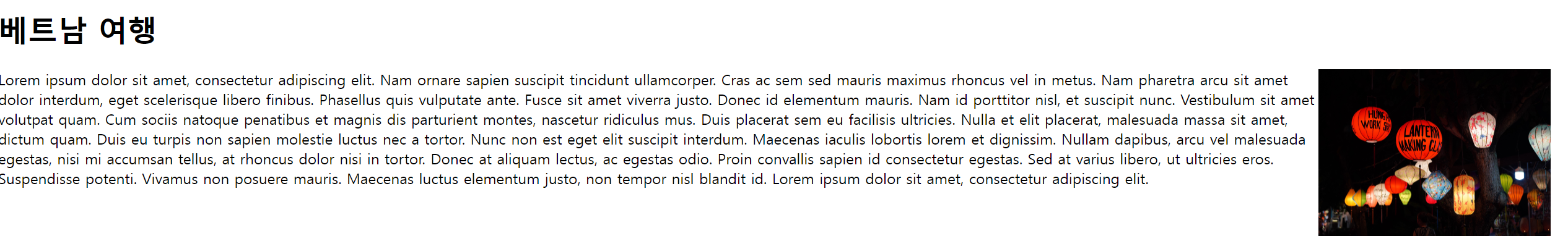
- clear속성 이용한 위치 조정
<!DOCTYPE html>
<html lang="ko">
    <head>
        <title>CSS Float</title>
        <style>
            .left{
                background-color: darksalmon;
                width: 180px;
                height: 90px;
                float: left;
            }
            .right{
                background-color: mediumslateblue;
                width: 180px;
                height: 90px;
                float: right;
            }
            p{
                clear: left;
            }
        </style>
</head>
<body>
    <h1>Clear 속성을 이용한 위치 조정</h1>
    <div>
        <div class="left">왼쪽에 위치하는 나는 darksalmon색~</div>
        <dib class="right">오른쪽에 위치하는 나는 mediumslateblue색~~!</dib>
    </div>
    <p>둘의 색깔 중 뭐가 더 좋나요? 다크 살몬색과 미디움 블루색입니다.둠둠다리 둠둠다다다다</p>
</body>
</html>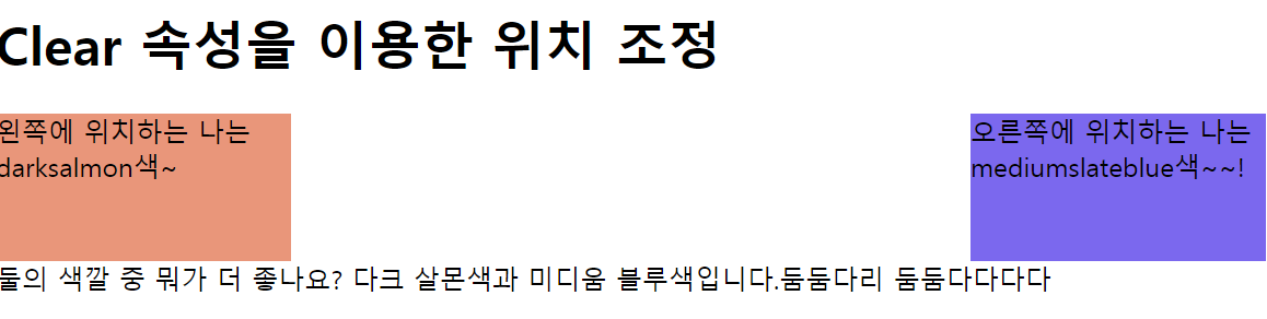
- overflow속성을 이용한 크기 조정
<!DOCTYPE html>
<html lang="ko">
    <head>
        <title>CSS Float</title>
        <style>
            div{
                border: 3px solid #6faad1;
                padding: 5px;
            }
            img{ float: left;}
            #second{ clear: left}
            .good{overflow: auto;}
        </style>
    </head>

    <body>
        <h1>overflow 속성을 이용한 border 안 크기 조정</h1>
        <div>이미지와 함께 할 내용
            <img src="trip.png" alt="picture" width="250" height="200">
        </div>
        <p id="second"><br>overflow 속성값을 auto로 주면 자동으로 컨테이너 요소의 크기도 함께 늘어난다.</p>
        <div class="good">이미지와 함께 할 내용
            <img src="trip.png" alt="picture" width="250" height="200">
        </div>
    </body>
</html>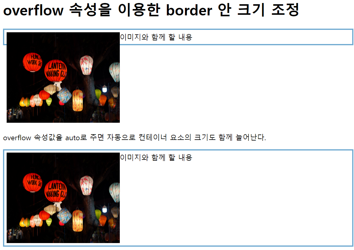
- 위 문제와 같이 컨테이너 요소를 벗어나면 잘리거나 스크롤로 바뀌게끔 만들어보자
<!DOCTYPE html>
<html lang="ko">
    <head>
        <title>CSS Float</title>
        <style>
            div{
                border: 3px solid #6faad1;
                padding: 5px;
                height: 100px;
            }
            img{ float: left;}
            #second{ clear: left}
            .good{overflow: auto;}
            .hide{overflow: hidden;}
        </style>
    </head>

    <body>
        <h1>overflow 속성을 이용한 border 안 크기 조정</h1>
        <div>이미지와 함께 할 내용
            <img src="trip.png" alt="picture" width="250" height="200">
        </div>
        <p id="second"><br>overflow 속성값을 auto로 주면 자동으로 컨테이너 요소의 크기도 함께 늘어난다.</p>
        <div class="good">이미지와 함께 할 내용
            <img src="trip.png" alt="picture" width="250" height="200">
        </div>
        <p id="second"><br>overflow 속성값을 hidden으로 주면 컨테이너 크기를 벗어나는 곳을 잘려서 나온다.</p>
        <div class="hide">이미지와 함께 할 내용
            <img src="trip.png" alt=""picture" width="250" height="200">
        </div>

    </body>
</html>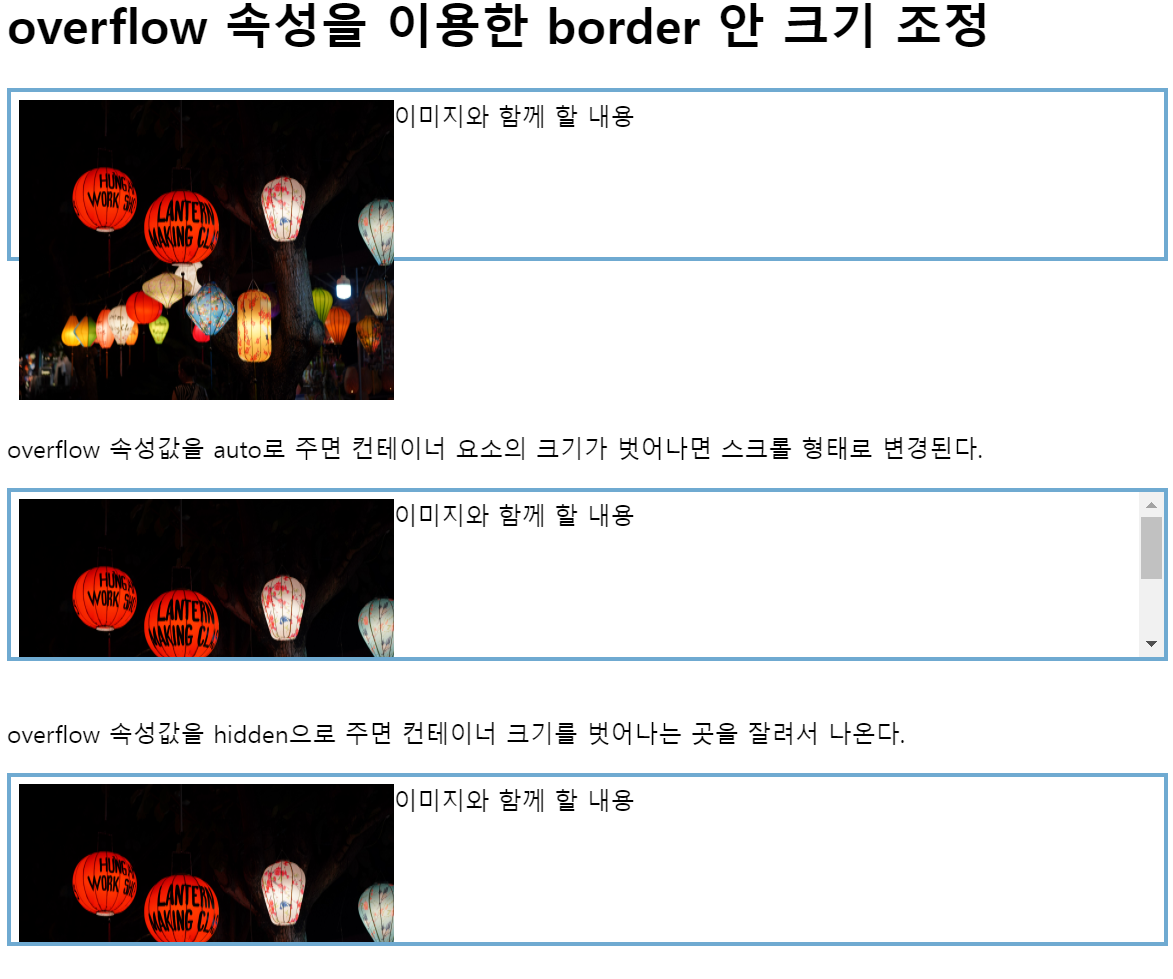
- 4번과 다르게 head에서 div에 세로폭을 주고, 사진이 해당 폭을 넘어가면 auto는 스크롤 형태로 변환되고, hidden을 그대로 잘려서 나온다.
- div요소에 overflow: hidden속성을 주어 내용이 넘칠 때 해당 부분을 숨기고, padding속성을 사용해 내용과 테두리 사이에 여백을 설정하고 height속성을 사용해 요소의 높이를 지정하고 있는 것이다.
- float속성을 이용한 레이아웃 만들기
<!DOCTYPE html>
<html lang="ko">
    <head>
        <title>CSS Float</title>
        <style>
            .page{
                border: 3px solid #d7e77e;
                overflow: auto;
            }
            h2{
                text-align: center;
            }
            header{border: 3px solid #e7b456;}
            nav{
                border: 3px solid #3eb8b8;
                width: 150px;
                float: left;
            }
            section{
                border: 3px solid #e64545;
                margin-left: 154px;
            }
            footer{border: 3px solid #3242c0;}
            p{text-align: center;}
        </style>
    </head>

    <body>
        <h1>float 속성을 이용한 레이아웃</h1>
        <div class="page">
            <header>
                <h2>header 영역</h2>
            </header>
            <nav>
                <h2>nav 영역</h2>
                <p>여기에는 보통 메뉴가 들어간다.</p>
            </nav>
            <section>
                <h2>section 영역</h2>
                <p>여기에는 페이지에 해당하는 내용이 들어간다.
                    <br>
                Lorem ipsum dolor sit amet, consectetur adipiscing elit. Nam ornare sapien suscipit tincidunt ullamcorper. Cras ac sem sed mauris maximus rhoncus vel in metus. Nam pharetra arcu sit amet dolor interdum, eget scelerisque libero finibus. Phasellus quis vulputate ante. Fusce sit amet viverra justo. Donec id elementum mauris. Nam id porttitor nisl, et suscipit nunc. Vestibulum sit amet volutpat quam. Cum sociis natoque penatibus et magnis dis parturient montes, nascetur ridiculus mus. Duis placerat sem eu facilisis ultricies.
                </p>
            </section>
            <footer>
                <h2>footer 영역</h2>
            </footer>
        </div>
    </body>
</html>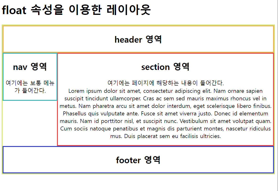
-
저 nav영역도 하려면 어떻게 해야하는지 다시 풀어보기
- page랑 nav의 최소 높이를 맞춰서 어거지로 해결
<!DOCTYPE html>
<html lang="ko">
    <head>
        <title>CSS Float</title>
        <style>
            .page{
                border: 3px solid #d7e77e;
                overflow: auto;
                min-height: 300px;
            }
            h2{
                text-align: center;
            }
            header{border: 3px solid #e7b456;}
            nav{
                border: 3px solid #3eb8b8;
                width: 150px;
                float: left;
                min-height: 260px;
            }
            section{
                border: 3px solid #e64545;
                margin-left: 154px;
            }
            footer{border: 3px solid #3242c0;}
            p{text-align: center;}
        </style>
    </head>

    <body>
        <h1>float 속성을 이용한 레이아웃</h1>
        <div class="page">
            <header>
                <h2>header 영역</h2>
            </header>
            <nav>
                <h2>nav 영역</h2>
                <p>여기에는 보통 메뉴가 들어간다.</p>
            </nav>
            <section>
                <h2>section 영역</h2>
                <p>여기에는 페이지에 해당하는 내용이 들어간다.
                    <br>
                Lorem ipsum dolor sit amet, consectetur adipiscing elit. Nam ornare sapien suscipit tincidunt ullamcorper. Cras ac sem sed mauris maximus rhoncus vel in metus. Nam pharetra arcu sit amet dolor interdum, eget scelerisque libero finibus. Phasellus quis vulputate ante. Fusce sit amet viverra justo. Donec id elementum mauris. Nam id porttitor nisl, et suscipit nunc. Vestibulum sit amet volutpat quam. Cum sociis natoque penatibus et magnis dis parturient montes, nascetur ridiculus mus. Duis placerat sem eu facilisis ultricies.
                </p>
            </section>
            <footer>
                <h2>footer 영역</h2>
            </footer>
        </div>
    </body>
</html>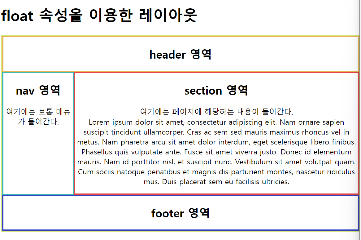
Overflow 속성
-
display
-
inline은 상하를 정할 수 없고, 마진도 상하는 정할 수 없다. 좌우만 줄 수 있다.
-
inline-block은 상하좌우 다 줄 수 있고, 마진도 상하좌우 다 줄 수 있다.
-
중요함 이 개념
-
-
overflow
-
overflow의 기본값이 visible
-
height, width에는 0이 아니라면 단위를 반드시 넣어준다. (px)
-
overflow를 이용한 크기 조정
-
overflow를 이용한 레이아웃
-
-
float
- 이미지와 글이 어울릴 수 있게끔
-
2-0번 예제 : p에 직접 html속성을 줬는데 보통 Css로 준다.
- 2-1번 예제 보면, style에 img - float: left를 줘서 이미지를 왼쪽에 놓고, 그 옆에 글이 올 수 있게끔 짜져있다. 이런 기능으로 float속성을 활용한다(오른쪽에 놓고싶다면 float : right로 놓으면 된다.)
-
clear
- 위치 조정
-
3-2 예제: 이미지에 float : left를 주고 글을 쓰면 왼쪽으로 부유햐게 되는데, p태그에 id태그를 줘서 clear:both한다면, 그 부유하는 성질을 clear시켜서 정상적인 위치로 아래로 출력되는? 형식
- float:right 를 줬다면 clear:right를 주면 되는 형식 - 부유를 상쇄시켜주는
-
hidden
- 요소의 내용이 요소의 경계를 벗어날 때 해당 내용을 잘라내어 보이지 않도록 하는 역할
- 요소의 내용이 너무 커서 요소의 크기를 벗어날 때, 넘치는 부분을 숨기는 역할