
오전 문제 네비게이션
-
Margin
-
마진은 요소 주의의 공간을 나타낸다. >> 요소와 다른 요소 사이의 공간이다.
-
요소의 외부 공간을 조정한다. >> 외부 요소와의 간격을 조절하는데 사용된다.
-
양수, 음수 또는 auto로 설정할 수 있다.
-
-
Padding
-
패딩은 요소 내부의 공간을 나타낸다. >> 요소 내부의 여백이라고 생각할 수 있다.
-
요소 내부의 콘텐츠와 테두리 사이의 공간을 조절한다.
-
양수 값을 사용하여 요소의 크기를 늘리거나, 내부 콘텐츠와 테두리 사이의 공간을 조절할 수 있다.
-
<!DOCTYPE html>
<html>
<head>
    <title>CSS Attribute</title>
    <style>
     body{
        margin: 0;
     }
     ul{
        margin: 0;
        padding: 0;
        list-style-type: none;
        overflow: hidden;
        background-color: bisque;
        position: fixed;
        top: 0;
          /* bottom: 0; 이렇게 하면 아래에 고정*/
        width: 100%;
    }
    li{
        float: left;
        border-right: 1px solid #000000;
        /* border: 1px solid black; */
     }
     li:last-child{
        border-right: none;
     }
     li a{
       padding: 18px 25px;
        display: block;
        color:black;
        text-align: center;
        text-decoration: none;
     }
     li a:hover:not(.active){
        background-color:coral ;
     }
     .active{
        background-color: #e69161;
     }
     div{
        padding: 20px;
        margin-top: 40px;
        height: 1500px;
        background-color: bisque;
        color: black;
     }
    </style>

</head>
<body>
   <ul>
    <li><a class="active" href="#home">Home</a></li>
    <li><a href="#news">News</a></li>
    <li><a href="#contact">Contact</a></li>
    <li><a href="#about">About</a></li>
   </ul>

<div>
    <h1>Fixed Top Navigation Bar</h1>
  <h2>Scroll this page to see the effect</h2>
  <h2>The navigation bar will stay at the top of the page while scrolling</h2>

  <p>Some text some text some text some text..</p>
  <p>Some text some text some text some text..</p>
  <p>Some text some text some text some text..</p>
  <p>Some text some text some text some text..</p>
  <p>Some text some text some text some text..</p>
  <p>Some text some text some text some text..</p>
  <p>Some text some text some text some text..</p>
  <p>Some text some text some text some text..</p>
  <p>Some text some text some text some text..</p>
  <p>Some text some text some text some text..</p>
  <p>Some text some text some text some text..</p>
  <p>Some text some text some text some text..</p>
  <p>Some text some text some text some text..</p>
  <p>Some text some text some text some text..</p>
  <p>Some text some text some text some text..</p>
  <p>Some text some text some text some text..</p>
  <p>Some text some text some text some text..</p>
  <p>Some text some text some text some text..</p>
  <p>Some text some text some text some text..</p>
  <p>Some text some text some text some text..</p>
   </div>
</body>
</html>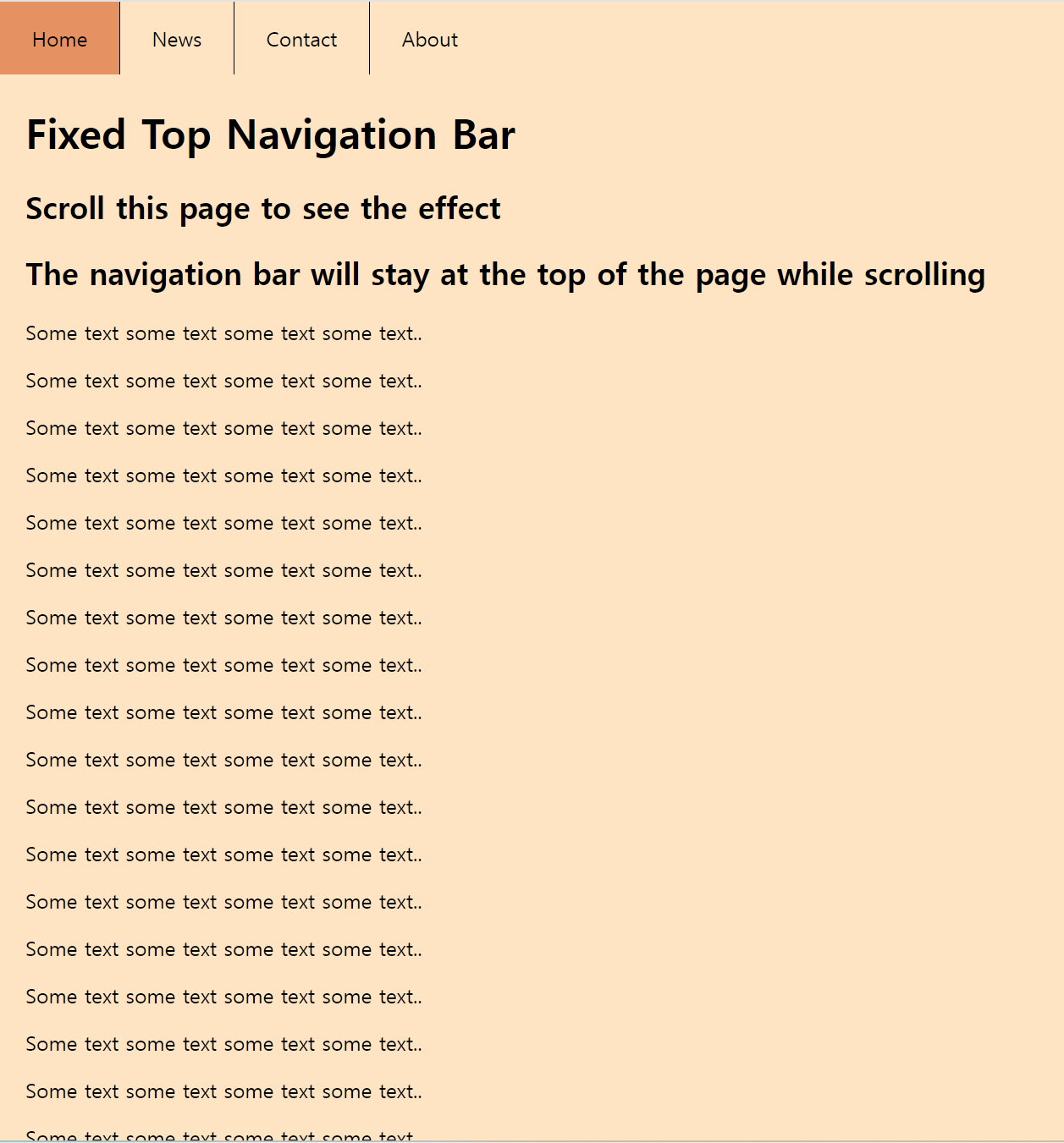
문자
<!DOCTYPE html>
<html>
<head>
    <title>CSS Attribute</title>
    <style>
     p:nth-child(2){
        font-size: 100%;
     }
     p:nth-child(3){
        font-size: 150%;
     }
     p:nth-child(4){
        font-size: 200%;
     }
    </style>

</head>
<body>
   <p>Lorem ipsum dolor sit amet, consectur adipiscing elit.</p>
   <p>Lorem ipsum dolor sit amet, consectur adipiscing elit.</p>
   <p>Lorem ipsum dolor sit amet, consectur adipiscing elit.</p>
   <p>Lorem ipsum dolor sit amet, consectur adipiscing elit.</p>
</body>
</html>
<!DOCTYPE html>
<html>
<head>
<title>CSS Attribute</title>
<style>
p:nth-child(2){
font-size: 1.0em;
}
p:nth-child(3){
font-size: 1.5em;
}
p:nth-child(4){
font-size: 2.0em;
}
</style>
</head>
<body>
<p>Lorem ipsum dolor sit amet, consectur adipiscing elit.</p>
<p>Lorem ipsum dolor sit amet, consectur adipiscing elit.</p>
<p>Lorem ipsum dolor sit amet, consectur adipiscing elit.</p>
<p>Lorem ipsum dolor sit amet, consectur adipiscing elit.</p>
</body>
</html><!DOCTYPE html>
<html>
<head>
<title>CSS3 Style Property Basic</title>
<style>
p:nth-child(1) { }
p:nth-child(2) { font-size: 16px; }
p:nth-child(3) { font-size: 24px; }
p:nth-child(4) { font-size: 32px; }
</style>
</head>
<body>
<p>Lorem ipsum dolor sit amet, consectetur adipiscing elit.</p>
<p>Lorem ipsum dolor sit amet, consectetur adipiscing elit.</p>
<p>Lorem ipsum dolor sit amet, consectetur adipiscing elit.</p>
<p>Lorem ipsum dolor sit amet, consectetur adipiscing elit.</p>
</body>
</html>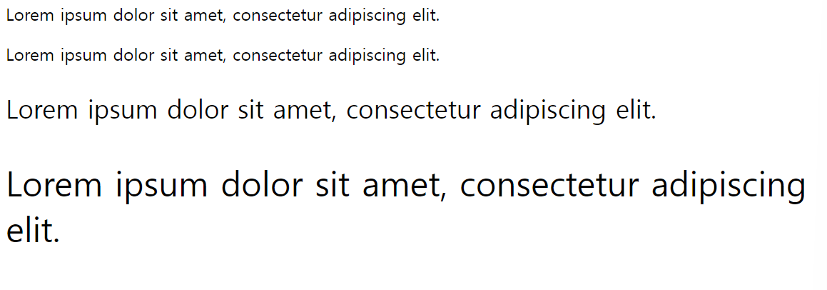
background- color
<!DOCTYPE html>
<html>
<head>
    <title>CSS Attribute</title>
    <style>
     h1{
        background-color: red;
     }
     h2{
        background-color: orange;
     }
    h3{
        background-color: yellow;
    }

    </style>

</head>
<body>
   <h1>h1 태그 입니다.</h1>
   <h2>h2 태그 입니다.</h2>
   <h3>h3 태그 입니다.</h3>
</body>
</html>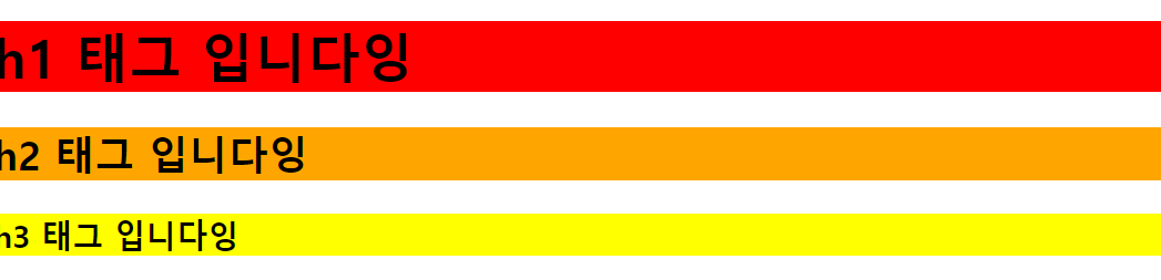
<!DOCTYPE html>
<html>
<head>
    <title>CSS Attribute</title>
    <style>
     div{
        width: 100px;
        height: 100px;
        background-color: green;
     }

    </style>

</head>
<body>
 <div></div>
</body>
</html>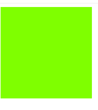
<!DOCTYPE html>
<html>
<head>
    <title>CSS Attribute</title>
    <style>
     div{
        width: 100px;
        height: 100px;
        background-color: green;

        border: 20px solid darkgreen;
        margin: 20px; padding: 30px;
     }

    </style>

</head>
<body>
 <div></div>
</body>
</html>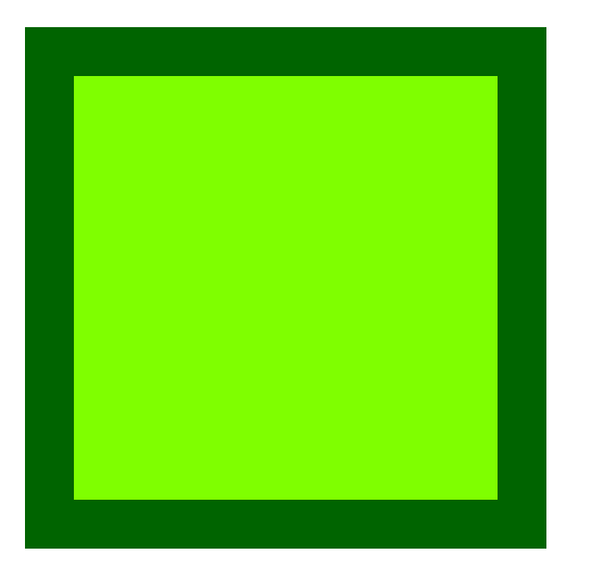
border-style
<!DOCTYPE html>
<html>
<head>
    <title>CSS Attribute</title>
    <style>
    h1{
        border-style: dashed;
        border-width: 2px;
    }

    </style>

</head>
<body>
 <h1>Lorem ipsum dolor amet</h1>
</body>
</html>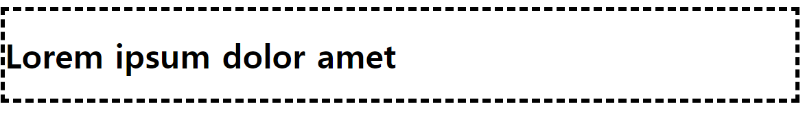
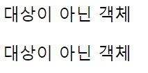
화면에서 숨기기
<!DOCTYPE html>
<html>
<head>
    <title>CSS Attribute</title>
    <style>
   .hide{
    display: none; /*해당 요소를 화면에 숨긴다. */
   }

    </style>

</head>
<body>
    <p>대상이 아닌 객체</p>
    <div id="hide">
        <p class="hide">대상 객체</p>
    </div>
    <p>대상이 아닌 객체<p>
</body>
</html>
p와 span의 차이
-
의미론적 차이
-
<p>(단락 요소): 단락을 나타내며, 일반적으로 텍스트 블록을 구분하는 데 사용됩니다.<p>요소는 보통 단락의 시작과 끝에 사용되며, 브라우저는 일반적으로 단락 사이에 공간을 추가합니다. -
<span>(인라인 요소): 특정 부분의 텍스트나 인라인 요소를 감싸는 데 사용됩니다. 스타일링을 위해 사용되며, 브라우저는 일반적으로<span>요소를 사용하여 텍스트를 특정 스타일로 감싸거나 강조하는 데 사용됩니다.
-
-
디스플레이 속성
-
<p>는 블록 레벨 요소이므로 기본적으로 새로운 줄에서 시작하고 수직으로 쌓입니다. -
<span>은 인라인 요소이므로 줄의 일부로 취급되며, 수평으로 쌓입니다. 이는<span>이 문장 내에서 일부 텍스트에만 스타일을 적용하거나 특정한 효과를 주기 위해 사용될 때 유용합니다.
-
배경 이미지
<!DOCTYPE html>
<html>
<head>
    <title>CSS Attribute</title>
    <style>
        body{
            background-image: url(book1.png);
        }
    </style>

</head>
<body>

</body>
</html>
<!DOCTYPE html>
  <html>
  <head>
    <title>CSS3 Property Basic</title>
    <style>
        body {
            /* 각각의 그림을 레이어라고 부릅니다. */
            background-image: url('BackgroundFront.png'), url('BackgroundBack.png');
        }
    </style>
  </head>
  <body>
먼저 입력한 이미지가 앞에 나오고, 나중에 입력한 이미지가 뒤에 나온다.
최소 너비 조절 문제
- 창의 크기에 맞춰 안에 내용물이 가변적으로 움직이게끔 만들어보자
<!DOCTYPE html>
<html>
<head>
    <title>CSS Attribute</title>
    <style>
        .city{
          float: left;
          margin: 10px;
          padding: 10px;
          max-width: 300px;
          height: 300px;
          border: 1px solid black;
        }
    </style>

</head>
<body>
   <h1>Responsive Web Design Demo</h1>
   <h2> Resize this responsive page!</h2>
   <div class="city">
    <h2>London</h2>
    <p>London is the capital of England.</p>
    <p>It is the most populous city in the United Kingdom. with a metropolitan area of over 13 million inhabitants.</p>
   </div>
   <div class="city">
    <h2>Paris</h2>
    <p>Paris is the capital of France.</p>
    <p>The Paris area is one of the largest population centers in Europe, with more than 12 million inhabitants.</p>
</div>
<div class="city">
    <h2>Tokyo</h2>
    <p>Tokyo is the capital of Japan.</p>
    <p>It is the center of the Greater Tokyo Area, and the most populous metropolitan area in the world.</p>
  </div>

  <div class="city">
    <h2>New York</h2>
    <p>The City of New York is the most populous city in the United States.</p>
    <p>New York is an important center for international diplomacy and has been described as the cultural and financial capital of the world.</p>
  </div>
</body>
</html>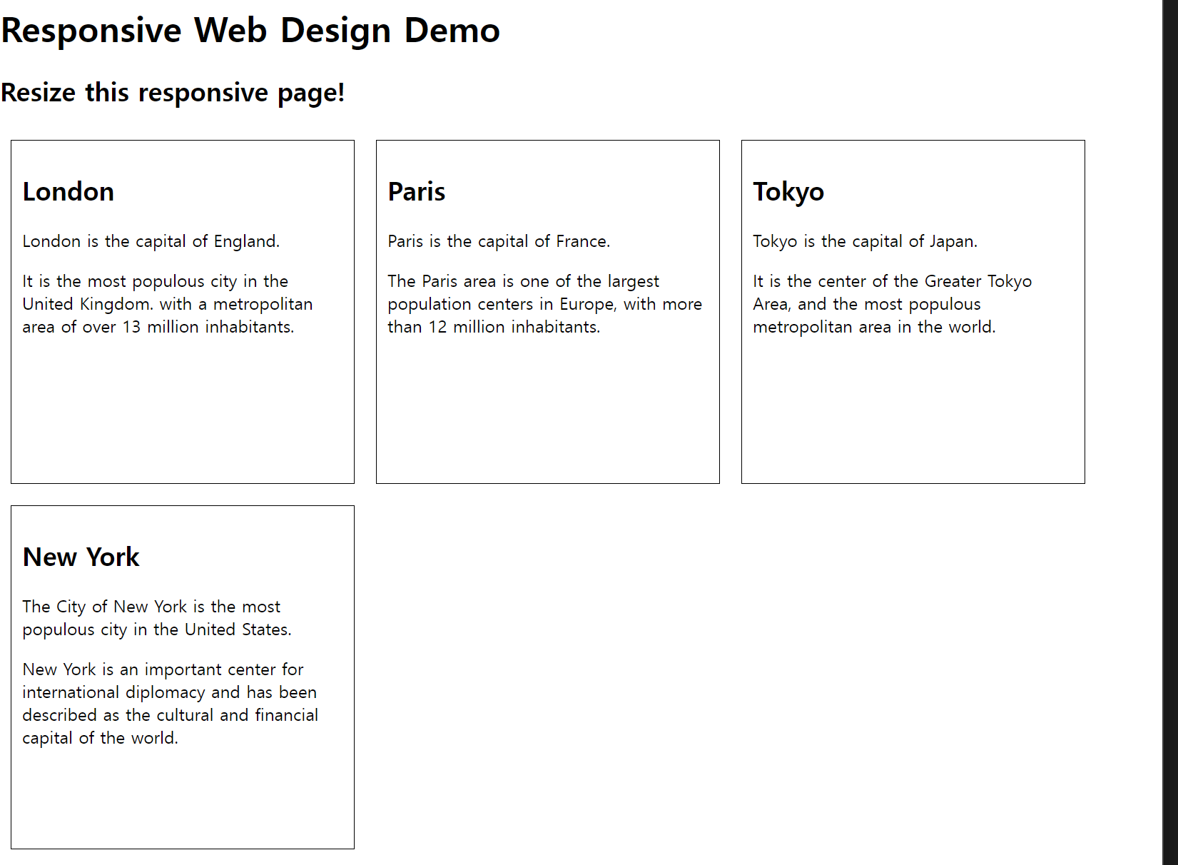
예제
폰트 예제
font-size
-
font-size는 글자 크기를 지정하는 속성이다.
<!DOCTYPE html> <html> <head> <title>CSS3 Font Property</title> <style> .a { font-size: 32px; } .b { font-size: 2em; } .c { font-size: large; } .d { font-size: small; } </style> </head> <body> <h1>Lorem ipsum</h1> <p class="a">Lorem ipsum</p> <p class="b">Lorem ipsum</p> <p class="c">Lorem ipsum</p> <p class="d">Lorem ipsum</p> </body> </html> -
font-falmily
- 개발에 사용하는 컴퓨터 글꼴이 설치되어 있지만 개발한 웹 페이지를 이용하는 사용자의 컴퓨터에는 글꼴이 없을 수 있다. >> font-family 속성을 여러 개 입력한다.
- font-family 속성의 가장 마지막에 Serif 글꼴(명조체), Sans-serif글꼴(고딕체), Mono space 글꼴(고정 폭 글꼴) 같이 웹 브라우저에서 지정하는 generic-family 글꼴을 입력한다.
- 개발에 사용하는 컴퓨터 글꼴이 설치되어 있지만 개발한 웹 페이지를 이용하는 사용자의 컴퓨터에는 글꼴이 없을 수 있다. >> font-family 속성을 여러 개 입력한다.
<!DOCTYPE html>
    <html>
    <head>
        <title>CSS3 Font Property</title>
        <style>
            .font_arial { font-family: Arial; } /*클래스가 font_arial이란는 애 */
            .font_roman { font-family: 'Times New Roman'; }
          /*폰트 이름 사이에 공백이 있는 애들은 따옴표로 묶어줘야 한다. 아니면 인식 못할 수도 있음 */
        </style>
    </head>
    <body>
        <h1 class="font_arial">Lorem ipsum</h1>
        <p class="font_roman">Lorem ipsum dolor sit amet, consectetur adipiscing elit. Etiam malesuada felis id massa adipiscing eget pellentesque ipsum lacinia. In orci massa, venenatis quis ultrices ac, accumsan vitae nunc. Sed eget pellentesque enim. Maecenas eros risus, hendrerit eget lacinia nec, mollis nec velit. Mauris sem mi, molestie sed bibendum eu, blandit et ante. Pellentesque vel mauris et mauris ornare pharetra. Etiam scelerisque pulvinar diam posuere ultrices. Duis et enim at velit ultricies cursus a at felis. Phasellus sit amet est hendrerit lorem convallis consequat ac ut massa. Aliquam luctus porttitor lacus id hendrerit. Nulla facilisi. Aliquam dictum tempus augue, eu tempor dui varius et. In pretium ultricies dapibus.</p></body>
</html>- HTML 페이지에서 p 태그의 기본 크기는 16px입니다. 따라서 32px로 지정한 글자와 2배수를 적용한 글자의 크기가 같다. 또한 h1 태그의 기본 크기는 32px이다.
글꼴 한 개 지정하기
-
일반적으로 한 단어로 이루어진 글꼴 이름은 따옴표를 사용하지 않지만 두 단어 이상으로 이루어지는 글꼴 이름은 따옴표 사용을 추천한다.
<!DOCTYPE html> <html> <head> <title>CSS3 Font Property</title> <style> .font_arial { font-family: '없는 폰트', Arial; } .font_roman { font-family: 'Times New Roman', Arial; } </style> </head> <body> <h1 class="font_arial">Lorem ipsum</h1> <p class="font_roman">Lorem ipsum dolor sit amet, consectetur adipiscing elit. Etiam malesuada felis id massa adipiscing eget pellentesque ipsum lacinia. In orci massa, venenatis quis ultrices ac, accumsan vitae nunc. Sed eget pellentesque enim. Maecenas eros risus, hendrerit eget lacinia nec, mollis nec velit. Mauris sem mi, molestie sed bibendum eu, blandit et ante. Pellentesque vel mauris et mauris ornare pharetra. Etiam scelerisque pulvinar diam posuere ultrices. Duis et enim at velit ultricies cursus a at felis. Phasellus sit amet est hendrerit lorem convallis consequat ac ut massa. Aliquam luctus porttitor lacus id hendrerit. Nulla facilisi. Aliquam dictum tempus augue, eu tempor dui varius et. In pretium ultricies dapibus.</p> </body> </html> -
처음에 font-family에 디자이너가 원하는 글꼴을 넣고, 그 뒤에는 해다 글꼴이 없기에 대비하는 글꼴을 넣고 가장 마지막에는 웹 브라우저의 기본적인 폰트를 넣어준다.
글꼴 여러 개 지정하기
<!DOCTYPE html>
<html>
<head>
    <title>CSS3 Font Property</title>
    <style>
        .font_arial { font-family: '없는 폰트', sans-serif; }
        .font_roman { font-family: '없는 폰트', serif; }
    </style>
</head>
<body>
    <h1 class="font_arial">Lorem ipsum</h1>
    <p class="font_roman">Lorem ipsum dolor sit amet, consectetur adipiscing elit. Etiam malesuada felis id massa adipiscing eget pellentesque ipsum lacinia. In orci massa, venenatis quis ultrices ac, accumsan vitae nunc. Sed eget pellentesque enim. Maecenas eros risus, hendrerit eget lacinia nec, mollis nec velit. Mauris sem mi, molestie sed bibendum eu, blandit et ante. Pellentesque vel mauris et mauris ornare pharetra. Etiam scelerisque pulvinar diam posuere ultrices. Duis et enim at velit ultricies cursus a at felis. Phasellus sit amet est hendrerit lorem convallis consequat ac ut massa. Aliquam luctus porttitor lacus id hendrerit. Nulla facilisi. Aliquam dictum tempus augue, eu tempor dui varius et. In pretium ultricies dapibus.</p>
</body>
</html>- 글꼴이사용자의 컴퓨터에 설치되어 있지 않으므로 사용자의 웹 브라우저에 설정된 고유의 글꼴을 출력한다.
글꼴의 두께와 기울기 조정하기
-
font-style과 font-weight는 글자의 기울기와 두께를 조정하는 속성이다.
-
두께를 지원하지 않는 글꼴은 font-weight 속성을 사용해 두께를 조절할 수 없다.
<!DOCTYPE html>
<html>
<head>
  <title>CSS3 Font Property</title>
  <style>
      .font_big { font-size: 2em; }
      .font_italic { font-style: italic; }
      .font_bold { font-weight: bold; }
  </style>
</head>
<body>
  <p class="font_big font_italic font_bold">Lorem ipsum dolor amet</p>
</body>
</html>
글자 정렬하기 - text align
<!DOCTYPE html>
<html>
<head>
    <title>CSS3 Font Property</title>
    <style>
        .font_big { font-size: 2em; }/* 2em == 2배 */
        .font_italic { font-style: italic; }
        .font_bold { font-weight: bold; }
        .font_center { text-align: center; }
        .font_right { text-align: right; }
    </style>
</head>
<body>
    <p class="font_big font_italic font_bold font_center">Lorem ipsum dolor amet</p>
    <p class="font_bold font_right">2013.12.09</p>
    <p>Lorem ipsum dolor sit amet, consectetur adipiscing elit. Etiam malesuada felis id massa adipiscing eget pellentesque ipsum lacinia. In orci massa, venenatis quis ultrices ac, accumsan vitae nunc. Sed eget pellentesque enim. Maecenas eros risus, hendrerit eget lacinia nec, mollis nec velit. Mauris sem mi, molestie sed bibendum eu, blandit et ante. Pellentesque vel mauris et mauris ornare pharetra. Etiam scelerisque pulvinar diam posuere ultrices. Duis et enim at velit ultricies cursus a at felis. Phasellus sit amet est hendrerit lorem convallis consequat ac ut massa. Aliquam luctus porttitor lacus id hendrerit. Nulla facilisi. Aliquam dictum tempus augue, eu tempor dui varius et. In pretium ultricies dapibus.</p>
</body>
</html>
text-align 스타일 속성과 영역
-
span태그에 text-align 속성은 적용되지 않는다.
-
span 태그는 인라인 형태이므로 너비가 존재하지 않는다.
-
따라서 중앙이라는 개념 자체가 존재하지 않으므로text-align 속성을 적용할 수 없다.
<!DOCTYPE html>
<html>
<head>
<title>CSS3 Font Property</title>
<style>
  .font_center { text-align: center; }
</style>
</head>
<body>
<span class="font_center">Lorem ipsum dolor amet</span>
<p class="font_center">Lorem ipsum dolor amet</p>
</body>
</html>
-
글꼴에 그림자 만들기 및 글자의 높이 지정
- offset-x : 가로 위치입니다. 양수면 오른쪽에, 음수면 왼쪽에 그림자가 만들어집니다. (필수)
- offset-y : 세로 위치입니다. 양수면 아래쪽에, 음수면 위쪽에 그림자가 만들어집니다. (필수)
- border-radius : 그림자를 흐릿하게 만듭니다. 값이 클 수록 더욱 흐려집니다.
- color : 글꼴 색을 정합니다.
<!DOCTYPE html>
<html>
<head>
    <title>CSS3 Font Property</title>
    <style>
        .font_big { font-size: 2em;}
        .font_italic { font-style: italic; }
        .font_bold { font-weight: bold; }
        .font_center { text-align: center; }

        .button {
            width: 150px;
            height: 70px;
            background-color: #FF6A00;
            border: 10px solid #FFFFFF;
            border-radius: 30px; /*테두리 꼭지 둥글게 */
            box-shadow: 5px 5px 5px #A9A9A9;
          /*첫번째 : 오른쪽, 두번째 : 밑에, 세번째 : 그림자 흐림도  그림자 색 */
      /*값이 클수록 그림자가 흐려짐 */
       }
        .button > a {
            display: block;
        }
    </style>
</head>
<body>
    <div class="button">
        <a href="#" class="font_big font_italic font_bold font_center">Click</a>
    </div>
</body>
</html>
    /* offset-x | offset-y | blur-radius | color */
글자를 수직 중앙 정렬하기 line-height
-
line-height : 글자의 높이를 지정한다. 그러나 글자의 높이를 지정하는것 보다 글자를 중앙 정렬할 때더 많이 사용한다.
<!DOCTYPE html> <html> <head> <title>CSS3 Font Property</title> <style> .font_big { font-size: 2em; } .font_italic { font-style: italic; } .font_bold { font-weight: bold; } .font_center { text-align: center; } .button { width: 150px; height: 70px; background-color: #FF6A00; border: 10px solid #FFFFFF; border-radius: 30px; box-shadow: 5px 5px 5px #A9A9A9; } .button > a { /*자손 선택자(바로 밑 하나) > // 후손 선택자 공백 */ display: block; line-height: 70px; } </style> </head> <body> <div class="button"> <a href="#" class="font_big font_italic font_bold font_center">Click</a> </div> </body> </html> -
글자를 감싸는 박스의 높이와 같은 크기인 70px을 line-height 속성으로 지정하면 글자가 수직으로 중앙정렬된다.
하이퍼 링크 밑줄 제거 text-decoration
- a 태그에 href 속성을 지정하면 글자에 밑줄이 생기고 파란색으로 변경된다.
- text-decoration 속성으로는 밑줄만 제거되며 색상은 color 속성을 사용해 별도로 지정해야 한다.
<!DOCTYPE html>
<html>
<head>
    <title>CSS3 Font Property</title>
    <style>
        a { text-decoration: none } /*링크 밑줄 제거 */
    </style>
</head>
<body>
    <h1>
        <a href="#">Lorem ipsum dolor amet</a>
    </h1>
</body>
</html>
position 예제
레이아웃에서 중요
\
- screen: 화면을 표시하는 장치에 스타일을 적용합니다. 일반적으로 모니터, 태블릿, 스마트폰과 같은 디스플레이 장치를 대상으로 한다.
- print: 인쇄물에 스타일을 적용합니다. 프린터와 같은 인쇄 장치를 대상으로 합니다.
- speech: 음성 합성기에 스타일을 적용합니다. 스크린 리더와 같은 보조 기술을 사용하는 장치를 대상으로 한다.
static
-
position속성이 기본적으로 static이므로 세로로 나열된다.
<!DOCTYPE html> <html lang="ko" dir="ltr"> <head> <meta charset="utf-8"> <title>Html Basic</title> <style media="screen"> div{ width:100px; height:100px; } div#a{ /*# == 아이디 선택자*/ background:#52D4FF; } div#b{ background:#FF63EA; } div#c{ background:#C5FF63; } </style> </head> <body> <div id="a"> a 영역 </div> <div id="b"> b 영역 </div> <div id="c"> c 영역 </div> </body> </html> -
만약 div #a 라면 div의 후손이고, 아이디가 a인 애를 의미 잘 봐야함
relative
-
position의 relative는 상대적으로 위치를 잡는다.
-
아래 코드를 보면 left를 이용해 px을 지정하는것을 볼 수 있다.
<!DOCTYPE html>
<html lang="ko" dir="ltr">
<head>
<meta charset="utf-8">
<title>Html Basic</title>
<style media="screen">
div{
  width:100px;
  height:100px;
}
div#a{
  background:#52D4FF;
  position: static;
}
div#b{
  background:#FF63EA;
  position: relative;
  top:0px;
  left:100px; /*#a를 기준으로 100px위치에 그려진다. */
}
div#c{
  background:#C5FF63;
  position: relative;
  top:0px;
  left:200px; /*0px에서 200px위치에 그려진다*/
}
</style>
</head>
<body>
<div id="a">
a 영역
</div>
<div id="b">
b 영역
</div>
<div id="c">
c 영역
</div>
</body>
</html>
-
absoulute
- static과 다른점은 absolutue는 margin 즉, 외부 영역이 없기에 바로 창과 붙어있다.
- b와 c태그가 a를 기준으로 위치를 잡는다.
- a가 부모태그인데, 이때 부모 태그는position을 relative로 주고, 자식에게 absoulute를 주면, 부모태그를 기준으로 위치를 잡는게 공식이다.!! 중요
<!DOCTYPE html>
<html lang="ko" dir="ltr">
  <head>
    <meta charset="utf-8">
    <title>Html Basic</title>
    <style media="screen">
      div{
        width:100px;
        height:100px;
      }
      div#a{
        width:300px;
        height:300px;
        background:#52D4FF;
        position: relative;;
        top:100px; /*top : 위에서 100px떨어진 위치 top이랑 left는 없어도 */
        left:100px; /*left: 왼쪽에서 100px 떨어진 위치*/
      }
      div#b{
        background:#FF63EA;
        position: absolute;
        top:0px;
        left:100px;
      }
      div#c{
        background:#C5FF63;
        position: absolute;
        top:0px;
        left:200px;
      }
    </style>
  </head>
  <body>
    <div id="a"> /*b와 c태그를 a가 감싸고 있음*/
      a 영역
      <div id="b">
        b 영역
      </div>
      <div id="c">
        c 영역
      </div>
    </div>
  </body>
</html>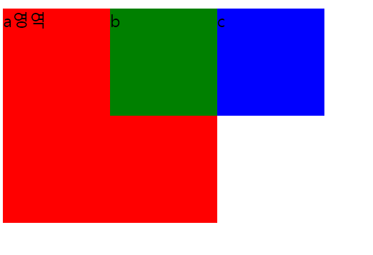
fixed
<!DOCTYPE html>
<html lang="ko" dir="ltr">
  <head>
    <meta charset="utf-8">
    <title>Html Basic</title>
    <style media="screen">
      div{
        width:100px;
        height:100px;
      }
      div#a{
        width:300px;
        height:300px;
        background:#52D4FF;
        position: relative;;
        top:100px; /*top : 위에서 100px떨어진 위치*/
        left:100px; /*left: 왼쪽에서 100px 떨어진 위치*/
      }
      div#b{
        background:#FF63EA;
        position: absolute;
        top:0px; /*부모인  a를 기준으로 위치를 잡음 부모가 relative고, 자식이 absolute니까*/
        left:100px;
      }
      div#c{
        background:#C5FF63;
        position: fixed; /*스크롤을 해도 고정이 된다.*/
        top:0px; /*absolute가 아니므로, 부모를 기준으로 위치를 잡지 않기에 창 상단에 고정*/
        left:200px; /*a
      }
    </style>
  </head>
  <body>
    <div id="a">
      a 영역
      <div id="b">
        b 영역
      </div>
      <div id="c">
        c 영역
      </div>
    </div>
  </body>
</html>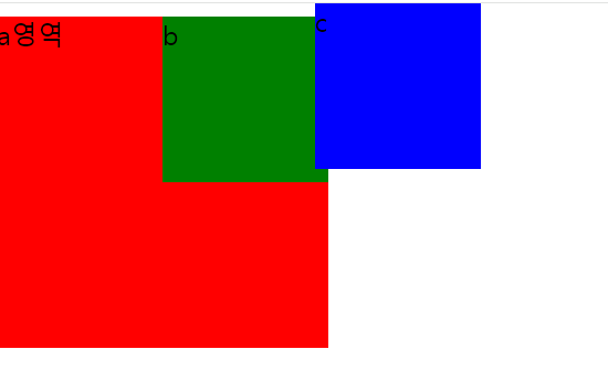
position속성 개념
-
위치 속성 : 프로그램을 개발할 때 요소의 위치는 다음 두 가지 방법으로 설정한다.
- 절대 위치 좌표 : 요소의 X좌표와 Y좌표를 설정해 절대 위치를 지정한다.
- 상대 위치 좌표 : 요소를 입력한 순서에 따른 상대 위치를 지정한다.
-
상대 위치 좌표를 사용할 때는 position 속성에 static이나 relative 키워드를 입력한다.
-
절대 위치 좌표를사용할 때는 position 속성에 absolute나 fixed키워드를 입력한다.
position 속성 키워드
- static : 상대 위치 좌표 설정
- relative: 초기 위치에서 상하좌우로 이동
- absolute : 절대위치 좌표 설정
- fixed : 화면을 기준으로 절대 위치 좌표 설정
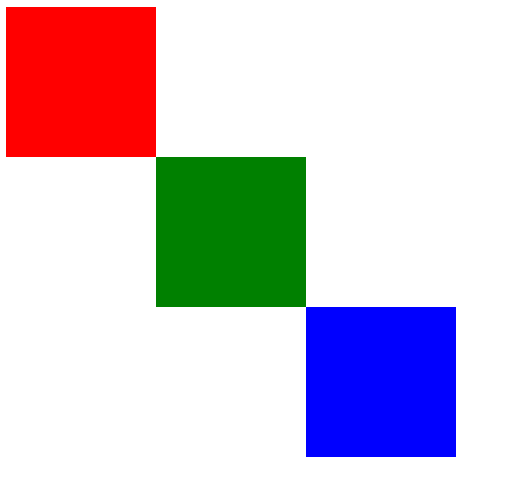
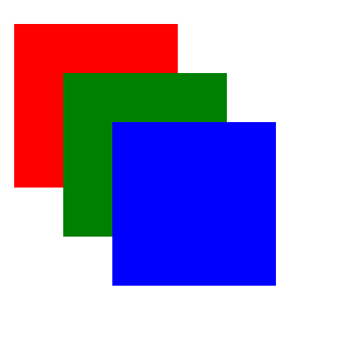
색들이 겹쳐진것처럼 보이기
<!DOCTYPE html>
<html>
<head>
    <title>CSS3 Property Basic</title>
    <style>
        .box {
            width: 100px; height: 100px;
            position: absolute;
        }
        .box:nth-child(1) {
            background-color: red;
            left: 10px; top: 10px;
        }
        .box:nth-child(2) {
            background-color: green;
            left: 50px; top: 50px;
        }
        .box:nth-child(3) {
            background-color: blue;
            left: 90px; top: 90px;
        }
    </style>
</head>
<body>
    <div class="box"></div>
    <div class="box"></div>
    <div class="box"></div>
</body>
</html>
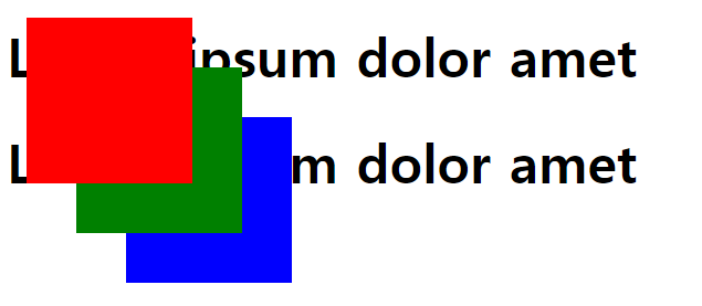
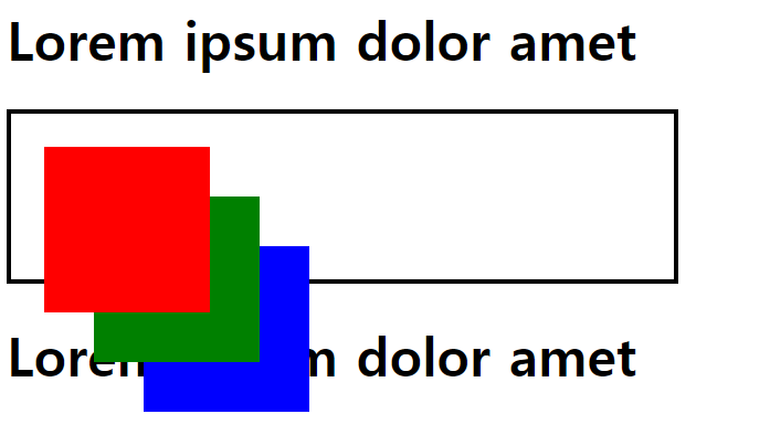
z-index 속성
- 실행 결과에서 도형의 순서를 변경하고 싶을 때는 z-index 속성을 사용
- 숫자를 입력하여 숫자가 클수록 앞에 위치한다.
- z-index 속성에 100, 10, 1을 입력했다.
<!DOCTYPE html>
<html>
<head>
    <title>CSS3 Property Basic</title>
    <style>
        .box {
            width: 100px; height: 100px;
            position: absolute;
        }
        .box:nth-child(1) {
            background-color: red;
            left: 10px; top: 10px;

            z-index: 100;
        }
        .box:nth-child(2) {
            background-color: green;
            left: 50px; top: 50px;

            z-index: 10;
        }
        .box:nth-child(3) {
            background-color: blue;
            left: 90px; top: 90px;

            z-index: 1;
        }
    </style>
</head>
<body>
    <div class="box"></div>
    <div class="box"></div>
    <div class="box"></div>
</body>
</html>
일반적으로 "너는 반드시 앞에 있어야 한다."라는 태그의 z-index 속성에 9999 같이 터무니 없게 큰 값을 입력하기도 한다. 하지만 너무 크게 입력하면 웹 브라우저가 인식을 못할 수도 있다.
위치 속성 공식
오류 예시
<!DOCTYPE html>
<html>
<head>
    <title>CSS3 Property Basic</title>
    <style>
        .box {
            width: 100px; height: 100px;
            position: absolute;
        }
        .box:nth-child(1) {
            background-color: red;
            left: 10px; top: 10px;

            z-index: 100;
        }
        .box:nth-child(2) {
            background-color: green;
            left: 50px; top: 50px;

            z-index: 10;
        }
        .box:nth-child(3) {
            background-color: blue;
            left: 90px; top: 90px;

            z-index: 1;
        }
    </style>
</head>
<body>
    <h1>Lorem ipsum dolor amet</h1>
    <div>
        <div class="box"></div>
        <div class="box"></div>
        <div class="box"></div>
    </div>
    <h1>Lorem ipsum dolor amet</h1>
</body>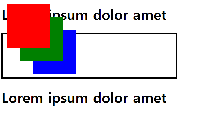
</html>- 문제 파악하기 : 실행 결과에 두 가지 문제가 있다.
- h1 태그 두 개가 붙어 있다(div 태그가 영역을 차지하지 않는다).
- 색상이 적용된 상자가 자신의 부모를 기준으로 위치를 잡지 않는다.
- position 속성에 absolute 키워드를 적용하면 부모 태그가 영역을 차지하지 않는다.
- 자손의 position 속성에 absolute 키워드를 적용할 경우에는 자손의 position 속성에 absolute 키워드를 적용하면 부모에게 height 속성을 입력해야한다.
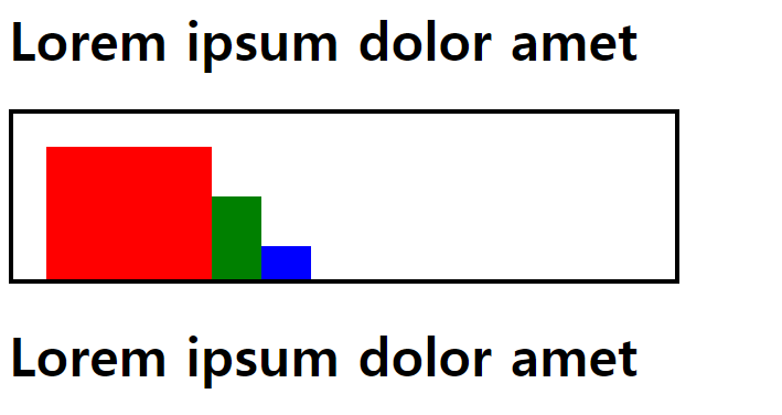
첫 번쨰 문제 해결
<!DOCTYPE html>
<html>
<head>
    <title>CSS3 Property Basic</title>
    <style>
        .box {
            width: 100px; height: 100px;
            position: absolute;
        }
        .box:nth-child(1) {
            background-color: red;
            left: 10px; top: 10px;

            z-index: 100;
        }
        .box:nth-child(2) {
            background-color: green;
            left: 50px; top: 50px;

            z-index: 10;
        }
        .box:nth-child(3) {
            background-color: blue;
            left: 90px; top: 90px;

            z-index: 1;
        }
        body > div { /*자손 선택자*/
            width: 400px; height: 100px;
            border: 3px solid black;
        }
    </style>
</head>
<body>
    <h1>Lorem ipsum dolor amet</h1>
    <div> /*포지션이 다 absolute */
        <div class="box"></div>
        <div class="box"></div>
        <div class="box"></div>
    </div>
    <h1>Lorem ipsum dolor amet</h1>
</body>
</html>- "자손의 position 속성에 absolute 키워드를 적용하면 부모에게 height 속성을 입력한다." 이렇게 하면 부모 태그가 영역을 차지하게 만들 수 있다.
두 번째 문제 해결 옳은 답 - 부모 태그에 position 속성 부여
-
자손의 position 속성을 absolute 키워드로 적용하면 부모의 position 속성을 relative 키워드로 적용한다.
-
이렇게 하면 자손 태그가 부모의 위치를 기준으로 절대 좌표를 설정한다. 이 공식에 따라서 div 태그에 position 속성을 입력한다.
부모를 relative 자손을 absolute로
<!DOCTYPE html>
<html>
<head>
<title>CSS3 Property Basic</title>
<style>
  .box {
      width: 100px; height: 100px;
      position: absolute;
  }
  .box:nth-child(1) {
      background-color: red;
      left: 10px; top: 10px;

      z-index: 100;
  }
  .box:nth-child(2) {
      background-color: green;
      left: 50px; top: 50px;

      z-index: 10;
  }
  .box:nth-child(3) {
      background-color: blue;
      left: 90px; top: 90px;

      z-index: 1;
  }
  body > div {
      width: 400px; height: 100px;
      border: 3px solid black;

      position: relative;
  }
</style>
</head>
<body>
<h1>Lorem ipsum dolor amet</h1>
<div>
  <div class="box"></div>
  <div class="box"></div>
  <div class="box"></div>
</div>
<h1>Lorem ipsum dolor amet</h1>
</body>
</html>
-
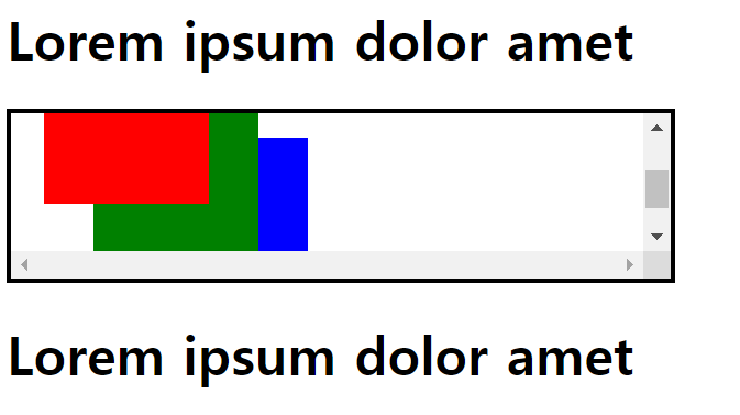
넘치는 부분 숨기기 및 스크롤 형태 - overflow이용
- overflow는 내부의 요소가 부모의 범위를 벗어날 때 요소를 처리하는 방법을 지정하는 속성이다.
- hidden : 영역을 벗어나는 부분을 보이지 않게 만든다.
- scroll : 영역을 벗어나는 부분을 스크롤로 만든다.
<!DOCTYPE html>
<html>
<head>
    <title>CSS3 Property Basic</title>
    <style>
        .box {
            width: 100px; height: 100px;
            position: absolute;
        }
        .box:nth-child(1) {
            background-color: red;
            left: 10px; top: 10px;

            z-index: 100;
        }
        .box:nth-child(2) {
            background-color: green;
            left: 50px; top: 50px;

            z-index: 10;
        }
        .box:nth-child(3) {
            background-color: blue;
            left: 90px; top: 90px;

            z-index: 1;
        }
        body > div {
            width: 400px; height: 100px;
            border: 3px solid black;

            position: relative;
            overflow: hidden;
        }
    </style>
</head>
<body>
    <h1>Lorem ipsum dolor amet</h1>
    <div>
        <div class="box"></div>
        <div class="box"></div>
        <div class="box"></div>
    </div>
    <h1>Lorem ipsum dolor amet</h1>
</body>
</html>- hidden 속성 적용 : div 태그의 overflow 속성에 hidden 키워드를 입력하면 부모의 영역을 벗어난 부분이 모두 숨겨진다.
- scroll 속성 적용 : overflow 속성에 scroll 키워드를 입력하면 div 태그에 스크롤링 생긴다. 부모의 영역을 벗어나는 부분은 스크롤을 내리면 볼 수 있다.
position 문제
<!DOCTYPE html>
<html>
<head>
    <title>CSS Attribute</title>
    <style media="screen">
        .box{
            width: 100px;
            height: 100px;
            position: absolute;
        }
        .box:nth-child(1){
            background-color: red;
            left: 20px;
            top: 20px;
        }
        .box:nth-child(2){
            background-color: green;
            left: 50px;
            top: 50px;
        }
        .box:nth-child(3){
            background-color: blue;
            left: 80px;
            top: 80px;
        }

    </style>
</head>
<body>
   <div class="box"></div>
   <div class="box"></div>
   <div class="box"></div>
</body>
</html><!DOCTYPE html>
<html>
<head>
<title>CSS Attribute</title>
<style media="screen">
.box{
width: 100px;
height: 100px;
position: absolute;
}
.box:nth-child(1){
background-color: red;
left: 20px;
top: 20px;
z-index: 50;
}
.box:nth-child(2){
background-color: green;
left: 50px;
top: 50px;
z-index: 30;
}
.box:nth-child(3){
background-color: blue;
left: 80px;
top: 80px;
z-index: 10;
}
body > div{
width: 400px;
height: 100px;
border: 3px solid black;
position: relative;
}
</style>
</head>
<body>
<h1>Lorem ipsum dolor amet</h1>
<div>
<div class="box"></div>
<div class="box"></div>
<div class="box"></div>
</div>
<h1>Lorem ipsum dolor amet</h1>
</body>
</html> body > div{
width: 400px;
height: 100px;
border: 3px solid black;
position: relative;
overflow: hidden;
}body > div{
width: 400px;
height: 100px;
border: 3px solid black;
position: relative;
overflow: scroll;
}float속성
웹 페이지를 만들 때 가장 많이 사용하는 속성
레이아웃을 잡을 때 많이 사용
-
left 태그를 왼쪽에 붙인다.
-
right 태그를 오른쪽에 붙인다.
-
이미지를 삽입하면 이미지와 글이 분리되서 화면으로 출력하는데, 이때 style안에 img{float: left;} 하게 되면 사진 바로 옆에 글로 붙어서 출력될것이다.
- img는 인라인 형식의 태그이고, p는 블록형식의 태그이므로 분리되서 나타난는 것
shadow text-shadow
-
text-shadow는 글자에 그림자를 부여하는 속성
- text-shadow: 5px 5px 5px 0px black(오른쪽, 아래, 흐림도, 퍼짐 정도, 색상)
-
색상 뒤에 inset 키워드를 넣으면 그림자가 태그 안쪽에 생성된다.
blur 선택지정. 그림자의 흐림 반경. 길이값(px, em, pc, in, 등 ...)
0으로 지정하면 그림자가 진하고, 숫자가 높아질수록 점점 흐릿해짐(양수값만 허용)
따로 지정하지 않으면 0임
text에 그림자 만들기
<!DOCTYPE html>
<html>
<head>
    <title>CSS3 Property Basic</title>
    <style>
        h1 {
            text-shadow: 5px 5px 5px black; /*x축(오른쪽), y축(아, 흐림도(클수록 더 흐림)
        }
    </style>
</head>
<body>
    <h1>Lorem ipsum dolor amet</h1>
</body>
</html>
박스에 그림자 만들기 - inset이용
-
box-shadow는 박스에 그림자가 생기고, inset은 해당 박스 태그 안쪽으로 그림자가 먹는다.
<!-- 박스에 그림자 만들기 -->
<!DOCTYPE html>
<html>
<head>
  <title>CSS3 Property Basic</title>
  <style>
      div {
          border: 3px solid black;
          box-shadow: 10px 10px 30px black inset;
          text-shadow: 5px 5px 5px black;
      }
  </style>
</head>
<body>
  <div class="box">
      <h1>Lorem ipsum dolor amet</h1>
  </div>
</body>
</html>
중첩 그림자 만들기
-
쉼표를 사용하면 여러 개의 그림자 속성을 적용할 수 있다.
<!DOCTYPE html> <html> <head> <title>CSS3 Property Basic</title> <style> .box { border: 3px solid black; box-shadow: 10px 10px 10px black, 10px 10px 20px orange, 10px 10px 30px red; text-shadow: 10px 10px 10px black, 10px 10px 20px orange, 10px 10px 30px red; } </style> </head> <body> <div class="box"> <h1>Lorem ipsum dolor amet</h1> </div> </body> </html> -
CSS3 Generator http://css3generator.com/에 접속하면 box-shadow와 text-shadow 속성을 쉽게 생성할 수 있다.
Gradient
- 두 가지 이상의 색상을 혼합하는 채색 기능이다. >> CSS3부터 그레이디언트 기능을 지원한다.
- 원형 그레이디언트를 생성할 때는 radial-gradient()함수를 사용
- cssgradient.io싸이트 이용해서 사용하는게 더 좋음 툴 이용
  <!DOCTYPE html>
  <html>
  <head>
    <title>CSS3 Style Property Basic</title>
    <style>
        div {
            font-family: 'Times New Roman';
            height: 60px;
            line-height: 60px;
            text-align: center;

background: #a90329; /* Old browsers */
background: -moz-linear-gradient(top,  #a90329 0%, #129903 44%, #d804d1 75%, #6d0019 100%); /* FF3.6-15 */
background: -webkit-linear-gradient(top,  #a90329 0%,#129903 44%,#d804d1 75%,#6d0019 100%); /* Chrome10-25,Safari5.1-6 */
background: linear-gradient(to bottom,  #a90329 0%,#129903 44%,#d804d1 75%,#6d0019 100%); /* W3C, IE10+, FF16+, Chrome26+, Opera12+, Safari7+ */
filter: progid:DXImageTransform.Microsoft.gradient( startColorstr='#a90329', endColorstr='#6d0019',GradientType=0 ); /* IE6-9 */

        }
    </style>

</head>
<body>
    <div>
        <h1>CSS3 그레이디언트</h1>
    </div>
</body>
</html>
벤더 프리픽스
벤더 프리픽스 Vender Prefix는 글자 그대로 번역하면 공급 업체 접두사를 의미한다.
CSS 커서 속성
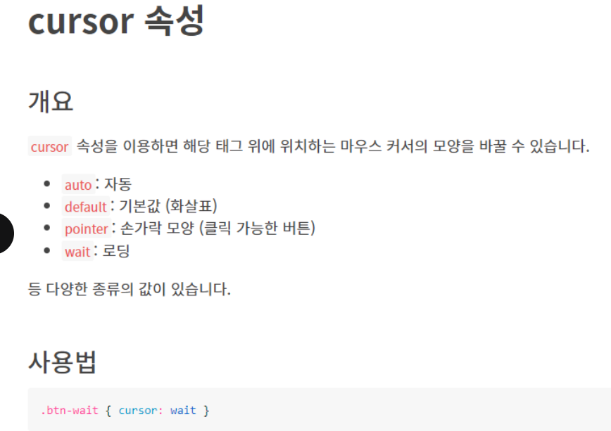
커서 속성들
<!DOCTYPE html>
<html>
<head>
    <style>
        .alias {
            cursor: alias;
        }

        .all-scroll {
            cursor: all-scroll;
        }

        .auto {
            cursor: auto;
        }

        .cell {
            cursor: cell;
        }

        .context-menu {
            cursor: context-menu;
        }

        .col-resize {
            cursor: col-resize;
        }

        .copy {
            cursor: copy;
        }

        .crosshair {
            cursor: crosshair;
        }

        .default {
            cursor: default;
        }

        .e-resize {
            cursor: e-resize;
        }

        .ew-resize {
            cursor: ew-resize;
        }

        .grab {
            cursor: -webkit-grab;
            cursor: grab;
        }

        .grabbing {
            cursor: -webkit-grabbing;
            cursor: grabbing;
        }

        .help {
            cursor: help;
        }

        .move {
            cursor: move;
        }

        .n-resize {
            cursor: n-resize;
        }

        .ne-resize {
            cursor: ne-resize;
        }

        .nesw-resize {
            cursor: nesw-resize;
        }

        .ns-resize {
            cursor: ns-resize;
        }

        .nw-resize {
            cursor: nw-resize;
        }

        .nwse-resize {
            cursor: nwse-resize;
        }

        .no-drop {
            cursor: no-drop;
        }

        .none {
            cursor: none;
        }

        .not-allowed {
            cursor: not-allowed;
        }

        .pointer {
            cursor: pointer;
        }

        .progress {
            cursor: progress;
        }

        .row-resize {
            cursor: row-resize;
        }

        .s-resize {
            cursor: s-resize;
        }

        .se-resize {
            cursor: se-resize;
        }

        .sw-resize {
            cursor: sw-resize;
        }

        .text {
            cursor: text;
        }

        .url {
            cursor: url(myBall.cur), auto;
        }

        .w-resize {
            cursor: w-resize;
        }

        .wait {
            cursor: wait;
        }

        .zoom-in {
            cursor: zoom-in;
        }

        .zoom-out {
            cursor: zoom-out;
        }
    </style>
</head>

<body>

    <h1>The cursor Property</h1>
    <p>Mouse over the words to change the mouse cursor.</p>

    <p class="alias">alias</p>
    <p class="all-scroll">all-scroll</p>
    <p class="auto">auto</p>
    <p class="cell">cell</p>
    <p class="context-menu">context-menu</p>
    <p class="col-resize">col-resize</p>
    <p class="copy">copy</p>
    <p class="crosshair">crosshair</p>
    <p class="default">default</p>
    <p class="e-resize">e-resize</p>
    <p class="ew-resize">ew-resize</p>
    <p class="grab">grab</p>
    <p class="grabbing">grabbing</p>
    <p class="help">help</p>
    <p class="move">move</p>
    <p class="n-resize">n-resize</p>
    <p class="ne-resize">ne-resize</p>
    <p class="nesw-resize">nesw-resize</p>
    <p class="ns-resize">ns-resize</p>
    <p class="nw-resize">nw-resize</p>
    <p class="nwse-resize">nwse-resize</p>
    <p class="no-drop">no-drop</p>
    <p class="none">none</p>
    <p class="not-allowed">not-allowed</p>
    <p class="pointer">pointer</p>
    <p class="progress">progress</p>
    <p class="row-resize">row-resize</p>
    <p class="s-resize">s-resize</p>
    <p class="se-resize">se-resize</p>
    <p class="sw-resize">sw-resize</p>
    <p class="text">text</p>
    <p class="url">url</p>
    <p class="w-resize">w-resize</p>
    <p class="wait">wait</p>
    <p class="zoom-in">zoom-in</p>
    <p class="zoom-out">zoom-out</p>

</body></html>
사용자 정의 커서
-
화면에서 둘리, 하이퍼링크에 커서를 대면 화투 그림
<!DOCTYPE html> <html lang="en"> <head> <meta charset="UTF-8"> <title>Document</title> <style> body, html {cursor: url('d3.cur'), auto} /*이미지를 로드하지 못했을 떄 대체되는 기본커서 스타일*/ a {cursor: url('8kwang.cur'), auto} </style> </head> <body> <a href="http://www.naver.com">네이버</a> </body> </html> -
png를 cur로 변환할 수 있는 변환 사이트가 있어서, 사용자가 커서를 만들 수 있다.
drop down - 커서를 올리면 메뉴가 보임
Position속성
요소의 위치를 지정하는데 사용된다.
-
static
-
요소의 기본 위치. 다른
position값이 지정되지 않은 경우 기본값으로 적용됩니다. -
일반적으로 요소는 문서 흐름에 따라 배치됩니다.
-
-
relative
-
요소를 자신의 원래 위치를 기준으로 상대적으로 이동시킵니다.
-
상대적인 위치 이동을 원할 때 사용됩니다. 다른 요소와의 관계에 따라 상대적인 위치를 조정하는 데 유용합니다.
-
-
absolute
-
요소를 가장 가까운 조상 요소 중
position: relative,position: absolute,position: fixed,position: sticky중 하나인 요소를 기준으로 이동시킵니다. -
주로 레이아웃을 조정하고 부모 요소 내부에 절대적으로 위치시키는 데 사용됩니다.
-
-
fixed
-
요소를 뷰포트(브라우저 창)의 초기 기준점을 기준으로 이동시킵니다. 스크롤에 영향을 받지 않습니다.
-
주로 페이지의 상단이나 하단에 고정된 네비게이션 바, 헤더 등을 만들 때 사용됩니다.
-
-
sticky
-
요소를 상대적인 위치로 시작하고 스크롤되면 고정된 위치로 바뀝니다. 부모 요소 중 하나가 스크롤 가능한 경우에만 동작합니다.
-
요소가 스크롤되는 동안 뷰포트 내에서 고정되어 있는 상단 네비게이션 바나 헤더 등을 만들 때 유용합니다.
-
- 부모 태그 position = relative
- 자식 태그 position = absolute >> 이렇게 적용시켜 자식 요소를 상대적으로 위치시킨다. 요소간의 상대적인 위치를 조정하고 원하는 레이아웃을 만들 수 있다.
  <!DOCTYPE html>
  <html>


<head>
    <style>
        .dropdown {
            position: relative;
            display: inline-block;
        }

        .dropdown-content {
            display: none; /*display를 none 을 줘서 안보이게*/
            position: absolute;
            background-color: #f9f9f9;
            min-width: 160px;
            box-shadow: 0px 8px 16px 0px rgba(0, 0, 0, 0.2);
                      /*세번째는 흐림도, 네번째는 퍼짐의 정도를 의미(클수록 커짐)*/
            padding: 12px 16px;
            z-index: 1;
        }

        .dropdown:hover .dropdown-content {/*dropdows을 hover했을 때 dropdown의 후손 dropdows-content를 block을 준다.(보이게함)*/
            display: block;
        }

    </style>

</head>

<body>

    <h2>Hoverable Dropdown</h2>
    <p>Move the mouse over the text below to open the dropdown content.</p>

    <div class="dropdown">
        <span>Mouse over me</span>
        <div class="dropdown-content">
            <p>Hello World!</p>
        </div>
    </div>

</body>
</html>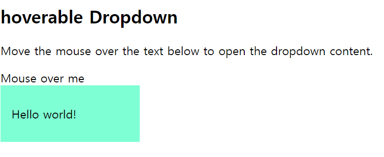
- Mouse over me에 커서를 가져다대면 hello world! 등장
예제2
<!DOCTYPE html>
<html>

<head>
    <style>
        .dropbtn {
            background-color: #4CAF50;
            color: white;
            padding: 16px;
            font-size: 16px;
            border: none;
            cursor: pointer;/*pointer(손가락)모양의 커서를 지정*/
        }

        .dropdown {
            position: relative;
            display: inline-block;/*다른 인라인 요소와 같은줄에 표시하기 위해  inline-block*/
        }

        .dropdown-content {
            display: none;
            position: absolute;
            background-color: #f9f9f9;
            min-width: 160px;
            box-shadow: 0px 8px 16px 0px rgba(0, 0, 0, 0.2);
            z-index: 1;
        }

        .dropdown-content a {
            color: black;
            padding: 12px 16px; /*상하 = 12px, 좌우 = 16px*/
            text-decoration: none;/*앵커태그의 밑줄 없애기*/
            display: block;
        }

        .dropdown-content a:hover {
            background-color: #f1f1f1
        }

        .dropdown:hover .dropdown-content {
            display: block;
        }

        .dropdown:hover .dropbtn {
            background-color: #3e8e41;
        }

    </style>
</head>

<body>

    <h2>Dropdown Menu</h2>
    <p>Move the mouse over the button to open the dropdown menu.</p>

    <div class="dropdown">
        <button class="dropbtn">Dropdown</button>
        <div class="dropdown-content">
            <a href="#">Link 1</a>
            <a href="#">Link 2</a>
            <a href="#">Link 3</a>
        </div>
    </div>

    <p><strong>Note:</strong> We use href="#" for test links. In a real web site this would be URLs.</p>

</body>

</html>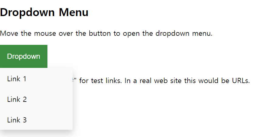
- dropdown에 커서를 올리면 link메뉴가 뜸
예제 3
<!DOCTYPE html>
<html>
<head>
    <style>
        .dropbtn {/*클래스가 dopbtn*/
            background-color: #4CAF50;
            color: white;
            padding: 16px;/*테두리와 내용 사이의 공간*/
            font-size: 16px;
            border: none;
            cursor: pointer;/*손가락 모양*/
        }

        .dropdown {
            position: relative; /*부모태그니까 relative*/
            display: inline-block;
        }

        .dropdown-content {
            display: none;
            position: absolute;/*자식태그니까 absolute*/
            right: 0;
            background-color: #f9f9f9;
            min-width: 160px;/*최소 너비 지정-특정 너비 이하로 줄어들지 않도록*/
            box-shadow: 0px 8px 16px 0px rgba(0, 0, 0, 0.2);
            z-index: 1;
        }

        .dropdown-content a {/*공백 = 후손 선택자*/
            color: black;
            padding: 12px 16px;/*좌우 , 상하*/
            text-decoration: none;/*<a>밑줄 없애기*/
            display: block;
        }

        .dropdown-content a:hover {
            background-color: #f1f1f1;
        }

        .dropdown:hover .dropdown-content {
            display: block;
        }

        .dropdown:hover .dropbtn {
            background-color: #3e8e41;
        }
    </style>
</head>

<body>

    <h2>Aligned Dropdown Content</h2>
    <p>Determine whether the dropdown content should go from left to right or right to left with the left and right properties.</p>

    <div class="dropdown" style="float:left;">/*인라인 스타일*/
        <button class="dropbtn">Left</button>
        <div class="dropdown-content" style="left:0;">
            <a href="#">Link 1</a>
            <a href="#">Link 2</a>
            <a href="#">Link 3</a>
        </div>
    </div>

    <div class="dropdown" style="float:right;">/*인라인 스타일*/
        <button class="dropbtn">Right</button>
        <div class="dropdown-content">
            <a href="#">Link 1</a>
            <a href="#">Link 2</a>
            <a href="#">Link 3</a>
        </div>
    </div>
</body>
</html>
예제 4 - 마우스를 올리면 해당 이미지가 크게 보이게끔
- 부모의 position은 relative :::: 자식의 position 은 absolute
<!DOCTYPE html>
<html>

<head>
    <style>
        .dropdown {
            position: relative;/*부모 태그 포지션*/
            display: inline-block;
        }

        .dropdown-content {
            display: none;/*처음엔 안보임*/
            position: absolute;/*자식 태그 포지션*/
            background-color: #f9f9f9;
            min-width: 160px;
            box-shadow: 0px 8px 16px 0px rgba(0, 0, 0, 0.2);
            z-index: 1;
        }

        .dropdown:hover .dropdown-content {/*dropdown이 hover했을 떄 dropdows의후손 content가 보임*/
            display: block;
        }

        .desc {
            padding: 15px;
            text-align: center;
        }

    </style>
</head>

<body>

    <h2>Dropdown Image</h2>
    <p>Move the mouse over the image below to open the dropdown content.</p>

    <div class="dropdown">
        <img src="img_5terre.jpg" alt="Cinque Terre" width="100" height="50">
        <div class="dropdown-content">
            <img src="img_5terre.jpg" alt="Cinque Terre" width="300" height="200">
            <div class="desc">Beautiful Cinque Terre</div>
        </div>
    </div>

</body>

</html>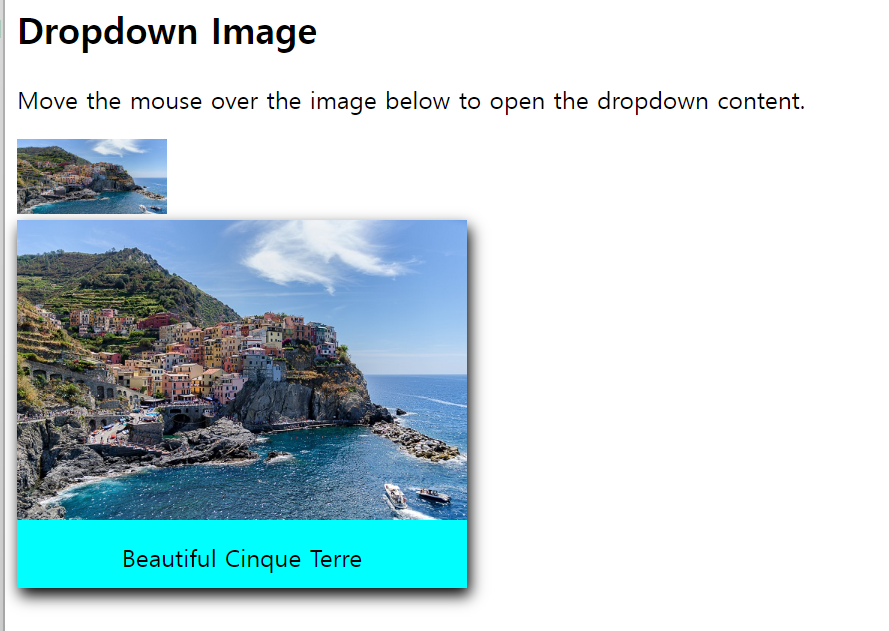
예제 5
<!DOCTYPE html>
<html>
<head>
<style>
ul {
list-style-type: none;
margin: 0;
padding: 0;
overflow: hidden;/*부모 태그 overflow 공식*/
background-color: #333;
}
li {
float: left;
}
li a, .dropbtn {
display: inline-block;
color: white;
text-align: center; /*수평 정렬*/
padding: 14px 16px;
text-decoration: none;
}
li a:hover, .dropdown:hover .dropbtn {/*li의 후손 a를 후버했을때, dropdown클래스를 후버했을때, dropbtn을 후버했을 떄*/
background-color: red;
}
li.dropdown {
display: inline-block;
}
.dropdown-content {
display: none;/*숨기기*/
position: absolute;
background-color: #f9f9f9;
min-width: 160px;
box-shadow: 0px 8px 16px 0px rgba(0,0,0,0.2);
z-index: 1;
}
.dropdown-content a {
color: black;
padding: 12px 16px;
text-decoration: none;
display: block;
text-align: left;
}
.dropdown-content a:hover {background-color: #f1f1f1;}
.dropdown:hover .dropdown-content {
display: block;
}
</style>
</head>
<body>
<ul>
<li><a href="#home">Home</a></li>
<li><a href="#news">News</a></li>
<li class="dropdown">
<a href="javascript:void(0)" class="dropbtn">Dropdown</a>
<div class="dropdown-content">
<a href="#">Link 1</a>
<a href="#">Link 2</a>
<a href="#">Link 3</a>
</div>
</li>
</ul>
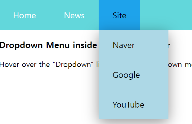
<h3>Dropdown Menu inside a Navigation Bar</h3>
<p>Hover over the "Dropdown" link to see the dropdown menu.</p>
</body>
</html>위에 이용해서 그냥 싸이트 연결해본거
<!DOCTYPE html>
<html>

<head>
    <style>
        ul{
            list-style-type: none;
            overflow: hidden;
            background-color: rgb(98, 215, 219);
            margin: 0px;
            padding: 0;
        }
        li{
            float: left;
        }
        li a, .dropbtn{
            display: inline-block;
            color:white;
            text-align: center;
            text-decoration: none;
            padding: 20px 30px;
            font-size: 18px;

        }
        li:first-child a:hover {
            background-color: transparent;
            color: white;
        }
        li a:hover{
            background-color: rgb(30, 163, 235);
            color: black;
        }
        li.dropdown{
            display: inline-block
        }
        .dropdown-content{
            display: none;
            position: absolute;
            background-color: lightblue;
            min-width: 150px;
            box-shadow: 0px 8px 30px rgba(0, 0, 0, 0.404);
            z-index: 1;
        }
        .dropdown-content a{
            color: black;
            text-decoration: none;
            display: block;
            text-align: left;
        }
        .dropdown-content a:hover{
            background-color: #d3ffc6;
        }
        .dropdown:hover .dropdown-content{
            display: block;
        }
         /* 미디어 쿼리 */
         @media screen and (max-width: 600px) {
            li a,
            .dropbtn {
                font-size: 16px; /* 화면이 600px 이하일 때 글꼴 크기를 줄임 */
                padding: 15px 20px; /* 패딩도 조절 가능 */
            }
    </style>
</head>

<body>
    <ul>
        <li><a href="#home">Home</a></li>
        <li class="dropdown">
            <a class="dropbtn">News</a>
            <div class="dropdown-content">
                <a href="https://news.naver.com/section/100">Political News</a>
                <a href="https://news.naver.com/section/105">It/Science News</a>
                <a href="https://entertain.naver.com/home">Entertainment News</a>
            </div>
        </li>
        <li class="dropdown">
            <a class="dropbtn">Site</a>
            <div class="dropdown-content">
              <a href="https://www.naver.com/?mobile">Naver</a>
              <a href="https://www.google.co.kr/">Google</a>
              <a href="https://www.youtube.com/?app=desktop">YouTube</a>
            </div>
          </li>
    </ul>
    <h3>Dropdown Menu inside a Navigation Bar</h3>
<p>Hover over the "Dropdown" link to see the dropdown menu.</p>

</body>

</html>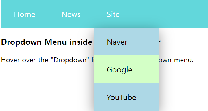
공백처리-white space
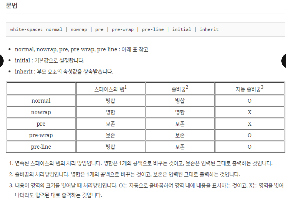
-
white-space는 스페이스와 탭, 줄바꿈, 자동 줄바꿈을 어떻게 처리할지 정하는 속성
-
기본값 normal
-
pre :
 태그와 같은 처리를 한다. 엔터키는
처리되며 줄바꿈은 작성된 형태대로 유지된다. -
nowrap : 줄바꿈을 하지 않는다.
-
-
상속 : yes
-
애니메이션 : no
-
버전 : css leve1
-
<!doctype html>
<html lang="ko">
  <head>
    <meta charset="utf-8">
    <title>CSS</title>
    <style>
      p {
        font-family: Consolas;
        font-size: 16px;
      }
      .t {
        font-weight: bold;
        color: #009688;
      }
      .a {
        white-space: normal;
      }
      .b {
        white-space: nowrap;
      }
      .c {
        white-space: pre;
      }
      .d {
        white-space: pre-wrap;
      }
      .e {
        white-space: pre-line;
      }
    </style>
  </head>
  <body>
    <p class="t">white-space: normal;</p>

    /* nomal : 스페이스바나 탭이 아무리 많아도 하나로 병합, 줄바꿈도 병합 + 자동으로 줄 바뀜*/
    <p class="a">    Lorem ipsum dolor sit amet, consectetur adipiscing elit.
    Nunc viverra lectus in nisl convallis, id mattis tortor ultrices. Quisque a justo non nisl maximus pretium quis sit amet tortor.</p>

    <p class="t">white-space: nowrap;</p>
    /* nowrap : 공백이 아무리 많아도 하나로 병합, 줄 바꿈도 병합 그러나 자동 줄바꿈은 x*/
    <p class="b">    Lorem ipsum dolor sit amet, consectetur adipiscing elit.
    Nunc viverra lectus in nisl convallis, id mattis tortor ultrices. Quisque a justo non nisl maximus pretium quis sit amet tortor.</p>

    <p class="t">white-space: pre;</p>
    /* pre : 공백이 있는 만큼 보존되서 출력, 줄 바꿈 또한 보존되어 br되서 출력 + 자동 줄바꿈은 x*/
    <p class="c">    Lorem ipsum dolor sit amet, consectetur adipiscing elit.
    Nunc viverra lectus in nisl convallis, id mattis tortor ultrices. Quisque a justo non nisl maximus pretium quis sit amet tortor.</p>

    <p class="t">white-space: pre-wrap;</p>
    <p class="d">    Lorem ipsum dolor sit amet, consectetur adipiscing elit.
    Nunc viverra lectus in nisl convallis, id mattis tortor ultrices. Quisque a justo non nisl maximus pretium quis sit amet tortor.</p>

    <p class="t">white-space: pre-line;</p>
    <p class="e">    Lorem ipsum dolor sit amet, consectetur adipiscing elit.
    Nunc viverra lectus in nisl convallis, id mattis tortor ultrices. Quisque a justo non nisl maximus pretium quis sit amet tortor.</p>
  </body>
</html>
초기화 코드
각자 어느 웹사이트를 만들지 잘 생각해서 초기화할지 안할지를 결정해야 한다.
-
자주 사용하는 초기화 코드 링크
-
Eric Meyer's Reset CSS https://meyerweb.com/eric/tools/css/reset/
-
HTML5 Doctor CSS Reset http://html5doctor.com/html-5-reset-stylesheet/
Text overflow속성
- clip 기본값. 텍스트를 자름
- ellipsis 잘린 텍스트를 생략 부호(...)로 표시함
- string 잘린 텍스트를 지정한 문자열로 표시 예: div{text-overflow:"---";} >> 현재 지원하는 브라우저 x
<!DOCTYPE html>
<html>
<head>
<style>
div.a {
  white-space: nowrap;
  width: 50px;
  overflow: hidden;
  text-overflow: clip;
  border: 1px solid #000000;
}

div.b {
  white-space: nowrap;
  width: 50px;
  overflow: hidden;
  text-overflow: ellipsis;
  border: 1px solid #000000;
}

div.c {
  white-space: nowrap;
  width: 50px;
  overflow: hidden;
  text-overflow: "----";
  border: 1px solid #000000;
}
</style>
</head>
<body>

<h1>The text-overflow Property</h1>

<p>The following two divs contains a text that will not fit in the box.</p>

<h2>text-overflow: clip (default):</h2>
<div class="a">Hello world!</div>

<h2>text-overflow: ellipsis:</h2>
<div class="b">Hello world!</div>

<h2>text-overflow: "----" (user defined string):</h2>/*지원하는 브라우저 존재 x*/
<div class="c">Hello world!</div>

<p><strong>Note:</strong> The text-overflow: "<em>string</em>" only works in
Firefox.</p>

</body>
</html>
address태그 - 주소 입력
-
\
단락태그 상하단에 여백이 존재한다. 아무리 줄을 바꾸고 공백을 2개이상 추가하더라도 한줄로 출력된다. -
\
p 태그와 달리 내가 쓰는 대로 웹페이지에 표시한다. 공백 줄바꿈 모두 적용된다.
구글 웹 폰트
웹 브라우저는 사용자의 컴퓨터에 설치된 폰트만 사용할 수 있다. >> 개발자 컴퓨터에는 설치되어 있지만 사용자의 컴퓨터에 폰트가 설치되어 있지 않아 문제가 된다. 이때 웹 폰트를 사용한다.
-
사용자가 웹 페이지에 접속하는 순간 폰트를 자동으로 내려받고 해당 웹 페이지에서 사용할 수 있게 만들어주는 기능이다.
-
구글 웹 폰트 링크: http://www.google.com/webfonts
<!DOCTYPE html>
<html lang="en">
<head>
    <meta charset="UTF-8">
    <title>Document</title>

    <link href="https://fonts.googleapis.com/css2?family=Chilanka&display=swap" rel="stylesheet">
    <style>
        h1{
            font-family: 'Chilanka', cursive;
        }
    </style>
</head>
<body>
    <h1>Good morning</h1>
    <h2>Good morning</h2>
</body>
</html>-
링크에서 embeded를 이용해 linke 코드를 카피해 클래스를 넣으면 된다.(위 코드는 style밖에 아래 코드는 style안에)
- body에서 클래스 이름을 명시해서 사용하면 된다.(위아래 코드 다 사용)
-
link가 아닌 @import를 이용한다면, 코드를 카피해서, 외부 스타일 시트이므로 style 안에 넣을 필요가 없다.(style이 필요없음 이 한정으로는)
- 똑같이 body안에서 클래스 이름을 주면 된다.
예시
<!DOCTYPE html>
<html lang="en">
<head>
    <meta charset="UTF-8">
    <title>Document</title>

    <link rel="preconnect" href="https://fonts.googleapis.com">
    <link rel="preconnect" href="https://fonts.gstatic.com" crossorigin>
    <link href="https://fonts.googleapis.com/css2?family=Jersey+10+Charted&display=swap" rel="stylesheet">
    <style>
        .jersey-10-charted-regular {
     font-family: "Jersey 10 Charted", sans-serif;
    font-weight: 400;
    font-style: normal;
}
    </style>
</head>
<body>
    <h1 class="jersey-10-charted-regular">Good morning</h1>
    <h2>Good morning</h2>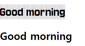
<!DOCTYPE html>
<html lang="en">
<head>
    <meta charset="UTF-8">
    <title>Document</title>

    <link rel="preconnect" href="https://fonts.googleapis.com">
    <link rel="preconnect" href="https://fonts.gstatic.com" crossorigin>
    <link href="https://fonts.googleapis.com/css2?family=Jersey+10+Charted&family=Satisfy&display=swap" rel="stylesheet">
    <style>
       .satisfy-regular {
  font-family: "Satisfy", cursive;
  font-weight: 400;
  font-style: normal;
        }

    </style>
</head>
<body>
    <h1 class="satisfy-regular">Good morning</h1>
    <h2>Good morning</h2>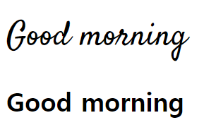
자바 라이브러리 만드는 법
my_application프로젝트에서 다른 프로젝트에 존재하는 A와 B클래스를 사용해 메인 메소드를 실행하면 my_lib라이브러리의 기능을 사용할 수 있다.
-
라이브러리 : 라이브러리(library)는 프로그램 개발 시 활용할 수 있는 클래스와 인터페이스들을 모아놓은 것을 말한다.
- JAR(Java Archive) 압축 파일(~.jar) 형태로 존재한다. JAR 파일에는 클래스와 인터페이스의 바이트크도 파일(~.class) 들이 압축되어 있다.
-
my_lib 라이브러리 프로젝트 생성 : 이름은 아무래도 상관 없음
-
각각의 패키지 안에 A와 B의 명을 가지고 있는 클래스 파일을 만든다. : 마찬가지로 이름은 상관 x
- 안에 메소드는
public void method(){syso"A class method"}/public void method(){syso"B class method"}
- 안에 메소드는
-
my_lib프로젝트를 선택하고 마우스 오른쪽 버튼을 클릭하여 [New]-[Folder]를 선택해 이름이 dist인 폴더를 생성한다.
-
my_lib 프로젝트를 선택하고 마우스 오른쪽 버튼을 클릭해 [Export]를 선택한다.
-
Export 대화상자의 Java 항목의 JAR fil을 선택한 후 [Next] 버튼을 클릭한다.
-
my_lib항목에서 src만 선택하고 나머지는 선택 해제한다. 후에 next버튼을 클릭한다. >> 그리고 생성한 dist 폴더를 선택해 이름을 주고 저장한다.(my_lib.jar)
-
-
my_application 프로젝트 생성
-
my_application에 메인 클래스 생성(Main Class)
-
my_application (메인 클래스로 사용할)프로젝트를 이클립스에서 컴파일할 때 라이브러리 파일인 my_lib.jar을 사용하기 위해 Build Path에 추가
- 우 클릭 후 **bulid path- configure build path - libraries - Classpath항목 선택 - [Add External JARs] 버튼**을 클릭한다.
-
my_application프로젝트에 다음 소스코드를 작성
package app; import pack1.A; import pack2.B; public class Main { public static void main(String[] args) { A a = new A(); a.method(); B b = new B(); b.method(); } } -
라이브러리 프로젝트를 직접 Build Path에 추가하기
라이브러리와 응용프로그램을 동시에 개발하는 경우 my_lib 프로젝트를 my_application 프로젝트에서 바로 Build Path에 추가할 수 있다. 이렇게 하면 my_lib 프로젝트를 수정하는 즉시 my_application에서 수정된 내용을 사용할 수 있게 된다.
-
my_application 프로젝트를 선택하고 마우스 오른쪽 버튼을 클릭하여 [Build Path] - [Configure Build Path] 메뉴를 선택한다.
-
[Projects] 탭에 들어가 Required projects on the build path에서 Classpath 항목을 선택하고 [Add] 버튼을 클릭한다.
-
my_lib 프로젝트를 선택한 후 [OK]와 [Apply and Close] 버튼을 차례대로 클릭해 추가한다.
-
ctrl + shift + f10 : context메뉴 뜸
화면 녹화에 좋은 앱 : 녹음, 판서도 가능
ZoomIt - Sysinternals | Microsoft Learn
다운받으면 처음 .exe를 실행시키면 된다.
