
오전문제 나라별 내용~
<!DOCTYPE html>
<html lang="en">
<head>
    <meta charset="UTF-8">
    <title>Document</title>
    <style>
      .city{
        margin: 5px;
        padding: 10px;
        max-width: 300px;
        width: 300px;
        height: 300px;
        float: left;
        border: 2px solid black;

      }

    </style>
</head>
<body>
    <h1>Responsive Web Design Demo</h1>
    <h2>Resize this reponsive page!</h2>
    <div class="city">
        <h2>London</h2>
        <p>London is the capital of England</p>
        <p>It is the most populous city in the United Kingdom, with a metropolitan area of over 13 million inhabitants.</p>
    </div>
    <div class="city">
        <h2>Paris</h2>
        <p>Paris is the capital of France.</p>
        <p>The Paris area si one of the largest population centers in Europe, with more than 12 million inhabitants.</p>
    </div>
    <div class="city">
        <h2>Tokyo</h2>
        <p>Tokyo is the capital of Japan.</p>
        <p>It is the center of the Greater Tokyo Area, and the most populous metropolitan area in the world.</p>
    </div>
    <div class="city">
        <h2>New York</h2>
        <p>The City of New York is the most populous city in the United States.</p>
        <p>New York is an important center for international diplomcy and has been descibed as the cultural and financial capital of the world.</p>
    </div>
</body>
dropdown- 이미지에 후버
<!DOCTYPE html>
<html lang="en">
<head>
<meta charset="UTF-8">
<title>dropdown4</title>
<style>
.dropdown{
position: relative;
display: inline-block;
}
.dropdown-content{
display: none;
position: absolute;
min-width: 150px;
box-shadow: 2px 5px 10px 0px;
z-index: 1;
background-color: aqua;
}
.dropdown:hover .dropdown-content{
display: block;
}
/* img:nth-child(1){
width: 100px;
height: 50px;
} */
.word{
padding: 10px;
text-align: center;
}
</style>
</head>
<body>
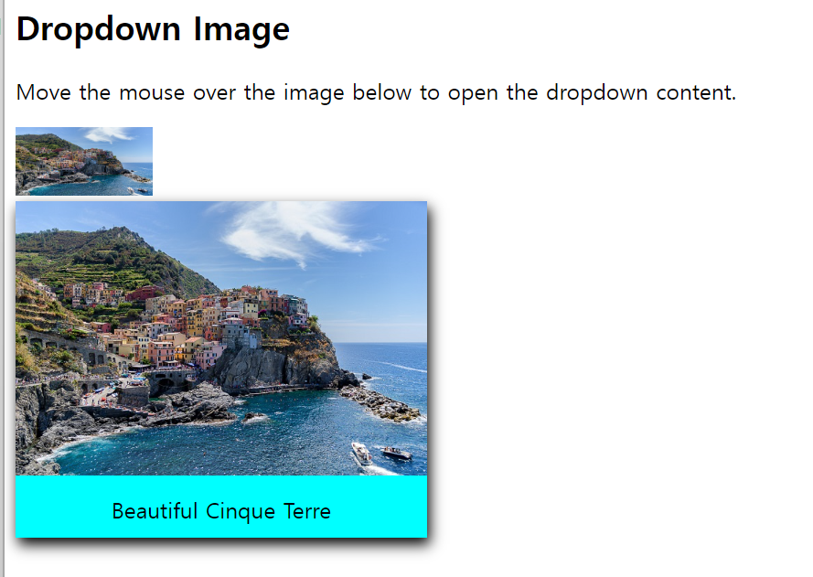
<h2>Dropdown Image</h2>
<p>Move the mouse over the image below to open the dropdown content.</p>
<div class="dropdown">
<img src="country.jpg" alt="Dropdown img" width="100" height="50">
<div class="dropdown-content">
<img src="country.jpg" alt="dropdown-content img" width="300" height="200">
<div class="word">Beautiful Cinque Terre</div>
</div>
</div>
</body>
</html>-
처음에는 클래스에 nth-child()와 last-child를 이용해서 사진 크기를 주려고 했는데, 후버했을 때 보이는 사진이 dropdown인 클래스의 사진 크기와 똑같이 나오는 것이다.
-
저 둘은 요소의 위치에 따라 스타일을 적용하는데, nth-child는 해당 선택자로 지정된 요소의 순서에 따라 스타일을 적용하고,
-
last-child는 해당 요소가 부모 부모 요소 내에서 마지막 자식 요소일 떄 스타일을 적용한다. >> 그냥 직접 크기를 지정하면 CSS가 이미지를 제어해 원하는 크기로 표시괴는데, 선택자를 사용하여 크기를 지정하면 선택자에 따라 스타일이 적용되서 후버 했을 떄 크기가 원하는대로 나오지 않을 수 있다,
그냥 직접 크기를 지정하는게 좋겠다..
-
네비게이션 바를 이용해 사이트 연결
<!DOCTYPE html>
<html>

<head>
    <style>
        ul{
            list-style-type: none;
            overflow: hidden;
            background-color: rgb(98, 215, 219);
            margin: 0px;
            padding: 0;
        }
        li{
            float: left;
        }
        li a, .dropbtn{
            display: inline-block;
            color:white;
            text-align: center;
            text-decoration: none;
            padding: 20px 30px;
            font-size: 18px;

        }
        li:first-child a:hover {
            background-color: transparent;
            color: white;
        }
        li a:hover{
            background-color: rgb(30, 163, 235);
            color: black;
        }
        li.dropdown{
            display: inline-block
        }
        .dropdown-content{
            display: none;
            position: absolute;
            background-color: lightblue;
            min-width: 150px;
            box-shadow: 0px 8px 30px rgba(0, 0, 0, 0.404);
            z-index: 1;
        }
        .dropdown-content a{
            color: black;
            text-decoration: none;
            display: block;
            text-align: left;
        }
        .dropdown-content a:hover{
            background-color: #d3ffc6;
        }
        .dropdown:hover .dropdown-content{
            display: block;
        }
         /* 미디어 쿼리 */
         @media screen and (max-width: 600px) {
            li a,
            .dropbtn {
                font-size: 16px; /* 화면이 600px 이하일 때 글꼴 크기를 줄임 */
                padding: 15px 20px; /* 패딩도 조절 가능 */
            }
    </style>
</head>

<body>
    <ul>
        <li><a href="#home">Home</a></li>
        <li class="dropdown">
            <a class="dropbtn">News</a>
            <div class="dropdown-content">
                <a href="https://news.naver.com/section/100">Political News</a>
                <a href="https://news.naver.com/section/105">It/Science News</a>
                <a href="https://entertain.naver.com/home">Entertainment News</a>
            </div>
        </li>
        <li class="dropdown">
            <a class="dropbtn">Site</a>
            <div class="dropdown-content">
              <a href="https://www.naver.com/?mobile">Naver</a>
              <a href="https://www.google.co.kr/">Google</a>
              <a href="https://www.youtube.com/?app=desktop">YouTube</a>
            </div>
          </li>
    </ul>
    <h3>Dropdown Menu inside a Navigation Bar</h3>
<p>Hover over the "Dropdown" link to see the dropdown menu.</p>

</body>

</html>
구글 웹 폰트 적용
<!DOCTYPE html>
<html lang="en">
<head>
    <meta charset="UTF-8">
    <title>dropdown4</title>
    <link rel="preconnect" href="https://fonts.googleapis.com">
    <link rel="preconnect" href="https://fonts.gstatic.com" crossorigin>
    <link href="https://fonts.googleapis.com/css2?family=Jersey+10+Charted&family=Satisfy&display=swap" rel="stylesheet">
    <style>
       .satisfy-regular {
  font-family: "Satisfy", cursive;
  font-weight: 400;
  font-style: normal;
        }
    </style>
</head>
<body>
    <h1 class="satisfy-regular">Good morning</h1>
    <h1 class="satisfy-regular">안녕하세요.</h1>
</body>
</html>
자바 라이브러리 만들기
-
my_lib 라이브러리 프로젝트 생성:
- 이클립스에서 새 Java 프로젝트를 만듭니다. 이름은
my_lib이라고 지정합니다.
- 이클립스에서 새 Java 프로젝트를 만듭니다. 이름은
-
A와 B 클래스 생성:
-
my_lib프로젝트 안에pack1패키지와pack2패키지를 각각 만듭니다. -
pack1패키지 안에A클래스를 만들고, 메소드는 다음과 같이 작성합니다:javaCopy code
package pack1; public class A { public void method() { System.out.println("A class method"); } } -
pack2패키지 안에B클래스를 만들고, 메소드는 다음과 같이 작성합니다:javaCopy code
package pack2; public class B { public void method() { System.out.println("B class method"); } }
-
-
Export로 JAR 파일 생성:
my_lib프로젝트를 선택하고 마우스 오른쪽 버튼을 클릭하여 [Export]를 선택합니다.- Export 대화상자에서 Java 항목의 JAR file을 선택한 후 [Next] 버튼을 클릭합니다.
my_lib항목에서src만 선택하고 나머지는 선택 해제한 후 Next를 클릭합니다.- 생성한
dist폴더를 선택해 이름을 주고 저장합니다 (예:my_lib.jar).
-
my_application 프로젝트 생성:
- 새 Java 프로젝트를 만들어 이름을
my_application으로 지정합니다.
- 새 Java 프로젝트를 만들어 이름을
-
메인 클래스 생성:
-
my_application프로젝트 안에 메인 클래스를 만듭니다. -
이클립스에서 새로운 Java 클래스를 생성하고 이름을
Main으로 지정합니다. -
다음 코드를 메인 클래스에 작성합니다:
package app;

import pack1.A;
import pack2.B;

public class Main {

    public static void main(String[] args) {
        A a = new A();
        a.method();

        B b = new B();
        b.method();
    }

}
-
-
라이브러리 프로젝트를 Build Path에 추가:
my_application프로젝트를 선택하고 마우스 오른쪽 버튼을 클릭하여 [Build Path] - [Configure Build Path] 메뉴를 선택합니다.- [Projects] 탭에 들어가 Required projects on the build path에서 Classpath 항목을 선택하고 [Add] 버튼을 클릭합니다.
my_lib프로젝트를 선택한 후 [OK]와 [Apply and Close] 버튼을 차례대로 클릭하여 추가합니다.
이제 my_application 프로젝트에서 A와 B 클래스를 사용하여 메인 메소드를 실행하면 my_lib 라이브러리의 기능을 사용할 수 있습니다.
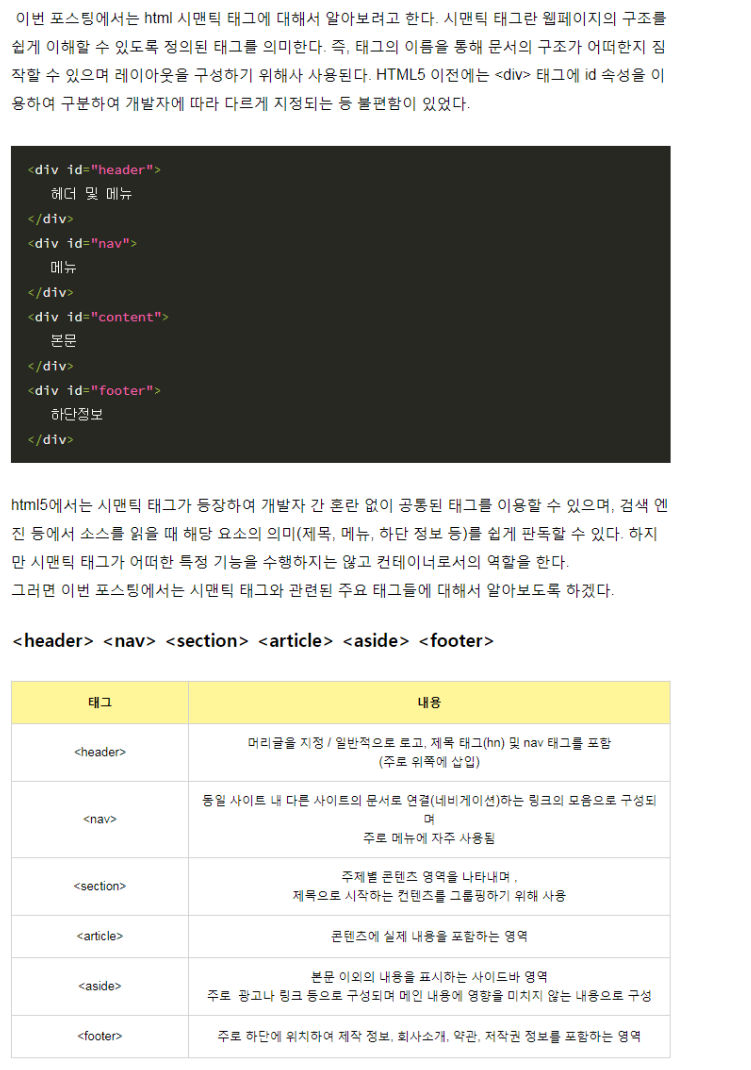
시맨틱 태그 semantic tags
유저가 웹에서 검색을 했을 때 웹 페이지의 해당 코드를 찾아 그 정보를 기반으로 의미있는 내용이 출력되도록 도와준다.
이렇게 웹 문서를 구조화하여 시맨틱 태그를 사용한 웹을 시맨틱 웹이라고 한다.
- form / table / article등 자신의 컨텐츠를 명확하게 정의
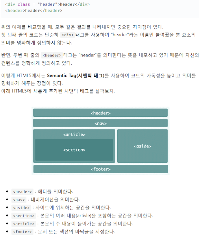
html 시맨틱 태그 레이아웃
<!DOCTYPE html>
<html lang="en">
<head>
    <meta charset="UTF-8">

</head>
<body>
   <header>
    <h2 style="text-align: center;">JOKER'S ROON</h2>
    <nav>
        <span>
            <a href="hhtp://www.naver.com">naver</a>
        </span>
        <span>
            <a href="http://www.google.co.kr">google</a>
        </span>
    </nav>
   </header>
   <hr />
   <section>
    <article>
        <h3>naver</h3>
        <p>대한민국 1등 웹 포털</p>
    </article>
    <hr />
    <article>
        <h3>google</h3>
        <p>대한민국 1등 웹 포털</p>
    </article>
   </section>
   <aside>
    광고 영역
   </aside>
   <footer>
    Copy-right@ Joker
   </footer>
</body>
</html>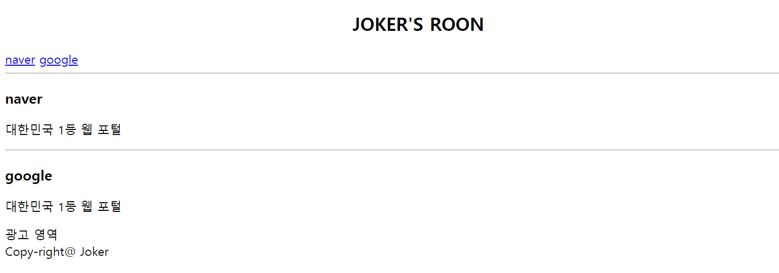
box-sizing
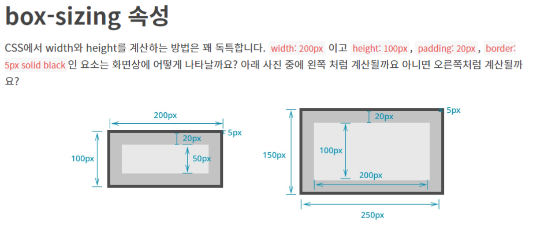
-
오른쪽 처럼 계산된다. : conten-box
-
왼쪽처럼 계산 : border-box
conten-box
box-sizing에 디폴트 값 :content-box
- width를 200px 로 설정해도, 전체 너비를 말하는 것이 아닌 padding 과 border-width가 더해져서 그려지게 된다. >> 이런 계산 방법을 content-box라고 한다.
-
container1 > div : ">" 자손 선택자
-
conten-box로 child1인 애가 부모 영역을 벗어나게 된다. >> 나머지는 box-sizing을 border-box로 줘서 부모의 width만큼만 차지하며 영역을 벗어나지 않는다.
border-box
위 사진의 왼쪽처럼 계산된다.
형태구조 선택자
-
first-of-type 형제 관계 중에서 첫 번째로 등장하는 특정 태그를 선택한다.
-
last-of-type 형제 관계 중에서 마지막으로 등장하는 특정 태그를 선택한다.
-
nth-of-type(수열) 형제 관계 중에서 앞에서 수열 번째로 등장하는 특정 태그를 선택한다.
-
nth-last-of-type(수열) 형제 관계 중에서 뒤에서 수열 번째로 등장하는 특정 태그를 선택한다.
예시 1
<!DOCTYPE html>
<html>
<head>
    <title>CSS3 Selector Basic Page</title>
    <style>
        h1:first-of-type { color: red; }
        h2:first-of-type { color: red; }
        h3:first-of-type { color: red; }
    </style>
</head>
<body>
    <h1>Header - 1</h1>
    <h2>Header - 2</h2>
    <h3>Header - 3</h3>
    <h3>Header - 3</h3>
    <h2>Header - 2</h2>
    <h1>Header - 1</h1>
</body>
</html>
예시 2-1
<!DOCTYPE html>
<html>
<head>
    <title>CSS3 Selector Basic Page</title>
    <style>
        body > *:first-of-type { color: red; }
    </style>
</head>
<body>
    <h1>Header - 1</h1>
    <h2>Header - 2</h2>
    <h3>Header - 3</h3>
    <h4>Header - 4</h4>
    <h5>Header - 5</h5>
    <h6>Header - 6</h6>
</body>
</html>
예시 2-2
<!DOCTYPE html>
<html>
<head>
    <title>CSS3 Selector Basic Page</title>
    <style>
        body > *:first-of-type { color: red; }
    </style>
</head>
<body>
    <h1>Header - 1</h1>
    <h2>Header - 2</h2>
    <h3>Header - 3</h3>
    <h4>Header - 4</h4>
    <h5>Header - 5</h5>
    <h6>Header - 6</h6>
    <h1>hi</h1>
</body>
</html>- 마지막 h1은 Red로 나오지 않음 >> 이미 앞에서 h1이 한번 나왔으니까
예시 3
-
first-of-type: 처음으로 나오는
-
last-of-type: 마지막으로 나오는
<!DOCTYPE html>
<html>
<head>
    <title>CSS3 Selector Basic Page</title>
    <style>
        h1:first-of-type { color: red; }
        h2:first-of-type { color: red; }
        h3:first-of-type { color: red; }
        h1:last-of-type { color: blue; }
        h2:last-of-type { color: blue; }
        h3:last-of-type { color: blue; }
    </style>
</head>
<body>
    <h1>Header - 1</h1>
    <h2>Header - 2</h2>
    <h3>Header - 3</h3>
    <h3>Header - 3</h3>
    <h2>Header - 2</h2>
    <h1>Header - 1</h1>
    <h1>hi</h1>
</body>
</html>h1>
</body>
</html>
예제 4-1
<!DOCTYPE html>
<html>
<head>
    <title>CSS3 Selector Basic Page</title>
    <style>
    .box > p:nth-child(5){
        color:red;
    }
    </style>
</head>
<body>
    <div class="box">
        <p>1. p태그1</p>
        <span>2. span태그1</span>
        <p>3. p태그2</p>
        <span>4. span태그2</span>
        <p>5. p태그3</p>
    </div>
</body>
</html>- 클래스 박스의 자손 중 5번째 나오는 p 태그의 글자 색상을 변경
예제 4-2
<!DOCTYPE html>
<html>
<head>
    <title>CSS3 Selector Basic Page</title>
    <style>
    .box > p:nth-child(4){
        color:red;
    }
    </style>
</head>
<body>
    <div class="box">
        <p>1. p태그1</p>
        <span>2. span태그1</span>
        <p>3. p태그2</p>
        <span>4. span태그2</span>
        <p>5. p태그3</p>
    </div>
</body>
</html>-
클래스 박스의 자손 중 4번째 나오는 p 태그의 글자 색상을 변경
-
근데 4번째에 해당하지만 span태그이므로 Red로 변경되지 않음,
-
만약 변경하고 싶다면 Head에서 p가 아닌 span으로 변경해줘야 함
-
예제 5
<!DOCTYPE html>
<html>
<head>
    <title>CSS3 Selector Basic Page</title>
    <style>
    .box > p:nth-of-type(3){
        color:blue;
    }
    </style>
</head>
<body>
    <div class="box">
        <p>1. p태그1</p>
        <span>2. span태그1</span>
        <p>3. p태그2</p>
        <span>4. span태그2</span>
        <p>5. p태그3</p>
    </div>
</body>
</html>- 클래스 박스의 자손 중 3번째 나오는 p 태그의 글자 색상을 변경
더미 이미지
<!DOCTYPE html>
<html lang="ko" dir="ltr">
  <head>
    <meta charset="utf-8">
    <title>Html Basic</title>
  </head>
  <body>
    <a href="#">
      <!-- <img src="http://placehold.it/300x200"/> -->
      <img src="http://placekitten.com/300/200" />
    </a>
  </body>
</html>
배운거 총 응용 레이아웃 문제
strong은 b와 같지만 검색엔진이 강조하는 구문으로 인식한다.
~는 형제 선택자로, 선택한 요소 뒤에 오는ㄴ 형제 요소 중에서 특정 유형의 요소를 선택하는 CSS 선택자
내가 푼거
<!DOCTYPE html>
<html lang="kr">
<head>
    <meta charset="UTF-8">
    <link rel="preconnect" href="https://fonts.googleapis.com">
    <link rel="preconnect" href="https://fonts.gstatic.com" crossorigin>
    <link href="https://fonts.googleapis.com/css2?family=Silkscreen:wght@400;700&display=swap" rel="stylesheet">
    <link rel="preconnect" href="https://fonts.googleapis.com">
<link rel="preconnect" href="https://fonts.gstatic.com" crossorigin>
<link href="https://fonts.googleapis.com/css2?family=Micro+5&family=Silkscreen:wght@400;700&display=swap" rel="stylesheet">
    <style>
        .silkscreen-regular {
            font-family: "Silkscreen", sans-serif;
            font-weight: 400;
            font-style: normal;
        }
        .micro-5-regular {
  font-family: "Micro 5", sans-serif;
  font-weight: 400;
  font-style: normal;
        }
        #main_header{
            width: 1000px;
            margin: 0 200px;

            height: 120px;
            position: relative;
        }
        #main_header > .title{
            position: absolute;
            font-size: 50px;
        }
        #main_header > #main_gnb{
            position: absolute;
            right: 0;
            top: 0;
        }
        #main_header > #main_lnb{
            position: absolute;
            right: 0;
            top: 50px;
            bottom: 10px;
        }
        #main_gnb > ul{
            overflow: hidden;
            list-style-type: none;
        }
        #main_gnb > ul > li{
            float: left;
        }
        #main_gnb > ul > li > a{
            display: block;
            text-decoration: none;
            padding: 3px 10px;
            border: 1px solid black;
            color: blue;
        }
        #main_gnb > ul > li > a:hover{
            background-color: black;
            color: white;
        }
        #main_gnb > ul > li:first-child > a{
            border-radius: 10px 0 0 10px;
        }
        #main_gnb > ul > li:last-child > a{
            border-radius: 0 10px 10px 0;
        }
        #main_lnb > ul{
            overflow: hidden;
            list-style-type: none;
        }
        #main_lnb > ul > li{
            float: left;
        }
        #main_lnb > ul > li > a{
            display: block;
            text-decoration: none;
            padding: 5px 17px;
            border: 1px solid black;
            color: blue;

        }
        #main_lnb > ul > li > a:hover {
            background: black;
            color: white;
        }
        #main_lnb > ul > li:first-child > a { border-radius: 10px 0 0 10px; }
        #main_lnb > ul > li:last-child > a  { border-radius: 0 10px 10px 0; }

        .container{
            width: 1200px;
            margin: 0 100px;
            display: flex;
            flex-direction: column;
            position: relative;
            margin-top: 0px;
        }

        .container > Article{
            padding: 10px;
            margin-bottom: 15px;
            margin-left: 80px;
            border: 2px solid black;
            max-width: 900px;
            width: 900px;
            height: 250px;
        }
        .container > #main_aside{
            width: 200px;
            position: absolute;
            float: right;
            top: 0;
            right: -20px;
        }
        .container > #main_aside > .tab_item{
            position: absolute;
            top: 10px;
            left: -39px; /* main_aside와 같은 위치에 배치 */
        }
        /* 첫 번째 탭 */
        input:nth-of-type(1) { display: none; }
        input:nth-of-type(1) ~ div:nth-of-type(1) { display: none; }
        input:nth-of-type(1):checked ~ div:nth-of-type(1) { display: block; }

        /* 두 번째 탭 */
        input:nth-of-type(2) { display: none; }
        input:nth-of-type(2) ~ div:nth-of-type(2) { display: none; }
        input:nth-of-type(2):checked ~ div:nth-of-type(2) { display: block; }

        /* 탭 모양 구성 */
        section.buttons { overflow: hidden; }
        section.buttons > label {
        /* 수평 정렬 */
        display: block;
         float: left;

        /* 크기 및 글자 위치 지정*/
        width: 100px; height: 30px;
        line-height: 30px;
        text-align: center;

        /* 테두리 지정 */
        box-sizing: border-box;
        border: 1px solid black;

        /* 색상 지정*/
        background: white;
        color: black;
        }
        input:nth-of-type(1):checked ~ section.buttons >  label:nth-of-type(1) {
            background: black;
            color: white;
        }
        input:nth-of-type(2):checked ~ section.buttons >  label:nth-of-type(2) {
            background: black;
            color: white;
        }

        .item {
            /* box-sizing: border-box; */
            overflow: hidden;
            padding: 15px;
            border: 1px solid black;
            border-top: none;
        }
        .description {
            float: left;
            margin-left: 50px;
            height: 45px;
            }
        .description > strong {
            display: block;
            width: 120px;
            white-space: nowrap;
            overflow: hidden;
            text-overflow: ellipsis;
}
        .thumbnail {
            float: left;
            margin-right: 15px;
        }
        footer{
            position: relative;
            border: 2px solid black;
            margin-left: 80px;
            max-width: 1100px;
            height: 100px;
        }
        footer h1{
            position: absolute;
            margin-top: 10px;
            top: 0;
            left: 350px;
        }
        footer p{
            position: absolute;
            left: 450px;
            top: 40px;
        }

    </style>
</head>
<body>
    <header id="main_header">
    <div class="title">
        <div class="silkscreen-regular">Rint Development</div>
        <div class="micro-5-regular">HTML5 + CSS3 Basic</div>
    </div>
    <nav id="main_gnb">
        <ul>
            <li><a href="#">Web</a></li>
            <li><a href="#">Mobile</a></li>
            <li><a href="#">Game</a></li>
            <li><a href="#">Simulation</a></li>
            <li><a href="#">Data</a></li>
        </ul>
    </nav>
    <nav id="main_lnb">
        <ul>
            <li><a href="#">HTML5</a></li>
            <li><a href="#">CSS3</a></li>
            <li><a href="#">JavaScript</a></li>
            <li><a href="#">jQuery</a></li>
            <li><a href="#">Node.js</a></li>
        </ul>
    </nav>
</header>
    <div class="container">
        <Article>
            <h1>
                Main Article
            </h1>
            <p>
                Lorem ipsum dolor sit amet, consectetur adipiscing elit. Curabitur in magna libero. Sed nec pharetra nunc. Proin eget magna id ipsum eleifend cursus sit amet nec lectus. Nunc quis lacus magna. Aliquam blandit, sapien ut viverra fermentum, elit tortor ornare nisi, in luctus sem massa pulvinar turpis. Cras tincidunt dictum urna ut ultricies. Nullam diam nibh, pellentesque non laoreet ut, bibendum nec mauris. Maecenas pulvinar porttitor laoreet. Vivamus bibendum purus nisl, eget aliquam lectus. Maecenas justo libero, euismod sit amet suscipit eu, vulputate eget neque. Aliquam quam est, blandit nec iaculis non, suscipit vel nunc. Proin et odio aliquam erat pharetra accumsan et quis neque. Vivamus interdum accumsan leo eu adipiscing. Integer accumsan elit non turpis faucibus porttitor. Aliquam scelerisque nisi et turpis pretium at ultricies turpis pharetra.
            </p>
        </Article>
        <footer>
            <h1 class="silkscreen-regular">
                HTML5 + CSS3 Basic
            </h1>
            <p class="silkscreen-regular">Website Layout Basic</p>
        </footer>
        <aside id="main_aside">
            <input id="first" type="radio" name="tab" checked="checked"/>
            <input id="second" type="radio" name="tab" />
            <section class="buttons">
            <label for="first">First</label>
            <label for="second">Second</label>
        </section>
        <div class="tab_item">
            <ul>
                <li class="item"><a href="#">
                    <div class="thumbnail">
                        <img src="https://via.placeholder.com/45x45" />
                    </div>
                    <div class="description">
                        <strong>HTML5 Canvas</strong><p>2012-03-15</p>
                    </div>
                </a></li>
                <li class="item"><a href="#">
                    <div class="thumbnail">
                        <img src="https://via.placeholder.com/45x45" />
                    </div>
                    <div class="description">
                        <strong>HTML5 Audio</strong><p>2012-03-15</p>
                    </div>
                </a></li>
                <li class="item"><a href="#">
                    <div class="thumbnail">
                        <img src="https://via.placeholder.com/45x45" />
                    </div>
                    <div class="description">
                        <strong>HTML5 Video</strong><p>2012-03-15</p>
                    </div>
                </a></li>
                <li class="item"><a href="#">
                    <div class="thumbnail">
                        <img src="https://via.placeholder.com/45x45" />
                    </div>
                    <div class="description">
                        <strong>HTML5 Semantic Web</strong><p>2012-03-15</p>
                    </div>
                </a></li>
            </ul>
        </div>
        <div class="tab_item">
            <ul>
                <li class="item"><a href="#">
                    <div class="thumbnail">
                        <img src="https://via.placeholder.com/45x45" />
                    </div>
                    <div class="description">
                        <strong>CSS3 Transition</strong><p>2012-03-15</p>
                    </div>
                </a></li>
                <li class="item"><a href="#">
                    <div class="thumbnail">
                        <img src="https://via.placeholder.com/45x45" />
                    </div>
                    <div class="description">
                        <strong>CSS3 Animation</strong><p>2012-03-15</p>
                    </div>
                </a></li>
                <li class="item"><a href="#">
                    <div class="thumbnail">
                        <img src="https://via.placeholder.com/45x45" />
                    </div>
                    <div class="description">
                        <strong>CSS3 Border</strong><p>2012-03-15</p>
                    </div>
                </a></li>
                <li class="item"><a href="#">
                    <div class="thumbnail">
                        <img src="https://via.placeholder.com/45x45" />
                    </div>
                    <div class="description">
                        <strong>CSS3 Box</strong><p>2012-03-15</p>
                    </div>
                </a></li>
            </ul>
        </aside>
    </div>
</body>
</html>
선생님 풀이
css
* { margin: 0; padding: 0; }
body { font-family: 'Times New Roman', serif; }
li { list-style: none; }
a { text-decoration: none; }
img { border: 0; }

#main_header {
    /* 중앙 정렬*/
    width: 960px; margin: 0 auto;

    /* 절대 좌표 */
    height: 160px;
    position: relative;
}
#main_header > #title {
    position: absolute;
    left: 20px; top: 30px;
}
#main_header > #main_gnb {
    position: absolute;
    right: 0; top: 0;
}
#main_header > #main_lnb {
    position: absolute;
    right: 0; bottom: 10px;
}

#title {
    font-family: 'Henny Penny', cursive;
}

#main_gnb > ul { overflow: hidden; }
#main_gnb > ul > li { float: left; }
#main_gnb > ul > li > a {
    display: block;
    padding: 2px 10px;
    border: 1px solid black;
}
#main_gnb > ul > li > a:hover {
    background: black;
    color: white;
}
#main_gnb > ul > li:first-child > a { border-radius: 10px 0 0 10px; }
#main_gnb > ul > li:last-child > a  { border-radius: 0 10px 10px 0; }

#main_lnb > ul { overflow: hidden; }
#main_lnb > ul > li { float: left; }
#main_lnb > ul > li > a {
    display: block;
    padding: 10px 20px;
    border: 1px solid black;
}
#main_lnb > ul > li > a:hover {
    background: black;
    color: white;
}
#main_lnb > ul > li:first-child > a { border-radius: 10px 0 0 10px; }
#main_lnb > ul > li:last-child > a  { border-radius: 0 10px 10px 0; }

#content {
    /* 중앙 정렬 */
    width: 960px; margin: 0 auto;

    /* 수평 레이아웃 구성 */
    overflow: hidden;
}
#content > #main_section {
    width: 750px;
    float: left;
}
#content > #main_aside {
    width: 200px;
    float: right;
}

#main_section > article.main_article {
    margin-bottom: 10px;
    padding: 20px;
    border: 1px solid black;
}

/* 첫 번째 탭 */
input:nth-of-type(1) { display: none; }
input:nth-of-type(1) ~ div:nth-of-type(1) { display: none; }
input:nth-of-type(1):checked ~ div:nth-of-type(1) { display: block; }

/* 두 번째 탭 */
input:nth-of-type(2) { display: none; }
input:nth-of-type(2) ~ div:nth-of-type(2) { display: none; }
input:nth-of-type(2):checked ~ div:nth-of-type(2) { display: block; }

/* 탭 모양 구성 */
section.buttons { overflow: hidden; }
section.buttons > label {
    /* 수평 정렬 */
    display: block; float: left;

    /* 크기 및 글자 위치 지정*/
    width: 100px; height: 30px;
    line-height: 30px;
    text-align: center;

    /* 테두리 지정 */
    box-sizing: border-box;
    border: 1px solid black;

    /* 색상 지정*/
    background: black;
    color: white;
}
input:nth-of-type(1):checked ~ section.buttons >  label:nth-of-type(1) {
    background: white;
    color: black;
}
input:nth-of-type(2):checked ~ section.buttons >  label:nth-of-type(2) {
    background: white;
    color: black;
}

.item {
    overflow: hidden;
    padding: 10px;
    border: 1px solid black;
    border-top: none;
}
.thumbnail {
    float: left;
}
.description {
    float: left;
    margin-left: 10px;
}
.description > strong {
    display: block;
    width: 120px;
    white-space: nowrap;
    overflow: hidden;
    text-overflow: ellipsis;
}

#main_footer {
    /* 중앙 정렬 */
    width: 960px; margin: 0 auto;
    margin-bottom: 10px;

    /* 테두리 */
    box-sizing: border-box;
    padding: 10px;
    border: 1px solid black;

    /* 글자 정렬 */
    text-align: center;
}
<!DOCTYPE html>
<html lang="ko">
<head>
<title>CSS Layout</title>
<link href="http://fonts.googleapis.com/css?family=Henny+Penny" rel="stylesheet" >
<link rel="stylesheet" type="text/css" href="layout.css">
</head>
<body>
<header id="main_header">
<div id="title">
<h1>Rint Development</h1>
<h2>HTML5 + CSS3 Basic</h2>
</div>
<nav id="main_gnb">
<ul>
<li><a href="#">Web</a></li>
<li><a href="#">Mobile</a></li>
<li><a href="#">Game</a></li>
<li><a href="#">Simulation</a></li>
<li><a href="#">Data</a></li>
</ul>
</nav>
<nav id="main_lnb">
<ul>
<li><a href="#">HTML5</a></li>
<li><a href="#">CSS3</a></li>
<li><a href="#">JavaScript</a></li>
<li><a href="#">jQuery</a></li>
<li><a href="#">Node.js</a></li>
</ul>
</nav>
</header>
<div id="content">
<section id="main_section">
<article class="main_article">
<h1>Main Article</h1>
<p>Lorem ipsum dolor sit amet, consectetur adipiscing elit. Curabitur in magna libero. Sed nec pharetra nunc. Proin eget magna id ipsum eleifend cursus sit amet nec lectus. Nunc quis lacus magna. Aliquam blandit, sapien ut viverra fermentum, elit tortor ornare nisi, in luctus sem massa pulvinar turpis. Cras tincidunt dictum urna ut ultricies. Nullam diam nibh, pellentesque non laoreet ut, bibendum nec mauris. Maecenas pulvinar porttitor laoreet. Vivamus bibendum purus nisl, eget aliquam lectus. Maecenas justo libero, euismod sit amet suscipit eu, vulputate eget neque. Aliquam quam est, blandit nec iaculis non, suscipit vel nunc. Proin et odio aliquam erat pharetra accumsan et quis neque. Vivamus interdum accumsan leo eu adipiscing. Integer accumsan elit non turpis faucibus porttitor. Aliquam scelerisque nisi et turpis pretium at ultricies turpis pharetra.</p>
</article>
</section>
<aside id="main_aside">
<input id="first" type="radio" name="tab" checked="checked" />
<input id="second" type="radio" name="tab" />
<section class="buttons">
<label for="first">First</label>
<label for="second">Second</label>
</section>
<div class="tab_item">
<ul>
<li class="item"><a href="#">
<div class="thumbnail">
<img src="https://via.placeholder.com/45x45" />
</div>
<div class="description">
<strong>HTML5 Canvas</strong><p>2012-03-15</p>
</div>
</a></li>
<li class="item"><a href="#">
<div class="thumbnail">
<img src="https://via.placeholder.com/45x45" />
</div>
<div class="description">
<strong>HTML5 Audio</strong><p>2012-03-15</p>
</div>
</a></li>
<li class="item"><a href="#">
<div class="thumbnail">
<img src="https://via.placeholder.com/45x45" />
</div>
<div class="description">
<strong>HTML5 Video</strong><p>2012-03-15</p>
</div>
</a></li>
<li class="item"><a href="#">
<div class="thumbnail">
<img src="https://via.placeholder.com/45x45" />
</div>
<div class="description">
<strong>HTML5 Semantic Web</strong><p>2012-03-15</p>
</div>
</a></li>
</ul>
</div>
<div class="tab_item">
<ul>
<li class="item"><a href="#">
<div class="thumbnail">
<img src="https://via.placeholder.com/45x45" />
</div>
<div class="description">
<strong>CSS3 Transition</strong><p>2012-03-15</p>
</div>
</a></li>
<li class="item"><a href="#">
<div class="thumbnail">
<img src="https://via.placeholder.com/45x45" />
</div>
<div class="description">
<strong>CSS3 Animation</strong><p>2012-03-15</p>
</div>
</a></li>
<li class="item"><a href="#">
<div class="thumbnail">
<img src="https://via.placeholder.com/45x45" />
</div>
<div class="description">
<strong>CSS3 Border</strong><p>2012-03-15</p>
</div>
</a></li>
<li class="item"><a href="#">
<div class="thumbnail">
<img src="https://via.placeholder.com/45x45" />
</div>
<div class="description">
<strong>CSS3 Box</strong><p>2012-03-15</p>
</div>
</a></li>
</ul>
</div>
</aside>
</div>
<footer id="main_footer">
<h3>HTML5 + CSS3 Basic</h3>
<address>Website Layout Basic</address>
</footer>
</body>
</html>
sql 책 문제
-
회원(MEMBER)테이블에서 주소(addr)을 별칭 주소, 데뷔 날짜(debut_date)를 별칭 "데뷔 일자", 이름(mem_name)을 출력한다.
SELECT addr 주소, debut_date "데뷔 일자", mem_name FROM member;
-
회원(member)테이블에서 회원이름이 '블랙핑크'인 것의 모든 열을 출력한다.
SELECT * FROM MEMBER WHERE MEM_NAME = '블랙핑크';
-
회원(MEMBER)테이블에서 인원(MEM_NUMBER)가 4인 것의 모든 열을 출력한다.
SELECT * FROM MEMBER WHERE MEM_NUMBER = 4;
-
회원(MEMBER)테이블에서 회원 키가(HEIGHT) 162이하인 것의 아이디(MEM_ID), 이름(MEM_NAME)을 출력하시오.
- SELECT MEM_ID, MEM_NAME FROM MEMBER WHERE HEIGHT <= 162;
-
회원(MEMBER)테이블에서 키(HEIGHT)가 165이상이고 멤버 수(MEM_NUMBER)가 6초과인것의 이름(MEM_NAME), 키(HEIGHT), 멤버 수(MEM_NUMBER)를 조회하시오.
- SELECT mem_name, height, mem_number from member WHERE height >= 165 AND mem_number > 6;
-
회원(MEMBER)테이블에서 키(HEIGHT)가 165이상이거나 멤버 수(MEM_NUMBER)가 6초과인것의 이름(MEM_NAME), 키(HEIGHT), 멤버 수(MEM_NUMBER)를 조회하시오.
- SELECT mem_name, height, mem_number from member WHERE height >= 165 OR mem_number > 6;
-
회원 테이블(member)에서 키가 163이상 165이하인 것의 이름(mem_name), 키(height)를 출력하시오.(두 가지 방법으로)
- SELECT mem_name, height FROM member WHERE height >= 163 AND height <= 165;
- SELECT mem_name, height FROM member WHERE height BETWEEN 163 AND 165;
-
member 테이블에서 addr이 '경기' 이거나 '전남'이거나 '경남' 인것의 mem_name, addr을 보여주시오.(두 가지 방법으로)
- SELECT mem_name, addr FROM member WHERE addr = '경기' OR addr = '전남' OR addr = '경남';
-
IN()을 사용하면 코드를 훨씬 간결하게 작성할 수 있다. 다음은 바로 앞의 SQL과 동일한 결과를 낸다.
- SELECT mem_name, addr FROM member WHERE addr IN('경기', '전남', '경남');
-
회원 테이블(member)에서 이름(mem_name)이 '우'로 시작하는 것의 모든 열을 조회하시오.
- SELECT * FROM member WHERE mem_name LIKE '우%';
-
회원 테이블(member)에서 이름(mem_name)이 4글자 이고 끝에 두 글자는 '핑크'로 끝나는 것의 모든 열을 조회하시오.
- SELECT * FROM member WHERE mem_name LIKE '__핑크';
-
서브 쿼리
SELECT 안에는 또 다른 SELECT가 들어갈 수 있습니다. 이것을 서브 쿼리(subquery) 또는 하위 쿼리라고 부릅니다.
-
회원(member) 테이블에서 이름(mem_name)이 '에이핑크'인 회원의 키(height)보다 큰 회원의 이름(mem_name)과 키(height)를 출력하시오.
- SELECT mem_name, height FROM member WHERE height > (SELECT height FROM member WHERE mem_name = '에이핑크');
-
회원(member) 테이블에서 아이디(mem_id), 이름(mem_name), 데뷔 날짜(debut_date)를 데뷔 날짜 순으로 정렬하여 출력하시오.
- SELECT mem_id, mem_name, debut_date FROM member ORDER BY debut_date;
-
회원(member) 테이블에서 아이디(mem_id), 이름(mem_name), 데뷔 날짜(debut_date)를 데뷔 날짜 내림차순으로 정렬하여 출력하시오.
- SELECT mem_id, mem_name, debut_date FROM member ORDER BY debut_date desc;
-
회원(member) 테이블에서 키가 164이상인 회원의 아이디(mem_id), 이름(mem_name), 데뷔날짜(debut_date), 키(height)를 키 내림차순으로 조회하시오.
- SELECT mem_id, mem_name, debut_date, height FROM member WHERE height >= 164 ORDER BY height DESC;
-
회원(member) 테이블에서 키가 164이상인 회원의 아이디(mem_id), 이름(mem_name), 데뷔날짜(debut_date), 키(height)를 키 내림차순, 데뷔날짜 오름차순으로 정렬하여 출력하시오.
- SELECT mem_id, mem_name, debut_date, height FROM member WHERE height >= 164 ORDER BY height DESC, debut_date ASC;
-
출력의 개수를 제한 : LIMIT
LIMIT는 출력하는 개수를 제한한다.
-
회원(member) 테이블에 상위 3개를 조회한다.
- SELECT * FROM MEMBER LIMIT 3;
-
회원 테이블(member)에서 데뷔날짜가 빠른 회원의 이름(mem_name), 데뷔 날짜(debut_date)를 데뷔순으로 3건을 출력하자.
-
SELECT mem_name, debut_date FROM member ORDER BY debut_date LIMIT 3;
(LIMIT 형식은 LIMIT 시작, 개수이다. 지금과 같이 LIMIT 3만 쓰면 LIMIT 0, 3과 동일하다. 즉, 0번째부터 3건이라는 의미이다.)
참고 :
LIMIT 시작, 개수는 LIMIT 개수 OFFSET 시작이라고 쓰는 것과 동일하다. 또한 LIMIT는 첫 데이터를 0번으로 설정하고 시작한다.
-
-
회원(member)테이블에서 이름(mem_name), 키(height) 키로 내림차순 정렬해서 3번째 2개를 가져와서 출력하자.
-
SELECT mem_name, height FROM member ORDER BY height DESC LIMIT 3, 2;
중복된 결과를 제거 : DISTINCT
-
-
회원(member)테이블로 부터 중복된 값을 제외하고 주소를 출력하자.
- SELECT DISTINCT addr FROM member;
-
회원(member)테이블로부터 주소(addr)를 주소 오름차순으로 출력하자.
- SELECT addr FROM member ORDER BY addr;
-
구매(buy) 테이블로 부터 회원 아이디( mem_id), 개수 (amount) 를 회원 아이디(mem_id) 오름차순으로 정렬하자.
- SELECT mem_id, amount FROM buy ORDER BY mem_id;
집계 함수(aggregate function)
GROUP BY와 함께 주로 사용되는 집계 함수
SUM() 합계를 구한다.
AVG() 평균을 구한다.
MIN() 최소값을 구한다.
MAX() 최대값을 구한다.
COUNT() 행의 개수를 센다.
COUNT(DISTINCT) 행의 개수를 센다(중복은 1개만 인정)
- SELECT mem_id, amount FROM buy ORDER BY mem_id;
-
구매(buy)테이블에서 아이디(mem_id)별로 그룹화하여 아이디(mem_id) (별칭 "회원 아이디") 와 개수(amount)를 합친 것을 (별칭 "총 구매 개수") 출력하자.
- SELECT mem_id "회원 아이디", SUM(amount) "총 구매 개수" FROM buy GROUP BY mem_id;
-
구매(buy)테이블에서 아이디(mem_id)별로 그룹화하여 아이디(mem_id) (별칭 "회원 아이디") 와 총 구매 금액(price*amount)을 출력하자.
- SELECT mem_id "회원 아이디", SUM(price*amount) "총 구매 금액" FROM buy GROUP BY mem_id;
-
구매(buy) 테이블의 물품 개수(amount)의 평균(별칭 평균 구매 개수)을 출력하자.
- SELECT AVG(amount) "평균 구매 개수" FROM buy;
-
구매 테이블(buy)로 부터 회원 아이디별(mem_id) 평균 구매 개수(amount)를 출력하자.
- SELECT mem_id, AVG(amount) "평균 구매 개수" FROM buy GROUP BY mem_id;
-
회원(member)테이블로 부터 전체 회원의 수를 출력하자.
- SELECT COUNT(*) FROM member;
-
회원(member)테이블로 부터 연락처가 있는 회원의 수를 출력하자.
- SELECT COUNT(phone1) "연락처가 있는 회원" FROM member;
-
구매(buy)에서 회원 아이(mem_id)로 그룹핑 했을 때, 아이(mem_id) 별칭 "회원 아이디", 총 구매 금액(price * amount의 합계) 별치 "총 구매 금액"을 출력하시오.
- SELECT mem_id "회원 아이디", SUM(price * amount) "총 구매 금액" FROM buy GROUP BY mem_id;
-
구매(buy)에서 회원 아이(mem_id)로 그룹핑 했을 때, 총 구매 금액(price amount의 합계)이 1000이상인 것의 ,아이디(mem_id) 별칭 "회원 아이디", 총 구매 금액(price amount의 합계) 별칭 "총 구매 금액"을 출력하시오.
- SELECT mem_id "회원 아이디", SUM(price amount) "총 구매 금액" FROM buy GROUP BY mem_id HAVING SUM(priceamount) > 1000;
-
구매(buy) 테이블에서 회원 아이디(mem_id)로 그룹핑 했을 때 총 구매 금액(price amount)가 1000 이상인 회원의 회원 아이디(mem_id - 별칭 "회원 아이디"), 총 구매 금액(price amount)를 출력 하는데 총 구매 금액의 내림차순으로 출력 하시오.
-
SELECT mem_id "회원 아이디", SUM(priceamount) "총 구매 금액" FROM buy GROUP BY mem_id HAVING SUM(priceamount) > 1000 ORDER BY SUM(price*amount) DESC;
(HAVING은 WHERE와 비슷한 개념으로 조건을 제한하는 것이지만, 집계 함수에 대해서 조건을 제한하는 것이라고 생각하면 된다. 그리고 HAVING 절은 꼭 GROUP BY 절 다음에 나와야 한다.)
-
데이터 입력 : INSERT
INSERT INTO 테이블 [(열1, 열2, ...)] VALUES (값1, 값2, ...)
우선 테이블 이름 다음에 나오는 열은 생략이 가능하다. 열 이름을 생략할 경우에 VALUES 다음에 나오는 값들의 순서 및 개수는 테이블을 정의할 때의 열 순서 및 개수와 동일해야 한다.
USE market_db;
테이블 hongong1 을 만든다
toy_id INT
toy_name char(4)
age int
CREATE TABLE hongong1(toy_id INT, toy_name CHAR(4), age INT);
다음 데이터를 삽입한다.
1, '우디', 25
INSERT INTO hongong1 VALUES(1, '우디', 25);
-
hongong1 테이블에 아이디(toy_id) 2, 이름(toy_name)에 '버즈'를 삽입하자.
- INSERT INTO hongong1 (toy_id, toy_name) VALUES(2, '버즈');
-
hongong1 테이블에 toy_name에 '제시', age에 20, toy_id에 3을 넣자.
- INSERT INTO hongong1 (toy_name, age, toy_id) VALUES('제시', 20, 3);
-
자동으로 증가하는 AUTO_INCREMENT
AUTO_INCREMENT는 열을 정의할 때 1부터 증가하는 값을 입력해준다. INSERT에서는 해당열이 없다고 생각하고 입력하면 된다. 단, 주의할 점은 AUTO_INCREMENT로 지정하는 열은 꼭 PRIMARY KEY로 지정해줘야 한다.
hongong2 테이블을 다음의 자료형을 가지고 만든다.
toy_id INT 자동증가
toy_name CHAR(4)
age INT
CREATE TABLE hongong2(
toy_id INT AUTO_INCREMENT PRIMARY KEY,
toy_name CHAR(4),
age INT);
자동 증가하는 부분을 NULL 값으로 채워 놓으면 1부터 차례대로 채워진다.
INSERT INTO hongong2 VALUES (NULL, '보핍', 25);
INSERT INTO hongong2 VALUES (NULL, '슬랭키', 22);
INSERT INTO hongong2 VALUES (NULL, '렉스', 21);
-
가장 마지막 증가값 가져오기
- SELECT LAST_INSERT_ID();
-
hongong2 테이블 자동 증가로 입력되는 다음 값을 100부터 시작하도록 변경하기
- ALTER TABLE hongong2 AUTO_INCREMENT=100;
- INSERT INTO hongong2 VALUES(NULL, '재남', 35);
- SELECT * FROM hongong2;
-
hongong3 테이블 자동 증가값 1000부터 시작하기
- ALTER TABLE hongong3 AUTO_INCREMENT=1000;
-
자동 증가값을 3씩 증가하게 하기
-
SET @@auto_increment_increment=3;
시스템 변수란 MySQL에서 자체적으로 가지고 있는 설정값이 저장된 변수를 말한다. 주로 MySQL의
환경과 관련된 내용이 저장되어 있으며, 그 개수는 500개 이상이다.
시스템 변수는 앞에 @@가 붙는 것이 특징이며, 시스템 변수의 값을 확인하려면
SELECT @@시스템변수를 실행하면 된다. 만약, 전체 시스템 변수의 종류를 알고 싶다면
SHOW GLOBAL VARIABLES를 실행하면 된다.
-
-
전체 시스템 변수 보기
- SHOW GLOBAL VARIABLES
TRUNCATE는 DELETE와 달리 WHERE문을 사용할 수 없다. 그러므로 TRUNCATE는 조건 없이
전체 행을 삭제할 때만 사용된다.
대용량 테이블의 전체 내용을 삭제할 때 테이블 자체가 필요 없을 경우에는 DROP으로 삭제하고,
테이블의 구조는 남겨놓고 싶다면 TRUNCATE로 삭제하는 것이 효율적이다.