학습목표
- 부분의존도그림(Partial dependence plot, PDP)을 시각화하고 해석할 수 있습니다.
- 개별 예측 사례를 Shap value plots을 사용해 설명할 수 있습니다.
머신러닝 예측 모델을 만든 후 분석가는 "예측모델의 결과가 의미하는 바가 무엇인지" 그 결과를 해석해야한다.
그러나 높은 성능의 모델을 만들기 위한 앙상블 모델(랜덤포레스트, 부스팅)이나 블랙박스(복잡한 머신러닝 모델)의 경우 선형모델에 비해 그 결과를 이해하고 신뢰하기 어렵다.
- 불투명한 ‘블랙박스’ 모델: 이 범주에서는 DNN, 랜덤 포레스트, 그래디언트 부스팅 머신을 고려할 수 있습니다. 대개 많은 예측변수와 복잡한 트랜스포메이션이 이용되는데요. 또 일부는 많은 매개변수를 가집니다. 일반적으로 이러한 모델 내부에서 일어나는 일들은 시각화하거나 이해하기 어렵고, 특히 타깃과의 연관 관계를 파악하기는 더욱 어렵습니다. 그러나 예측 정확성은 다른 모델보다 훨씬 더 뛰어날 수 있습니다. 최근 블랙박스 모델의 투명성을 높이고자 학습 과정의 일부인 기법 등에 대해 다양한 연구들이 진행되고 있습니다. 예측 외에도 모델에 대한 설명과 학습 과정 후 피쳐를 시각화하는 것도 투명성을 향상시키는 방법입니다.
즉 다음과 같은 관계가 성립되는 것이다.
- 복잡한 모델 -> 이해하기 어렵지만 성능이 좋다.
- 단순한 모델 -> 이해하기 쉽지만 성능이 부족하다.
랜덤포래스트, 부스팅의 경우 쉽게 특성중요도(feature importance) 값을 얻을 수 있는데, 이를 통해서 우리가 알 수 있는 것은 어떤 특성들이 모델의 성능에 중요하다, 많이 쓰인다는 정보 뿐이다.
다음의 예측모델의 결과 해석 방법론 2가지는 관심있는 특성들이 타겟에 어떻게 영향을 주는지를 모델에 구애받지 않고(model-agnostic) 알려준다.
PDP(Partial Dependence Plot)
: 특성하나가 전체 target의 평균에 미치는 영향 (ice curve의 평균)
ICE curve(Individual Conditional Expectation)
: 특성하나가 각 관측치의 타겟에 미치는 영향
SHAP (Global)
: 특성 전체가 target 전체에 미치는 영향
SHAP (Local)
: 특성 전체가 각 관측치의 타겟에 미치는 영향
부분의존도그림(Partial dependence plot, PDP)
예측모델을 만들었을 때, 어떤 특성(feature)이 예측모델의 타겟변수(target variable)에 어떤 영향을 미쳤는지(개별 특성과 타겟관의 관계)에 대한 전체적인 파악이 가능한 전역적(Global)방법론으로 회귀와 분류 문제 모두에 사용할 수 있다.
PDP_1가지 특성
!pip install pdpbox

from pdpbox.pdp import pdp_isolate, pdp_plot

feature = 'annual_inc'

#선형회귀 모델
isolated = pdp_isolate(
    model=linear,
    dataset=X_val,
    model_features=X_val.columns,
    feature=feature,
    grid_type='percentile', # default='percentile', or 'equal'
    num_grid_points=10 # default=10
)

pdp_plot(isolated, feature_name=feature);
#부스팅 모델
isolated = pdp_isolate(
    model=boosting,
    dataset=X_val_encoded,
    model_features=X_val_encoded.columns,
    feature=feature
)

pdp_plot(isolated, feature_name=feature);
#일부분 확대
pdp_plot(isolated, feature_name=feature)
plt.xlim((20000,150000));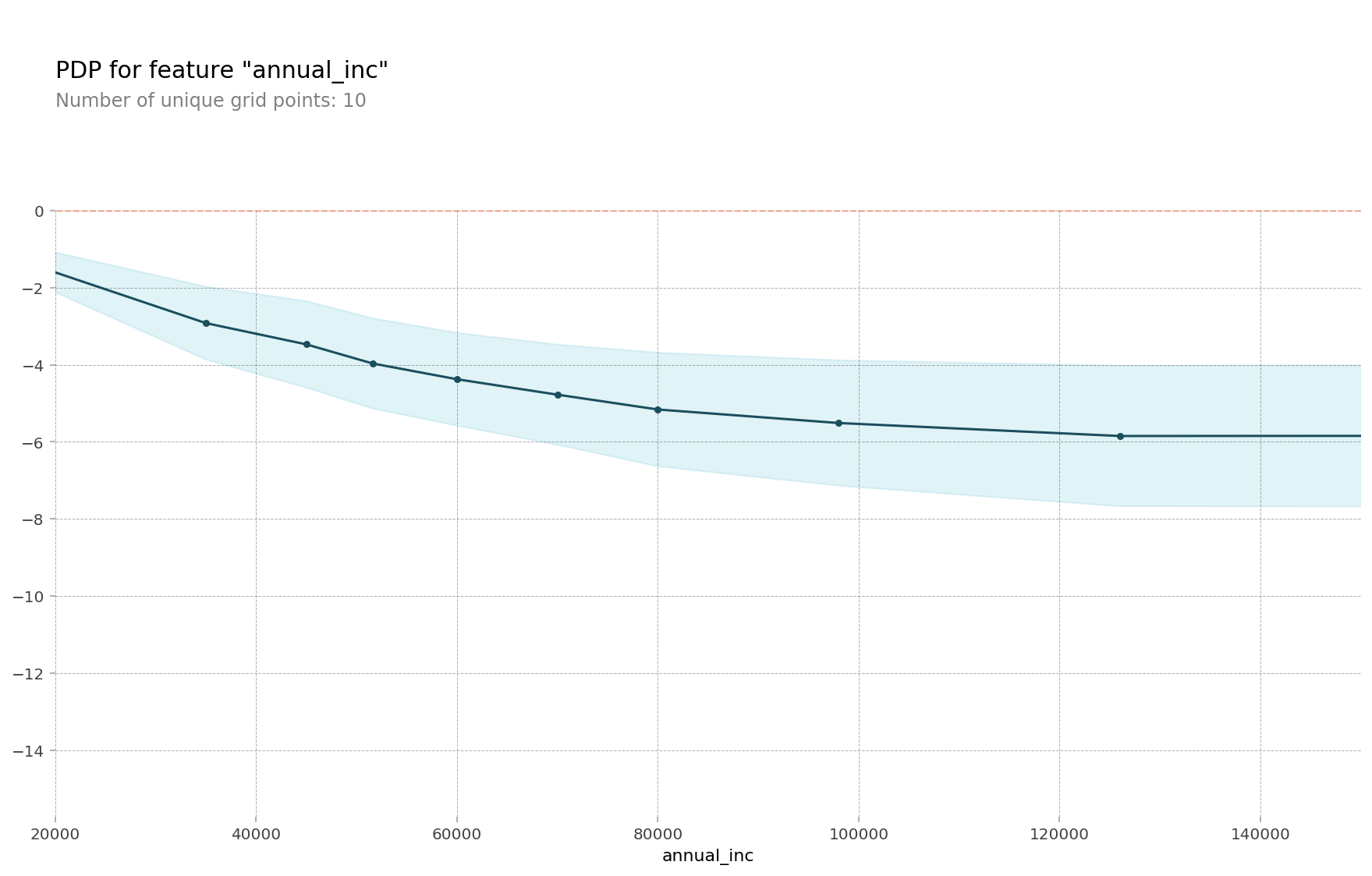
PDP_10개의 ICE(Individual Conditional Expectation) curves
개별 조건부 기대치(ICE)
: 하나의 관측치에 대해 관심 특성을 변화시킴에 따른 타겟값 변화 곡선
부분 의존도 그림(PDP)
: ICE의 선 평균으로 전체 평균에 초점을 맞추는 전역적인(Global) 방법
pdp_plot(isolated
         , feature_name=feature
         , plot_lines=True # ICE plots
         , frac_to_plot=0.001 # or 10 (# 10000 val set * 0.001)
         , plot_pts_dist=True)

plt.xlim(20000,150000);
PDP_2가지 특성 사용(interaction)
from pdpbox.pdp import pdp_interact, pdp_interact_plot

features = ['annual_inc', 'fico_range_high']

interaction = pdp_interact(
    model=boosting,
    dataset=X_val_encoded,
    model_features=X_val.columns,
    features=features
)

pdp_interact_plot(interaction, plot_type='grid',
                  feature_names=features);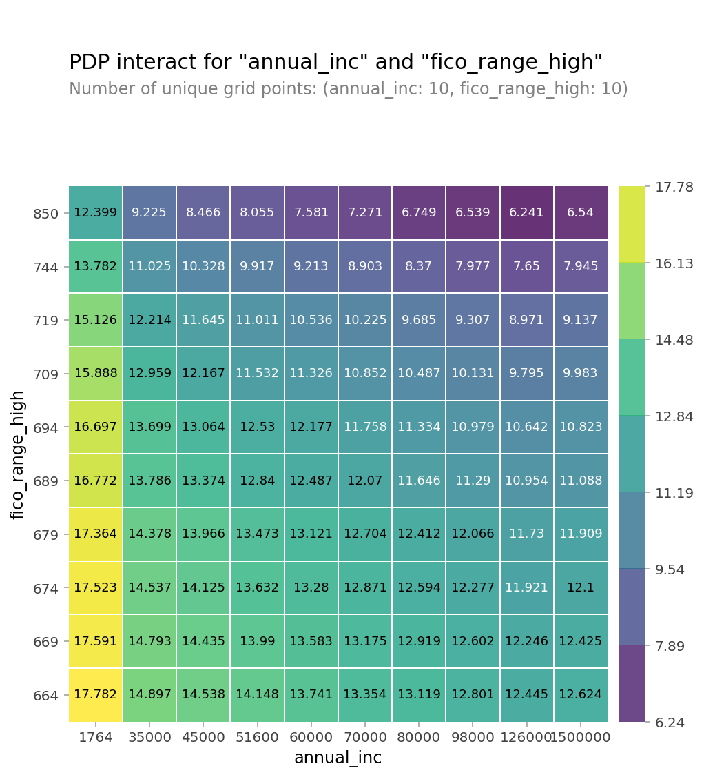
PDP_3D(Plotly 사용)
features

# 2D PDP dataframe
interaction.pdp

type(interaction.pdp)	#pandas.core.frame.DataFrame

# 위에서 만든 2D PDP를 테이블로 변환(using Pandas, df.pivot_table)하여 사용

pdp = interaction.pdp.pivot_table(
    values='preds', # interaction['preds']
    columns=features[0],
    index=features[1]
)[::-1] # 인덱스를 역순으로 만드는 slicing입니다

# 양단에 극단적인 annual_inc를 drop 합니다
pdp = pdp.drop(columns=[1764.0, 1500000.0])


import plotly.graph_objs as go

surface = go.Surface(
    x=pdp.columns,
    y=pdp.index,
    z=pdp.values
)


layout = go.Layout(
    scene=dict(
        xaxis=dict(title=features[0]),
        yaxis=dict(title=features[1]),
        zaxis=dict(title=target)
    )
)

fig = go.Figure(surface, layout)
fig.show()
PDP_인코딩 카테고리
인코더(Ordinal Encoder, Target Encoder)를 하게되면 학습 후 PDP를 그릴 때 인코딩된 값이 나오게 되어 카테고리특성의 실제 값을 확인하기 어려운 문제가 있으므로 PDP에 인코딩되기 전 카테고리값을 보여주기 위한 방법을 알아 보겠습니다.
import seaborn as sns
from sklearn.ensemble import RandomForestClassifier
from sklearn.pipeline import make_pipeline

df = sns.load_dataset('titanic')
df['age'] = df['age'].fillna(df['age'].median())
df = df.drop(columns='deck') # NaN 77%
df = df.dropna()

target = 'survived'
features = df.columns.drop(['survived', 'alive'])

X = df[features]
y = df[target]


pipe = make_pipeline(
    OrdinalEncoder(),
    RandomForestClassifier(n_estimators=100, random_state=42, n_jobs=-1)
)
pipe.fit(X, y);


encoder = pipe.named_steps['ordinalencoder']
X_encoded = encoder.fit_transform(X)
rf = pipe.named_steps['randomforestclassifier']

import matplotlib.pyplot as plt
from pdpbox import pdp


feature = 'sex'
for item in encoder.mapping:
    if item['col'] == feature:
        feature_mapping = item['mapping'] # Series

feature_mapping = feature_mapping[feature_mapping.index.dropna()]
category_names = feature_mapping.index.tolist()
category_codes = feature_mapping.values.tolist()

pdp.pdp_plot(pdp_dist, feature)

plt.xticks(category_codes, category_names);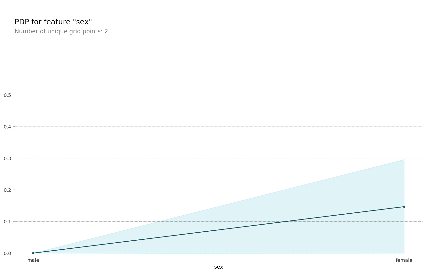
# 2D PDP
features = ['sex', 'age']

interaction = pdp_interact(
    model=rf,
    dataset=X_encoded,
    model_features=X_encoded.columns,
    features=features
)

pdp_interact_plot(interaction, plot_type='grid', feature_names=features);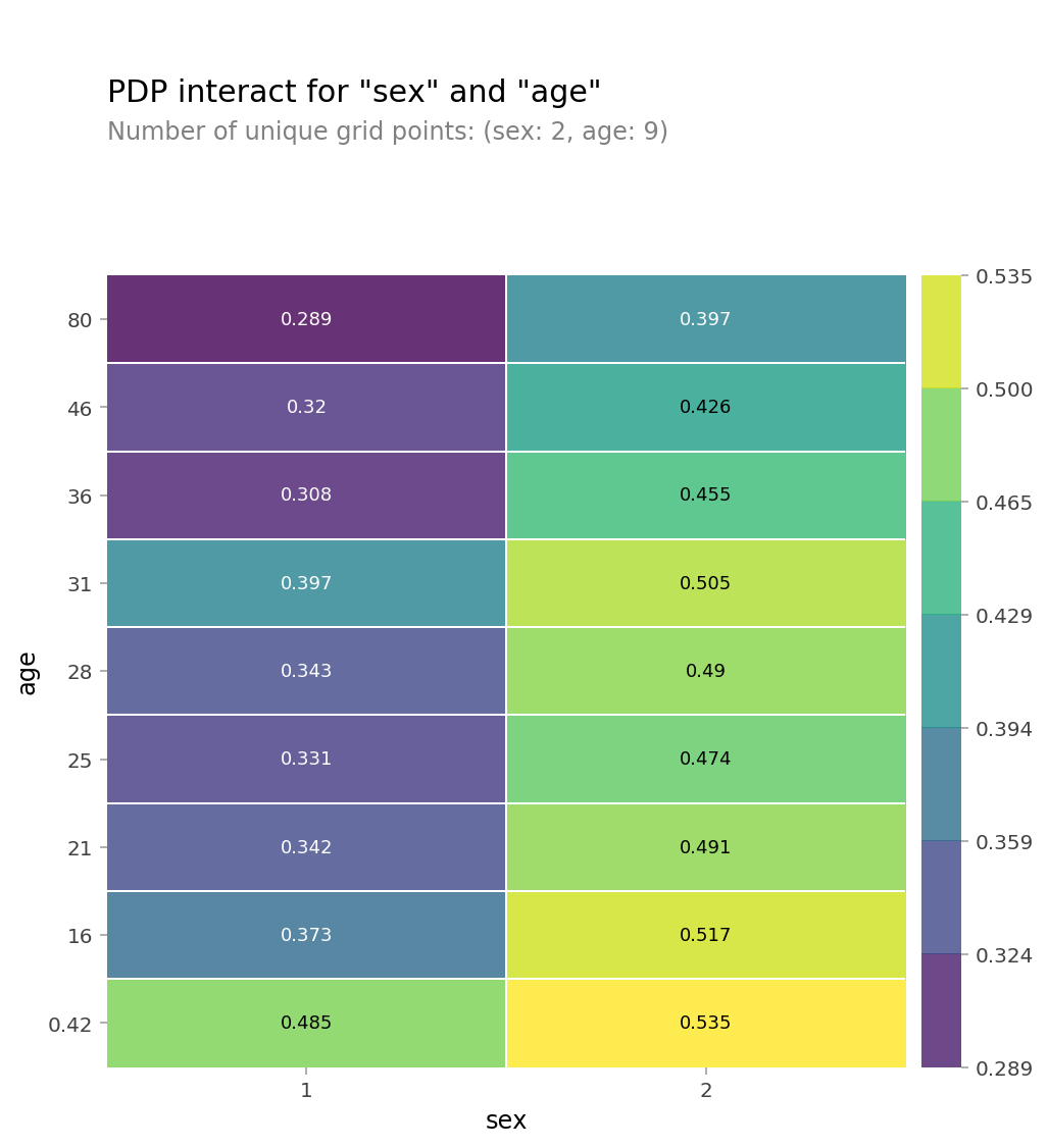
# 2D PDP -> Seaborn Heatmap으로 그리기 위해 데이터프레임으로 만듭니다
pdp = interaction.pdp.pivot_table(
    values='preds',
    columns=features[0],
    index=features[1]
)[::-1]

pdp = pdp.rename(columns=dict(zip(category_codes, category_names)))
plt.figure(figsize=(6,5))
sns.heatmap(pdp, annot=True, fmt='.2f', cmap='viridis')
plt.title('PDP decoded categorical');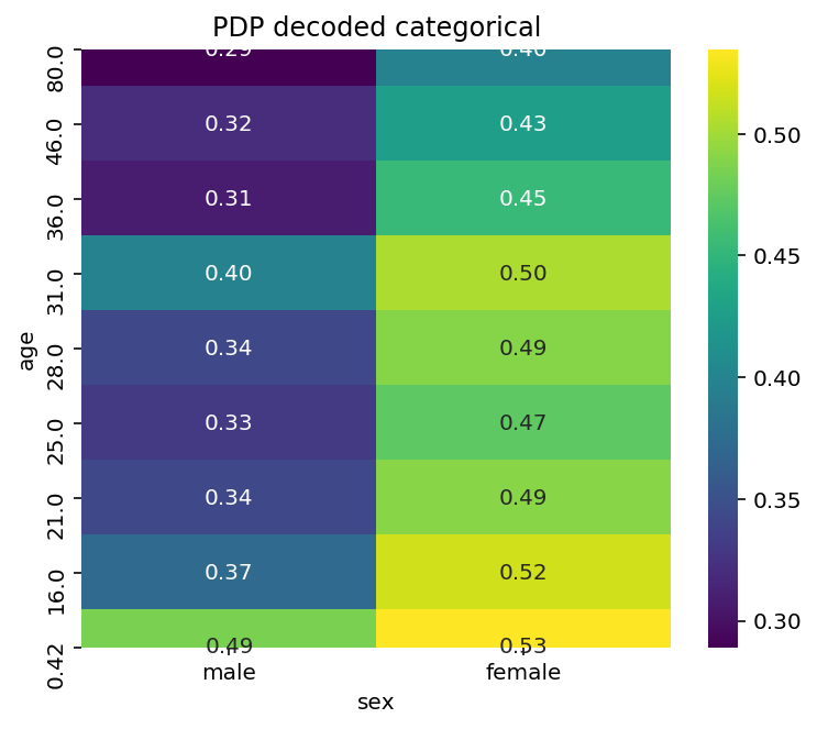
SHAP(SHapley Additive exPlanations)_shapley values
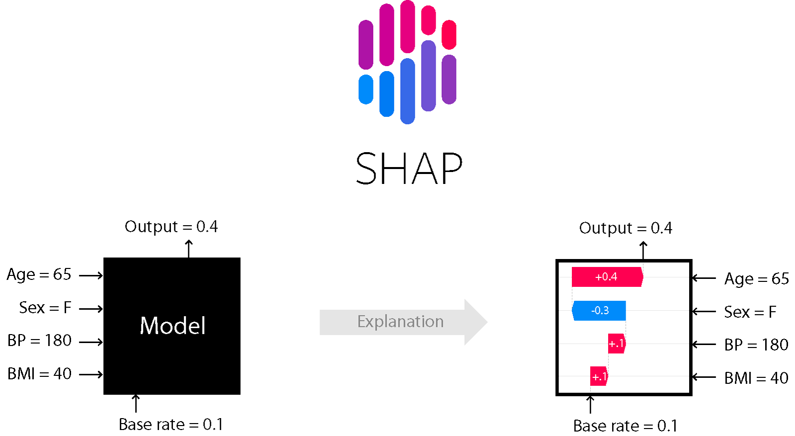

단일 관측치로부터 특성들의 기여도(feature attribution)를 계산하기 위한 방법으로 개별 관측치에 대한 특성과 타겟변수의 관계를 파악하는 지역적(Local) 방법론이다.
SHAP values는 한 예측에서 변수의 영향도를 방향과 크기로 표현한다.
여러가지 SHAP plot
force_plot
force plots 은 shap 패키지에 의해서 개별 모델 예측들을 시각화하는 기본적인 방법으로 특정 데이터 하나 & 전체 데이터에 대해, Shapley Value 를 1차원 평면에 정렬해서 보여줍니다.
회귀
!pip install shap

row = X_test.iloc[[1]]  # 중첩 brackets을 사용하면 결과물이 DataFrame입니다

# 실제 집값
y_test.iloc[[1]] # 2번째 데이터를 사용했습니다	# 323000.0

# 모델 예측값
model.predict(row)	# 341878.50142523

# 모델이 이렇게 예측한 이유를 알기 위하여
# SHAP Force Plot을 그려보겠습니다.

import shap

explainer = shap.TreeExplainer(model)
shap_values = explainer.shap_values(row)

shap.initjs()
shap.force_plot(
    base_value=explainer.expected_value,
    shap_values=shap_values,
    features=row
)
- Red arrows : 예측값을 더 높게 하는 변수들의 영향도를 설명(SHAP values)
- Blue arrows : 반대로 지금 예측값을 더 낮게 하는 변수들의 영향도
- 각각의 arrows의 크기 : 변수의 영향도에 대한 양
- base value(왼쪽 상단) : train set에서의 모델 평균 예측을 마킹한 것
- output value : 모델의 예측(0.64)으로 가장 큰 영향을 준 변의 값은 아래에 표시가 된다.
=> forceplot 은 예측에 대한 효과적인 요약을 제공
100개 테스트 샘플에 대한 누적 Shapley Value
# 100개 테스트 샘플에 대해서 각 특성들의 영향을 봅니다. 샘플 수를 너무 크게 잡으면 계산이 오래걸리니 주의하세요.
shap_values = explainer.shap_values(X_test.iloc[:100])
shap.initjs()
shap.force_plot(explainer.expected_value, shap_values, X_test.iloc[:100])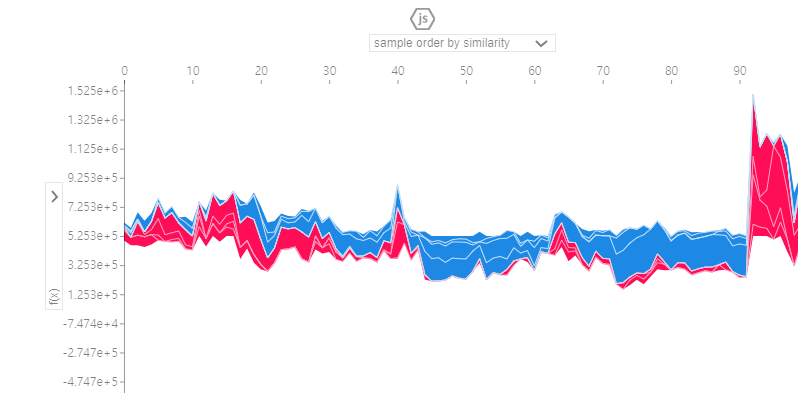
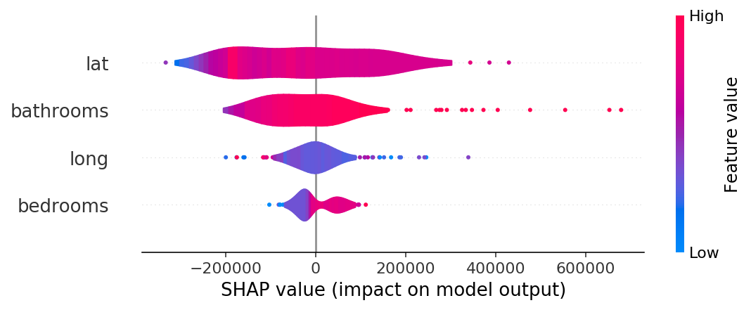
summary_plot
shap_values = explainer.shap_values(X_test.iloc[:300])
shap.summary_plot(shap_values, X_test.iloc[:300])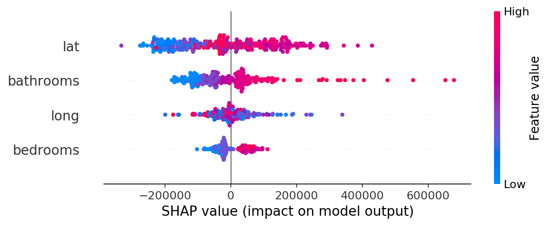
violin
shap.summary_plot(shap_values, X_test.iloc[:300], plot_type="violin")
- blue : 특성값 자체가 작은 경우
- red : 특성값이 큰 경우
- lat: 분산이 크고, 음과 양으로 영향을 많이 주고 있음
- bedroooms : 크게 영향을 미치지 못하고 있음.
- 점으로 나타나는 부분은 이상치
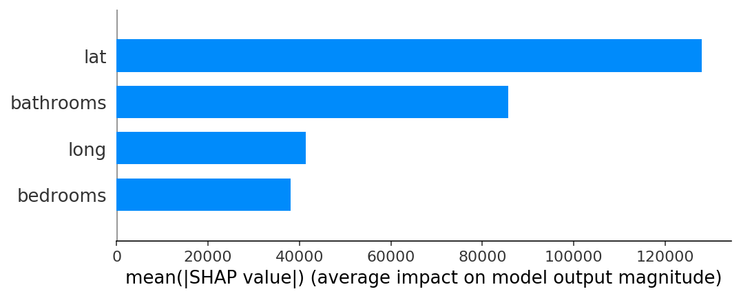
bar
shap.summary_plot(shap_values, X_test.iloc[:300], plot_type="bar")
> 분류
row = X_test.iloc[[3160]]

## UnicodeDecoderError 발생시 xgboost 1.1-> 1.0 다운그레이드 (conda install -c conda-forge xgboost=1.0)
import xgboost
import shap

explainer = shap.TreeExplainer(model)
row_processed = processor.transform(row)
shap_values = explainer.shap_values(row_processed)

shap.initjs()
shap.force_plot(
    base_value=explainer.expected_value,
    shap_values=shap_values,
    features=row,
    link='logit' # SHAP value를 확률로 변환해 표시합니다.
)
#예측을 SHAP그래프를 통해 설명하는 함수
def explain(row_number):
    positive_class = 'Fully Paid'
    positive_class_index = 1

    # row 값을 변환합니다
    row = X_test.iloc[[row_number]]
    row_processed = processor.transform(row)

    # 예측하고 예측확률을 얻습니다
    pred = model.predict(row_processed)[0]
    pred_proba = model.predict_proba(row_processed)[0, positive_class_index]
    pred_proba *= 100
    if pred != positive_class:
        pred_proba = 100 - pred_proba

    # 예측결과와 확률값을 얻습니다
    print(f'이 대출에 대한 예측결과는 {pred} 으로, 확률은 {pred_proba:.0f}% 입니다.')

    # SHAP를 추가합니다
    shap_values = explainer.shap_values(row_processed)

    # Fully Paid에 대한 top 3 pros, cons를 얻습니다
    feature_names = row.columns
    feature_values = row.values[0]
    shaps = pd.Series(shap_values[0], zip(feature_names, feature_values))
    pros = shaps.sort_values(ascending=False)[:3].index
    cons = shaps.sort_values(ascending=True)[:3].index

    # 예측에 가장 영향을 준 top3
    print('\n')
    print('Positive 영향을 가장 많이 주는 3가지 요인 입니다:')

    evidence = pros if pred == positive_class else cons
    for i, info in enumerate(evidence, start=1):
        feature_name, feature_value = info
        print(f'{i}. {feature_name} : {feature_value}')

    # 예측에 가장 반대적인 영향을 준 요인 top1
    print('\n')
    print('Negative 영향을 가장 많이 주는 3가지 요인 입니다:')

    evidence = cons if pred == positive_class else pros
    for i, info in enumerate(evidence, start=1):
        feature_name, feature_value = info
        print(f'{i}. {feature_name} : {feature_value}')

    # SHAP
    shap.initjs()
    return shap.force_plot(
        base_value=explainer.expected_value,
        shap_values=shap_values,
        features=row,
        link='logit'	# SHAP value를 확률로 변환해 표시합니다.
    )


    explain(3160)
Feature Importances 와 함께 PDP, SHAP의 특징 구분
서로 관련이 있는 모든 특성들에 대한 전역적인(Global) 설명
- Feature Importances
- Drop-Column Importances
- Permutaton Importances
타겟과 관련이 있는 개별 특성들에 대한 전역적인 설명
- Partial Dependence plots
개별 관측치에 대한 지역적인(local) 설명
- Shapley Values
[reference]
머신러닝 해석력 시리즈 1탄: 인공지능(AI)과 머신러닝을 신뢰하기 위한 필수 조건, 해석력!
[ Python ] SHAP (SHapley Additive exPlanations) Decision plot 설명
해석 가능 여부의 구분법
뭣이 중헌디! 특성의 중요도