컴포넌트란?
컴포넌트란 소프트웨어 시스템에서 독립적인 기능을 수행하는 모듈로써 교체가 가능한 부품입니다. react native에서는 재사용할 수 있는 조립 블록으로 화면에 나타나는 UI요소라고 생각하면 됩니다.
react native에서는 다양한 컴포넌트를 제공하고 있습니다.
내장 컴포넌트 사용
import { StatusBar } from 'expo-status-bar';
import { StyleSheet, Text, View, Button } from 'react-native';
//사용하고자 하는 컴포넌트를 import 해와야 한다.

export default function App() {
  return (
    <View >
      <Text }>src에 들어간 파일이 잘 돌아가나</Text>
      <StatusBar style="auto" />
      <Button title= "Button" onPress={()=>alert("click!")}/>
//onPress : 해당 버튼을 클릭했을시
    </View>
  );
}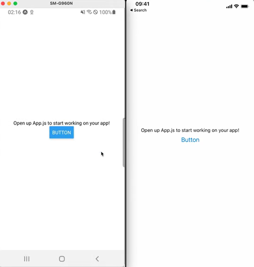
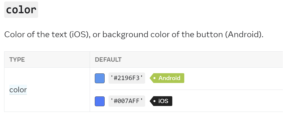
안드로이드와 ios의 스타일이 다른 것을 볼 수 있는데 그것은 reactnative 공식문서를 보게 되면 둘의 설정이 다른 것을 볼 수 있습니다.
https://reactnative.dev/docs/button#color
커스텀 컴포넌트
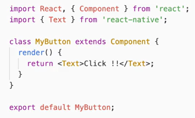
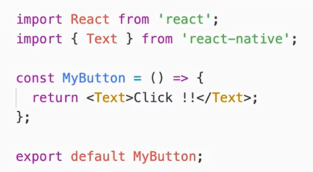
1. 클래스 컴포넌트 vs 함수 컴포넌트
클래스 컴포넌트(class component)
클래스 컴포넌트는 렌더 함수에서 반환된 내용을 렌더링
함수 컴포넌트(function component)
함수 컴포넌트는 함수에서 반환된 내용을 렌더링
커스텀 컴포넌트 사용하기
//MyButton
import React from 'react';
import { TouchableOpacity, View, Text } from 'react-native';

const MyButton = ()=>{
    return(
        <TouchableOpacity onPress={()=>alert("MyButton")}>
        {/* // 클릭했을시 호출되는 onpress를 담당  */}
        {/* // TouchableOpacity와 비슷한 속성인 PressAble 컴포넌트가 있다.  */}
            <View style={{backgroundColor: 'red', padding:10}}>
                {/* // 버튼에 스타일을 적용하는 것을 담당 */}
                <Text style={{fontSize:20, color:'white'}}>MyButton</Text>
                {/* // 버튼에 나타나는 텍스트를 담당 */}
            </View>
        </TouchableOpacity>
    )
}

export default MyButton;
//app.js
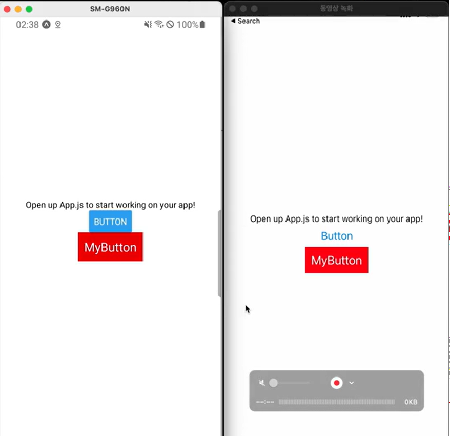
import { StatusBar } from 'expo-status-bar';
import { StyleSheet, Text, View, Button } from 'react-native';
import MyButton from './MyButton';
export default function App() {
return (
<View style={styles.container}>
<Text>src에 들어간 파일이 잘 돌아가나</Text>
<StatusBar style="auto" />
<Button title= "Button" onPress={()=>alert("click!")} />
<MyButton />
</View>
);
}
const styles = StyleSheet.create({
container: {
flex: 1,
backgroundColor: '#fff',
alignItems: 'center',
justifyContent: 'center',
},
});
정확하게 버튼 클릭하지 않아도 클릭되도록
일반적으로 모바일은 버튼을 정확하게 클릭하지 못해도 클릭한 것으로 처리하기위해 버튼에 클릭되는 범위를 조금 넓게 지정하는 경우가 많습니다.
방법1. 그 중 하나의 방법은 margin을 이용하는 것입니다. 마진을 100을 주어 버튼을 정확하게 선택하지 않아도 버튼이 클릭된 것으로 처리
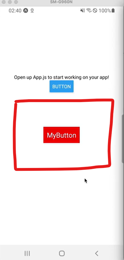
방법2. hitSlop 사용
import React from 'react';
import { TouchableOpacity, View, Text } from 'react-native';

const MyButton = ()=>{
    return(
        <TouchableOpacity
            onPress={()=>alert("MyButton")}
            hitSlop={{bottom:100, top: 100, left:100, right:100}}
        >
            <View style={{backgroundColor: 'red', padding:10}}>
                <Text style={{fontSize:20, color:'white'}}>MyButton</Text>
            </View>
        </TouchableOpacity>
    )
}
마진은 스타일이기 때문에 공간을 실제로 차지를 하지만 hitSlop은 공간을 차지하지 않습니다.
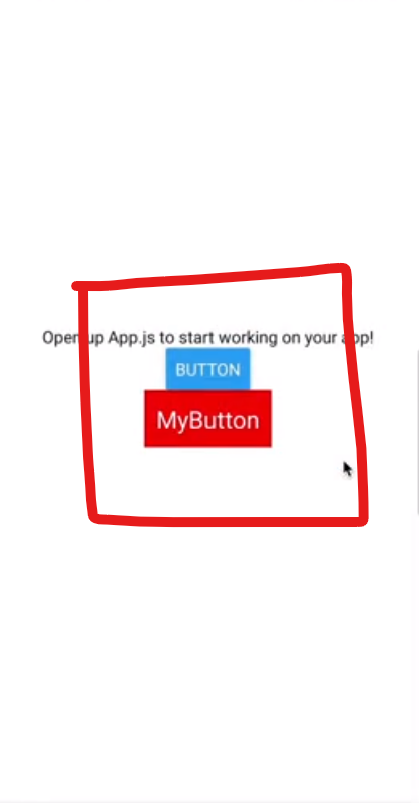
버튼 클릭했다가 떼지 않은 상태로 쓱 이동(PressRetentionOffset)
        <TouchableOpacity
            onPress={()=>alert("MyButton")}
            // hitSlop={{bottom:100, top: 100, left:100, right:100}}
            pressRetentionOffset={{bottom:100, top: 100, left:100, right:100}}
> 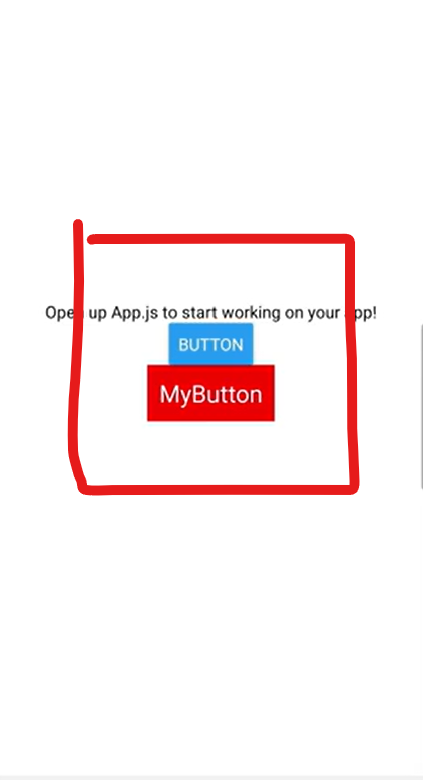
해당 빨간색 영역을 벗어나서 손가락을 떼면 클릭이 안되도록 설정하는 것