회고 리스트
1. 디지털 명함을 완성하시오.
<!DOCTYPE html>
<html lang="en">
    <head>
        <title>Bootstrap Example</title>
        <meta charset="utf-8">
        <meta name="viewport" content="width=device-width, initial-scale=1">
        <link href="https://cdn.jsdelivr.net/npm/bootstrap@5.3.3/dist/css/bootstrap.min.css" rel="stylesheet">
        <!-- Bootstrap CSS -->
        <link href="https://cdn.jsdelivr.net/npm/bootstrap@5.3.3/dist/css/bootstrap.min.css" rel="stylesheet">

        <!-- Bootstrap Icons -->
        <link rel="stylesheet" href="https://cdn.jsdelivr.net/npm/bootstrap-icons/font/bootstrap-icons.css">

        <script src="https://cdn.jsdelivr.net/npm/bootstrap@5.3.3/dist/js/bootstrap.bundle.min.js"></script>

        <style>
            body {
                background-image: url("bg-img.jpg");
                background-position: top center;
                background-size: cover;
                background-repeat: no-repeat;
            }

        </style>

    </head>

    <body>

        <div class="d-flex justify-content-center align-items-center min-vh-100">
            <div class="card bg-white bg-opacity-50 p-4 d-flex flex-row justify-content-center align-items-center" style="width: 65vw; border-radius: 15px;">
                <div class="profile">
                    <img src="profile.jpg" class="img-fluid rounded-circle d-flex  " style="width: 75%;" alt="프로필 이미지">
                </div>
                <div class="content">
                    <h6 >디지털 아티스트</h6>
                    <h2>에릭 킴에밀리아</h2>
                    <p>This is a wider card with supporting text below as a natural lead-in to additional content. This content is a little bit longer.</p>
                    <div class="d-flex gap-3">
                        <a href="#" class="btn btn-dark rounded-circle d-flex align-items-center justify-content-center"
                           style="width: 50px; height: 50px;">
                            <i class="bi bi-house-door-fill text-white fs-4"></i>
                        </a>
                        <a href="#" class="btn btn-danger rounded-circle d-flex align-items-center justify-content-center"
                           style="width: 50px; height: 50px;">
                            <i class="bi bi-youtube text-white fs-4"></i>
                        </a>
                        <a href="#" class="btn btn-primary rounded-circle d-flex align-items-center justify-content-center"
                           style="width: 50px; height: 50px;">
                            <i class="bi bi-facebook text-white fs-4"></i>
                        </a>
                        <a href="#" class="btn btn-warning rounded-circle d-flex align-items-center justify-content-center"
                           style="width: 50px; height: 50px;">
                            <i class="bi bi-instagram text-dark fs-4"></i>
                        </a>
                    </div>
                </div>
            </div>
      </div>

        <script
            src="https://cdn.jsdelivr.net/npm/bootstrap@5.3.3/dist/js/bootstrap.bundle.min.js"
            integrity="sha384-YvpcrYf0tY3lHB60NNkmXc5s9fDVZLESaAA55NDzOxhy9GkcIdslK1eN7N6jIeHz"
            crossorigin="anonymous"></script>
    </body>
</html>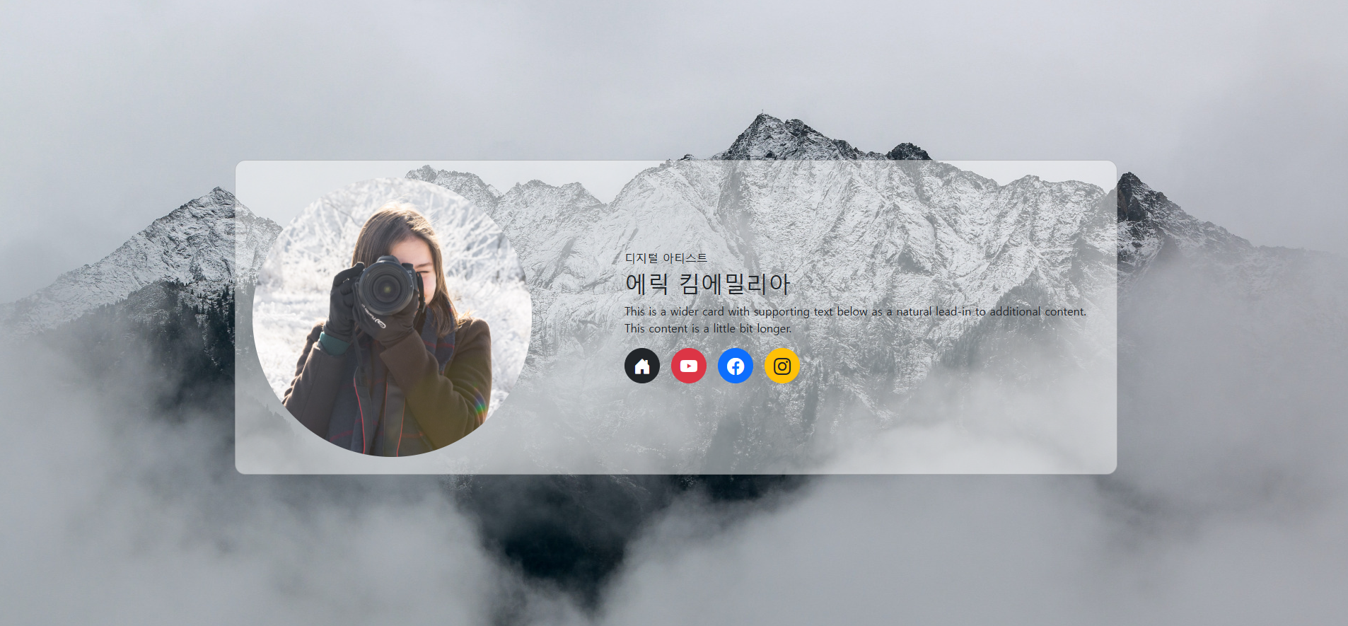
로고 사진 찾다가 챗 gpt한테 물어보니까 부트스트랩에서 제공하는 아이콘 디자인이라고 한다....ㅎㅎㅎ
2. 요안도라를 부트스트랩 기반으로 만들어 보시오.
<!DOCTYPE html>
<html lang="en">
    <head>
        <title>Joandora</title>
        <meta charset="utf-8">
        <meta name="viewport" content="width=device-width, initial-scale=1">

        <!-- Bootstrap CSS -->
        <link href="https://cdn.jsdelivr.net/npm/bootstrap@5.3.3/dist/css/bootstrap.min.css" rel="stylesheet">
    </head>

    <body>

        <div class="container d-flex flex-column" style="max-width : 70%; height: auto;">
            <!-- 헤더 + 네비게이션 바 -->
            <div class="wrapper">
                <header class="display: flex; flex-direction: column;" style="background-image: url('1.png'); background-size:cover; background-repeat:no-repeat; height: 200px;">
                    <h1 class="fw-bold pt-5 pe-4 text-end" style="color: #ffffcc; text-shadow: 2px 2px 4px #333;">Joandora</h1>
                    <h2 class="pe-4 text-end" style="color: #Ffff00; text-shadow: 1px 1px 2px #333;">가장 제주다운 수산리집</h2>

                </header>
                <nav class = "navbar navbar-expand-lg" style="background: #271717;  width: 100%; margin-top: auto;">
                    <div class="container">
                        <div class="navbar-nav  w-100 d-flex flex-lg-row flex-column">
                            <a class="nav-link text-white px-lg-4 ps-5 py-2" href="#">이용 안내</a>
                            <a class="nav-link text-white px-lg-4 ps-5 py-2" href="#">객실 소개</a>
                            <a class="nav-link text-white px-lg-4 ps-5 py-2" href="#">예약 방법</a>
                            <a class="nav-link text-white px-lg-4 ps-5 py-2" href="#">예약 하기</a>
                        </div>

                    </div>

                </nav>
            </div>

            <!-- 메인 -->

            <main class="row w-100 m-0">
                <section class="col-md-8 col-12 ps-3">
                    <h3 class="pt-3">요안도라 소개</h3>
                    <h5 class="pt-3">¤ 요안도라는 게스트 하우스(Guest House) 형식의 농어촌 민박입니다.</h5>

                    <p>성산의 날씨는 다음주 내낸 높은 구름에 햇살 가득이라고 합니다. 목요일이면 섭씨 27도까지 오른다고 하지만, 늘 부는 바람이 쾌적한 균형을 잡아 마당에 나가 앉아있는 시간이 많아질 듯 합니다.</p>

                    <p>오늘은 사진에 보이는 긴 돌담을 따라 들어오는 요안도라 올레 입구에 곤색의 대문을 달았습니다.</p>

                    <p>
                        내일은 두달 여동안 밖거리에 만든 데스트하우스에 연백색의 황토 페인트를 칠할 예정입니다.<br>
                        그리고 이것저것 사소한 저이를 마치고 나면, 나이 드시고 젊고 한 미지의 새식구들을 설렘으로 만나고 함께 하고, 도시의 바쁜 생활로 소원해진 오래된 친구와의 우정을 이 제주에서 새롭게 열어나가기 위해 요안도라를 세상에 알리려고 합니다.
                    </p>

                    <div class="img-container1">
                        <img src="2.png" class="img-fluid mt-3 mb-3" alt="빨간색 꽃 이미지">
                    </div>

                </section>

                <aside class="col-md-4 col-12"  style="background: #dcfedc;">
                    <h5 class="fw-bold pt-4 pb-1">¤ 알립니다.</h5>
                    <p class="m-0">게스트하우스 예약은 전화 070-###-####로 직접 통화하시는 게 가장 정확하고 빠릅니다. 인터넷 전화이므로 시외 전화 요금이 부과되지 않습니다.</p>

                    <div class="img-container2 d-flex flex-wrap">
                        <img src="3.jpg" class="w-100 mt-3 mb-2" alt="돌담 사진">
                        <img src="4.jpg" class="w-100 mb-2" alt="파란 지붕 하얀 집">
                        <img src="5.jpg" class="w-100 mb-3 alt="곤색 대문">
                    </div>
                </aside>
            </main>

            <!-- 푸터 -->
            <footer class="text-white text-center py-3" style="background: #003300; font-style: italic;">
                <p class="mb-1">제주특별자치도 남제주군 성산읍 수산리 000번지 요안도라<br>
                                yoan##@naver.com<br>
                                Copyright ©. All rights reserved.</p>
            </footer>
        </div>
    </body>
</html>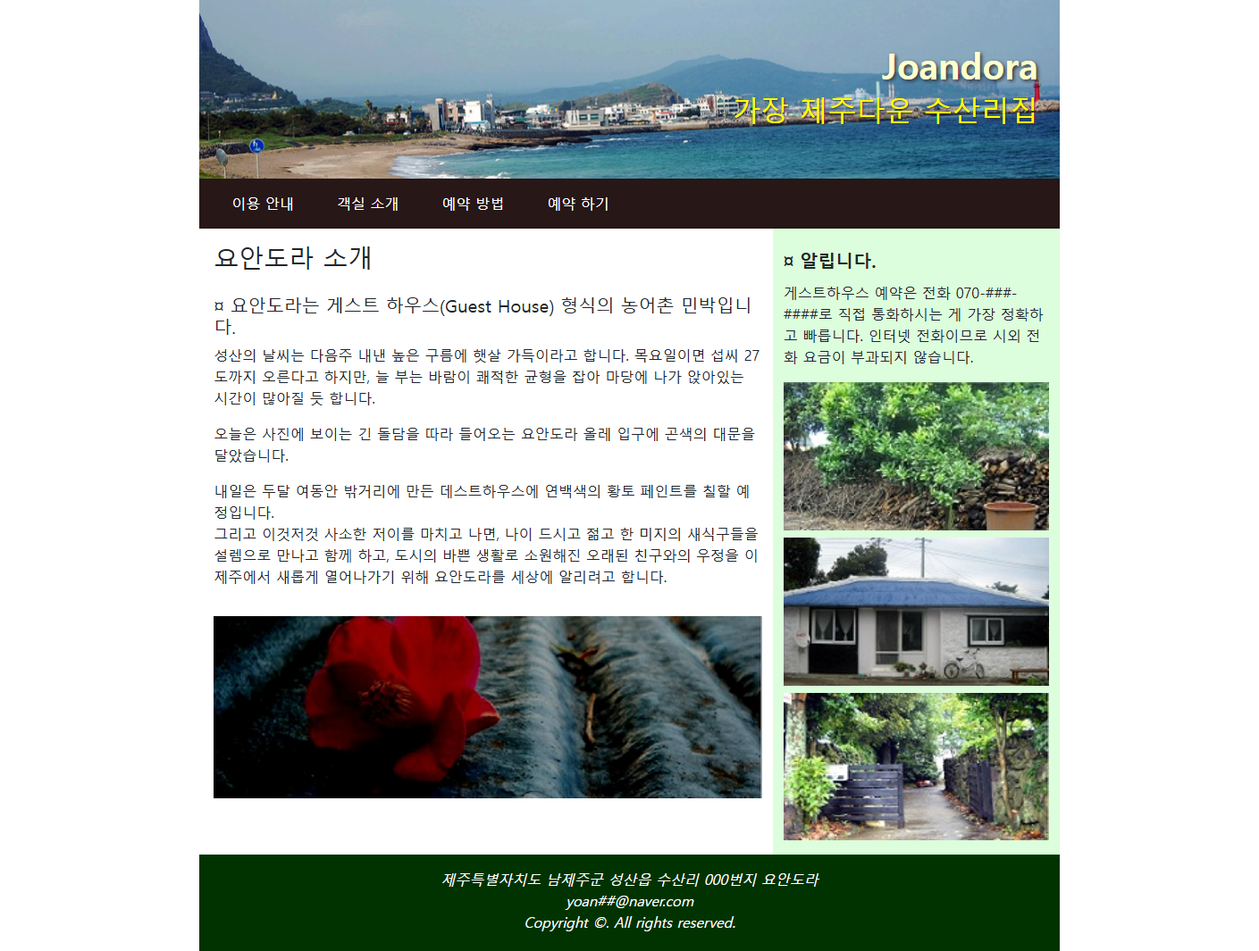
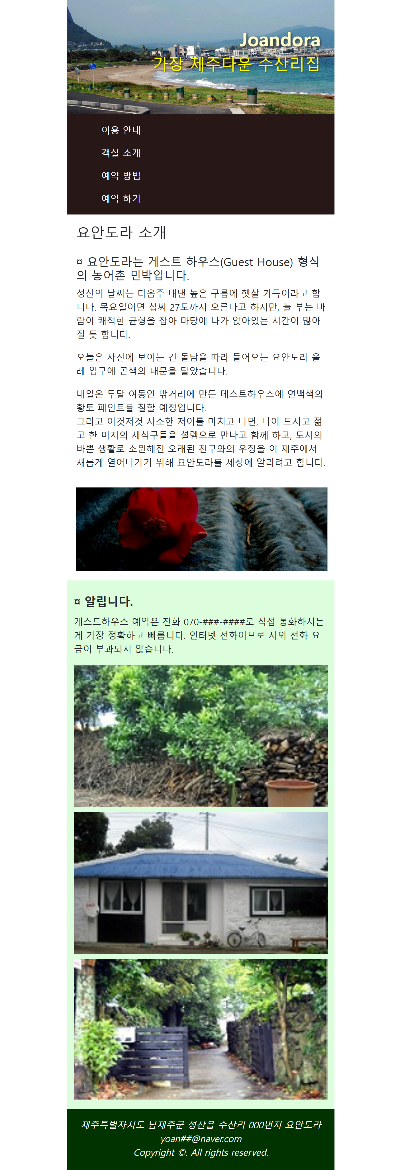
화면 비율에 따라 네비게이션 바(메뉴 바)와 메인 공간(내용이 들어가는 곳)이 바뀐다.
화면이 작아지면 네비게인션 바가 세로로 정렬되고
메인 공간이 나눠져서 세로로 정렬된다.
3줄 요약:
1. 부트스트랩 화면 기본 레이 아웃순서는 container -> row -> col 이다
2. 부트스트랩은 12개로 나눈 그리드 시스템이다.
3. 부트스트랩내에서 디폴트로 적용 되는 속성들은 언제든지 style로 직접 변경 가능하다.
아니 text-align:center;은 text-align-center 쳐놓고 뿌듯했는데 text-center길래 font-weight:bold;는 font-bold 쳤더니 fw-bold였다.
난 다 틀린다.
배경색이 연노랑이길래 class="bg-warning-subtle"이라고 뒤에 -subtle을 넣으면 연해진대서 넣었는데 class="bg-warning bg-opacity-25" 이렇게 투명도를 바꾸면 되는거였다.