📝 Flexbox
요소의 정렬되는 방향, 순서, 요소 간의 간격을 수치적으로 처리하지 않아도 알아서 유연하게 처리해 주는 형식
📌 Flexbox를 이용할 때 반드시 알아야 되는 것!
✏️ 1. Flexbox의 구성
- flex-container : 정렬이 필요한 요소를 감싸는 요소
- item : 정렬을 적용할 요소
✏️ 2. Flexbox의 축
- 중심축(main axis)
- 교차축, 반대축(cross axis)
💡 flex-direction
(flex-container 전용 속성)
main axis의 방향과 시작 위치를 지정하는 속성
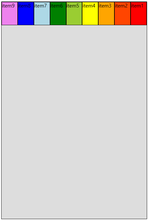
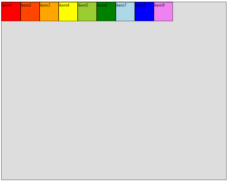
- flex-direction: row;
행 방향(가로, 기본값)

- flex-direction: row-reverse;
행 방향(가로) + 순서 반대
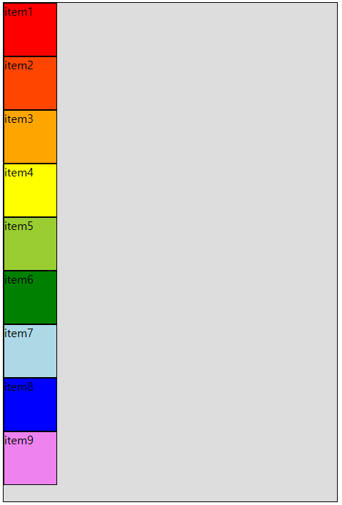
- flex-direction: column;
열 방향(세로)
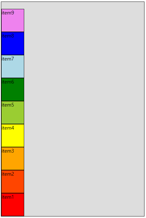
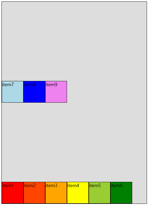
- flex-direction: column-reverse;
열 방향(세로) + 순서 반대
💡 flex-wrap
내부 item들을 포장하는 속성
-> item들이 강제로 한 줄에 배치되게 할 것인지
flex-container가 줄어들면 한 줄을 벗어나 여러 줄로 배치할 것인지를 지정
- flex-wrap: nowrap;
item 한 줄로 배치(기본값)
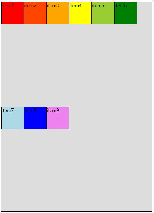
- flex-wrap: wrap;
item을 여러 줄로 배치
- flex-wrap: wrap-reverse;
item을 여러 줄로 배치(뒤에서부터 배치)
💡 flex-flow
flex-container의 main axis의 방향, 순서와 여러 줄로 배치할지에 대한 여부를 한 번에 설정하는 속성
(flex-direction + flex-wrap 합쳐진 모양)
       /* flex-direction  flex-wrap */
flex-flow: row-reverse      wrap;
flex-flow: column wrap-reverse;
💡 justify-content
- justify : 조정하다
- justify-content : 내용을 조정하다
main axis 방향으로 item(내용)의 정렬 방법을 조정함
- justify-content: flex-start;
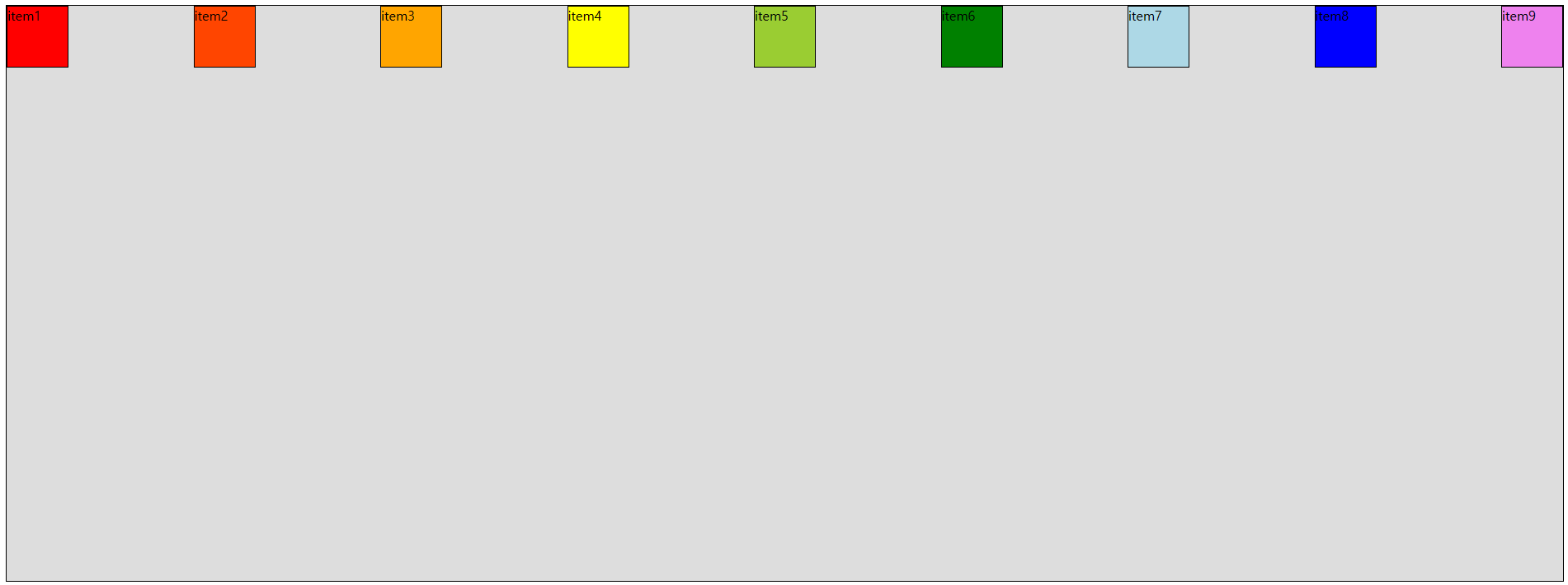
main axis 시작 지점을 기준으로 정렬함(기본값)
- justify-content: flex-end;
main axis 끝 지점을 기준으로 정렬함
-> 순서가 달라지는 flex-direction : row-reverse;와 구분해서 기억
- justify-content: center;
main axis 가운데 정렬
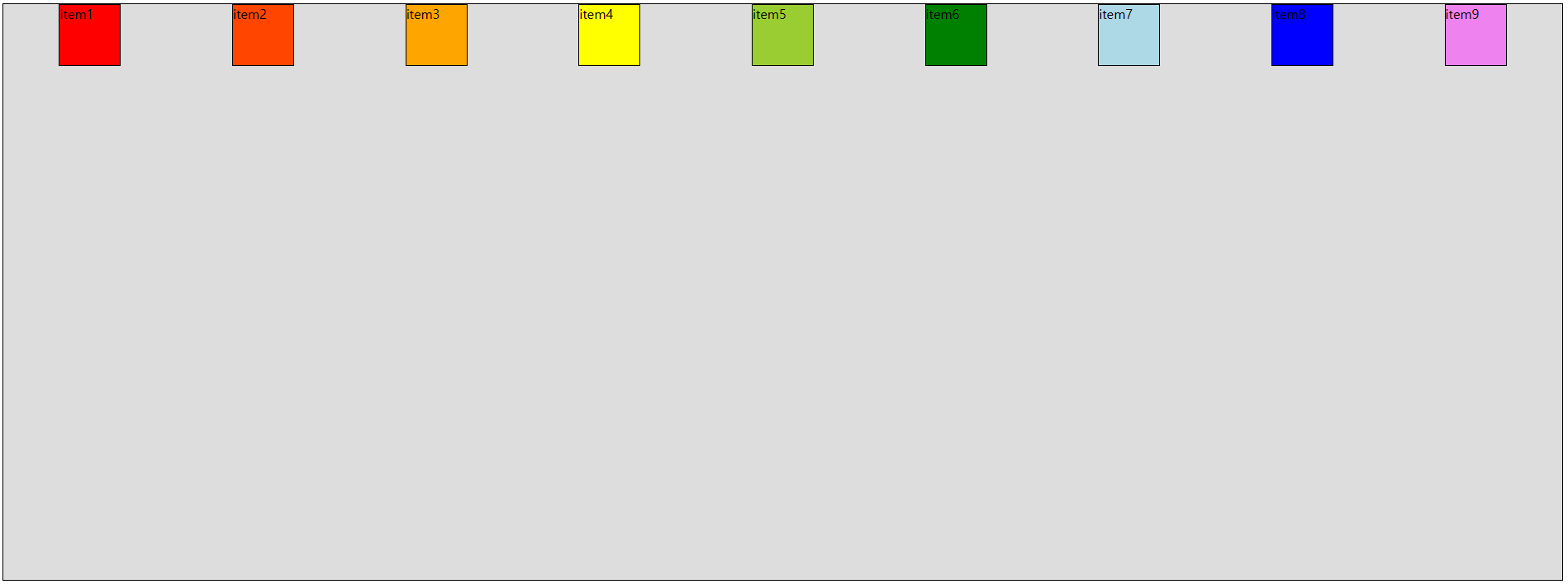
- justify-content: space-around;
item 주위에 main axis 방향 양쪽으로 일정한 크기에 공간을 추가
-> 양끝은 조금, item 중간은 넓게 떨어져 있음
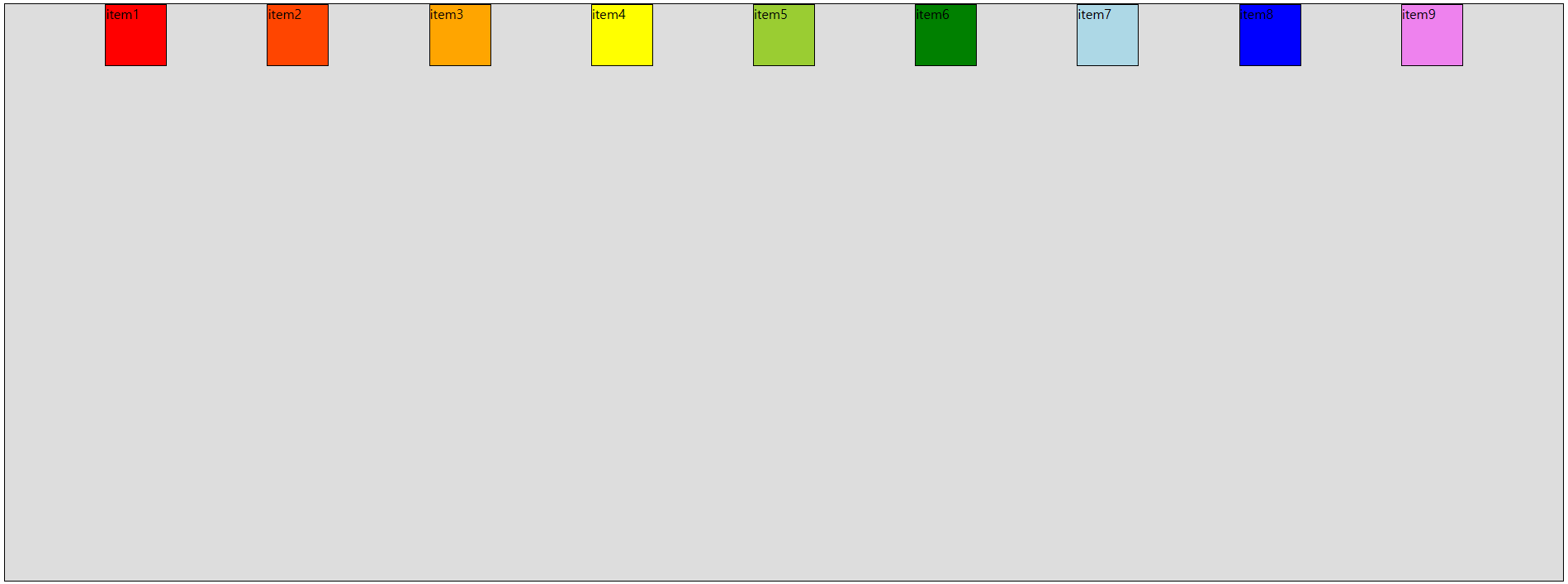
- justify-content: space-evenly;
item이 main axis 내에서 동일한 간격을 가지게 됨
- justify-content: space-between;
space-evenly에서 양 끝을 flex-container에 붙게 함
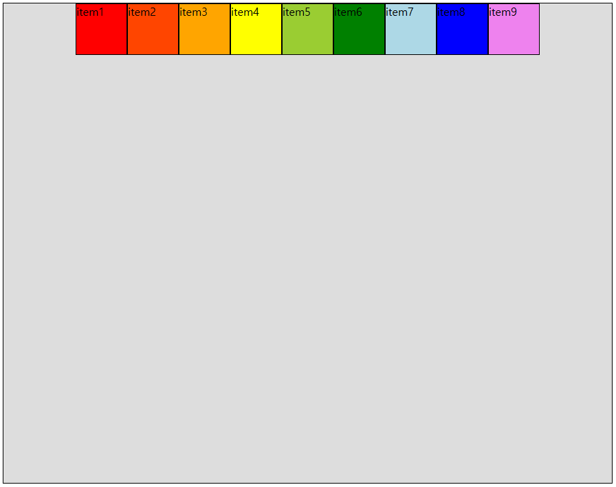
💡 align-items
item들을 cross axis(반대축, 교차축) 방향으로 정렬하는 방법을 지정하는 속성
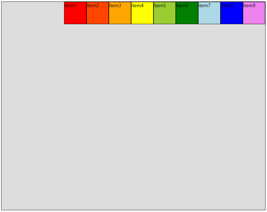
- align-items: stretch;
item들의 너비 또는 높이를 cross axis 방향으로 늘려서 flex-container와 같은 크기를 가지도록 함 (기본값)
-> 조건 : item에 cross axis 방향의 크기 지정 속성이 없어야 함

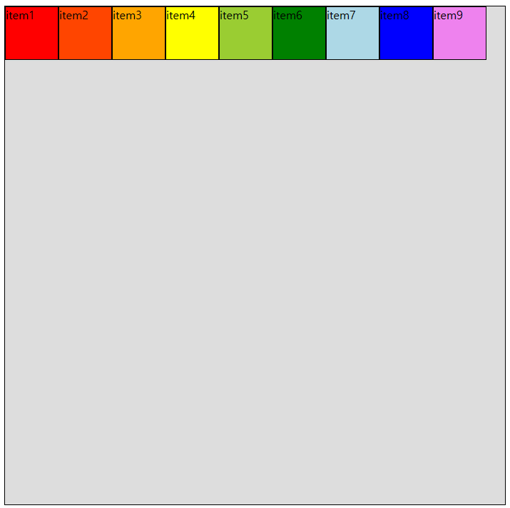
- align-items: flex-start;
cross axis 시작 지점을 기준
(stretch처럼 늘어나지 않고, content의 크기를 유지)
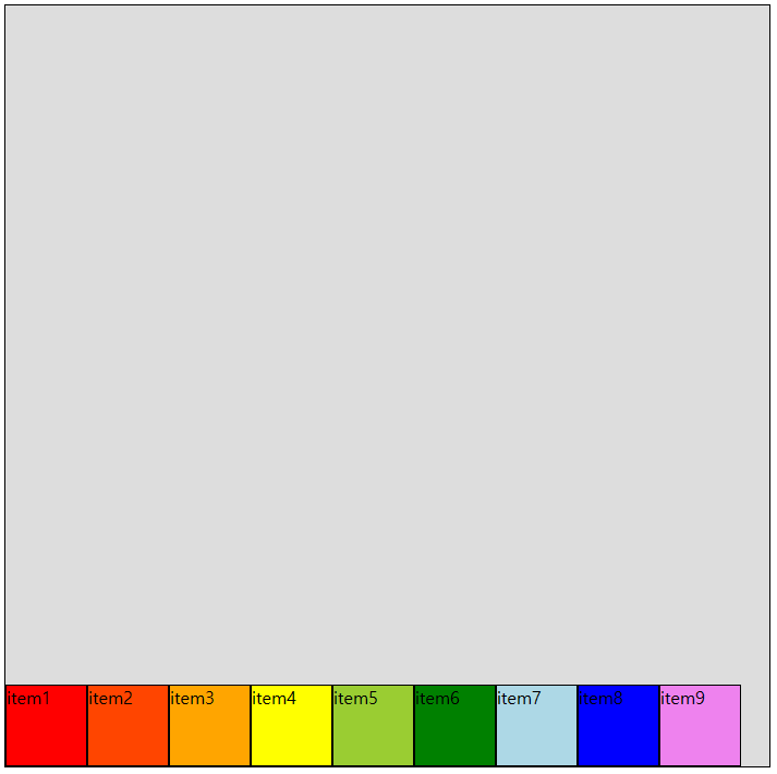
- align-items: flex-end;
cross axis 끝 부분을 기준
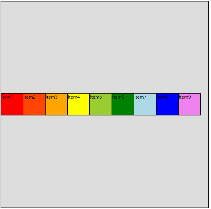
- align-items: center;
cross axis 가운데 기준
- align-items: baseline;
item 내부 content가 모두 한 줄에 배치될 수 있도록 item 요소를 cross axis로 움직이는 설정
✏️ 코드로 살펴보기
- flexbox1.html
<!DOCTYPE html>
<html lang="en">
<head>
<meta charset="UTF-8">
<meta name="viewport" content="width=device-width, initial-scale=1.0">
<title>Flexbox 1</title>
<link rel="stylesheet" href="../css/flex-style1.css">
<link rel="stylesheet" href="../css/style.css">
</head>
<body>
<hr>
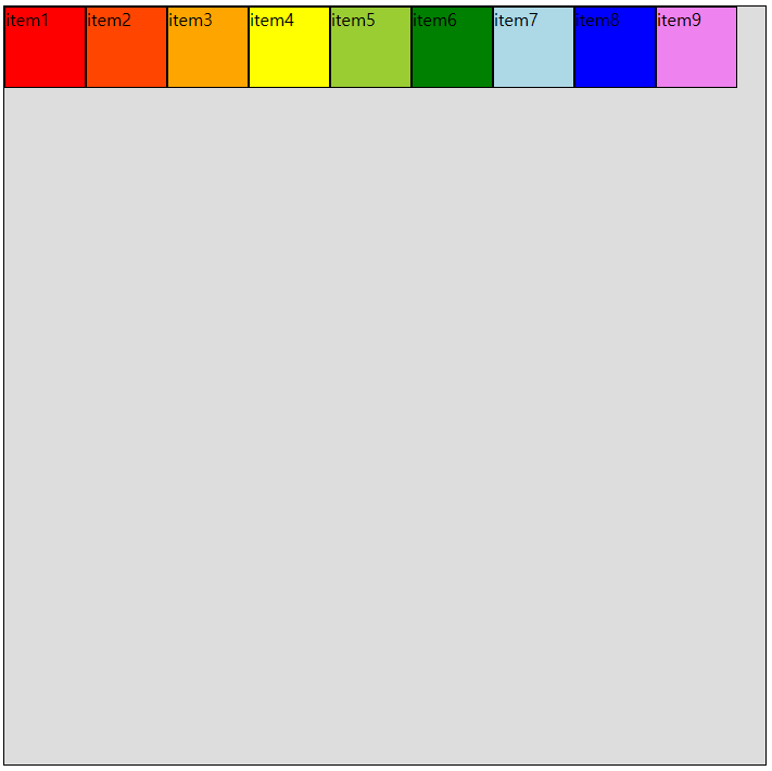
<div class="flex-container">
<div class="item item1">item1</div>
<div class="item item2">item2</div>
<div class="item item3">item3</div>
<div class="item item4">item4</div>
<div class="item item5">item5</div>
<div class="item item6">item6</div>
<div class="item item7">item7</div>
<div class="item item8">item8</div>
<div class="item item9">item9</div>
</div>
<hr>
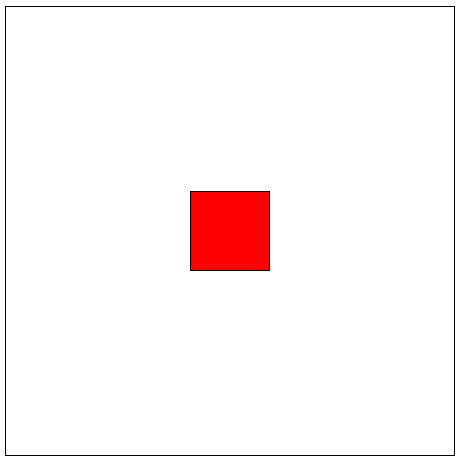
<h1>Flexbox를 이용한 요소 정 가운데 배치하기</h1>
<div id="con">
<div id="center"></div>
</div>
</body>
</html>- style.css (공통으로 사용할 style 지정 css)
div{
    border: 1px solid black;
    box-sizing: border-box;
    /* content + padding + border 합으로 width/height 지정 */
}

.item{
    width: 75px;
    height: 75px;
}

.item1{ background-color: red; }
.item2{ background-color: orangered; }
.item3{ background-color: orange; }
.item4{ background-color: yellow; }
.item5{ background-color: yellowgreen; }
.item6{ background-color: green; }
.item7{ background-color: lightblue; }
.item8{ background-color: blue; }
.item9{ background-color: violet; }- flex-style1.css
.flex-container{
background-color: #ddd;
height: 700px;
display: flex;
/* item(내부 요소)을 감싸는 요소의 형식을 flex로 변경
-> item에 자동으로 지정된 margin 요소가 모두 사라지고
content 영역만큼의 크기만 가지게 됨
item에 별도의 width/height가 지정되어 있지 않다면
item의 높이는 flex-container의 너비/높이와 같아지게 된다.
(flex-container 정렬 방향에 따라 다름)
*/
/******************/
/* flex-direction */
/******************/
/* (flex-container 전용 속성)
main axis의 방향과 시작 위치를 지정하는 속성
*/
/* 행 방향(가로, 기본값) */
flex-direction: row;
/* 행 방향(가로) + 순서 반대 */
/* flex-direction: row-reverse; */
/* 열 방향(세로) */
/* flex-direction: column; */
/* 열 방향(세로) + 순서 반대 */
/* flex-direction: column-reverse; */
/*************/
/* flex-wrap */
/*************/
/* 내부 item들을 포장하는 속성
item들이 강제로 한 줄에 배치되게 할 것인지
flex-container가 줄어들면
한 줄을 벗어나 여러 줄로 배치할 것인지를 지정
*/
/* item 한 줄로 배치(기본값) */
flex-wrap: nowrap;
/* item을 여러 줄로 배치 */
/* flex-wrap: wrap; */
/* item을 여러 줄로 배치(뒤에서부터 배치) */
/* flex-wrap: wrap-reverse; */
/*************/
/* flex-flow */
/*************/
/* flex-container의
main axis의 방향, 순서와
여러 줄로 배치할지에 대한 여부를
한 번에 설정하는 속성
flex-direction + flex-wrap 합쳐진 모양
*/
/* flex-direction flex-wrap */
/* flex-flow: row-reverse wrap; */
/* flex-flow: column wrap-reverse; */
/*******************/
/* justify-content */
/*******************/
/* justify : 조정하다 */
/* justify-content : 내용을 조정하다
-> main axis 방향으로
item(내용)의 정렬 방법을 조정함
*/
/* main axis 시작 지점을 기준으로 정렬함(기본값) */
/* justify-content: flex-start; */
/* main axis 끝 지점을 기준으로 정렬함 */
/* justify-content: flex-end; */
/* 순서가 달라지는
flex-direction : row-reverse;와 구분해서 기억
*/
/* main axis 가운데 정렬 */
/* justify-content: center; */
/* item 주위에 main axis 방향 양쪽으로
일정한 크기에 공간을 추가
-> 양끝은 조금, item 중간은 넓게 떨어져 있음 */
/* justify-content: space-around; */
/* item이 main axis 내에서 동일한 간격을 가지게 됨 */
/* justify-content: space-evenly; */
/* space-evenly에서 양 끝을 flex-container에 붙게 함 */
/* justify-content: space-between; */
/***************/
/* align-items */
/***************/
/* item들을 cross axis(반대축, 교차축) 방향으로 정렬하는 방법을 지정하는 속성 */
/* item들의 너비 또는 높이를
cross axis 방향으로 늘려서
flex-container와 같은 크기를 가지도록 함
(기본값)
조건 : item에 cross axis 방향의
크기 지정 속성이 없어야 함
*/
/* align-items: stretch; */
/* cross axis 시작 지점을 기준
(stretch처럼 늘어나지 않고, content의 크기를 유지)
*/
/* align-items: flex-start; */
/* cross axis 끝 부분을 기준 */
/* align-items: flex-end; */
/* cross axis 가운데 기준 */
/* align-items: center; */
/* item 내부 content가 모두 한 줄에 배치될 수 있도록
item 요소를 cross axis로 움직이는 설정
*/
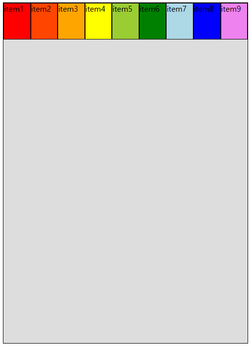
align-items: baseline;
}
/* .item2{padding : 10px;}
.item3{padding : 20px;}
.item4{padding : 30px;} */
/* 요소 정 가운데 배치하기 */
#con{
width: 450px;
height: 450px;
display: flex;
/* 중심축 방향 가운데 정렬 */
justify-content: center;
/* 교차축 방향 가운데 정렬 */
align-items: center;
}
#center{
width: 80px;
height: 80px;
background-color: red;
}

풀스택 개발자 기록집 📁