
import numpy as np
import pandas as pd
import matplotlib.pyplot as plt
import seaborn as sb

df_original = pd.read_csv("Diabetes.csv")

cols = [c for c in df_original.columns if c not in ["Pregnancies", "Outcome"]]
df = df_original.copy()
df[cols] = df[cols].replace({0: np.NaN})
df.head()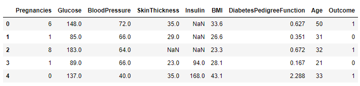
Scatter Matrix
원본 그래프
pd.plotting.scatter_matrix(df, figsize=(7, 7))
plt.show()
라벨을 0,1로 나눈 산점도
df2 = df.dropna()
colors = df2["Outcome"].map(lambda x: "#44d9ff" if x else "#f95b4a")
pd.plotting.scatter_matrix(df2, figsize=(7,7), color=colors);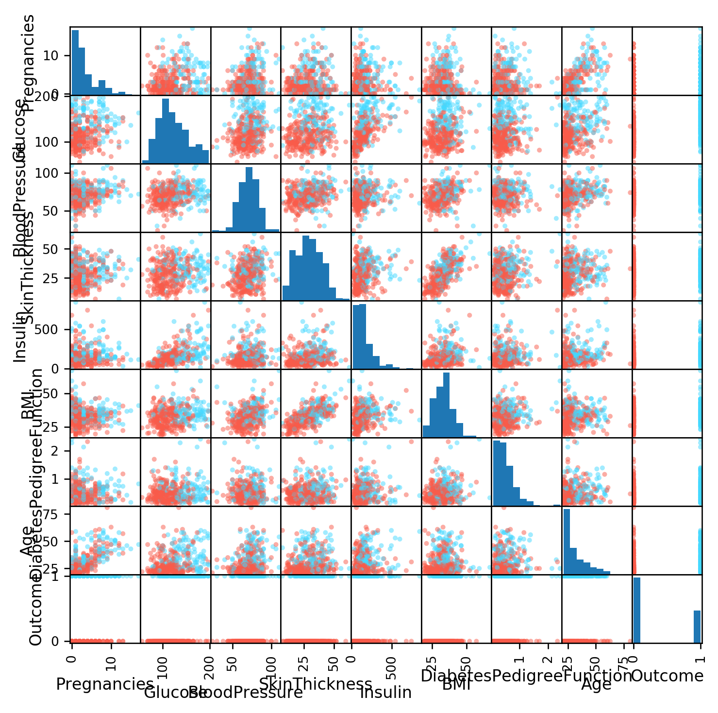
왼쪽 아래 삼각형을 보는 방법이 좋다. 대칭이긴 하지만 분산의 방향을 생각해야 하기 때문이다.
Correlation Plots
원본 그래프
sb.heatmap(df.corr())
plt.show()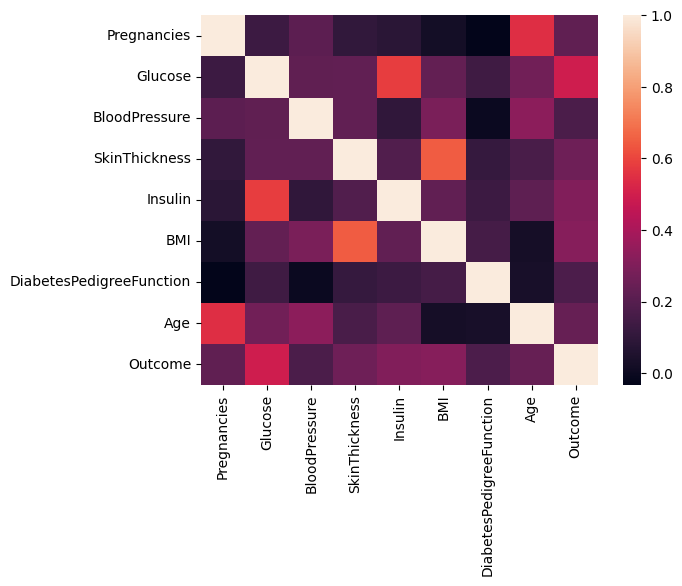
파라미터 추가
- annot : 내부에 텍스트 추가
- cmap : 색상 설정
sb.heatmap(df.corr(), annot=True, cmap="viridis", fmt="0.2f")
plt.show()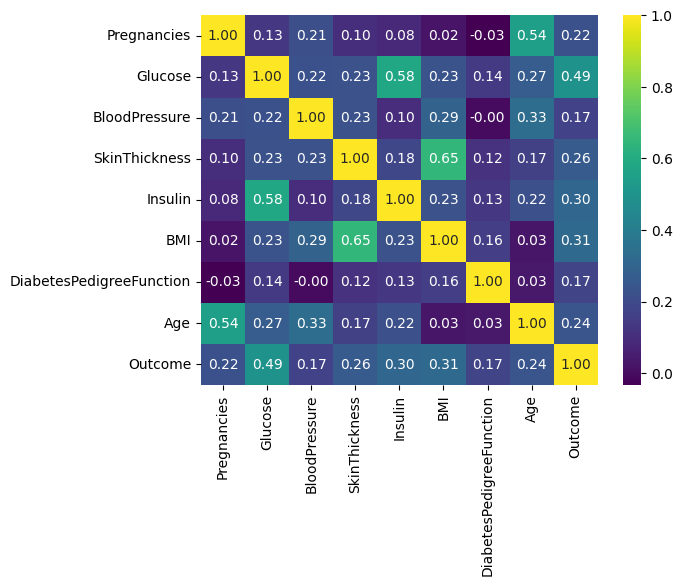
2D Histograms
- 2차원 히스토그램의 경우 표본 크기가 큰 경우에만 유효하다.
df2 = pd.read_csv("height_weight.csv")
df2.describe()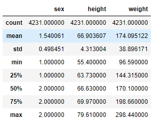
plt.hist2d(df2["height"], df2["weight"], bins=20, cmap="magma")
plt.xlabel("Height")
plt.ylabel("Weight")
plt.show()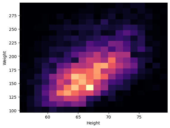
Contour plots
- 2차원 히스토그램에서는 상대적으로 정보를 얻기가 힘들다.
- 이미지에 노이즈도 많이 존재하기 때문에 Contour(등고선) Plots을 활용할 수 있다.
- 단, 따로 bins과정이 필요하다.
hist, x_edge, y_edge = np.histogram2d(df2["height"], df2["weight"], bins=20)
x_center = 0.5 * (x_edge[1:] + x_edge[:-1])
y_center = 0.5 * (y_edge[1:] + y_edge[:-1])

plt.contour(x_center, y_center, hist, levels=4)
plt.xlabel("Height")
plt.ylabel("Weight")
plt.show()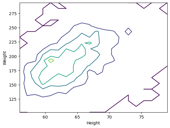
- 2차원 히스토그램처럼 노이즈가 많이 존재하는 것처럼 보인다.
- 또한 데이터가 충분하지 않다.
In Defense of Simplicity
- 무조건 복잡한 그래프를 통해 데이터를 살펴볼 필요는 없다.
- 산점도를 활용해 간단하게 필요한 정보만 탐색할 수 있다.
m = df2["sex"] == 1
plt.scatter(df2.loc[m, "height"], df2.loc[m, "weight"], c="#16c6f7", s=1, label="Male")
plt.scatter(df2.loc[~m, "height"], df2.loc[~m, "weight"], c="#ff8b87", s=1, label="Female")
plt.xlabel("Height")
plt.ylabel("Weight")
plt.legend(loc=2)
plt.show()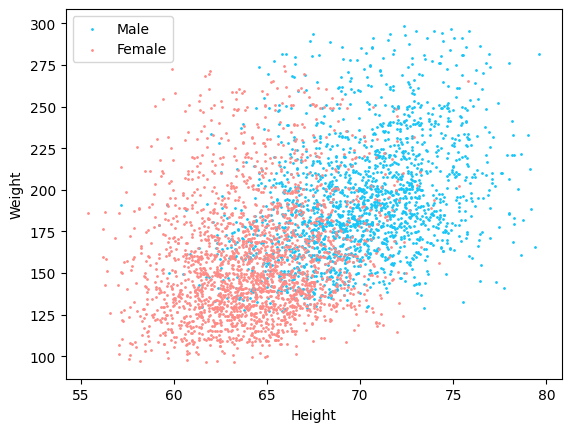
Treating points with probability
params = ["height", "weight"]
male = df2.loc[m, params].values
female = df2.loc[~m, params].values
from chainconsumer import ChainConsumer
c = ChainConsumer()
c.add_chain(male, parameters=params, name="Male", kde=1.0, color="b")
c.add_chain(female, parameters=params, name="Female", kde=1.0, color="r")
c.configure(contour_labels="confidence", usetex=False)
c.plotter.plot(figsize=2.0)
plt.show()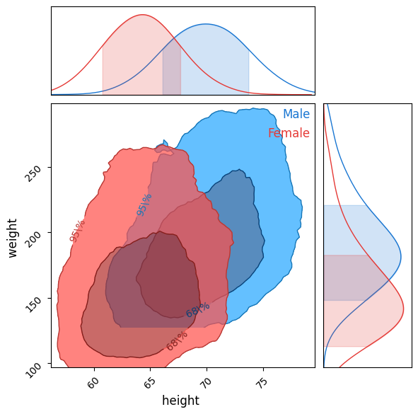
그래프 해석
- 남자와 여자에 해당하는 2개의 등고선이 존재
- 각 등고선은 2가지 수준이 존재하는데 68% 신뢰구간과 95%의 신뢰구간이다.
- 이 그래프를 통해 다른 데이터 표본에서 남자를 무작위로 고르는 경우, 키와 몸무게가 같은 표본에서 나왔다면 첫번쨰 등고선안에 있을 확률이 68%이고 두번째 등고선 안은 95%이다.
- 만약 왼쪽 아래 모서리에 있다면 확률 표본을 활용해 해당 데이터가 남자이거나 여자일 확률을 알 수 있다.
c.plotter.plot_summary(figsize=2.0)
plt.show()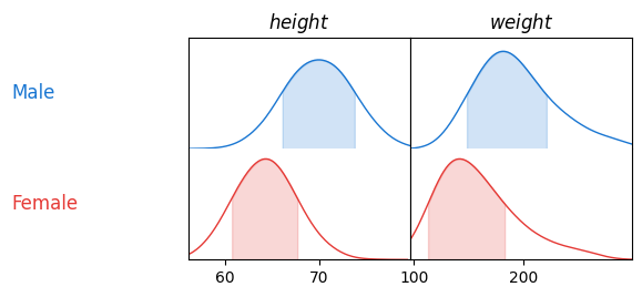
그래프 해석
- 키의 분포는 여자보다 남자에서 조금 더 크다.
- 참고 : 유데미 - 【한글자막】 Python : 통계 분석을 위한 파이썬

데이터 분석하고 있습니다