
2주 - 4일차 code camp
- CSS -> Transform, transform + transition, animation
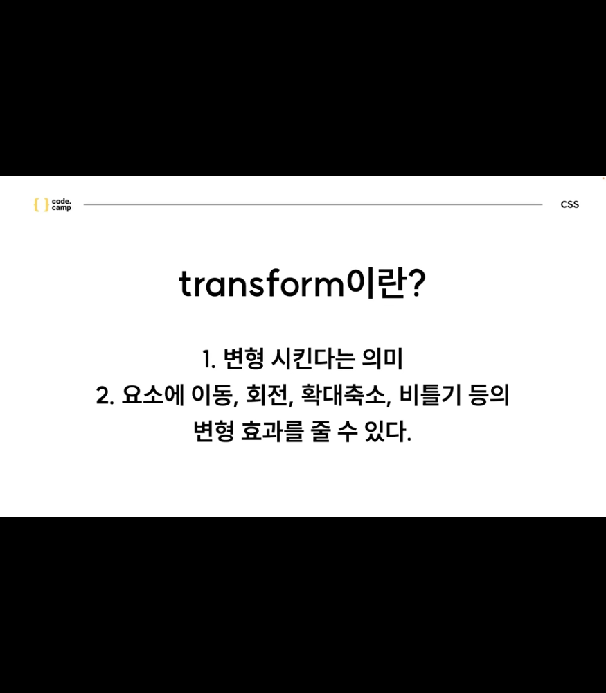
1 Transform - 변환 함수를 중첩 적용 시키는 것이 가능한 속성이다.
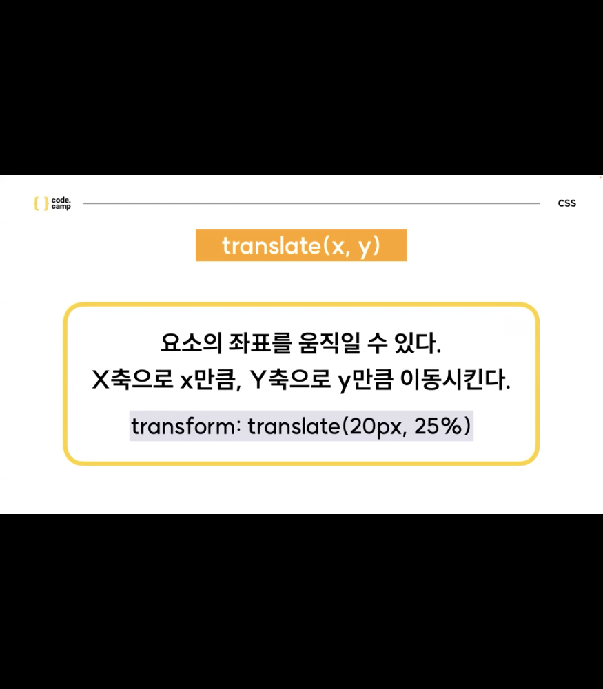
2. translate(20px, 25%)
- translateX or Y(n) - 요소의 좌표를 n만큼 움직인다
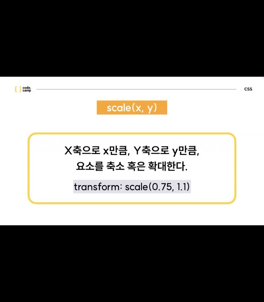
- Scale(0.75, 1.1)
- ScaleX or Y(n) - 요소의 좌표를 n만큼 움직인다
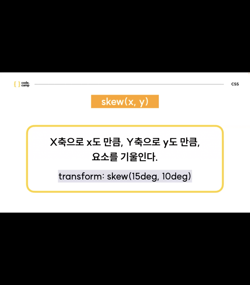
- Skew(15deg, 10deg)
- SkewX or Y(n) - 요소의 좌표를 n만큼 움직인다.
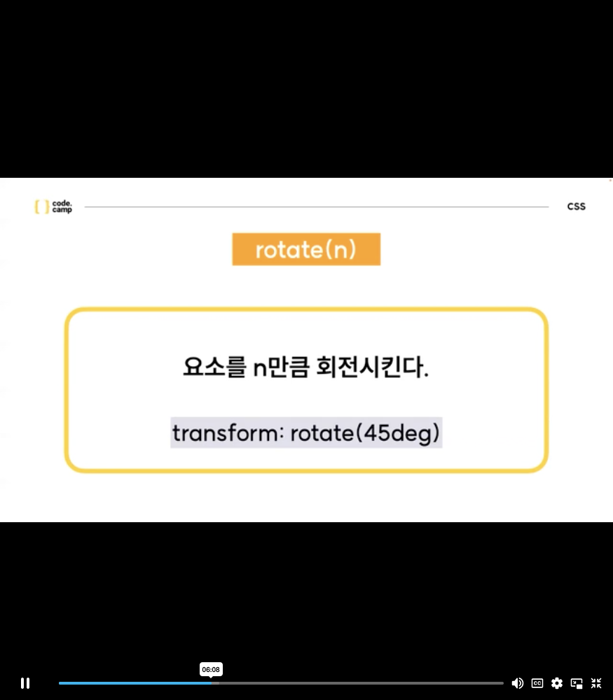
- rotate(n)
- 중첩적용
- transform : 속성() +공백+ 속성()
- transform + transition
- 같이쓰게 되면 애니메이션 효과를 볼수 있다.
* {
    box-sizing: border-box;
}

.box {
    width: 600px;
    height: 120px;
    background-image: linear-gradient(to top, orange, red);
    display: flex;
    flex-direction: row;
    justify-content: center;
    align-items: center;
}

span {
    font-size: 36px;
    color: white;
    font-weight: 600;
    transition: transform 0.4s ease-in-out;
}

.box #text1 {
    transition: transform 0.4s ease-in-out;
}

.box #text2 {
    transition: transform 0.4s ease-in-out 0.1s;
}

.box #text3 {
    transition: transform 0.4s ease-in-out 0.2s;
}

.box #text4 {
    transition: transform 0.4s ease-in-out 0.3s;
}

.box #text5 {
    transition: transform 0.4s ease-in-out 0.4s;
}

.box #text6 {
    transition: transform 0.4s ease-in-out 0.5s;
}

.box #text7 {
    transition: transform 0.4s ease-in-out 0.6s;
}

.box #text8 {
    transition: transform 0.4s ease-in-out 0.7s;
}

.box #text9 {
    transition: transform 0.4s ease-in-out 0.8s;
}

.box:hover span {
    transform: translateY(-20px);
}
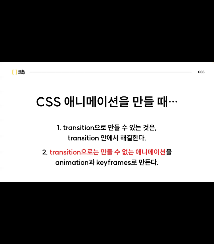
- animation
애니메이션이란?
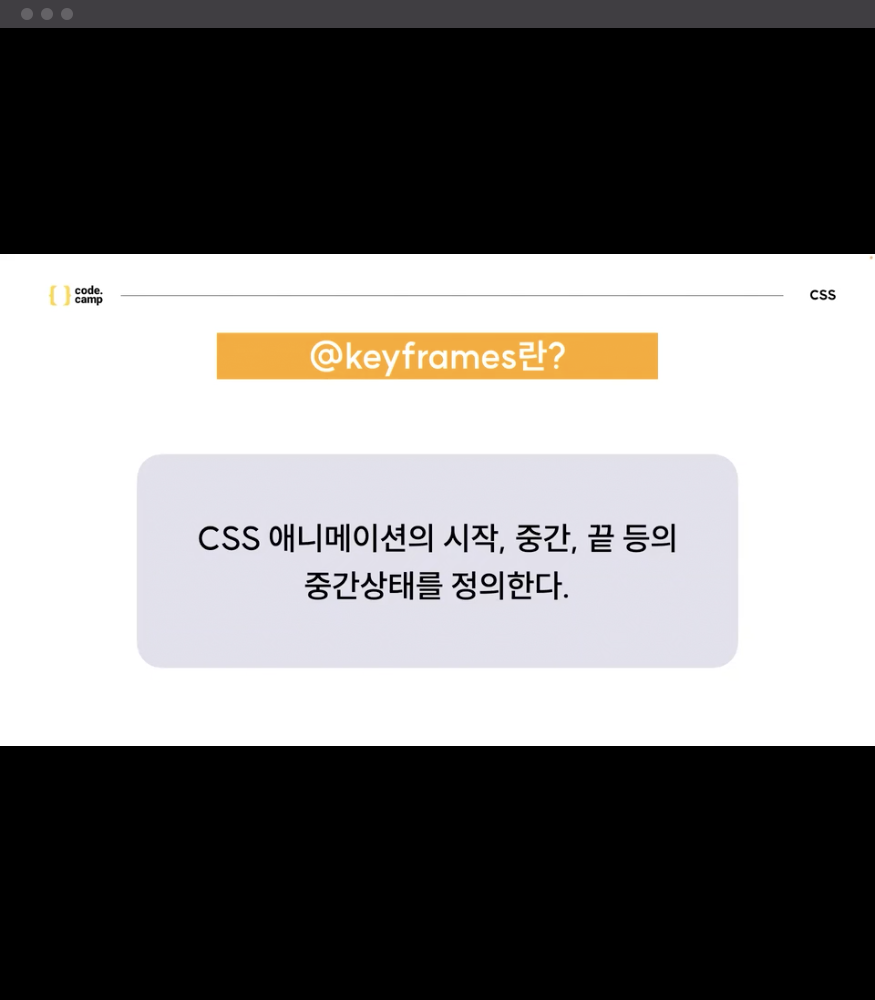
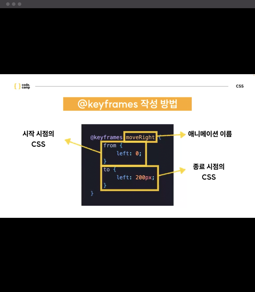
- @keyframes - 애니메이션 정의, 정의한 애니메이션을 불러와서 제어(조금 귀찮음!!)
- from & to 대신 진행도(%) 표기도 가능
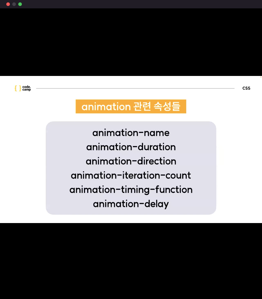
- animation 속성
- animation-name : keyframes 이름
- animation-duration : from - to로 갈대 걸리는 시간
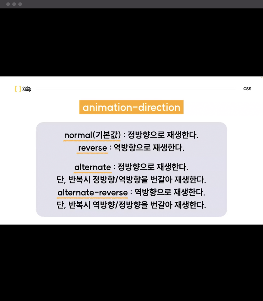
- animation-direction : 재생 방향을 정의(정방향,역방향)
- animation-iteration-count : infinite(애니메이션 재생 횟수를 정의)
- animation-timing-function : 애니메이션 재생 패턴을 정의
- animation-delay : 애니메이션 시작을 얼마나 지연할 지 설정
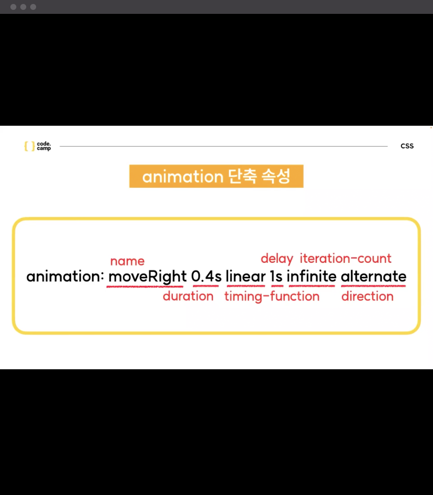
- animation 단축 속성
과제
- 과제
- 2주 - 4일차 과제 = CSS


코린이 열심히 배우자!