Scatter Plot
두개의 quantitative attribute를 위해서 scaleLinear()를 사용한다.
extent()는 데이터의 최소, 최댓값을 반환하는 함수이다.tickPadding()은 그래프와 tick 사이의 패딩을 조절한다.- Circle의
opacity값을 낮춘다.
import {
csv,
select,
scaleLinear,
axisLeft,
axisBottom,
format,
extent,
} from 'd3';
const svg = select('div')
.append('svg')
.attr('width', 1200)
.attr('height', 500);
const width = +svg.attr('width');
const height = +svg.attr('height');
const render = data => {
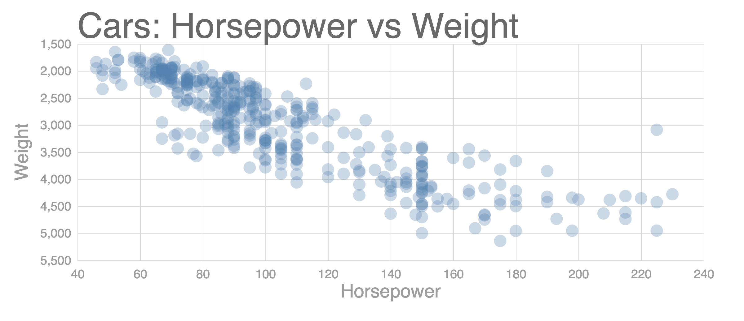
const title = 'Cars: Horsepower vs Weight';
const xValue = d => d.horsepower; // d.population
const xAxisLabel = 'Horsepower';
const yValue = d => d.weight;
const yAxisLabel = 'Weight';
const margin = {
top: 80,
right: 40,
left: 150,
bottom: 70,
};
const innerWidth = width - margin.right - margin.left;
const innerHeight = height - margin.top - margin.bottom;
const circleRadius = 10;
const xScale = scaleLinear() // (*) scaleLinear
.domain(extent(data, xValue)) // (*) extent
.range([0, innerWidth])
.nice();
const yScale = scaleLinear() // (*) scaleLinear
.domain(extent(data, yValue)) // (*) extent
.range([0, innerHeight])
.nice();
// Add margins
const g = svg
.append('g')
.attr('transform', `translate(${margin.left}, ${margin.top})`);
// Styling ticks
const xAixs = axisBottom(xScale).tickSize(-innerHeight).tickPadding(15);
const yAxis = axisLeft(yScale).tickSize(-innerWidth).tickPadding(10);
// Add axis and label
const yAxisG = g.append('g').call(yAxis);
yAxisG.selectAll('.domain').remove();
yAxisG
.append('text')
.attr('class', 'axis-label')
.attr('y', -80)
.attr('x', -innerHeight / 2)
.attr('fill', 'black')
.attr('transform', `rotate(-90)`)
.attr('text-anchor', `middle`)
.text(yAxisLabel);
const xAxisG = g
.append('g')
.call(xAixs)
.attr('transform', `translate(0, ${innerHeight})`);
xAxisG.select('.domain').remove();
xAxisG
.append('text')
.attr('class', 'axis-label')
.attr('y', 60)
.attr('x', innerWidth / 2)
.attr('fill', 'black')
.text(xAxisLabel);
// Add a title
g.append('text').attr('class', 'title').attr('y', -10).text(title);
// Create circles (data join)
g.selectAll('circle')
.data(data)
.enter()
.append('circle')
.attr('cy', d => yScale(yValue(d)))
.attr('cx', d => xScale(xValue(d)))
.attr('r', circleRadius);
};
// Represent a data table
csv('https://vizhub.com/curran/datasets/auto-mpg.csv')
.then(data => {
data.forEach(d => {
d.mpg = +d.mpg;
d.cylinders = +d.cylinders;
d.displacement = +d.displacement;
d.horsepower = +d.horsepower;
d.weight = +d.weight;
d.acceleration = +d.acceleration;
d.year = +d.year;
});
render(data);
})
.catch(error => console.log(error));
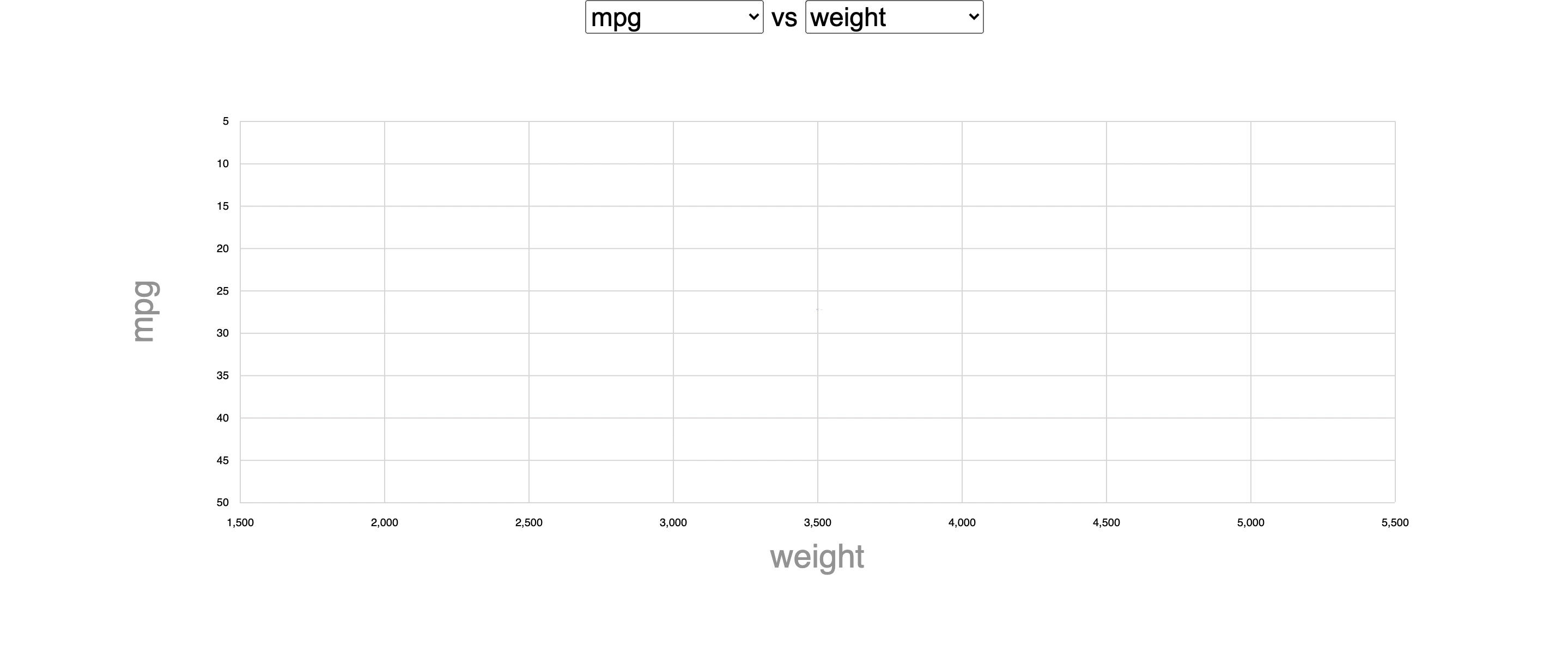
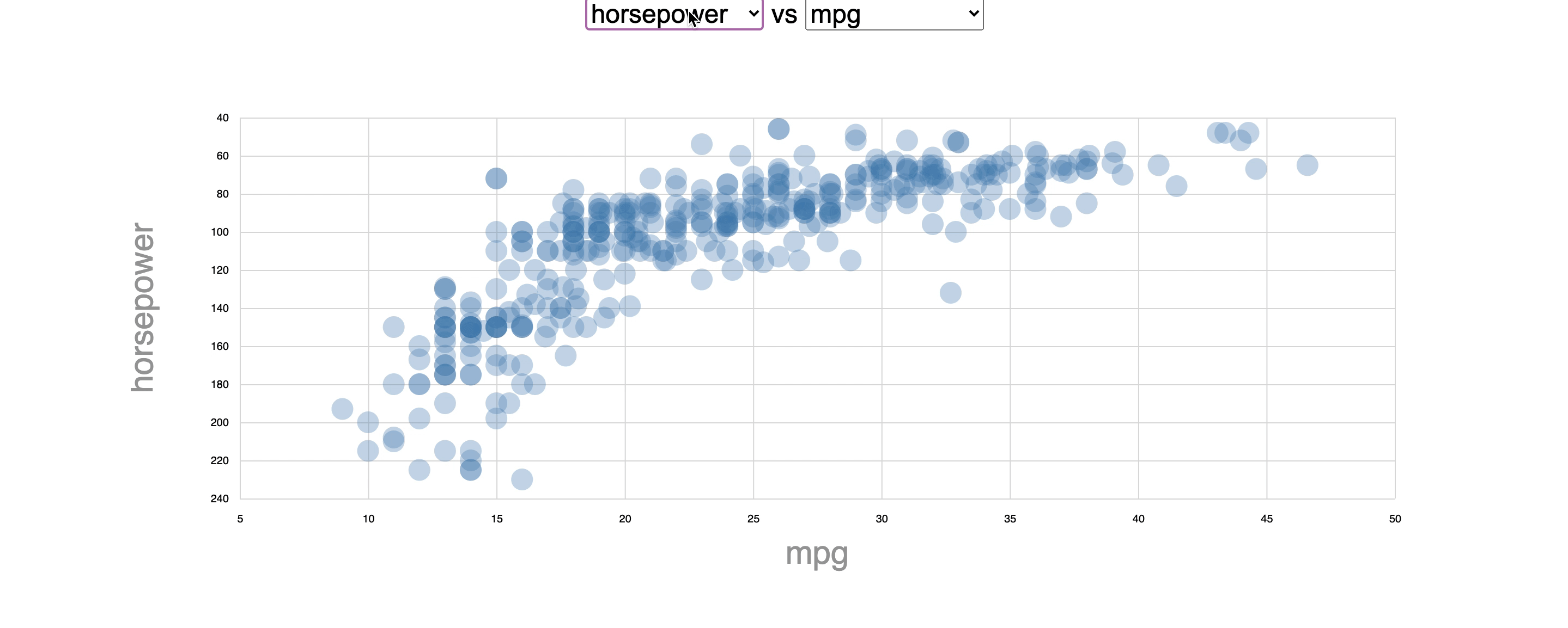
Interactive한 Scatter Plot 구현하기
Dropdown 메뉴 추가하기
// dropdownMenu.js
export const dropdownMenu = (selection, props) => {
  const { options, onOptionClicked } = props;

  let select = selection.selectAll('select').data([null]);
  select = select
    .enter()
    .append('select')
    .merge(select)
    .on('change', function () {
      // Use function declaration for "this" keyword
      onOptionClicked(this.value);
    });

  let option = select.selectAll('option').data(options);
  option
    .enter()
    .append('option')
    .merge(option)
    .attr('value', d => d)
    .text(d => d);
};
Scatter Plot 컴포넌트 만들기
- General Update Pattern을 사용해서 리팩토링
import { scaleLinear, axisLeft, axisBottom, extent } from 'd3';

export const scatterPlot = (selection, props) => {
  const {
    xValue,
    xAxisLabel,
    yValue,
    yAxisLabel,
    circleRadius,
    margin,
    width,
    height,
    data,
  } = props;

  const innerWidth = width - margin.right - margin.left;
  const innerHeight = height - margin.top - margin.bottom;

  const xScale = scaleLinear()
    .domain(extent(data, xValue))
    .range([0, innerWidth])
    .nice();

  const yScale = scaleLinear()
    .domain(extent(data, yValue))
    .range([0, innerHeight])
    .nice();

  // Add margins
  const g = selection.selectAll('.container').data([null]);
  const gEnter = g.enter().append('g').attr('class', 'container');

  gEnter.merge(g).attr('transform', `translate(${margin.left}, ${margin.top})`);

  // Formatting Number of axis
  const xAxis = axisBottom(xScale).tickSize(-innerHeight).tickPadding(15);
  const yAxis = axisLeft(yScale).tickSize(-innerWidth).tickPadding(10);

  // Add axis and label
  const yAxisG = g.select('.y-axis');
  const yAxisGEnter = gEnter.append('g').attr('class', 'y-axis');

  yAxisG.merge(yAxisGEnter).call(yAxis).selectAll('.domain').remove();

  const yAxisLabelText = yAxisGEnter
    .append('text')
    .attr('class', 'axis-label')
    .attr('y', -80)
    .attr('fill', 'black')
    .attr('transform', `rotate(-90)`)
    .attr('text-anchor', `middle`)
    .merge(yAxisG.select('.axis-label'))
    .attr('x', -innerHeight / 2)
    .text(yAxisLabel);

  const xAxisG = g.select('.x-axis');
  const xAxisGEnter = gEnter.append('g').attr('class', 'x-axis');

  xAxisG
    .merge(xAxisGEnter)
    .attr('transform', `translate(0, ${innerHeight})`)
    .call(xAxis)
    .selectAll('.domain')
    .remove();

  const xAxisLabelText = xAxisGEnter
    .append('text')
    .attr('class', 'axis-label')
    .attr('y', 60)
    .attr('fill', 'black')
    .merge(xAxisG.select('.axis-label'))
    .attr('x', innerWidth / 2)
    .text(xAxisLabel);

  // Create circles (data join)
  const circles = g.merge(gEnter).selectAll('circle').data(data);
  circles
    .enter()
    .append('circle')
    .merge(circles)
    .attr('cy', d => yScale(yValue(d)))
    .attr('cx', d => xScale(xValue(d)))
    .attr('r', circleRadius);
};
index.js 리팩토링
import { csv, select } from 'd3';
import { dropdownMenu } from './scatter-plot/dropdownMenu';
import { scatterPlot } from './scatter-plot/scatterPlot';

const menus = select('body').append('div').attr('class', 'menus');
const chart = select('body').append('div').attr('class', 'chart');
const svg = select('.chart')
  .append('svg')
  .attr('width', 1200)
  .attr('height', 500);

const yMenu = select('.menus').append('span').attr('class', 'y-menu');
const xMenu = select('.menus')
  .append('span')
  .attr('class', 'x-menu')
  .append('text')
  .text(' vs ');

const width = +svg.attr('width');
const height = +svg.attr('height');

// State
let data;
let xColumn;
let yColumn;

const onXColumnClicked = col => {
  xColumn = col;
  render();
};

const onYColumnClicked = col => {
  yColumn = col;
  render();
};

const render = () => {
  // Create select and options
  xMenu.call(dropdownMenu, {
    options: data.columns,
    onOptionClicked: onXColumnClicked,
  });

  yMenu.call(dropdownMenu, {
    options: data.columns,
    onOptionClicked: onYColumnClicked,
  });

  // Create Scatter Plot
  svg.call(scatterPlot, {
    width,
    height,
    xValue: d => d[xColumn],
    xAxisLabel: xColumn,
    yValue: d => d[yColumn],
    yAxisLabel: yColumn,
    margin: {
      top: 80,
      right: 40,
      left: 100,
      bottom: 70,
    },
    circleRadius: 10,
    data,
  });
};

// Represent a data table
csv('https://vizhub.com/curran/datasets/auto-mpg.csv')
  .then(loadedData => {
    // Set State
    data = loadedData;

    data.forEach(d => {
      d.mpg = +d.mpg;
      d.cylinders = +d.cylinders;
      d.displacement = +d.displacement;
      d.horsepower = +d.horsepower;
      d.weight = +d.weight;
      d.acceleration = +d.acceleration;
      d.year = +d.year;
    });

    // set initial axis labels
    yColumn = data.columns[0];
    xColumn = data.columns[4];
    render();
  })
  .catch(error => console.log(error));
Animation 추가하기

// scatterPlot.js
circles
    .enter()
    .append('circle')
    .attr('cy', innerHeight / 2) // Center initial circles
    .attr('cx', innerWidth / 2)
    .attr('r', 0)  // (*)
    .merge(circles)
    .transition()
    .duration(2000)  // (*)
    .delay((d, i) => i * 10)  // (*)
    .attr('cy', d => yScale(yValue(d)))
    .attr('cx', d => xScale(xValue(d)))
    .attr('r', circleRadius);
Hello World.