타입스크립트와 styled-components를 이용해보자
0. npm i styled-components를 실행해보자
그러면 바로 오류가 난다
why?
typescript로 만들어지지 않은 라이브러리를 import할 때가 있다.
그럴 때는 npm install @types/styeld-components를 입력해주면 된다.
1. 무작정 props를 줘보자
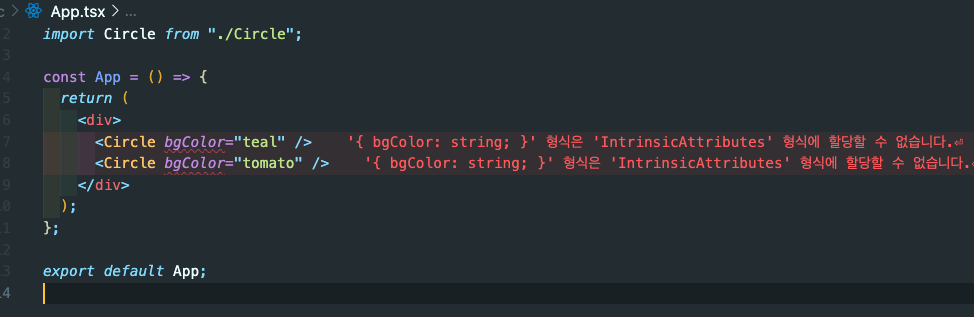
Circle 이라는 컴포넌트에 bgColor를 내릴려고 한다.
하지만 위 사진과 같은 에러가 난다
바로 interface에서 타입을 안정해줬기 때문이다
bgColor ="teal"(여기서 teal이 string인지, number인지 안정해줌)
2.이제 interface를 사용해보자
import React from "react";
import styled from "styled-components";

const Container = styled.div``;

interface CircleProps {  // interface를 설정해주고
  bgColor: string; // 타입을 정해주고
}

function Circle({ bgColor }: CircleProps) {  //bgColor prop을 받아오고, : CircleProps를 적어주자
  // 타입스크립트는 CircleProps안에 bgColor가 있다는 것을 알고있다.
  return <Container />;
}

export default Circle;
3. Styled-components에도 props를 이용해보자
import React from "react";
import styled from "styled-components";

interface ContainerProps {
  bgColor: string;
}
const Container = styled.div<ContainerProps>`
  width: 200px;
  height: 200px;
  background-color: ${(props) => props.bgColor}; // 여기서 props을 받기이ㅜ해 <ContainerProps>를 위에다 밖아놨음
`;

interface CircleProps {
  bgColor: string;
}

function Circle({ bgColor }: CircleProps) {
  return <Container bgColor={bgColor} />; // Ts에게 bgColor를 styled-component에게도 보내고 싶다고 말할거야
}

export default Circle;
4. Interface는 Object를 설명해준다.
5. 옵셔널 Optional
interface CircleProps {
  bgColor: string; //bgColor 필수이다.
  borderColor?: string; //borderColor는 있어도 그만 없어도 그만이다.
}
function Circle({ bgColor, borderColor }: CircleProps) {
return <Container bgColor={bgColor} borderColor={borderColor ?? bgColor} />;
// 만약 borderColor가 undefined 상태라면 bgColor와 같은 색상을 가진다.
// 만약 borderColor가 있다면 b-C를 사용하고 없다면 ?? 다음에 오는 것을 사용하세요
}
6. props로 받지 말고 default 값 주기
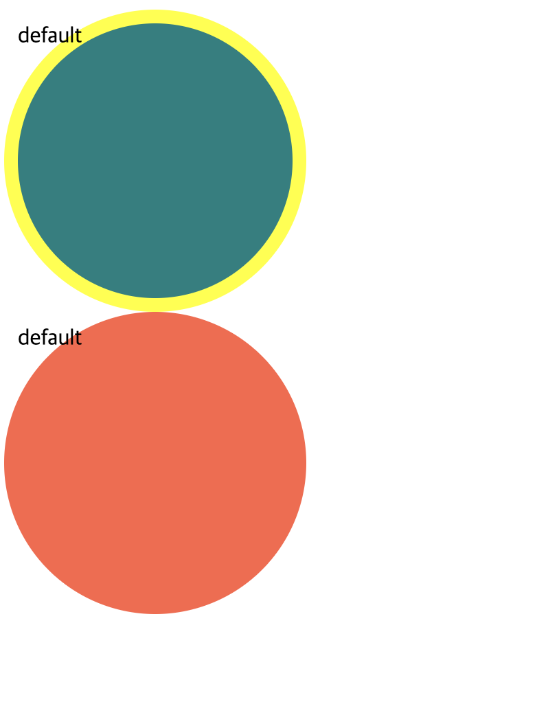
function Circle({ bgColor, borderColor, text = "default" }: CircleProps) { // 이렇게 text에 default 값을 줄 수 있다.
  return (
    <Container bgColor={bgColor} borderColor={borderColor ?? bgColor}>
      {text}
    </Container>
7. useState에 Type 주기
function Circle() {
const [value, setValue] = useState <number | string>("hi"); // 이렇게 타입을 정해주면 됨
setValue(2);
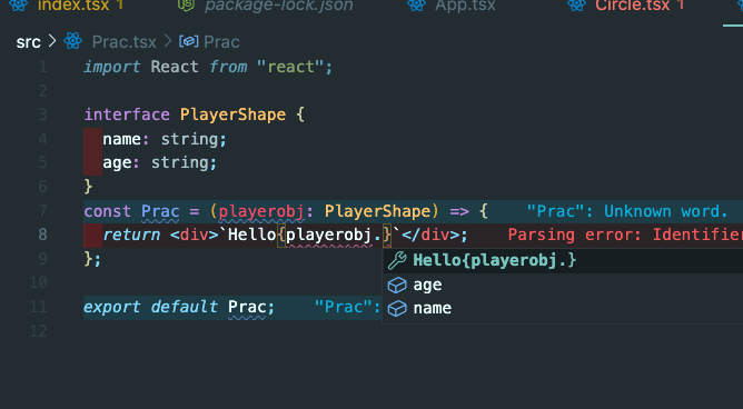
setValue("hello");8. 구조분해할당, React.FormEvent <>HTMLInputElement
import React, { useState } from "react";

const App = () => {
const [value, setValue] = useState("");
const onChange = (event: React.FormEvent<HTMLInputElement>) => {
  console.log(event.currentTarget.value);
  const {
    currentTarget: { value },
  } = event;
  setValue(value); // 여기서 구조분해할당을함, value를 편하게 쓰기 위해서임
};

const onSubmit = (event: React.FormEvent<HTMLFormElement>) => {
  event.preventDefault();
  console.log("hello", value);
};

return (
  <div>
    <form onSubmit={onSubmit}>
      <input
        onChange={onChange}
        value={value}
        type="text"
        placeholder="username"
      />
      <button>Login</button>
    </form>
  </div>
);
};

export default App;
헌데 만약에 currentTarget안에서 value, tagName, width, id 이 4개를 가져오고 싶다고 하면 기존 문법으로는 이렇게 써야 되겠죠?
const value = event.currentTarget.value;
const tagName = event.currentTarget.tagName;
const width = event.currentTarget.width;
const id = event.currentTarget.id;
이거를 이렇게 바꿔 쓰실수 있습니다.
const {
currentTarget: {value, tagName, width, id}
} = event;
9. 타입스크립트와 styled-components를 연결해보자
우선 style.d.ts를 만든다
전역으로 관리하게 위해
styled.d.ts

// import original module declarations
import "styled-components";

// and extend them!
declare module "styled-components" {
  export interface DefaultTheme {
    textColor: string; // textColor, bgColor, btnColor을 사용할꺼임, 미리 타입을 지정함
    bgColor: string;
    btnColor: string;
  }
}
10. 다음 theme.ts를 만든다
다크모드 사용시, 여기서 미리 색상을 정해서 추후에 component에 prop으로 내려줄 수 있음
theme.ts

import { DefaultTheme } from "styled-components";

export const lightTheme: DefaultTheme = { // 밝은모드 시 아래로 설정
  bgColor: "white",
  textColor: "black",
  btnColor: "tomato",
};
export const darkTheme: DefaultTheme = { // 다크모드 시 아래로 설정
  bgColor: "black",
  textColor: "white",
  btnColor: "teal",
};
- 이제 index.tsx가서 위에 씌어주자
index.tsx

import React from "react";
import ReactDOM from "react-dom/client";
import { ThemeProvider } from "styled-components";

import App from "./App";
import { darkTheme, lightTheme } from "./theme";

const root = ReactDOM.createRoot(
  document.getElementById("root") as HTMLElement
);
root.render(
  <ThemeProvider theme={lightTheme}>
    <App />
  </ThemeProvider>
);
11. 정리
interface DummyProps {
  text: string;
  active: boolean;
}

function Dummy({ text, active }: DummyProps) {
  return (
    <h1>
      {text}
      {active}
    </h1>
  );
}

const App = () => {
  return (
    <Container>
      <Dummy text="hello" active={true} />
    </Container>
  );
};
function App() {
  const onClick = (event: React.FormEvent<HTMLButtonElement>) => {};  // 이렇게 타입을 정해주면 된다.
  return (
    <Container>
      <Dummy text="hello" />
      <form>
        <button onClick={onClick}>버튼</button>
      </form>
    </Container>
  );
}- 우선 Dummy 컴포넌트에 text와 active를 prop으로 내릴거야, 그전에 어떤 값을 적어주자.
- 다음 Dummy 에서는 text와 active를 받는다. 하지만 타입이 없기에 오류가 난다
- 그래서 interface로 text와 active의 타입을 잡아준다.
끝