
실습 도구 1️⃣
【서울시 CCTV 현황 데이터 분석】에 사용된 라이브러리
✅ Pandas 기초
< Series >
- Pandas의 데이터형을 구성하는 기본은 Series이다.
- index와 value로 이루어져 있다
    import pandas as pd
    import numpy as np

    pd.Series([1, 2, 3, 4])
    # 실행결과
    # 0    1
    # 1    2
    # 2    3
    # 3    4
    # dtype: int64

    pd.Series([1, 2, 3, 4], dtype=np.float64)
    # 실행결과
    # 0    1.0
    # 1    2.0
    # 2    3.0
    # 3    4.0
# dtype: float64- 한 가지 데이터 타입만 가질 수 있다
    pd.Series([1, 2, 3, "5"])
    # 실행결과
    # 0    1
    # 1    2
    # 2    3
    # 3    5
    # dtype: object
    	👆 전체를 문자열 데이터로 인식한다.
    	   즉, Series는 한 가지 데이터 타입만 가질 수 있다.
< DataFrame >
-
Pandas에서 가장 많이 사용되는 데이터형은 DataFrame이다.
-
pandas DataFrame 구조 : index, columns, values
    import pandas as pd
    import numpy as np

    dates = pd.date_range("20230101", periods=6)
    data = np.random.randn(6, 4) # 표준정규분포에서 샘플링한 난수 생성

df = pd.DataFrame(data, index=dates, columns=["A", "B", "C", "D"]) - 실행결과
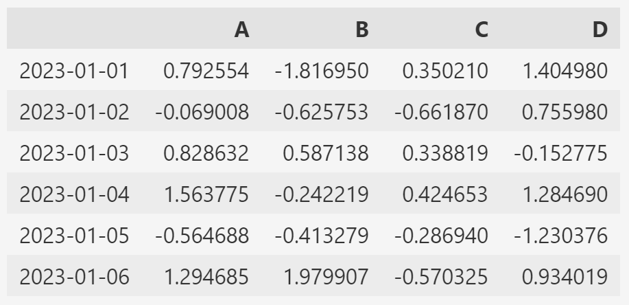
🔰 DataFrame 정보 탐색
- Pandas DataFrame 객체의 메서드 : df.head(), df.tail(), df.info(), df.describe()...

- Pandas DataFrame 객체의 속성(변수) : df.index, df.columns, df.values, ...-
info(): DataFrame의 개요(기본 정보)를 확인하는 메서드- 여기서는 각 컬럼의 크기와 데이터 형태를 확인하는 경우가 많다.
-
describe(): DataFrame의 통계적 개요(기본 정보)를 확인하는 메서드- count : column별 value 개수
- mean : 평균값
- std : 표준편차
- min, max : 최소, 최대 값
🔰 데이터 정렬
- 특정 컬럼(열)을 기준으로 데이터를 정렬한다.
- 정렬의 Default는 오름차순이다.
ascending=False이면 내림차순 정렬이다. - 정렬 결과를 데이터에 반영하려면 inplace 매개변수가 필요하다.
df.sort_values(by='__column', ascending=True, inplace=True)🔰 조건(condition)
- 특정 컬럼에서 조건이 True인 모든 rows 값 출력
df[df['A'] > 0]- 전체 DataFrame에서 0보다 큰 것을 만족하는 value만 출력
- 조건(df>0)을 만족하지 못하는 value는 NaN으로 표시된다.
- NaN(Not a Number) : 데이터가 아니라는 의미
df[df > 0]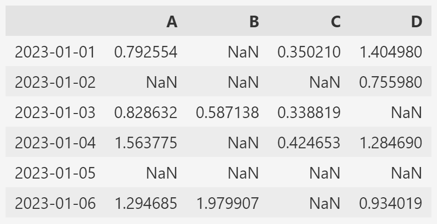
🔰 커럼 추가
- 해당 컬럼이 기존 데이터에 없다면 추가
- 해당 컬럼이 기존 데이터에 있다면 수정
    df['E'] = ['one', 'one', 'two', 'three', 'four', 'seven']
    //-> 'E'컬럼을 만들고 리스트의 값들로 채운다.
🔰 컬럼 제거
- del df[columns_name]: 제거 결과가 데이터 바로 반영된다.
- df.drop([columns_name]) : inplace param을 적용해야 제거 결과가 데이터에 반영된다.
- drop()은 axis 설정이 필요하다. → axis : {0 or 'index', 1 or 'columns'}, default 0
- axis=0 일 때는 Row 이름을 써줘야 한다.
    del df['E']
    df.drop(['D'], axis=1) //-> axis=1 세로(column)
    df.drop(['20230104'], inplace=True)
✅ Pandas 병합
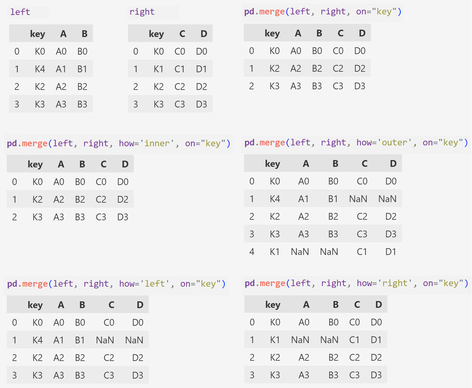
< pandas.merge(left, right) >
- pandas의 DataFrame 데이터끼리의 병합은 빈번히 일어난다.
- 병합 후 데이터가 엉망이 되지 않도록 잘 익혀야 한다.
- 두 데이터 프레임에서 컬럼이나 인덱스를 기준으로 잡고 병합하는 방식
- 기준이 되는 컬럼이나 인덱스를 키값이라고 한다.
- 기준이 되는 키값은 두 데이터 프레임에 모두 포함되어 있어야 한다.
    left = pd.DataFrame({
        "key": ['K0', 'K4', 'K2', 'K3'],
        "A": ['A0', 'A1', 'A2', 'A3'],
        "B": ['B0', 'B1', 'B2', 'B3']
    })
    right = pd.DataFrame([
        {"key": 'K0', "C": 'C0', "D": 'D0'},
        {"key": 'K1', "C": 'C1', "D": 'D1'},
        {"key": 'K2', "C": 'C2', "D": 'D2'},
        {"key": 'K3', "C": 'C3', "D": 'D3'}
    ])

    pd.merge(left, right, on="key") //-> "key" 컬럼을 기준으로 병합
    pd.merge(left, right, how='inner', on="key") //-> 두 데이터 교집합
    pd.merge(left, right, how='outer', on="key") //-> left와 right의 모든 "key"값을 살려 병합
    pd.merge(left, right, how='left', on="key")  //-> left의 "key"를 기준으로 right 병합
pd.merge(left, right, how='right', on="key") //-> right의 "key"를 기준으로 left 병합- 실행결과
✅ Matplotlib 기초
-
파이썬의 대표 시각화 도구이다.
-
pyplot은 MATLAB의 시각화 기능들을 담아놓은 것이다.
-
공식문서를 참고한다.
-
jupyter notebook 내에서 matplotlib의 결과(그래프)가 output session에 바로 나타나도록 해주는 옵션을 사용한다.
- %matplotlib inline
- get_ipython().run_line_magic("matplotlib", "inline")
- 두번째 정식 코드를 호출해서 사용할 것을 권장한다.
    import matplotlib.pyplot as plt
    from matplotlib import rc

    //# 마이너스 부호 때문에 한글이 깨질 수가 있어 주는 설정
    plt.rcParams["axes.unicode_minus"] = False

    rc("font", family="Malgun Gothic")
    get_ipython().run_line_magic("matplotlib", "inline")
🔰 예제1. 그래프 기초: 삼각함수 그리기
    import numpy as np

    t = np.arange(0, 12, 0.01) # 0부터 12까지 0.01 간격으로 1200개의 값
    y = np.sin(t)

    def drawGraph():
        plt.figure(figsize=(10, 6))
        plt.plot(t, np.sin(t), label="sin")
        plt.plot(t, np.cos(t), label="cos")
        plt.legend(loc=1) # plot 라벨의 범례

        plt.grid(True)
        plt.title("Example of sine and cosine wave")
        plt.xlabel("time")
        plt.ylabel("Amplitude")
        plt.show()

    drawGraph()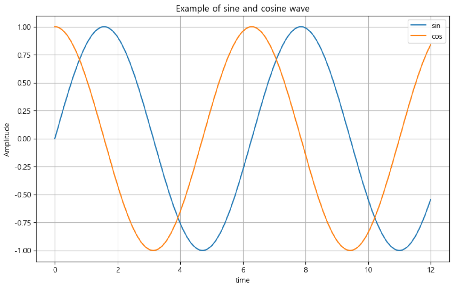
🔰 예제2. 그래프 커스텀
    t = list(range(0, 7)) # t = [0, 1, 2, 3, 4, 5, 6]
    y = [1, 4, 5, 8, 9, 5, 3]

    def drawGraph():

        plt.figure(figsize=(7, 4))
        plt.plot(
            t,
            y,
            color="red",
            linestyle="--", # "dashed"
            marker="o",
            markerfacecolor="blue",
            markersize=7,
        )

      # 축의 범위를 지정 (limit값)
        plt.xlim([-0.5, 6.5])
        plt.ylim([0.5, 9.5])
        plt.show()

    drawGraph()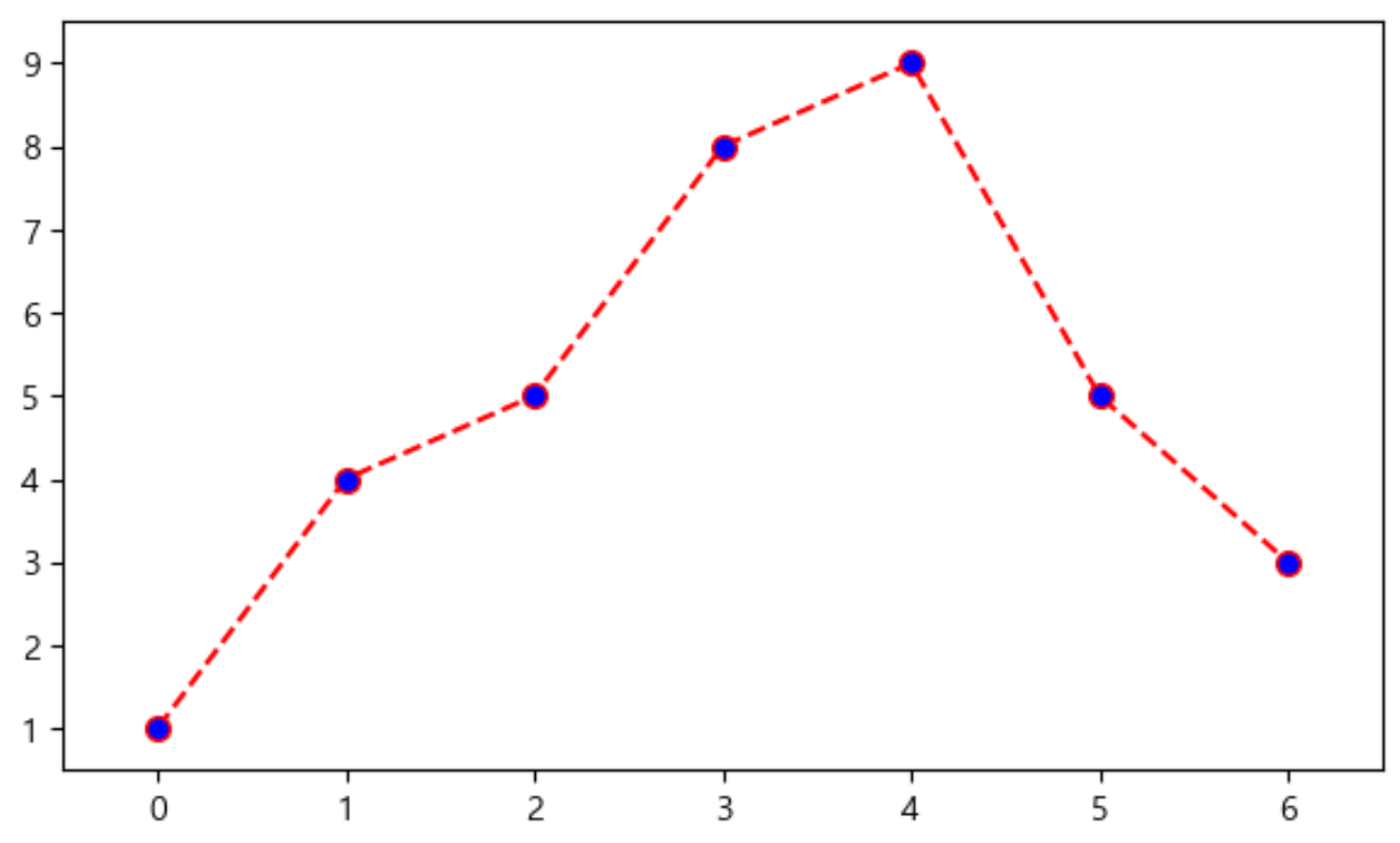
🔰 예제3. scatter plot
    t = np.array(range(0, 10))
    y = np.array([9, 8, 7, 9, 8, 3, 2, 4, 3, 4])
    colormap = t

    def drawGraph():
        plt.figure(figsize=(10, 6))
        plt.scatter(t, y, s=150, marker='<', c=colormap)
    	plt.colorbar()

    drawGraph()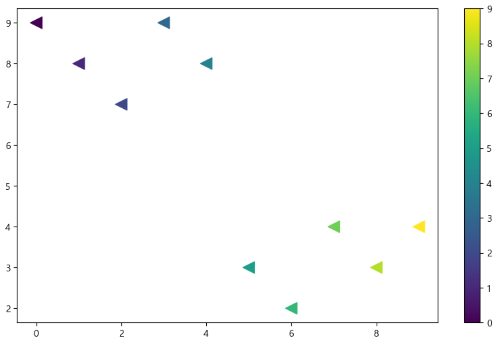

ISTP(정신승리), To Be Data Scientist