레이아웃 2일차
시작하기 전에
오늘 강의로 알게된 위치 속성이 많이 늘어났다.
이들 속성을 살펴보기 전에, position: absolute 속성의 마무리부터 시작한다.
position: absolute
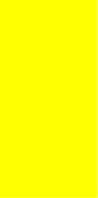
형제 태그간의 position: absolute 상관관계는 4가지 경우가 있다.
(아마 3차원 태그에 모두 적용될 것 같으나, fixed는 독립적이며, relative는 특이한 속성이므로 가장 평범한 3차원 속성이라 다루는 것 같다.)
- 두 개의 형제 태그가 모두
absolute속성을 가지지 않으면 겹침이 일어나지 않음. - 두 개의 형제 태그가 모두
absolute속성를 가지면 나중에 정의된 태그가 맨 위로 온다.
이 때,z-index를 정해주면 높이값을 정해줄 수 있다. 높이가 같을 경우엔 정하지 않았을 때와 같다. - 첫 형제 태그가 3차원이고, 두 번째 태그가 2차원이면 겹침이 일어난다.
- 첫 형제 태그가 2차원이고, 두 번째 태그가 3차원이면 겹침이 일어나지 않음.
(html)
<div class="z-one"></div>
<div class="z-two"></div>
(css)
.z-one {
	position: absolute;
	width: 200px;
	height: 400px;
	background-color: yellow;
	z-index: 10;
}
.z-two {
	position: absolute;
	width: 200px;
	height: 300px;
	background-color: blue;
	z-index: 20;
}
겹침이 일어나지 않을 때
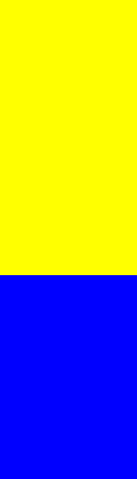
겹침이 일어나서 두 번째 태그가 맨 위로 왔을 때
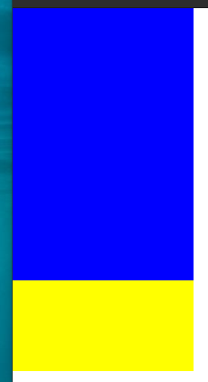
겹침이 일어나서 두 번째 태그가 맨 위로 왔을 때
float 위치 속성
float left, center, right : 3차원 속성을 부여. 다음 태그가 2차원이면 그 태그는 맨 뒤로 가면서 겹쳐진다. 이 때, 2차원 태그가 이전의 3차원 태그에 겹쳐지지 않으려면 clear 를 사용한다. 이 태그는 가장 마지막으로 float 기능을 끈다.
(라고는 하는데, 마지막 float 태그에만 영향을 받는게 아니라 인접하는 float 태그를 기준으로 정렬된다)
header {
	width: 100%;
	height: 100px;
	background-color: yellow;
}
.left-1 {
	float: left;
	width: 300px;
	height: 200px;
	background-color: pink;
}
.center {
	float: left;
	width: 300px;
	height: 300px;
	background-color: blue;
}
.right-1 {
	float: right;
	width: 300px;
	height: 200px;
	background-color: green;
}
footer {
	clear: both;
	width: 100%;
	height: 100px;
	background-color: black;
}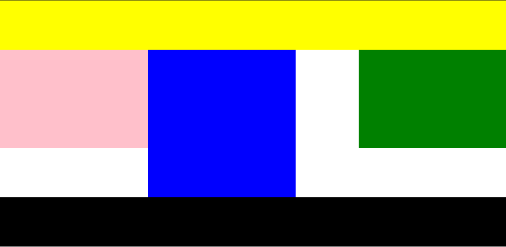
이 때, 브라우저 창이 left+center+right 의 폭보다 작을 경우, float: right와 float: right 레이어가 줄 바꿈 현상이 일어난다.
이에 대한 해결책은 두 가지가 있다.
- 부모 태그와 레이어를 생성해서 left+center+right 의 폭보다 크게 지정한다.
이 때 부모 레이어의 높이값이 없을 경우, 3차원인 left+center+right 레이어에 영향을 주지 않으므로 빈 배경으로 만들 수 있다.
- left+center+right 각각의 폭을 %로 지정하여 합 100%로 만든다.
float을 사용할 때는 static(기본값)이거나 relative만 적용이 가능하며,
absolute와 fixed는 적용이 되지 않는다.
relative와 같은 3차원 속성을 반만 가진다고 생각하면 될 듯.
한 편, clear 속성을 위한 태그를 만들어 따로 구분하는 것이 일반적인 관례라고 한다.
(직관적인 구조를 위한 것..이라고는 하는데 잘 모르겠다.)
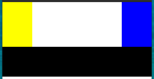
(html)
<div class="left-2"></div>
<div class="right-2"></div>
<div class="clearifx"></div>
<footer></footer>
(css)
.left-2{
	float: left;
	width: 100px;
	height: 150px;
	background-color: yellow;
}
.right-2{
	float: right;
	width: 100px;
	height: 150px;
	background-color: blue;
}
.clearifx{
	clear: both;
}
footer {
	width: 100%;
	height: 100px;
	background-color: black;
}
새로운 위치속성들
overflow 속성은 지정된 크기를 벗어난 넘치는 이미지나 텍스트에 관계된 속성이다.
overflow: hidden 은 넘친 내용물을 단순히 감춘다.
overflow-y: scroll, overflow-x: scroll은 각각 x, y 방향으로 넘친 내용물에 대해 스크롤을 만든다.
.over-box{
	overflow-y: scroll;
	overflow-x: scroll;
	width: 200px;
	height: 200px;
	background-color: yellow;
}
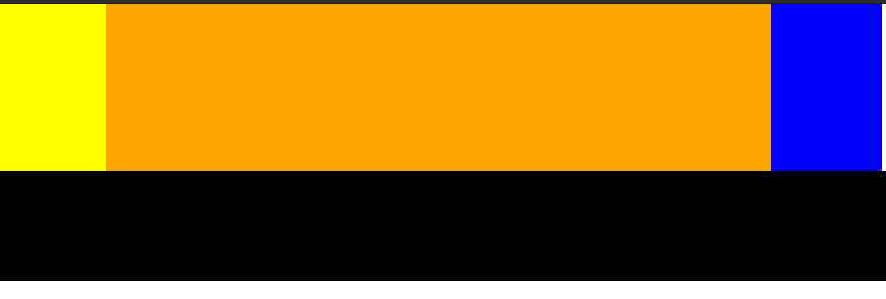
자식이 float 속성, 부모가 overflow: hidden 속성을 가질 경우, 부모 레이어의 범위를 벗어나는 자식 레이어는 감춰진다.
(html)
<section>
	<div class="left-2"></div>
	<div class="right-2"></div>
</section>
<div class="clearifx"></div>
<footer></footer>
(css)
.left-2{
	float: left;

	width: 100px;
	height: 150px;
	background-color: yellow;
}
.right-2{
	float: right;

	width: 100px;
	height: 150px;
	background-color: blue;
}
.clearifx{
	clear: both;
}
footer {
	width: 100%;
	height: 100px;
	background-color: black;
}
section {
	overflow: hidden;
	width: 800px;
	background-color: orange;
}
그외의 다양한 위치 속성
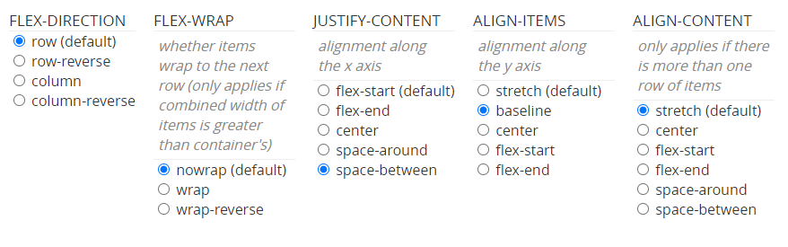
flex-direction 옵션은 row, column, row-reverse, column-reverse
각각 좌->우, 위->아래, 우->좌, 아래->위 방향으로 형제 레이어를 정렬한다.
flex-wrap 옵션은 nowrap, wrap, wrap-reverse(잘 쓰지 않는다고 한다)
같은 부모 레이어 간의 위치속성을 묶어줄 때 사용하는 속성이다.
속성을 묶어 부모1의 하위 레이어들은 왼쪽으로, 부모2의 하위 레이어들은 오른쪽으로 정렬할 수 있다.
justify-content 옵션은 flex-start, flex-end, center, space-between, space-around가 있고, 각각 시작점 정렬, 끝점 정렬, 가운데 정렬, 사이에 균일한 간격, 둘레에 균일한 간격 을 만든다.
align-items 옵션은 stretch, baseline, center, flex-start, flex-end가 있고, 각각 수직축 방향으로 끝까지 늘림, 텍스트 기본라인 정렬, 가운데 정렬, 시작점 정렬, 마지막점 정렬(이 때, 시작점과 마지막점은 row배치일때 위, column배치일 때 왼쪽이다) 이다.
align-content 옵션은 align-items 옵션과 유사하나, flex-wrap 옵션으로 여러 레이어가 묶인 레이어들에 적용하는 옵션이다.
금일 배운 위치 속성으로 만든 html이며, 상세한 코드는 아래 깃허브 링크에 업로드 되었다.
참고 사이트
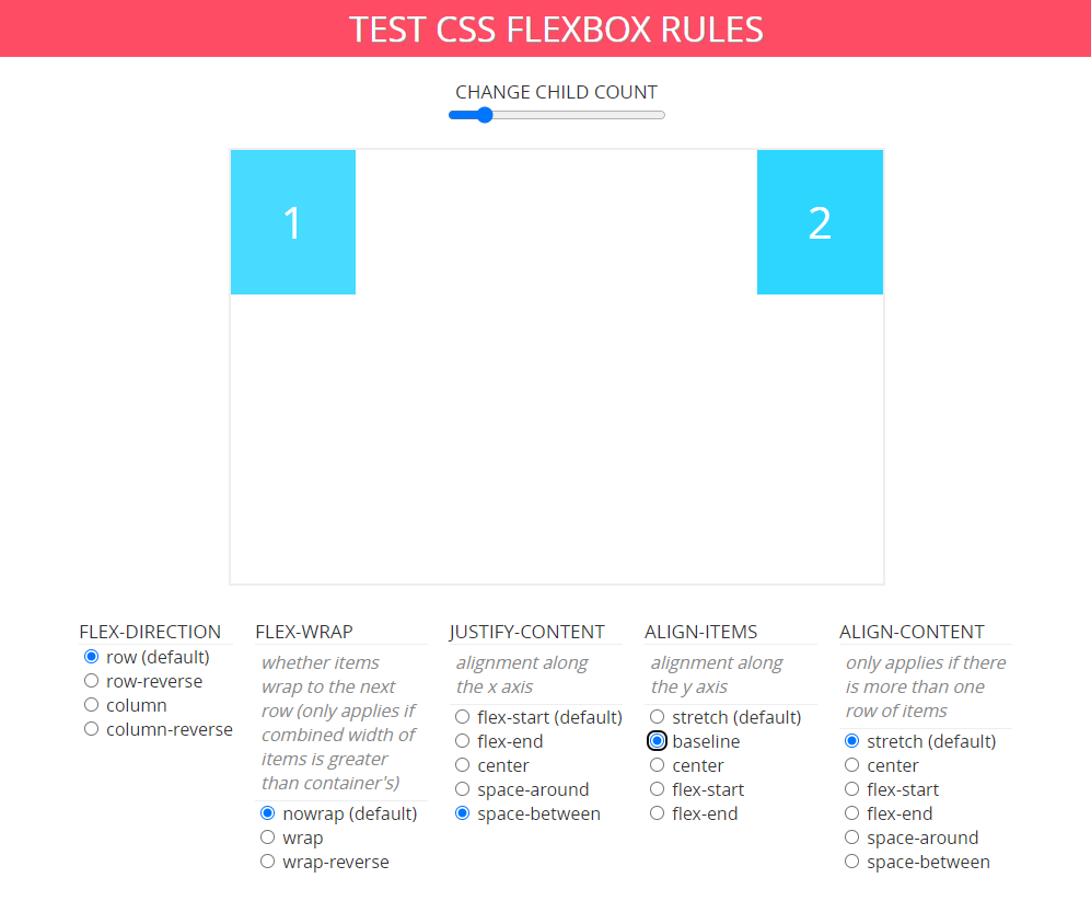
위 사이트에서 옵션을 선택하면 아래와 같이 css 코드가 자동으로 출력된다.
{
	display: flex;
	flex-direction: row;
	flex-wrap: nowrap;
	justify-content: space-between;
	align-items: baseline;
	align-content: stretch;
}
CSS-TRICK
CSS 스타일 우선순위
CSS Position 설명
CSS 레이아웃을 배웁시다
이번에야말로 CSS Flex를 익혀보자
어려웠던 점 및 해결 방법
갑자기 많은 위치속성이 나와서 상당히 혼란스러웠다. 강의 영상만으로는 잘 이해가 가지 않아 영상에서 알려준 사이트 외에도 따로 찾아보았다. 추가적으로 더 공부해야 이해할 것 같다.
학습 소감
아직도 기초를 배우는 것 같지만 한번에 이해되지 않는 경우가 나온다. 많은 경험과 실습이 답일 듯 하다.
진행한 코드 링크
오늘 진행한 자세한 코드는 내 github 링크 에 업로드 되었다.