레이아웃 1일차
* sublime text 주석처리 팁
주석을 원하는 줄 끝에서 ctrl+/ 을 누르면 그 줄 전체 주석 처리/해제가 된다. html, css 모두 적용가능. 다만 html은 그 줄 주석 처리 할 일이 잘 없다.
대신 원하는 영역을 드래그한 후, ctrl+/로 주석 처리도 가능. 영역 구분이 모호할 경우 해제는 잘 되지 않는다.
오늘은 각 레이아웃의 여백과 위치를 조정하는 법을 배웠다.
1. html 레이아웃의 여백
html 기본 레이아웃은 아래 사진과 같다.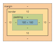
margin 은 해당 레이아웃과 주변 환경과의 간격이며, 일반적인 여백이다.
margin 다른 환경이 없을 경우 브라우저의 좌측 최상단을 기준으로 삼으며, 이때 모든 margin 을 0으로 설정할 경우 다음과 같은 결과가 나온다.
margin: 0px 0 0 0px; /*top right bottom left*/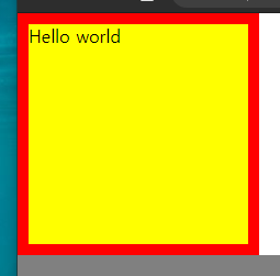
border 는 레이아웃의 경계선,
padding 는 해당 레이아웃 내의 컨텐츠(글자와 자식 태그 등)와의 간격이다.
이러한 여백은 주변에 다른 레이아웃이 있을 경우 병합 될 수 있으며,
오늘 다뤄본 것은 형제간의 margin 병합과 부모-자식간의 margin병합이다.
1-1. 형제간의 `margin` 병합
형제 레이아웃 간의 margin 이 맞닿을 경우, 병합되어 긴 쪽의 margin 만 적용된다.
(당연하지만, 같은 길이의 margin 은 하나만 적용된다)
.margin-one {
	width: 100%;
	height: 100px;
	background-color: yellow;

	margin-bottom: 100px;
}
.margin-two {
	width: 100%;
	height: 100px;
	background-color: blue;

	margin-top: 50px;
}
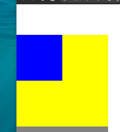
1-2. 부모-자식간의 `margin` 병합
부모-자식 레이아웃의 margin 또한 병합되어 긴 쪽이 적용된다.
다만 html의 위치 속성을 바꾼다면 다르게 적용될 수 있다.
(아래 2. html 레이아웃의 위치 에서 상세 설명)
.margin-parent {
	width: 300px;
	height: 300px;
	background-color: yellow;
}
.margin-child {
	width: 150px;
	height: 150px;
	background-color: blue;

	margin-top: 100px;
}
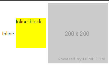
vertical-align , horizontal-align 으로 정렬 설정할 경우에도 형제 레이아웃중 가장 큰 레이아웃을 기준으로 정렬된다.
(html)
<span class="inline">Inline</span>
<span class="inline-block">Inline-block</span>
<img src="https://via.placeholder.com/200">
(css)
.inline-block {
	display: inline-block;
	width: 100px;
	height: 100px;
	background-color: yellow;
}
.inline, .inline-block, img {
	vertical-align: middle;
}
2. html 레이아웃의 위치
레이아웃의 위치 속성은 static, relative, fixed, absolute가 있으며, 이 속성에 따라 여백 적용이 달라진다. 위치 속성을 따로 설정하지 않는다면 static 으로 정해지며, 위의 여백 적용과 같다.
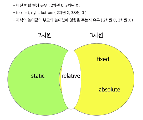
static 옵션은 2차원 위치로 취급되어 top, left, right, bottom 옵션을 적용할 수 없다.
fixed 옵션은 3차원 위치로 취급되며, 다른 레이아웃의 영향을 받지 않고 스크롤을 올리고 내림에 관계없이 브라우저 창의 특정 위치에 고정된다. 위치 속성을 설정하면 브라우저 좌측 최상단을 기준으로 적용된다.
(html)
<div class="box1"></div>
<div class="fixed-parent">
	<div class="fixed-child"></div>
</div>
(css)
.box1 {
	width: 300px;
	height: 200px;
	background-color: gray;
}
.fixed-parent {
	width: 300px;
	height: 300px;
	background-color: yellow;
}
.fixed-child {
	position: fixed;
	width: 100px;
	height: 100px;
	background-color: blue;
	top: 100px;
	left: 100px;
}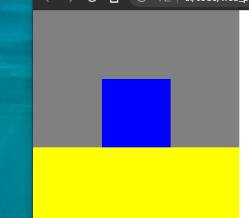
relative 옵션은 2차원과 3차원 사이의 위치로 취급되어, top, left, right, bottom 옵션이 적용되나 static 옵션일 때의 위치를 기준으로 적용된다. 부모-자식 레이아웃간의 margin병합이 발생한다.
(html)
<div class="box1"></div>
<div class="relative-parent">
	<div class="relative-child"></div>
</div>
(css)
.box1 {
	width: 300px;
	height: 200px;
	background-color: gray;
}
.relative-parent {
	width: 300px;
	height: 300px;
	background-color: yellow;
}
.relative-child {
	position: relative;
	width: 100px;
	height: 100px;
	background-color: blue;
	margin-top: 100px;
	top: 100px;
}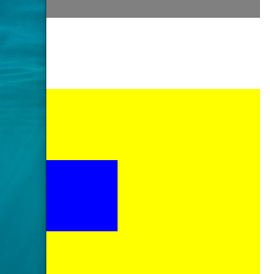
absolute 옵션은 3차원 위치로 취급되나, 부모 프레임의 위치속성에 영향을 받는다. 부모 레이아웃이 static 일 경우 브라우저를 기준으로 적용되고, relative, fixed, absolute 일 경우 부모 레이아웃을 기준으로 적용된다. 후자의 경우에도 margin병합은 발생하지 않는다.
(html)
<div class="box1"></div>
<div class="absolute-parent">
	<div class="absolute-child"></div>
</div>
(css)
.box1 {
	width: 300px;
	height: 200px;
	background-color: gray;
}
.absolute-parent {
	position: absolute;
	width: 300px;
	height: 300px;
	background-color: yellow;
	margin-top: 100px;
}
.absolute-child {
	position: absolute;
	width: 100px;
	height: 100px;
	background-color: blue;
	margin-top: 100px;
}
어려웠던 점 및 해결 방법
레이아웃 속성에 따른 특징과 활용처가 아직 잘 떠오르지 않는다. 레이아웃 2일차에서 좀 더 다뤄 보는 등의 더 많은 연습이 필요할 것 같다.
학습 소감
개념들이 슬슬 바로 와닿지 않기 시작한다. 많은 반복과 추가적인 학습이 필요할 것 같다.
진행한 코드 링크
오늘 진행한 자세한 코드는 내 github 링크 에 업로드 되었다.