hover
- 마우스 오버 이펙트를 주는 가상클래스

<a href="">네이버</a>
<a href="">구글</a>
<a href="">다음</a>

<style>
  a {
   color: #333;
   text-decoration: none;
   border: 1px solid #ccc;
   width: 120px;
   display: inline-block;
   text-align: center;
   padding: 5px;
   border-radius: 5px;
   transition: 2s;       // 트랜지션은 hover에 말고 직접 태그에!
  }
  a:hover {
   background-color: #000;
   color: #fff;
  }
 </style>
우선 a태그에 기본적으로 들어가는 text-decoration을 없애주고 보더를 추가해 박스형태로 만들었다.
여기에 마우스 오버를 했을때 color반전을 주기 위해
가상클래스 a:hover를 추가해서 오버됐을시 효과를 css에 작성
transition
여기서 중요한건 transition을 hover가 아닌 태그 그 자체에 추가해야된다는 것!
transition은 해당 이펙트를 얼마에 걸쳐 나타낼건지 시간을 표시하는 것이다.
nth-child
- 순서를 만드는 css 가상클래스
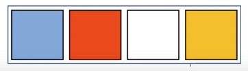
<div class="box">
  <div></div>
  <div></div>
  <div></div>
  <div></div>
</div>

<style>
  .box {
    border: 5px solid #000;
    text-align: center;
  }
  .box div {
    border: 5px solid #000;
    margin: 10px;
    width: 200px;
    height: 200px;
    display: inline-block;
  }
  .box div:nth-chlid(1) {
    color: dodgerblue;
  }
  .box div:nth-chlid(2) {
    color: red;
  }
  .box div:nth-chlid(3) {
    color: white;
  }
  .box div:nth-chlid(4) {
    color: yellow;
  }
</style>
사용법은 간단하다. 위 예시처럼, 같은 태그가 여러개 있는데
각각에 class를 부여하지 않고도 이렇게 nth-child(순번) 가상클래스로 css효과를 줄 수 있다.
참고로 첫번째와 마지막 순번에 있는 태그만 선택할 때에는 nth-child말고
.box div:first-child {}
.box div:last-child {}
이렇게 각각 first-child, last-child를 활용하면 된다.

기획, 개발공부, 그 외 잡다한 여정 기록 (SEMI로)