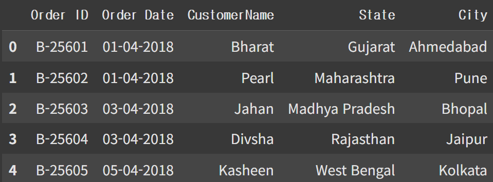
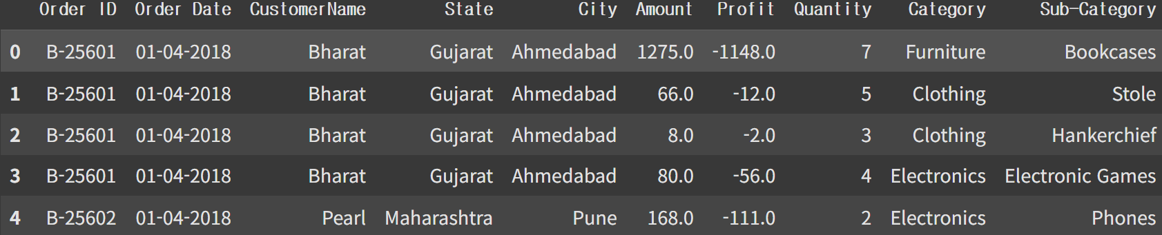
데이터 로드 및 확인
import pandas as pd
import numpy as np

Olist = pd.read_csv('List of Orders.csv')
Detail = pd.read_csv('Order Details.csv')
Olist 데이터 컬럼 설명
Order ID: 주문번호
Order Date: 주문일
CustomerName: 주문자명
State: 주
City: 도시 이름
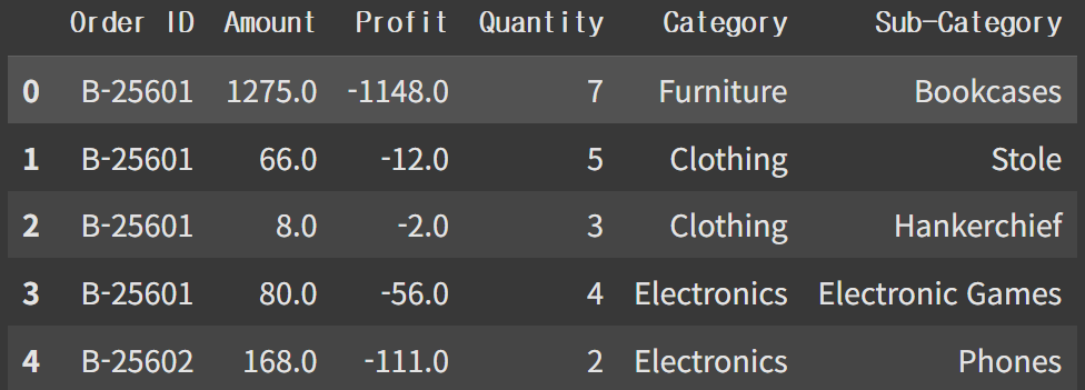
Detail 데이터 컬럼 설명
Order ID: 주문번호(Order data와 동일)
Amount: 판매 금액
Profit: 수익
Category: 큰 카테고리
Sub-Category: 세부 카테고리
Profit이 0보다 작은 경우(환불), 0보다 큰 경우, 0인 경우 3가지 모두 확인
Detail.loc[Detail['Profit']<0].shape # Profit이 -인 경우 환불
Detail.loc[Detail['Profit']>0].shape
Detail.loc[Detail['Profit']==0].shape
전처리
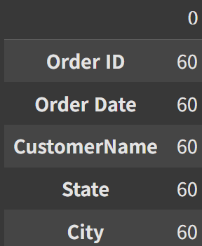
Olist null값 확인
Olist[Olist['Order ID'].isna()].isnull().sum()
Olist, Detail 데이터 merge
data=Olist.merge(Detail, on='Order ID') #Inner join(1500, 10)데이터 구성, 결측치 없음
데이터 날짜 변환
data['Order Date']=pd.to_datetime(data['Order Date'], format='%d-%m-%Y')데이터의 시작과 끝나는 시점 확인
data['Order Date'].min(), data['Order Date'].max()(Timestamp('2018-04-01 00:00:00'), Timestamp('2019-03-31 00:00:00'))
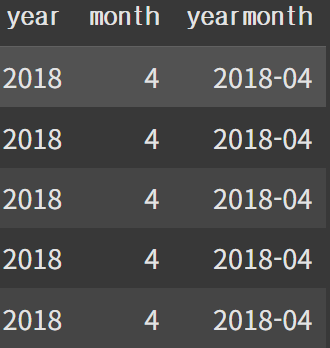
'Order Date' 컬럼을 'year', 'month', 'yearmonth'으로 연도, 월, 연월로 분리
data['year']=data['Order Date'].dt.year
data['month']=data['Order Date'].dt.month
data['yearmonth']=data['Order Date'].astype('str').str.slice(0,7)
'year', 'month', 'yearmonth' 컬럼이 추가됨
EDA
지금까지 썻던 matplotlib 대신 plotly를 이용해 시각화
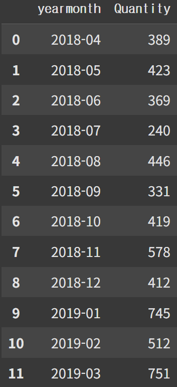
import plotly.express as px연월을 기준으로 그룹화하고 agg메서드를 이용해 'Quantity'열을 더한 결과 반환
df=data.groupby('yearmonth').agg({'Quantity':'sum'})
df=df.reset_index()
Line 그래프
'Quantity' 그래프
fig1=px.line(df, x='yearmonth', y='Quantity', title='Sales Quantity by month')
fig1.show()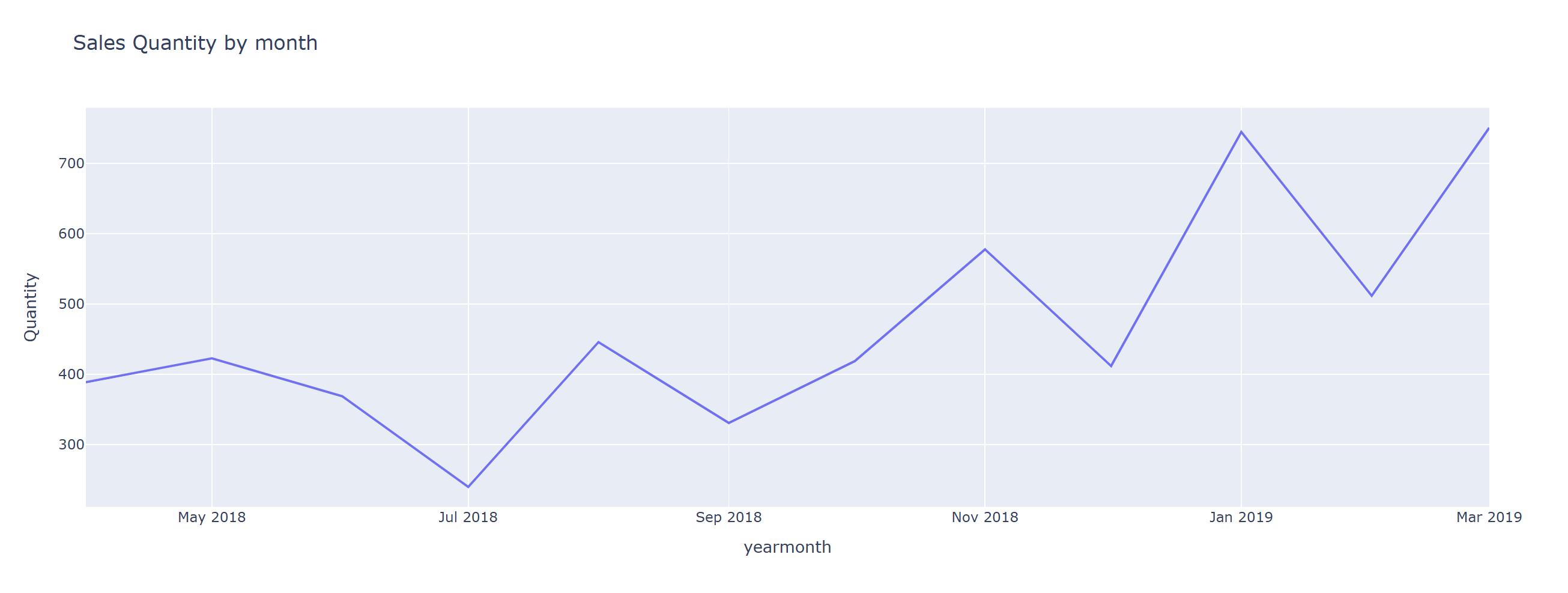
'Amount' 그래프
df2=data.groupby('yearmonth').agg({'Amount':'sum'}).reset_index()
fig2=px.line(df2, x='yearmonth', y='Amount', title='Sales Amount by month')
fig2.show()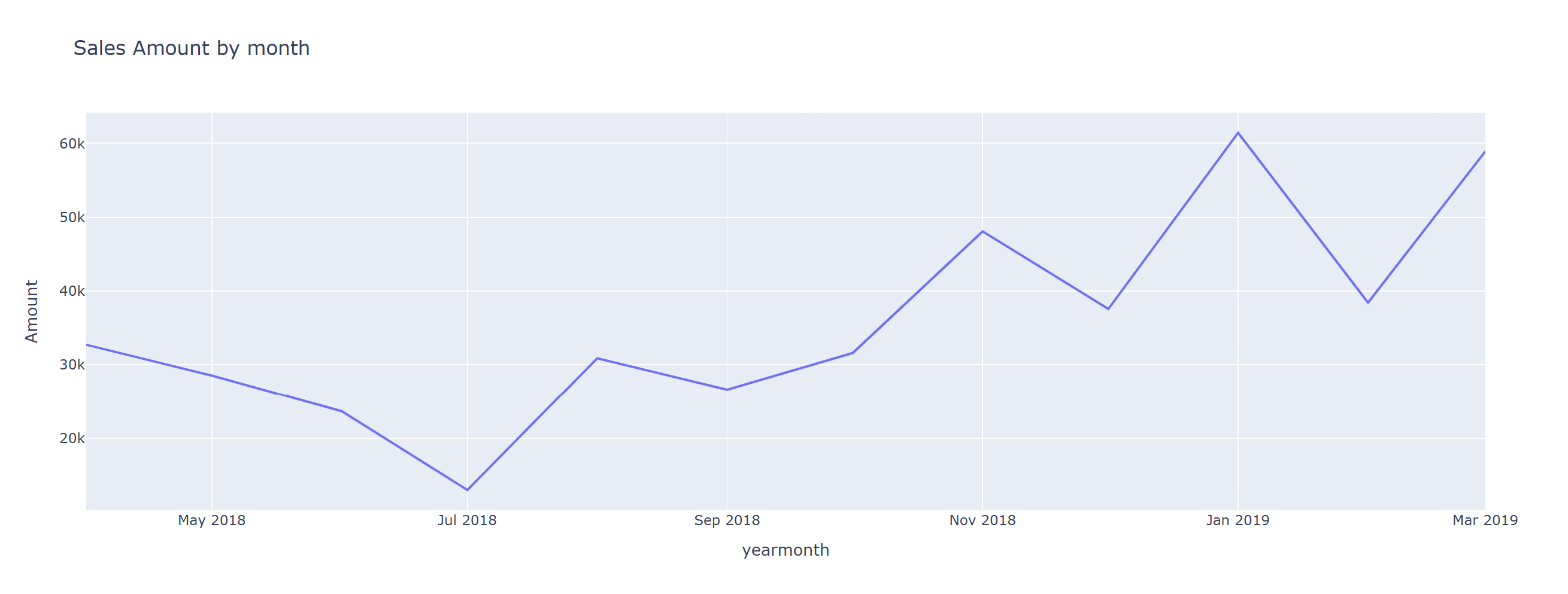
당연하게도 'Quantity'와 'Amount' 그래프 유사한 형태를 가지고 있다
Bar 그래프
pivot_table 메서드를 사용해서 그룹화하고 aggfunc을 이용해 그룹별 합계를 구한다. reset_index()를 통해 df 정리
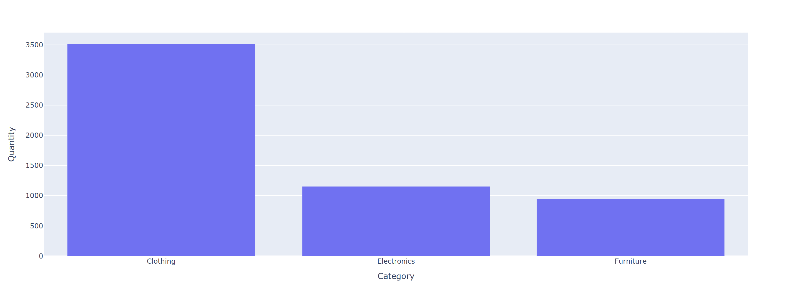
df3=data.pivot_table(index='Category', values='Quantity', aggfunc='sum').reset_index()
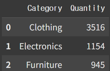
fig3=px.bar(df3, x='Category', y='Quantity')
fig3.show()
카테고리별 판매량 확인
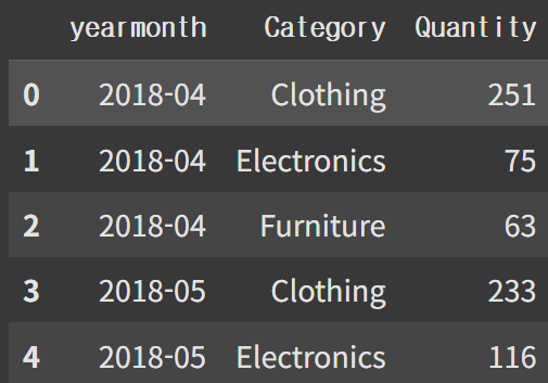
연월별 카테고리의 판매량 확인
df4=data.pivot_table(index=['yearmonth', 'Category'], values='Quantity', aggfunc='sum').reset_index()
df4.head()
누적 Bar 그래프
fig4=px.bar(df4, x='yearmonth', y='Quantity', color='Category')
fig4.show()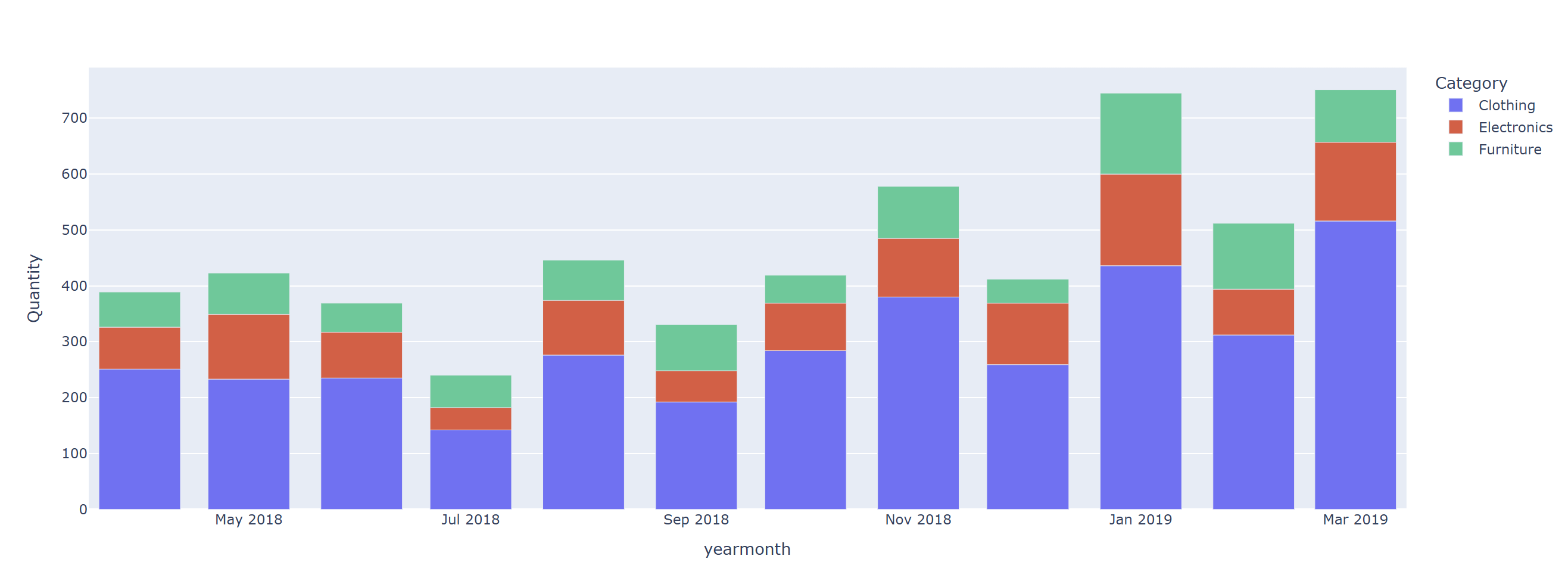
전체 판매량 증가의 가장 큰 원인은 'Clothing'
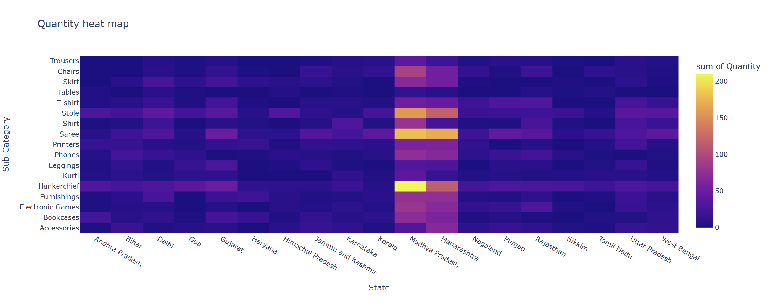
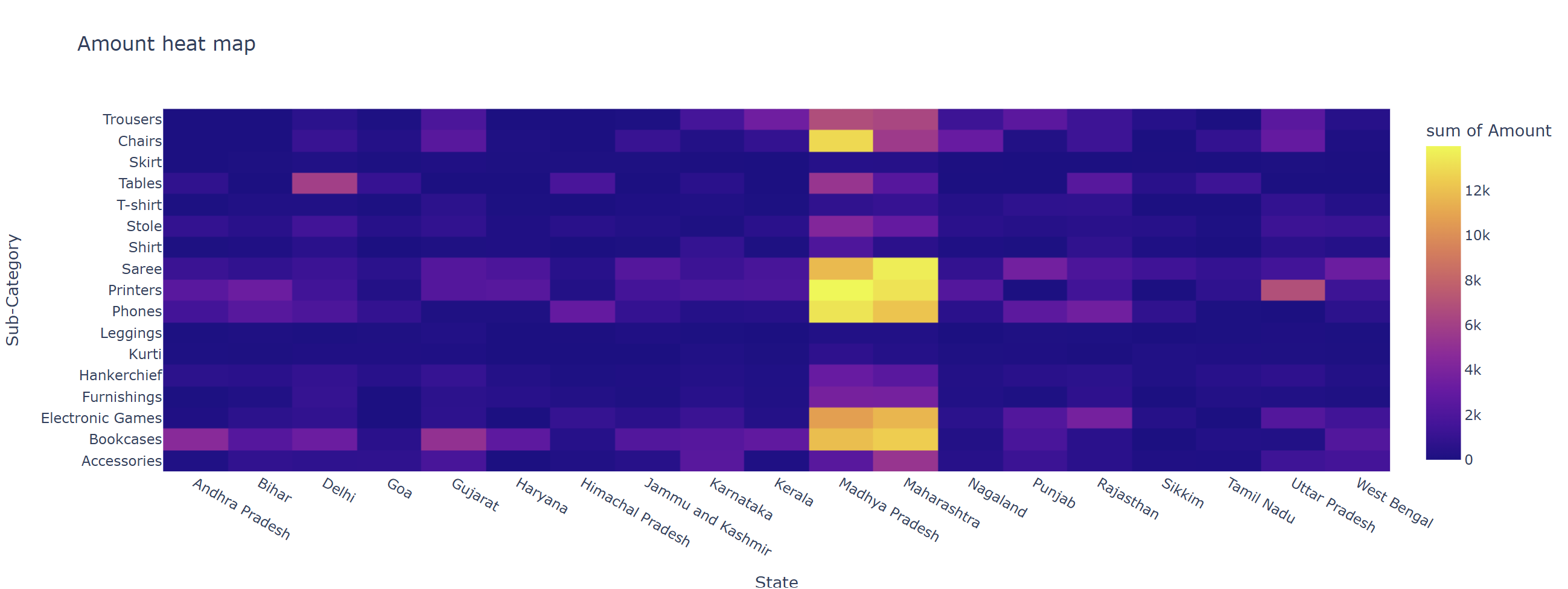
Heat map
히트맵을 이용해 지역별 주력 판매상품 분석
'State'별 'Sub-Category'의 매출액, 이익, 판매량을 pivot_table을 이용해서 df 생성
df5=data.pivot_table(index=['State', 'Sub-Category'], values=['Amount', 'Profit', 'Quantity'], aggfunc='sum').reset_index()
df5.head()
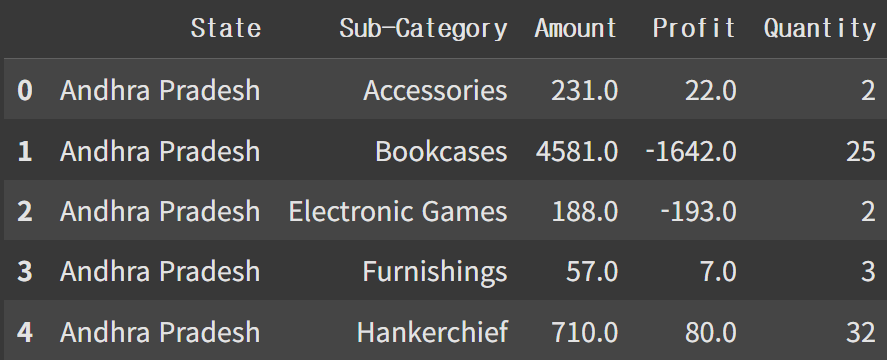
fig5=px.density_heatmap(df5, x='State', y='Sub-Category', z='Quantity', title='Quantity heat map')
fig5.show()
fig6=px.density_heatmap(df5, x='State', y='Sub-Category', z='Amount', title='Amount heat map')
fig6.show()
'Quantity' 히트맵
'Amount' 히트맵
모듈화
!pip install streamlit
!npm install localtunnel
!pip install "ipywidgets>=7, <8"
def load_data():
Olist = pd.read_csv('List of Orders.csv')
Detail = pd.read_csv('Order Details.csv')
data = Olist.merge(Detail, on = 'Order ID') # merge 하면서 na값 없어지니까 na 값을 처리하는 부분 제외함
return data
def preproc():
data['Order Date'] = pd.to_datetime(data['Order Date'], format = '%d-%m-%Y')
data['year'] = data['Order Date'].dt.year
data['month'] = data['Order Date'].dt.month
data['yearmonth'] = data['Order Date'].astype('str').str.slice(0,7)
return df
def line_chart(data, x, y, title):
df=data.groupby(x).agg({y:'sum'}).reset_index()
fig=px.line(df, x=x, y=y, title=title )
fig.show()
return fig
def bar_chart(data, x, y, color=None):
if color is not None:
index=[x,color]
else:
index=x
df=data.pivot_table(index=index, values=y, aggfunc='sum').reset_index()
fig=px.bar(df, x=x, y=y, color=color)
fig.show()
return fig
def heatmap(data, z, title):
df=data.pivot_table(index=['State', 'Sub-Category'], values=['Quantity', 'Amount', 'Profit'], aggfunc='sum').reset_index()
fig=px.density_heatmap(df, x='State', y='Sub-Category', z=z, title=title)
fig.show()
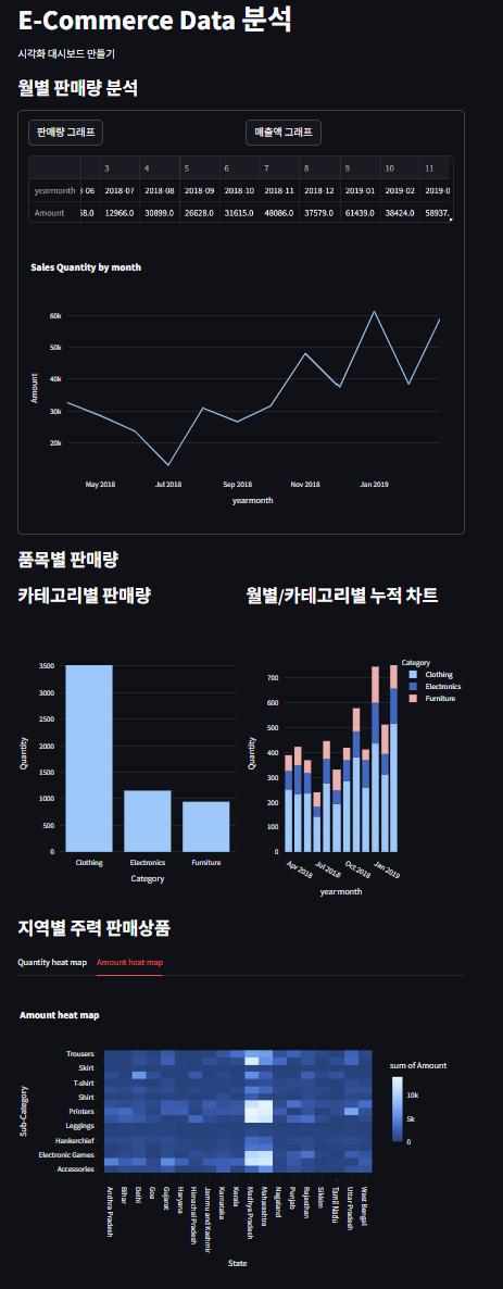
return figstreamlit을 이용한 대시보드 구현
%%writefile app.py


import streamlit as st
import plotly.express as px
import pandas as pd
import numpy as np


# 데이터 로드
@st.cache_data
def load_data():
  Olist = pd.read_csv('List of Orders.csv')
  Detail = pd.read_csv('Order Details.csv')
  data = Olist.merge(Detail, on = 'Order ID')

  return data

# 전처리
def preproc():
  data['Order Date'] = pd.to_datetime(data['Order Date'], format = '%d-%m-%Y')
  data['year'] = data['Order Date'].dt.year
  data['month'] = data['Order Date'].dt.month
  data['yearmonth'] = data['Order Date'].astype('str').str.slice(0,7)

  return data

# line차트
def line_chart(data, x, y, title):
  df = data.groupby(x).agg({y : 'sum'}).reset_index()
  fig = px.line(df, x=x, y=y, title=title)
  fig.show()

  return df, fig

# bar차트
def bar_chart(data, x, y, color=None):
  if color is not None:
    index = [x, color]
  else :
    index = x

  df = data.pivot_table(index = index, values=y, aggfunc = 'sum').reset_index()
  fig = px.bar(df, x = x, y = y, color = color)
  fig.show()

  return fig

def heatmap(data, z, title):

  df = data.pivot_table(index = ['State','Sub-Category'], values = ['Quantity', 'Amount', 'Profit'], aggfunc = 'sum').reset_index()
  fig = px.density_heatmap(df, x = 'State', y = 'Sub-Category', z = z, title=title)
  fig.show()

  return fig


if __name__ == "__main__":


  st.title('E-Commerce Data 분석')
  st.write('시각화 대시보드 만들기')

  # 데이터 로드
  data = load_data()
  # 데이터 전처리
  data = preproc()

st.subheader('월별 판매량 분석')
with st.form('form', clear_on_submit = True):
    col1, col2 = st.columns(2)
    submitted1 = col1.form_submit_button('판매량 그래프')
    submitted2 = col2.form_submit_button('매출액 그래프')

    if submitted1:
      df1, fig1 = line_chart(data, 'yearmonth', 'Quantity', 'Sales Quantity by month')
      st.dataframe(df1.T)
      st.plotly_chart(fig1, theme="streamlit", use_container_width=True)
    elif submitted2:
      df2, fig2 = line_chart(data, 'yearmonth', 'Amount', 'Sales Quantity by month')
      st.dataframe(df2.T)
      st.plotly_chart(fig2, theme="streamlit", use_container_width=True)


st.subheader('품목별 판매량')
col1, col2 = st.columns(2)
with col1:
  col1.subheader("카테고리별 판매량")
  fig3 = bar_chart(data, 'Category', 'Quantity')
  st.plotly_chart(fig3, theme="streamlit", use_container_width=True)
with col2:
  col2.subheader("월별/카테고리별 누적 차트")
  fig4 = bar_chart(data, 'yearmonth', 'Quantity', 'Category')
  st.plotly_chart(fig4, theme="streamlit", use_container_width=True)


st.subheader('지역별 주력 판매상품')
tab1, tab2 = st.tabs(["Quantity heat map", "Amount heat map"])
with tab1:
  fig5 = heatmap(data, 'Quantity', 'Quantity heat map')
  st.plotly_chart(fig5, theme="streamlit", use_container_width=True)
with tab2:
  fig6 = heatmap(data, 'Amount', 'Amount heat map')
  st.plotly_chart(fig6, theme='streamlit', use_container_width=True)
!npm install -g localtunnel~!streamlit run /content/app.py & lt --port 8501Extreanal URL에서 :8501 부분 제외하고 password 입력하면 된다.
최종 대시보드