CSS-in-JS - The State of CSS 2022에서
사용 순위가 제일 높은 Styled-Component의 사용법을 알아보자💨
💅 Styled-Component 준비
▷ Styled Components 설치
// with npm
$ npm install --save styled-components

// with yarn
$ yarn add styled-components
▷ package.json에 코드를 추가
// 아래의 코드를 추가하면 여러 버전의
// Styled Components가 설치되어 발생하는 문제를 줄여준다.
{
  "resolutions": {
    "styled-components": "^5"
  }
}
▷ import 하기
import styled from "styled-components"💅 Styled-Component 기본 사용법
따옴표가 아닌 백틱(`)을 사용한다.
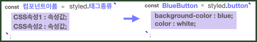
import styled from "styled-components";

// Styled Components로 컴포넌트를 만들고
const BlueButton = styled.button`
  background-color: blue;
  color: white;
`;

export default function App() {
  // React 컴포넌트를 사용하듯이 사용하면 된다.
  return <BlueButton>Blue Button</BlueButton>;
}
💅 컴포넌트 재활용
기존 컴포넌트를 재활용하여 새로운 컴포넌트를 만들 수 있다.
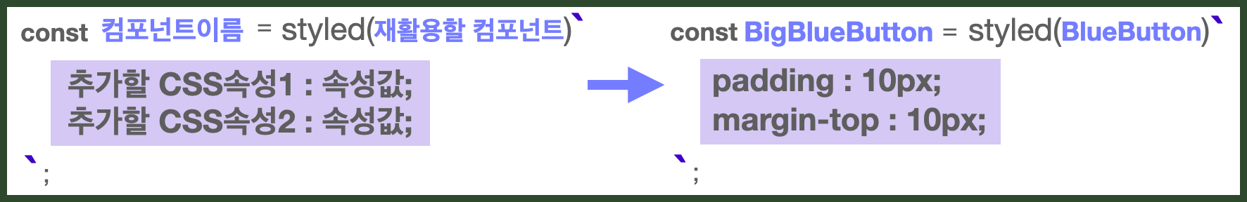
import styled from "styled-components";

const BlueButton = styled.button`
  background-color: blue;
  color: white;
`;

//만들어진 컴포넌트를 재활용해 컴포넌트를 만들 수 있다.
const BigBlueButton = styled(BlueButton)`
  padding: 15px;
  margin-top: 15px;
`;

//재활용한 컴포넌트를 재활용할 수도 있다.
const BigRedButton = styled(BigBlueButton)`
  background-color: red;
`;

export default function App() {
  return (
    <>
      <BlueButton>Blue Button</BlueButton>
      <br />
      <BigBlueButton>Big Blue Button</BigBlueButton>
      <br />
      <BigRedButton>Big Red Button</BigRedButton>
    </>
  );
}
💅 Props 활용
템플릿 리터럴 문법 ${ }으로 JavaScript 코드를 사용할 수 있다.
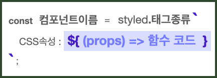
Props로 조건부 렌더링을 사용할 수 있다.
import styled from "styled-components";
export default function App() {
return (
<>
<Button1>Button1</Button1>
<Button1 skyblue>Button1</Button1>
</>
);
}
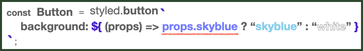
// 받아온 prop에 따라 조건부 렌더링이 가능하다.
const Button1 = styled.button`
background: ${(props) => (props.skyblue ? "skyblue" : "white")};
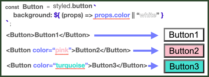
`;Props 값으로 렌더링도 가능하다.
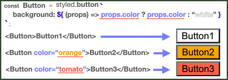
또는
import styled from "styled-components";

// 받아온 prop 값을 그대로 이용해 렌더링할 수도 있다.
const Button1 = styled.button`
  background: ${(props) => (props.color ? props.color : "white")};
`;
// 다음과 같은 형식으로도 활용할 수 있다.
const Button2 = styled.button`
  background: ${(props) => props.color || "white"};
`;

export default function App() {
  return (
    <>
      <Button1>Button1</Button1><br />
      <Button1 color="orange">Button1</Button1>
      <Button1 color="tomato">Button1</Button1>
      <br />
      <Button2>Button2</Button2>
      <Button2 color="pink">Button2</Button2>
      <Button2 color="turquoise">Button2</Button2>
    </>
  );
}
💅 전역 스타일 설정
// createGlobalStyle 가져오기
import { createGlobalStyle } from "styled-components";

// 스타일 작성하기
const GlobalStyle = createGlobalStyle`
	button {
        padding : 5px;
        margin : 2px;
        border-radius : 5px;
	}
`

// <GlobalStyle> 컴포넌트를 최상위 컴포넌트에서 사용
function App() {
	return (
		<>
			<GlobalStyle />
			<Button>전역 스타일 적용하기</Button>
		</>
	);
컴포넌트로 만들어서 올려도 됨
import { createGlobalStyle } from 'styled-components';
import { useLocation } from 'react-router-dom';

function BackgroundColor() {
  const { pathname } = useLocation();

  let background;
  switch (pathname) {
    case '/':
      background = '#EBEEFF';
      break;
    default:
      background = '#FFF';
  }
  return <GlobalStyled $background={background} />;
}

export default BackgroundColor;

const GlobalStyled = createGlobalStyle<{ $background: string; }>`
  body {
    background: ${({ $background }) => $background || '#FFF'};
  }

  @media all and (max-width: 805px) {
    body {
      background: #FFF;
    }
  }
`;
💅 hover 속성 적용
&:hover에 스타일을 작성하면 된다.
❗️참고) &는 현재의 요소를 뜻한다.
const Button1 = styled.button`
  color: ${(props) => props.color || "white"};

  // 현재 요소에 마우스가 올라갈 때
  &:hover {
    background: purple;
    color: white;
  }
`;&(현재 요소) 사용법
&:hover // 현재 요소에 마우스가 올라갈 때
& ~ & // 현재 요소의 바로 옆은 아니지만 형제 요소일 때
& + & // 현재 요소의 바로 옆 형제 요소일 때
&.something // 현재 요소가 something이라는 클래스를 갖고 있을 때
.something & // something이라는 클래스를 가진 친구 안에 있을 때
💅 attrs 메소드
attributes를 삽입하기 위한 메서드이며 1개의 객체 타입 arg를 받는다.
html tag가 가지고 있는 고유의 attributes를 반복적으로 사용하지 않기 위해 만들어졌다.
(ex. <input type="radio" />를 만들 때 attrs({ type: radio })를 사용)
export const ModalView = styled.div.attrs((props) => ({
  // attrs 메소드를 이용해서 아래와 같이 div 엘리먼트에 속성을 추가할 수 있습니다.
  role: "dialog",
}))`
  border-radius: 10px;
  background-color: #ffffff;
  width: 400px;
  ...
`;
input 예시
// 응용1
const Input = styled.input.attrs((props) => ({
  cursor: props.pointer ? "pointer" : "null",
}))`
  cursor: ${({ cursor }) => cursor};
`;

-----
// 응용2
const Input = styled.input.attrs((props) => ({
  cursor: props.pointer ? "pointer" : "null",
  transparent: props.transparent ? "transparent" : "null",
}))`
  cursor: ${({ cursor }) => cursor};
  caret-color: ${({ transparent }) => transparent};
`;
💅 hover + 전역 + 조건부 렌더링 예시
import "./styles.css";
import styled, { createGlobalStyle } from "styled-components";

export default function App() {
  return (
    <>
      <GlobalStyle />
      <Button1 color="black">
        Practice!
      </Button1>
    </>
  );
}

const GlobalStyle = createGlobalStyle`
	button {
	  padding : 5px;
      margin : 2px;
      border-radius : 5px;
	}
`;

const Button1 = styled.button`
  color: ${(props) => props.color || "white"};

  &:hover {
    background: purple;
    color: white;
  }
`;🔥CSS vs SASS vs BEM vs Styled-Component
✚ 참고
| 특징 | 장점 | 단점 | |
|---|---|---|---|
| CSS | 기본적인 스타일링 기법 | 일관된 패턴을 갖기 어려움, !important의 남용 | |
| SASS | 프로그래밍 방법론을 도입하여, 컴파일된 CSS를 만들어내는 전처리기 | 변수/함수/상속 개념을 활용하여 재사용 가능, CSS의 구조화 | 전처리 과정이 필요, 디버깅의 어려움이 있음. 컴파일한 CSS 파일이 거대해짐 |
| BEM | CSS 클래스명 작성에 일관된 패턴을 강제하는 방법론 | 네이밍으로 문제 해결, 전처리 과정 불필요 | 선택자의 이름이 장황하고, 클래스 목록이 너무 많아짐 |
| Styled-Component | 컴포넌트 기반으로 CSS를 작성할 수 있게 도와주는 라이브러리 | CSS를 컴포넌트 안으로 캡슐화, 네이밍이나 최적화를 신경 쓸 필요가 없음 | 빠른 페이지 로드에 불리함 |

🌿 https://www.tatahyeonv.com