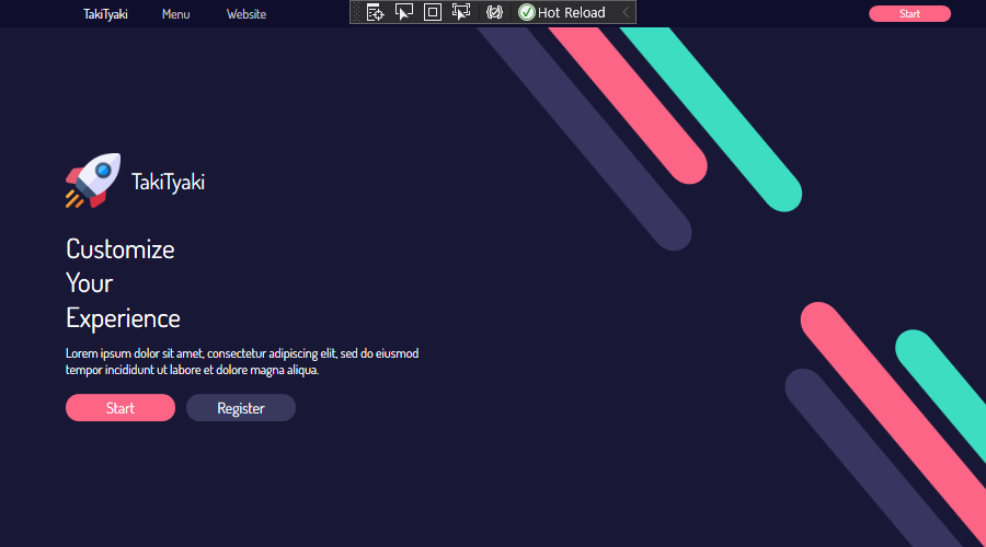
MainWindow.xaml
- 결과 창을 확인하며 디자인 할 수 있는 영역
- 마크업 언어(
.xaml)를 사용
- 윈도우(창) 설정
<Window x:Class="MordernUI.MainWindow"
        xmlns="http://schemas.microsoft.com/winfx/2006/xaml/presentation"
        xmlns:x="http://schemas.microsoft.com/winfx/2006/xaml"
        xmlns:d="http://schemas.microsoft.com/expression/blend/2008"
        xmlns:mc="http://schemas.openxmlformats.org/markup-compatibility/2006"
        xmlns:local="clr-namespace:MordernUI"
        mc:Ignorable="d"
        Title="MainWindow" Height="500" Width="900" // 창 크기 설정
        WindowStyle="None" // 윈도우 커스터마이징 가능
        ResizeMode="NoResize"
Background="#181735"> // 배경색 설정- Grid
- 열과 행으로 테이블 형태의 레이아웃 제공
Grid.RowDefinitions: 행Grid.ColumnDefinitions: 열
<Grid>
        <Grid.RowDefinitions>
            <RowDefinition Height="25"/>
            <RowDefinition/>
        </Grid.RowDefinitions>

        <Grid.ColumnDefinitions>
            <ColumnDefinition/>
            <ColumnDefinition/>
        </Grid.ColumnDefinitions>

        <Grid Background="#0F0F2D"
              Grid.ColumnSpan="2" // 2번 인덱스의 그리드
              MouseDown="Grid_MouseDown"> // 이벤트 핸들러

            <Grid.ColumnDefinitions> // 열이 14칸으로 나누어진다
                <ColumnDefinition/>
                <ColumnDefinition/>
                <ColumnDefinition/>
                <ColumnDefinition/>
                <ColumnDefinition/>
                <ColumnDefinition/>
                <ColumnDefinition/>
                <ColumnDefinition/>
                <ColumnDefinition/>
                <ColumnDefinition/>
                <ColumnDefinition/>
                <ColumnDefinition/>
                <ColumnDefinition/>
                <ColumnDefinition/>
            </Grid.ColumnDefinitions>
            ......
</Grid>- TextBlock
- 블록 단위로 문자열 출력
- 블록별 커스터마이징 가능
- 텍스트마다 다른 폰트 색, 배경 색, 크기 등의 다양한 속성 각기 적용 가능
- 출력만 가능하고 선택 및 편집은 불가능
- WPF에 폰트 적용하기
- 폰트 파일을 프로젝트 폴더 안에 넣기
- visual studio 상의 폴더 안에도 넣어준다
FontFamily=경로/#폰트 이름- 폰트 이름은 폰트 파일 내부에 있는 이름으로 사용
- 폰트 파일을 프로젝트 폴더 안에 넣기
<TextBlock Text="TakiTyaki" // 출력 문구
                       Foreground="White" // 글자 색
                       Grid.Column="1" // 그리드 상 위치
                       VerticalAlignment="Center" // 열 정렬
                       HorizontalAlignment="Center" // 행 정렬
                       FontFamily="Fonts/#Dosis" // 폰트 설정
FontWeight="Medium"/>- 버튼

Button Content- 버튼 색, 폰트 크기, 여백 등을 설정할 수 있다
<Setter Property>- 엘리먼트가 처음 생성되었을 때 프로퍼티 설정
- 폰트, 배경색, 커서 모양 등 설정 가능
<Style.Triggers>- 특정 프로퍼티의 변화(특정 값을 가졌을 때)에 내부에 정의한 Setter 컬렉션 실행
<Button.Template>- 버튼 컨트롤을 사용자가 원하는 모양으로 변경 가능하도록 도와주는 기능
{TemplateBinding Background}- 부모 컨트롤러의 속성을 받아들인다
- Control Template을 버튼 내부에 정의할 때, 템플릿과 버튼 속성을 바인딩시키기 위해 필요
- 예:) 템플릿 내의 Rectangle 요소와 버튼의 Width 맞추기
<Button Content="Start" // 출력 문구
                        Foreground="White"
                        FontSize="10"
                        FontWeight="Medium"
                        Margin="0,0,10,0"
                        Grid.Column="12"
                        Grid.ColumnSpan="2">

                <Button.Style>
                    <Style TargetType="Button"> // 반드시 설정
                        <Setter Property="TextElement.FontFamily" Value="Fonts/#Dosis"/>
                        <Setter Property="Background" Value="#FE6584"/>
                        <Setter Property="Cursor" Value="Hand"/>
                        <Style.Triggers>
                            // 마우스 포인터가 위치하는지 여부
                            <Trigger Property="IsMouseOver" Value="True">
                                <Setter Property="Background" Value="#FF4C70"/>
                            </Trigger>
                        </Style.Triggers>
                    </Style>
                </Button.Style>

                <Button.Template>
                    <ControlTemplate TargetType="Button">
                        <Border Width="75" Height="15"
                                    CornerRadius="8" // 가장자리 둥글게
                                    Background="{TemplateBinding Background}">
                            <ContentPresenter VerticalAlignment="Center"
                                                  HorizontalAlignment="Center"/>
                        </Border>
                    </ControlTemplate>
                </Button.Template>
</Button>- StackPanel
- 가로 또는 세로 방향으로 지정할 수 있는 단일 선에 따라 자식 요소를 결정하는 패널
- 가로는 가로로, 세로는 세로로 쭉 정렬해주는 패널
<StackPanel Grid.Row="1"
VerticalAlignment="Center"
Margin="60">
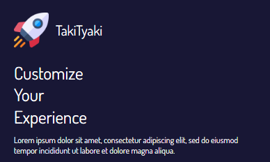
<StackPanel>
<StackPanel Orientation="Horizontal"
Margin="0,0,0,20">
<Image Width="50" Height="50"
Source="Images/rocket.png"
// 이미지 스케일링 조정(확대 시) 화질 개선
RenderOptions.BitmapScalingMode="Fant"/>
<TextBlock Text="TakiTyaki"
Foreground="White"
FontSize="20"
FontWeight="Medium"
VerticalAlignment="Center"
FontFamily="Fonts/#Dosis"
Margin="10,0,0,0"/>
</StackPanel>출처: https://www.youtube.com/watch?v=PzP8mw7JUzI
There's Only One Thing To Do: Learn All We Can