width: min-content content에 맞게 크기를 줄여준다.
전환효과는 가상클래스에 적용하면 안되고 오리지날에 적용.
.container{
  width: min-content;
  background-color: #4169e1;
  perspective: 600px;
}
.container img{
  transition: 1s;
  display: block;
}
.container:hover img{

  transform: rotateX(45deg);
}
transform-origin 변환효과의 기준
initial : 50% 50% x y
transform-origin 또한 가상클래스가 아닌 오리지날에 적용한다.
transform-style
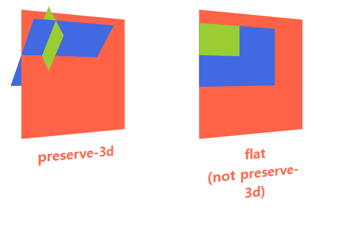
기본값인 transform-style:flat은 복잡한 3D 구조를 막아준다.
(부모 요소에 적용된 3D animation으로 중첩관계의 요소의 스타일 통일)
transform-style:preserve-3d를 통해 모든 요소가 3d animation이 적용케 한다.
animation
default
animation-name: none;
animation-duration: 0s;
animation-timing-function: ease;
animation-delay: 0s;
animation-iteration-count: 1;
animation-direction: normal;
animation-fill-mode: none;
animation-play-state: running;
animation
Animation을 제어하는 속성들이다.
실제 Animation을 작동시키는 것은 @rules의 @keyframes이다.
@keyframes rolling{
   0% {
	transform: rotateY(0deg);
   }

   100% {
	transform: rotateY(360deg);
   }
}
animation-name: rolling;
animation-duration: 2s;
animation-timing-function: linear;
animation-delay: 0s;
animation-iteration-count: infinite;
animation-direction:reverse;
animation-fill-mode: none;
animation-play-state: running;
단축속성
animation: rolling 2s linear infinite reverse
.container:hover img{
  transform: rotateY(180deg);
  animation-play-state: paused;

}
animation-direction: alternate; : 역왕복운동
animation-direction: alternate; : 왕복운동 animation-iteration-count를 2의 배수로 입력하여 왕복할 수 있게 만든다.
animation-fill-mode (animation의 play 상태)
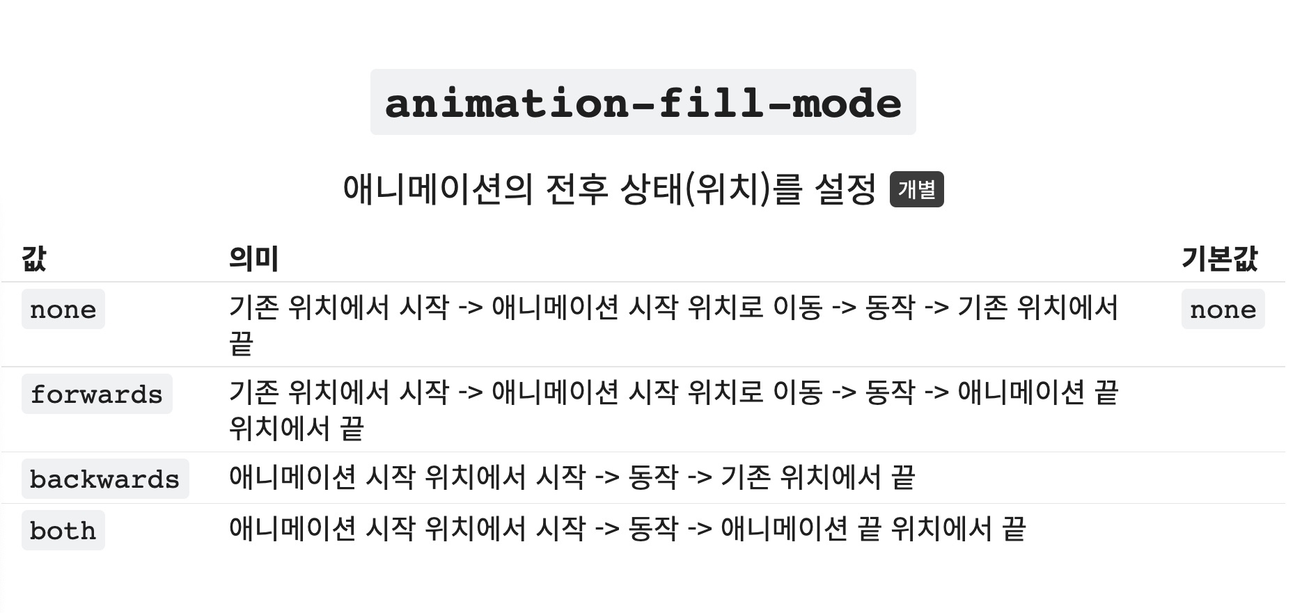
none, both를 가장 많이 사용한다.
다단
브라우저의 문서를 나눈다
body{
  padding: 30px;
}
.container{
  padding: 20px;
  border: 4px solid;
  column-count: 3;
}
column-gap 단과 단 사이의 여백을 조절한다.
기본값은 normal이며 1em이다.
column-rule 단과 단 사이의 선을 만든다.
border와 같은 속성값을 가지며 color를 자기참조한다.
CSS의 변수
html{
--name : red;
}

.box{
color: var(--name);
}