folium
- folium 패키지는 반응형 맵을 생성하는데 사용된다.
- folium import하기
import folium
from folium import Choropleth, Circle, Marker
from folium.plugins import HeatMap, MarkerCluste
interactive map
- folium.Map()으로 기본적인 맵을 생성한다.
# Create a map
m_1 = folium.Map(location=[42.32,-71.0589], tiles='openstreetmap', zoom_start=10)

# Display the map
m_1
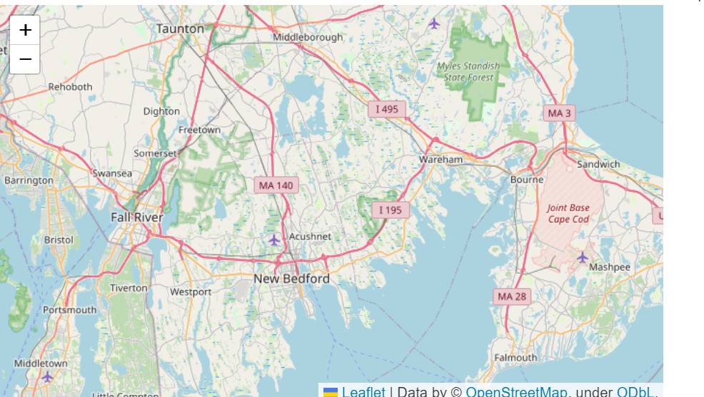
- location=[42.32,-71.0589] : 표현하고자 하는 위도와 경도
- tiles='openstreetmap' : tiles를 통해 지도 스타일 설정
- zoom_start=10 : 지도가 생성되었을 때, 초기 지도의 확대 및 축소값 (얼마나 지도를 확대해서 보여줄 것인가?)
Plotting Points
-
지도 표시 전에 불필요한 데이터의 표시를 줄이기 위해, 데이터를 따로 추출한 뒤 시각화를 진행하는 것이 효율적이다.
daytime_robberies = crimes[((crimes.OFFENSE_CODE_GROUP == 'Robbery') & \
                           (crimes.HOUR.isin(range(9,18))))]
 # kakggle에서는 보스톤 범죄율중 낮 범죄율을 시각화하기 위해 해당 데이터만을 추출하였다.
folium.Marker
-
folium.Marker를 통해 맵에 마커를 추가한다.
 # Create a map
m_2 = folium.Map(location=[42.32,-71.0589], tiles='cartodbpositron', zoom_start=13)

# Add points to the map
for idx, row in daytime_robberies.iterrows():
    Marker([row['Lat'], row['Long']]).add_to(m_2)
# Display the map
m_2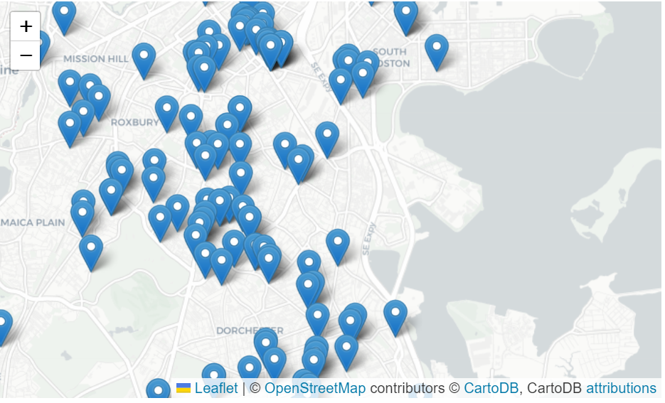
folium.plugins.MarkerCluster
- folium.plugins.MarkerCluster()는 데이터를 클러스터링해준다.
- 맵의 Zoom에 따라 MarkerCluster object의 갯수를 합축적으로 표현하여, Zoom에 따라 쉽게 데이터의 위치와 갯수를 쉽게 파악할 수 있다.
# Create the map
m_3 = folium.Map(location=[42.32,-71.0589], tiles='cartodbpositron', zoom_start=13)

# Add points to the map
mc = MarkerCluster()
for idx, row in daytime_robberies.iterrows():
    if not math.isnan(row['Long']) and not math.isnan(row['Lat']):
        mc.add_child(Marker([row['Lat'], row['Long']]))
m_3.add_child(mc)

# Display the map
m_3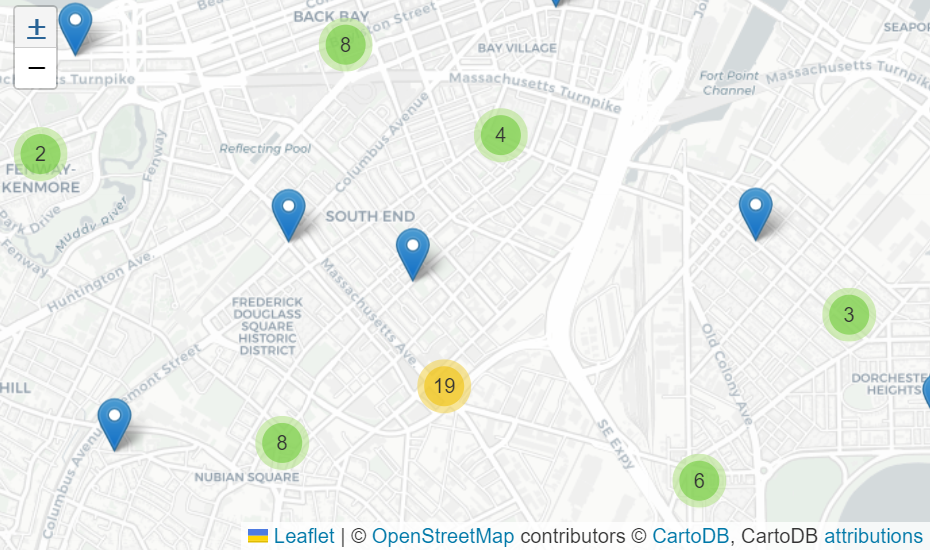
Bubble maps
- 버블맵은 마커 대신 버블 모양으로 데이터를 표시한다.
- 버블의 위치와 색으로 데이터를 표현한다
- folium.Circle()을 사용하여 버블 맵을 반ㅂ복적으로 사용하여 맵에 데이터를 추가한다.
# Create a base map
m_4 = folium.Map(location=[42.32,-71.0589], tiles='cartodbpositron', zoom_start=13)

def color_producer(val):
    if val <= 12:
        return 'forestgreen'
    else:
        return 'darkred'

# Add a bubble map to the base map
for i in range(0,len(daytime_robberies)):
    Circle(
        location=[daytime_robberies.iloc[i]['Lat'], daytime_robberies.iloc[i]['Long']],
        radius=20,
        color=color_producer(daytime_robberies.iloc[i]['HOUR'])).add_to(m_4)

# Display the map
m_4
# kaggle에서는 9-12시 데이터는 초록색, 13-17시 데이터는 파란색으로 표시한다.
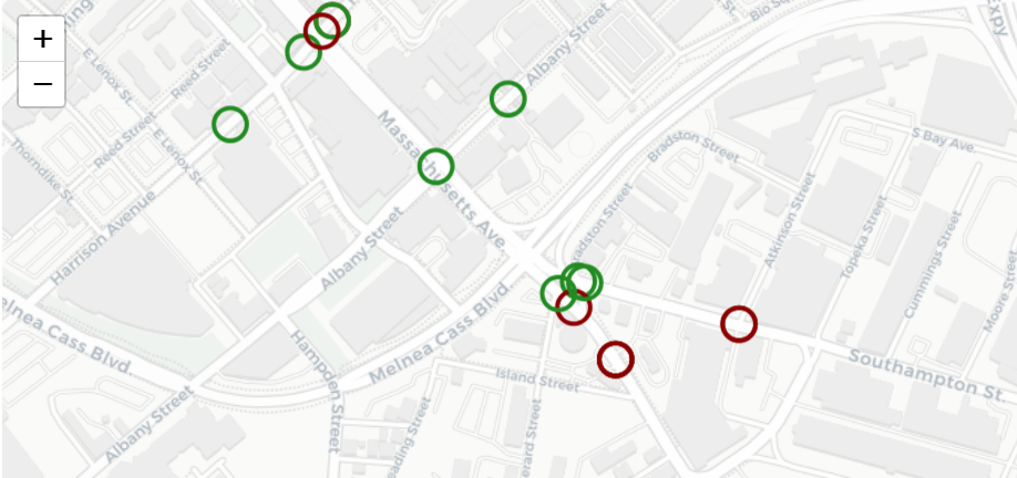
- location: 데이터의 위도와 경도
- radius: 원의 반경을 나타내는 설정. color_producer()를 통해 색을 변경
- color: color_producer()에 적용하기 위한 색 설정
Heatmaps
- folium.plugins.HeatMap()은 히트맵 형식으로 지도에 데이터를 표현
# Create a base map
m_5 = folium.Map(location=[42.32,-71.0589], tiles='cartodbpositron', zoom_start=12)

# Add a heatmap to the base map
HeatMap(data=crimes[['Lat', 'Long']], radius=10).add_to(m_5)

# Display the map
m_5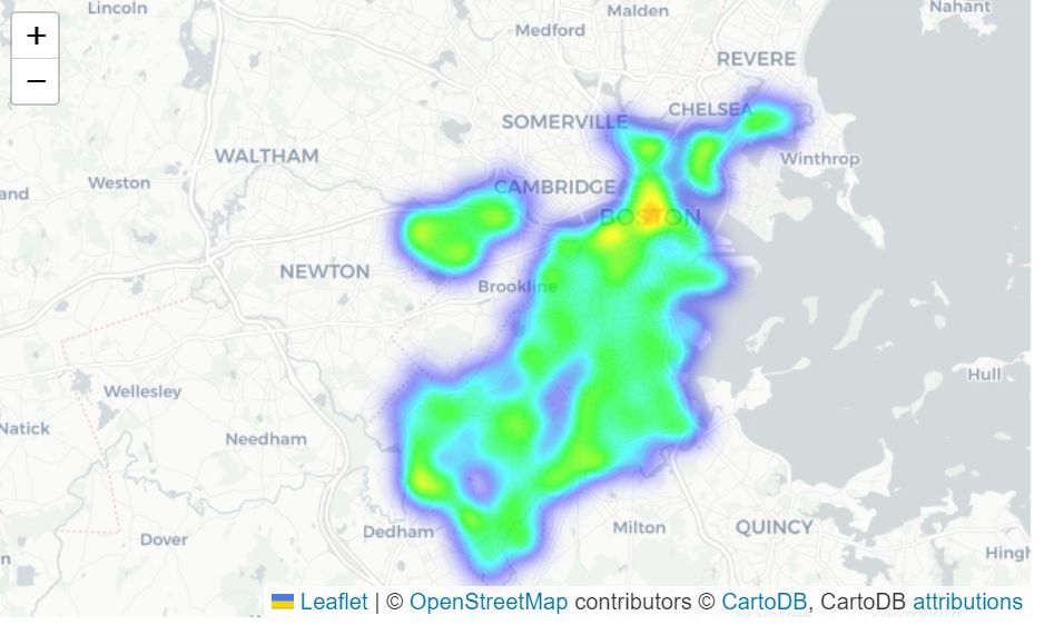
- data: plot에 표현하고자 하는 위치데이터가 있는 DataFrame
- radius: 히트맵의 부드러움(smoothness)을 조절. 높을수록 히트맵이 더 부드러워 진다. (간격이 적어져서 더 부드러워 진다)
Choropleth maps
- 지리적 경계가 포함된 지리데이터 DataFrame을 추출
# GeoDataFrame with geographical boundaries of Boston police districts
districts_full = gpd.read_file('../input/geospatial-learn-course-data/Police_Districts/Police_Districts/Police_Districts.shp')
districts = districts_full[["DISTRICT", "geometry"]].set_index("DISTRICT")
districts.head()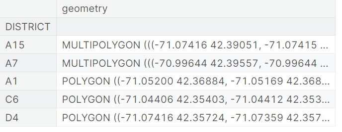
- plot_dict를 통해 구역에 따른 데이터의 갯수를 표현한다 .
# Number of crimes in each police district
plot_dict = crimes.DISTRICT.value_counts()
plot_dict.head()
D4 2885
B2 2231
A1 2130
C11 1899
B3 1421
Name: DISTRICT, dtype: int64
- plot_dict는 구역과 동일한 인덱스를 가진다.
- 경계와 설정한 색상을 배치시키는 역할을 한다.
- folium.Choropleth()는 등치지도를 생성한다.
# Create a base map
m_6 = folium.Map(location=[42.32,-71.0589], tiles='cartodbpositron', zoom_start=12)

# Add a choropleth map to the base map
Choropleth(geo_data=districts.__geo_interface__,
           data=plot_dict,
           key_on="feature.id",
           fill_color='YlGnBu',
           legend_name='Major criminal incidents (Jan-Aug 2018)'
          ).add_to(m_6)

# Display the map
m_6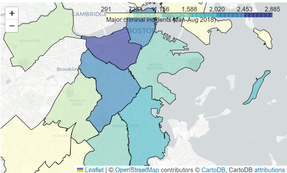
- geo_data는 지리적 경계 데이터를 가지고 있는 데이터
- key_on 는 feature.id를 설정한다.
참고

공부에는 끝이 없다