
Matplotlib
한글 설정
import matplotlib.pyplot as plt
from matplotlib import rc

rc('font', family='Arial Unicode MS')
# matplotlib inline
get_ipython().run_line_magic('matplotlib', 'inline')
matplotlib 그래프 기본 형태
- **plt.figure(figsize=(10,6))**
- **plt.plot(x, y)**
- **plt.show()**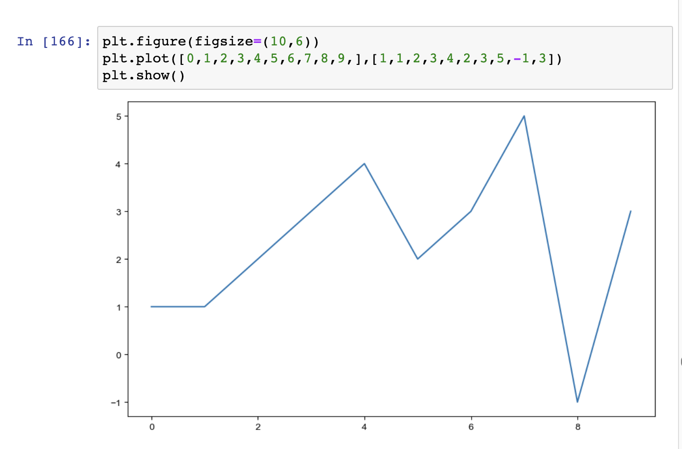
그래프 기초
삼각함수 그리기
import numpy as np
t = np.arange(0,12,0.01)
y = np.sin(t)plt.figure(figsize=(10,6))
plt.plot(t, np.sin(t))
plt.plot(t, np.cos(t))
plt.show()- 격자무늬 추가
- 그래프 제목 추가
- x축, y축 제목 추가
- 주황색,파란색 선 데이터 의미 구분
def drawGraph():
    plt.figure(figsize=(10,6))
    plt.plot(t, np.sin(t), label='sin')
    plt.plot(t, np.cos(t), label='cos')
    plt.grid(True)
    plt.legend(loc=2) # 범례
    plt.title('Example of sinewave')
    plt.xlabel('time')
    plt.ylabel('Amplitude') #진폭
    plt.show()

drawGraph()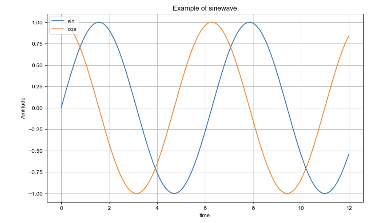
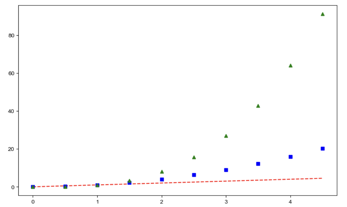
그래프 커스텀
t = np.arange(0,5, 0.5)

plt.figure(figsize=(10,6))
plt.plot(t, t, 'r--')
plt.plot(t, t**2, 'bs')
plt.plot(t, t**3, 'g^' )
plt.show()
t = list(range(0,7))
y = [1, 4, 5, 8, 9, 5, 3]

def drawGraph():
    plt.figure(figsize=(10,6))
    plt.plot(
        t,
        y,
        color='red',
        linestyle='-',
        marker='o',
        markerfacecolor='green',
        markersize=15,
    )
    plt.xlim([-0.5,6.5])
    plt.ylim([0.5,9.5])
    plt.show()

drawGraph()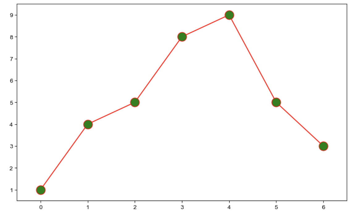
scatter plot
t = np.array(range(0,10))
y = np.array([9,8,7,9,8,3,2,4,3,4])

def drawGraph():
    plt.figure(figsize=(20,6))
    plt.scatter(t,y)
    plt.show()

drawGraph()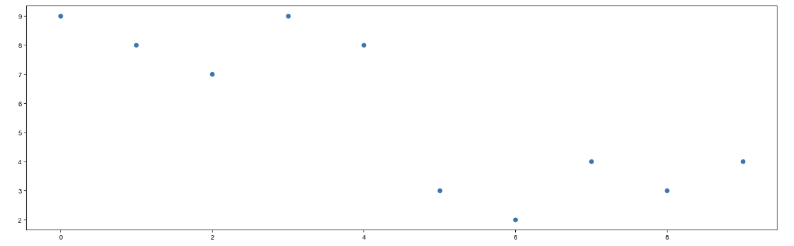
colormap = t

def drawGraph():
    plt.figure(figsize=(20,6))
    plt.scatter(t,y, s=150, c=colormap, marker='>')
    plt.colorbar()
    plt.show()

drawGraph()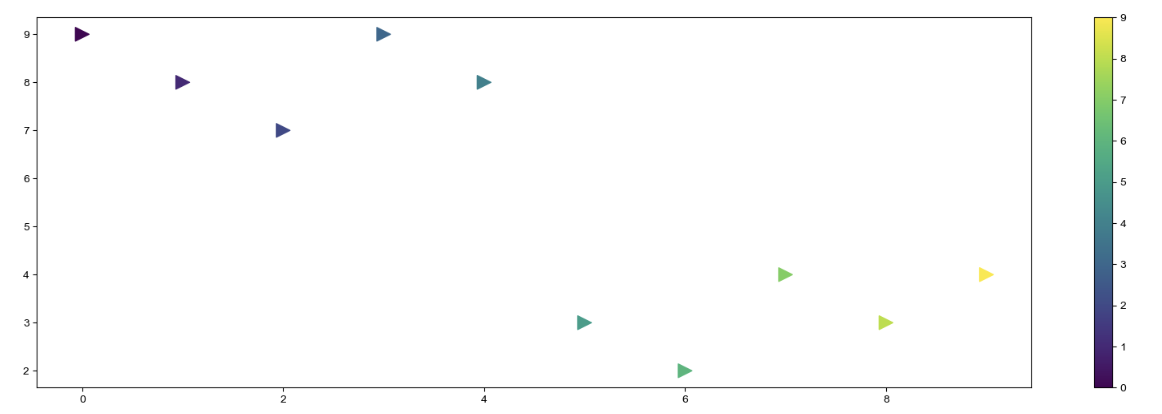

10√2 Data